Accessibility-First Mobile App Design for Ryman Healthcare
Rod Acevedo
Ryman Healthcare
Accessibility-first design for users with an average age of 80. A mobile app connecting residents to village life across Australia and New Zealand.
Most digital products quietly assume a young, confident user who forgives friction. Ryman's residents are the opposite of that assumption: an average age of 80, with the full range of vision, dexterity, memory and confidence that comes with it. Many were using a smartphone or tablet in earnest for the first time. For this audience, friction doesn't mean a frustrating session. It means giving up.
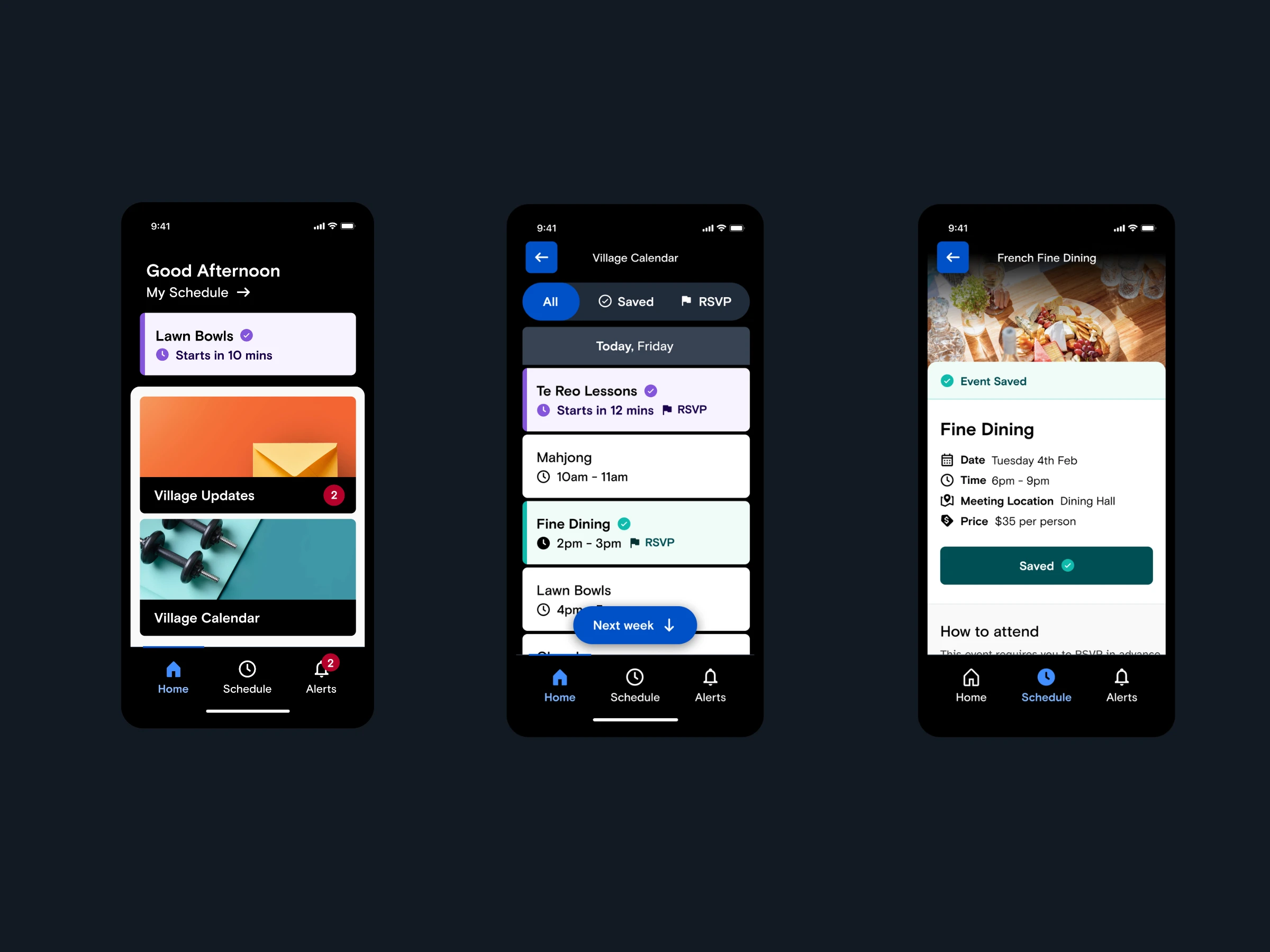
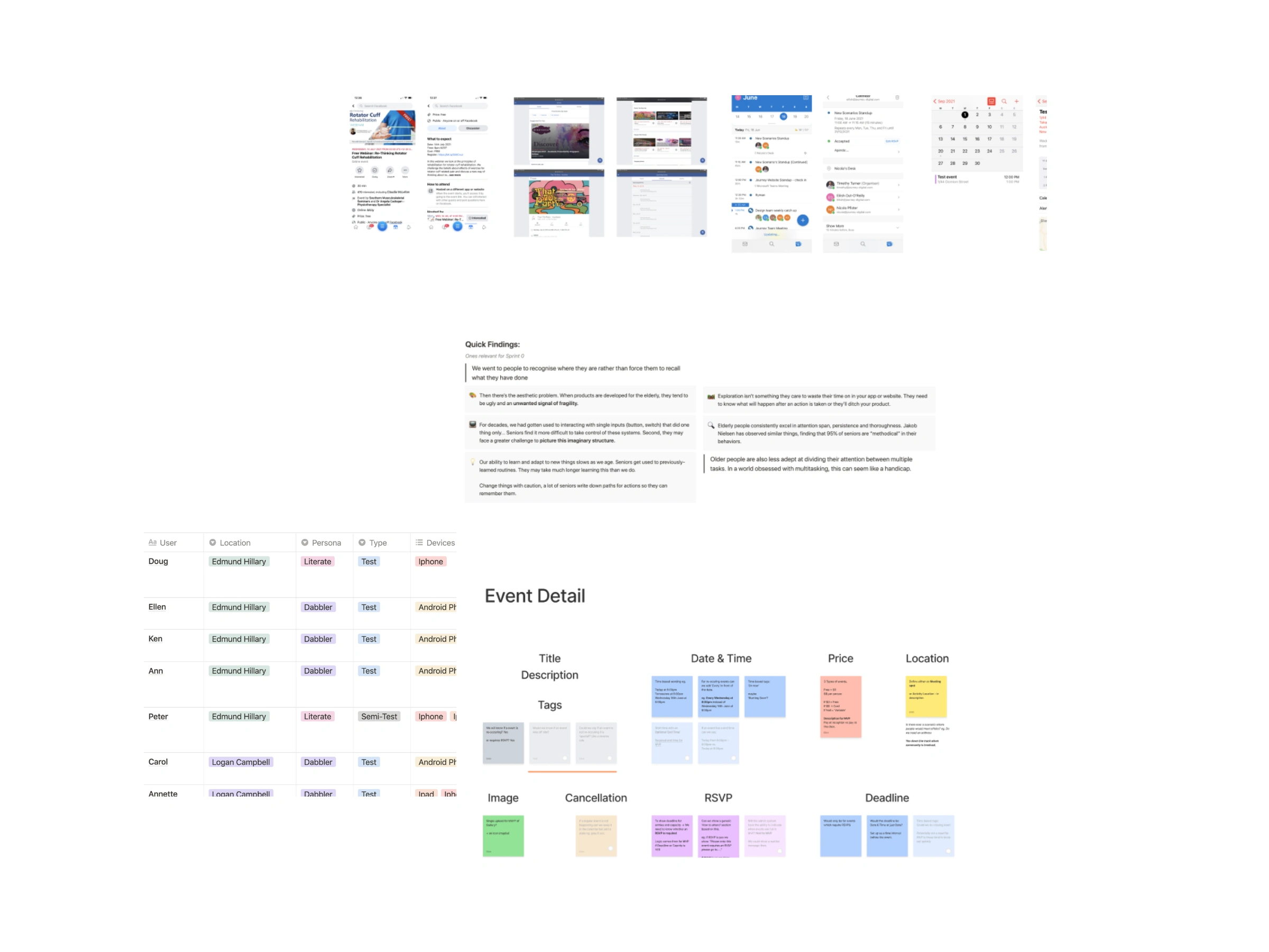
The app is how residents stay connected to village life: today's schedule, the village calendar, RSVPs, dining, community updates and the notifications that genuinely matter. It's also a strong enterprise story: a A$2.3 billion organisation trusting a design-led approach to connect with their most important users. Accessibility is usually the last slide. Here it was the first constraint.
Impact
208% increase in engagement · 76% household retention · 74% resident satisfaction · 80 y/o average user
Designing for the edges (oldest users, least technical confidence, highest accessibility needs) created a better product for everyone. The engagement lift held across Australia and New Zealand, and three in four households kept using the app once they had it. When lockdowns hit, the same system carried critical announcements and virtual events, exactly the moment a communication channel built for older residents proves its worth.
My role as Design Lead
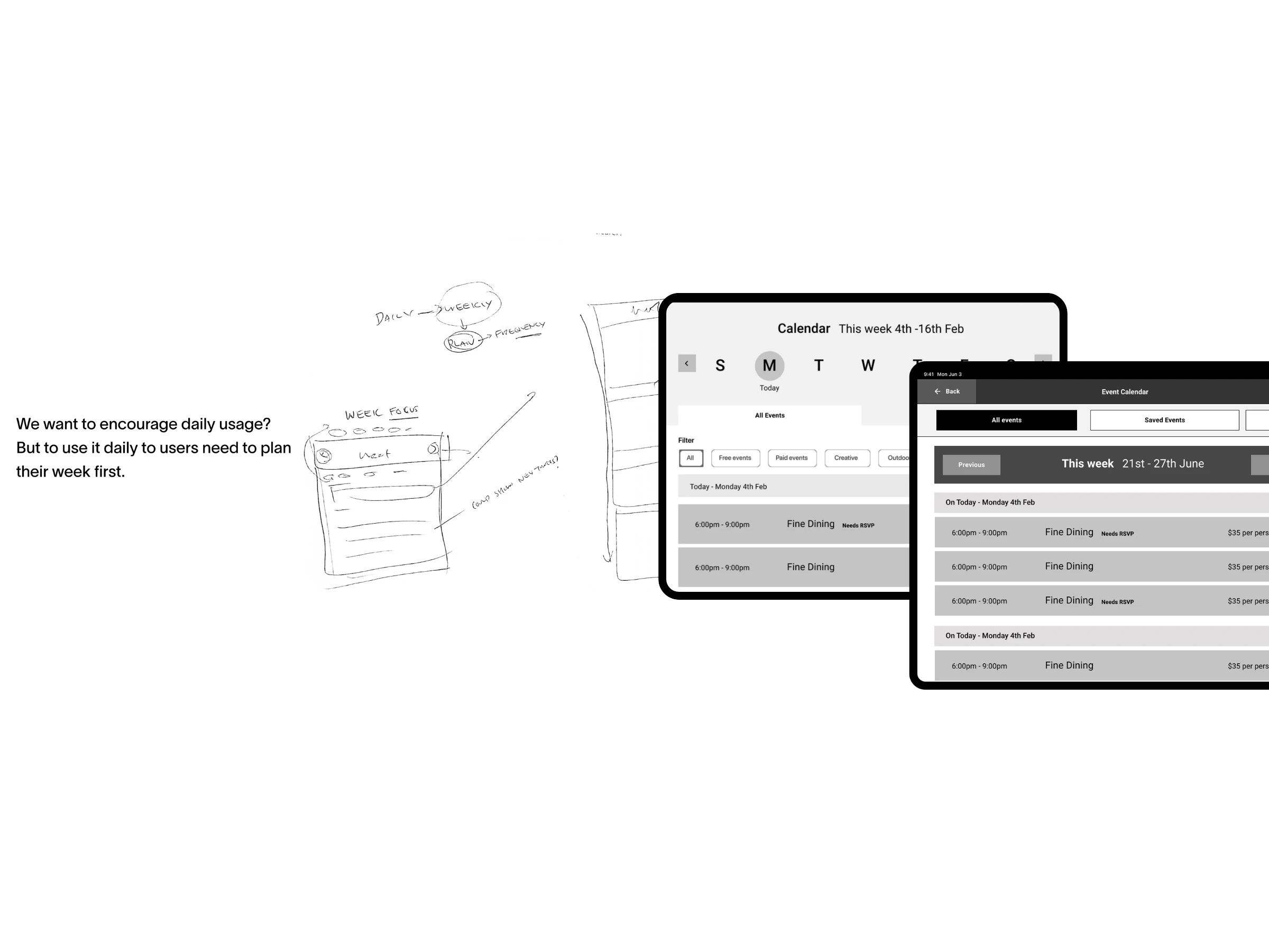
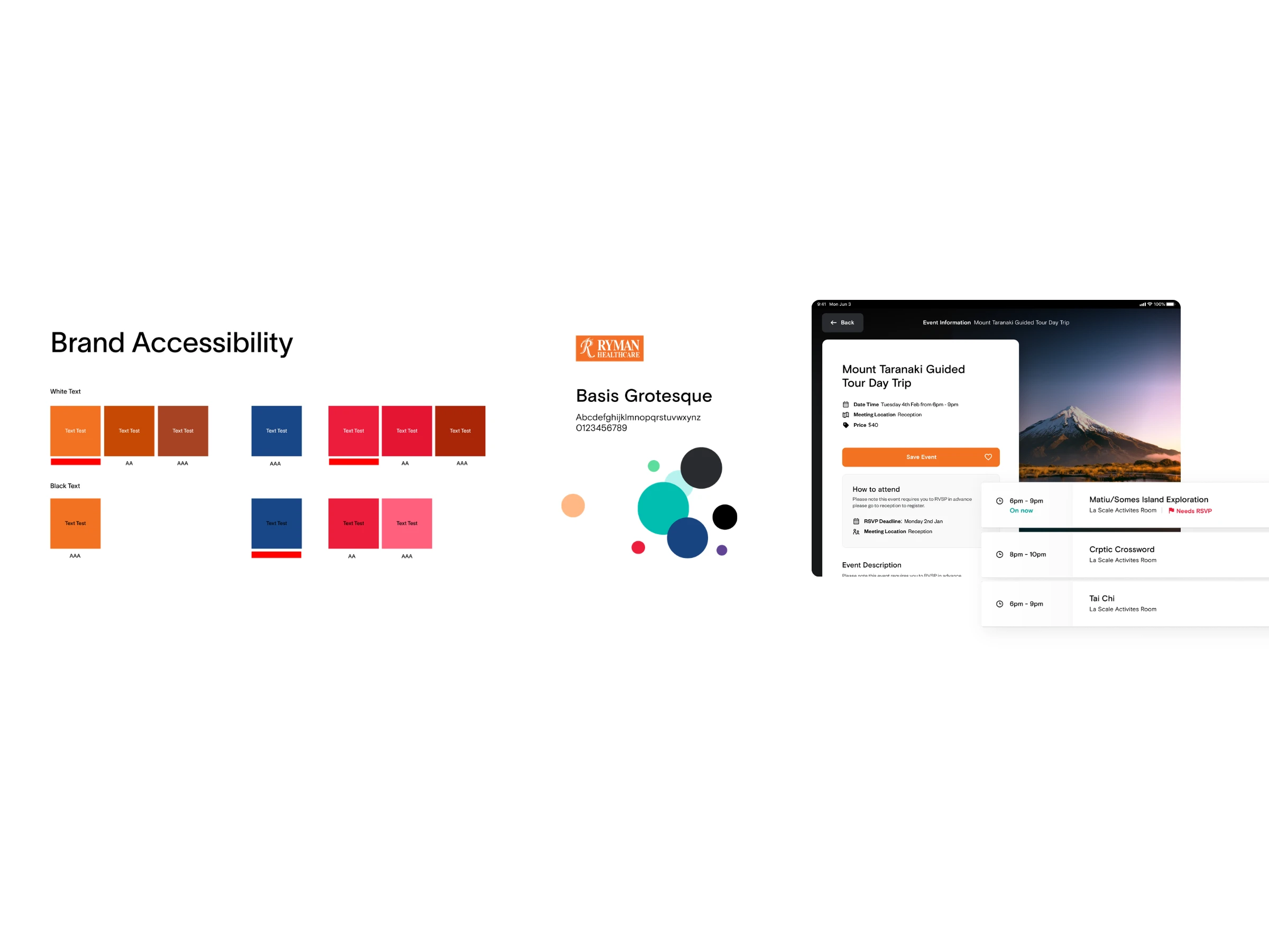
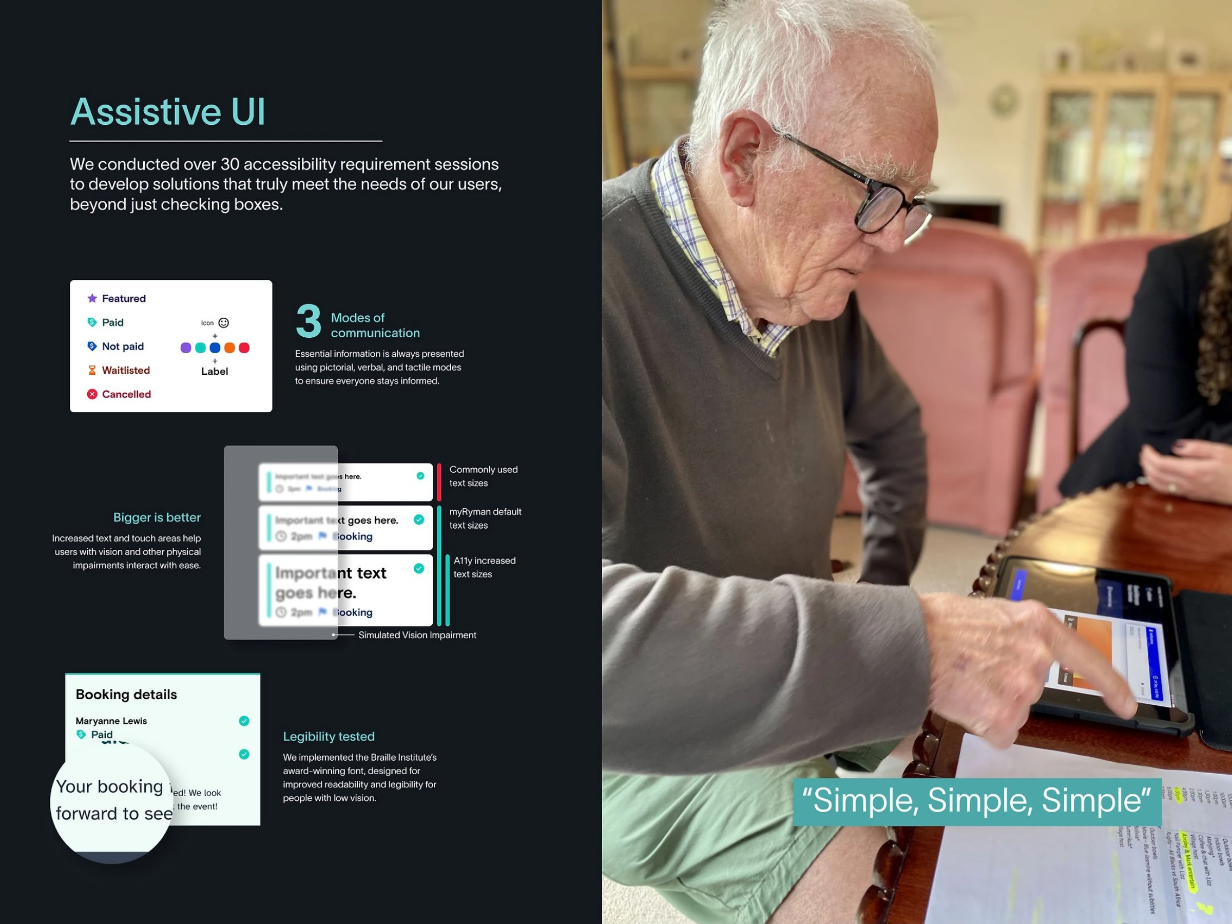
I led the design, building a custom component system with WCAG 2.1 AA as the floor rather than the finish line. Touch targets sized for hands with reduced dexterity, contrast ratios chosen for ageing eyes, a typography scale that stays legible without shouting, and layouts that keep cognitive load down: one clear action per screen, consistent placement, and an obvious way back and way home from anywhere.
The result didn't look clinical, quite the opposite. Aged care software tends to look like it was designed for the institution rather than the person. This looked warm and inviting, because accessible design doesn't have to mean boring design.
Every feature (schedules, calendars, RSVPs, community updates, notifications) was tested with real residents. I refined interaction patterns by watching how 80 year olds actually hold tablets and phones, how they move between screens, and above all how they recover from mistakes. Confidence is the real accessibility metric here: a resident who feels safe to tap will explore, and one who fears breaking something won't come back.
The platform now scales across Ryman's Australia and New Zealand operations, with localised content for each village and smooth transactions across villages, native on iOS and Android across phones and tablets.
Interested in the story behind this project? Let's have a chat!
Like this project
Posted Jun 10, 2026
Accessibility-first design for users with an average age of 80. A mobile app connecting residents to village life across Australia and New Zealand.