SN wellness
ABOUT THE BRAND
SN Wellness, a supplement brand from Hong Kong, specializes in providing natural supplements. The brand’s commitment lies in harnessing the power of botanical ingredients to unlock the radiant energy within you while providing comprehensive support for your overall well-being. SN Wellness believes in the transformative potential of nature's bounty. The high-quality supplements are thoughtfully formulated to nourish your body, ignite your vitality, and promote a harmonious balance in your life.
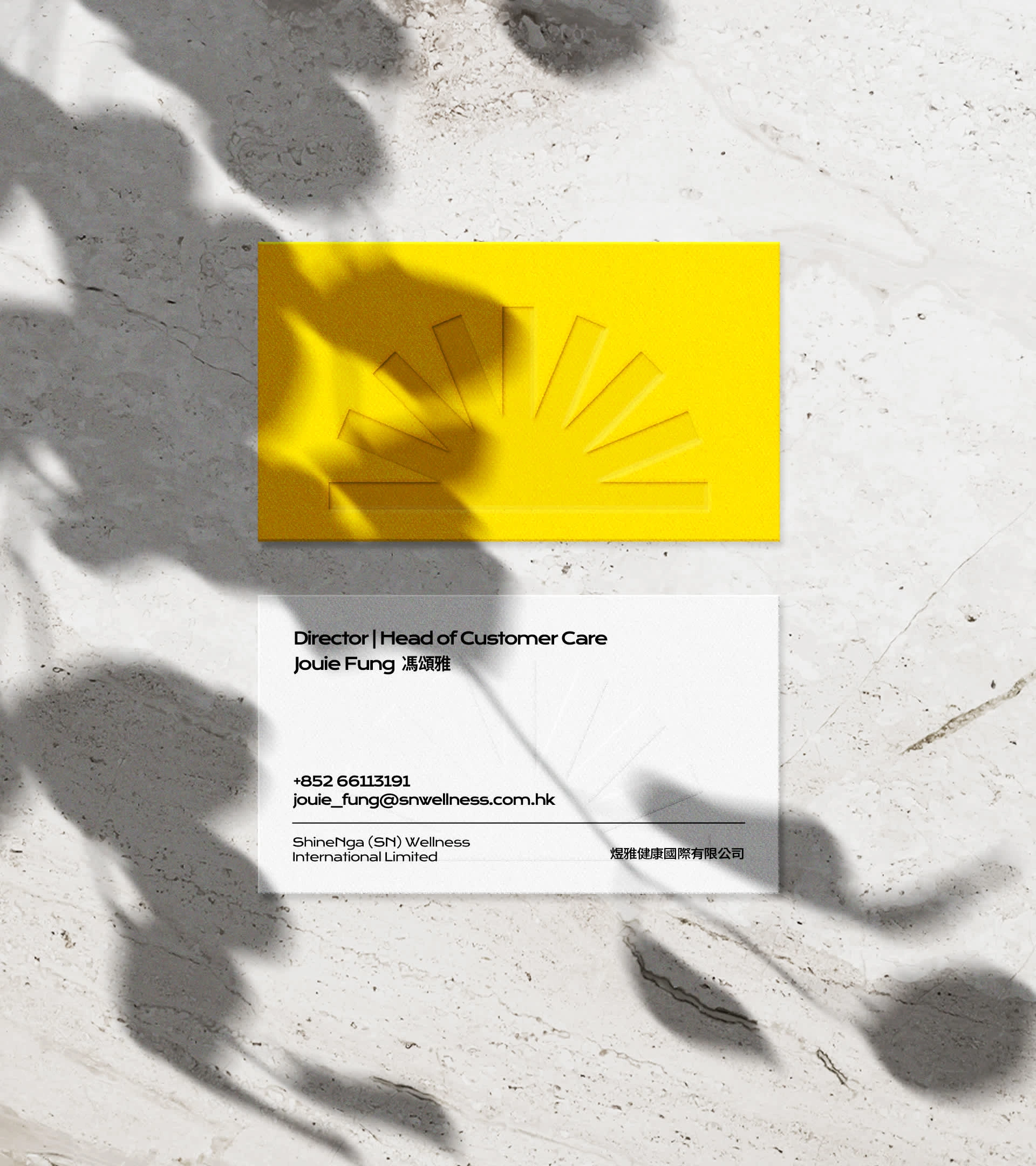
name card design
DESIGN CONCEPT
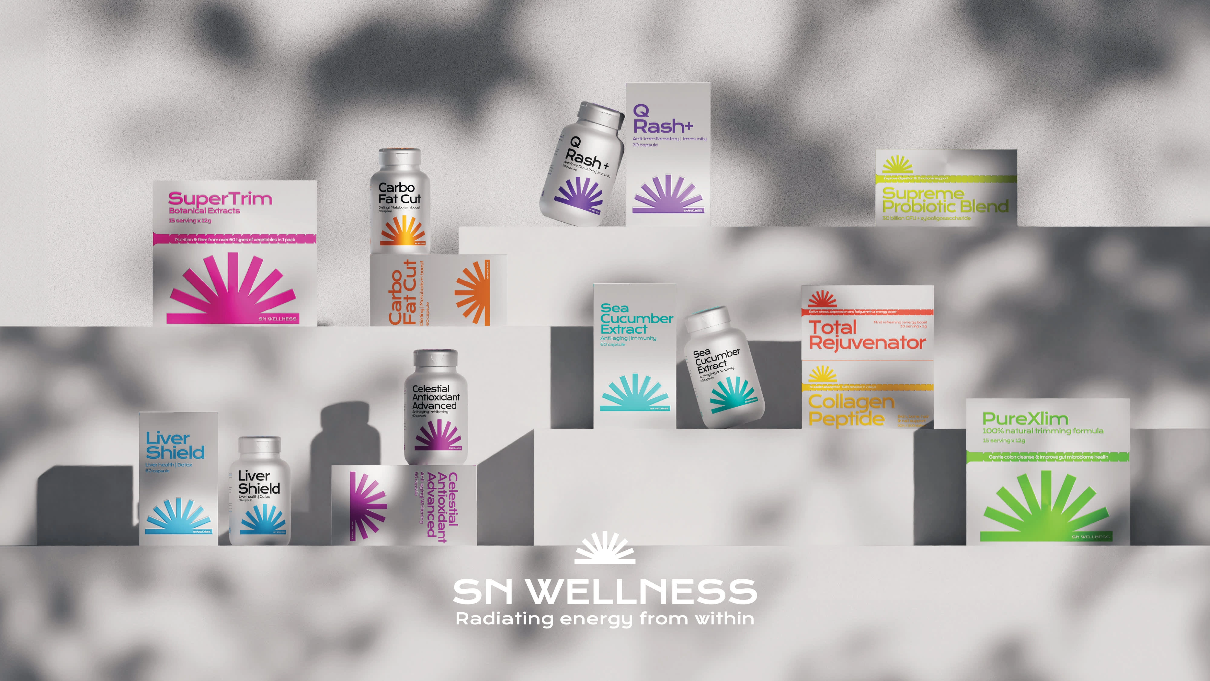
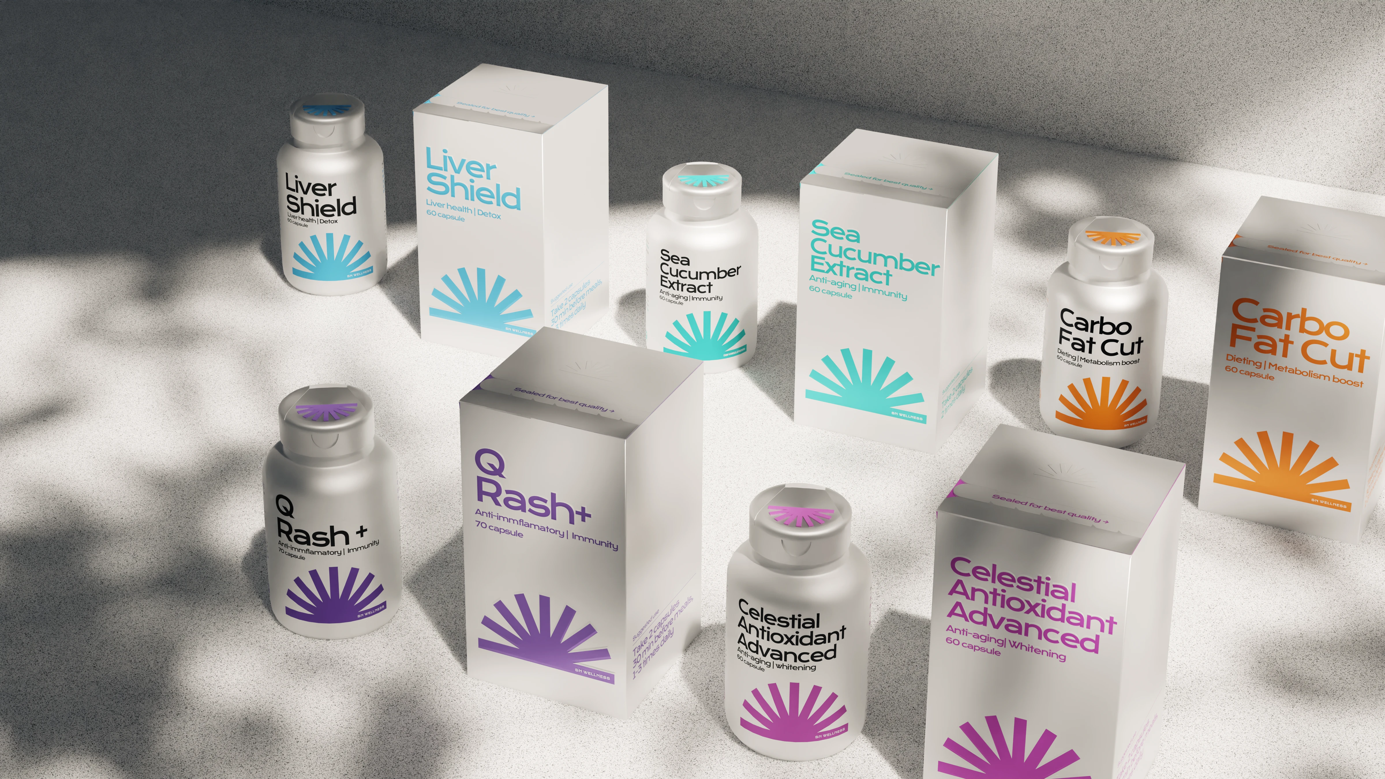
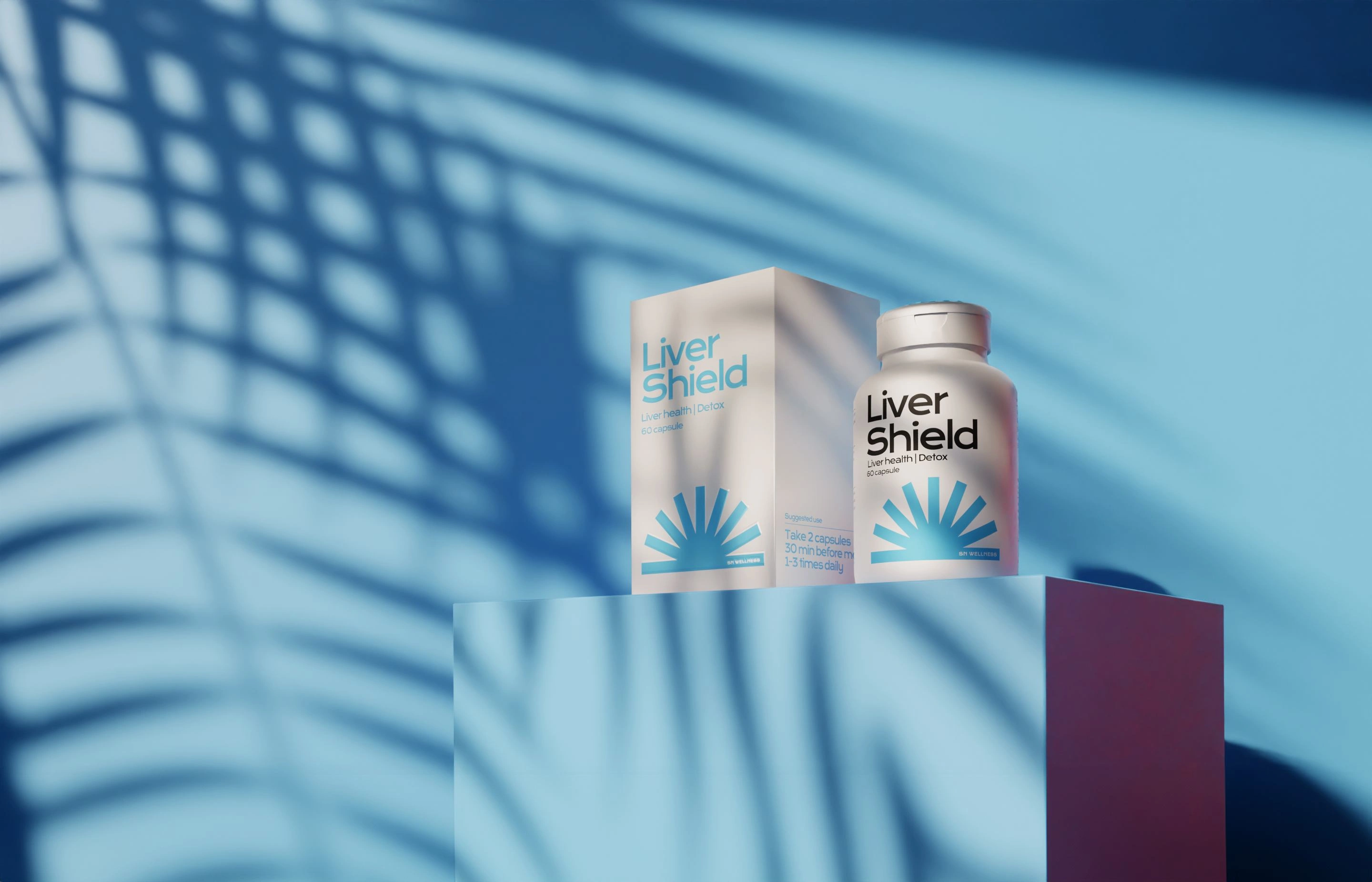
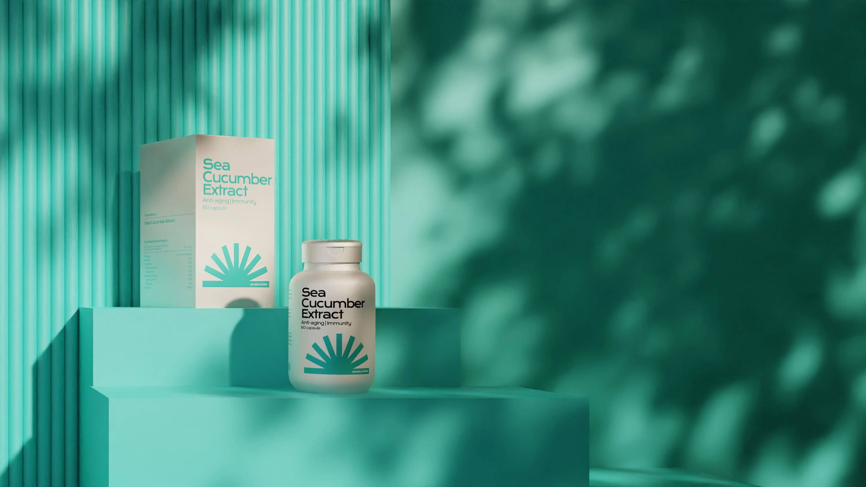
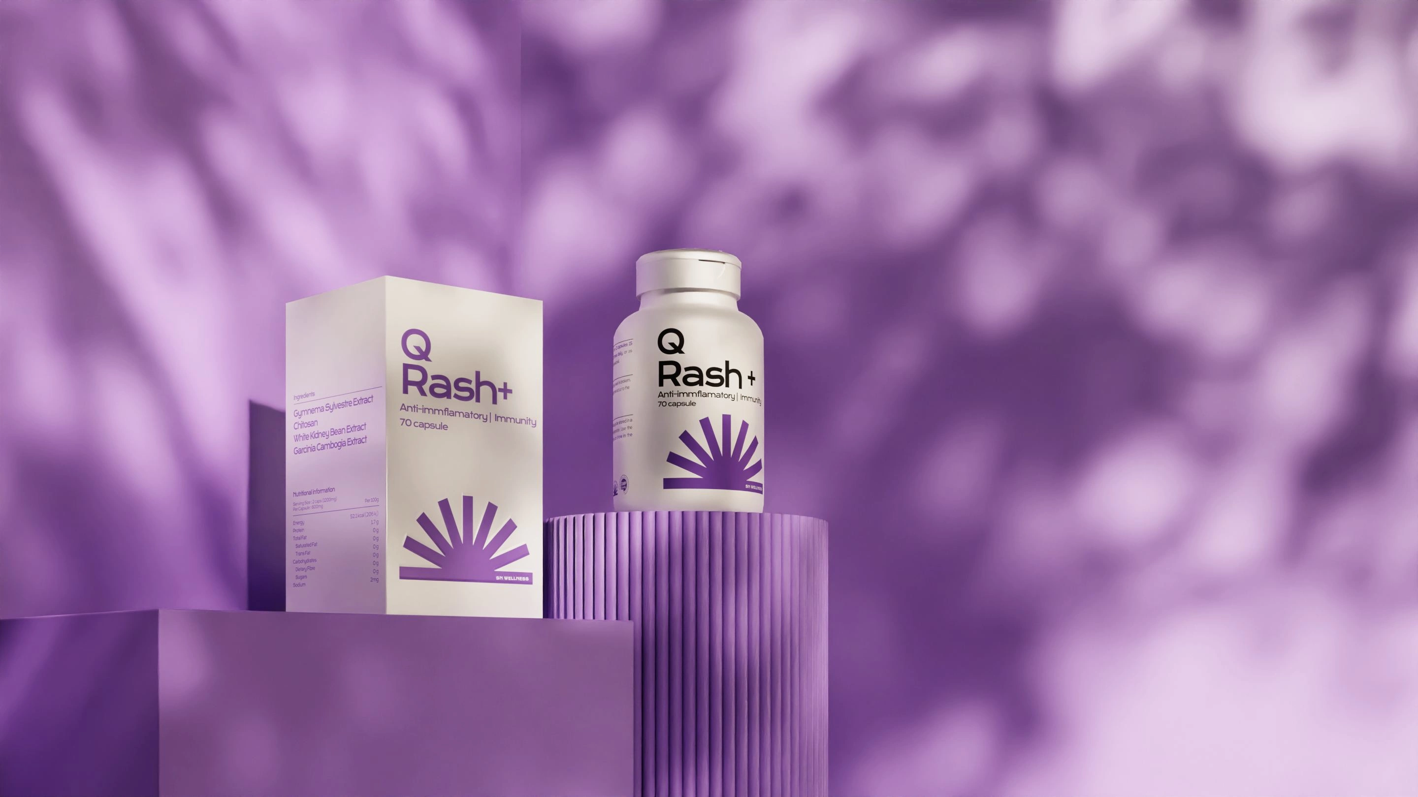
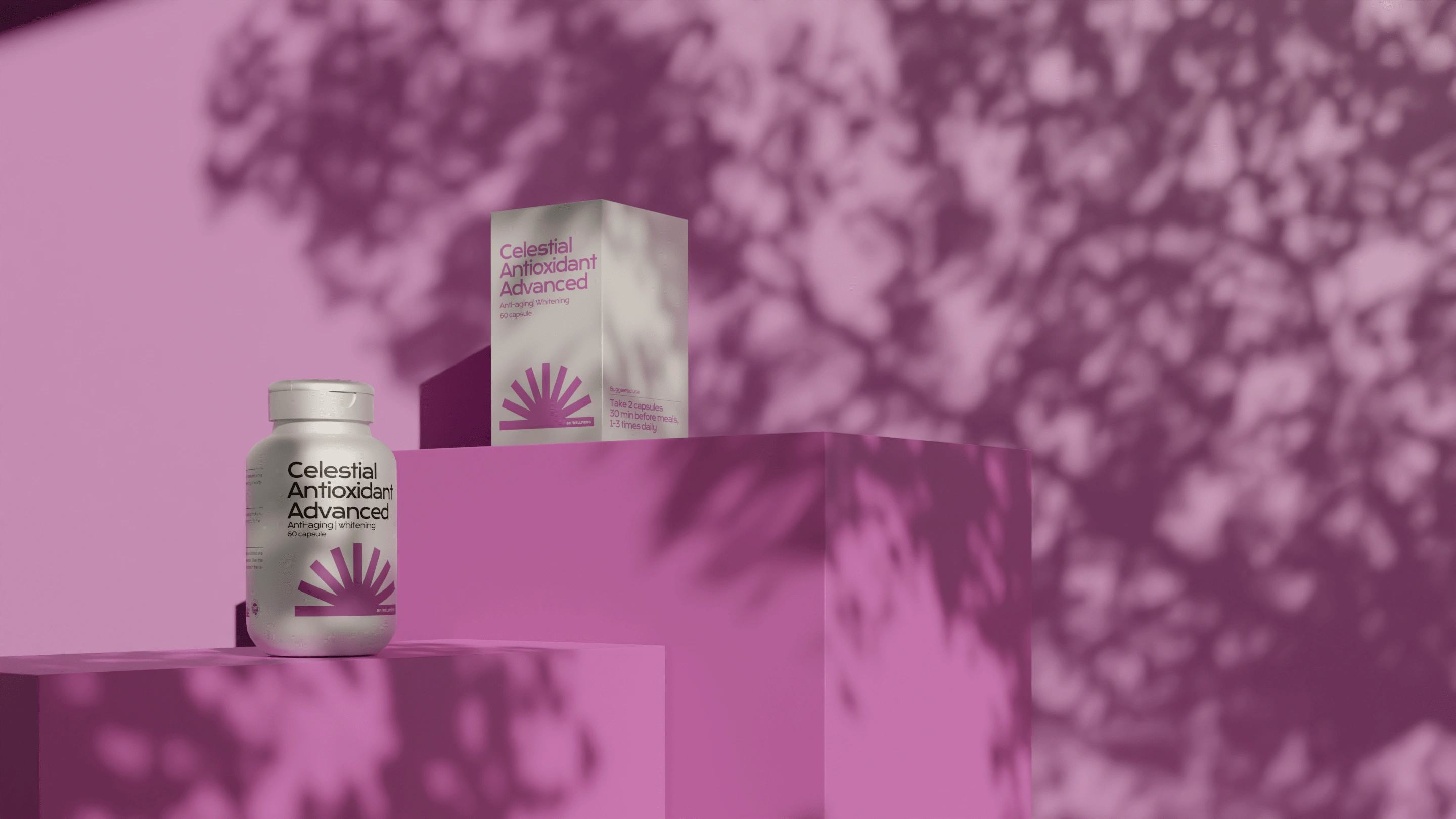
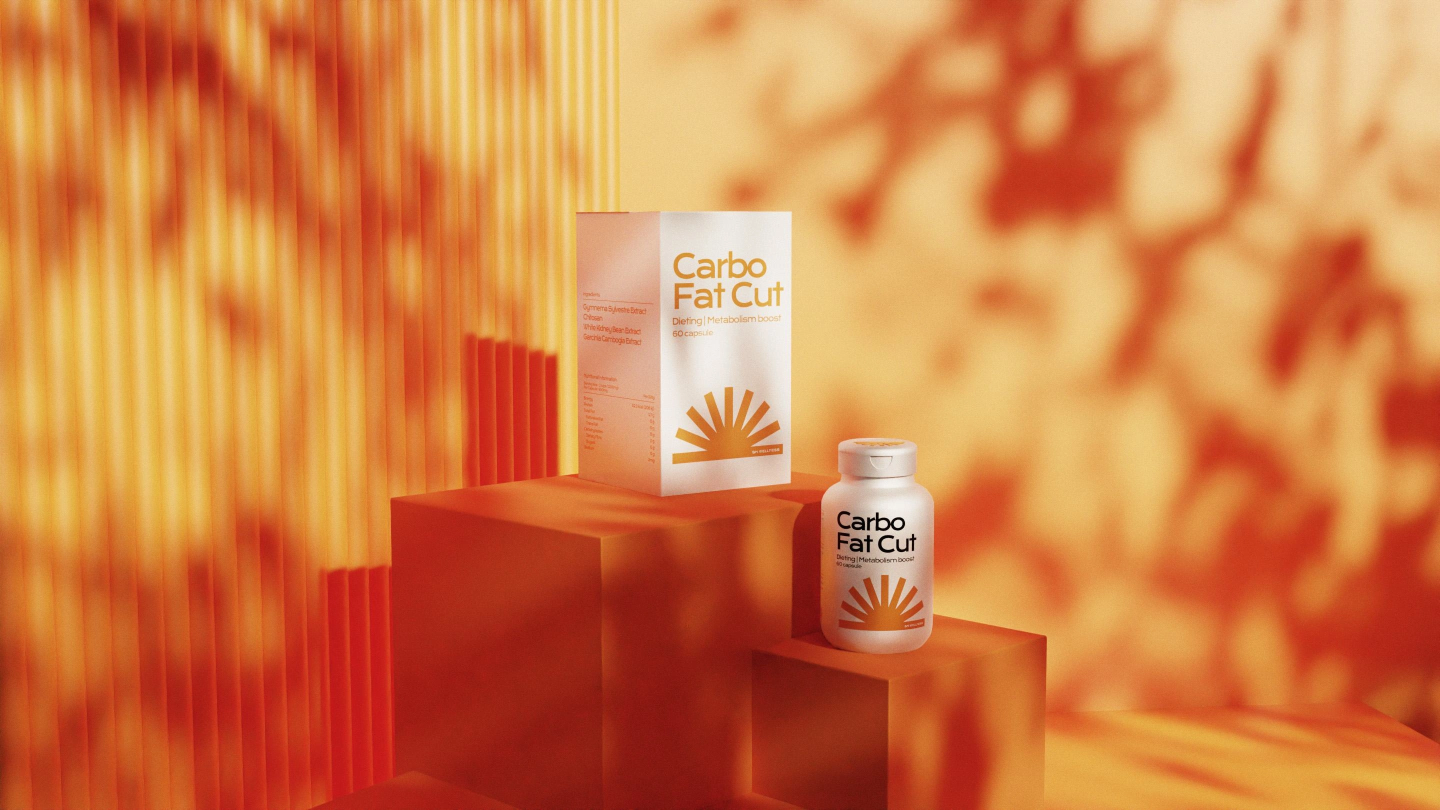
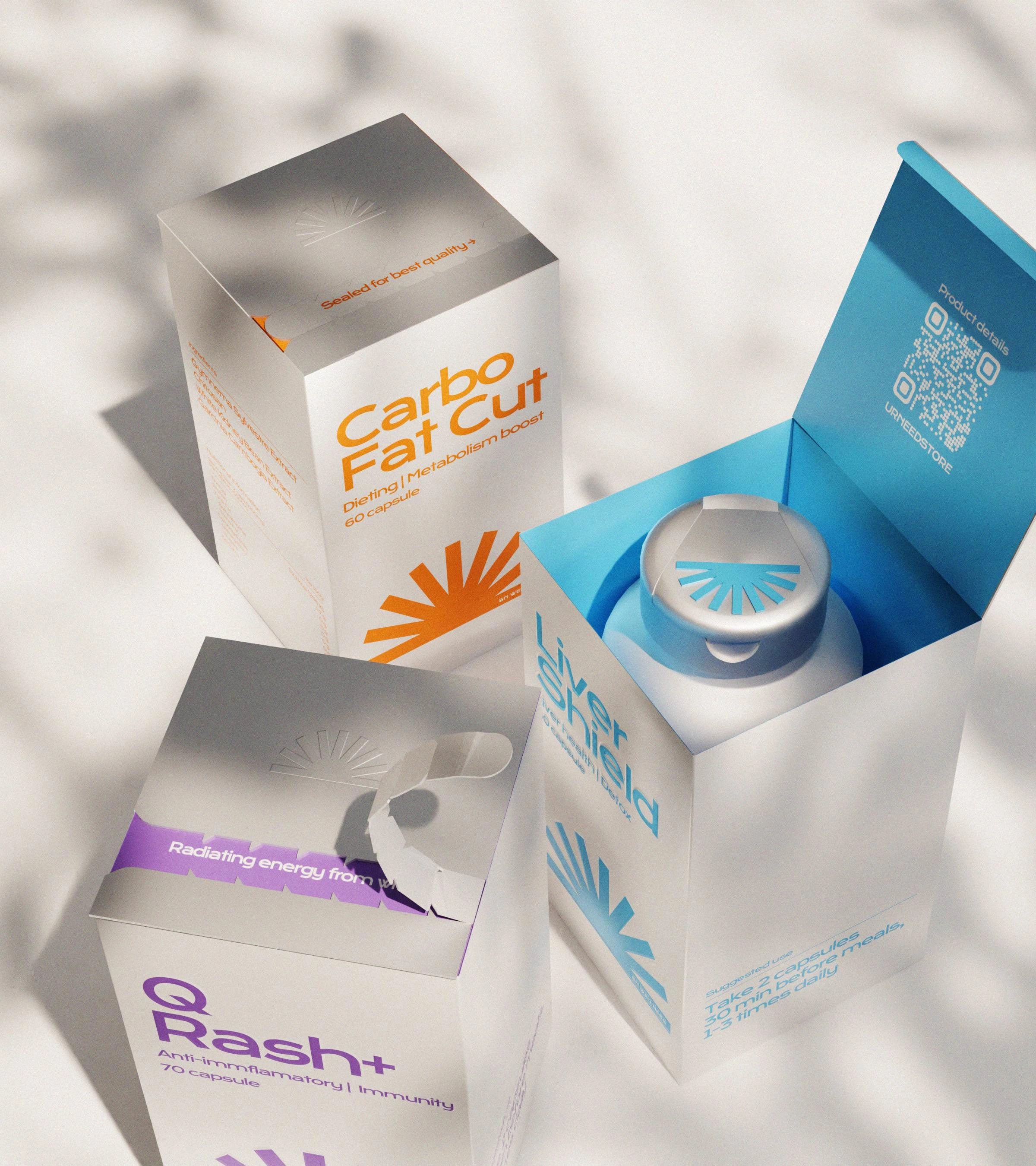
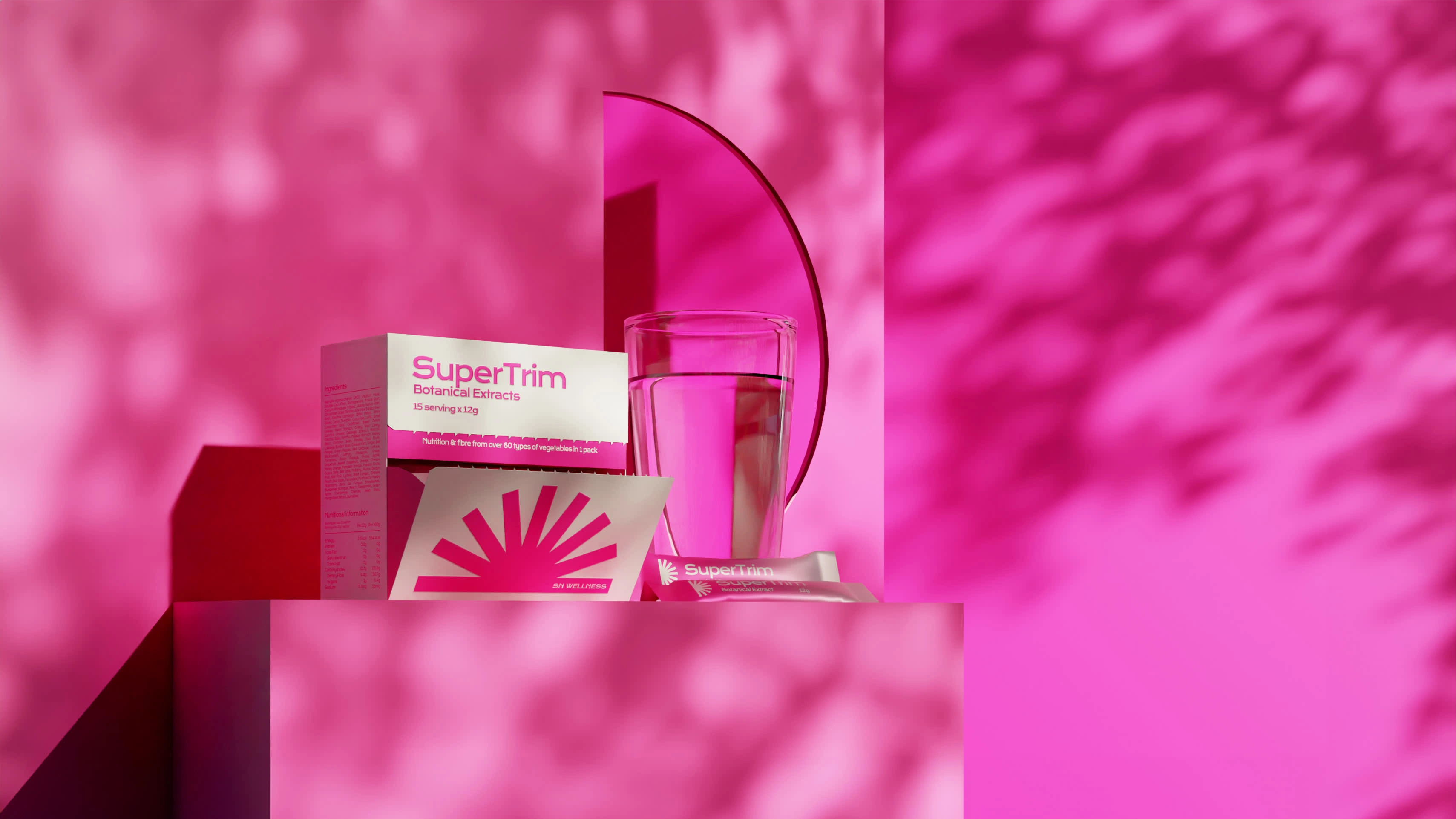
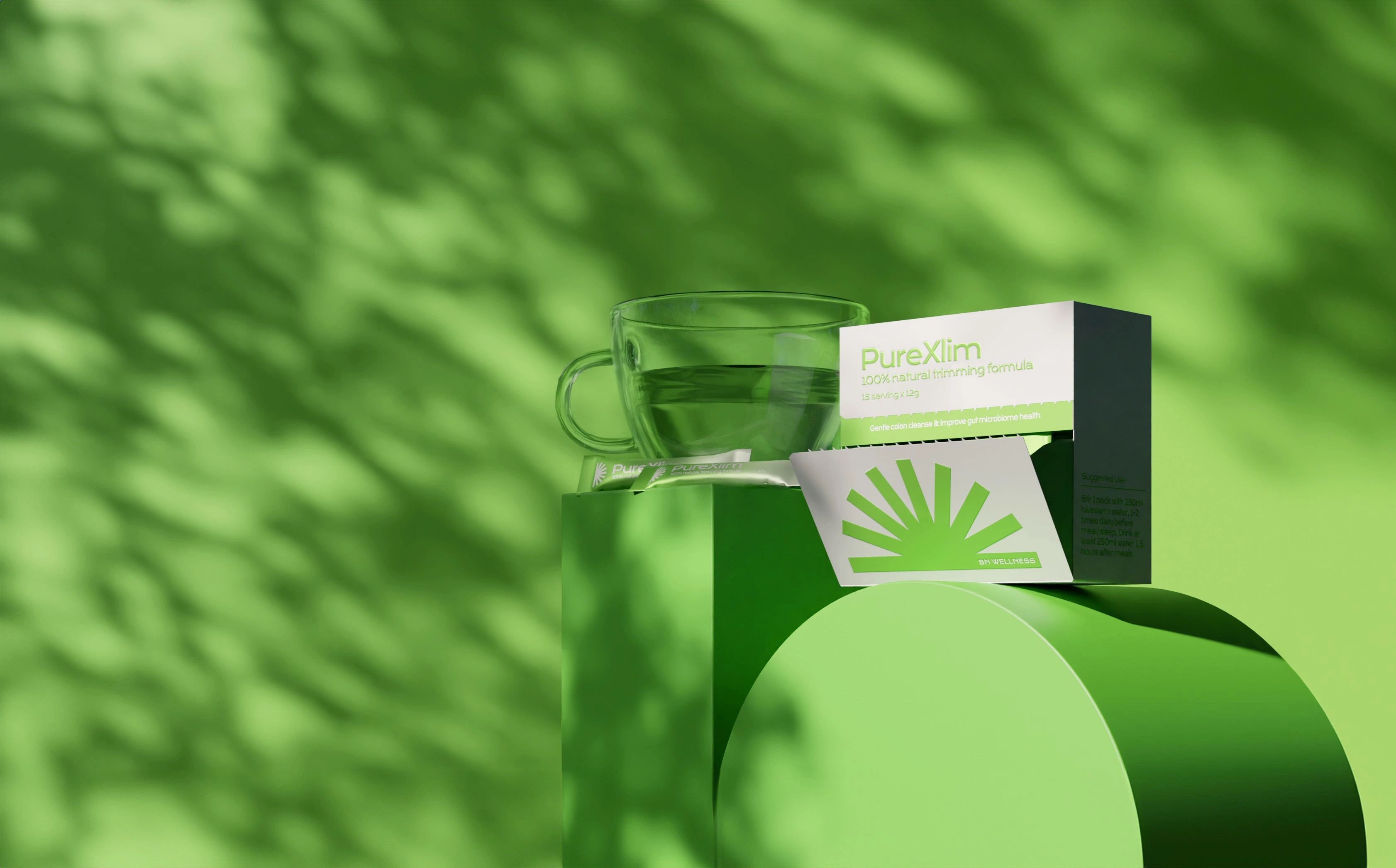
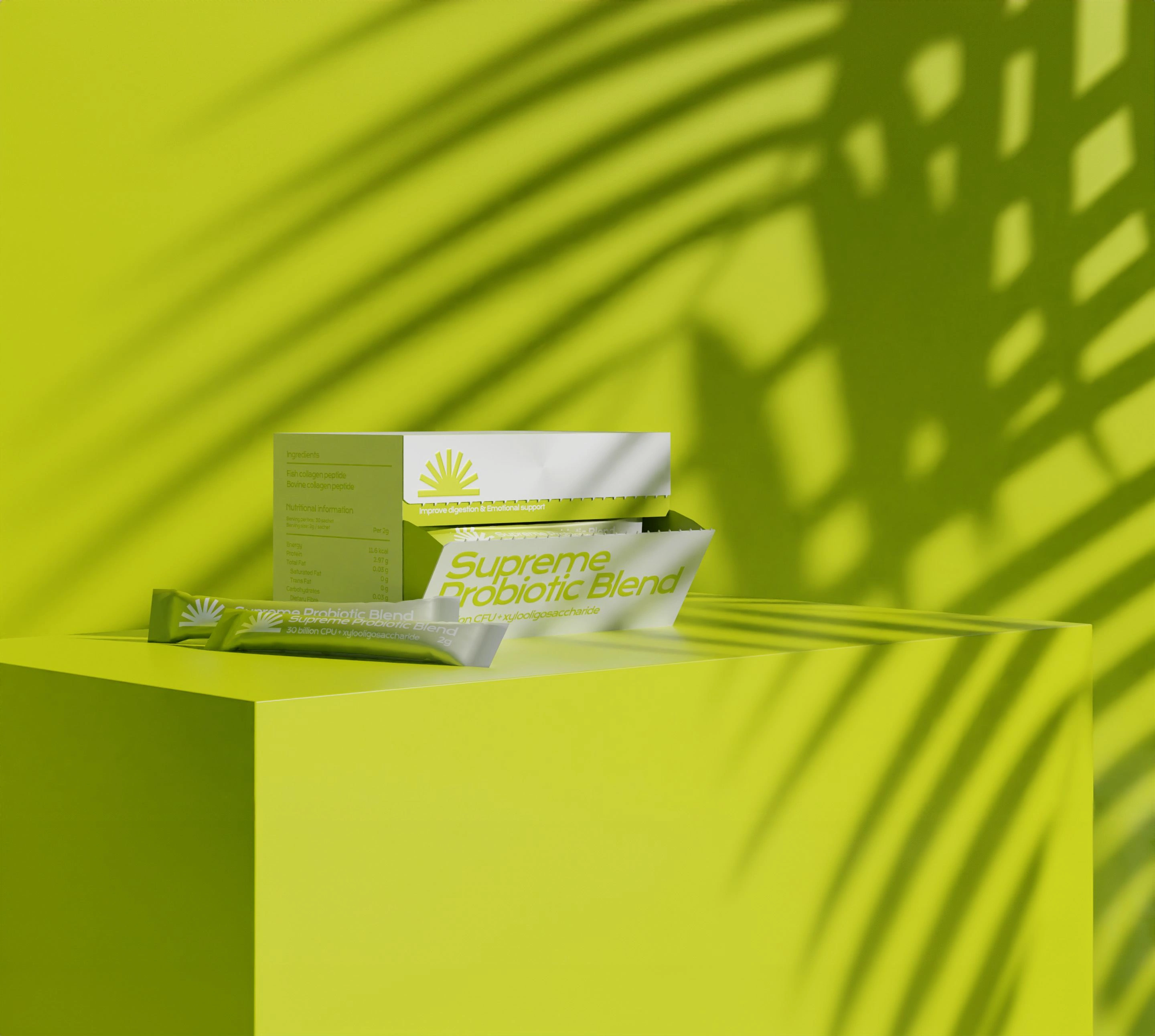
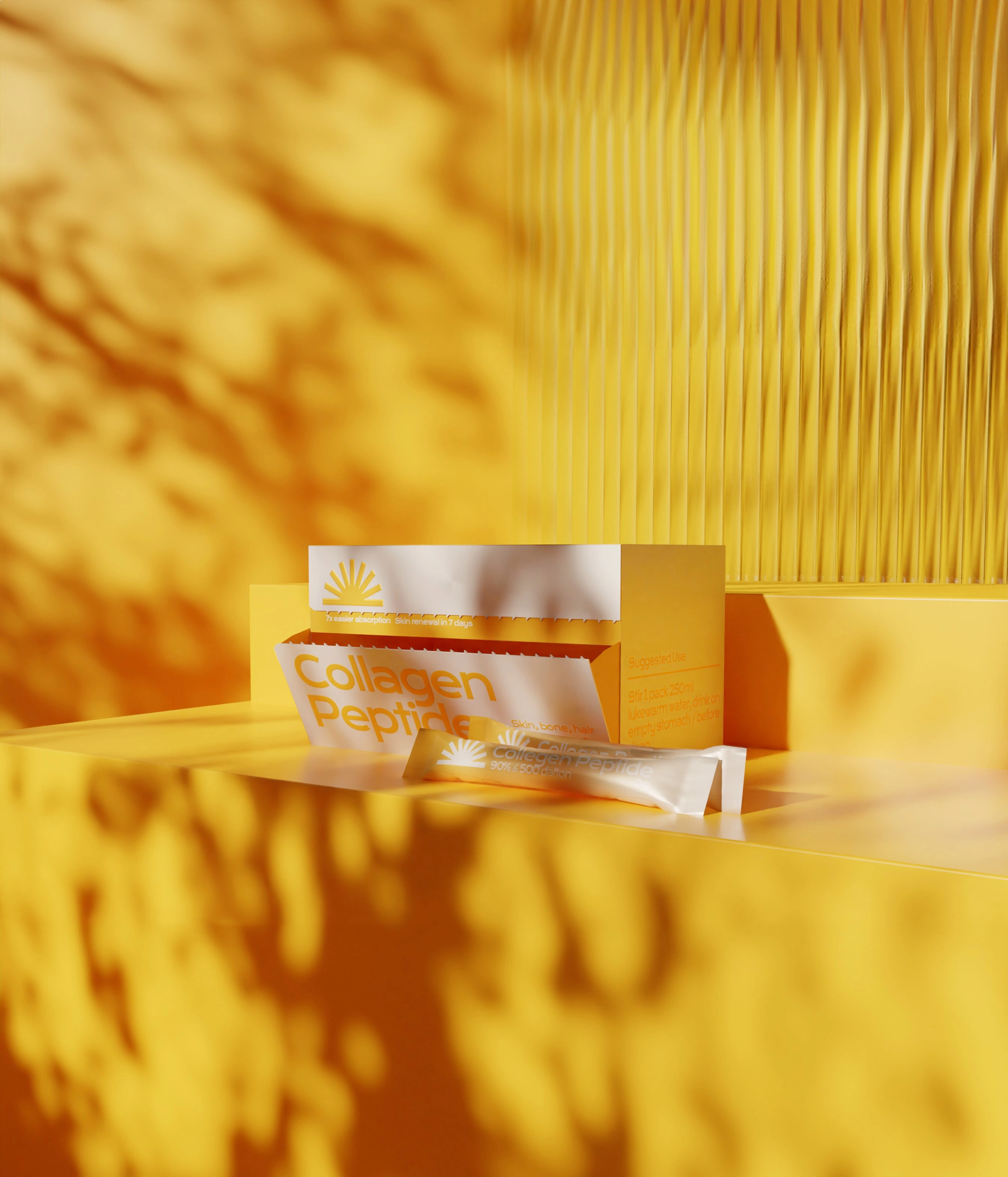
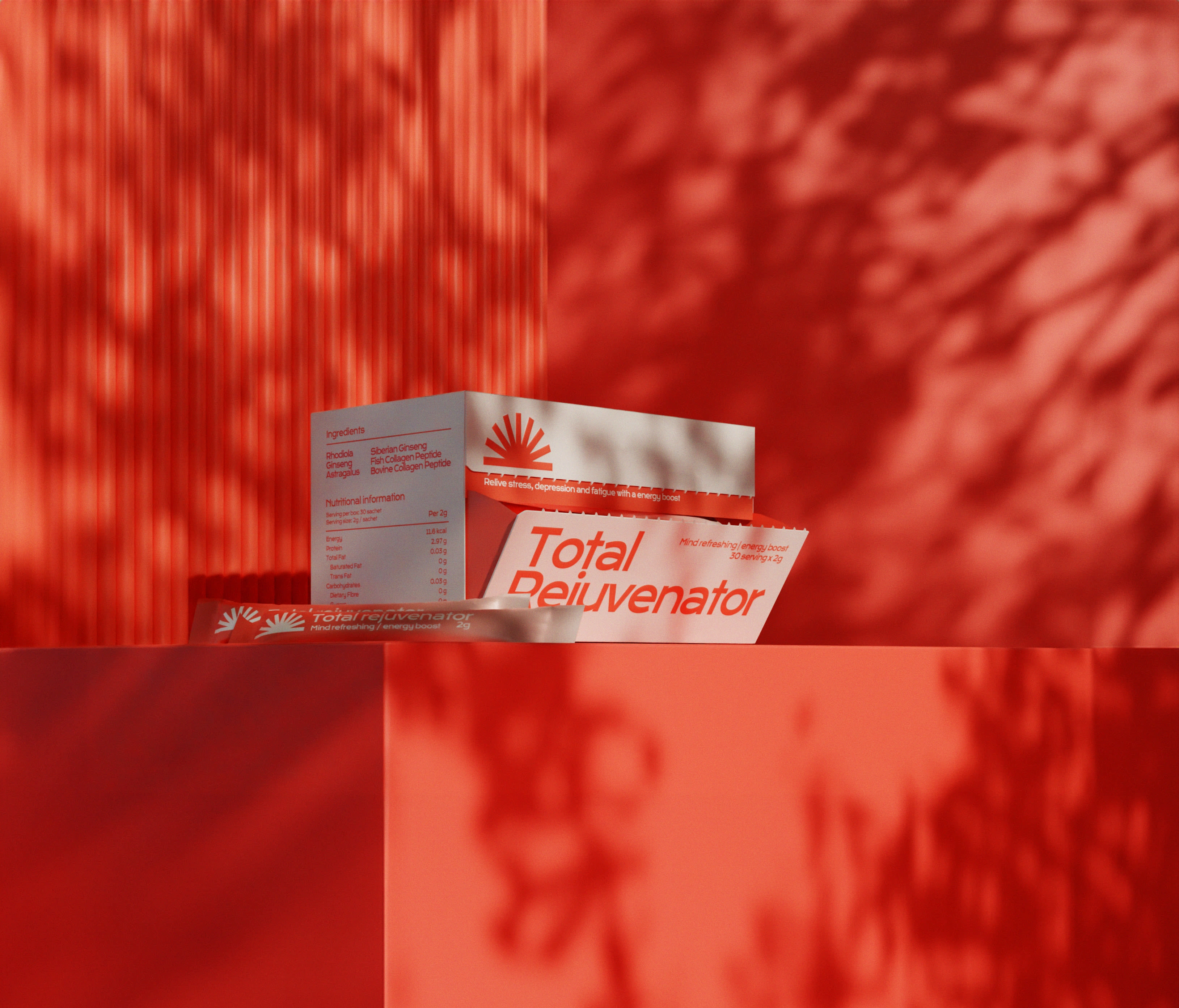
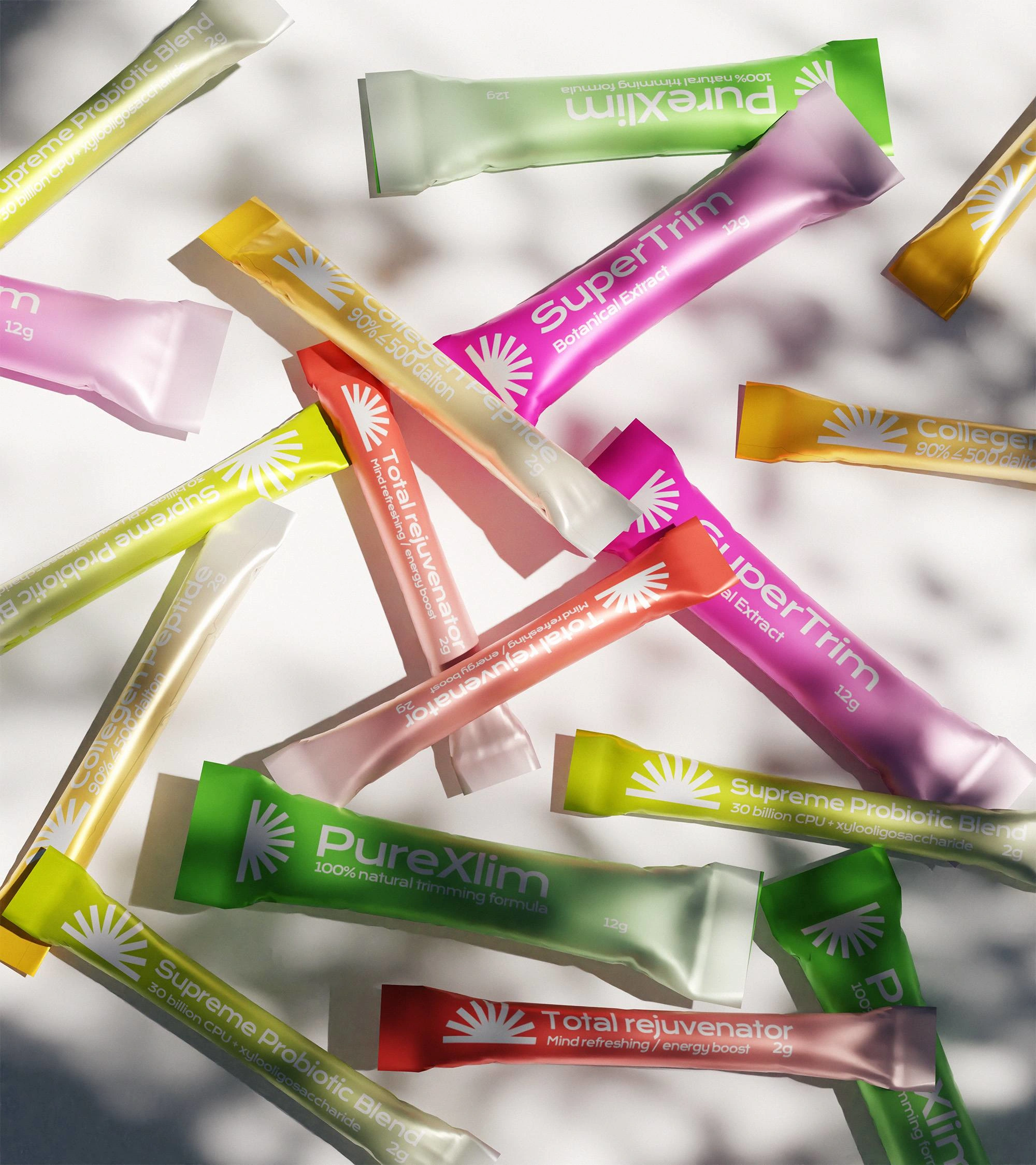
As part of our rebranding journey, the supplement brand was renamed and extracted the essence of sunlight from the original Chinese name. The word "煜" symbolizes the radiant energy of the sun, which now forms the foundation of the new identity. Our logo features a minimalist icon composed of radiating lines, evoking the imagery of a sunrise. The matte silver packaging reflects light in a subtle way, echoing with the elements of sunshine. By capturing our supplements bathed in soft sunlight and the gentle shadows of plants, we emphasize the warmth of sunbeams and infuse a touch of nature into our overall visual identity through product photography. This harmonious blend balances the solidity of our logo and fonts, creating a captivating representation of the brand.
BOTTLE DESIGN
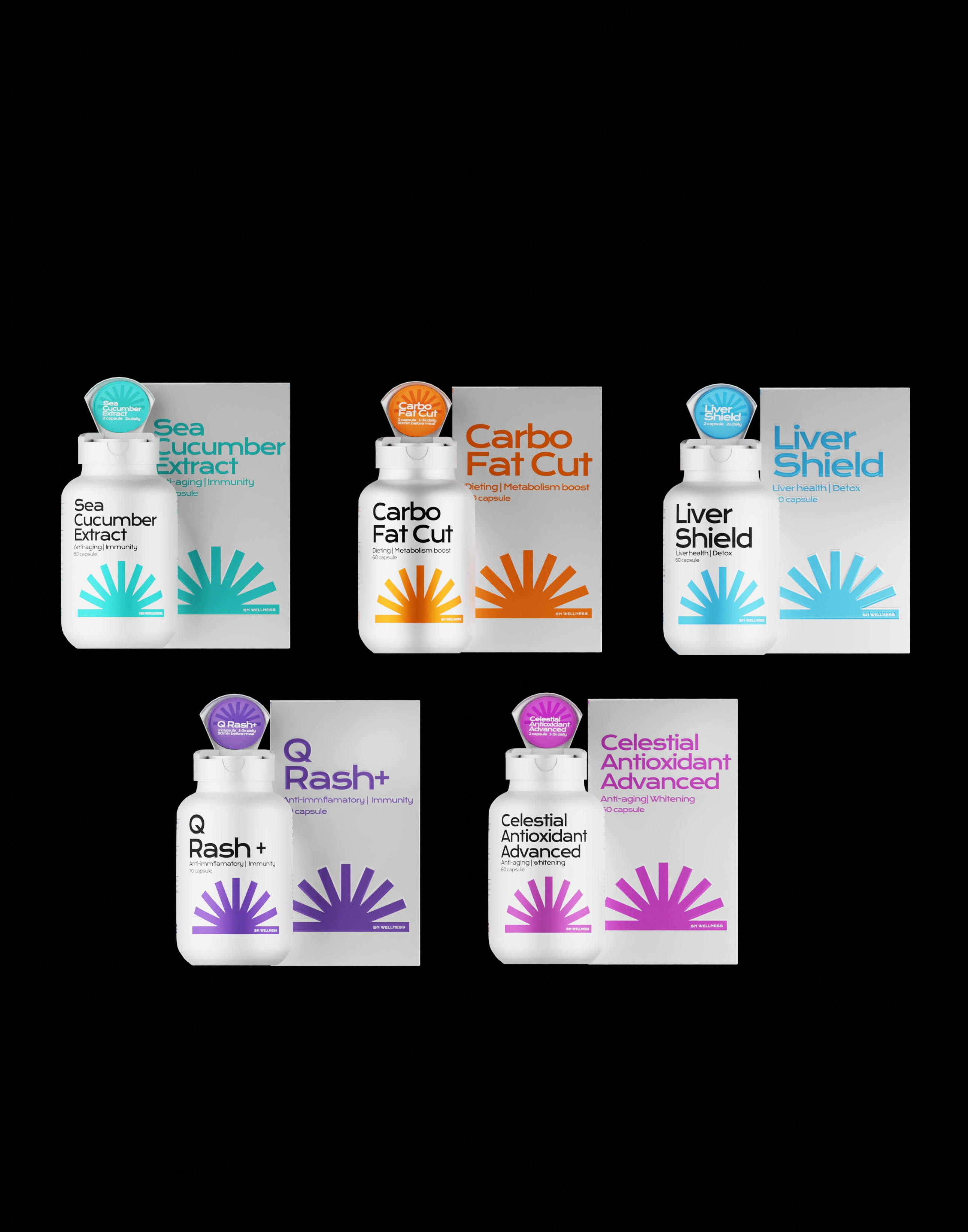
The primary focus of the package design is to ensure clear and concise information. Through the implementation of a layout system, users can easily locate relevant information across various products. Instead of having to search for usage instructions on the bottle label, users can now find them conveniently printed on the lid. This serves as a helpful reminder each time they take the supplement. All packaging has a tear seal on the top of the box, ensuring the quality of the product while incorporating an interesting experience for the users. When they tear it open, a pop of color and a slogan highlighting the key benefits of the product will show underneath, which matches with the brand manifesto " radiating energy from within".
SACHET DESIGN
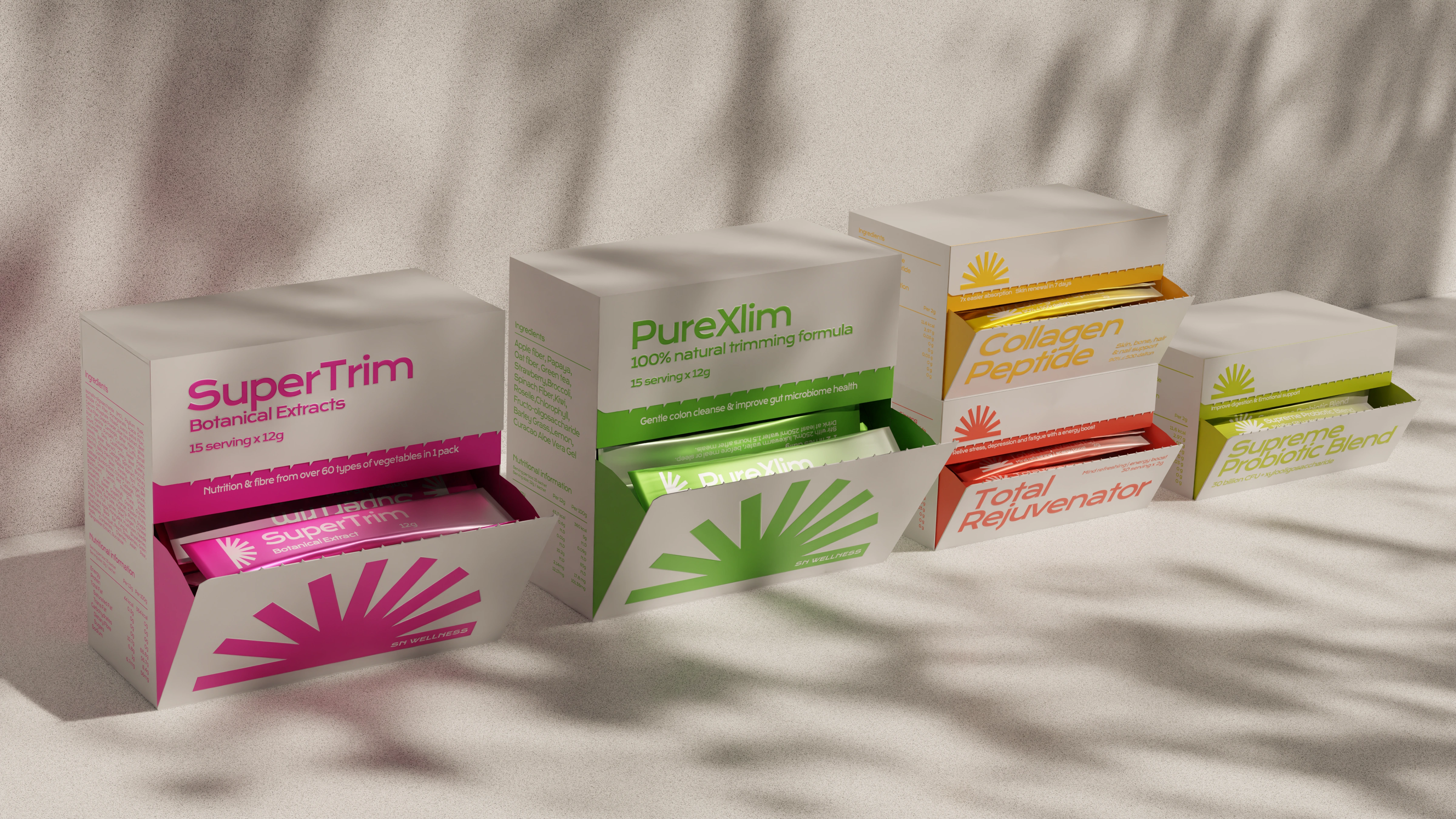
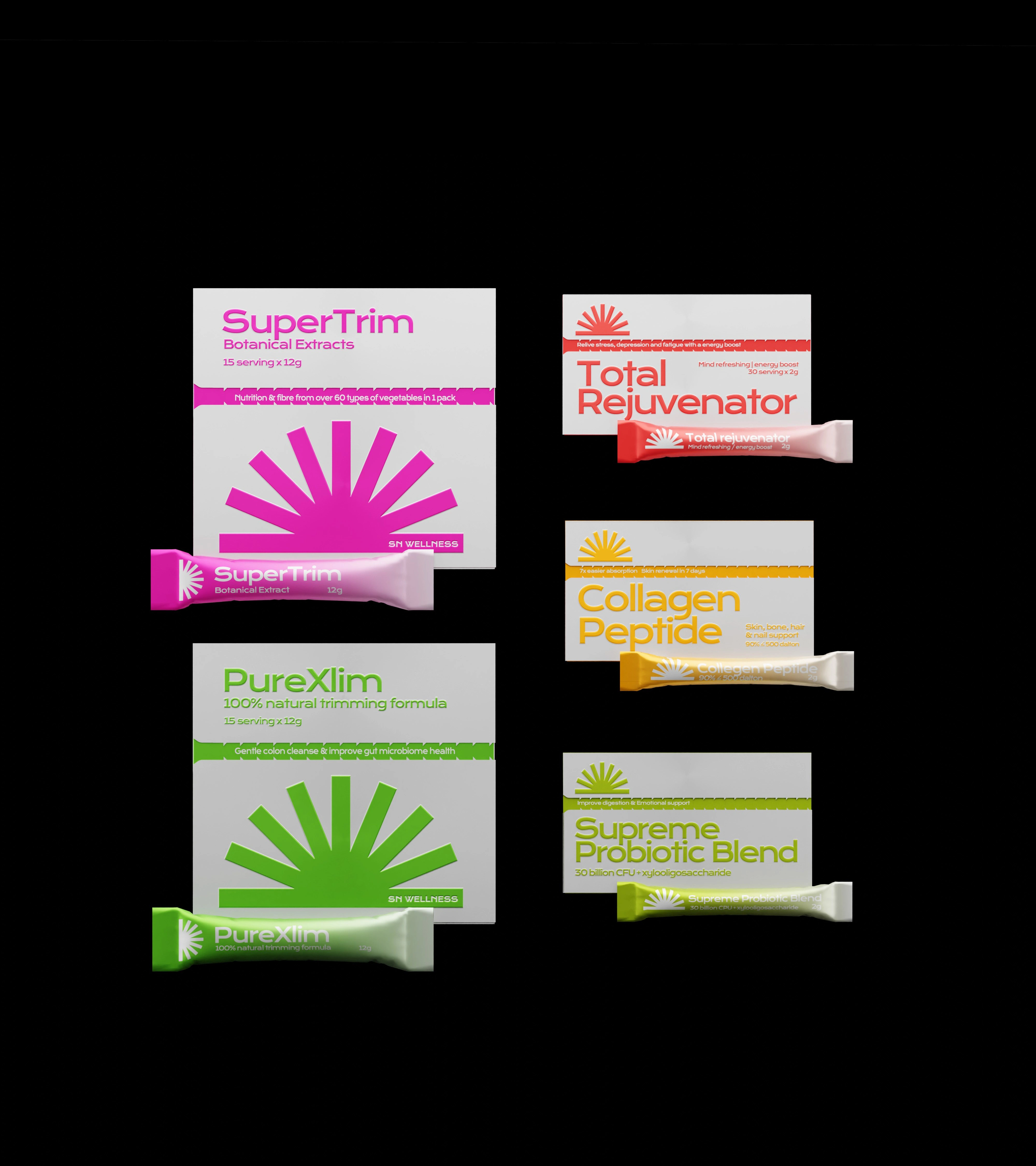
With a consistent layout system in mind, our aim was to ensure a cohesive experience across various packaging formats. Our primary focus was to design user-friendly packaging, which led us to transition from traditional tubs to individually packed sachets for powdered supplements. This change allows for effortless daily consumption.
To enhance convenience further, we introduced a dispenser box that organizes the sachets and also serves as a display on tabletops. This way, users can easily grab a sachet before heading out, simplifying their routines. Additionally, usage instructions is printed directly on each sachet, ensuring users can still access important information even without the original box in hand.
Like this project
Posted Jul 17, 2024
botanical supplement branding and packaging inspired by the radiating sunshine
