Designing LetterStash, all your newsletter at one place.
Jash Shah
Problem Statement
Design a seamless and hassle free newsletter consumption app for users who consume newsletter frequently.
Background
We consume alot of content via newsletters(Email based subscriptions, Substack, Personal newsletter, etc). Post pandemic ,newsletters have become important part of my information diet. But consuming newsletter via Gmail, Substack is not feasible as we take information diet from multiple sources, and often we want to recollect information which we consumed from a particular newsletter issue which we cannot find when we need it the most.
The idea was to design an app which has all of your newsletter subscriptions, helps you discover newsletter based on interests, allows you take notes.
To all those newsletter emails I keep swiping right 😅
If you want to skip to the final design, here is prototype video
Key Deliverables
User Research
Empathy Map & Persona
Wireframing
Visual Design
Prototype
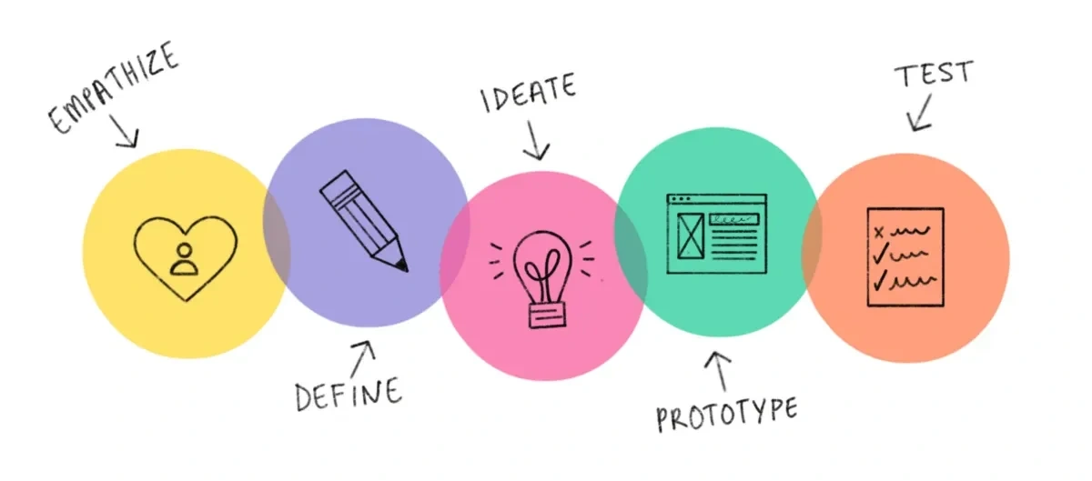
Design Process
So, to get more insight on the problem I started conducting research on what problems do people face while consuming newsletter content and what they would like to add to improve existing experience.
User Research
So, even before getting ahead with the problem I need to understand the reasoning behind why people used newsletter, what they find it difficult and more such questions.
Do you use newsletter frequently ?
How many newsletters have you subscribed to approximately ?
For what purpose do you subscribe to newsletters ?
What spoils your current newsletter experience?
What is the one feature if added can elevated your consumption?
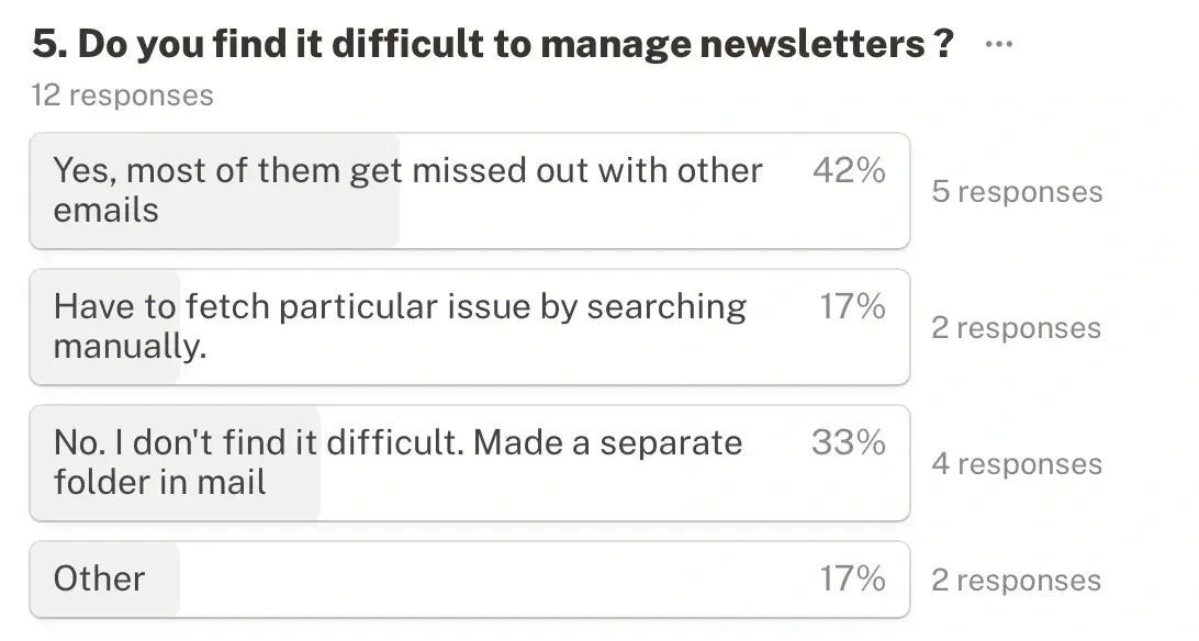
Do you find it difficult to manage all your newsletter at one place?
Do you track your newsletter consumption ?
Do you set a fix time for newsletter consumption ?
Do user curate newsletters they consume based on category (Web3, UI design and other topic).
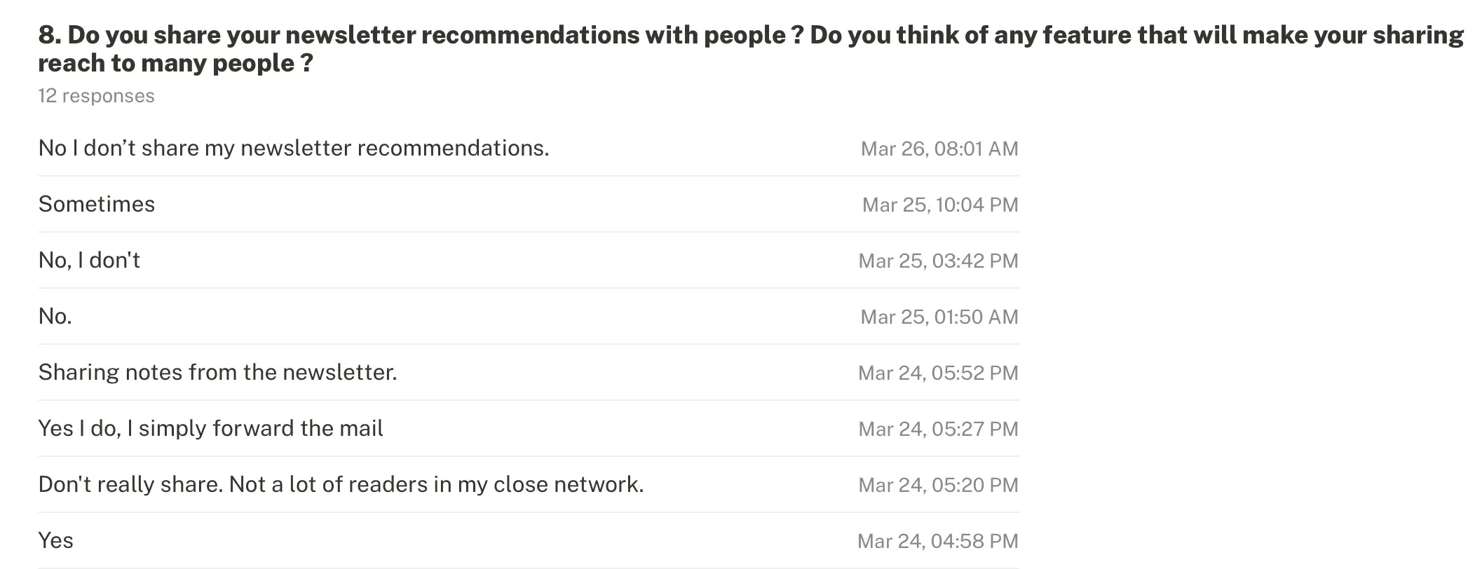
Do you like to make your newsletter subscription public (like people can see what subscription you read ) and share with community ?
This where some of the questions which I asked to people.
Here is the results of the primary research
So, while working on this problem statement, I searched if any such tool already exist or not. This is when I got to know about Stoop, which brings all your email newsletter at one place. I tried out the app and saw following reviews on Google Play
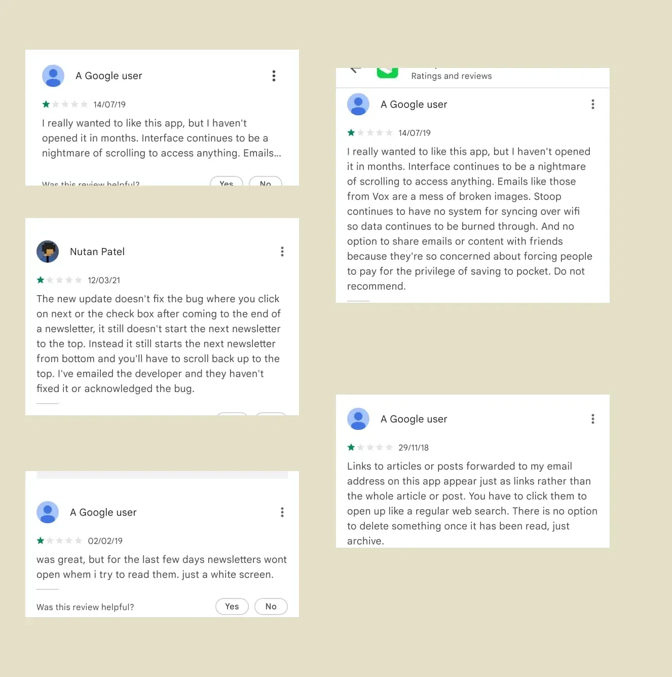
Through this, I got to know newsletters play very important part in our information diet but this consumption is often not a priority 1 in our to-do list. Most of the newsletter don’t get read.
I conducted research on the how people consume newsletter. Here are few of the insights
People often subscribe to newsletters they find insightful but read very less of them.
People find it difficult to manage newsletter and want to track their consumption.
Most of time people subscribe to most of newsletter but they only read when they find themselves in that zone or vibe to read.
Content on topic > Creator of newsletter.(I love Ankur Warikoo’s content but that doesn’t mean I have read all his newsletter issues).
Gmail newsletter notification most of the time get swipped right(i.e ignore).
Secondary Research
To get know more about why people subscribe to newsletters and what choices they make. Newsletters are generally known as marketing tools for brands. But we are seeing change in brand marketing as well. Individuals are the new brands.
Content creators like Ankur Warikoo, Shaan Puri, Balaji Srinivasan are bigger brands
According to Parsely report, Newsletters are among top 3 brand marketing activity.
According to MailChimp average open rate of newsletter across all the industries stands at 21.33%
You can read about it here.
Ideation Phase
Once I got to know what problem is to be solved it was time for getting some pattern inspirations. People consume content in many format audio, video, read, short form, long form. With newsletter, it can be anything short form, updates about life and work of some person people follow, byte size news, or even 1 hour long essay type newsletter.
While interview few major feature which most people required where as follow:
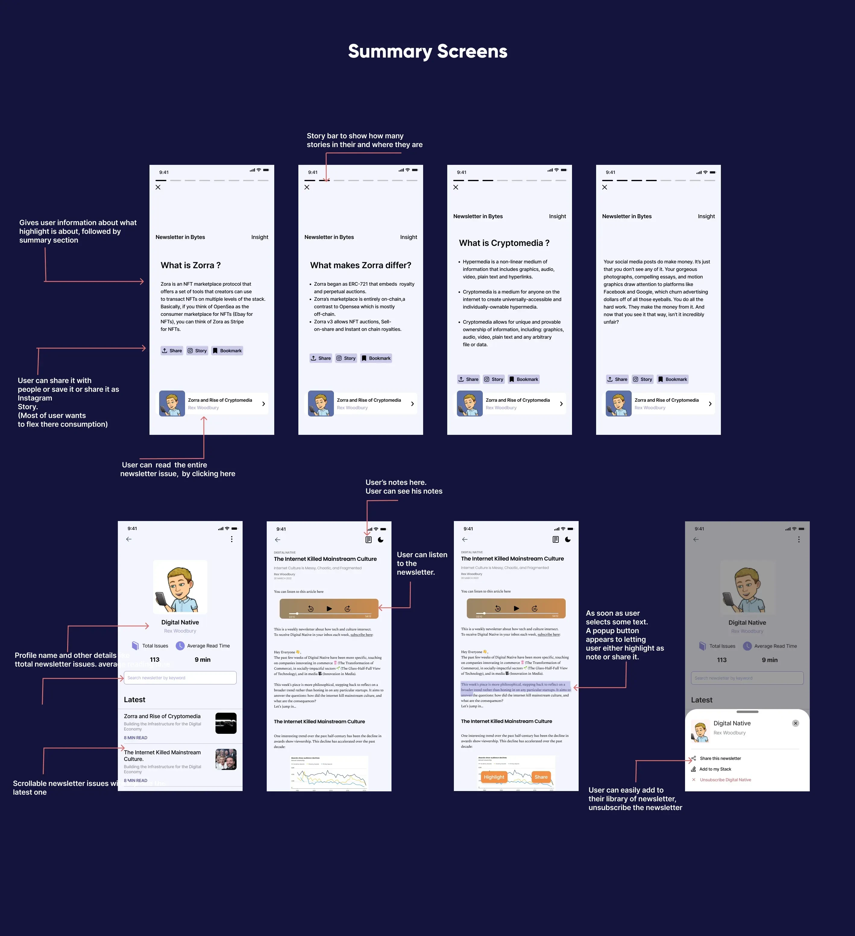
A way to have summary of large newsletter to get byte size knowledge
A way to switch from read to listen and vice versa.
I can easily highlight and take notes.
For this, I started exploring design inspirations across various platforms across variety of content like audio, text, podcasting and more.
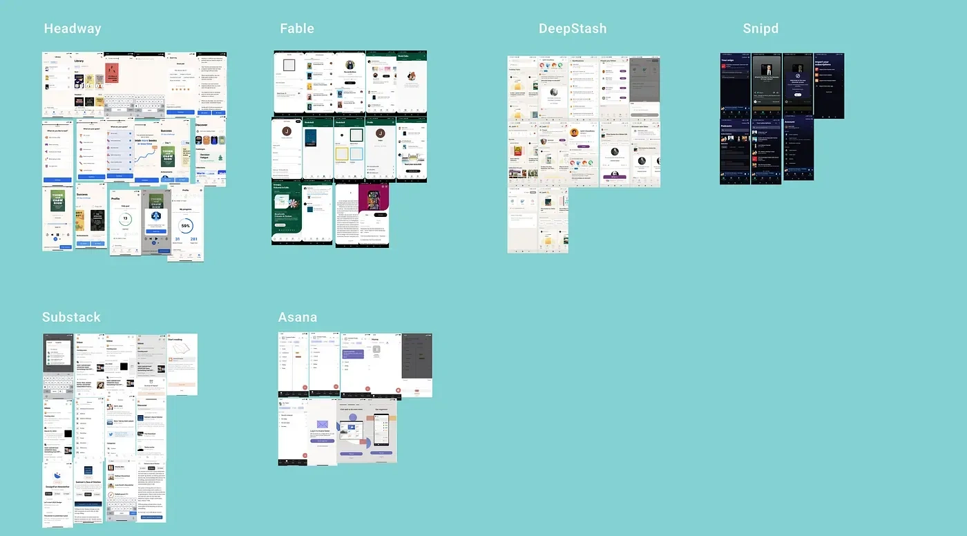
I took inspirations from apps which were into providing and discovering reading content to users.
The exploration phase helped we building intuition of what user wants . With content consuming, it is not that you place the content in user’s platter they will consume it, they need to incentivise for there consumption. A sense of curiiosity needs to be developed within user’s mind.
Design inspiration phase enabled me to access various design patterns through which user may stick to newsletter or platform.
The next step was to get start giving a physical form to all the collected ideas and pattern. With wire framing phase, I brainstormed on various layouts and design pattern on how to visualise the information to user in most accessible and consumable way.
Wire-framing Phase
When I started approaching the problem statement I sketched wireframes based on the use case defined in the problem statement and output of my user research process.
Here are the some of the initial wireframes
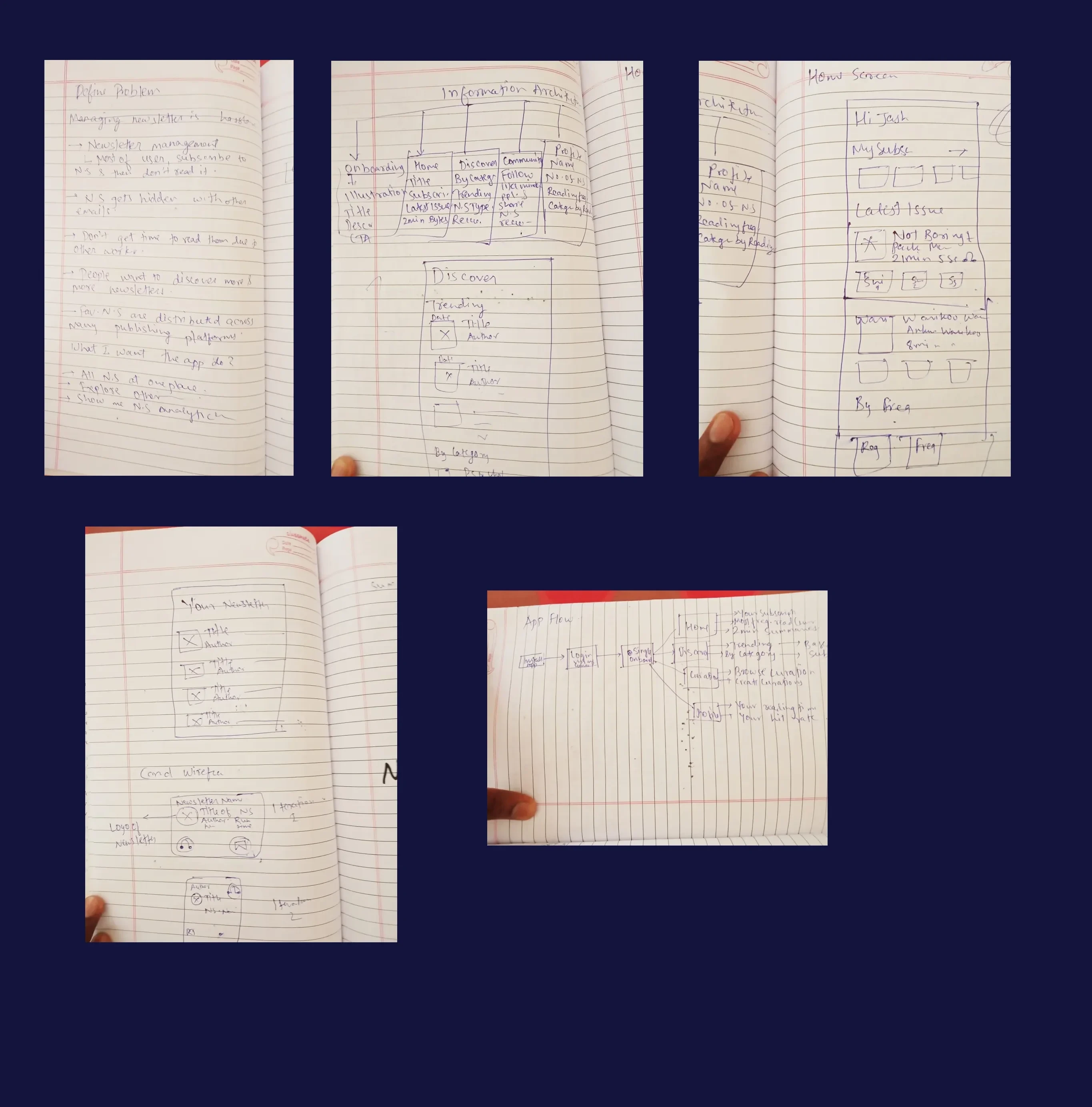
Also, went onto create many iterations of multiple screens so as to come to decision which made most impact on the user with least efforts. While conducting user research, the two activities which most user wanted were first they should be able to consume bit size 2 minutes kind of content of newsletter issues and second was to take notes within the newsletter.
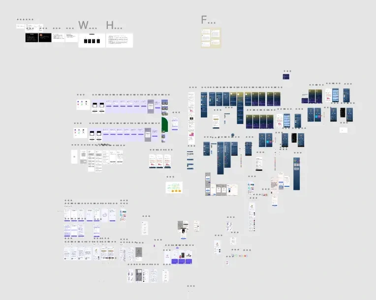
Here is what the Figma looked at some point of time.
Visual Design
Let’s get to the fun part i.e the visual design.
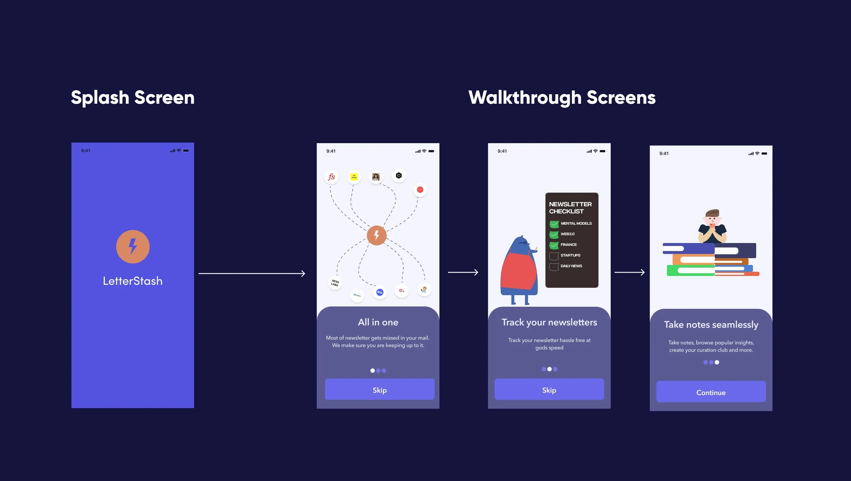
The walkthrough screens are important because they are the initial screens which user sees.
To make user onboarding fun, I added interactive illustrations to get idea about app via visuals. Because visual sticks to our mind and stays with us.
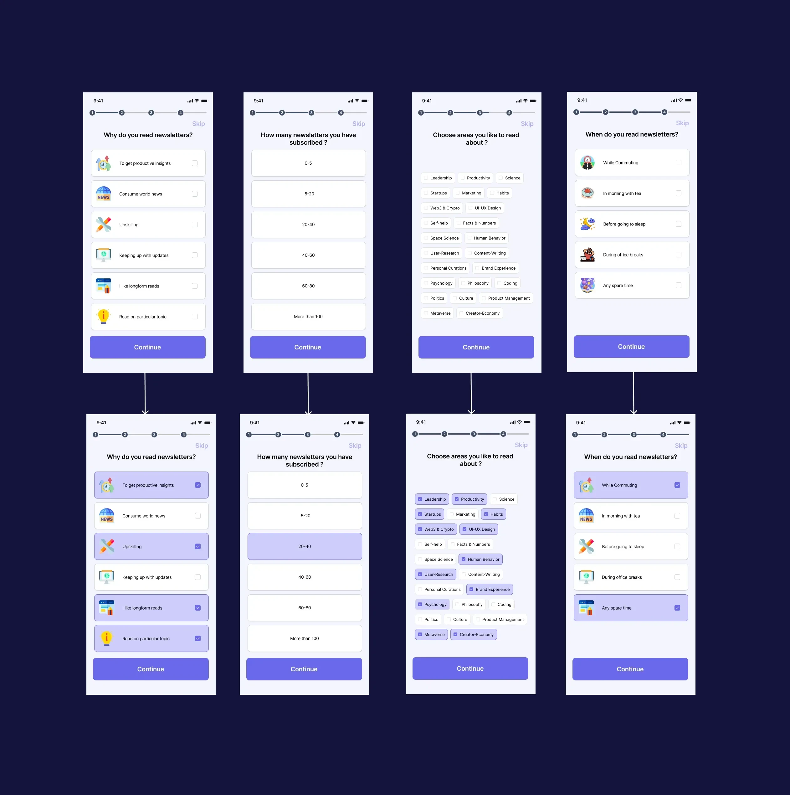
Next, as it is purely user generated or subscribed content, to recommend personalised newsletter to user, few data point are to be required like
what time do you read newsletters ?
no of newsletters you have subscribed ?
When do you consume newsletter content?
type of content you consume.
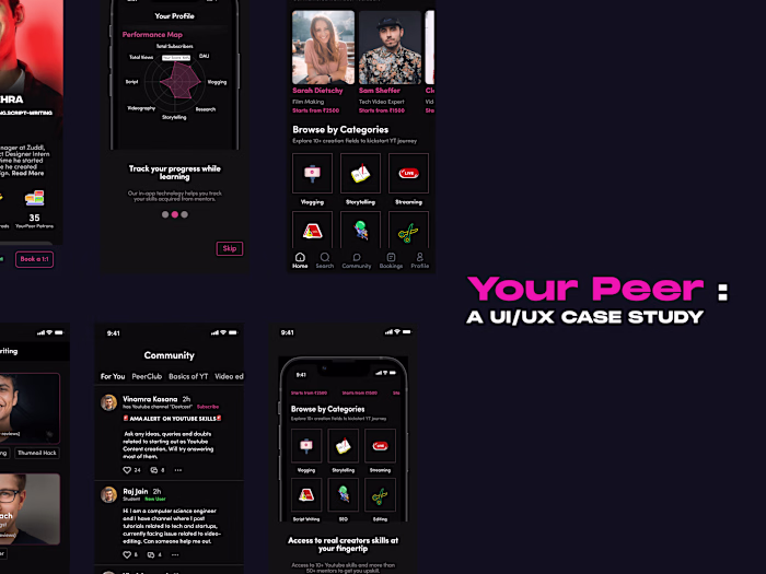
Home Screen
Now, home screen where all of the users newsletters are there is the most important screen of entire app. The screen should display latest issues of newsletter user has subscribed to , a way to get byte size themed content using Instagram Stories like feature.
It should have following content on home screen
Instagram stories to consume byte size newsletter content
Newsletters which users frequently consumes(can be weekly or daily basis)
Newsletter collections based on themes like productivity, startups, crypto and more
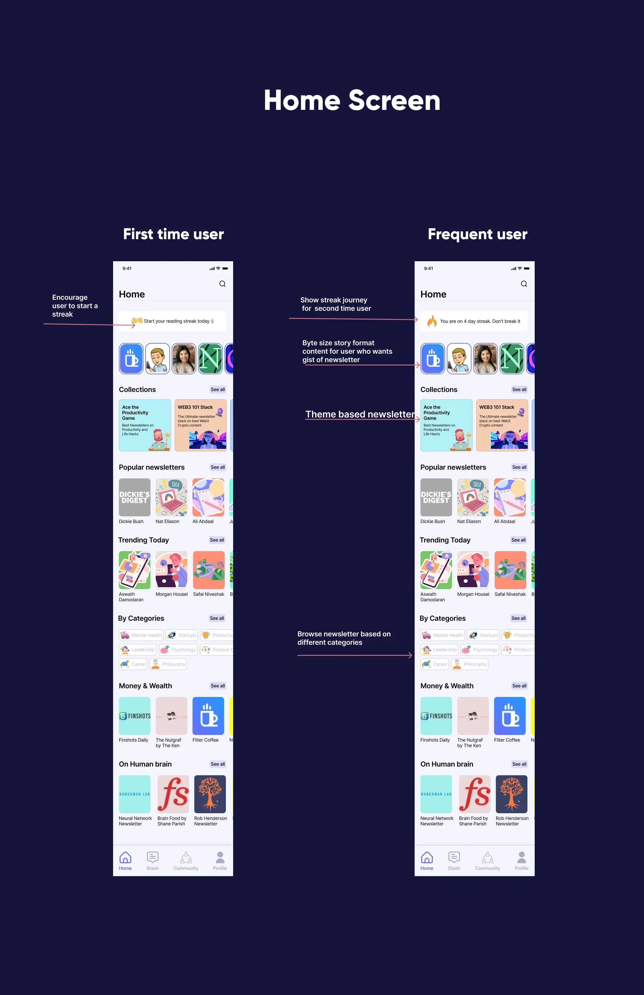
Most of the common issue user had with present app is the app just prompts to website in app form. If a newsletter platform is Substack, it just opens the webpage in app form. So, while ideating on this, I came up with approach of app having its own way of displaying newsletter content. So users can further perform other actions like comment, highlight, take notes and more.
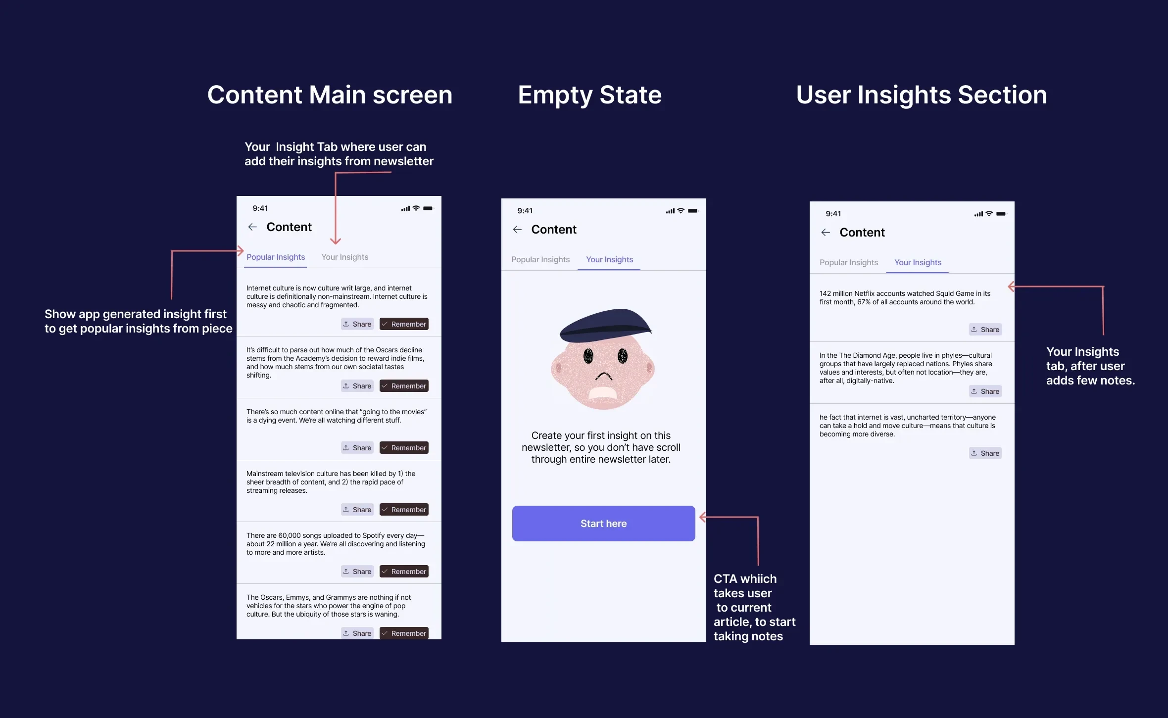
While doing my research on this case study, I also came to know about most people don’t want to read entire newsletter. Most of the time they just wanted to get bullet size information on particular topic. So I came up with approach of adding a feature called Insight tab. Divided by two section one where popular insights are curated and one where user adds there insights.
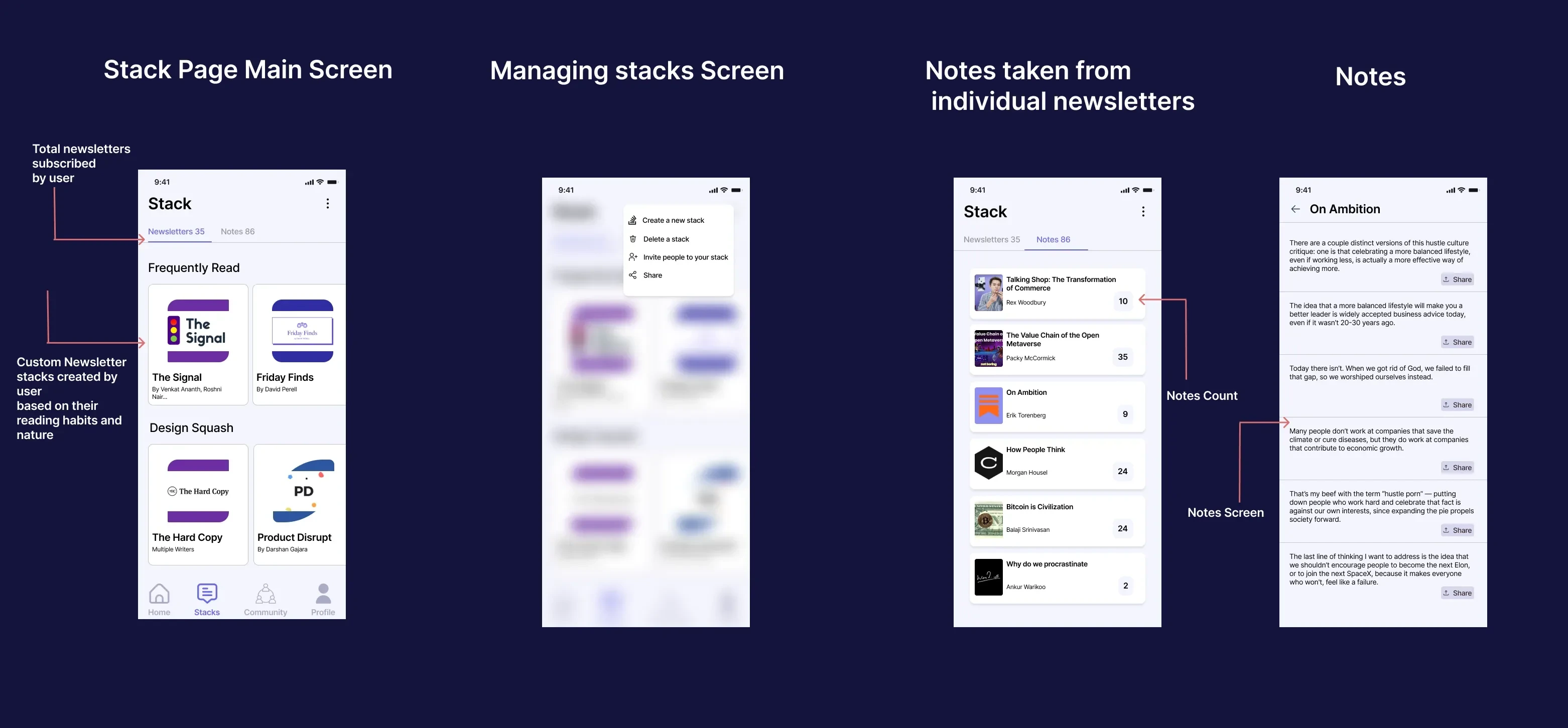
Designing Stack, fun way to discover newsletters
Currently, most of the users subscribe to newsletter based on their interests and word of mouth on social media. The next thing was to design user focused Discover section where user can discover newsletter.
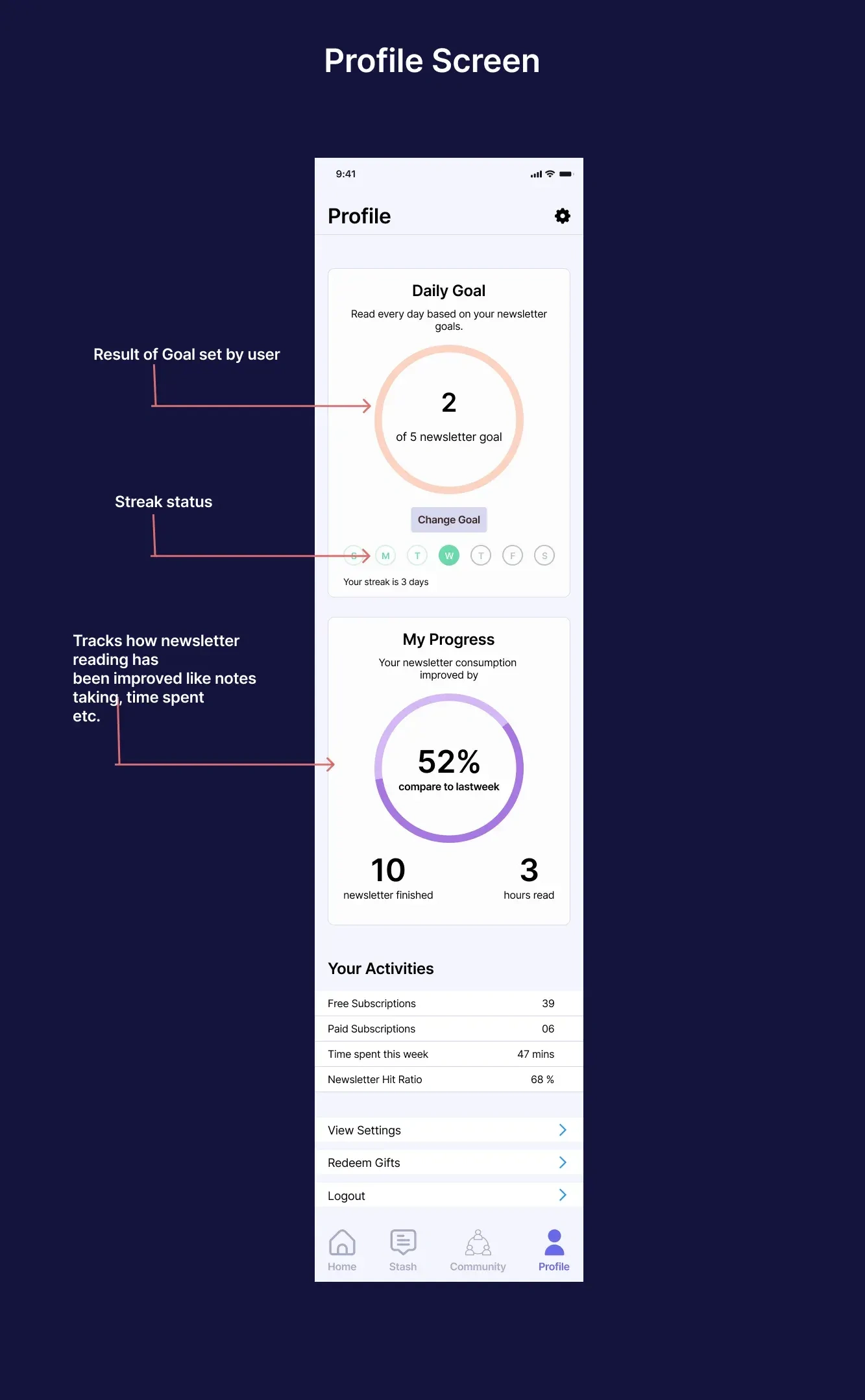
Next was designing the profile screen of user. Almost all of the users wanted built in analytics for their newsletter consumption within the app. During my research, one interesting thing I came to know people want to make newsletter reading a habit and make the consumption of it efficient. While researching, I came across this article by Duolingo team on how to they used streaks to build learning new language as habit.
Here is the profile screen
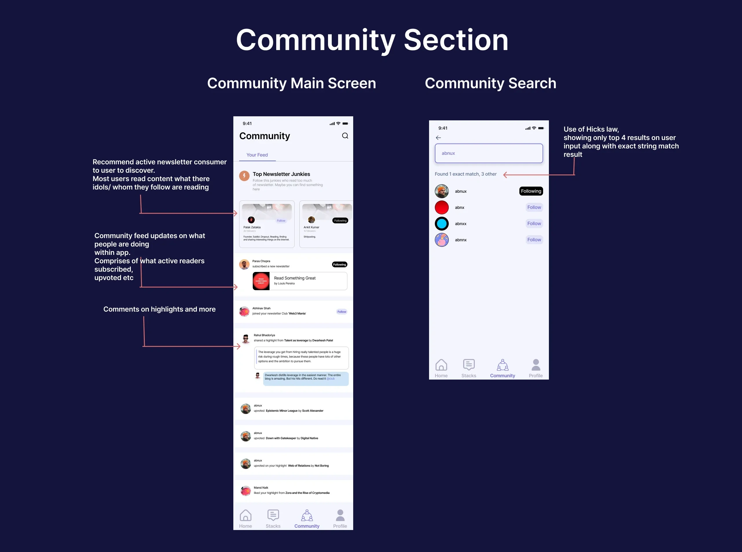
Community Section
Next big task was designing a built-in community within the app. A place in app where user can browse stuff people they follow are consuming. I made an assumption that user has allowed access to make their newsletter subscription appear public, something which Substack provides.
Here is the working Figma prototype for the app here
Lessons from case study
Newsletters are easiest way to connect to people. Newsletters are not just marketing tool for brands. Individuals becoming brands themselves makes them more interactive and fun.
Newsletters have become gateway to how we consume news, information, our interests and more.
Users want a social element to their content consumption. A place where their content consumption reaches to people.
Thanks for reading this case study.
And that’s a wrap. This was personal project on the problem I faced with. Feel free to reach out to me for any queries regarding the project, feedback or design opportunities.
Like this project
Posted Sep 2, 2024
A project, on how designing a mobile app for enhancing newsletter consumption coupled with community.
Likes
0
Views
12