Catalyst PMO Branding and Web Design
Muaaz Saeed
When Catalyst PMO approached the need for a brand identity, the objective was clear: to create a unified, professional presence that would resonate with leaders in the financial industry. Catalyst PMO’s core mission is to empower executives with strategic project management, ensuring mission-critical initiatives are completed efficiently and aligned with corporate goals. The challenge was to develop a brand that felt authoritative, reliable, and mature while also setting Catalyst PMO apart as an industry leader.
The financial industry values stability, trust, and strategic insight, which meant the branding needed to reflect these attributes. Our task was to craft an identity that was not just visually appealing but also deeply aligned with Catalyst PMO’s ethos—an extension of its mission to drive sustainable growth.
Phase 1: Research & Defining the Brand Direction
Before diving into design, we conducted thorough research and competitive analysis. We examined the branding approaches of major financial and consultancy firms, particularly those based in the UAE, where Catalyst PMO aimed to establish its presence.
We discovered a common trend: many brands in the financial sector leaned towards corporate blues and muted color palettes. However, Catalyst PMO needed to differentiate itself—it had to look established yet forward-thinking, modern yet rooted in classic professionalism.
Through this analysis, we defined the core brand attributes:
Mature & Trusted – A brand that feels like an industry veteran.
Strategic & Sharp – Clear, precise messaging with no fluff.
Elegant & Structured – A timeless aesthetic that conveys stability.
With these in mind, we set out to craft an identity that upheld these values while ensuring visual uniqueness.
Phase 2: Crafting the Logo & Visual Identity
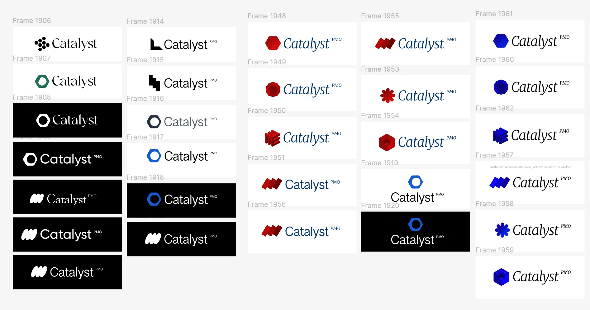
The first major challenge was defining the right tone for the brand identity. Catalyst PMO needed a grown-up, classic approach, something that exuded confidence but avoided feeling outdated.
The logomark, featuring a distinctive hexagonal shape, was designed to symbolize structure, strategy, and transformation—three pillars of Catalyst PMO’s approach. The hexagon is an emblem of stability, often associated with efficiency and precision, both crucial elements in project management.
The typography within the logo balances classic and modern aesthetics, ensuring Catalyst PMO feels timeless but not rigid.
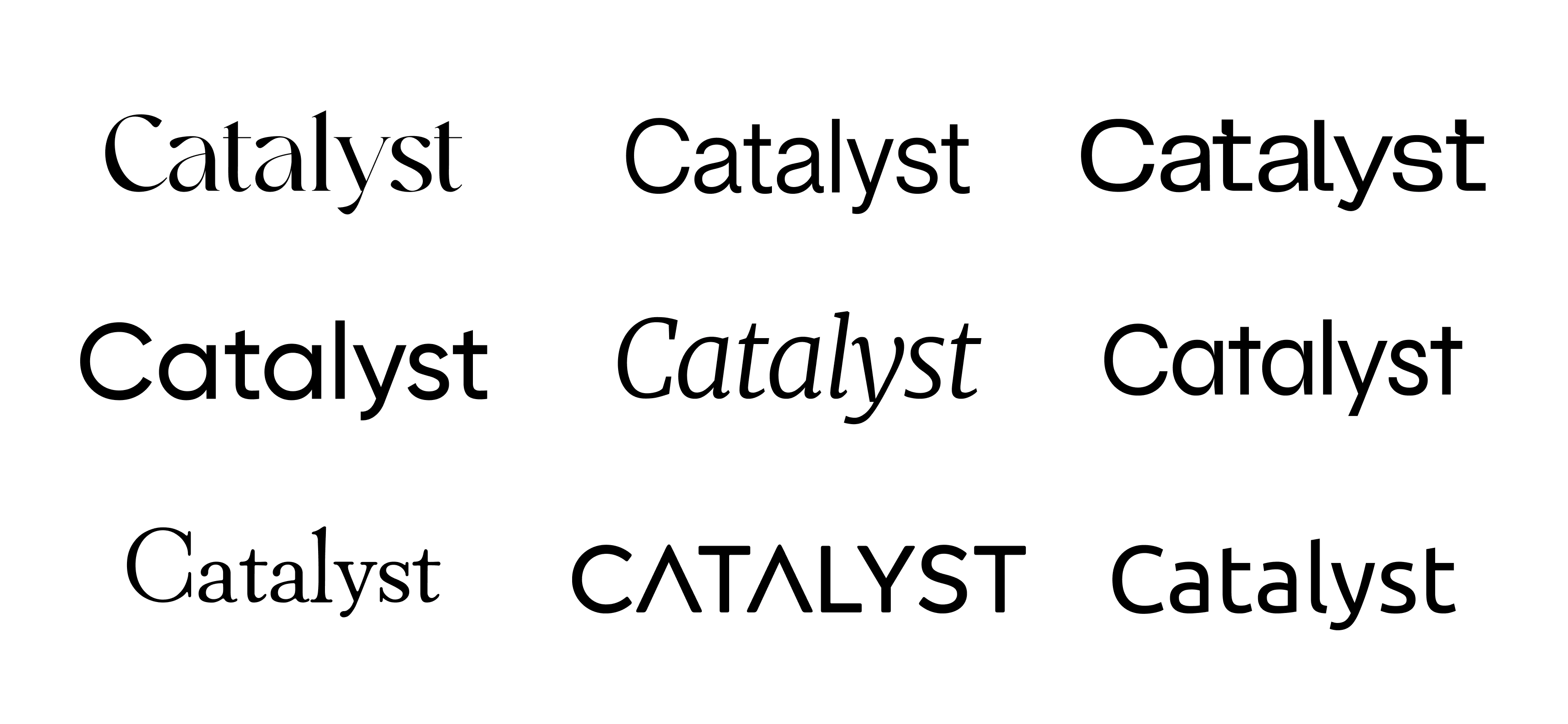
Phase 3: Selecting the Right Typography
Typography was one of the most defining choices in this brand identity. We needed a typeface that reflected both professionalism and heritage while remaining readable across multiple formats.
Challenge: The brand needed to feel sophisticated yet functional.
Solution: We chose Merriweather, a classic serif font, which added a refined, intellectual quality to the brand. Unlike modern sans-serif fonts often used in tech and startups, Merriweather evokes the wisdom and reliability associated with established financial institutions.
To complement this, we paired it with Helvetica, a clean and highly legible sans-serif, ensuring a balance between tradition and clarity.
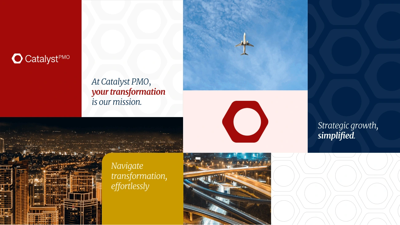
Phase 4: Establishing a Strong Color Palette
With the financial industry in mind, we carefully selected colors that would convey authority, maturity, and trustworthiness.
• Burgundy (#A20B09) – Symbolizes passion and strength, giving the brand a sense of depth and tradition. It evokes confidence, leadership, and experience, setting Catalyst PMO apart from typical blue-centric financial brands.
• Oxford Blue (#012148) – Represents stability and reliability—a grounding force that reinforces Catalyst PMO’s strategic precision.
This combination of deep burgundy and Oxford blue creates a classic yet powerful look, ensuring Catalyst PMO commands attention in a competitive industry.

Phase 5: Structuring the Brand Guide
Once the core visual identity was established, we built out a comprehensive brand guide to ensure consistency across all touchpoints. This guide includes:
✔ Logo usage rules – Defining how the logomark and wordmark should be used across different platforms.
✔ Typography hierarchy – Establishing the proper use of Merriweather and Helvetica for headers, body text, and callouts.
✔ Color application – Guidelines on when to use primary and secondary colors.
✔ Brand voice & messaging – Outlining tone of voice, ensuring all communication aligns with Catalyst PMO’s professional, supportive, and strategic identity.
✔ Branding applications – Showcasing real-world examples of the branding in social media, presentations, and marketing materials.
Building the Catalyst PMO brand was more than just creating a logo and color scheme—it was about defining an identity that reflects its mission, values, and future ambitions.
By blending classic design principles with strategic modernity, we crafted an identity that commands respect, instills trust, and signals industry leadership.
Catalyst PMO now stands as a brand that not only delivers results but looks the part of an industry authority—a transformation that mirrors the very service it provides to its clients.
What the client said about us:
I give Muaaz and his team full scores on all fronts because they deserve no less. I embarked on this project with little or no knowledge about branding and web building. I was very nervous because I knew that I would need and want to be involved in every aspect of the brand identity creation, as well as the web development and content side - so I needed to find people who had the patience to pull me along with them. I found this exact quality in Muaaz and his team. He and his colleague Rumaisa were not only professional and patient (in fact, super patient), but also direct, concise and, in general, spot on. I really do not have enough words to describe the kind of good attitude and professionalism I encountered on this job from these two people. Not only do I have a brand and a website that I can be proud of, but I am now able to make small and every day changes to the site myself without having to reach out every time. I am indeed very grateful for the result. Muaaz and Rumaisa have my full marks.
Like this project
Posted Feb 24, 2025
Crafted a timeless, professional brand identity for Catalyst PMO, ensuring credibility, consistency, and industry leadership in corporate transformation.
Likes
1
Views
3
Timeline
Aug 30, 2024 - Oct 24, 2024