Echova - "Not all stars belong in the sky"
In early summer 2021, we were asked to create the name and visual identity for a technology platform for Magseis Fairfield.
We were fortunate to be chosen as the design agency for this leading provider of OBN seismic systems and services. A recognized, publicly traded company that has led the development in ocean-bottom seismic technology for years.
A big thank you to André (SVP Corporate Communication) at Magseis Fairfield for the fantastic collaboration, project, and trust. And not least the support from Carel (CEO) and Mark (CTO) in the process of developing the name and logo.

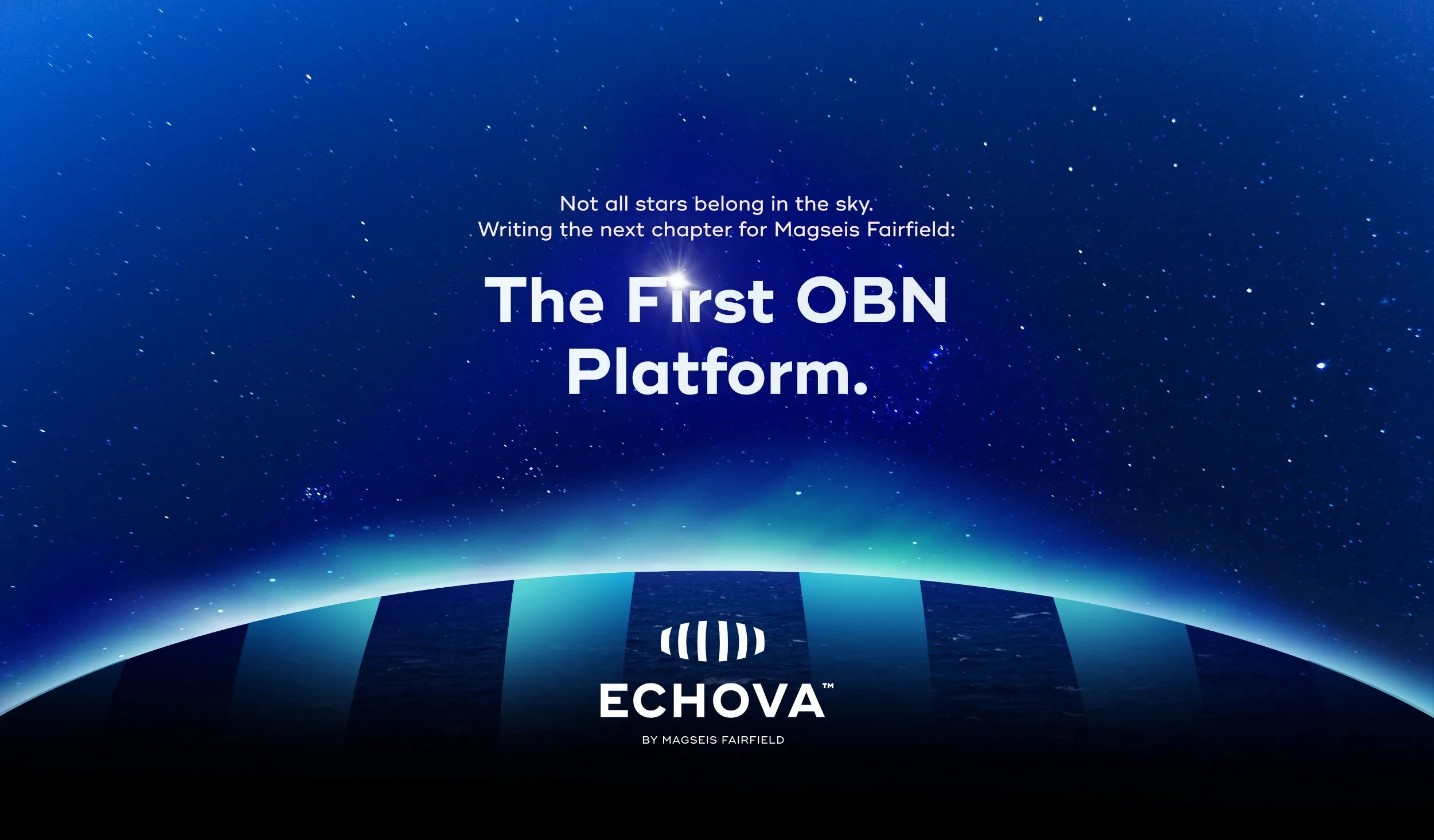
After an exciting process with name suggestions and drafts, we and the client landed on “Echova.” The name represents “echo” (reflecting seismic data/images from the sea), “nova” (the new star), and “va” (French for “go”). This led to a presentation with the tagline “Not all stars belong in the sky. Writing a new chapter for Magseis Fairfield,” which became key for the launch.
The chosen logo reflects this through its shape, colors, and composition, representing sustainability, technology (node shape), and data visualization (eye shape meets layers of data). The selected typeface, “Ridley Grotesk,” is a modern and strong sans-serif font. As part of the delivery, we also presented the new product with a one-minute video highlighting Magseis Fairfield’s achievements and how Echova will set a new standard by uniting the entire chain on one platform, enhancing the customer experience in planning, collecting, and processing data.
A series of icons were created to simplify the process through: Engage, Plan, Acquire, Image, and Decisions. Magseis Fairfield received a complete design manual outlining colors, logo, design elements, and general guidelines for the use of the visual profile.

Like this project
Posted Jul 27, 2024
Developed the name and visual identity for Magseis Fairfield's tech platform "Echova," including logo, design manual, icons, and a launch video.

