LOOMIX - Account Creation Flow
Project Overview
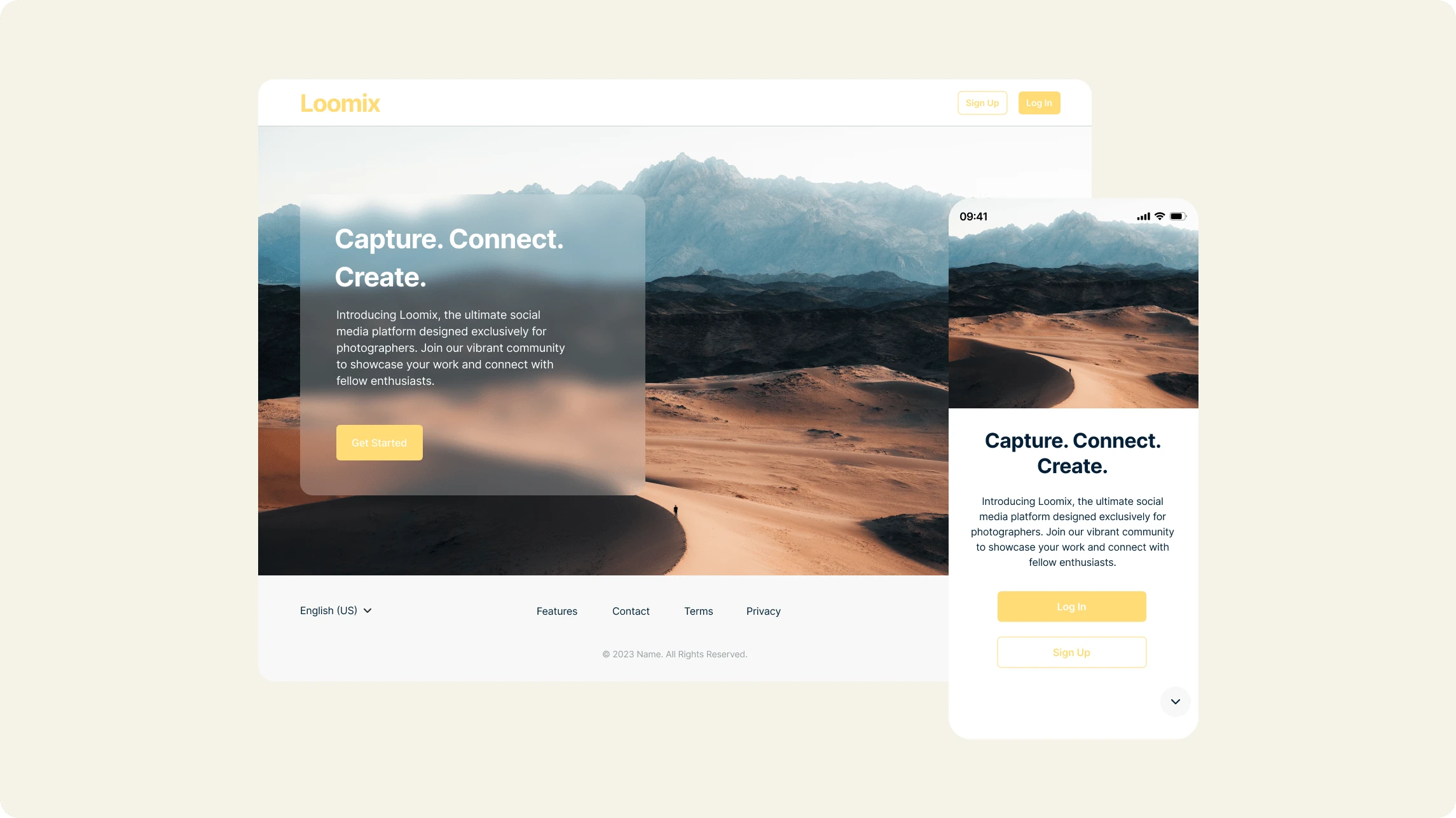
For this exercise, I created a responsive sign-up flow to help users create an account faster using a desktop, a tablet or a mobile device by keeping what’s essential and eliminating anything that feels unwanted.
Build and design a sign-up flow to reduce friction, improve user onboarding, and increase user retention while ensuring data security and privacy compliance. My goal was to give this project a simple design so users could quickly get away with the registration and start using their accounts.
In addition to my research and discussions with potential users, they confirmed the importance of social media sign-up, where users can sign up for the application with just one click.
Process
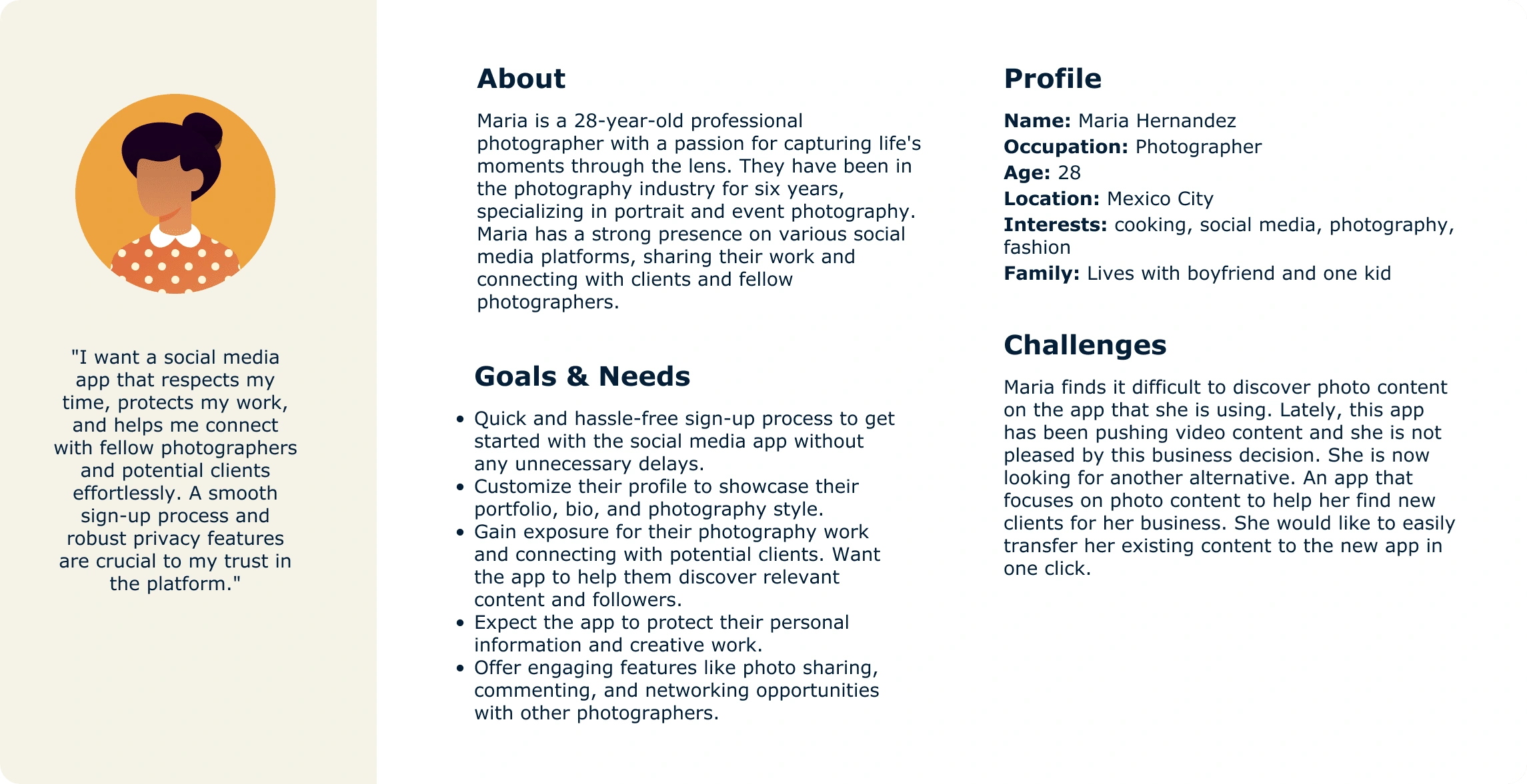
Persona
Problem
Launching a new social media app tailored exclusively for photographers presents a unique set of challenges, particularly ensuring an exceptional sign-up experience that captivates users from the beginning. The sign-up process must be intuitive and engaging, instantly capturing users' attention and interest. Users are increasingly concerned about data security and privacy. We must assure users that their personal information is protected.
Site Map
The site map showcases the thoughtfully crafted structure that ensures a more intuitive and efficient path for users to join the app, set up their profiles, and begin exploring, sharing, and connecting. From information gathering to account verification, I have carefully considered every step to enhance user satisfaction and retention.

UI Kit
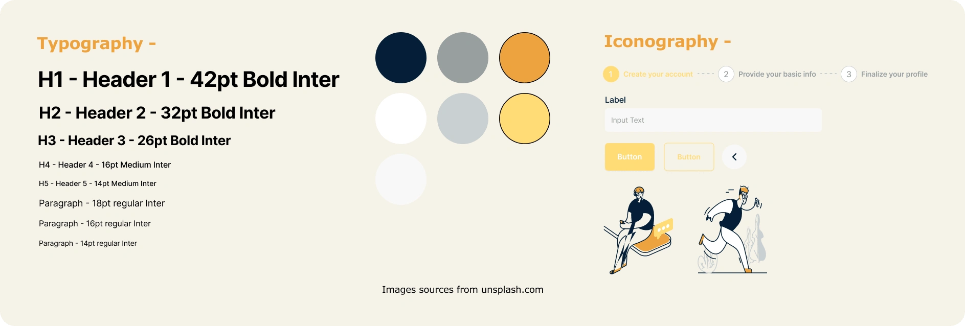
Tone & Voice
Excitement: Inject enthusiasm and excitement into the messaging. Convey the idea that the app is not only functional but also fun and inspiring for photographers.
Transparent and Informative: Use clear and informative language, especially when addressing data security and privacy measures.
Usability Study: Findings
I conducted a usability study with 5 participants, each lasting 10 to 15 minutes.
Objectives:
Determine if the sign-up flow is easy for users to complete. Understand the specific challenges that users might face in the process.
Findings:
Participants expressed the importance of adding a back button to the user flow.
Participants want to have the option of verifying the account and personalizing the experience later in their profile.
Iterate:
Added a back button when the user can go back to edit the information in the user flow.
Added a “Skip” button to the Account verification and Personalize experience page.
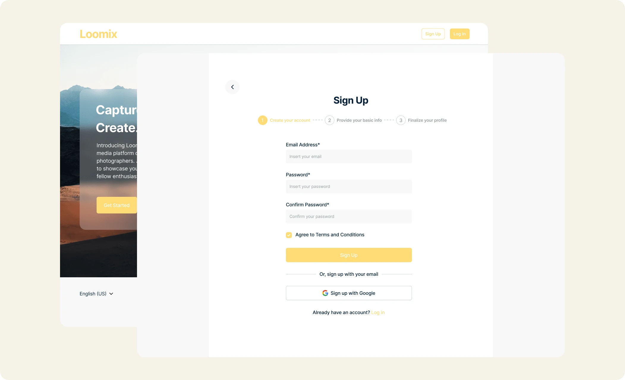
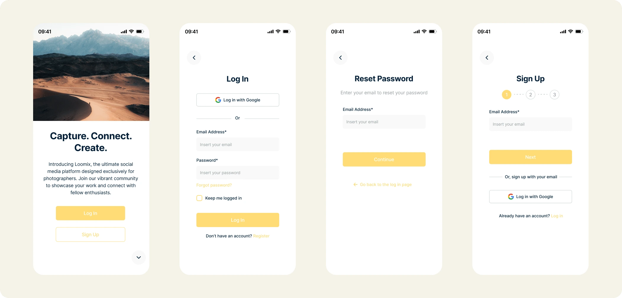
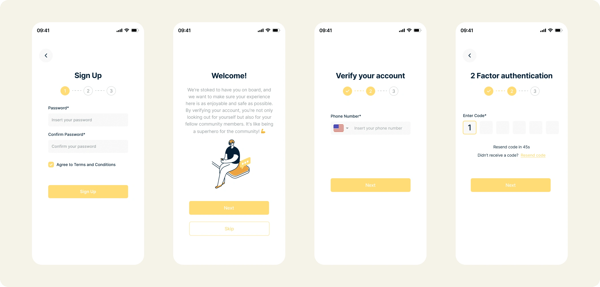
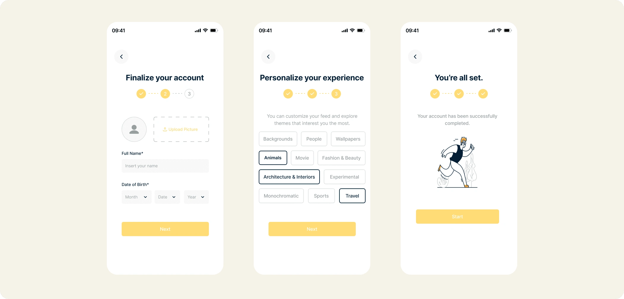
Click to play the prototypes 👇
Flow 1: Desktop App
Flow 2: Mobile App
Measuring Success
Some of the KPIs that we can apply to this case and measure successes are:
Task Success Rate: This measures the number of correctly executed tasks.
Time On Task: This describes the time a user needs to complete a task successfully, in this case, signing up or logging into the app.
Error Rate: The number of errors that occur during a user’s interaction with the sign-up flow.
Takeaways
For this case study, I allowed myself to explore login / sign-up flows of different categories of applications. They are essential for an application to create a memorable user experience. We notice the problems in a login/sign-up page only when it is not doing its job or only when it exists. And a user wouldn’t likely continue into an app if the flow goes wrong. It would lead to a bad impression.
I learned that even a slight design change can significantly impact the user experience. My most important takeaway is to always focus on the user's actual needs when coming up with design ideas and solutions.
Thank you for reading this case study. You can read more case studies from my Portfolio Website, and please stay connected with me on LinkedIn.
Like this project
Posted Jun 12, 2024
Designed a responsive sign-up flow for fast, secure account creation on any device, enhancing user onboarding and retention.
Likes
0
Views
24

