VINYL - Music Purchase Flow
Project Overview
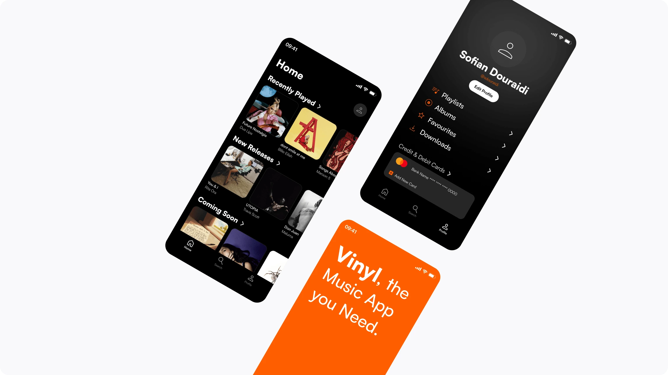
Vinyl is a music app that offers a large selection of songs and albums. The app targets vinyl collectors, allowing them to order their favorite albums from the comfort of their homes.
Project Goal
This app will let users buy their favorite music, which will affect users who prefer to buy albums and songs by letting them purchase the music they like without going to a store, saving them time and money. We will measure effectiveness by tracking the time necessary to complete an order.
To realize this project, here are the different stages of design I went through:

Process
Understanding The User
I conducted interviews and created empathy maps to understand the users I was designing for and their needs. A primary user group identified through research was working adults who enjoy music experiences and support emerging artists.
This research revealed that poor navigation was not the only factor limiting users from using the app. Other user problems included confusing checkout, app crashes, data security, or difficulty accessing support within the app.
Pain points
Security: Transparency on how personal data is stored
Accessibility: Music apps are not equipped with assistive technologies
Navigation: Confusing checkout process, requiring excessive steps
Personas
Problem Statement
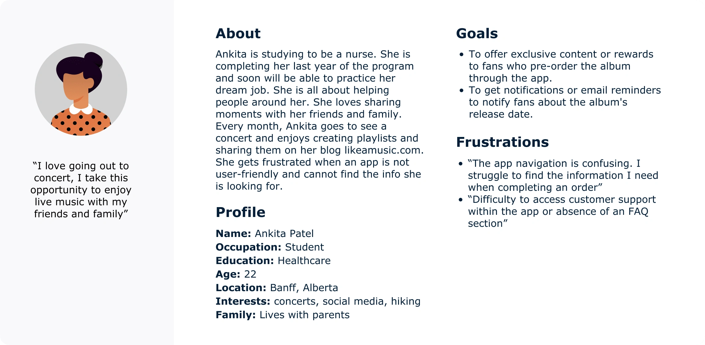
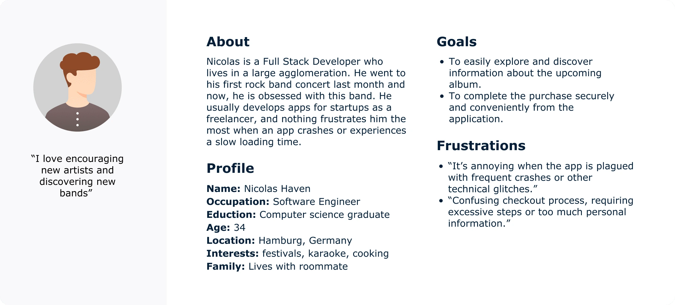
Ankita is a busy working adult who needs to be able to order albums through the app because they have no time to go to a physical store and do the line.
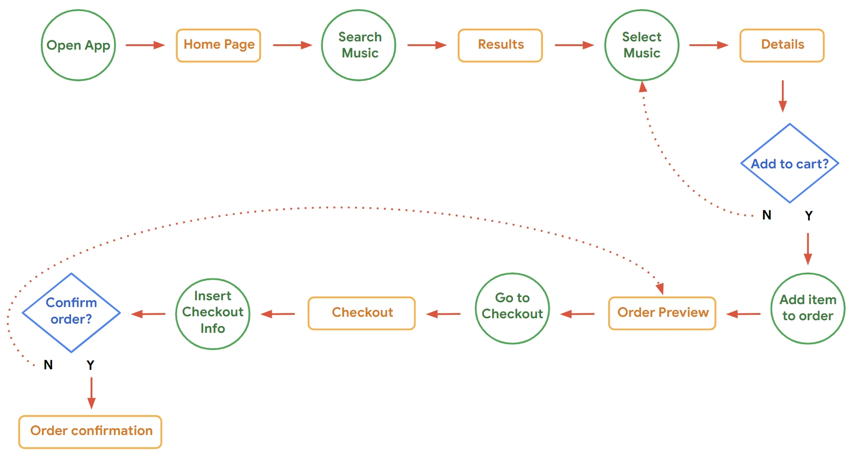
User Flow
Paper Wireframes
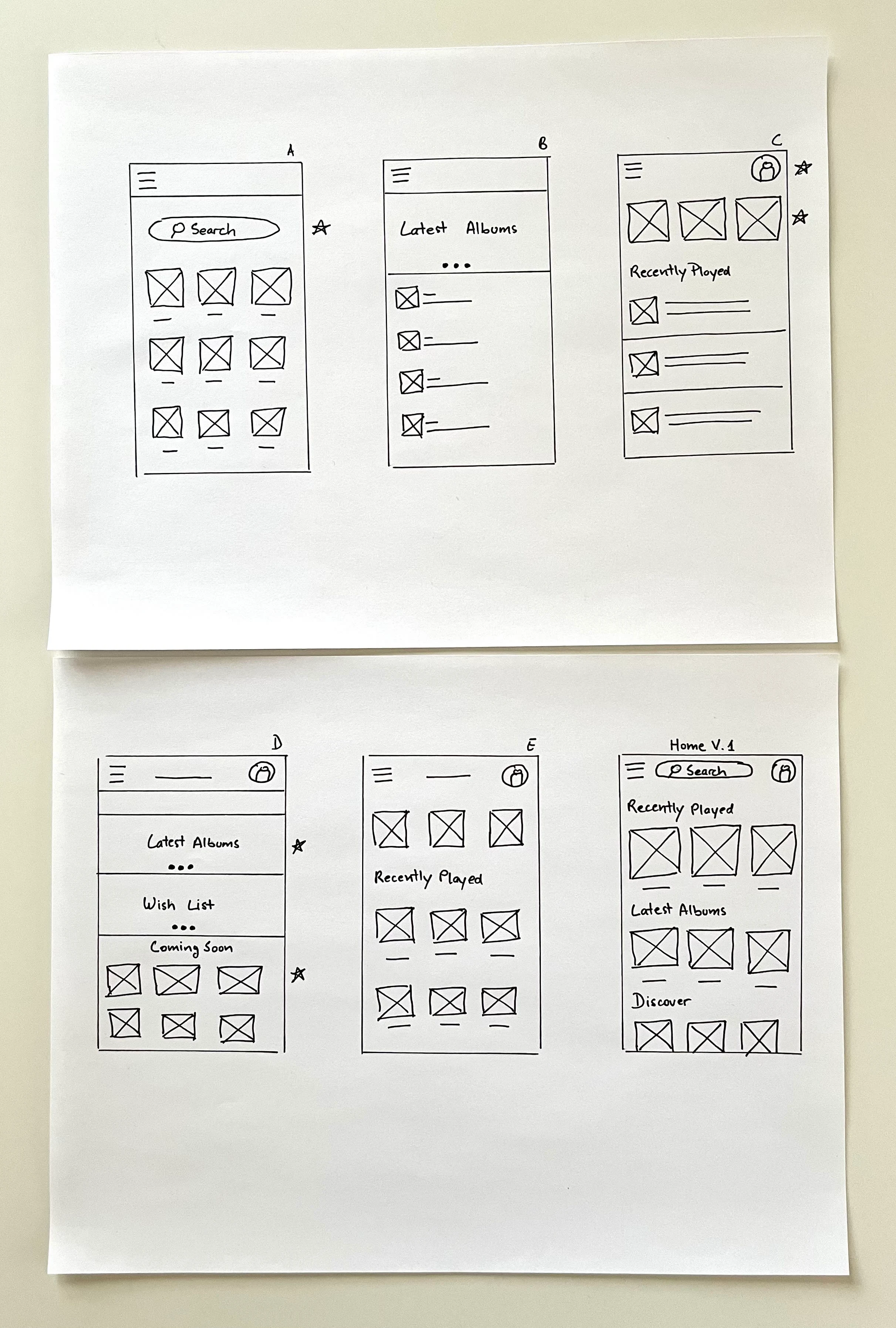
I started by drafting iterations of the home page of the app on paper to make sure that the elements that made it to the digital wireframe would be well-suited to address user pain points. I made the first page look like a library to help users find what they are looking for in one click and save them time.
Digital Wireframes
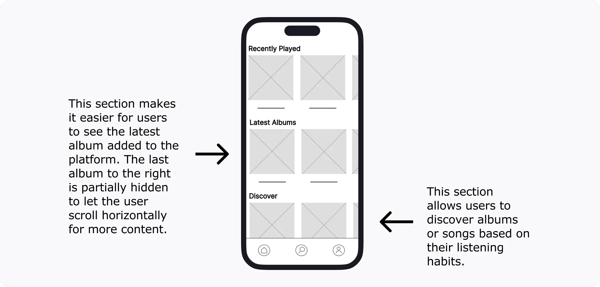
I then brought my ideas to an interactive digital low-fidelity prototype and brought it to five potential users to collect feedback. This screen design is based on the user research and competitive audit conducted in the Define phase.
Low-Fidelity Prototype
The low-fidelity prototype connected the primary user flow of pre-ordering an album so the prototype could be used in a usability study with users.
Click to play the prototype 👇
Low-Fidelity Prototype
Usability Study: Findings
I conducted two rounds of usability studies. Findings from the first study helped guide the designs from wireframes to mockups. The second study used a high-fidelity prototype and revealed what aspects of the mockups needed refining.
Round 1 findings
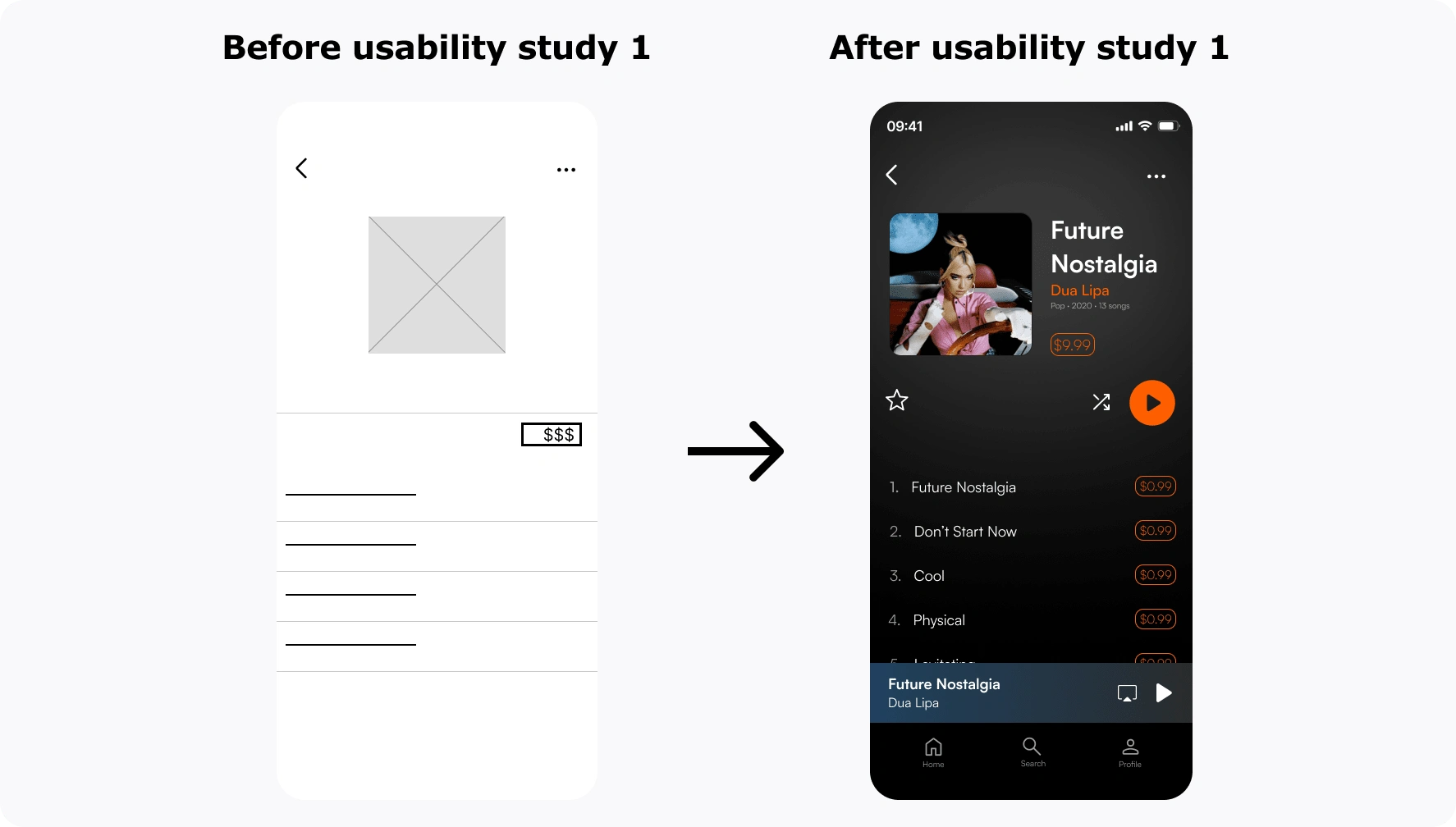
Users want to have the option of buying individual songs
Search navigation at the bottom of the screen
Offer both digital and physical songs and albums on the ap
Round 2 findings
The “Pay” button is too close to the “Cancel” button
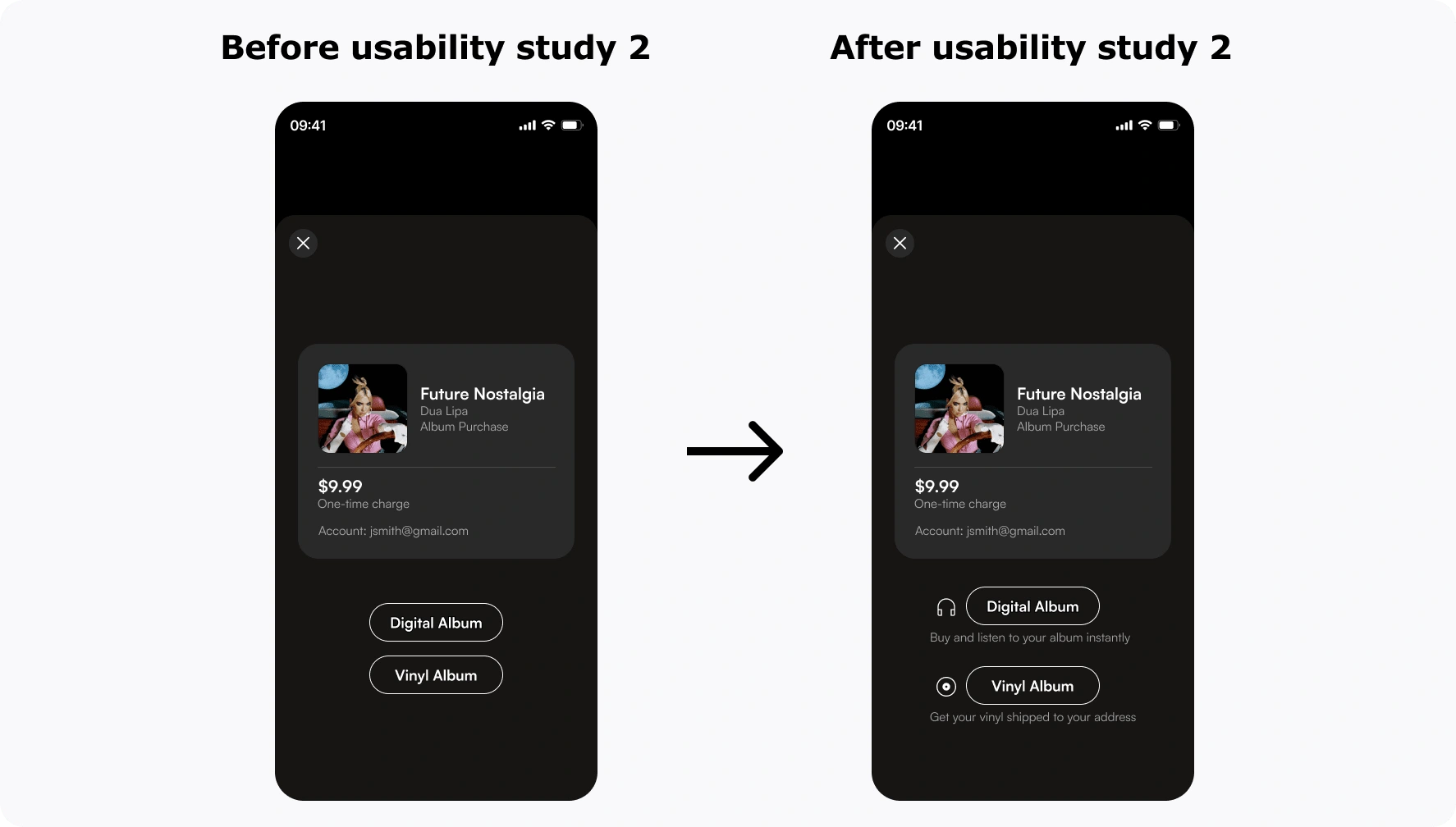
Users can’t differentiate between vinyl and digital copies of album
Refining The Design
Early designs allowed for some customization, but after the usability studies, I added an option to buy individual songs. I also added a search button to the navigation bar for better accessibility.
The second usability study revealed confusion when participants had to choose between ordering a digital or a vinyl copy of the album. I added text and icons to differentiate both options.
Design Changes
I made three major changes based on the user feedback.
Buy individual songs: In the original design, a user can buy vinyl albums. I iterated on the design and decided to add the possibility of purchasing individual songs.
Search icon: In the original design, the search icon was on top. However, users suggested adding another search button to the navigation bar for better accessibility.
Re-organize content and information: The second usability study revealed confusion when participants had to choose between ordering a digital or a vinyl copy of an album. I added text and icons to differentiate both options.
Final Designs
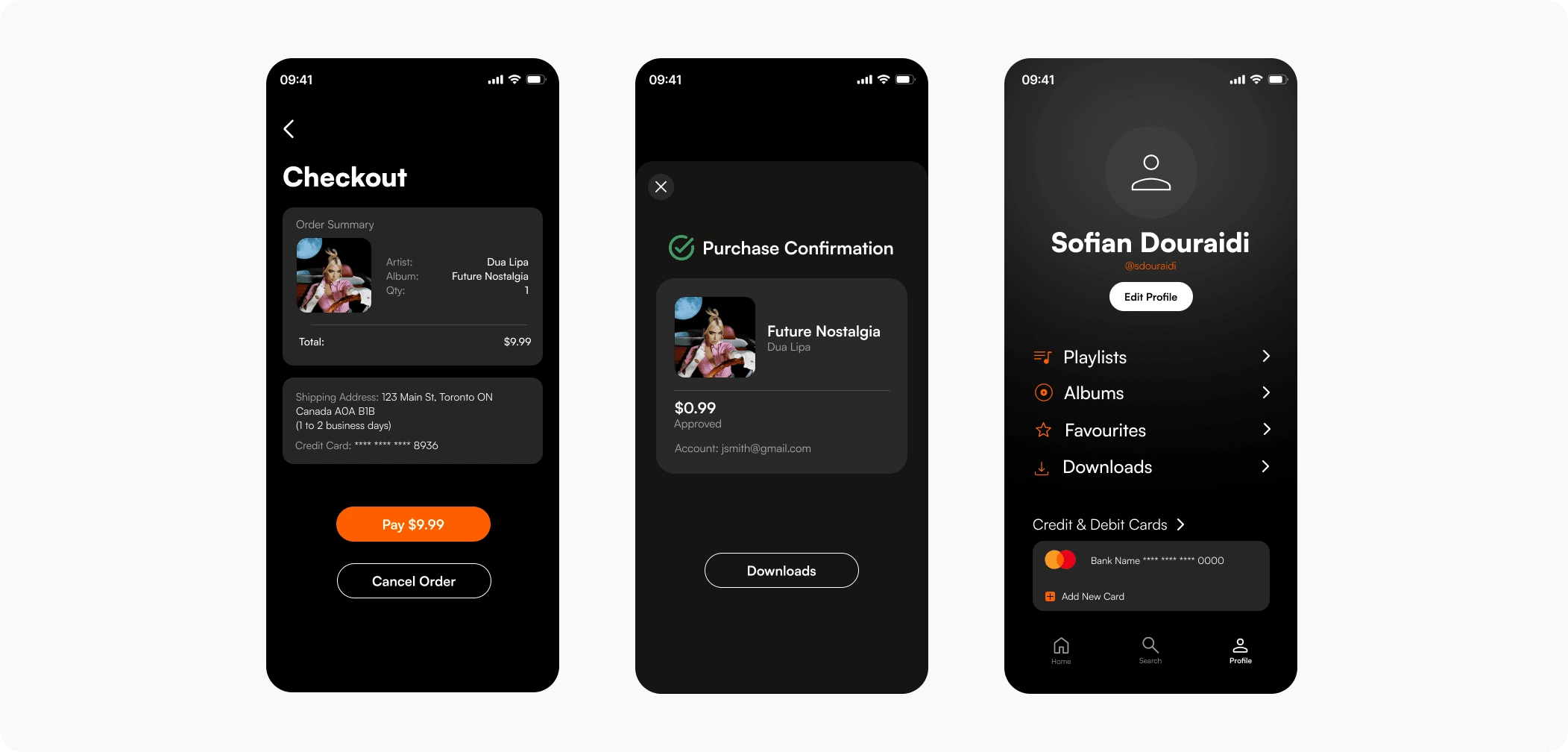
High-Fidelity Prototype
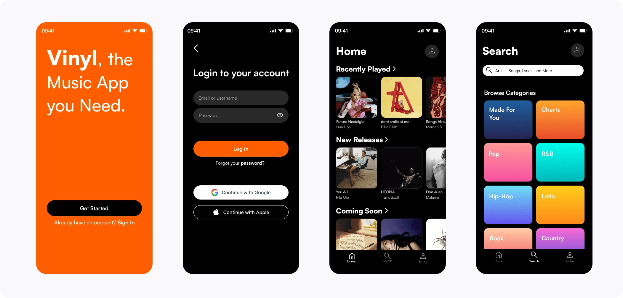
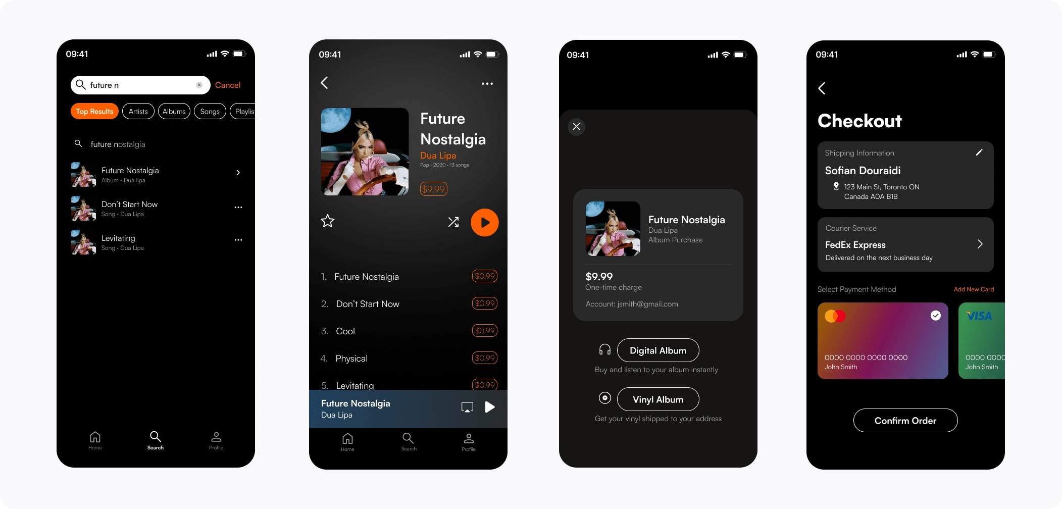
The final high-fidelity prototype presented cleaner user flows for buying a song or an album.
Click to play the prototypes 👇
High-Fidelity Prototype
Accessibility Considerations
Color and contrast: Use of a dark theme with white and orange for text and interactive elements.
Clear icons and labels: Icons and labels to accommodate color-blind users.
Responsive Design: Responsive app layouts that adapt to different screen sizes and orientations.
What I learned
While designing the Vinyl app, I learned that the first ideas for the app were only the beginning of the process. Usability studies influenced each iteration of the app’s designs. In this project, I started to gather user feedback a few weeks after I started the project, which provided strong first-hand evidence on design decision-making.
Thank you for reading this case study. You can read more case studies from my Portfolio Website, and please stay connected with me on LinkedIn.
Like this project
Posted Jun 13, 2024
Designed a user-centric music app, enhancing UX through usability studies and feedback, resulting in an efficient and accessible album purchase experience.
Likes
0
Views
10

