Crypto Management Experience Design for Converge
Zakariya Buhari
About Project
Converge is a crypto finance app designed to help users manage their digital assets, track market performance, and build better financial habits — all in one simple, visually consistent experience.
Task
Design a seamless crypto management experience that balances financial data clarity with approachable visuals, ensuring both new and experienced users feel confident navigating the app.
Process
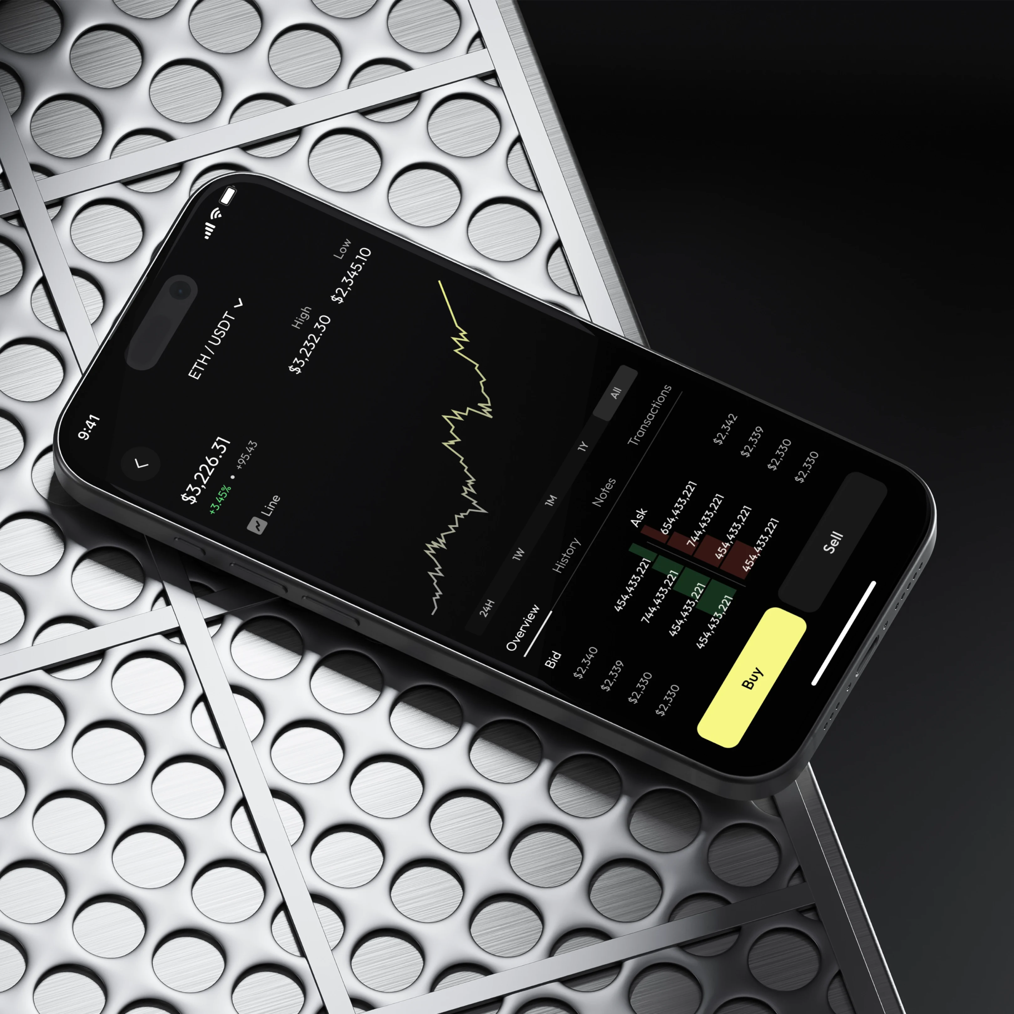
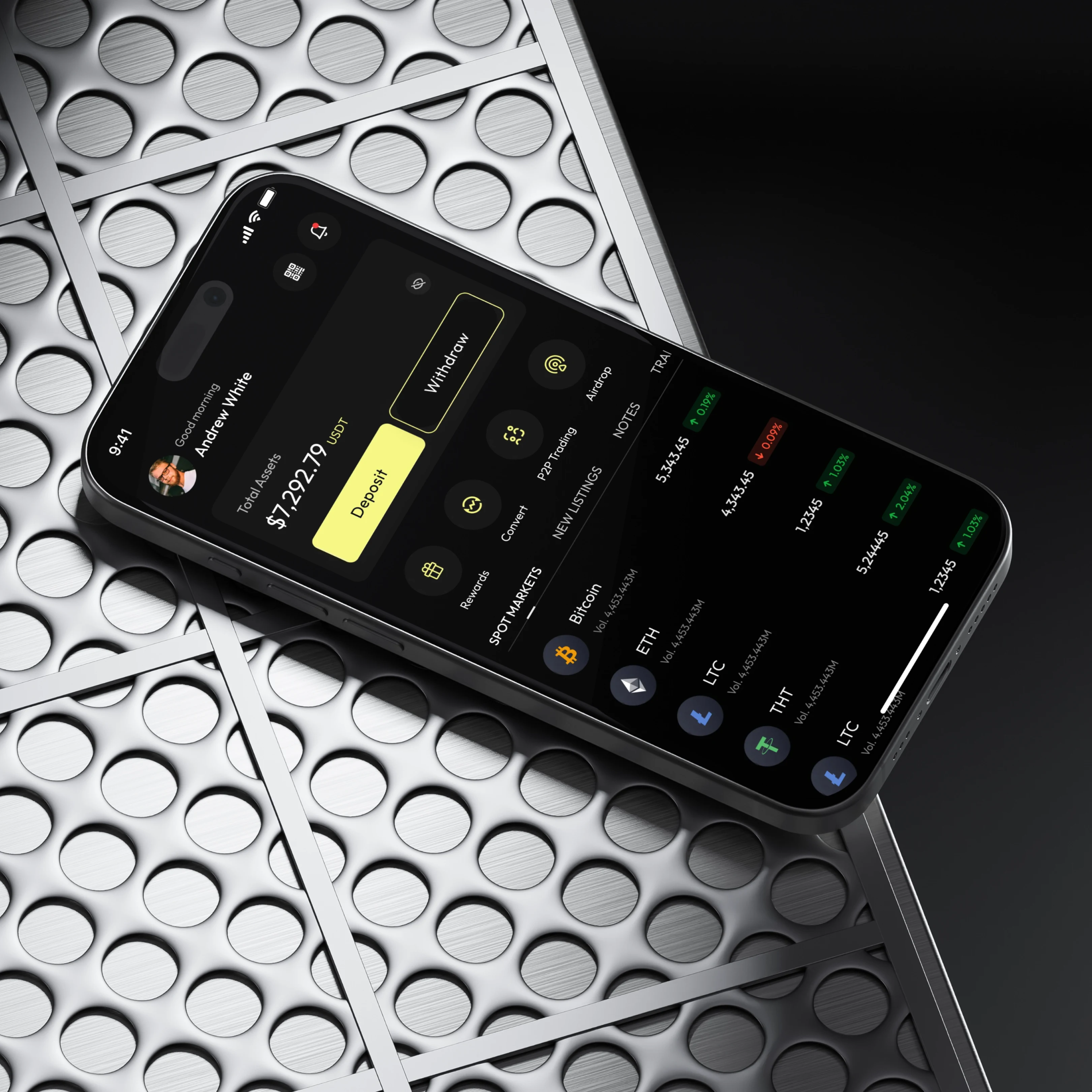
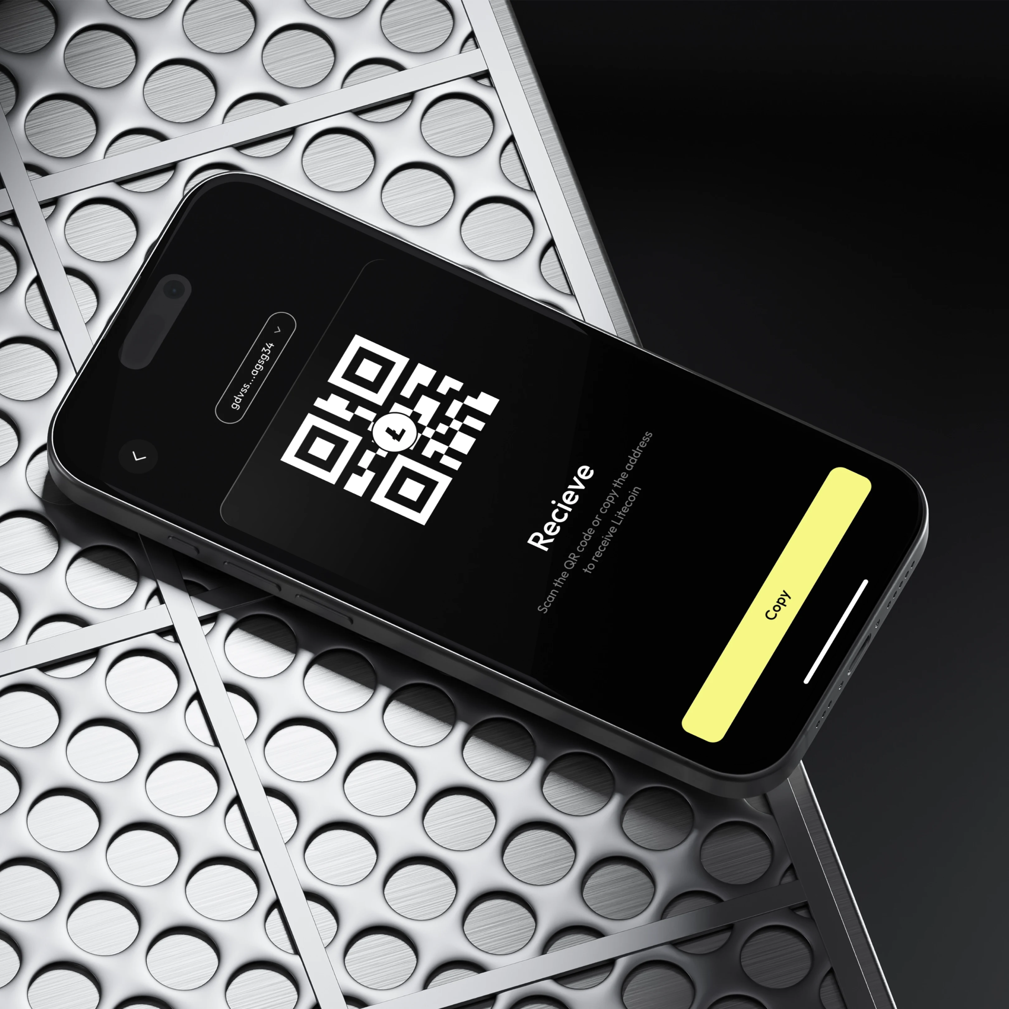
I started by identifying key user goals — monitoring assets, trading, and receiving crypto. The design needed to feel secure, professional, yet friendly.
I chose a dark theme to reduce visual strain and reflect the finance/crypto aesthetic, then introduced a soft yellow accent to highlight actions like “Sign Up,” “Deposit,” and “Buy.”
Each screen follows a consistent information hierarchy — typography and color contrast guide the eye naturally from the most important metrics (like total balance) down to secondary data.
The onboarding screens are clean and direct, using 3D-style illustrations to simplify complex ideas like budgeting, saving, and tracking.
Result
A visually balanced, easy-to-navigate experience that helps users take control of their crypto journey. It combines clarity, trust, and a touch of playfulness — exactly what finance apps often miss.
Like this project
Posted Oct 6, 2025
Designed a seamless crypto management experience for Converge app.
Likes
0
Views
3
Timeline
Oct 1, 2025 - Oct 5, 2025
Clients
Converge