Build My First Personal Portfolio Website
Rizka Shinta W
Project Overview 🔍
Context
I want to get real work experience as a product designer. One thing that is needed to apply is a portfolio. Therefore, here I want to design my own portfolio website which is intended to apply for jobs or to catch potential clients.
Problem
There are many people who want to build a career in product design as well as many bootcamps or training on product design. Hence the "cookie-cutter portfolio" problem. It means that the case studies in the portfolio are all similar because they follow the template provided by the bootcamp.
Most portfolios look the same.
This problem can make it difficult for recruiters to filter candidates. How do I build a portfolio that demonstrates my uniqueness so that I can stand out from other candidates?
Goal
Build a personal portfolio that demonstrates my uniqueness so that I can stand out from others.
Design Process💠
First, let's take a look at the overall steps of the product designer recruitment process in general.
Screening resume & portfolio
Present portfolio
Product design critique (optional)
Design exercise (take home, on-site exercise, or whiteboarding)
Present the results of the exercise
Interview with the user
Offer
Based on the steps of the product designer recruitment process above. Portfolios play a very important role from the start. There are thousands of portfolios that must be reviewed by a recruiter. It will take less than 2 minutes to decide whether the candidate is eligible to proceed to the next stage or not. Recruiters have a very short time. So, I have to provide the information they need on the portfolio landing page efficiently.
There are3 important things to note that recruiters might look for in my portfolio:
Who are you?
How good are you?
Can I trust you?
A portfolio can be anything, Dribbble, Behance, writing platforms (Medium, etc.), PDF, and personal websites. Each medium has its own advantages and disadvantages. I chose a personal website because it has a high level of customization. It allows me to show my brand personality.
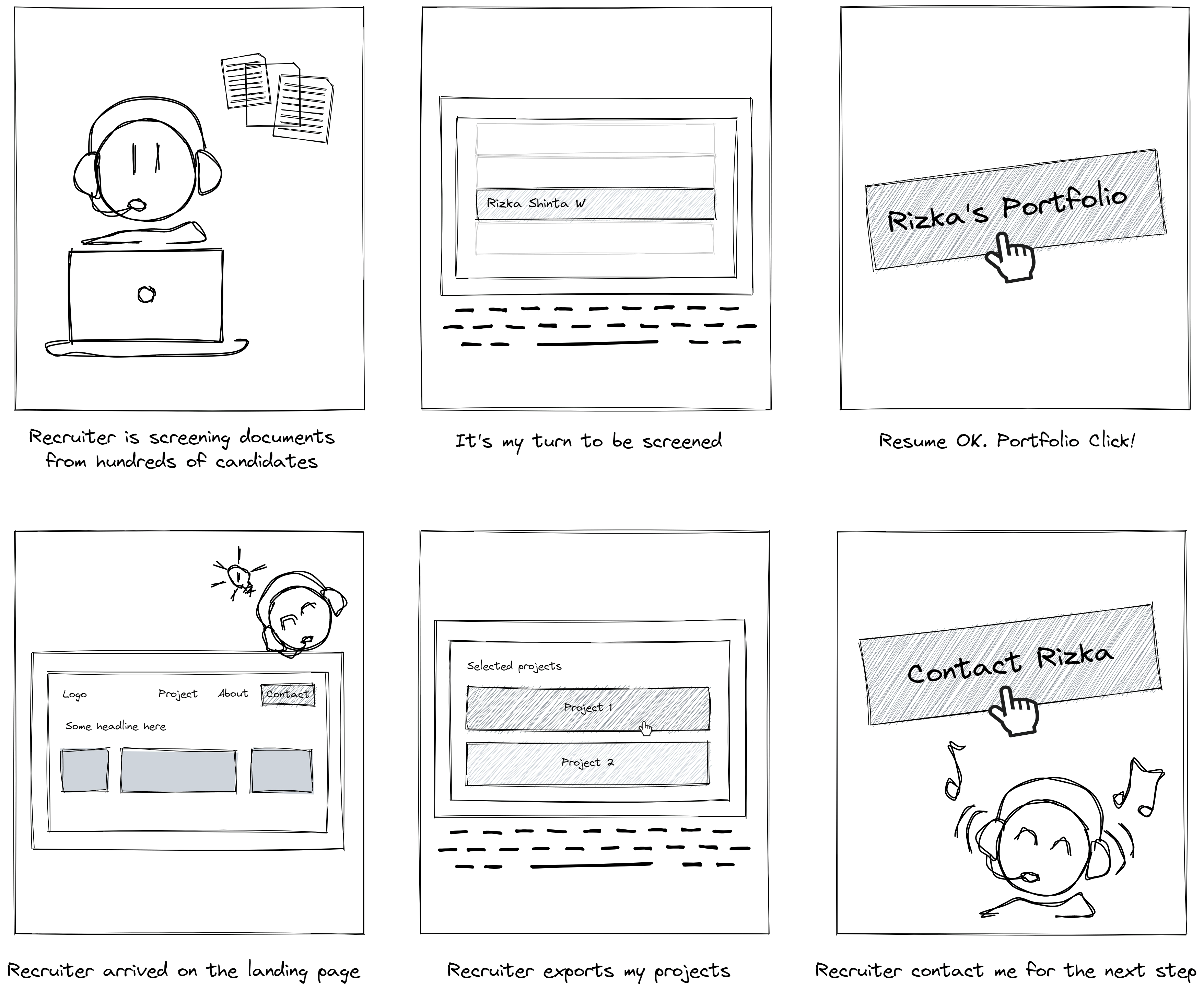
Storyboard
I made a storyboard to get an idea of what interactions are needed in the recruiter journey.
The recruiter is screening documents from hundreds of candidates
It's time for my document to be screened by the recruiter
Resume ok, portfolio click
The recruiter arrived at my portfolio landing page
Recruiter explore my project
Recruiter contact me for the next step
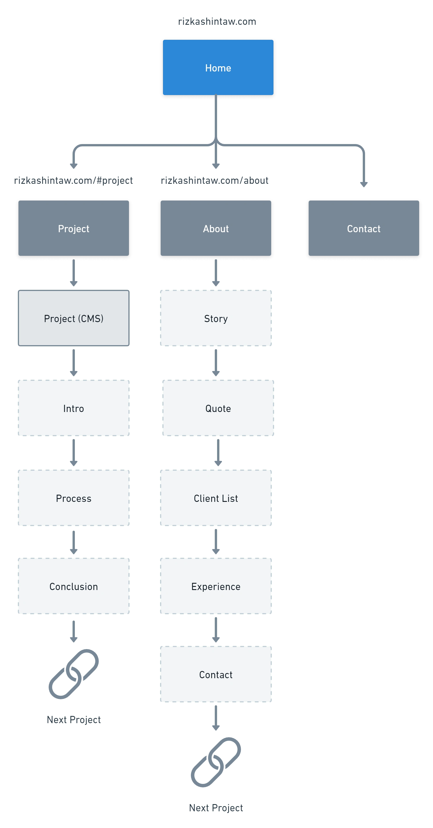
Sitemap
An overview of the sitemap to organize the content I want to convey to the recruiter.
Low-Fidelity Design
I created several wireframes to help me structure the information needed.
Landing Page
What does the very first screen say about me? Is it enough to convince the recruiters I am worth looking at? I have less than 2 minutes to get a recruiter's attention. Here I want to provide information about who am I.
Important parts that can help convey information about me:
Headline.The first thing recruiters see. Explain clearly what I do or my goals.
Teasing my work. Show my work upfront, so the recruiter will get a sense of what I do and how good I am.
Contact. Don't make it difficult for recruiters to contact me.
Photos. This is to make the recruiter feel they can trust me. I'm a real person in the world, not an imaginary one.
Social proof. This may not be very important, but it would be better if there were testimonials from clients or colleagues about me. A good way to gain recruiters' trust.
I made 2 variants, the first has a direct contact method (no dedicated page) and the second has a dedicated page for contact. The contents of the contact page may contain several mediums for contacting candidates such as forms, WhatsApp, and third-party apps.
I chose variant 1 because it's more straightforward and doesn't require a lot of clicks for recruiters. But maybe a product designer who is more experienced and has various users for his portfolio will have different ways of contacting him according to the type of user.

Home variant 1
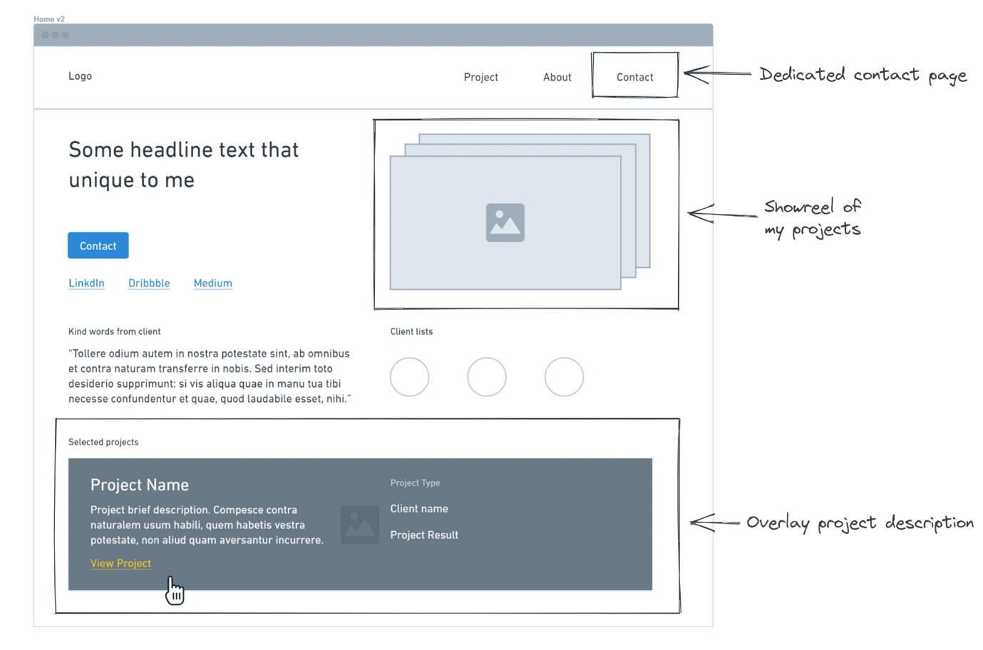
Home variant 2
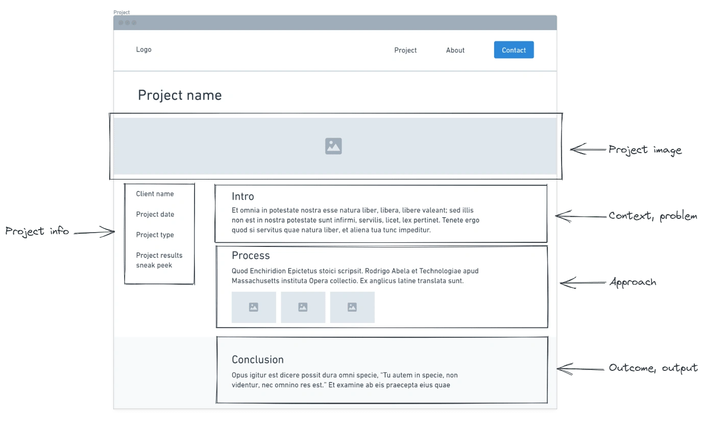
Project page
I want to show my process of working on the project. I took a reference from Budi Tanrim on how to structure an effective portfolio:
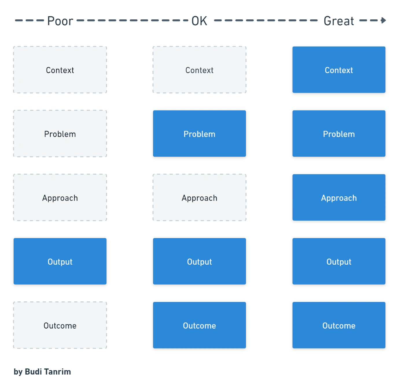
I divided it into 3 parts, to make it less complex and easier to read.
Introduction.Consists of the context and problem of the project.
Process. My approach to working on the project.
Conclusion.Consists of the output and outcome of the project.
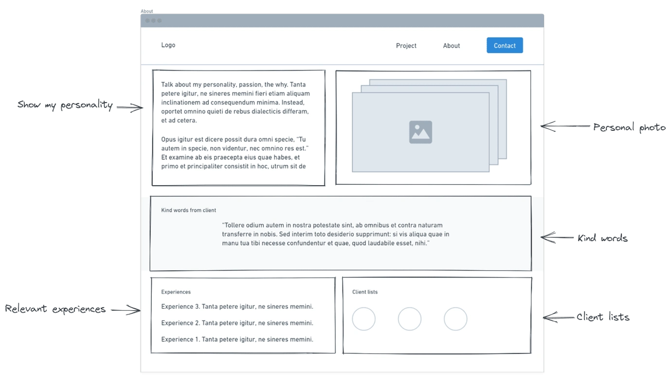
About page
Here I share my personality such as where I live, my passion, my goals, and maybe my perspective. This may build a connection and bond with a recruiter through a similar background or hobby. Similarity bias — We prefer what is like us over what is different. Moreover, I think at the end of the day they want to work with the person, not the portfolio.
Seeing pictures of the person on their website, their portfolio or whatever it might be, I do think is lovely is wonderful. It gives you just a sense of who they are and a lot of times, folks show kind of different images like if they like to go on hikes, they go sailing they’re a photographer, they have a family like these things are awesome — Katie Dill(Head of Design at Stripe).
Visual Design
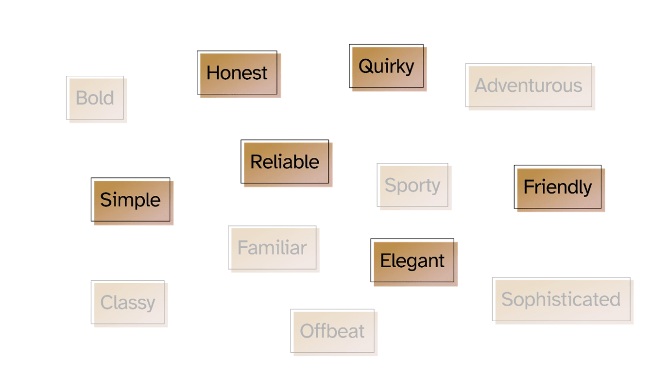
Key brand value
What do I want recruiters to feel about me? What would be the most important adjectives to best characterize them?
Honest and reliable
Quirky but friendly
Simple but elegant
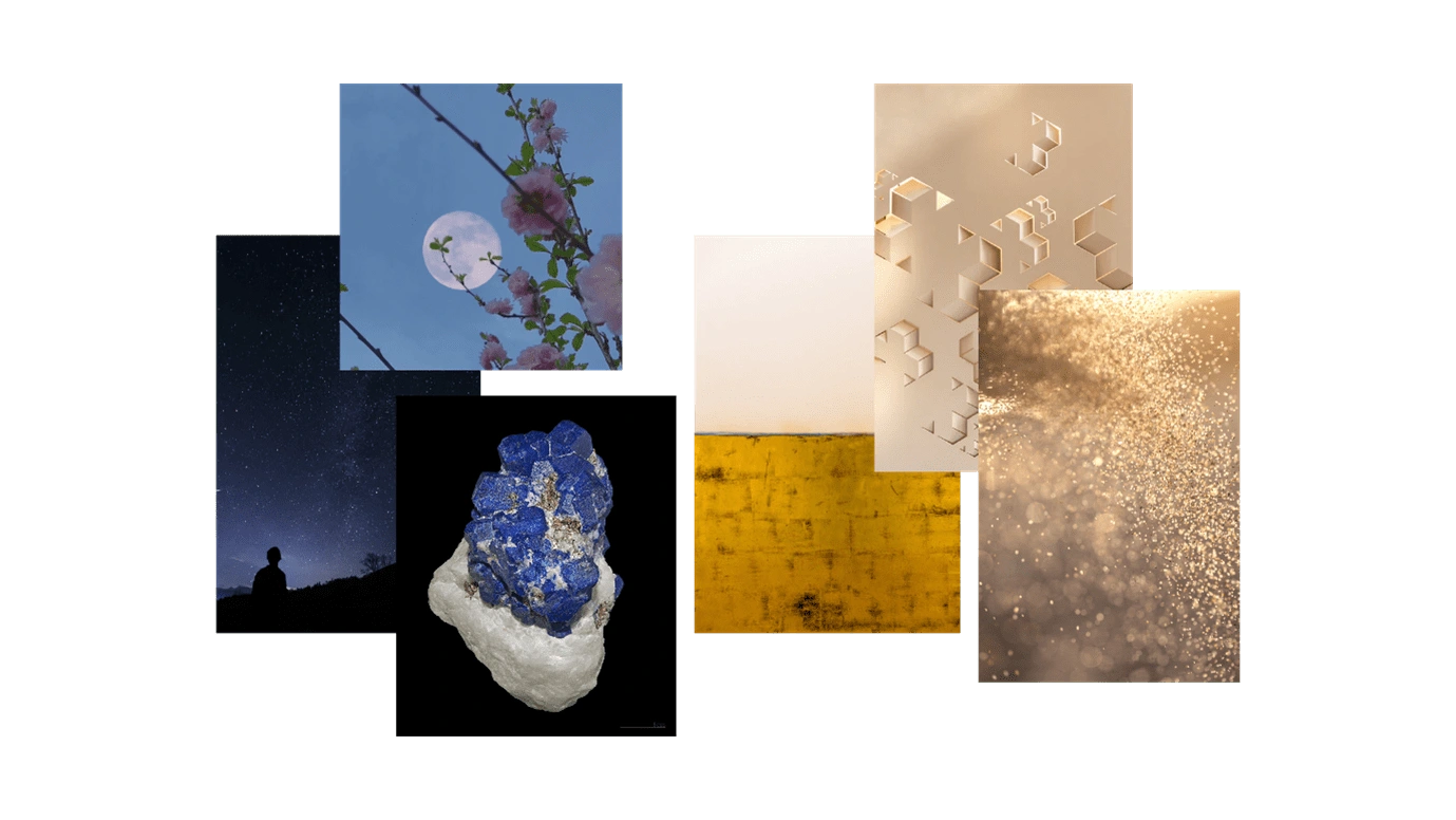
Brand concept & visual
The concept is from the etymology of my own name. My parents named me Rizka Shinta Wulandari in the hope of providing sustenance for the family and spreading love and wisdom to the community. I grew up in an environment that values communal work.
Rizka means "sustenance, gift from God" (رِزْق) (rizq) from Arabic.
Shinta means "love, purity" (सीता) (sita) in Sanskrit.
Wulandari means "full moon, wisdom" from the Javanese language.
There is a gem that I think can represent the brand concept perfectly, lapis lazuli.
Lapis lazuli is a highly spiritual stone and is known as the stone of truth and friendship. It brings harmony, love and protection to relationships. It also helps aid awareness and good judgement, which can help deepen relationships — Luna Tide
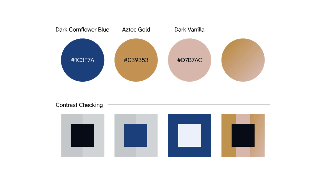
Color
Inspired by lapis lazuli color indigo blue with yellow flecks resembling gold.
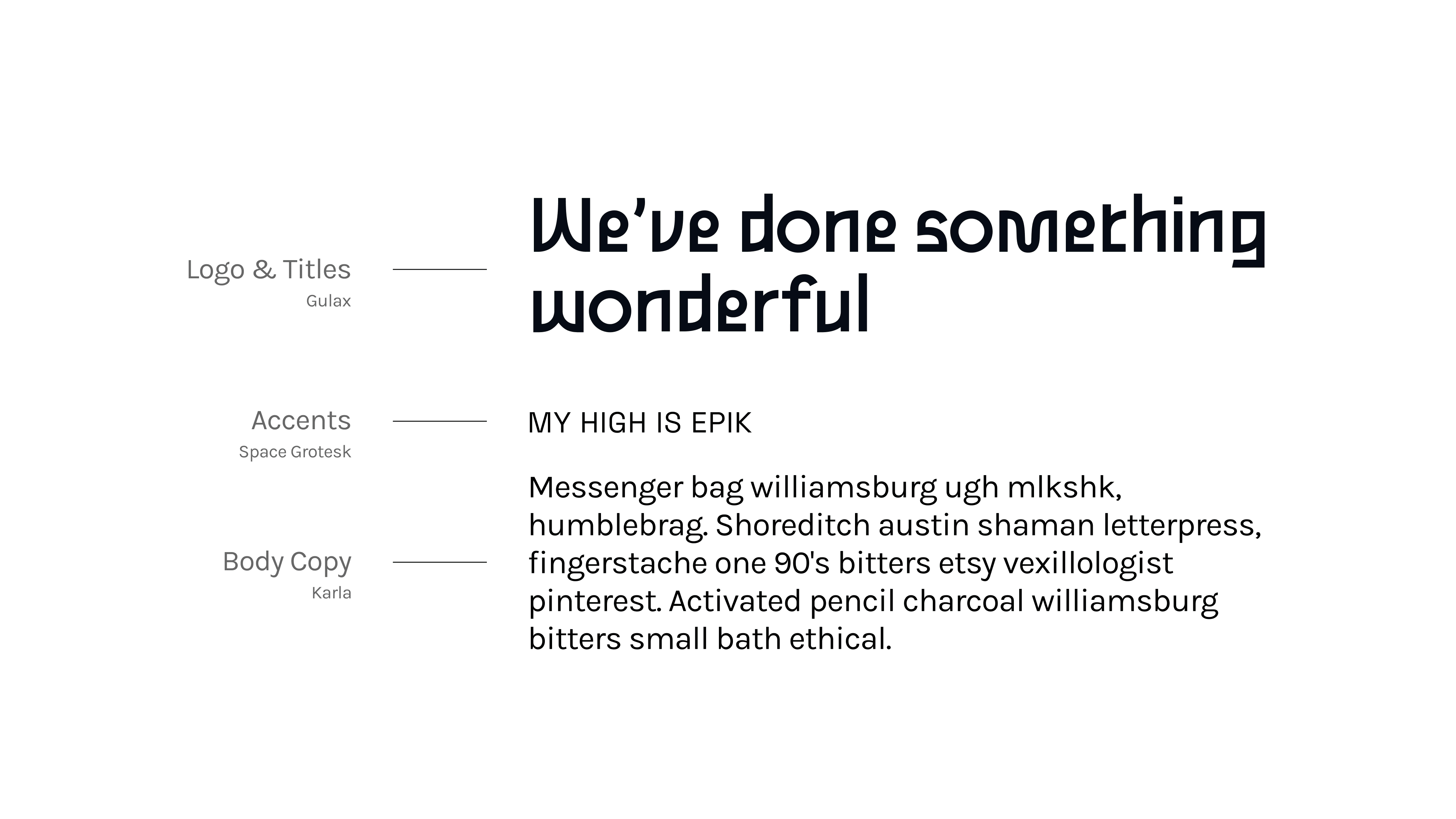
Typography
Gulax is an open-source monolinear sans typeface designed by Morgan Gilbert. I chose this typeface because its personality feels elegant and quirky.
Space Grotesk is a proportional sans-serif typeface designed by Florian Karsten. The Space Grotesk has monospaced special detail that is preserved while increasing legibility at non-display sizes. I think it's suitable for accents.
Karla is a grotesque sans serif designed by Jonny Pinhorn. Karla's typeface has a quirky feel and besides that, it has various weights, so I chose it for the body copy.
Final Design
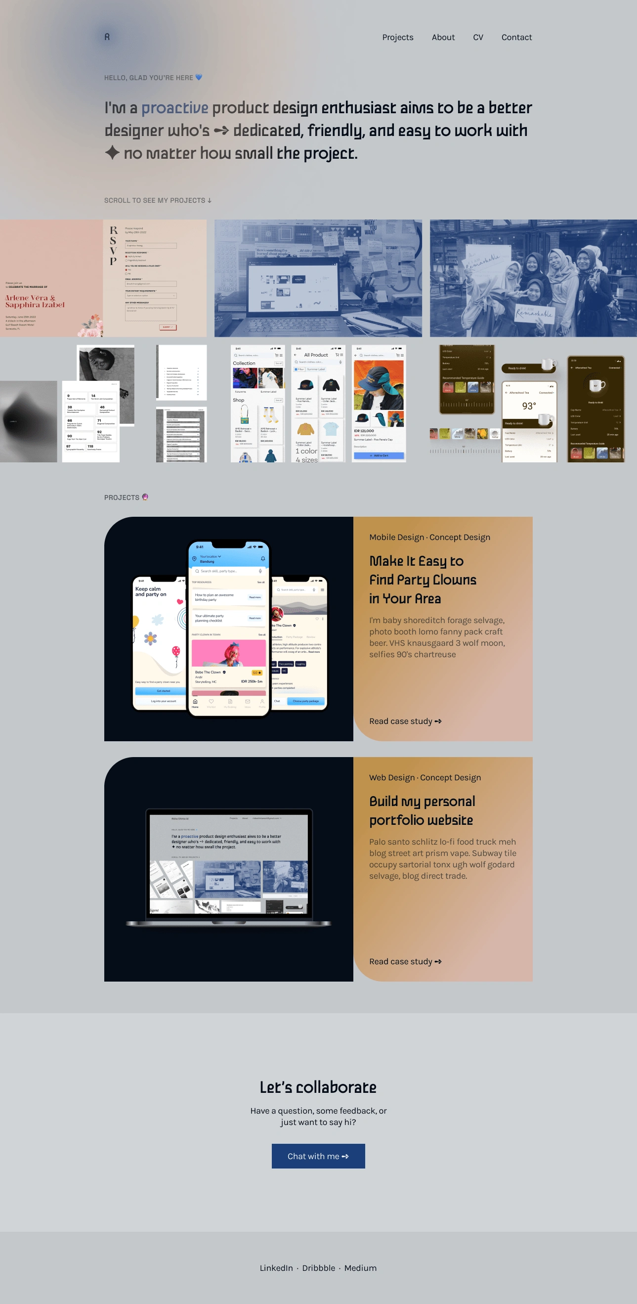
Check the live website at https://ratelier.webflow.io/
Reflection✨
The portfolio doesn't have to be perfect now, just start with what I have. It is not fixed, but a living breathing thing and will change as I grow. But, the brand personality that I build will be timeless. Remember that portfolio alone is not enough, there are many other factors that influence whether I will be hired or not such as my resume, case studies in my portfolio, design exercises, interviews, and others.
Like this project
Posted Mar 11, 2023
Design a personal portfolio website that fits my brand personality so that I can stand out from others.
Likes
0
Views
37