Redesigning Ternak Uang Homepage
Rizka Shinta W
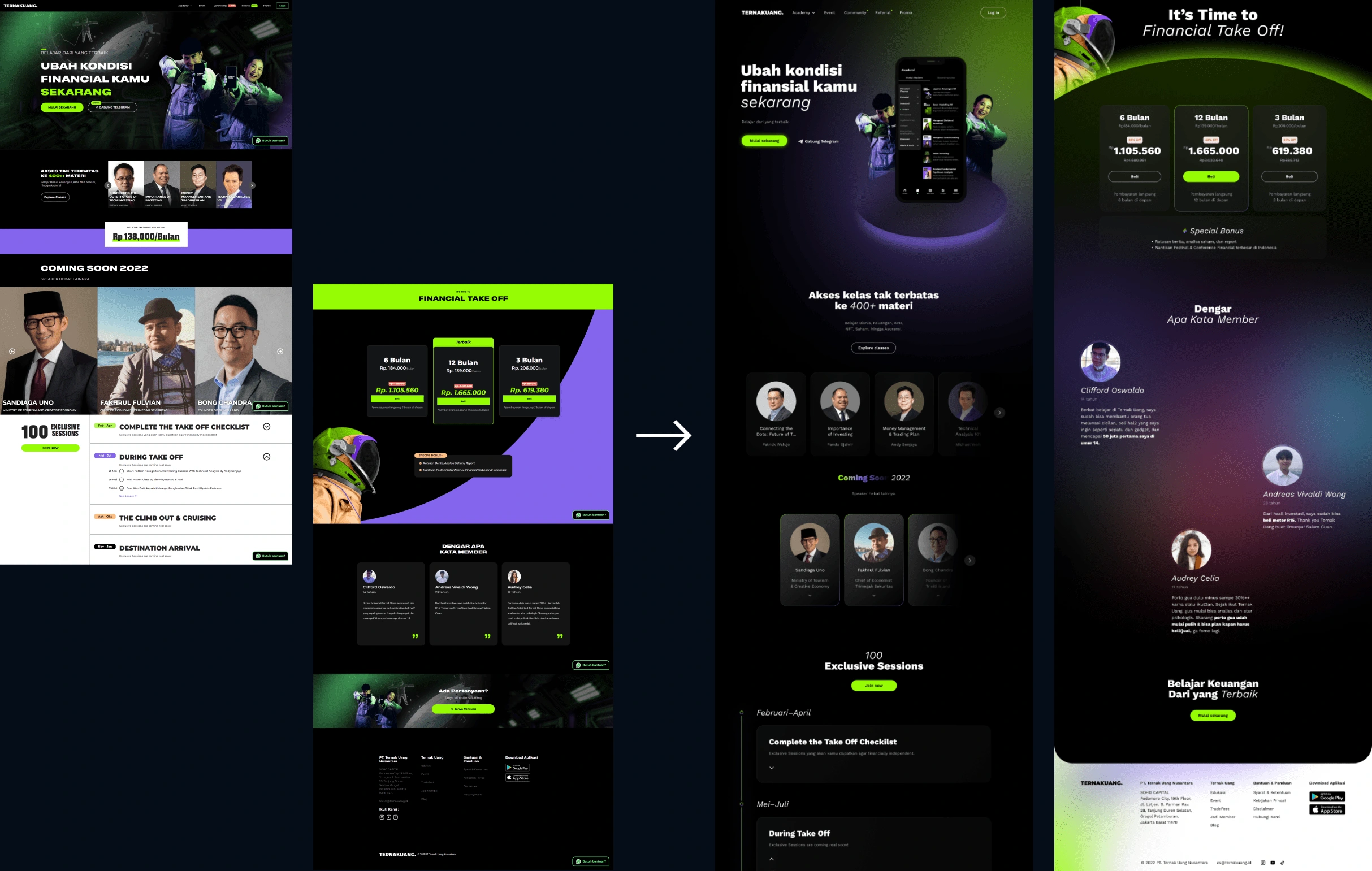
Before (left) and after (right) redesign
Project Overview 🔍
Background
This is an exploratory project in designing good homepages. I will use the fundamental UI design principle and an effective website homepage design strategy to evaluate the quality of the current Ternak Uang homepage design.
Problem
As I evaluated the current website homepage design, I found that there was an unclear hierarchy and inconsistent use of colors and typefaces. There's one more thing that bothers me, copywriting. But that's for another time; now I'd like to focus on the overall homepage UI.
Goal
Improve the hierarchy and color use of the homepage user interface design while maintaining the brand that Ternak Uang has built.
Design Process💠
About Ternak Uang
Ternak Uang has a mission to create 10 million investors in Indonesia with a focus on the younger generation, especially millennials. Due to this, the platform takes a new, innovative approach to address financial concerns by designing and developing features that are relevant and modern for the younger generation.
Ternak Uang was initiated by young people under 30 years old. This is an advantage to be observant in capturing financial issues that are relevant and interesting for other young people. We also recognize the need to present material in a concise manner and use easy-to-understand language so that can reach the younger generation broadly —Raymond Chin (CEO of Ternak Uang)
Key brand value
As a result of seeing various Ternak Uang content on TikTok, Instagram, and free webinars. In my opinion, Ternak Uang has the following brand values:
Visionary. Better financial health in the future.
Cutting-edge. Stay updated with the existing news to stay relevant to young people.
Witty. Funny, and casual, but clever.
Current homepage design structure
Let's break down the current structure of the home page.
Header. Contains a logo, navigational links and menus, and a login button.
Main lockup and visual. Contains headline, sub-headline, CTA, and visual.
Class speaker. Featuring speakers in the Ternak Uang class.
Exclusive sessions. Display exclusive session timeline.
Pricing. Displays a choice of subscription prices.
Testimonial. Testimonials from Ternak Uang users.
Final action. Provides actionable endings to guide the visitors.
Footer. Displays contact information, sitemap, social media, copyright, and logo.
Part 1. Above the fold
This section is the first seen by visitors without scrolling. Therefore, it must convey information as clearly as possible. What we want users to do on our website.
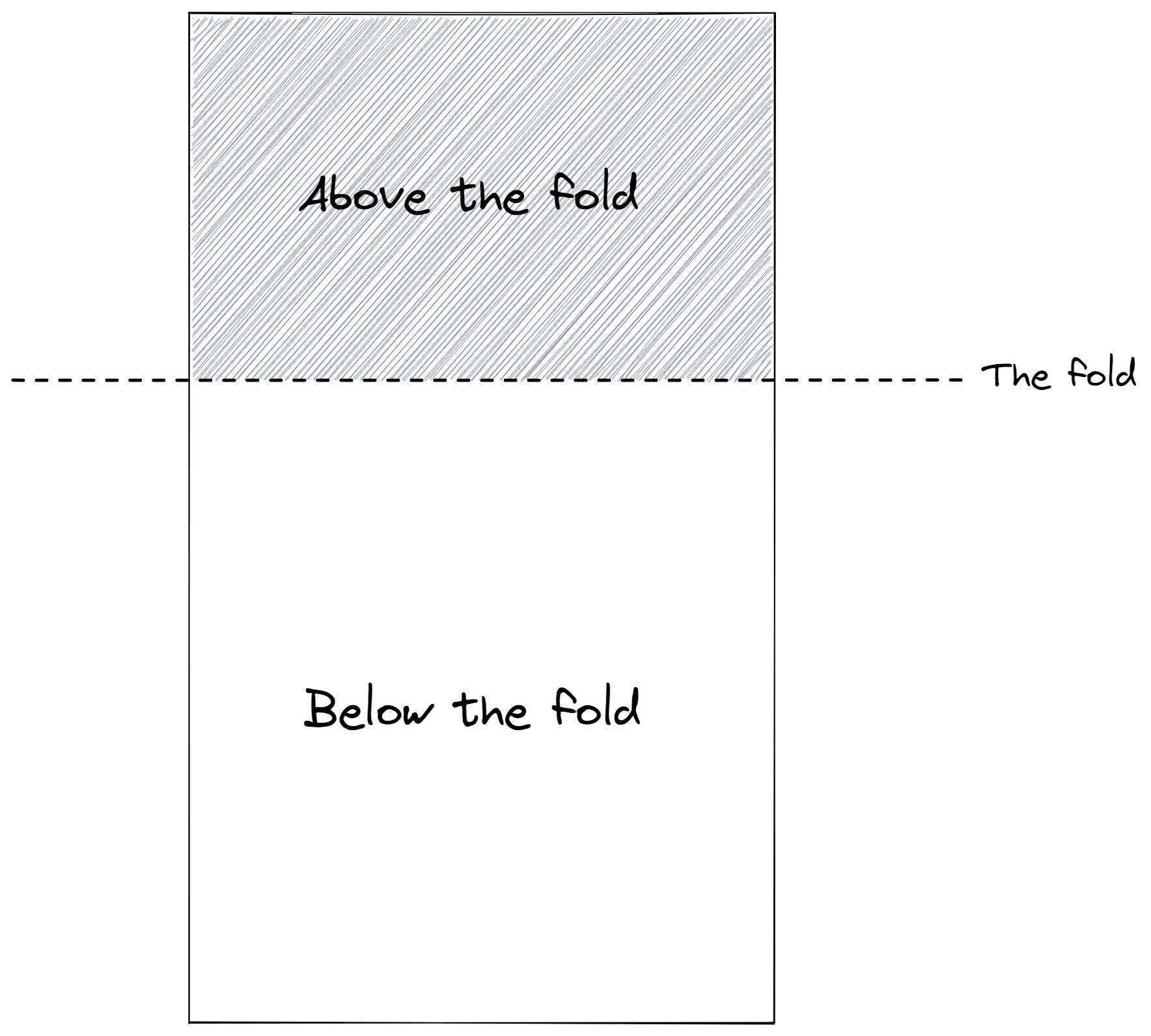
Common structures that have been proven to work in this section are usually:
Header
Main lockup (headline, sub-headline, CTA)
Visual
Examples:
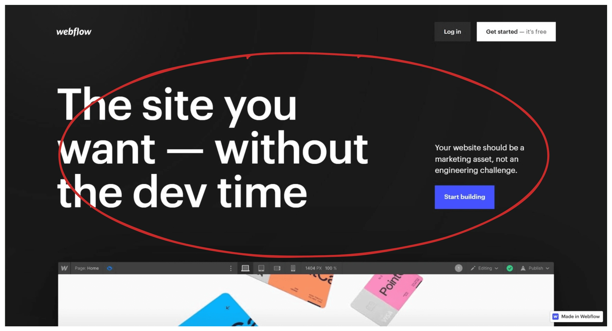
Webflow
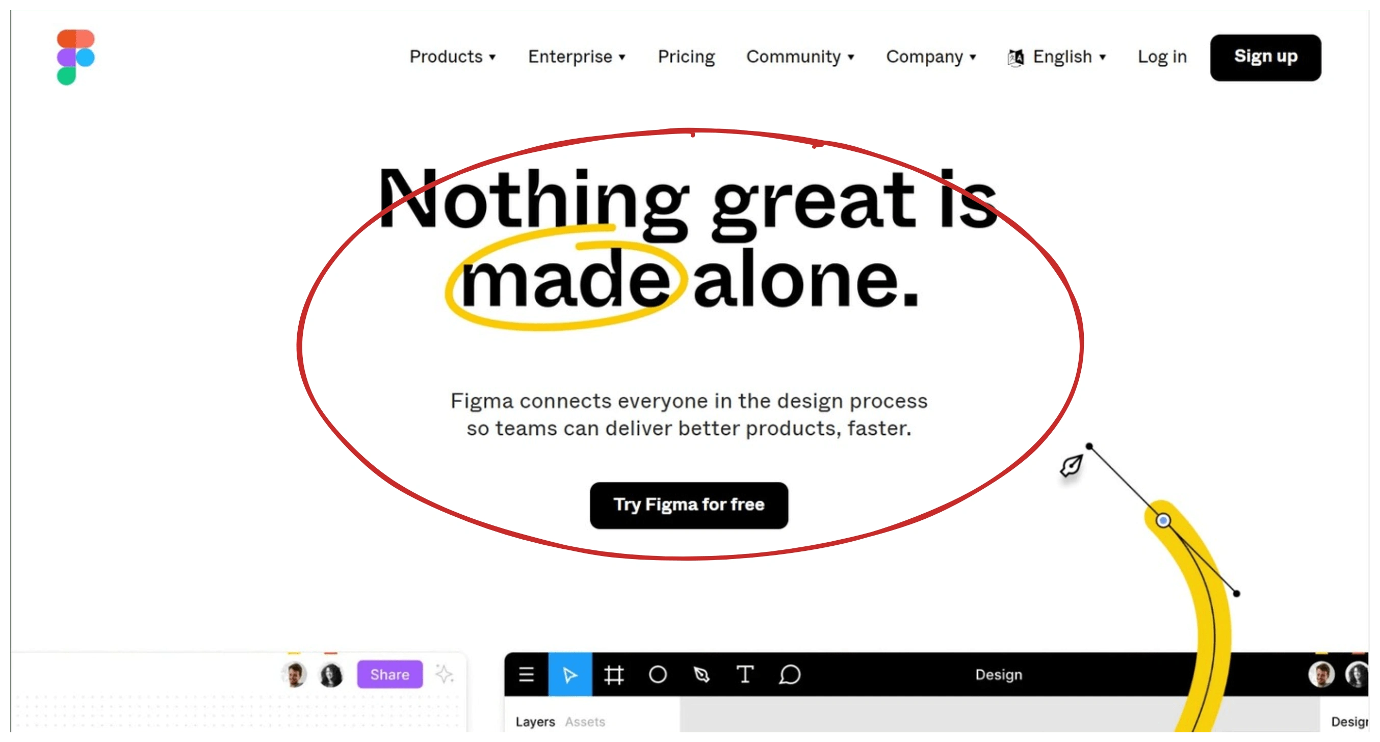
Figma
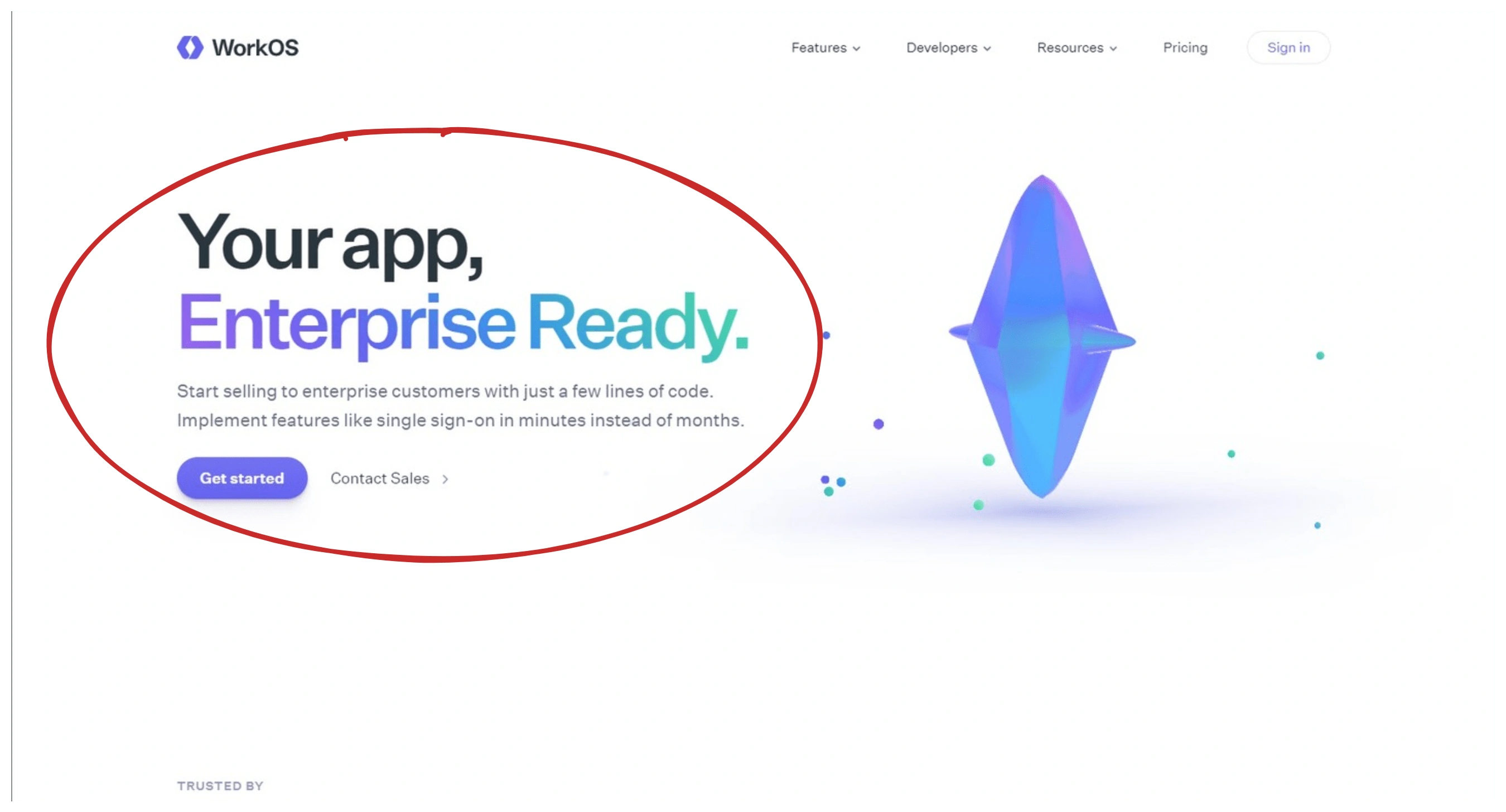
WorkOS
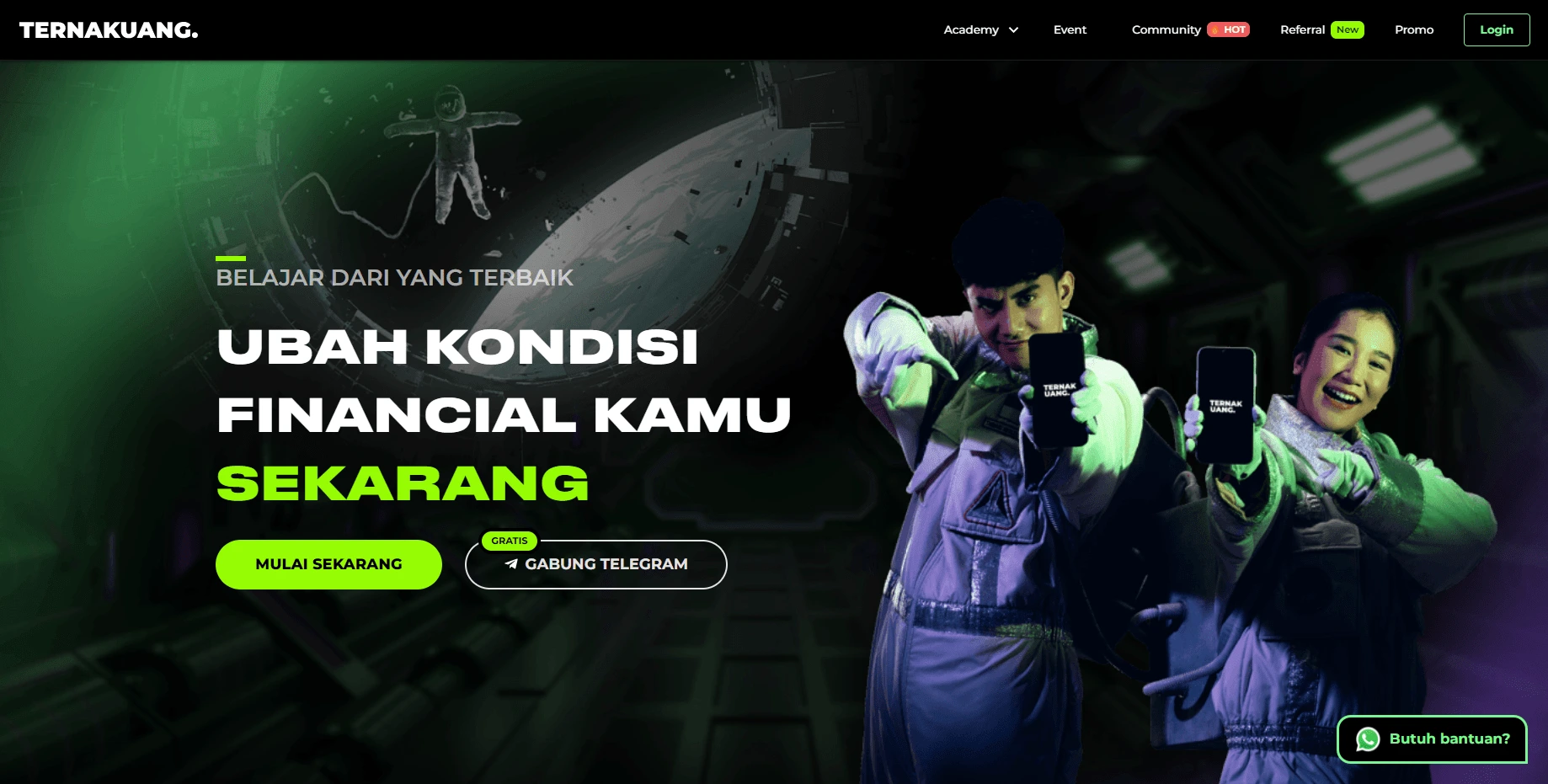
The current above-the-fold section of the Ternak Uang website no has all four of these structures. However, the hierarchy is not clear. It feels like every element is screaming and competing for the attention of visitors. Plus the use of inconsistent brand colors.
The visuals used looks cool, but don't illustrate the actual Ternak Uang product. The model only shows the Ternak Uang logo on the smartphone screen. It's not clear what that means.

Above the fold section current design
Some great visual examples showing the real product:
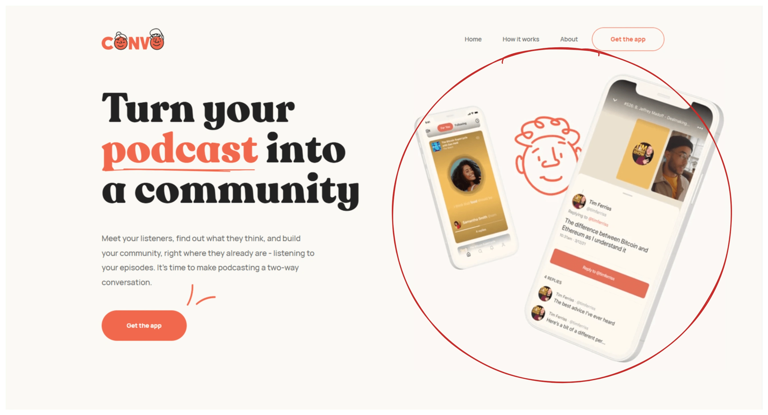
Convo
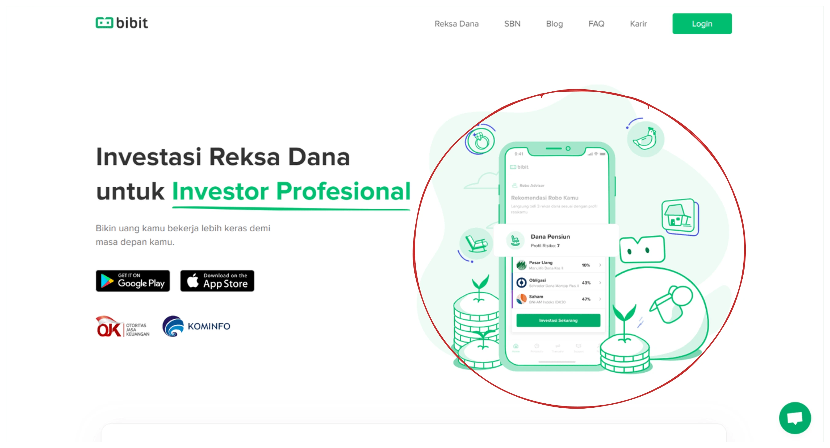
Bibit
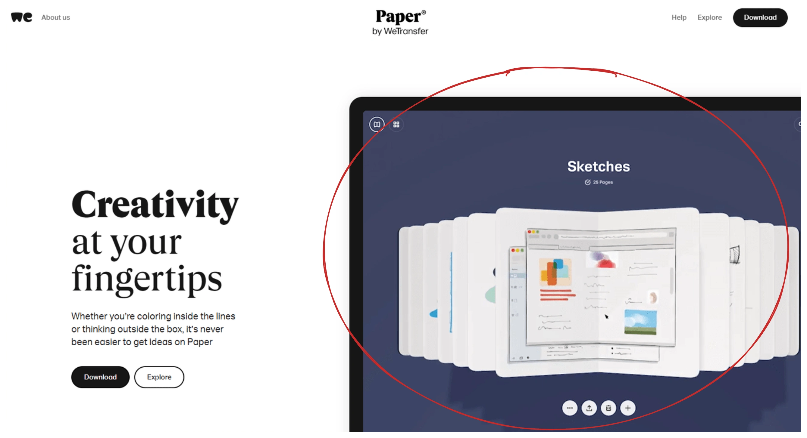
Paper by WeTransfer
Taking into account the things mentioned above, this is the result of the redesign:
Before
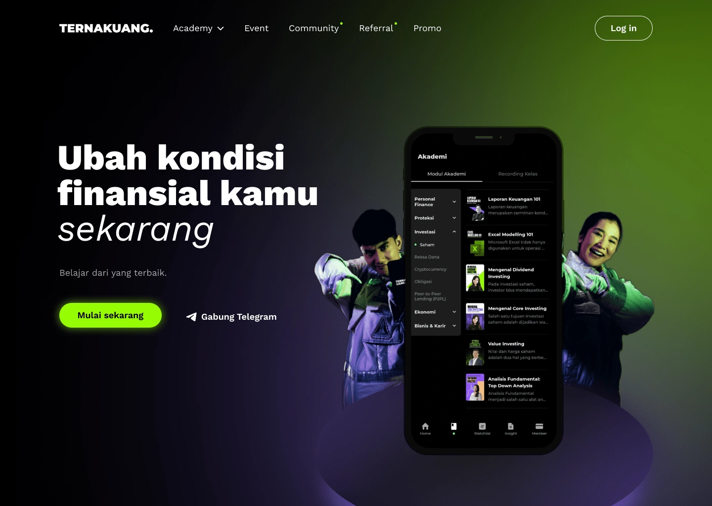
After
Part 2. Class speaker
This section is divided into two columns. The first column has text and CTA, the second column displays the speakers in the carousel component. I think this design is less effective because the column is divided into two, and the carousel component that displays the speaker is small so it is difficult to interact with these components. Visitors are less flexible if they want to see a list of other speakers.
I designed it all into one column, so I focused on presenting the speakers.
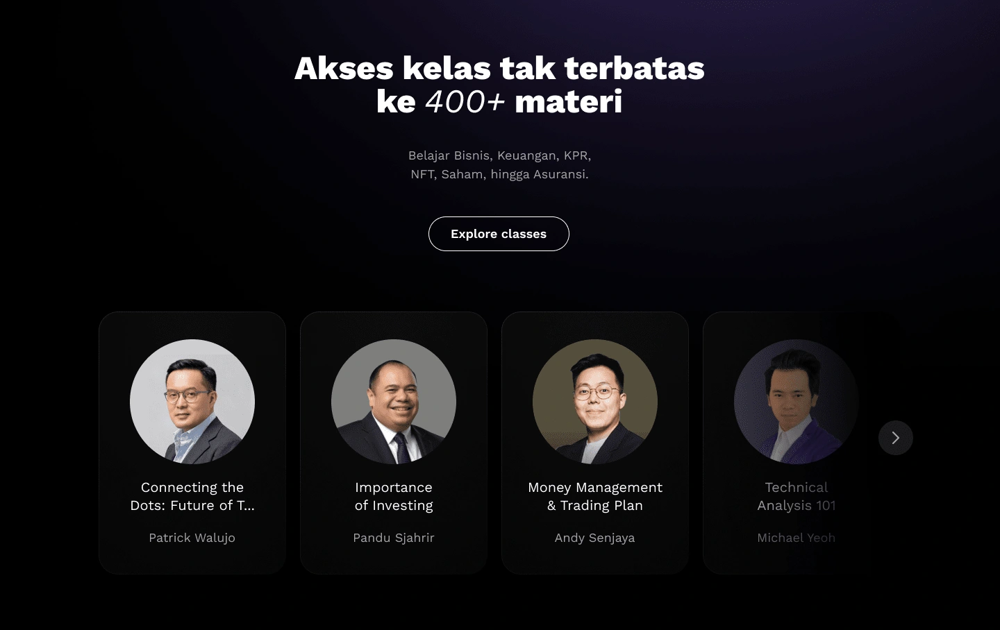
For the upcoming speaker section, the carousel component is even larger and if hovered there is a detailed description of the speaker.
I changed the component design to be clickable so that visitors have control if they want to see more info about that speaker. If the visitor clicks, details about the speaker will appear.
These are the results before and after redesign:
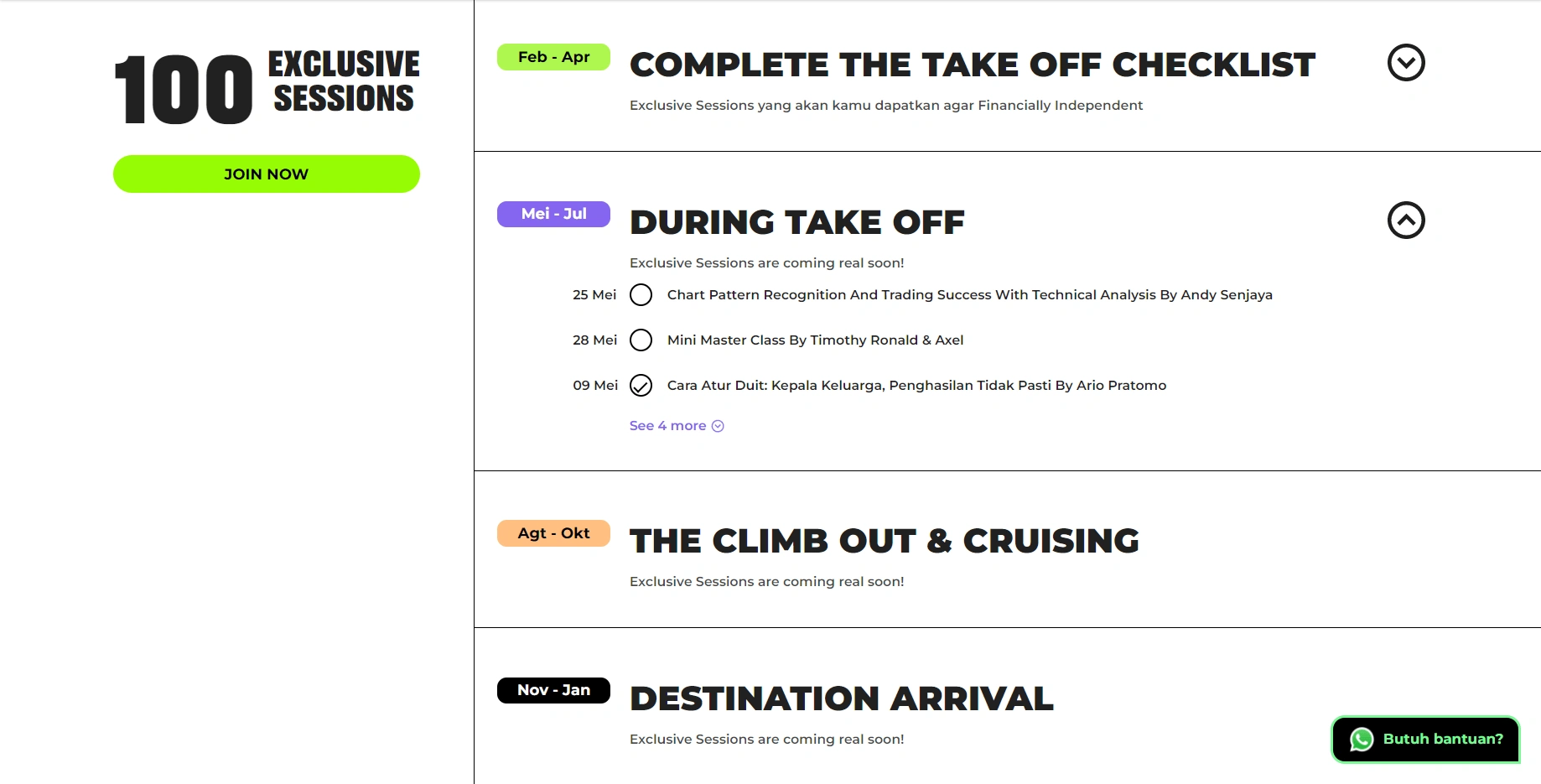
Part 3. Exclusive sessions
Here shows the exclusive session timeline for Ternak Uang subscribers. The design is interesting because it looks like a to-do list, but visitors can't interact with the checkbox component. I think it was deliberately designed that way, maybe to attract visitors to join the exclusive session, and then subscribed to Ternak Uang.
I changed the design to just one column to make it easier to scan the timeline. I've also added a "Join now" CTA at the end of each accordion component so that visitors don't have to scroll to the top and might make visitors want to subscribe to Ternak Uang right away after seeing an exclusive session that caught their attention.
These are the results before and after the redesign:
Before
Part 4. Pricing
Ternak Uang divides the price options into three, the difference is only the subscription period. It seems that all the features are the same. In this section, I didn't change the design much, just improve the hierarchy a little bit.
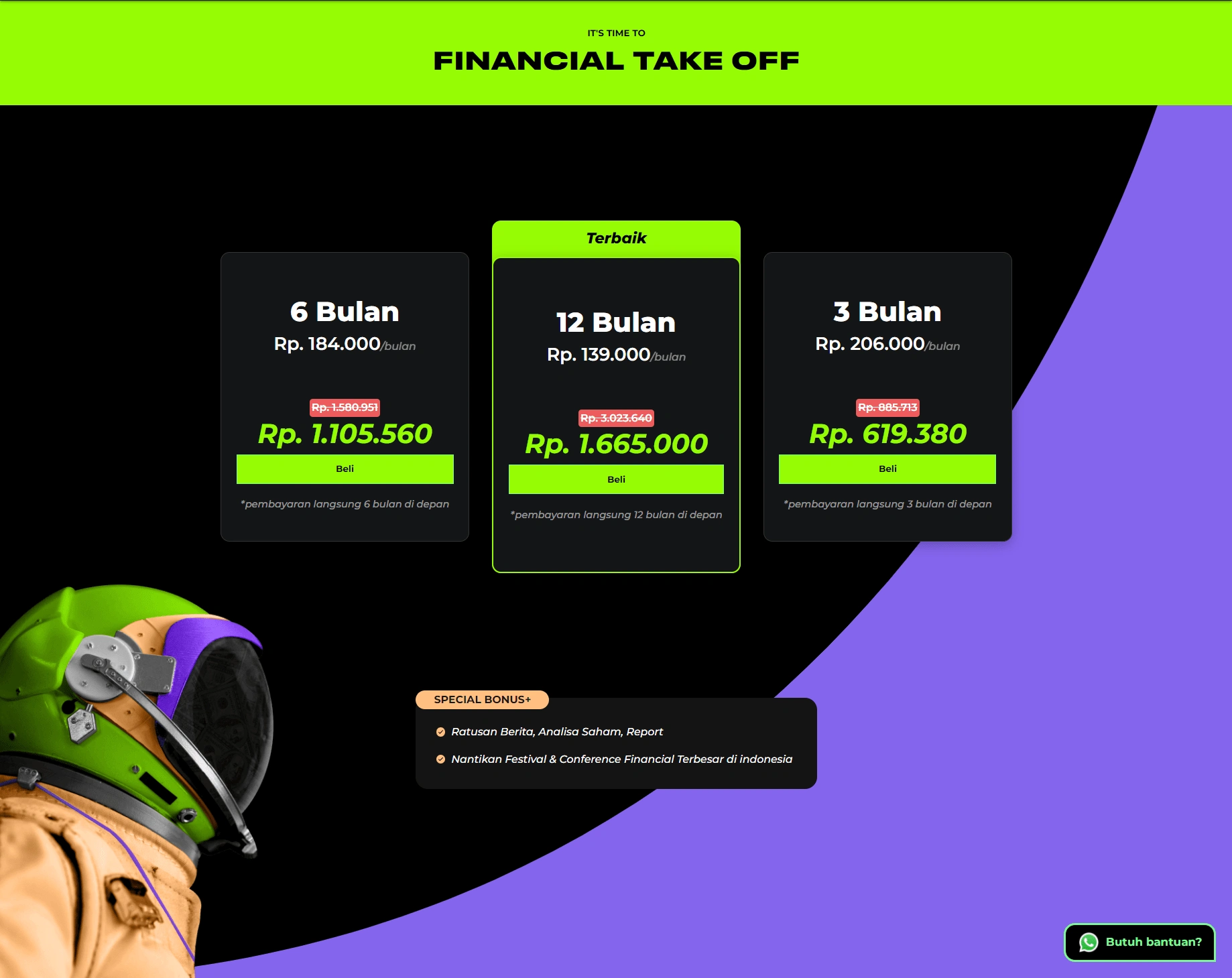
Before
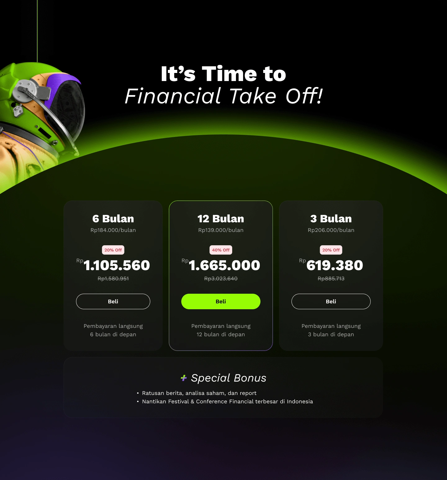
After
Part 5. Testimonial
Here I highlight the benefits that users have received after using the Ternak Uang product.
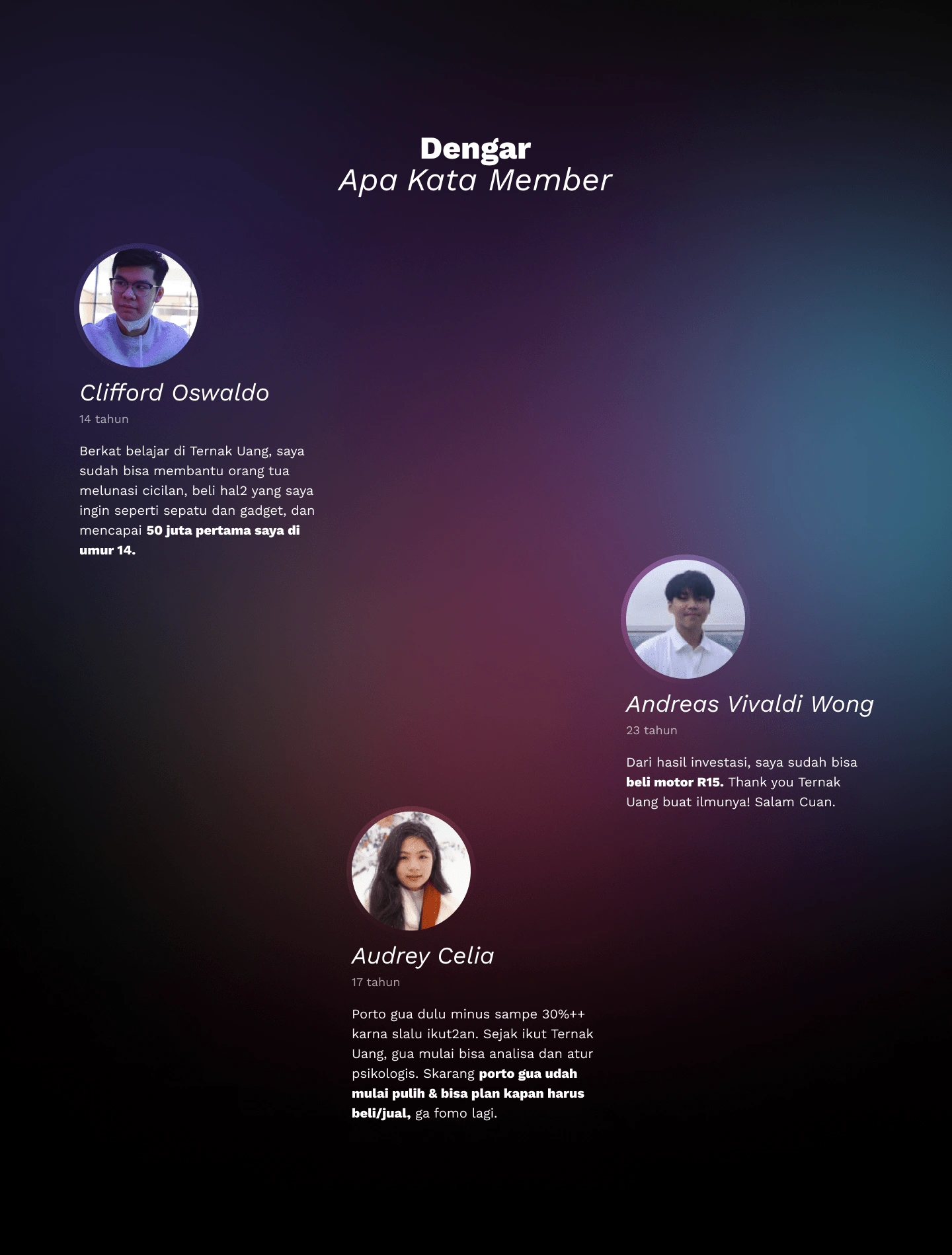
After
Part 6. Final Action
The flow is good, ending with actions that can be done by visitors. Don't just end with a footer. It's just that, I think the recommended action will be more powerful if it offers the main CTA, namely "Buy," "Get started," or "Join now." The final action that can guide visitors.
If we want to give visitors a room to ask questions, I think it is enough with the floating help/ask button that has been implemented by Ternak Uang before.
Some examples of final actions:
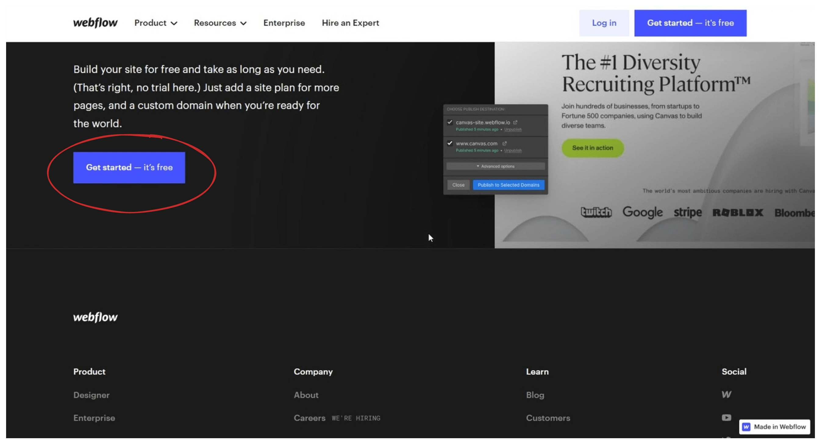
Webflow
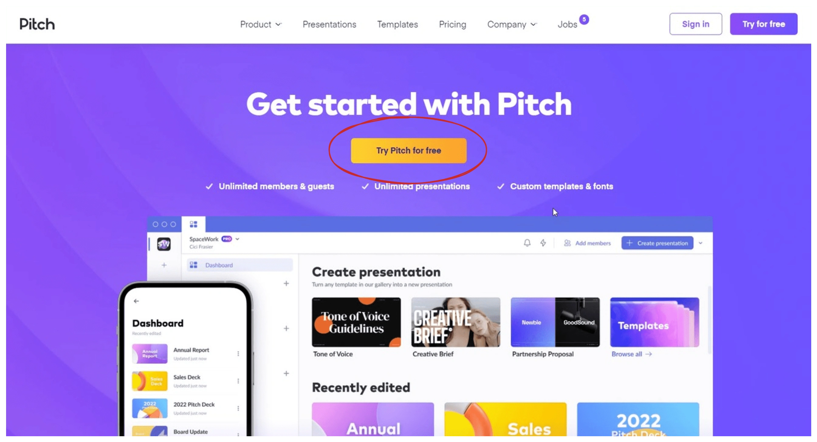
Pitch
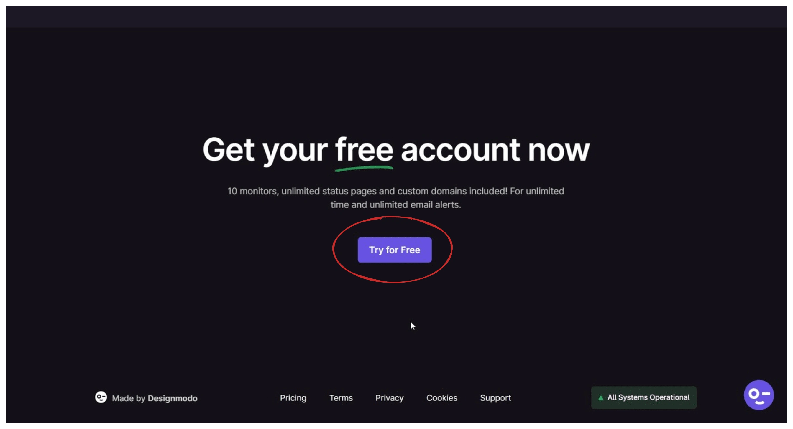
Pulsetic
These are the results before and after the redesign:

Before

After
Part 7. Footer
The content is not changed, only the layout and visuals.
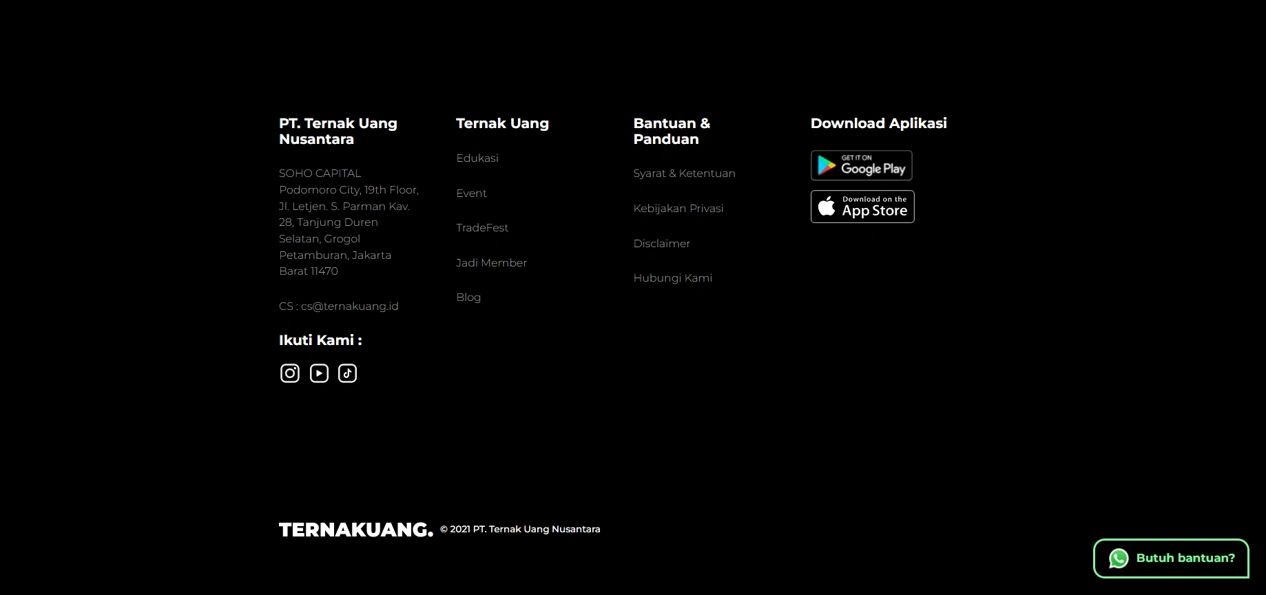
Before
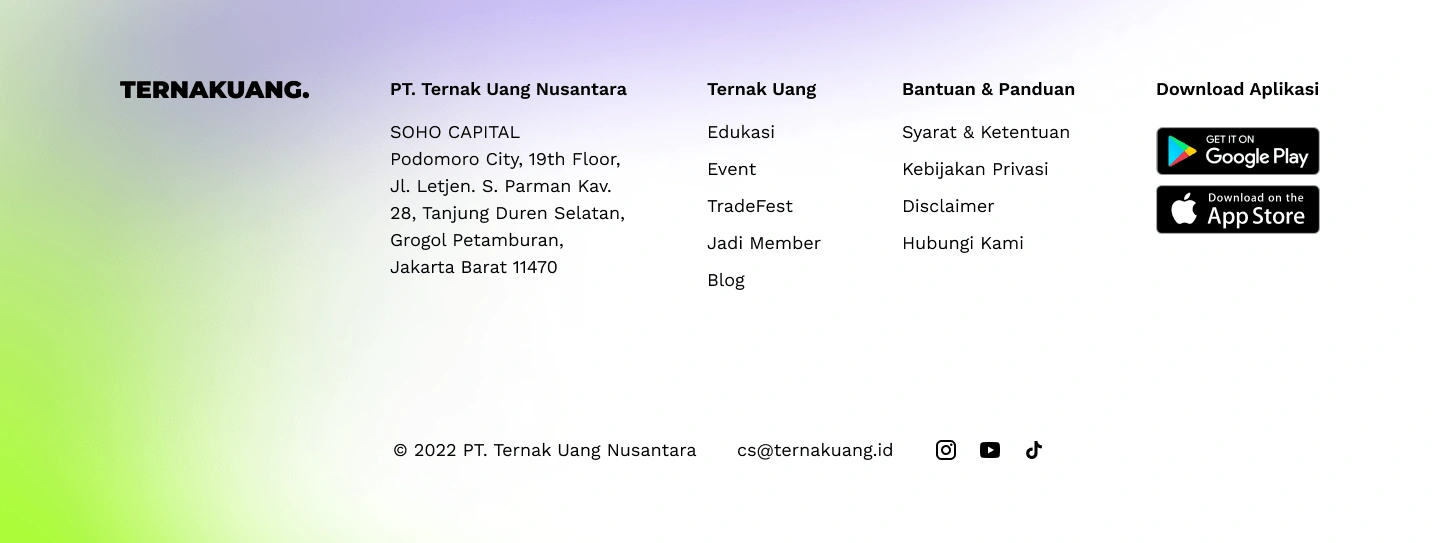
After
The Result
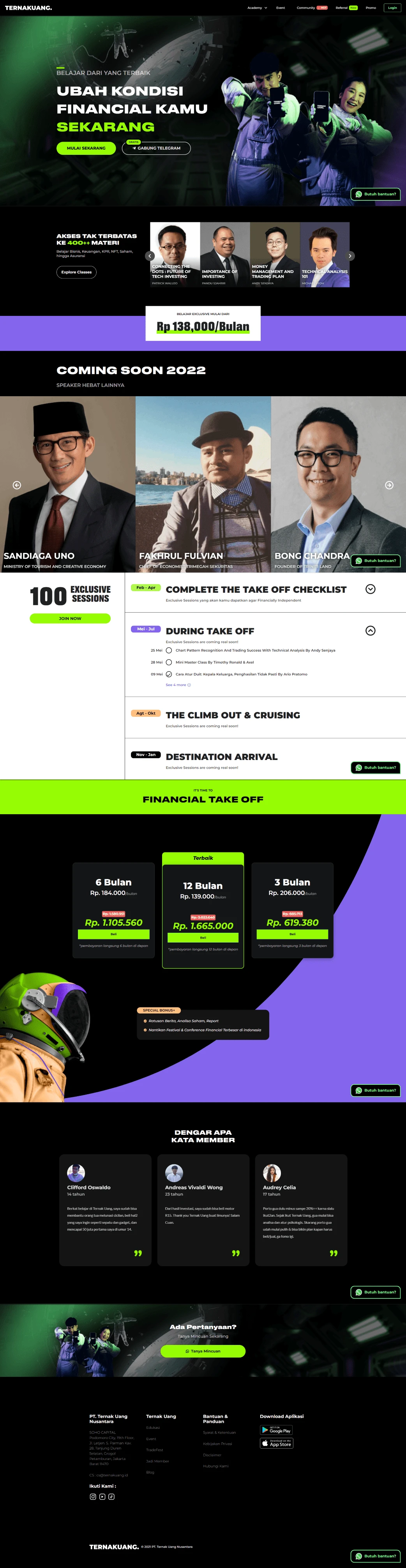
Before
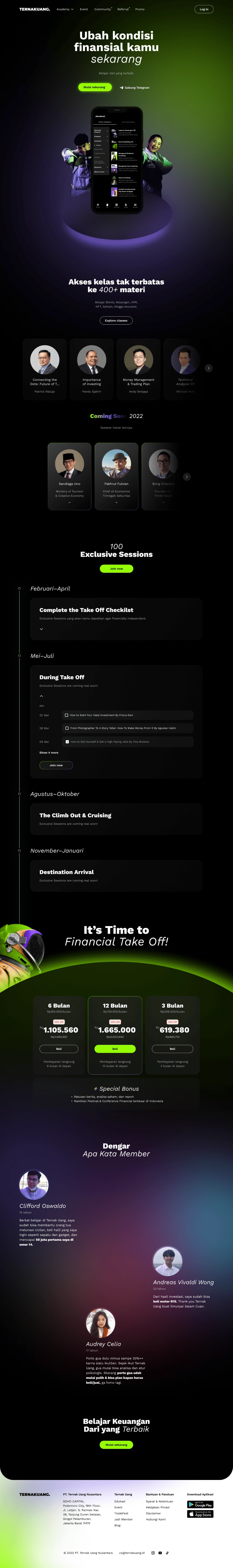
After
Reflection ✨
In this project, I practiced the basic principles of visual design and learned how to structure an effective homepage while thinking about the flow through which website visitors will go.
The disadvantage of this website redesign is that it focuses more on the user interface design aspect, and does not explore more from a business perspective.
If I have more time and resources, I'd like to first discuss with Ternak Uang what causes them to want to redesign their website and understand visitor behavior from the web analytics data they have. What might cause visitors not to convert?
Update
The term "above the fold" in website design has evolved in its relevance. While it used to be important to prioritize content above the fold because users were less likely to scroll down, this has decreased due to the prevalence of mobile devices and long-scrolling websites. Nevertheless, making a strong first impression and communicating important information quickly is still important. It is not necessary to prioritize all-important content above the fold, but the top of the page should be designed to capture users' attention and encourage further exploration.
Like this project
Posted Mar 14, 2023
Improve the hierarchy and color use of the homepage user interface design while maintaining the brand that Ternak Uang has built.
Likes
0
Views
53