Terrain Tea: Reimagining branding for TenRen’s Tea
Alison Chan
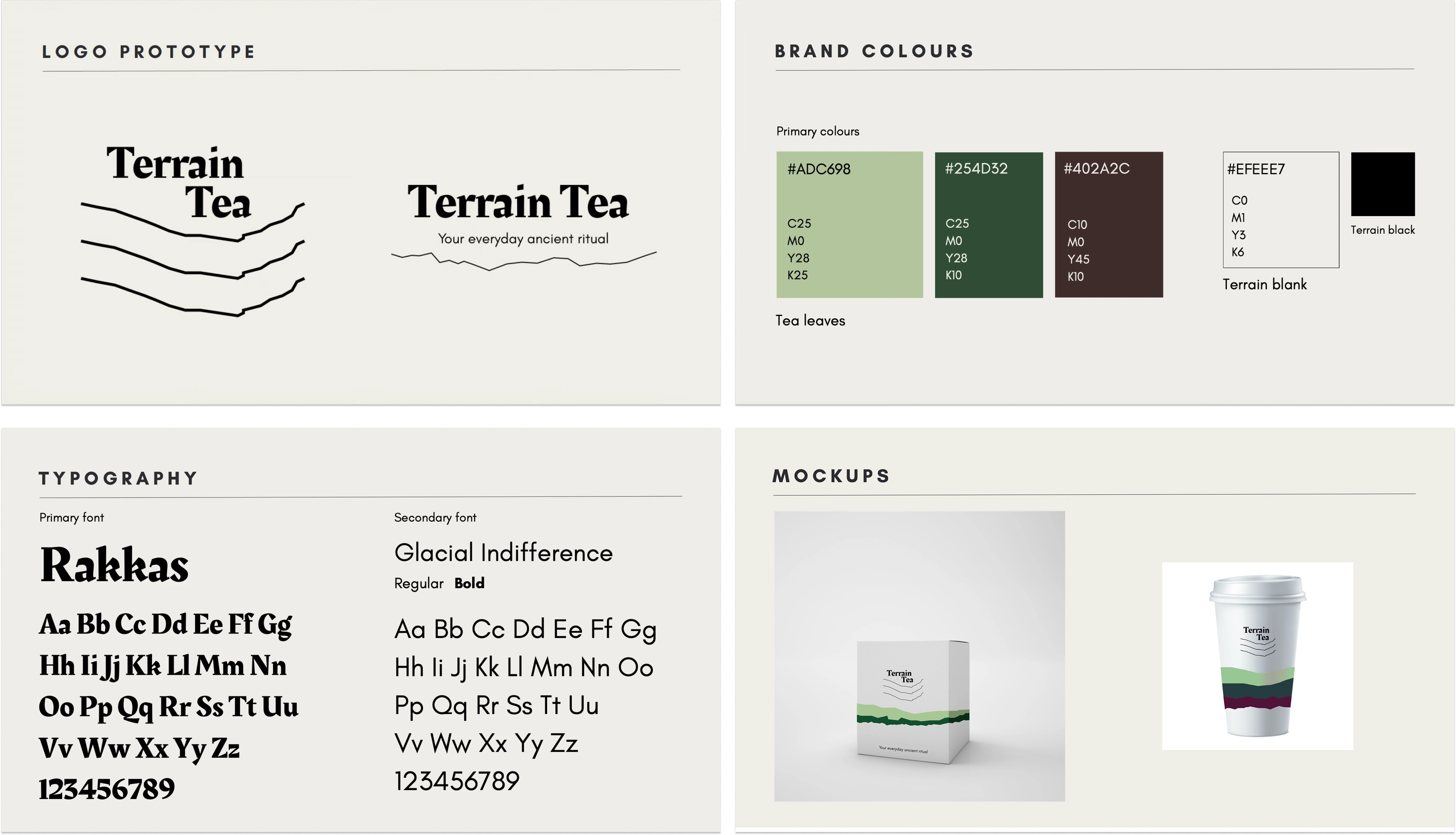
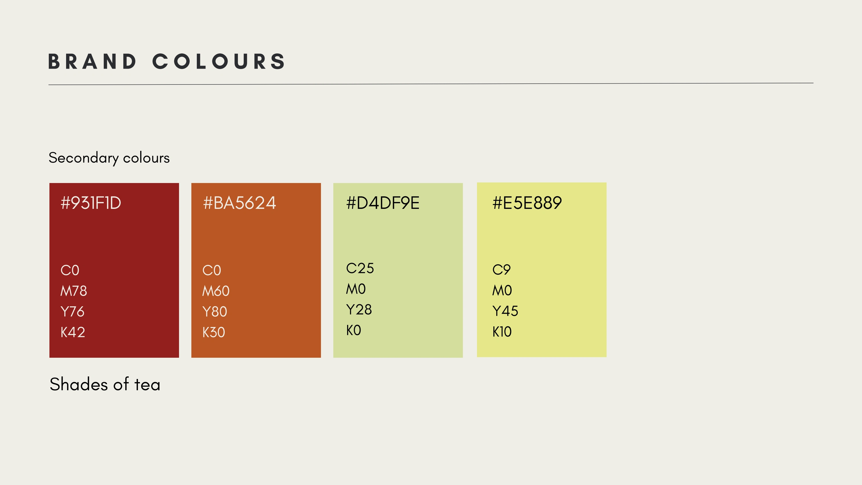
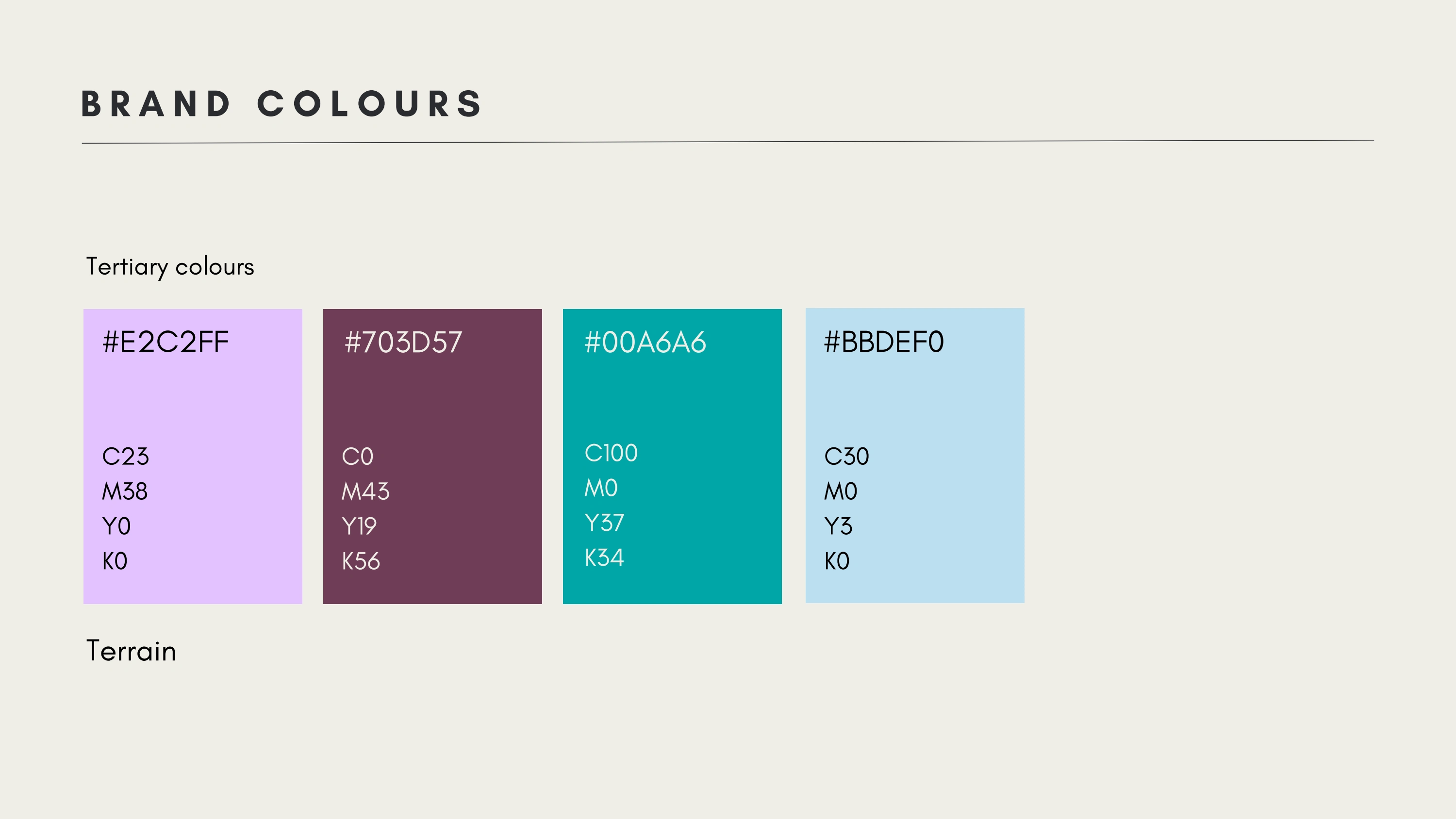
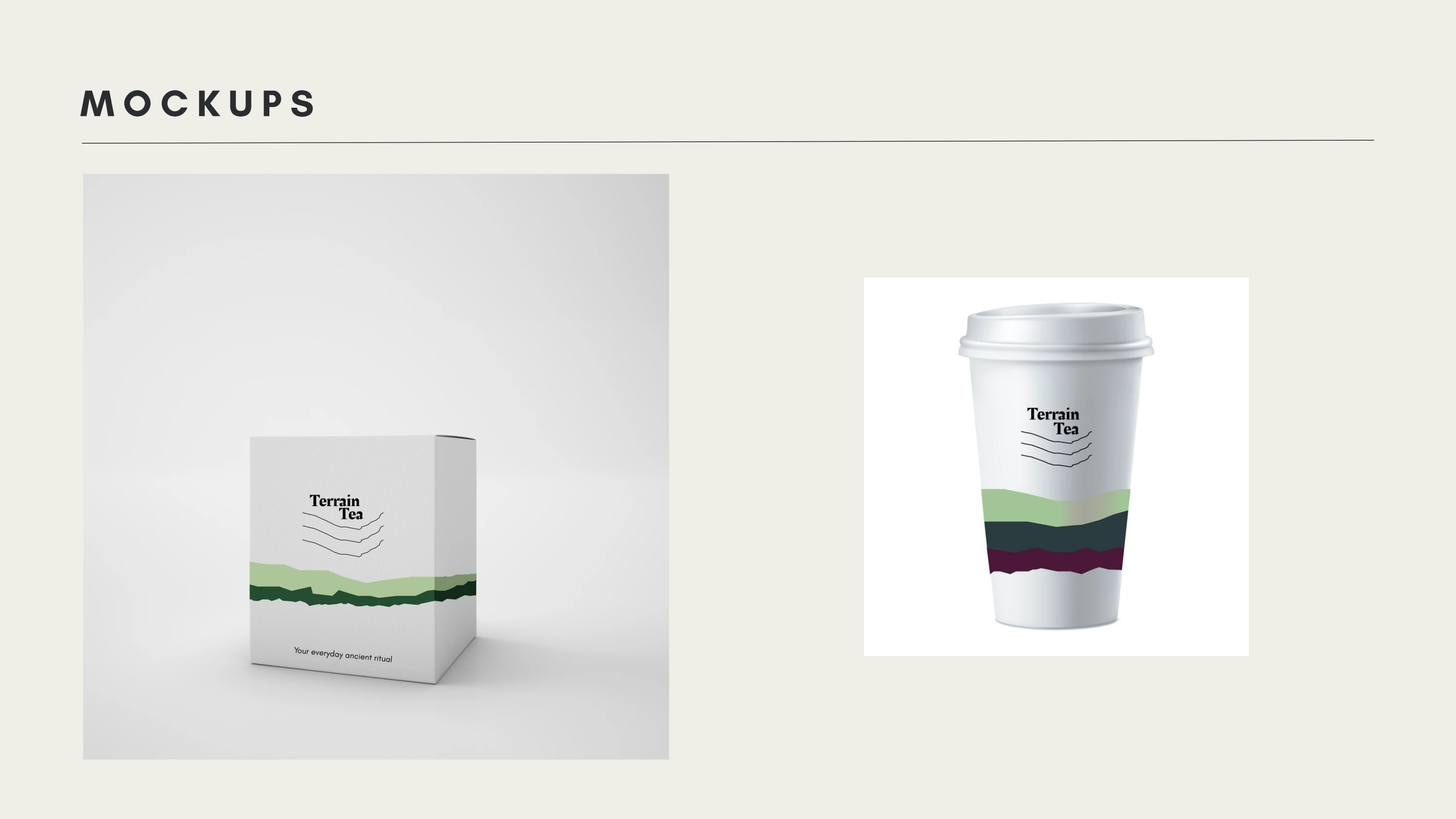
Terrain Tea
Taiwanese tea reimagined — loosely based on the iconic Taiwanese tea brand TenRen's Tea.
About:
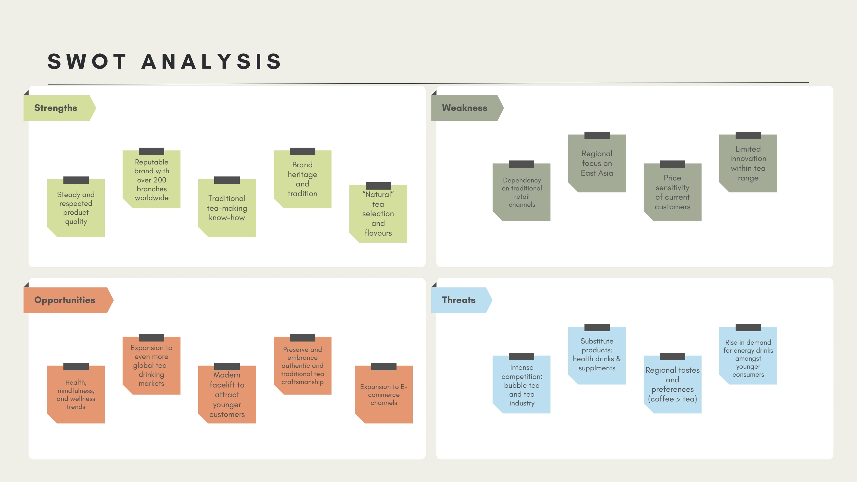
A complete rebranding of the Taiwanese tea brand TenRen’s Tea, from a strategic overview of the brand itself including a SWOT analysis, Brand Soul and Positioning workshop to colours, typography, and finally a logo prototype and mockup.
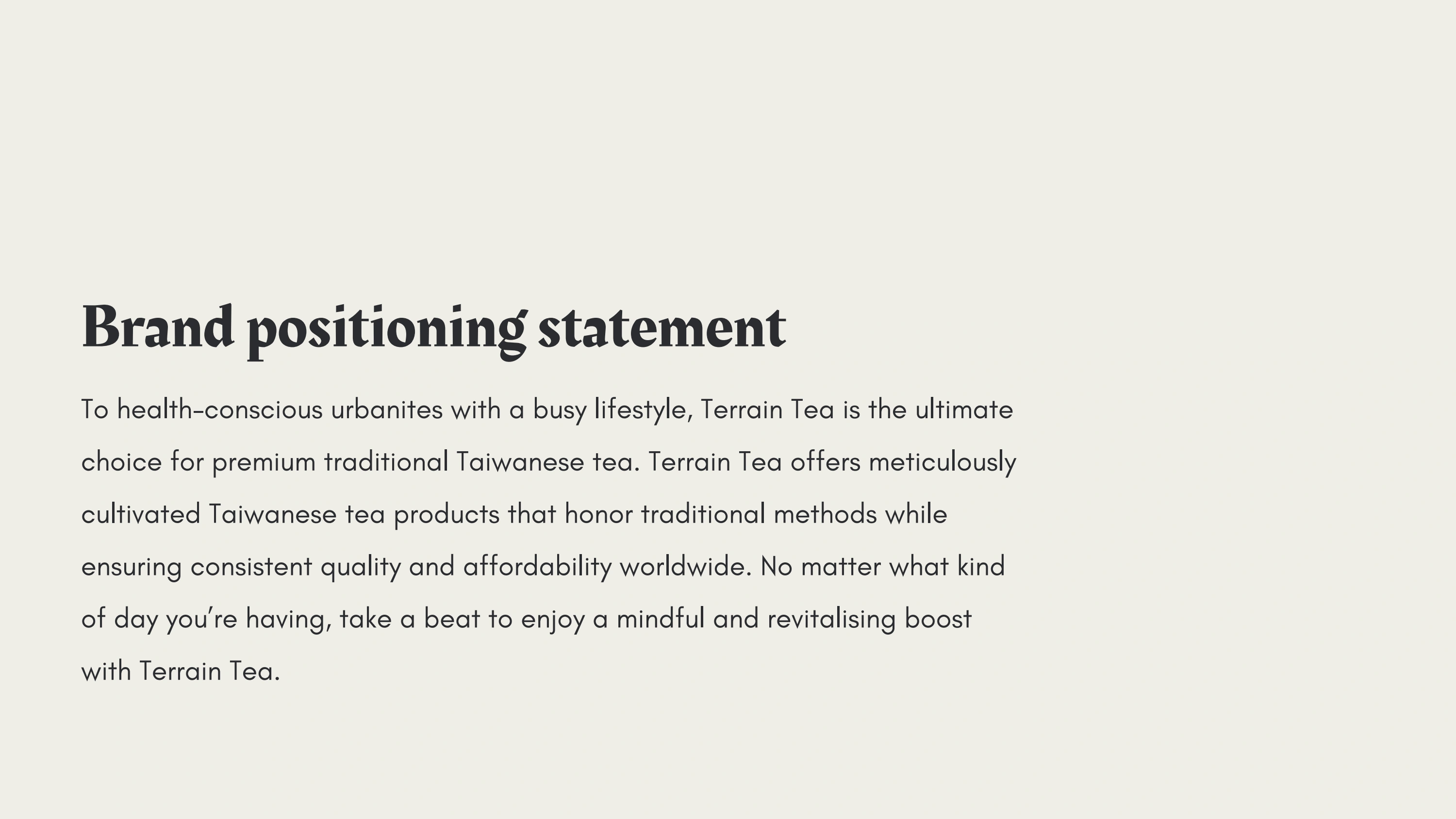
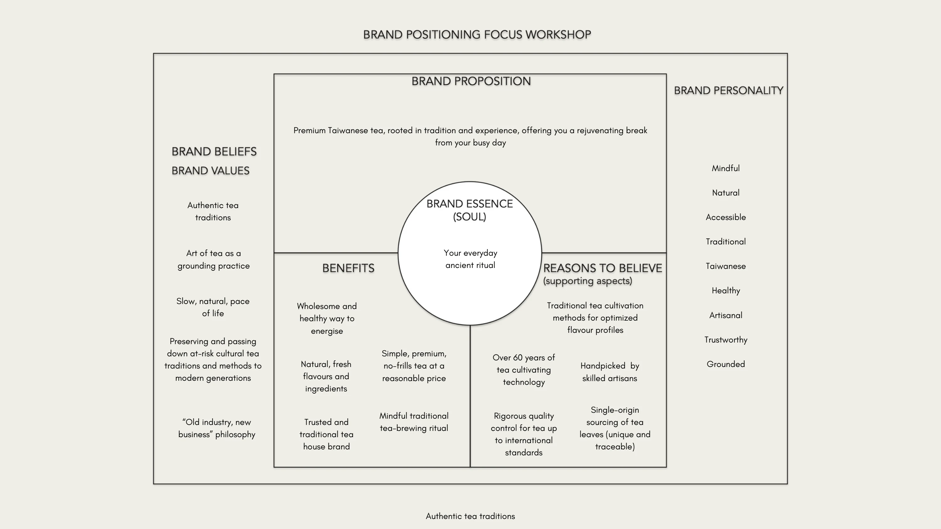
After a workshop to discover the different brand benefits, brand values, and traits for Terrain Tea’s brand personality, the brand proposition puts a focus on a traditional ritual as a retreat from the drinker’s busy day.
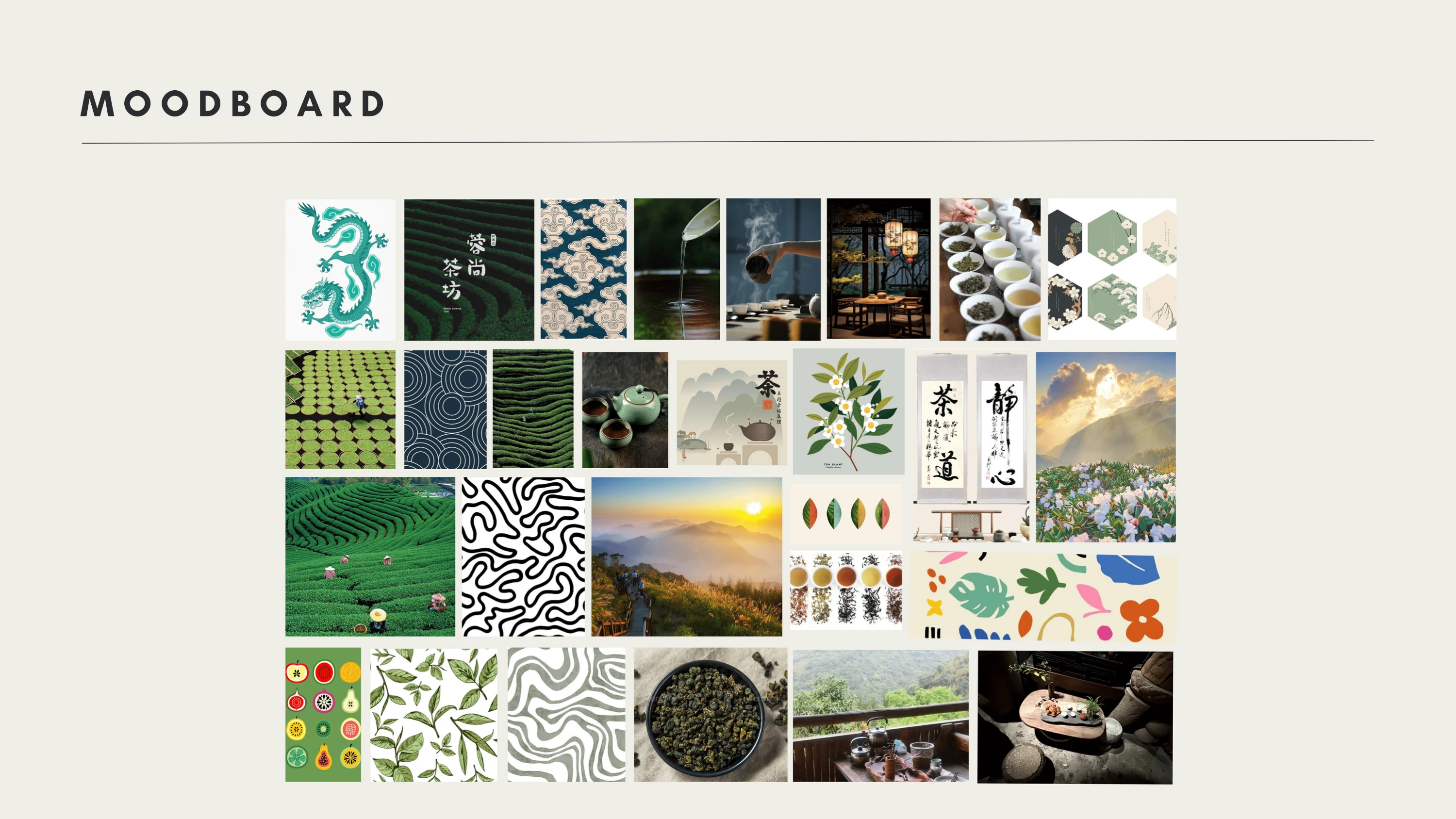
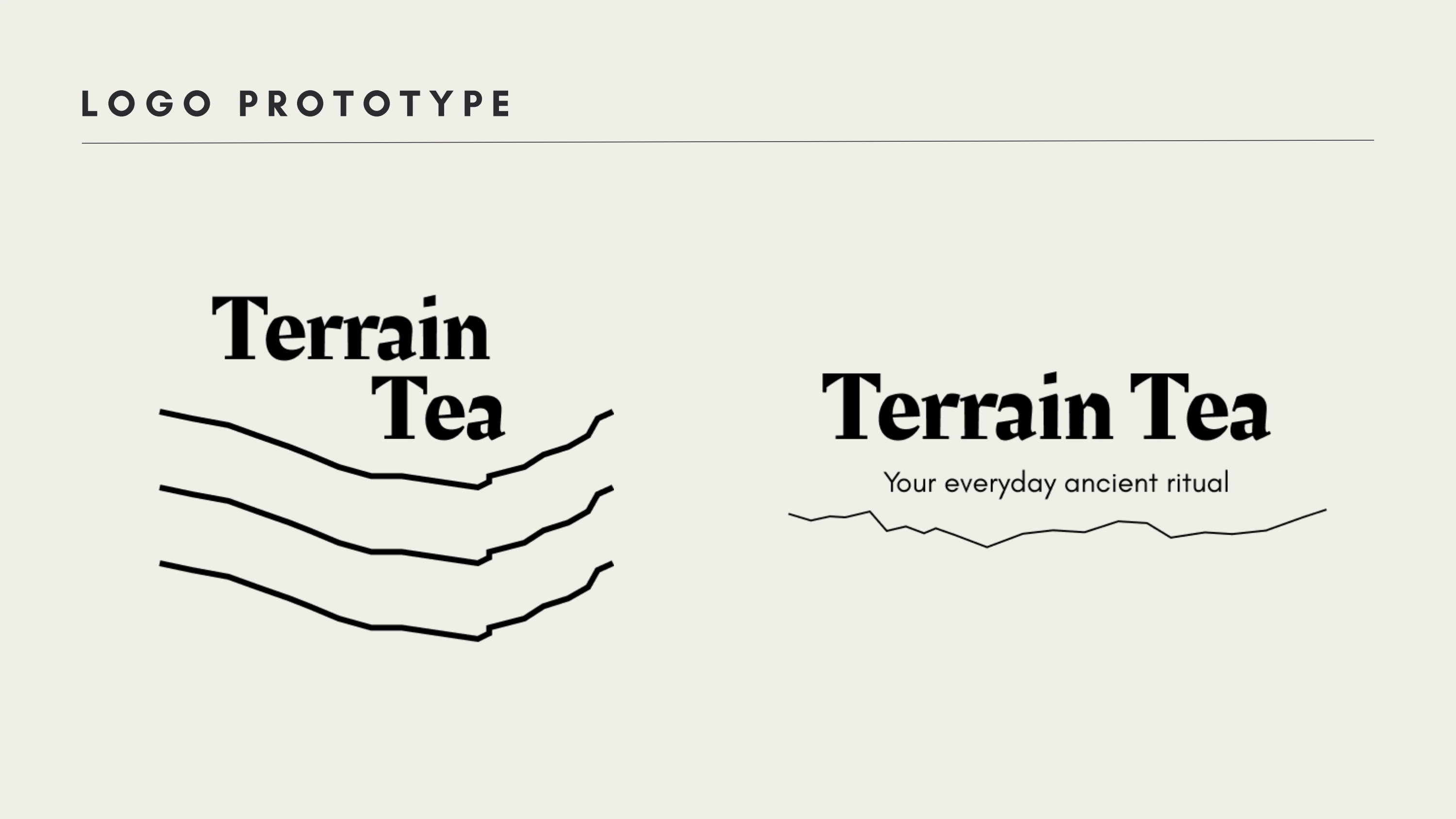
Repeating motifs to capture the squiggly and textured lines of the mountainous Taiwanese tea fields can be seen in shapes curled-up Oolong tea leaves, fresh tea-leaves laid out, the brightly coloured teal dragon, as well as the classically East-Asian rounded twirling clouds. Foggy smoke is not only found within the fog of the Taiwanese mountains but also from the piping-hot tea being poured at a traditional tea ceremony. Contemporary shapes are included to modernise the ultra-traditional branding from TenRen’s existing brand.
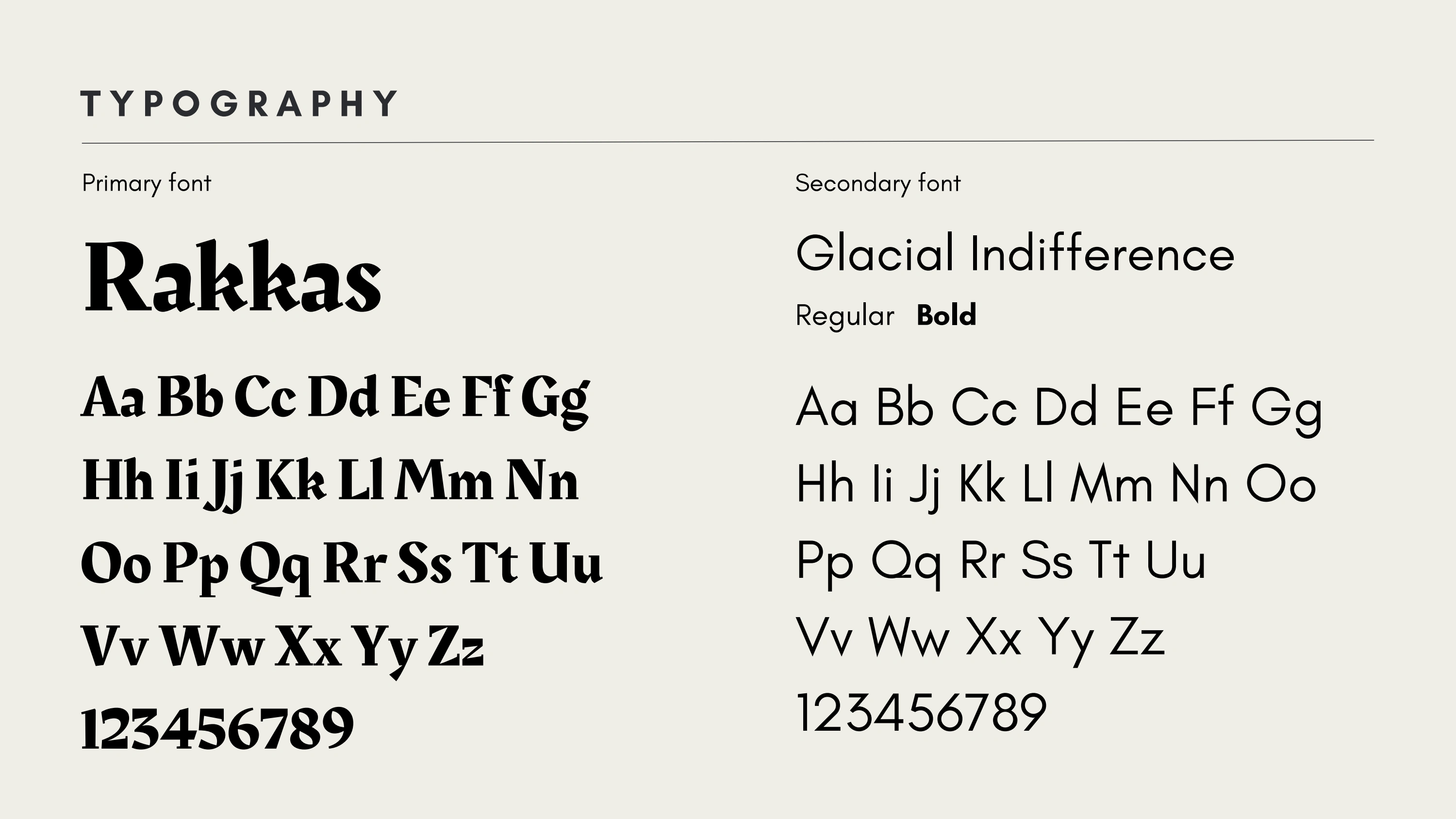
Primary fonts for Terrain Tea — Rakkas provides a modern twist on the almost calligraphic shapes in the type, harking back to the Chinese calligraphy that can be found in many traditional tea houses of Taiwan
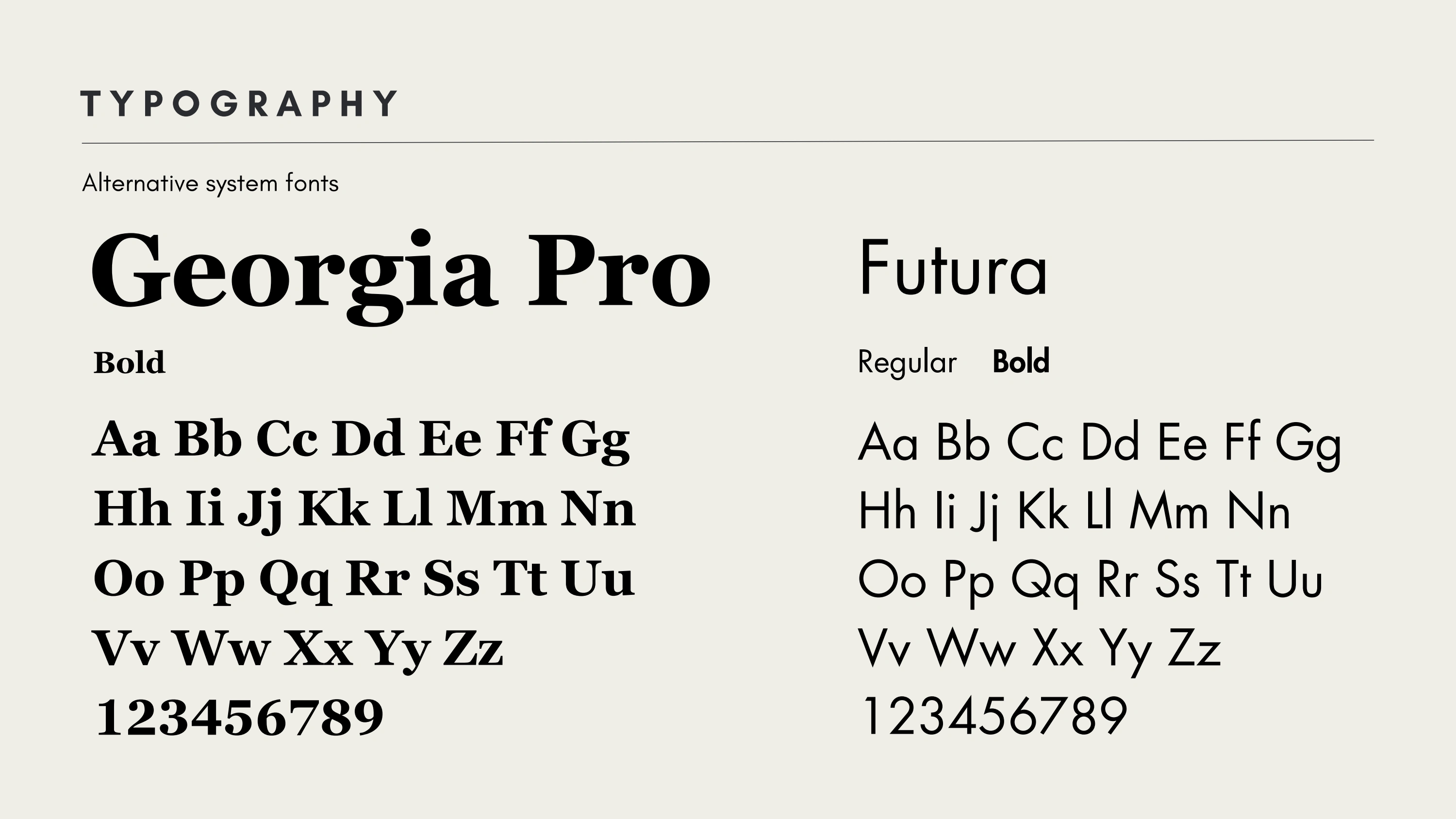
Alternative system fonts to be used in case primary fonts are unavailable
Like this project
Posted Apr 8, 2026
Rebranding project for Taiwanese tea icon TenRen's Tea with strategic and design elements.
Likes
0
Views
14

![[Ideation, Wireframe, Content, Copy] Homepage for CRM suite](https://media.contra.com/image/upload/c_fill,w_700/wzubmsvdg7zaq5tziq4z.avif)
![[Ideation, Wireframe, Content, Copy] AI page for CRM Suite](https://media.contra.com/image/upload/c_fill,w_700/tvctpv3gw1outgvpe9kh.avif)
![[Copy, Value Prop, Position] Product pages for CRM suite](https://media.contra.com/image/upload/c_fill,w_700/qxiiv0sczx1fnbuo8xrv.avif)