Product Design for Mic Meeting Insights App

Uga Shanth


Mic - Turning meeting audio into actionable performace insight
Mobile app · UX/UI design · 4-week MVP
Overview
Most meeting recording tools stop at transcription — you get a wall of text and have to do the analysis yourself. Mic goes further: record a meeting, and get back a structured report on who spoke, how much, what was discussed, and the emotional tone of the conversation — built to help people actually improve how they run meetings, not just remember them.
The problem
Meetings are one of the least measured parts of work life. People walk out with a vague sense of "that went well" or "that was chaotic" but no actual data to act on. Existing transcription apps solve for record and recall — Mic needed to solve for record and improve.
Approach
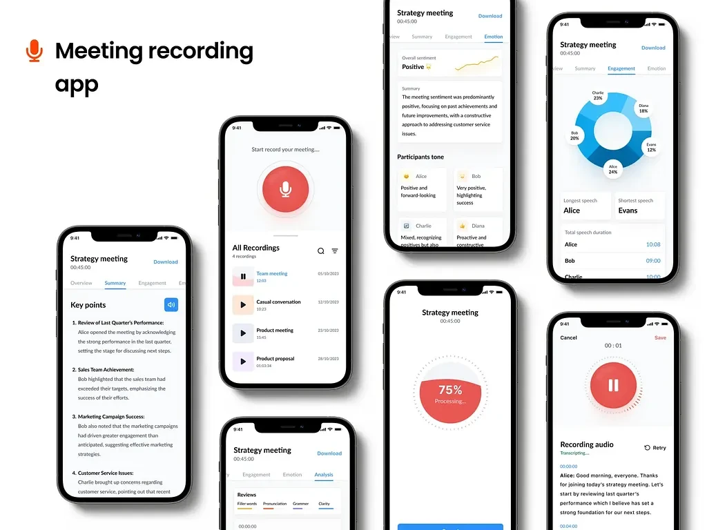
The core design challenge was information density: a single meeting generates a lot of data (transcript, speaker breakdown, duration, emotional tone), and dumping all of it on one screen would defeat the purpose. I structured the report around progressive disclosure — an Overview tab gives the fastest possible read (who talked most, overall tone), and Summary/Engagement tabs let the user drill into specifics only if they want to.
For the analytics view, speech-time distribution needed to answer one question instantly: is this meeting balanced, or is one person dominating? A donut chart with each speaker's percentage does that faster than a bar chart or raw numbers would.
Status
Mic is currently an unreleased MVP — validated through design and prototyping, not yet in user hands.

Like this project
Posted Jul 5, 2026
Design an MVP for Mic in just 4 weeks, turning meeting audio into actionable insights.
Likes
1
Views
11