AFC Richmond Reimagining
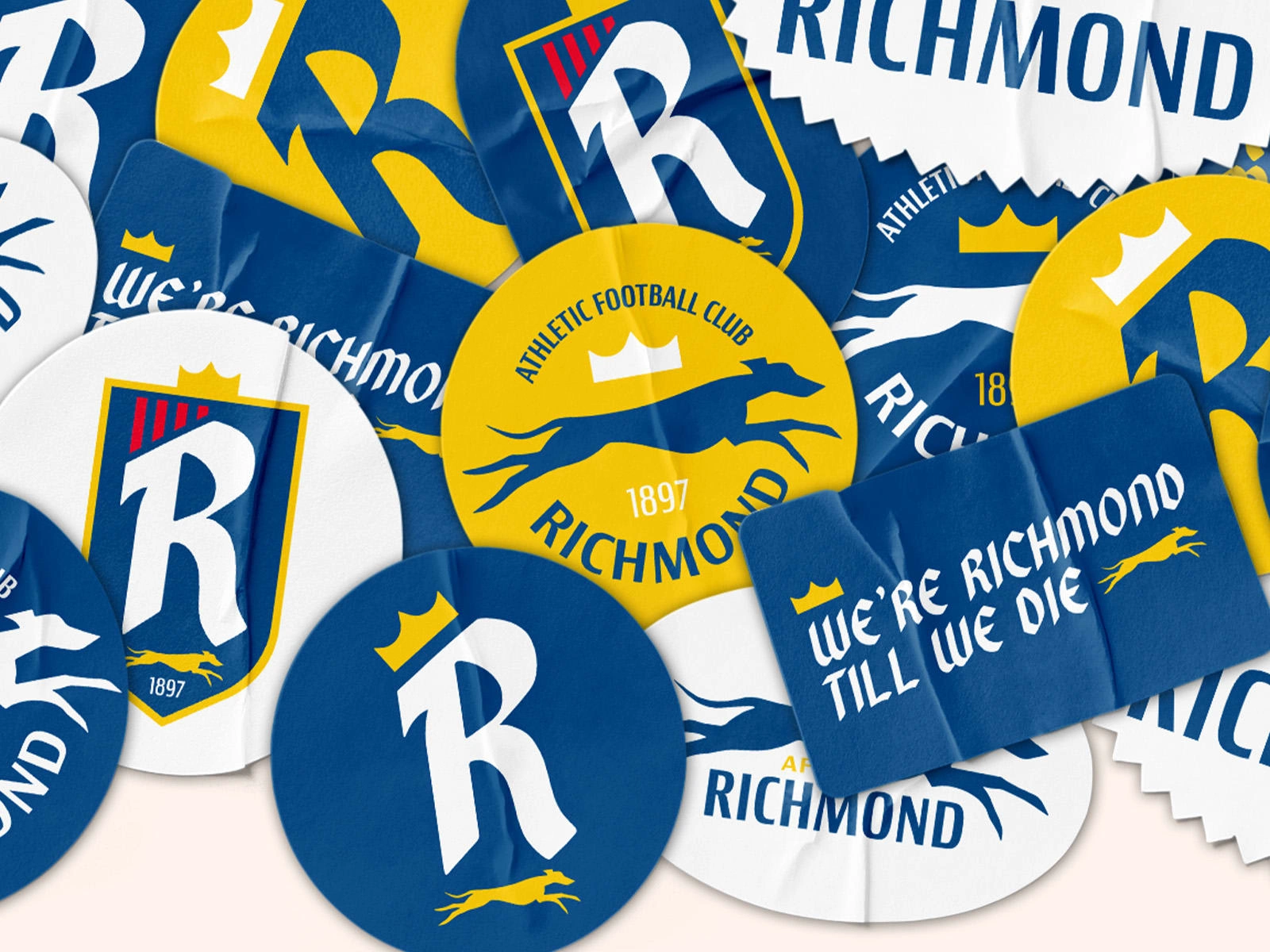
I am Ted Lasso’s biggest fan. I love the show and owe my football (soccer) fandom to the show. When I first turned on the show, I didn’t know what to expect just based on NBC Sports commercials. All I knew is, I loved Jason Sudeikis and I figured why not give it a shot. Now it’s my favorite show of all time, and it sparked an interest in Premier League football (“Football is life!”), where I have become a huge fan.
Because of this, I threw my love into rebranding AFC Richmond and mocking up everything from home and away kits to a special edition Roy Kent poster.
The Logo
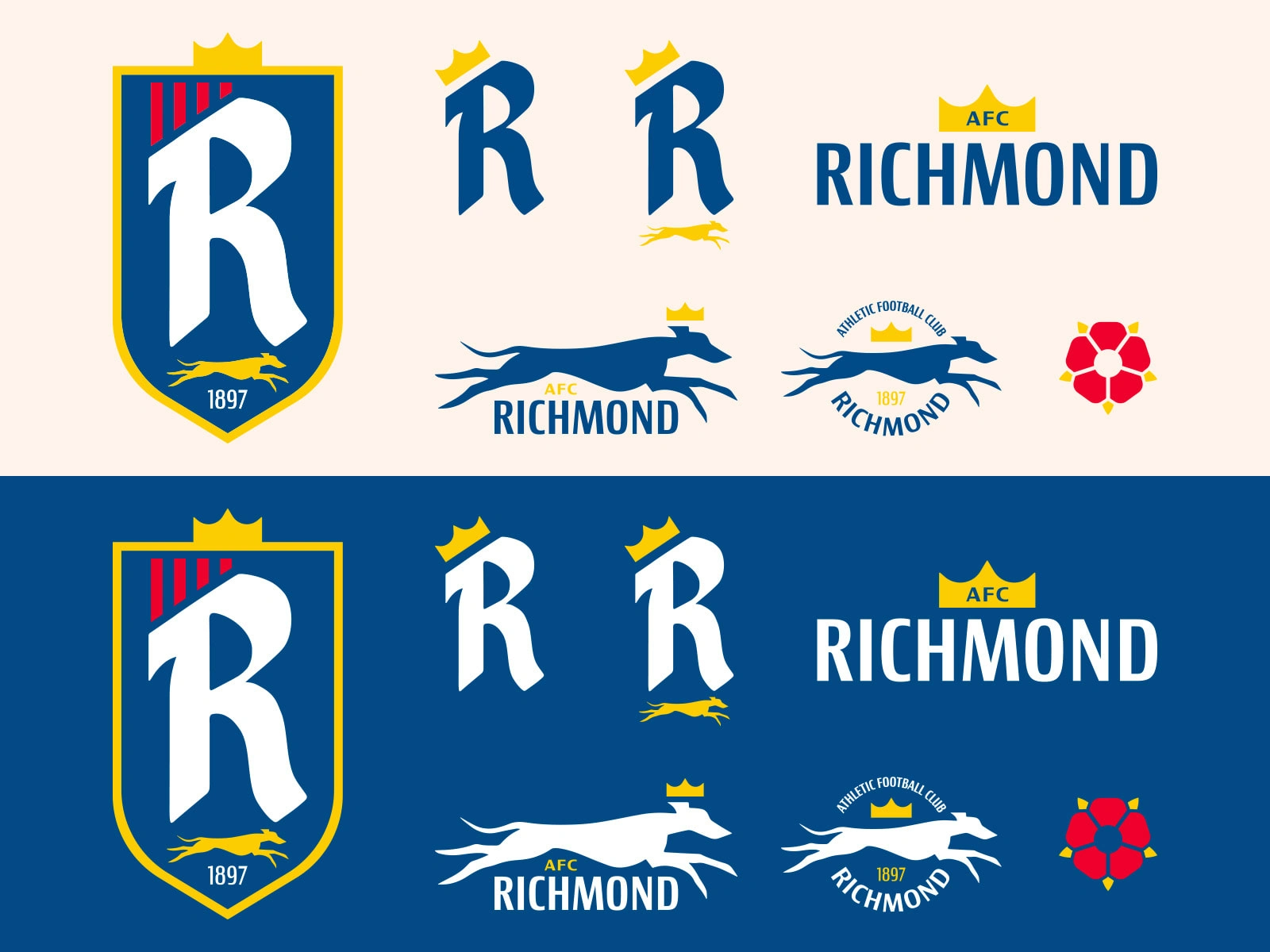
My process began with a logo. Luckily I was already halfway there with the show providing the city, nickname and color scheme for me. So off I went researching. The town of Richmond is south west of London and sits upon the River Thames. It was founded in the 16th century when King Henry VII built Richmond Palace, of which the town got its name. Elizabeth I also spent her final days at Richmond Palace.
So knowing the history, I wanted to use the royal roots of the town as a centerpiece for the team’s brand, while also making a more contemporary shield and supporting logos. The main element of the brand is the Richmond R. Rather than focus on the Greyhounds, I wanted the team to focus on its roots as ‘West London’s Finest.’ A gold crown is incorporated in every iteration of the logo, as well as a running greyhound. The final icon, a rose, signifies the town’s ties back to royalty and is also prominent on the town’s coat of arms.
The Kit
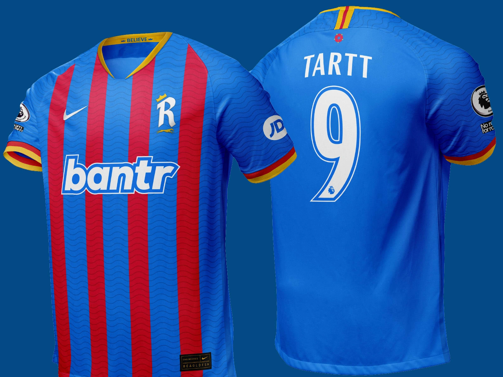
A classic kit is the bedrock of a successful football club and I tried to capture that with a home and away version.
The home kit is a blue base with four red vertical stripes (which I carry throughout the branding and exists on the primary shield), with a wave texture to symbolize the town’s location on the River Thames. On the inside collar, the word ‘Believe’ is featured with two crowns on either side, while on the back, the rose sits just below the neck. Keeley’s company Bantr sits as the kit sponsor and splashes of gold are seen on the neck and sleeves, while Jamie Tartt’s No. 9 features on the back.
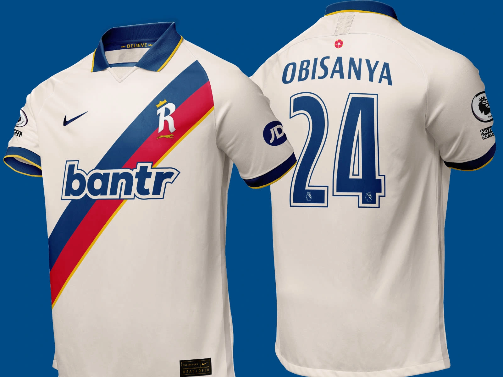
The away kit is off-white and collared (not ashamed to admit the 2021-22 Liverpool away kits were a major inspiration), with a three color sash across the front. Sashes are frequently worn by the royal family. The same small details carry over onto the away kit, as well as Bantr as the sponsor. This time we have Sam Obisanya’s No. 24 on the back. On both, JD Sports is a sleeve sponsor, while the English Premier League logo sits on the other sleeve.
Brand Touchpoints
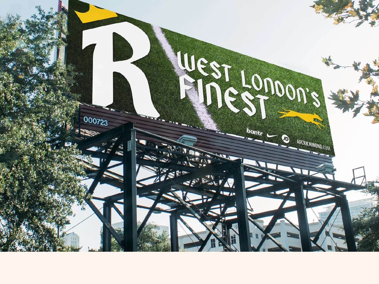
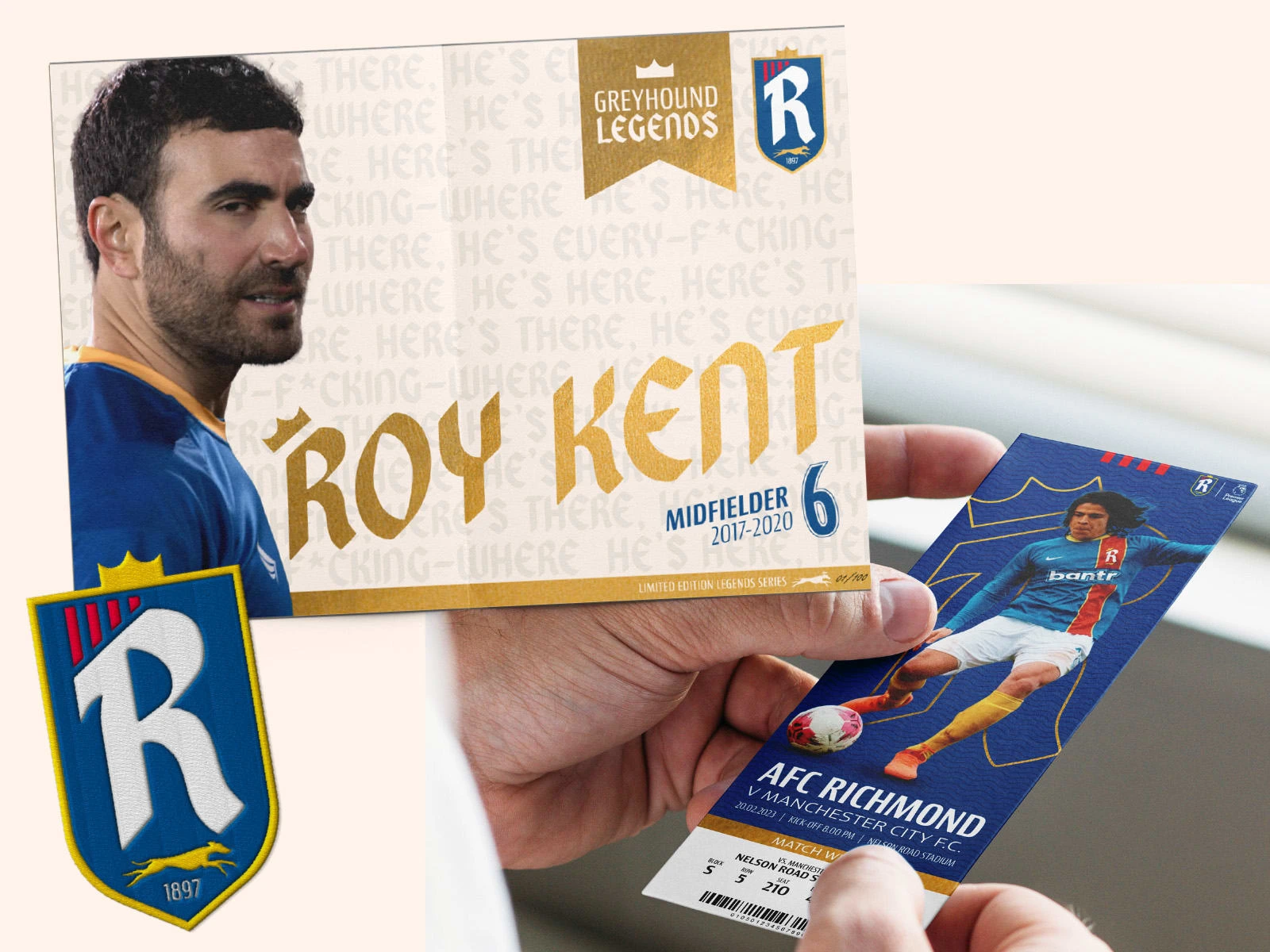
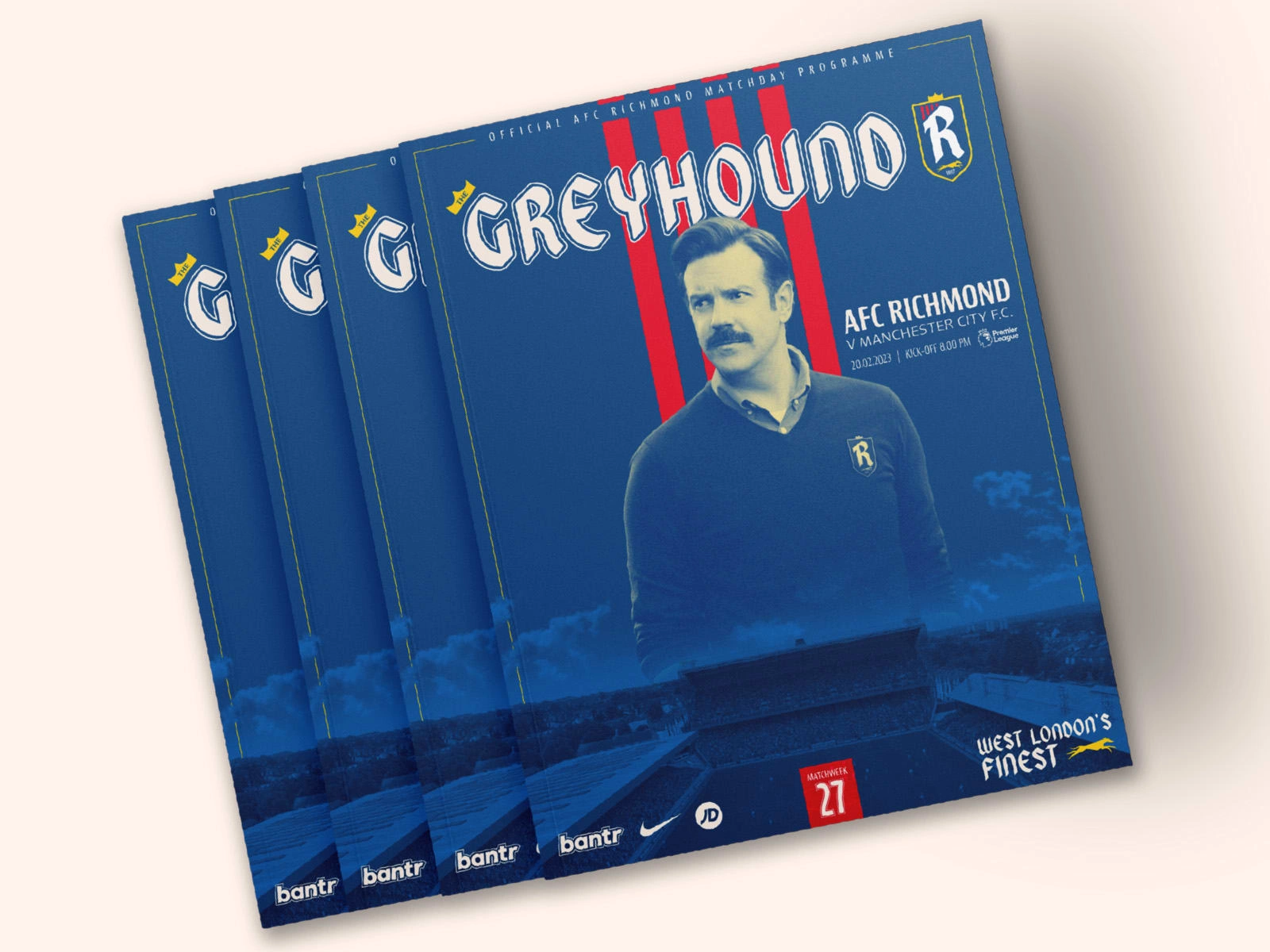
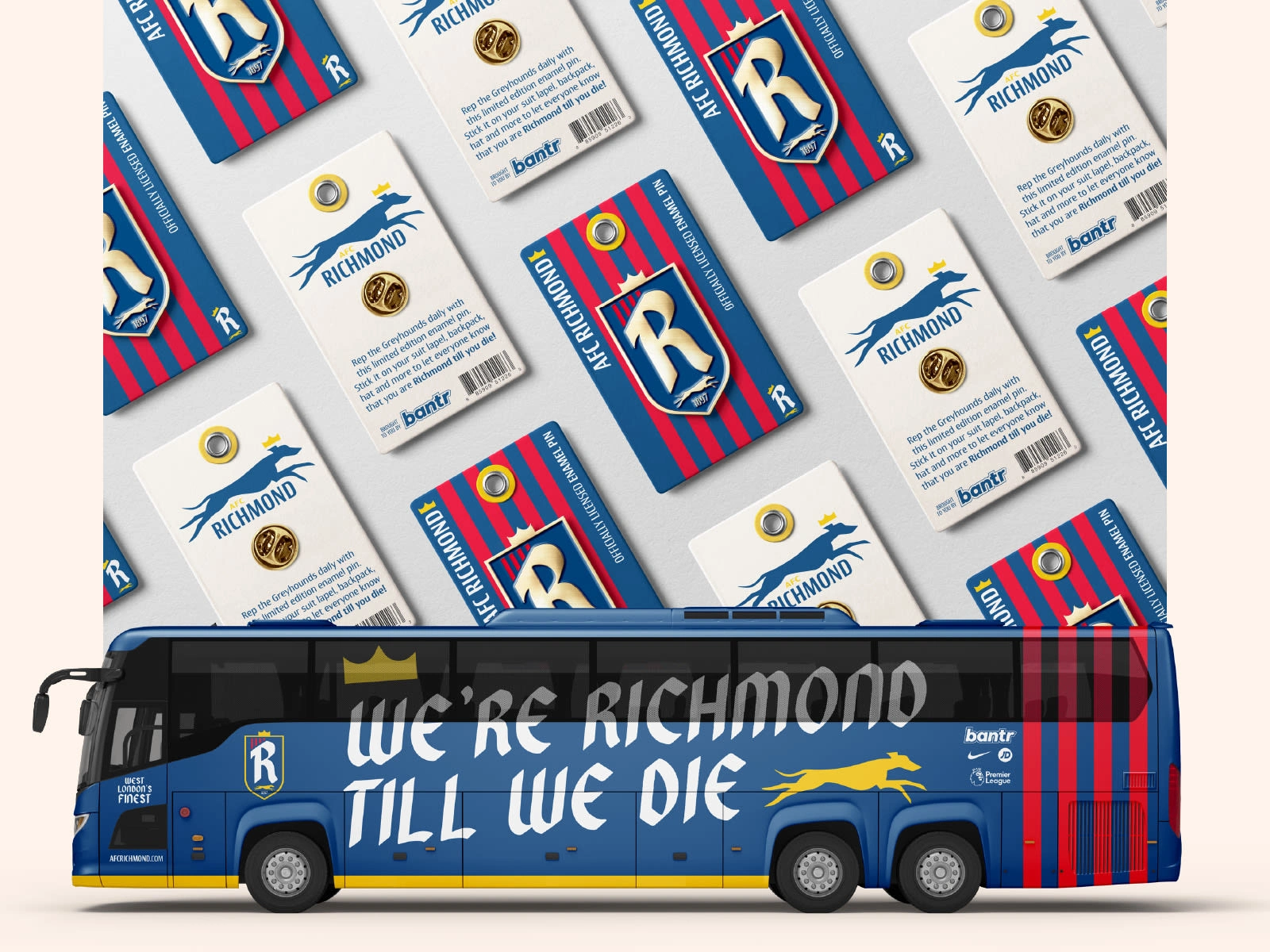
From there, I wanted to create and mockup a bunch of brand touchpoints. Below you’ll find a game ticket featuring Dani Rojas, a billboard, the team bus, a matchday program, an AFC Richmond Legends poster featuring Roy Kent and enamel pins. It was a lot of work for a personal project, but it was so fun paying homage to my favorite show and doing my best to honor and improve upon the AFC Richmond brand.
Like this project
Posted Mar 31, 2023
A complete reimagining and rebranding of AFC Richmond, a fictional English football team from the Apple TV show, Ted Lasso.


