Rethink - Small research and case study

Arpita Araballi

Rethink — A News App Redesign Backed by Real User Research
Made by Human for Human
Every major news app today runs on the same broken bargain: heavy curation, heavy ads, and zero visibility into either. I wanted to find out if that bargain was actually necessary — or just lazy.
The research
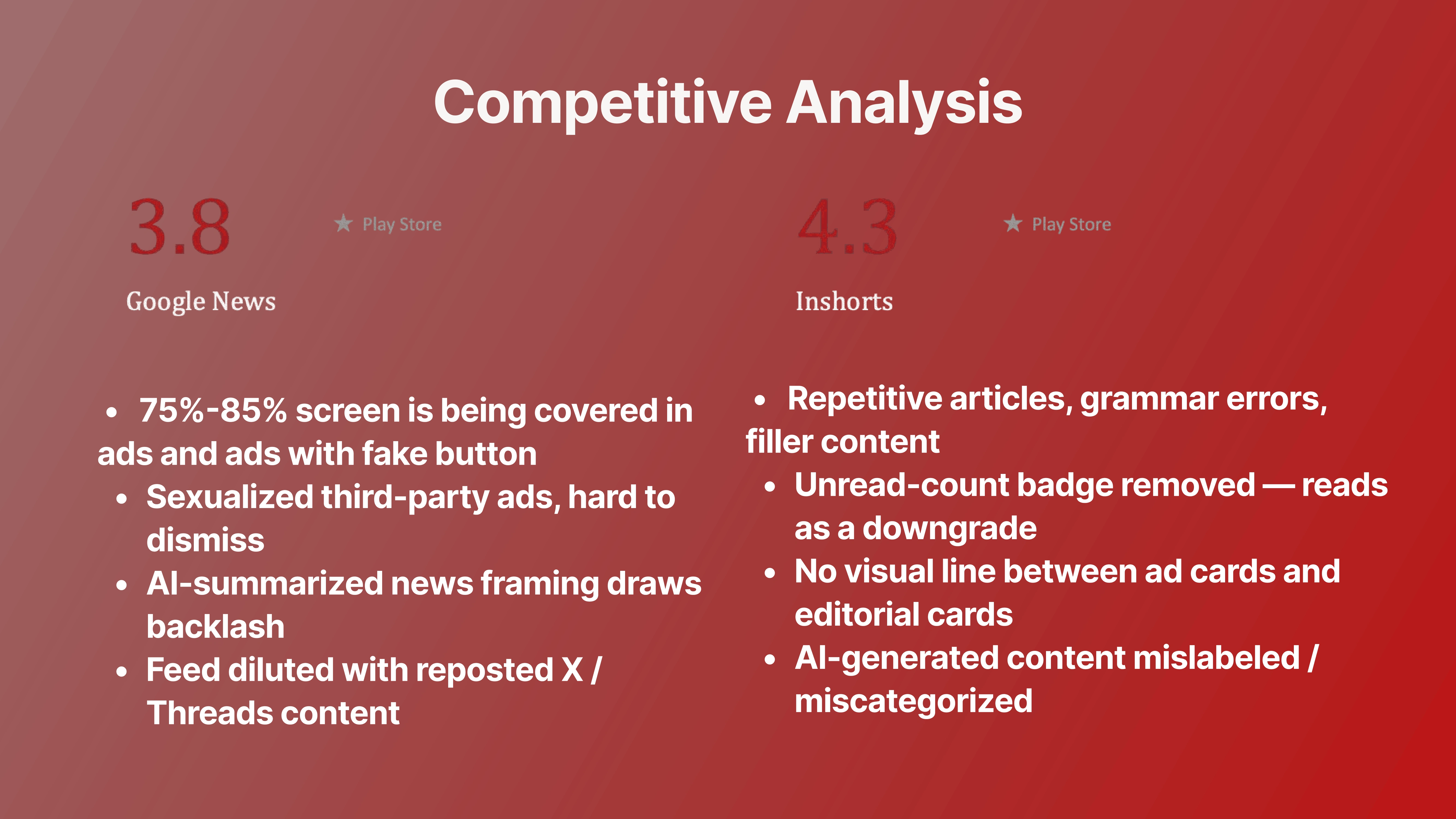
I ran a competitive teardown of Inshorts (4.3★) and Google News (3.8★) against their own Play Store reviews, then backed it with direct user interviews. The pattern was loud and consistent:
75–85% of screen real estate on some apps is ad space — including deceptive "fake button" units and hard-to-dismiss third-party ads
AI-generated summaries were called out repeatedly for repackaging the same handful of stories, sometimes mislabeled or miscategorized
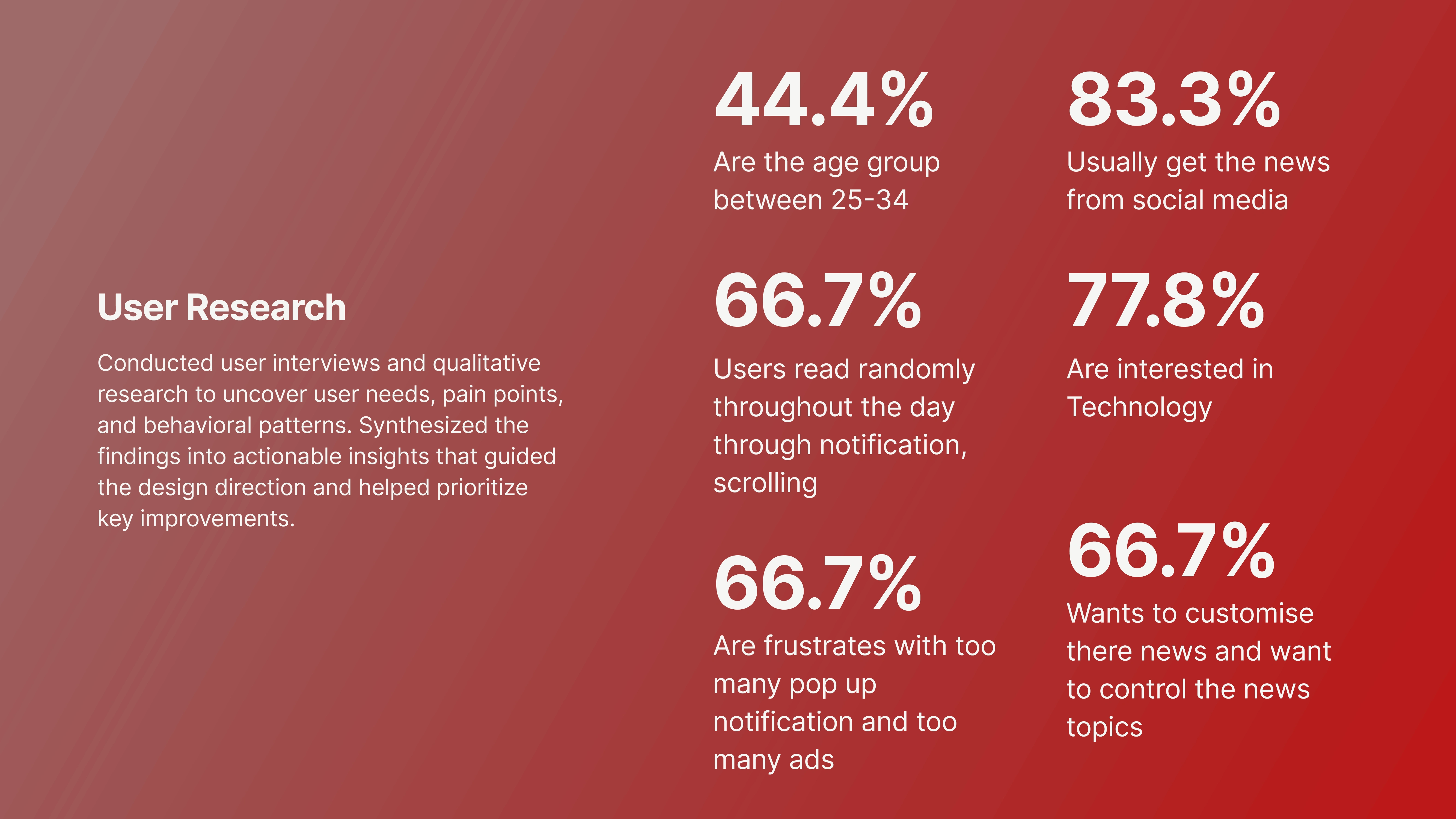
66.7% of users said they want to customize their news and control the topics they see, but had no way to
83.3% still default to social media for news because the apps themselves feel un-personalizable
The insight
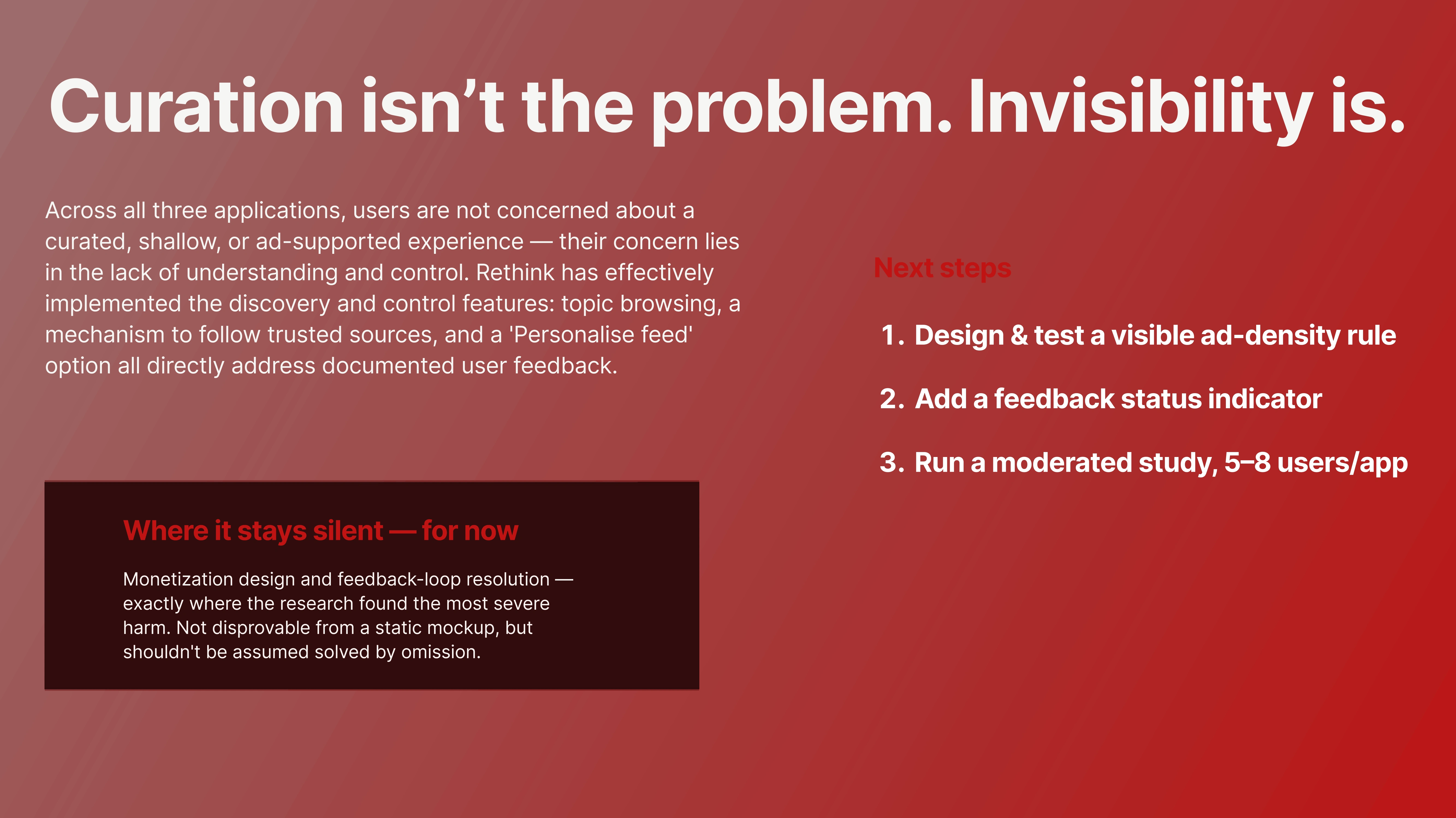
People don't actually mind curation, automation, or even ads. They mind not understanding why they're seeing what they're seeing, and having no way to fix it. Curation isn't the problem. Invisibility is.
The solution
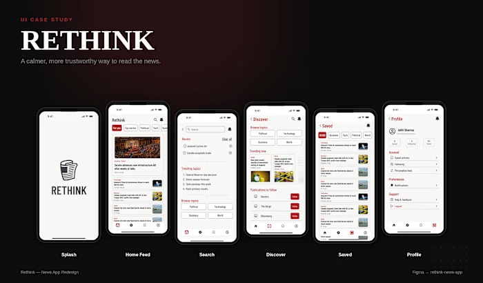
Rethink is built around giving that control back, visibly:
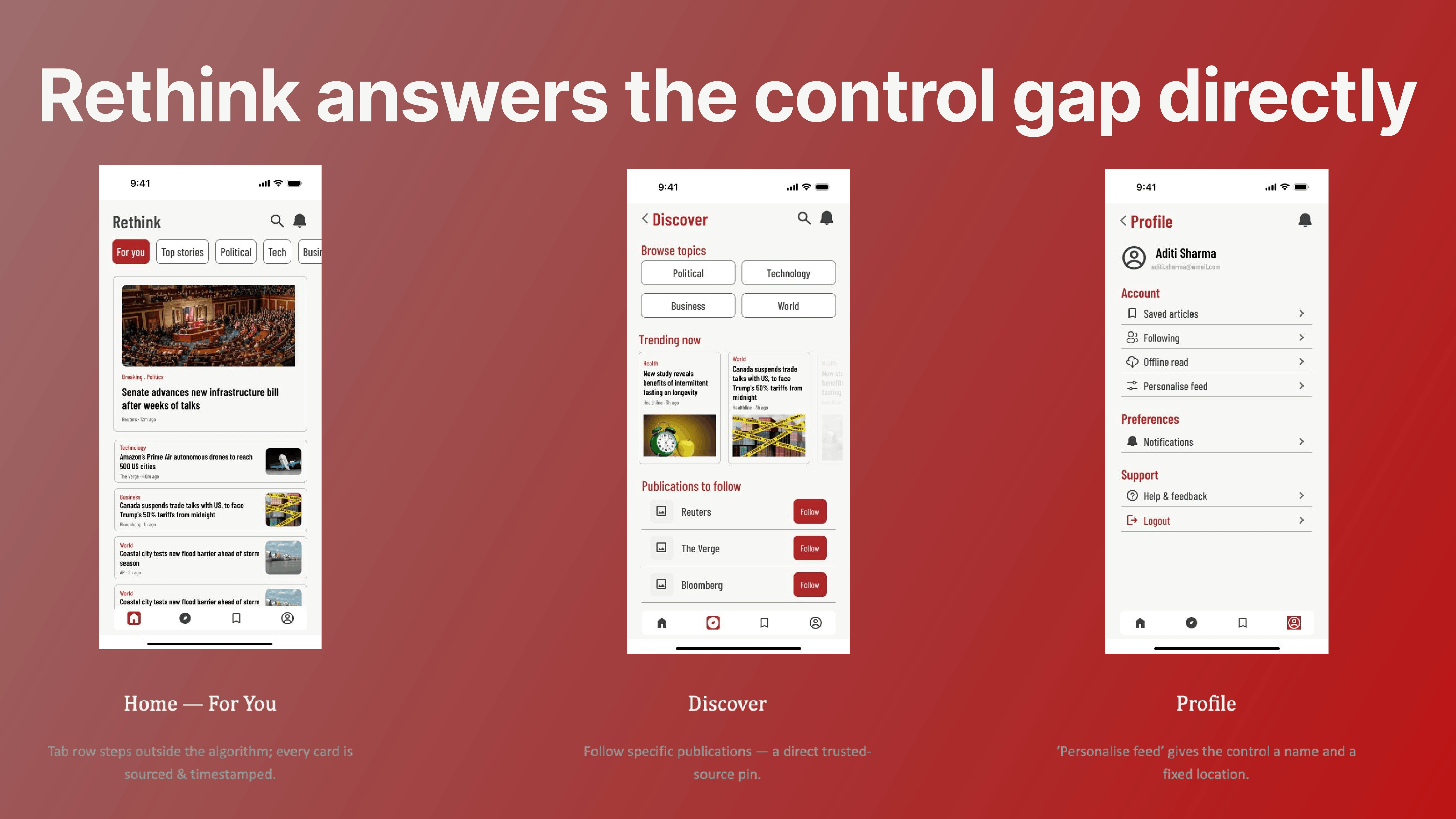
Discover → follow specific publications directly, instead of trusting an opaque "recommended for you" feed
Home → every card is sourced and timestamped, so it's clear what's editorial vs. trending vs. personalized
Profile → a named, standalone "Personalise feed" setting — not a buried toggle
What's next
This is a research-backed direction, not a finished product — a visible ad-density rule and a real feedback-status indicator are the next two things to design and test, followed by a moderated usability study (5–8 users per app) to validate it against real behavior.
Like this project
Posted Sep 24, 2026