Kona Padel Club Branding
Invisual Studio
Credits:
Art Direction - Jo
Graphic Designer - Yasir
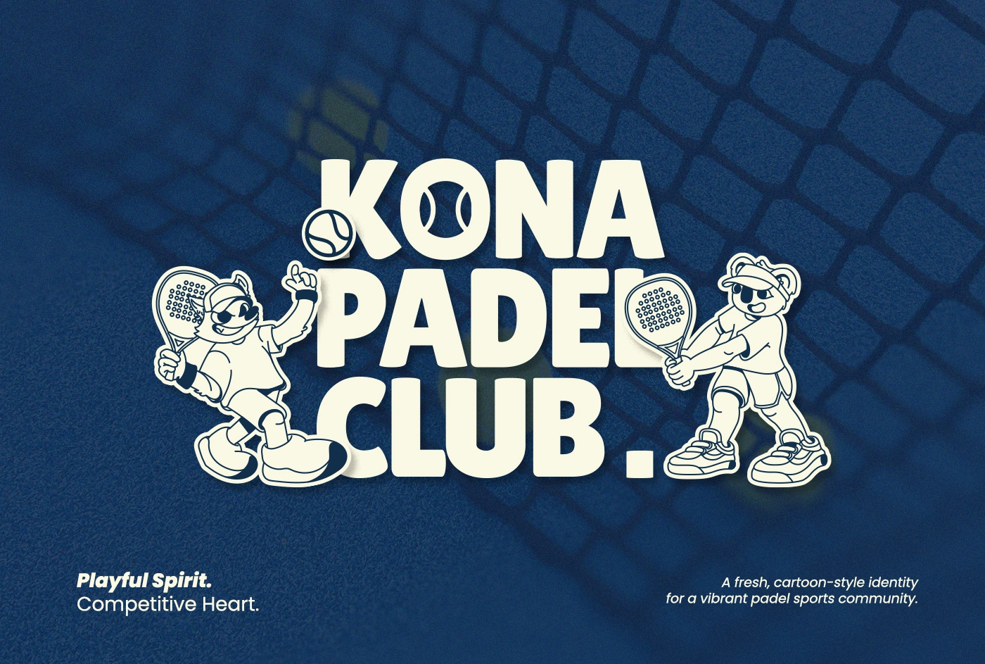
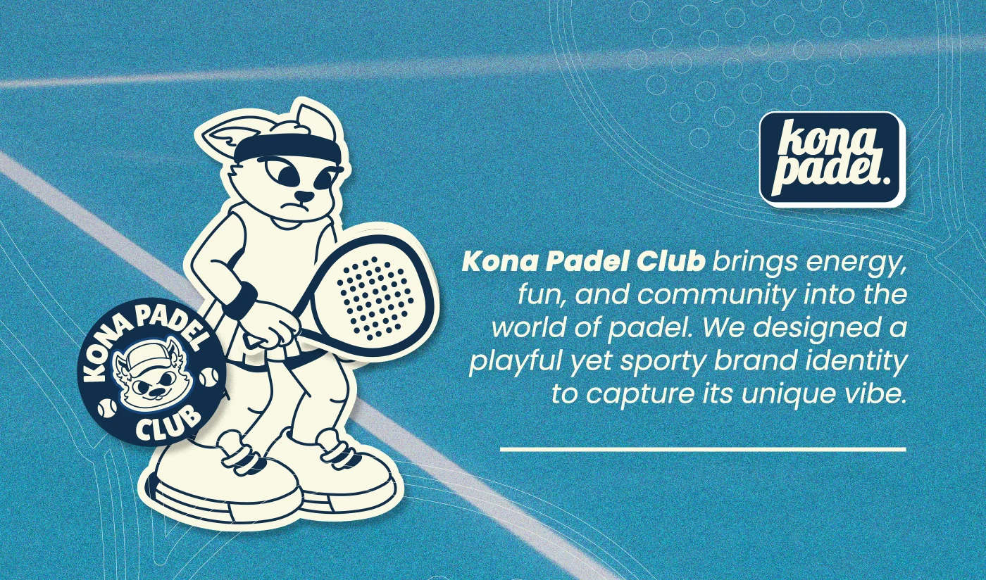
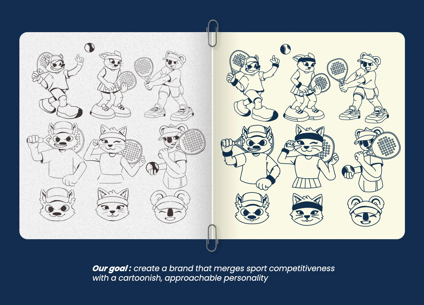
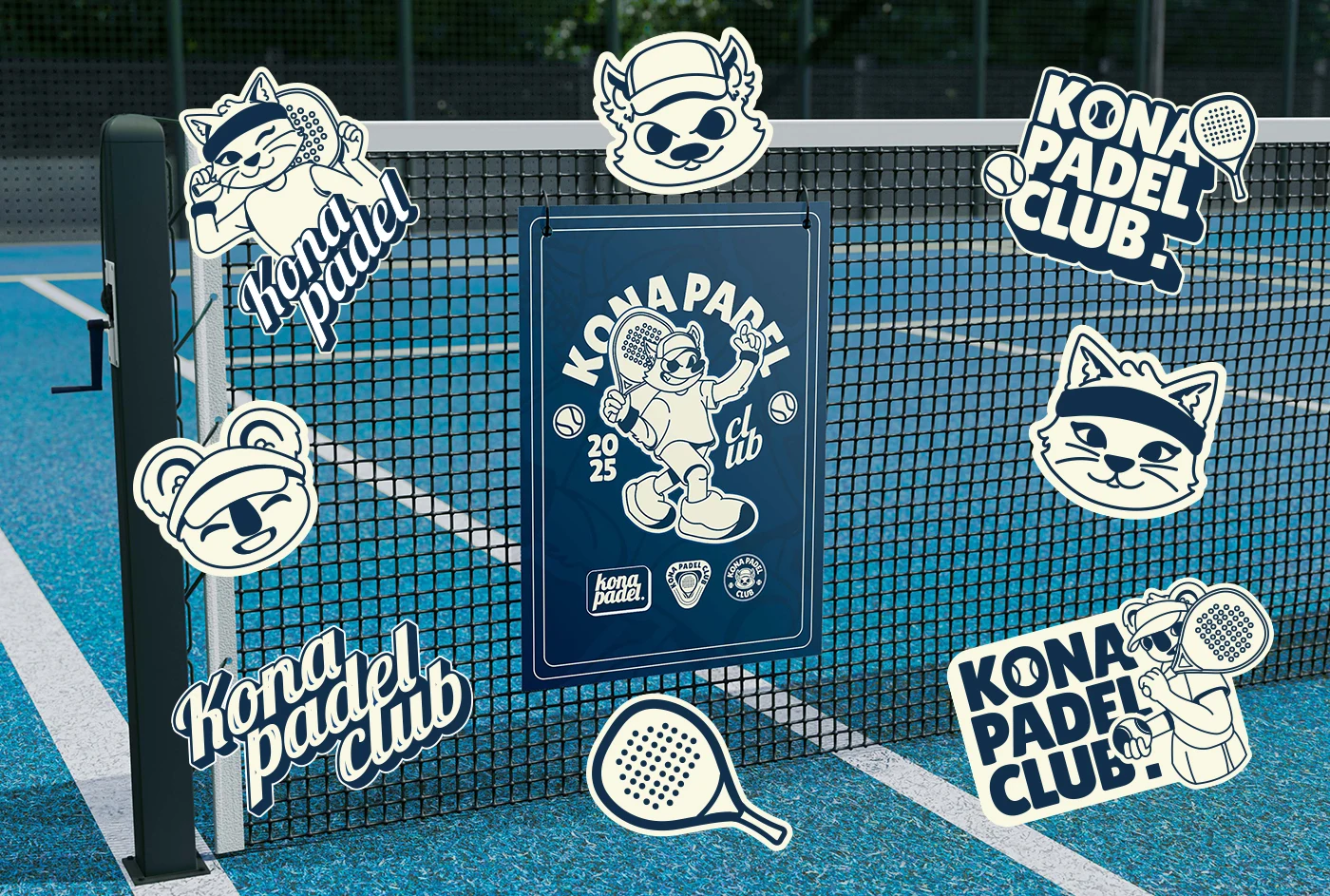
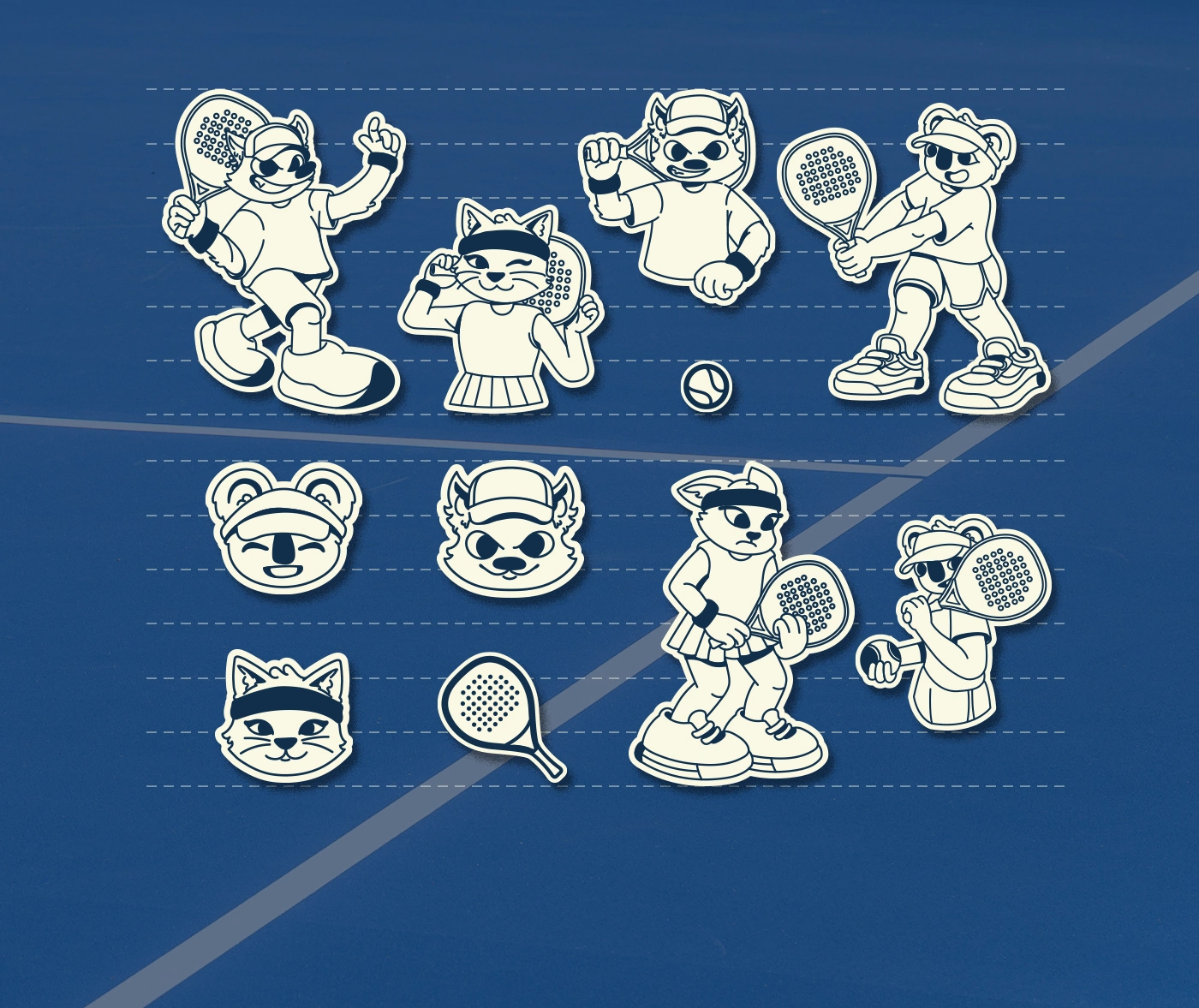
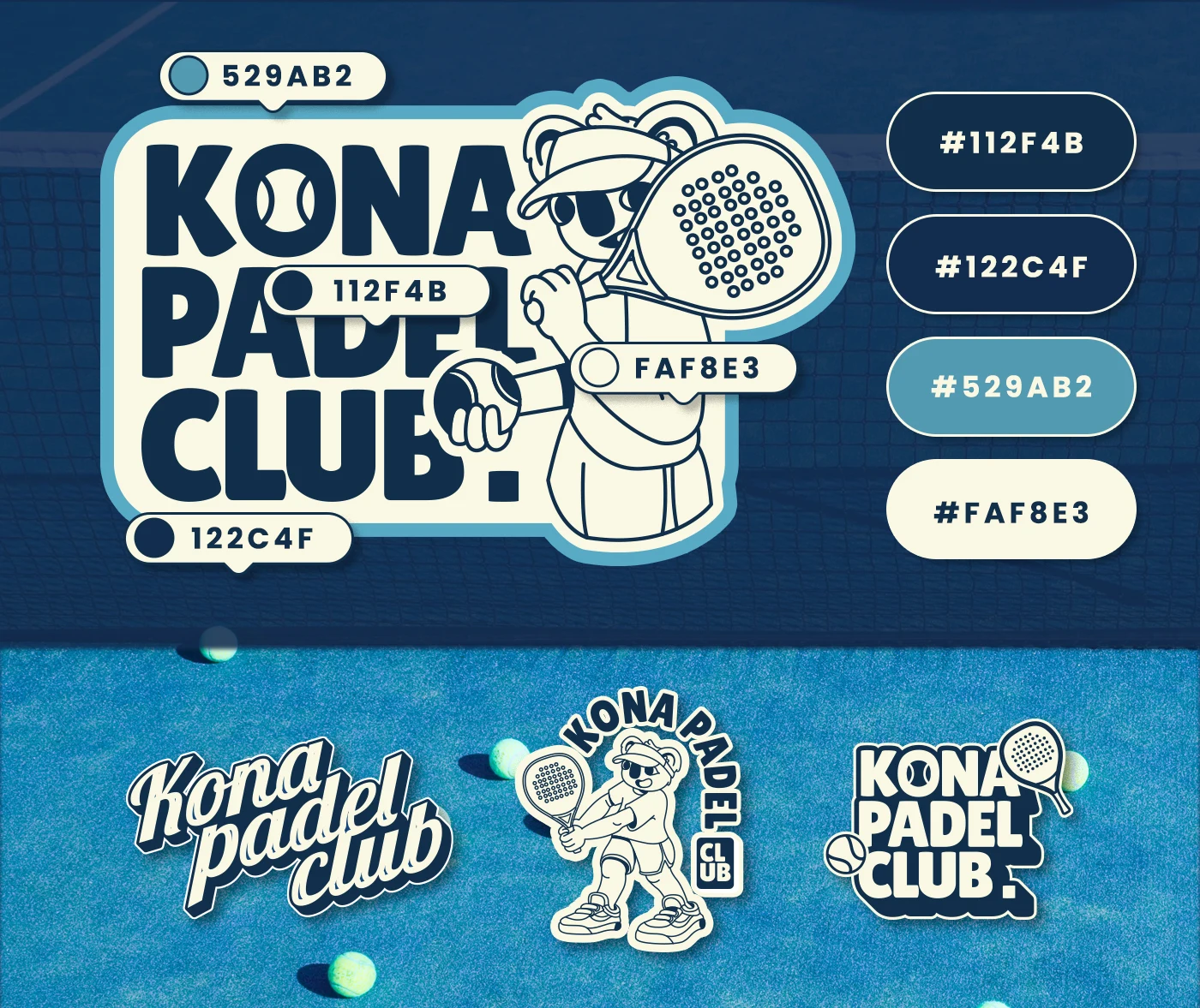
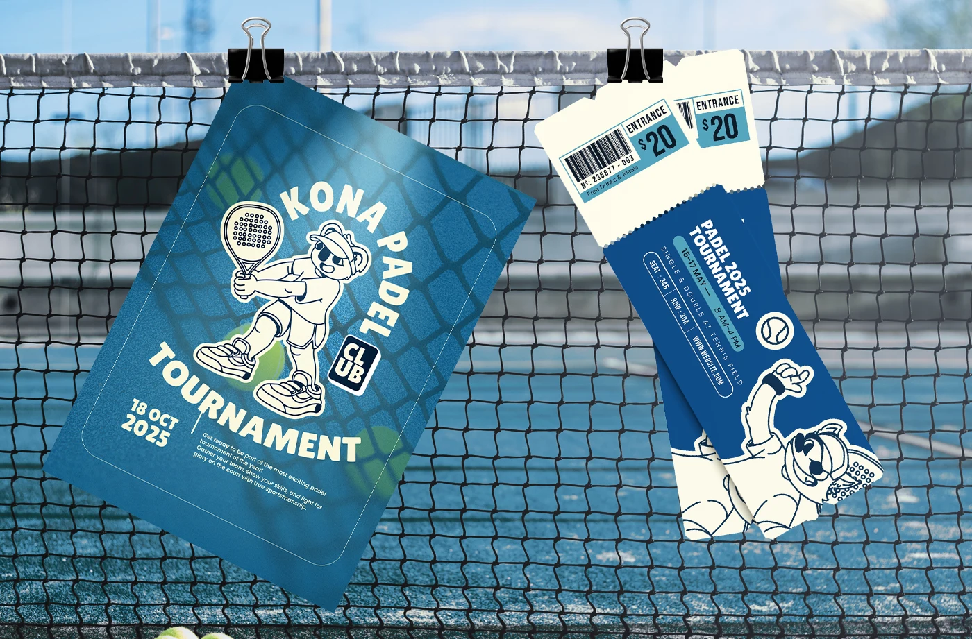
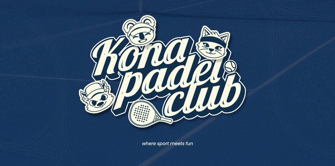
Through the use of playful mascots, bold typography, and a clean sporty aesthetic, the brand positions itself as approachable and engaging while still honoring the competitive nature of padel. It’s a balance between lighthearted spirit and serious gameplay.
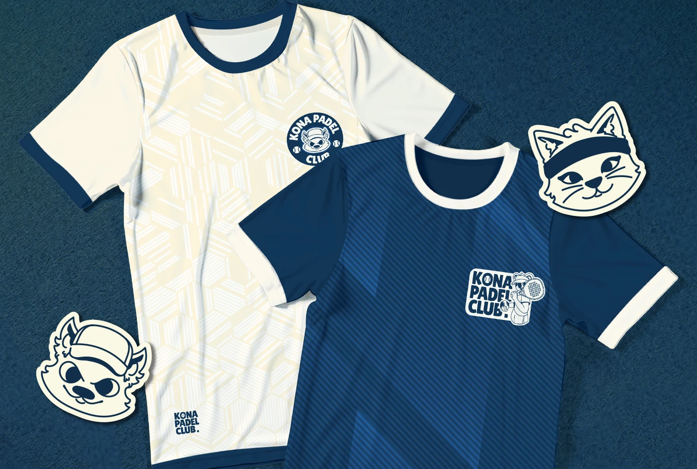
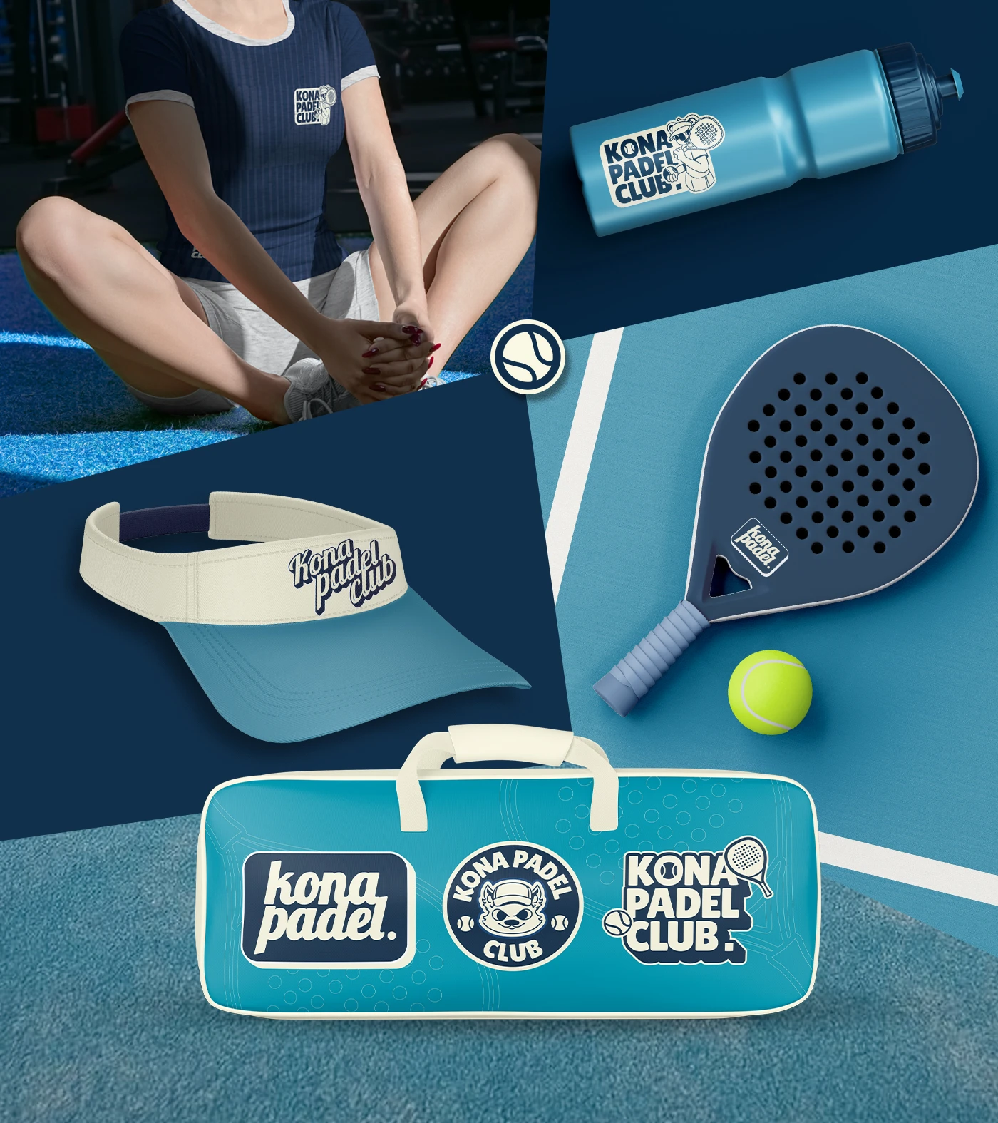
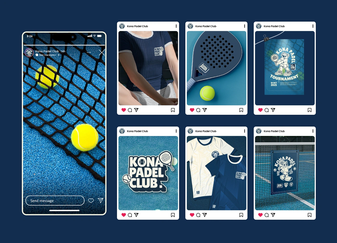
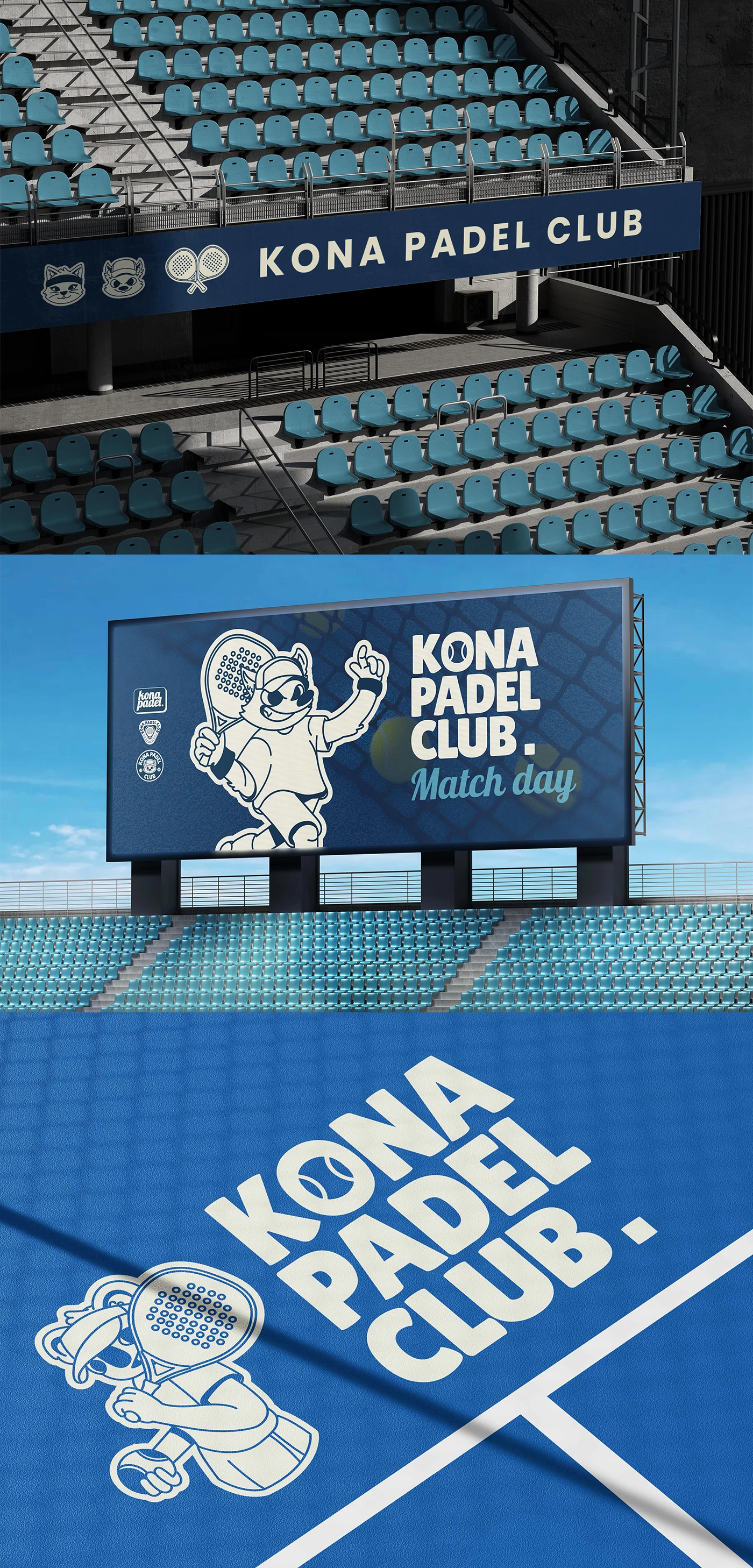
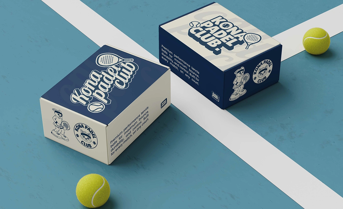
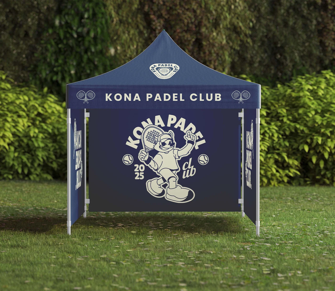
The identity thrives across multiple touchpoints: from jerseys and sportswear that embody pride and belonging, to court signage that elevates the atmosphere of the game, and social media templates that extend the brand’s personality into the digital space. Consistency was key to ensuring a strong and memorable presence.
More than just a logo or a mascot, this branding creates a story – one where players, fans, and the wider community can see themselves reflected. It’s about building connection, amplifying spirit, and encouraging growth in the padel culture.
In the end, KONA Padel Club represents a fresh, cartoon-inspired identity that fuses playful spirit with competitive heart. It’s not only a brand, but a stage where energy, creativity, and teamwork come together to shape a lasting legacy in the padel scene.
Like this project
Posted Jun 2, 2026
Likes
0
Views
2