Digital Transformation: Accessibility & Newsletter Design

Jordi Milan


Overview
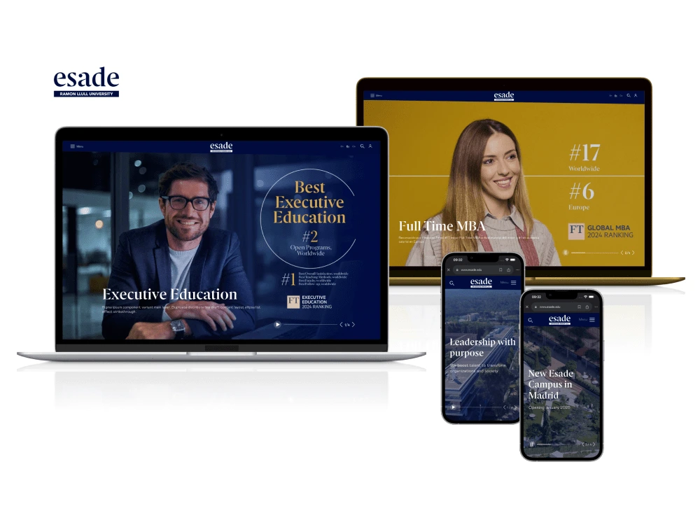
This project focused on improving the accessibility and visual consistency of Esade’s website by optimizing color usage and contrast across all components. The process involved cleaning up the code to eliminate inconsistencies in color application and developing a system based on opacity variations of the corporate colors using CSS variables. Additionally, link visualization was redesigned to ensure clarity and accessibility across different backgrounds, including images.
In parallel, I took on the challenge of redesigning the DoBetter newsletter, where I faced issues related to email client compatibility and layout consistency. By addressing these challenges, I was able to improve the overall user experience, ensuring the newsletter was visually consistent and accessible across various platforms.
Challenges & Constraints
Inconsistent Color Usage
The website contained multiple manually applied colors, leading to inconsistencies in contrast.
Balancing Identity & Accessibility
A flexible solution was needed to maintain Esade’s visual identity while improving accessibility.
Global Implementation
The contrast optimization had to be implemented globally, impacting all components without disrupting the existing design.
Process & Solutions
Audit & Analysis
Color System Refinement
Prototyping & Testing
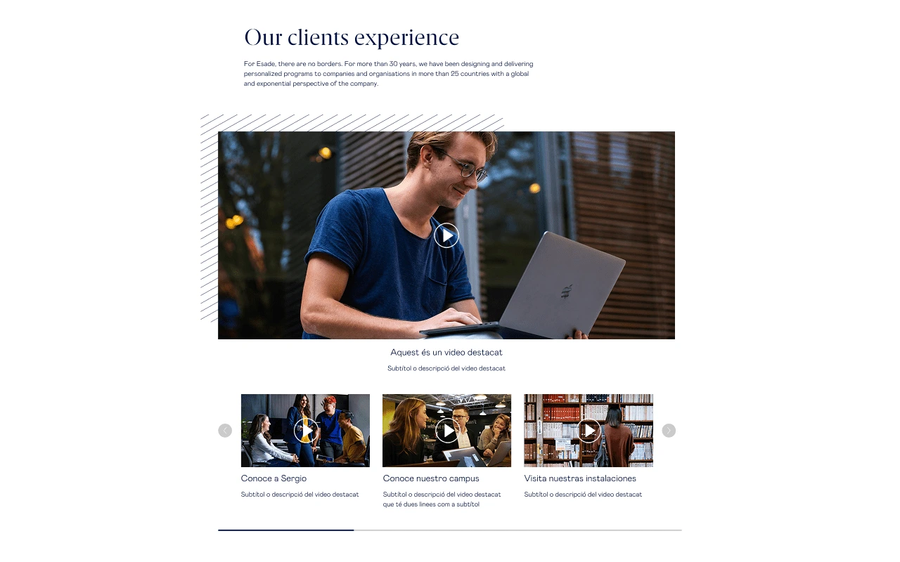
Highlighted Video Section
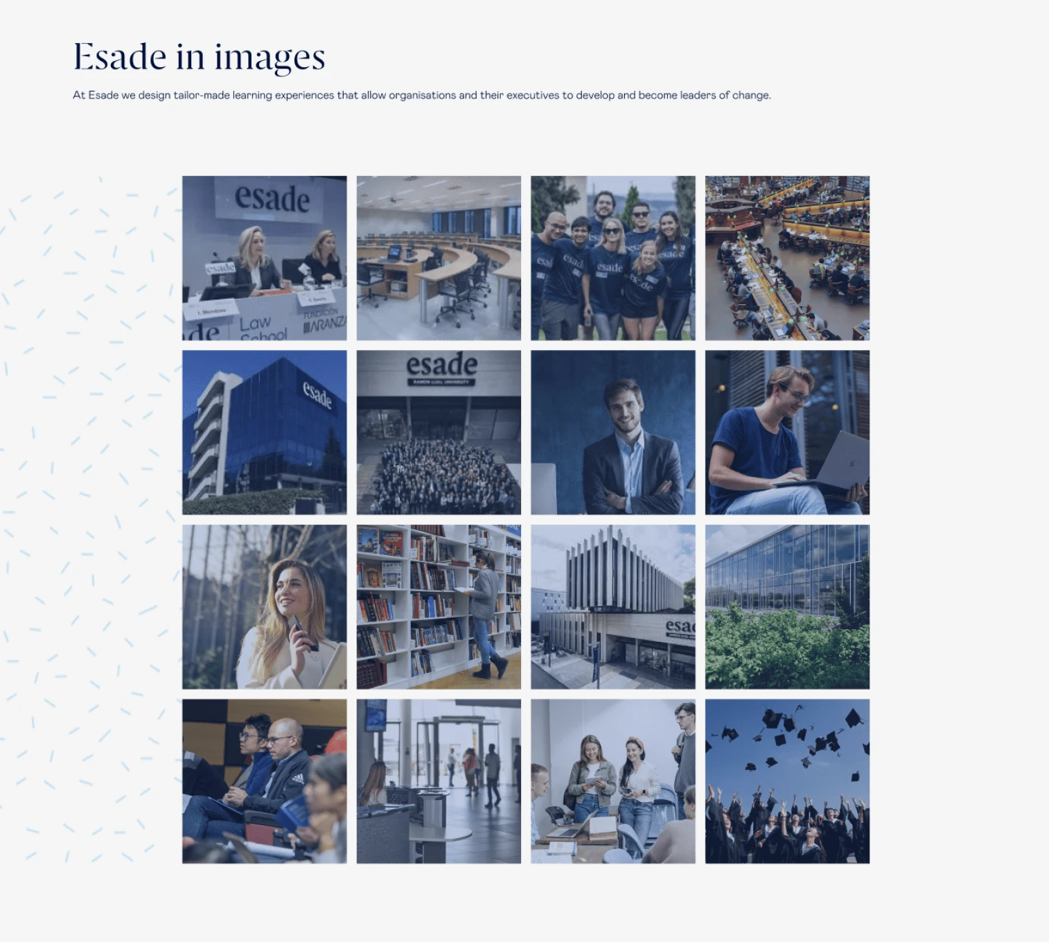
New Image Gallery
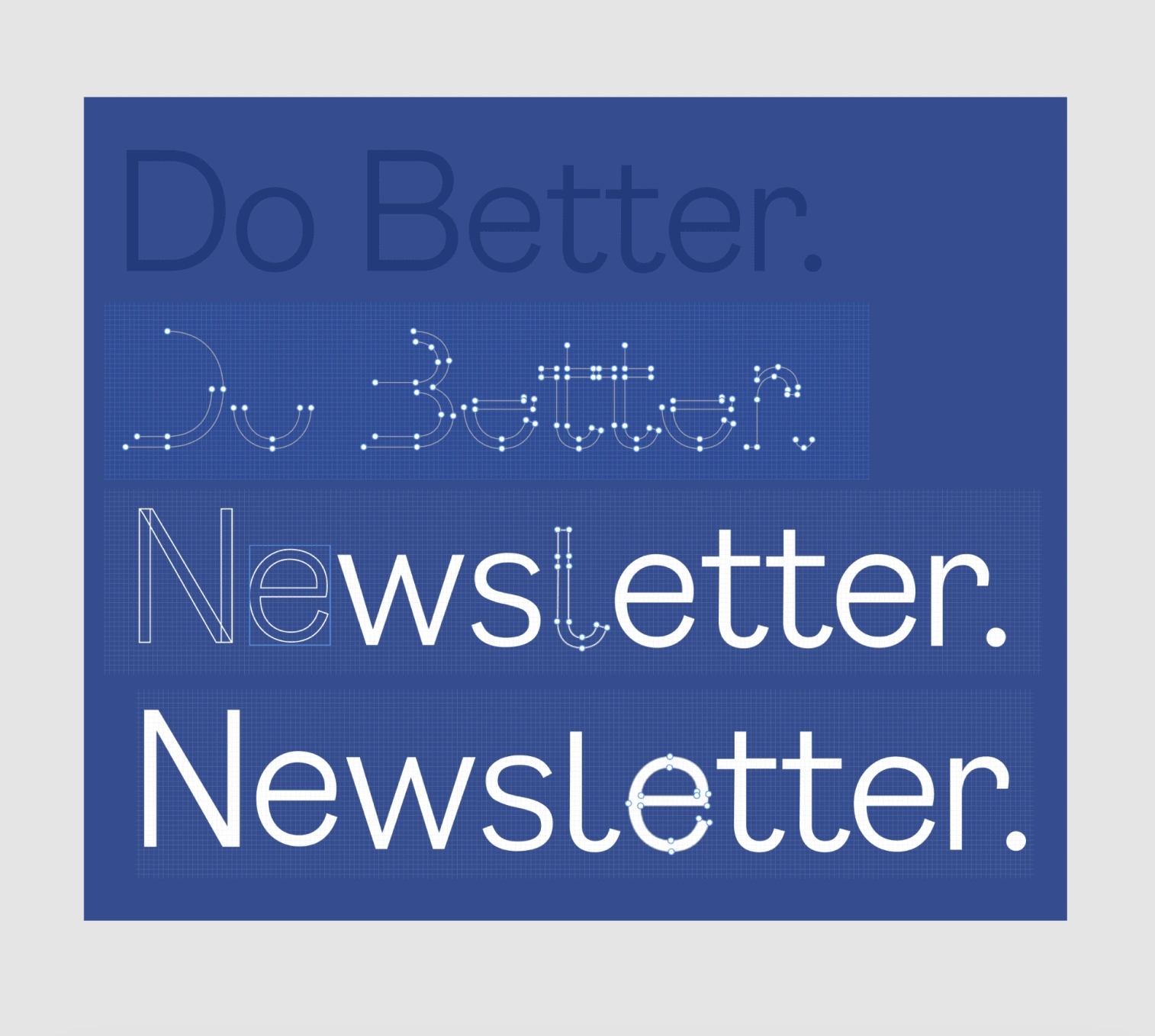
DoBetter Newsletter Title Redefine
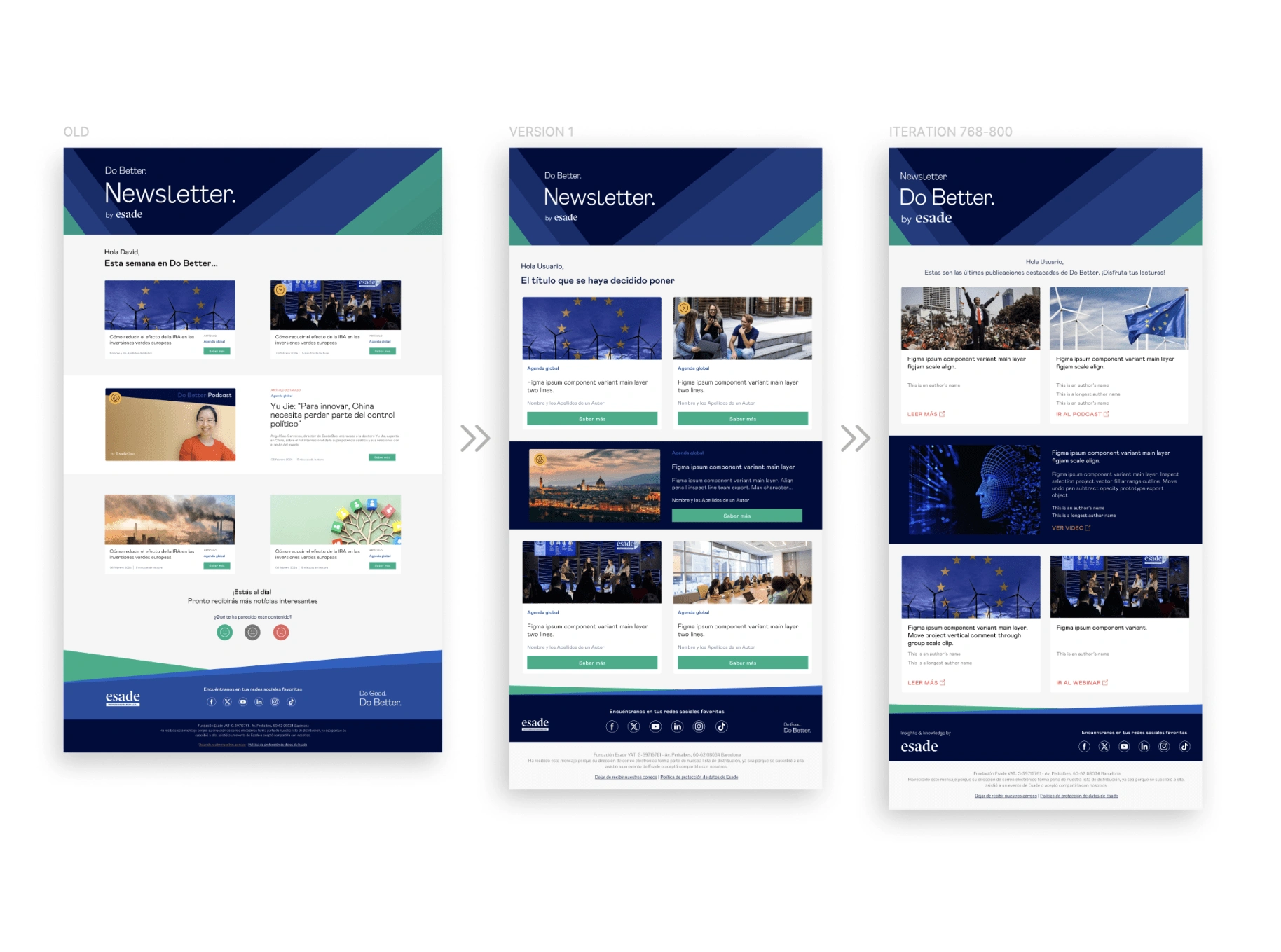
DoBetter Newsletter iteration
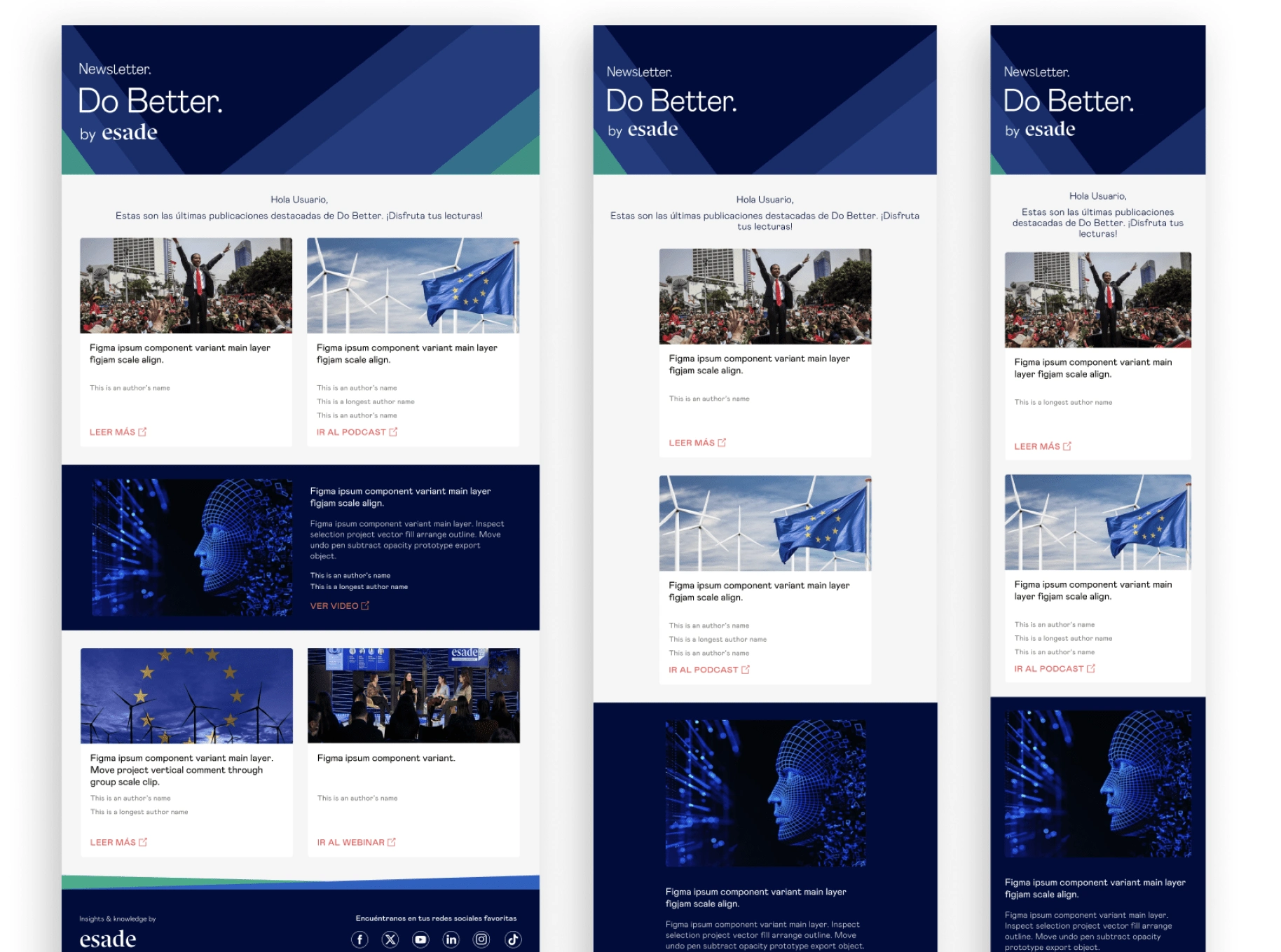
Final design
Like this project
Posted Apr 9, 2025
This project improved the accessibility and visual consistency of Esade’s school website, creating new design components and design the DoBetter's Newsletter.


Audiovisual product delivery system in Prestacam
Microsite – Unifying Multiple Institutions
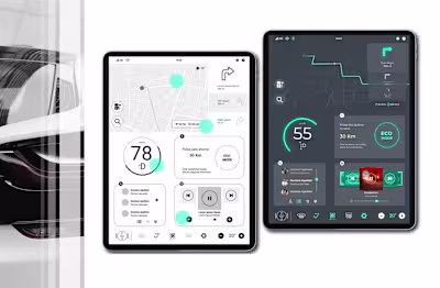
Designing an electric car dashboard
HeroFinder, the CounterGrogWise's App