A construction brand shouldn’t just

STEPHEN ALEJI


A construction brand shouldn’t just look strong. It should feel engineered.
That was the thinking behind ALKRA Construction.
The goal wasn’t to create another construction logo built around the usual buildings, cranes, or generic industrial visuals.
I wanted to create a visual identity that communicates strength, precision, progress, and long-term reliability while still feeling modern enough to stand confidently in front of investors, partners, and clients.
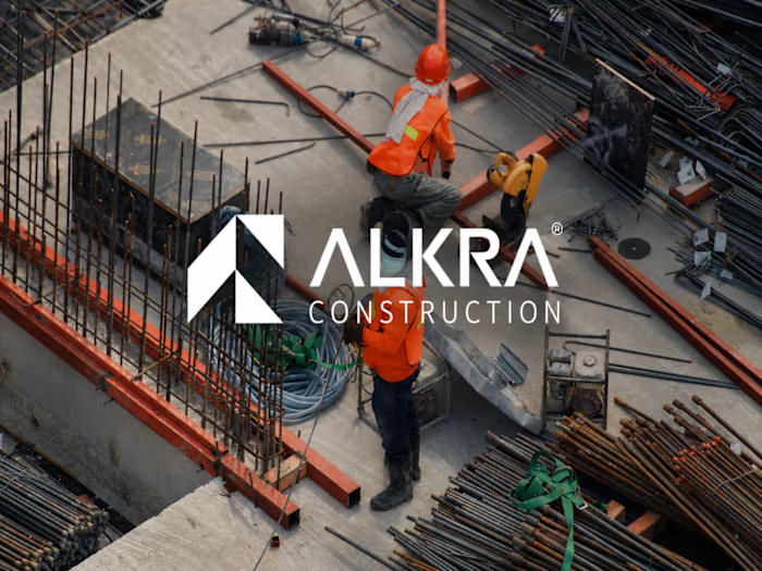
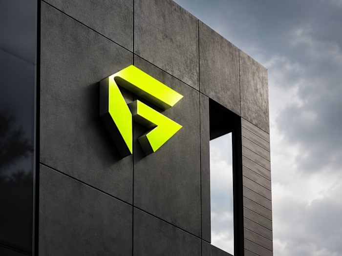
From the geometric ALKRA symbol and typography system to construction-site branding, vehicles, stationery, packaging, signage, and digital applications, every touchpoint was designed to work as part of one consistent system.
The result is a brand identity built to feel as solid as the structures ALKRA creates.
Built with precision. Designed for what’s next.
I’ve shared the full case study on my Contra profile.
#BrandIdentity #BrandDesign #LogoDesign #VisualIdentity #BrandStrategy #ConstructionBranding #ConstructionDesign #CorporateBranding #GraphicDesign #BrandDesigner #Contra #CreativeDesigner #VisualSystems
Like this project
Posted Oct 5, 2026
A construction brand shouldn’t just look strong. It should feel engineered. That was the thinking behind ALKRA Construction. The goal wasn’t to create anothe...