ALKRA Construction Brand Identity Project

STEPHEN ALEJI


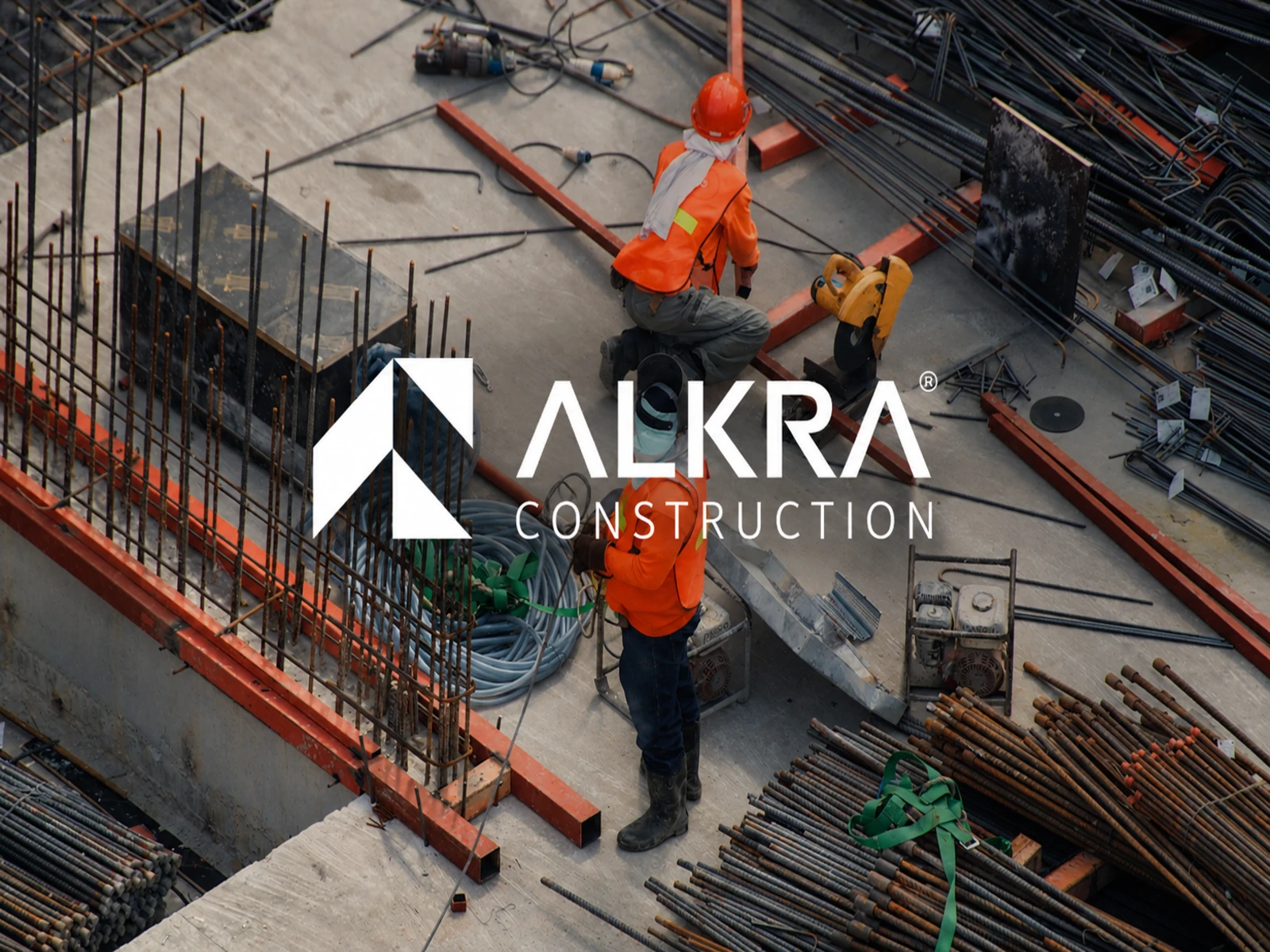
ALKRA Construction
Brand Identity & Visual System
Industry: Construction & Engineering
Services: Brand Strategy, Logo Design, Brand Identity, Visual System, Brand Applications, Environmental Branding
ALKRA Construction is a modern construction and engineering brand positioned around strength, precision, reliability, and long term excellence.
The project focused on creating more than a logo. The goal was to build a complete visual identity system capable of representing ALKRA consistently across construction sites, corporate communication, vehicles, digital platforms, signage, and everyday brand touchpoints.
02 — THE CHALLENGE
Breaking away from the typical construction brand.
Construction and engineering companies often rely on predictable visual language generic buildings, cranes, heavy typography, and conventional industrial aesthetics.
ALKRA needed a visual identity that could communicate engineering expertise and structural strength while still feeling modern, professional, and distinctive.
The challenge was to create a brand that could feel credible in front of investors and corporate partners while remaining highly visible within the physical construction environment.
03 — THE CONCEPT
Structure became the foundation of the identity.
The visual direction was built around geometry, movement, and architectural structure.
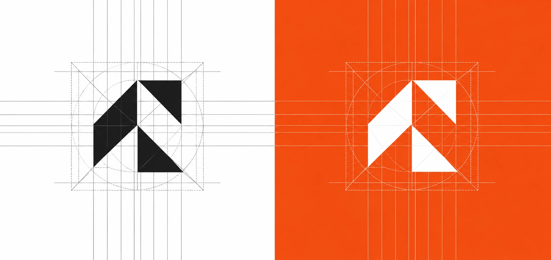
Rather than creating a literal construction symbol, I developed an abstract geometric “A” that could communicate ALKRA without relying on obvious construction imagery.
The symbol uses angular forms and negative space to create a mark that feels engineered, directional, and architectural.
04 — THE LOGO SYSTEM
One symbol. Multiple environments.
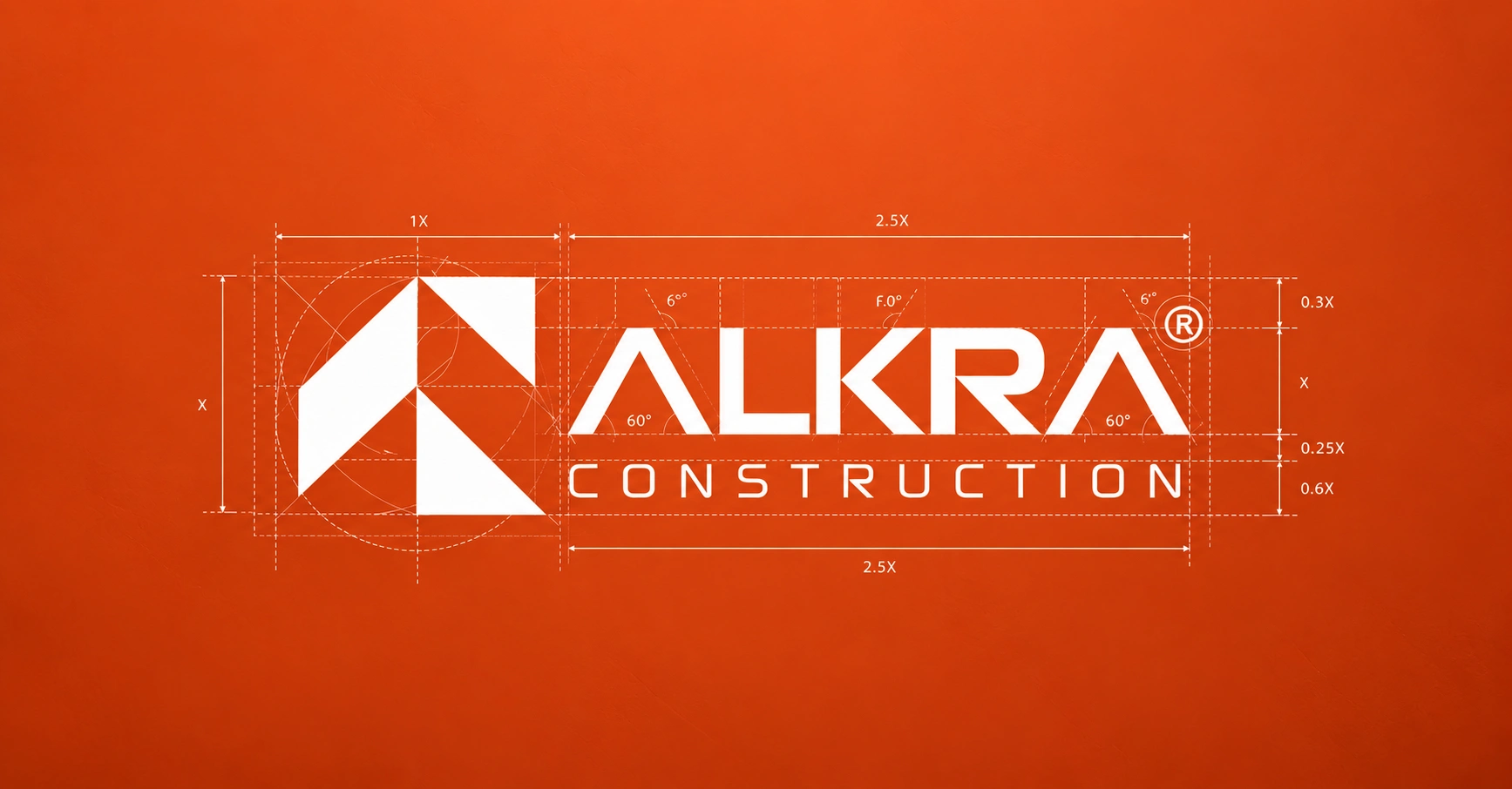
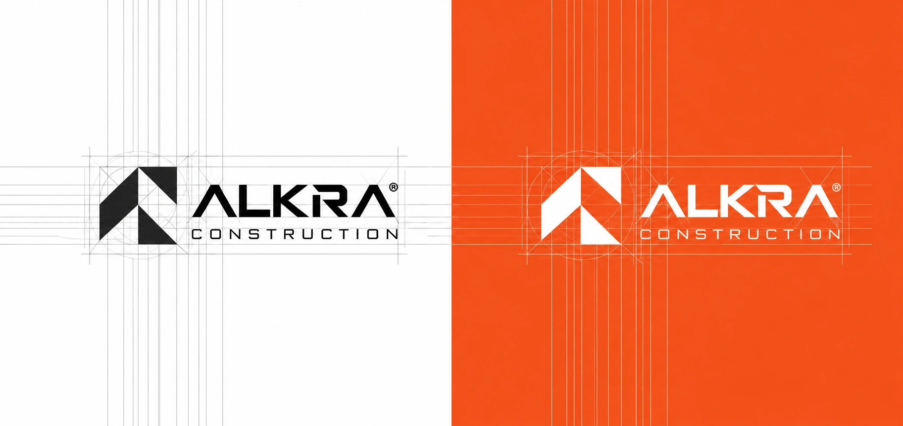
The ALKRA symbol was designed to work independently as well as alongside the wordmark.
This gave the identity flexibility across large-scale applications such as building signage and vehicles, while also allowing the symbol to function at smaller sizes across digital platforms and branded materials.
The logo system was developed with defined proportions and construction rules to maintain consistency across every application.
05 — TYPOGRAPHY
Precision in every letter.
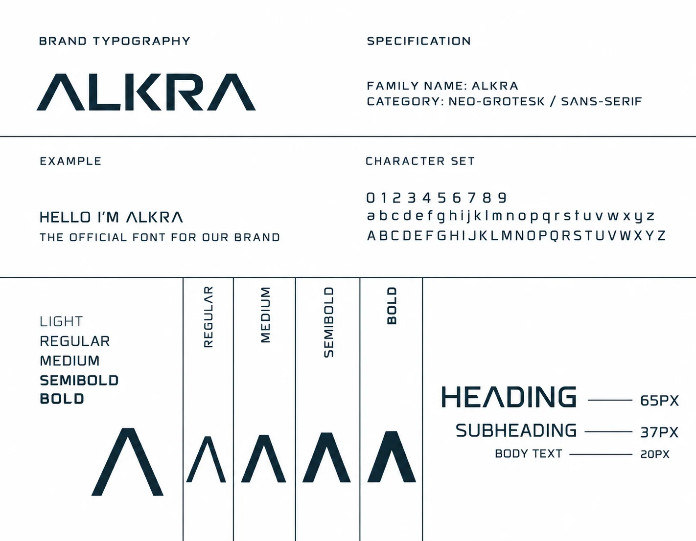
Typography needed to complement the geometry of the symbol without competing with it.
The identity uses a neo-grotesk / sans-serif direction, giving the brand a clean, technical, and contemporary voice.
Multiple weights create flexibility across headlines, subheadings, body copy, and supporting information while maintaining a consistent visual hierarchy.
06 — COLOR SYSTEM
A palette designed for visibility.
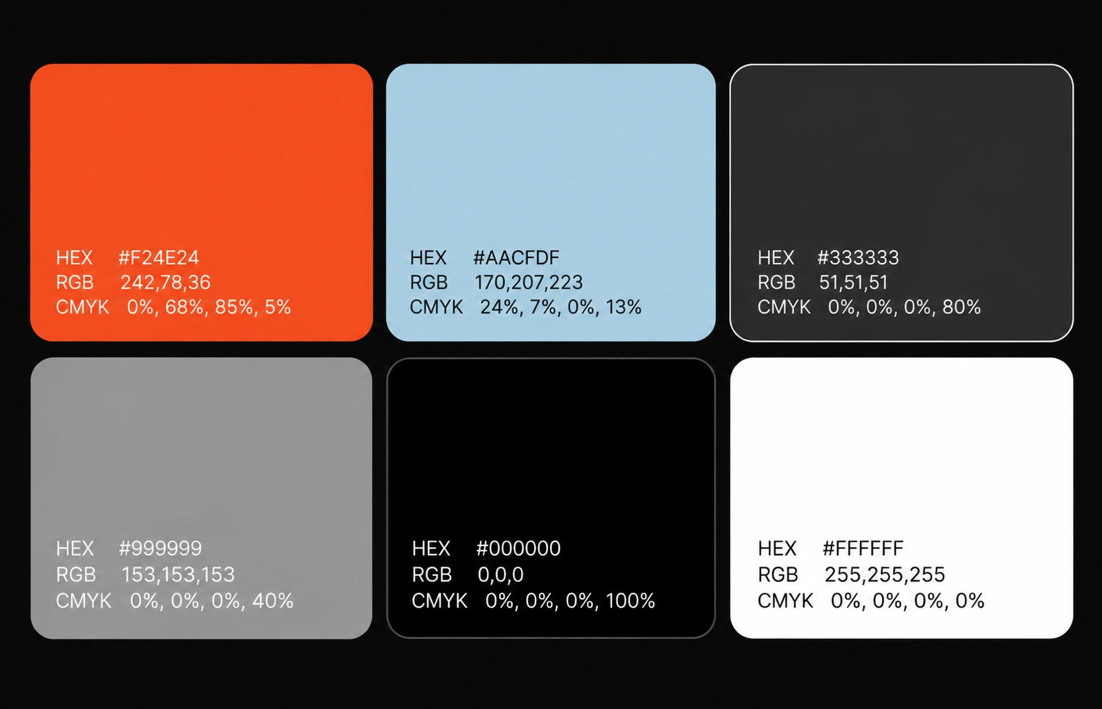
The primary ALKRA orange creates the strongest point of recognition within the identity.
It is supported by charcoal, black, white, gray, and a light blue accent, creating enough contrast for both corporate and environmental applications.
Primary Orange — #F24E24
Light Blue — #AACDFD
Charcoal — #333333
Gray — #999999
Black — #000000
White — #FFFFFF
The result is a palette that feels bold and highly visible without becoming visually overwhelming.
07 — FROM IDENTITY TO APPLICATION
A brand designed to exist in the real world.
The identity was not designed to live inside a brand guideline document.
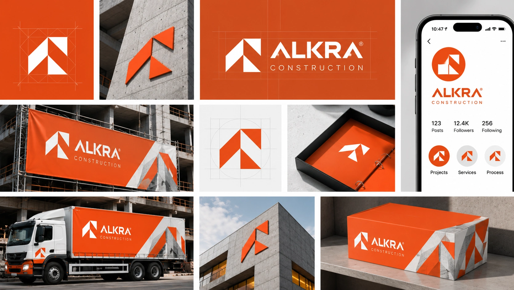
It was tested across physical environments where construction companies actually operate — from equipment and workwear to vehicles, site signage, and architectural surfaces.
This helped ensure that the visual system remained recognizable even when surrounded by complex construction environments.
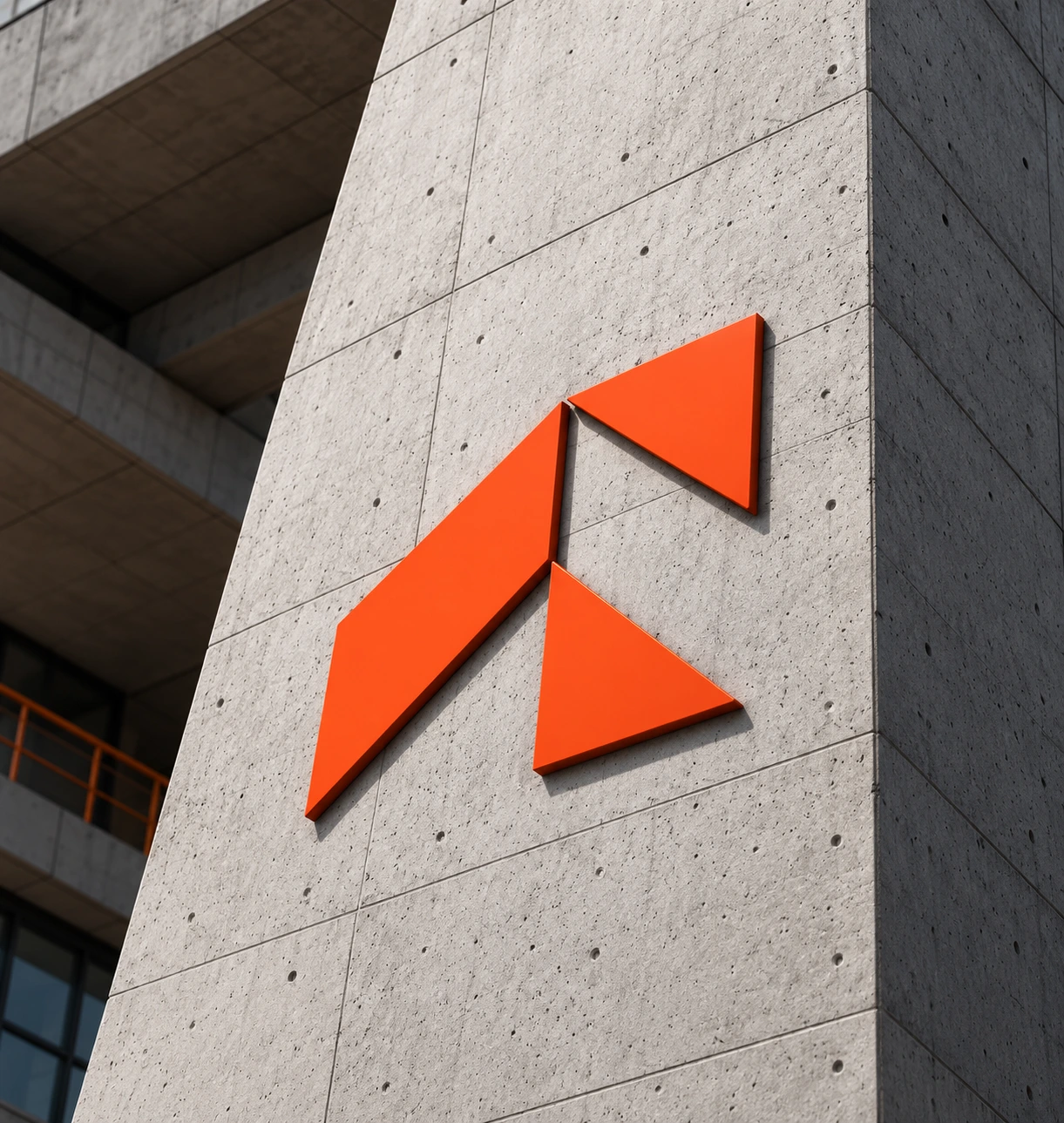
[IMAGE 10 — USE PDF PAGE 11]
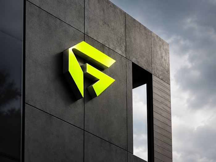
Large ALKRA symbol installed on a concrete building.
08 — ENVIRONMENTAL BRANDING
Turning construction sites into brand experiences.
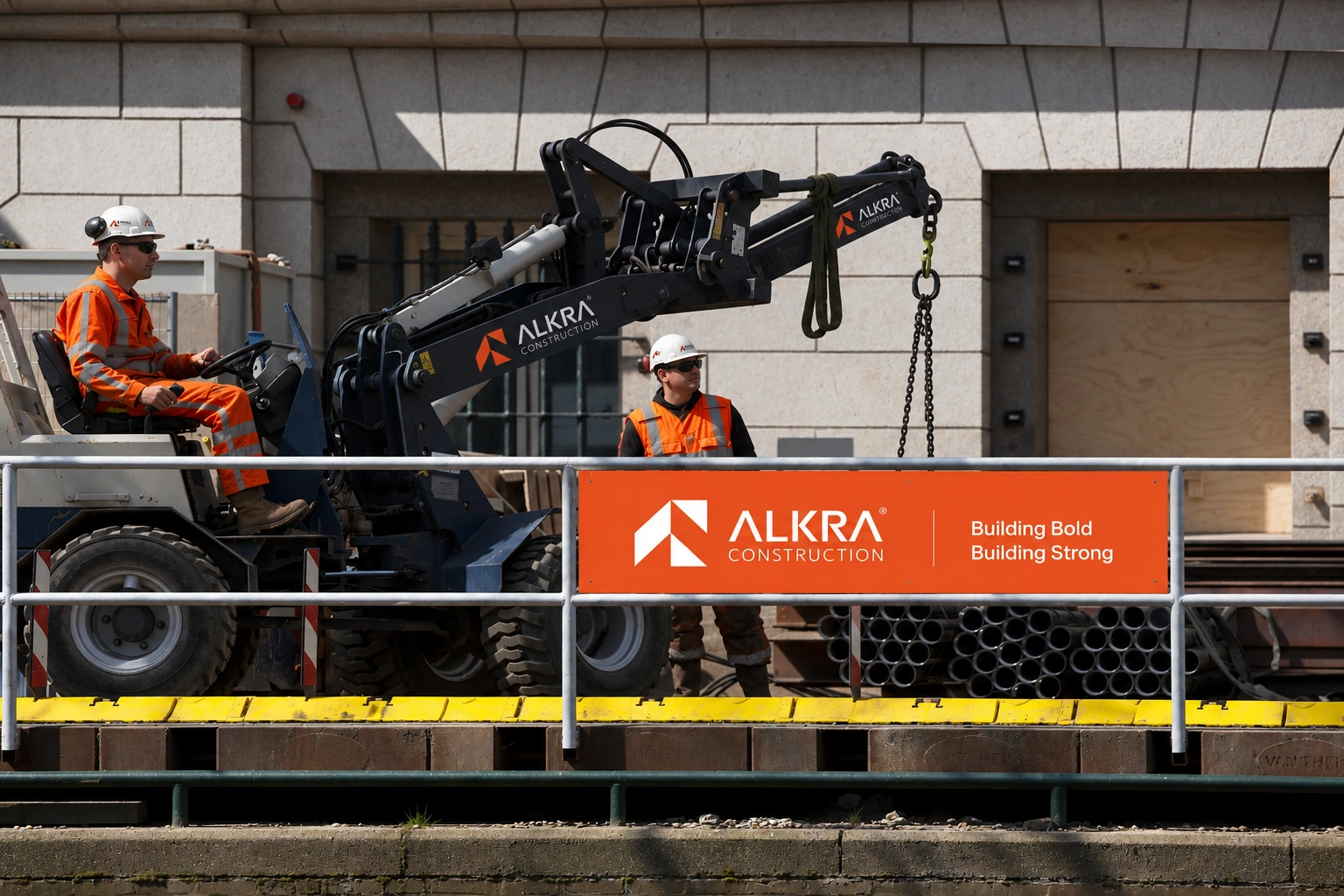
Construction sites became an important part of the identity system.
The bold orange palette and simplified symbol create strong visibility across machinery, barriers, buildings, and site environments.
The result is a brand presence that feels integrated into the physical world rather than simply placed on top of it.
09 — VEHICLE BRANDING
Built to move.
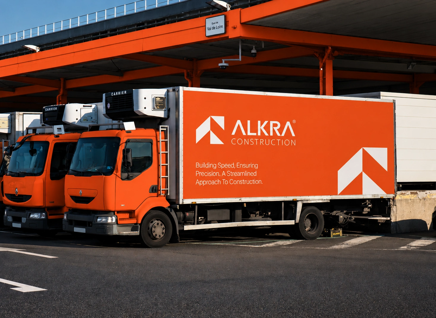
For a construction company, vehicles are more than transportation. They are moving brand assets.
The identity was applied to trucks using large-scale typography, the ALKRA symbol, orange panels, and concise messaging.
The system maintains strong visibility from a distance while keeping the communication clean and professional.
10 — CORPORATE IDENTITY
Bringing construction strength into the boardroom.
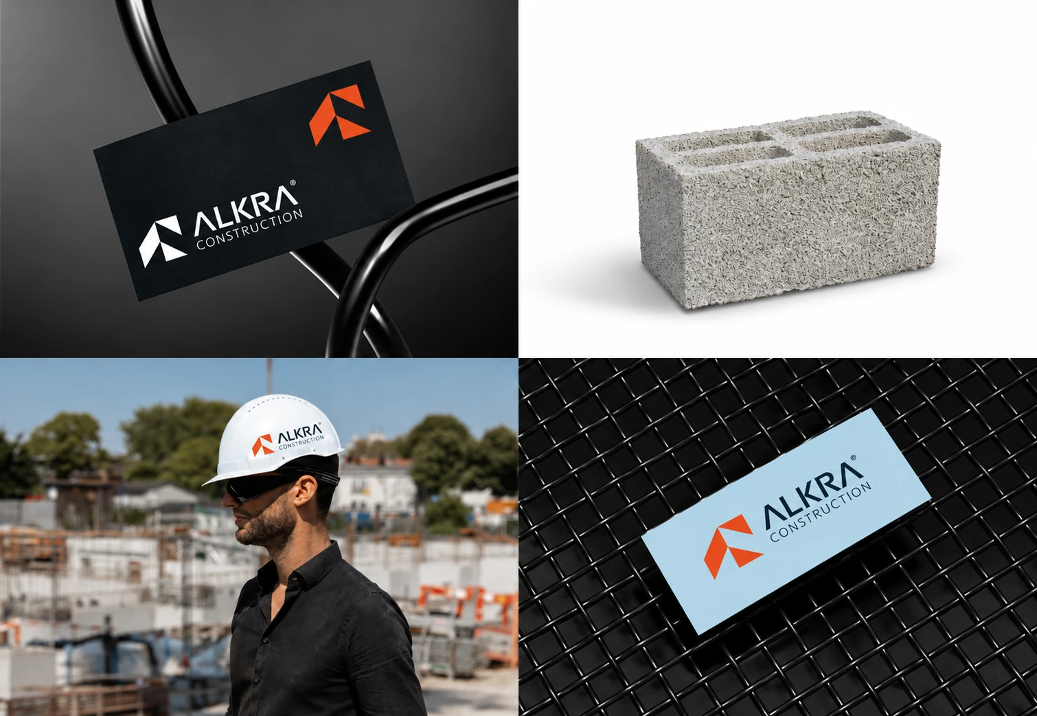
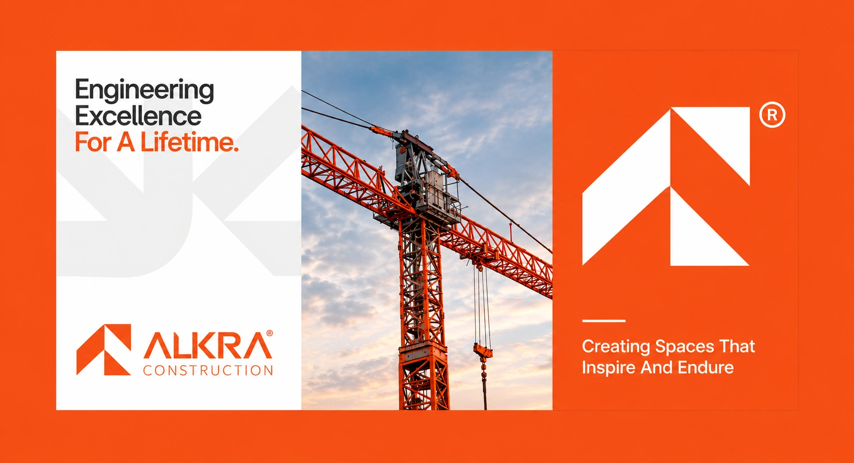
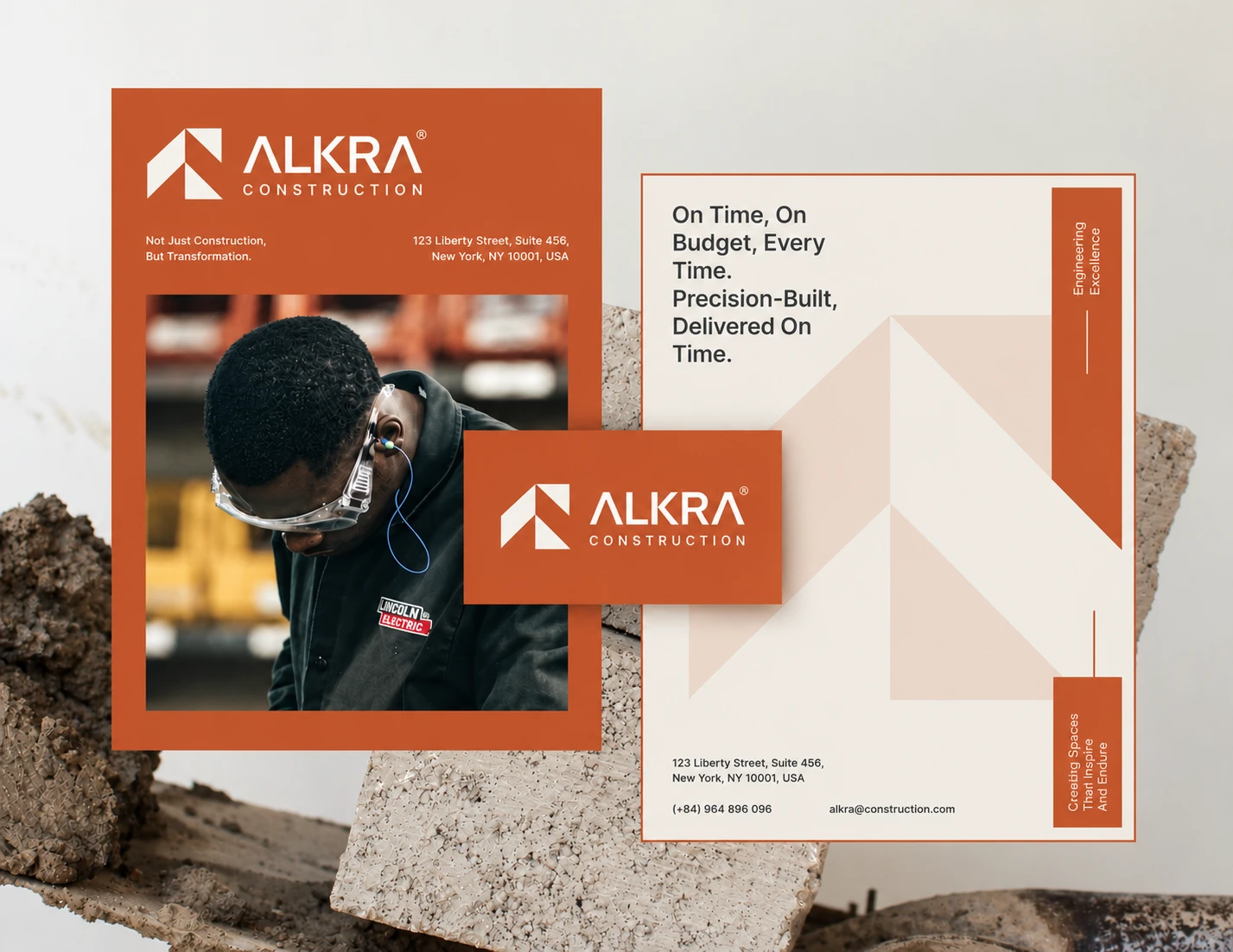
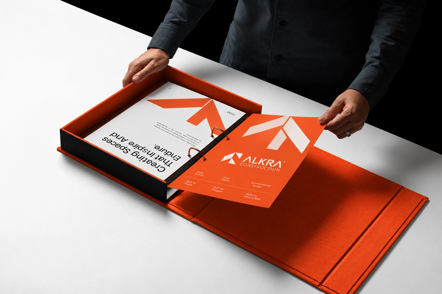
The identity was translated into corporate materials to ensure that ALKRA could maintain the same level of professionalism away from the construction site.
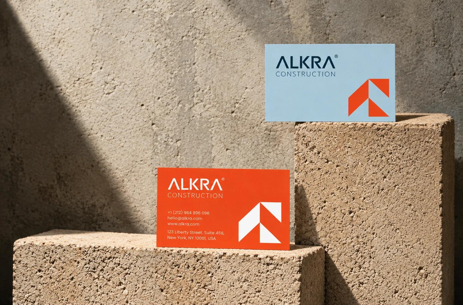
Business cards, stationery, presentation materials, and branded documents use the same visual language established by the core identity.
11 — DIGITAL IDENTITY
The same brand, built for digital.
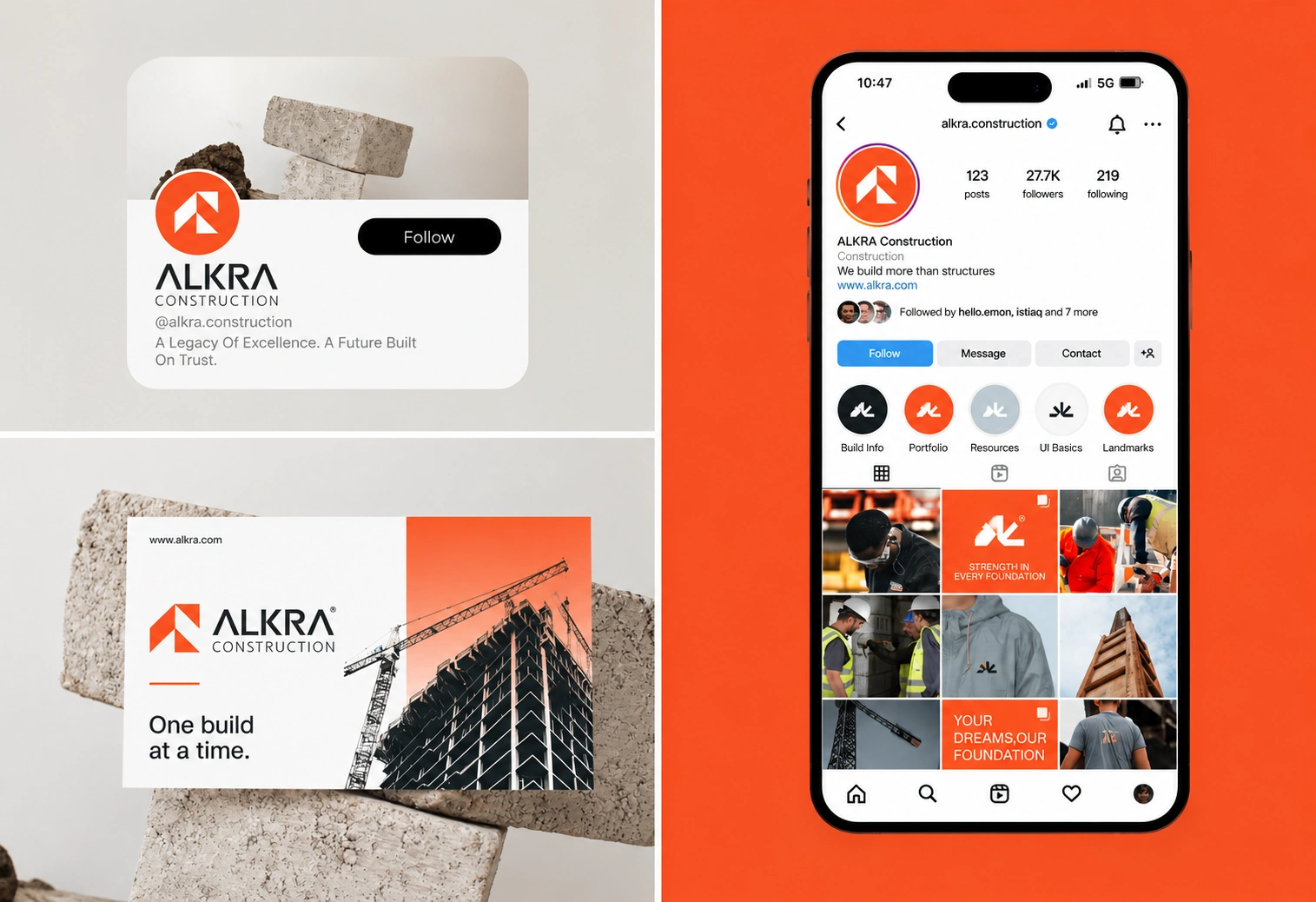
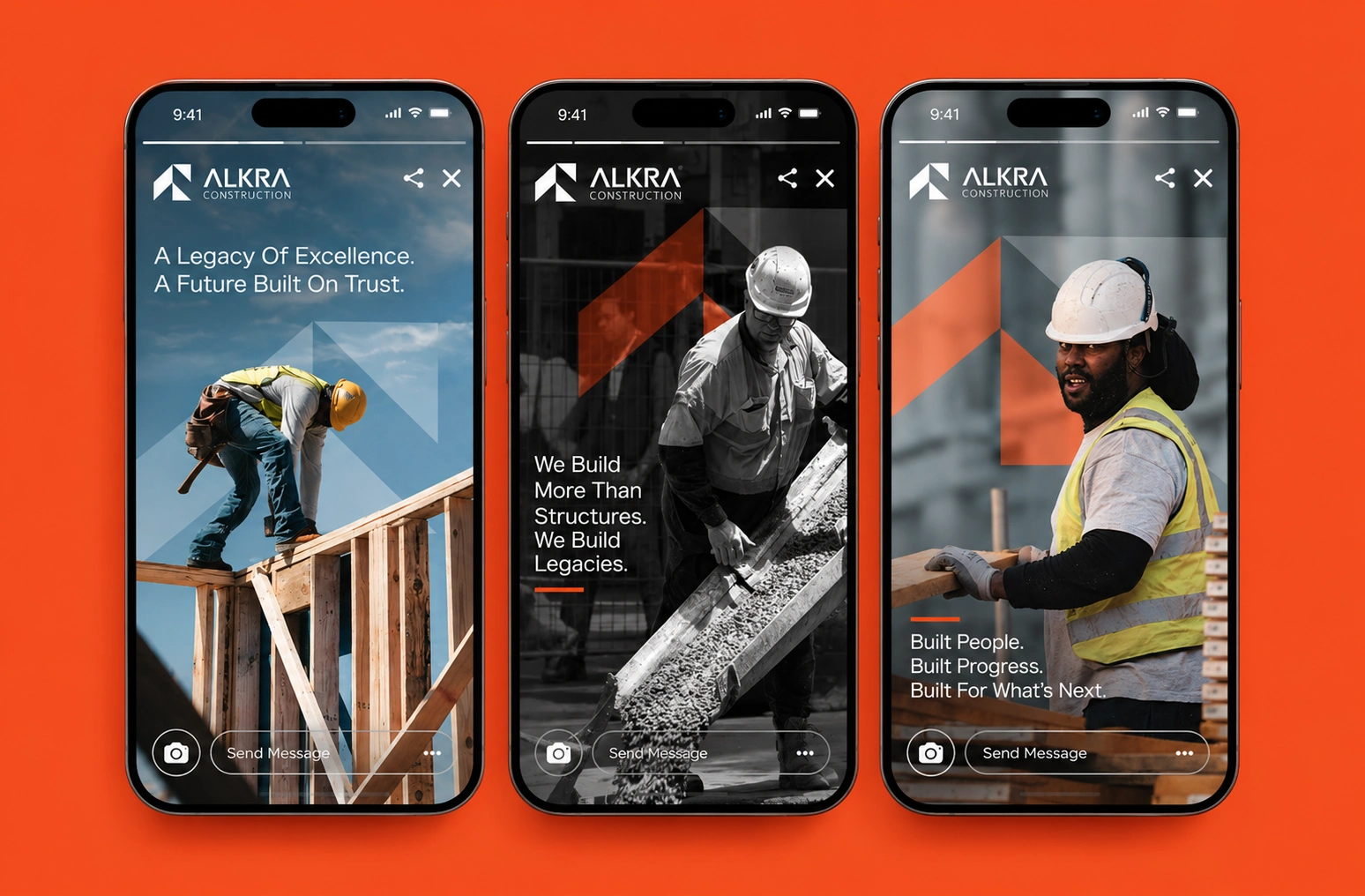
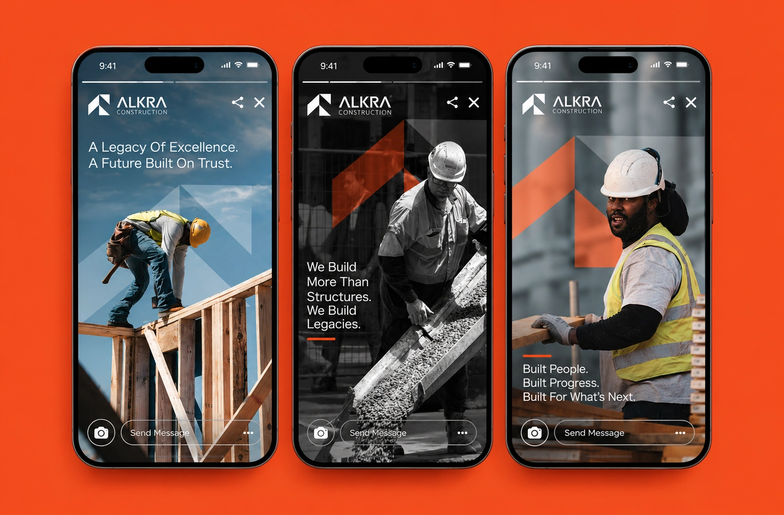
ALKRA's visual language was extended into social media and mobile experiences.
The digital applications use the same orange, typography, photography direction, and geometric forms to create consistency between the physical and digital brand.
The result is a digital presence that feels connected to the company's physical identity rather than operating as a separate visual system.
12 — BRAND COMMUNICATION
More than structures. A legacy.
The visual identity was supported by messaging centered around engineering excellence, trust, progress, and long-term impact.
Key messaging directions included:
“Engineering Excellence For A Lifetime.”
“A Legacy of Excellence. A Future Built On Trust.”
“We Build More Than Structures. We Build Legacies.”
These messages help position ALKRA beyond simply constructing buildings — toward creating structures and environments designed to endure.
13 — BRAND IN THE DETAILS
Consistency across every touchpoint.
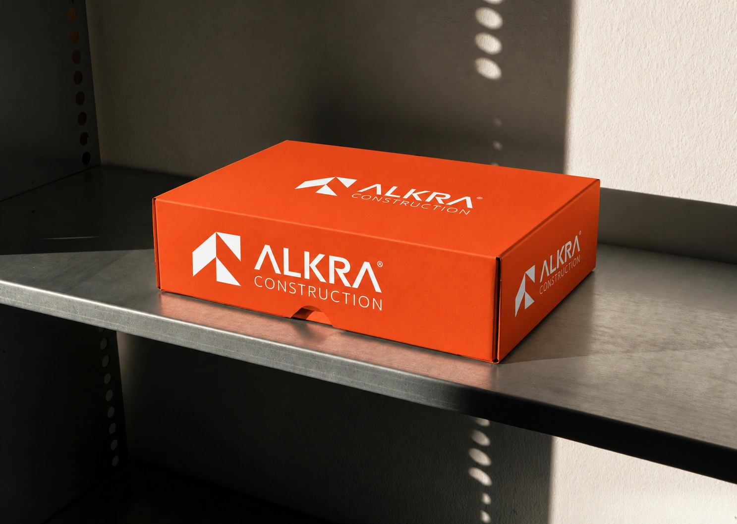
The identity was also explored through smaller branded objects and everyday applications.
From packaging and business cards to branded apparel and physical materials, every touchpoint follows the same visual principles.
This is where the identity becomes a system rather than a logo.
14 — THE SYSTEM IN CONTEXT
Designed to scale with the business.
The final identity was built to work across different scales and environments.
From a small social media avatar to a construction truck, from a business card to architectural signage, the same visual language remains recognizable.
That scalability was one of the most important principles behind the system.
15 — THE RESULT
A construction identity with a stronger point of view.
The final result is a complete visual identity system that gives ALKRA a recognizable and scalable presence across construction, corporate, environmental, digital, and communication touchpoints.
Instead of relying on generic construction aesthetics, the brand now has a distinctive visual language built around:
Structure.
Precision.
Strength.
Visibility.
Progress.
The identity gives ALKRA a foundation that can continue to scale as the company grows — without losing consistency or recognition.
16 — FINAL BRAND MOMENT
Engineering excellence, built to last.
The ALKRA identity brings together a geometric symbol, disciplined typography, a bold color system, and a flexible application framework to create a brand that feels engineered rather than decorated.
Every element was designed to support the same idea:
Build bold. Build with precision. Build for what comes next.
Like this project
Posted Oct 5, 2026
A complete construction brand identity built around strength, precision, and engineering excellence from logo to digital and physical applications.