FinForge — Building a Bold Brand Identity For Digital Finance

STEPHEN ALEJI


FinForge — Building a Bold Brand Identity for the Future of Digital Finance
Alternative title
FinForge — A Bold Crypto Finance Brand Built Around Trust, Freedom & Growth
I prefer the first title because it communicates both the project and your strategic role without sounding overly promotional.
Preview Description
A bold visual identity for FinForge, a next-generation digital finance platform built to make crypto investing feel secure, simple, and accessible.
Building a Financial Brand People Can Trust
FinForge is a next-generation crypto finance platform designed around a simple idea: financial technology should give people more control, not more complexity.
The challenge was to create a visual identity that could operate confidently within the fast-moving world of digital finance while avoiding the visual language often associated with short-lived crypto brands.
The brand needed to feel secure, intelligent, modern, ambitious, and established while remaining accessible enough to communicate with everyday users.
The identity was built around the idea of turning financial complexity into clear, confident movement.
The Challenge
Crypto and digital finance brands often compete within an extremely saturated visual landscape.
Neon colors, futuristic graphics, dark interfaces, coins, charts, and abstract technology imagery are everywhere.
For FinForge, simply looking “modern” wasn't enough.
The identity needed to communicate:
Trust without feeling traditional
Innovation without looking experimental
Security without feeling restrictive
Growth without relying on financial clichés
Accessibility without losing sophistication
The goal was to create a system that could feel equally credible across a digital product, website, social media, physical packaging, and corporate communications.
The Approach
I built the identity around three core ideas:
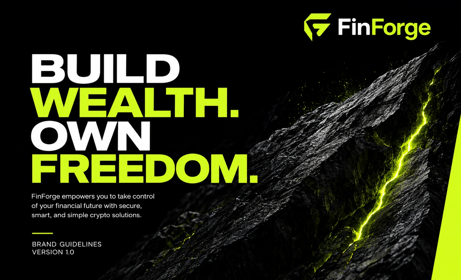
BUILD. WEALTH. OWN. FREEDOM.
These became more than a tagline.
They became the foundation for the visual language.
Build represents progress and long-term growth.
Wealth represents financial opportunity and asset ownership.
Freedom represents the broader promise of decentralized finance — giving users greater control over their financial future.
From there, I developed a visual system that combines bold typography, high-contrast layouts, directional movement, and a distinctive lime-green accent to give FinForge an identity that feels energetic without sacrificing clarity.
The Logo System
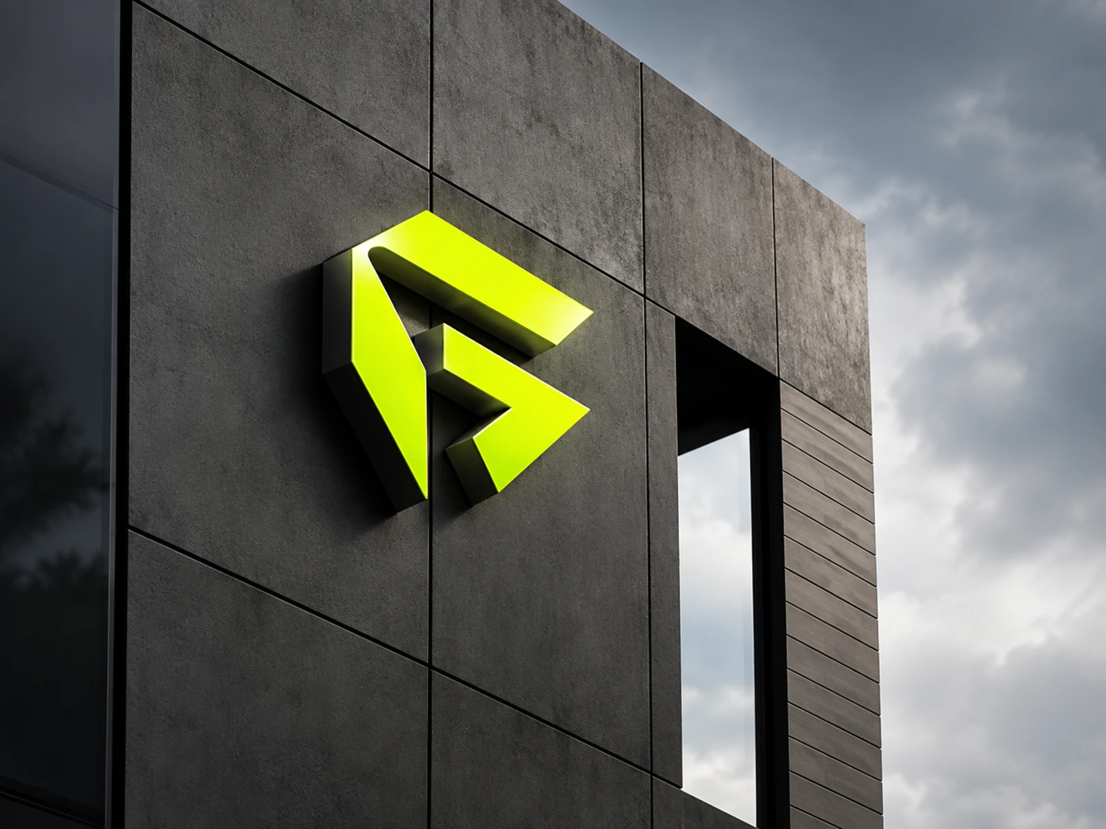
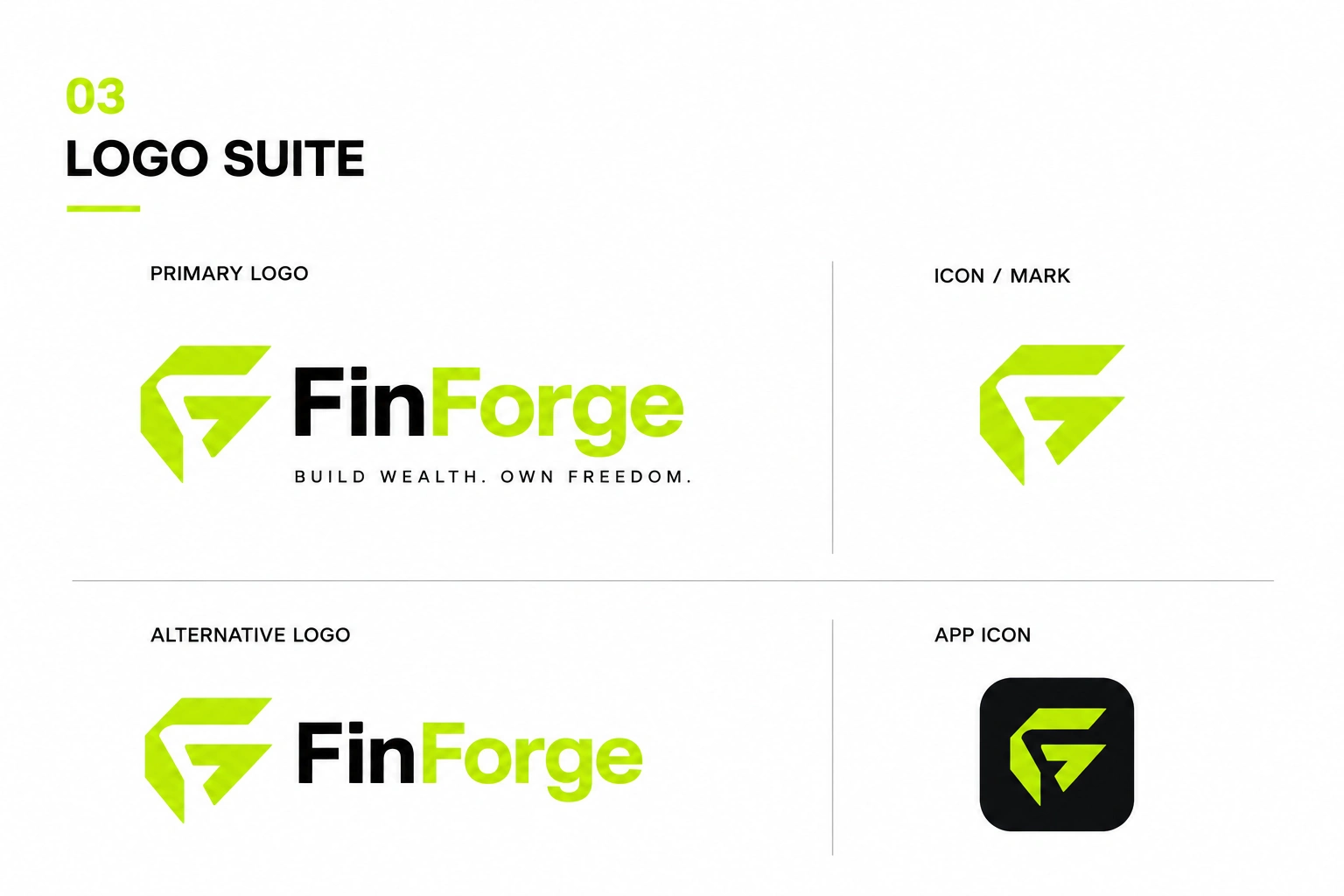
The FinForge mark was designed as a compact geometric symbol that combines the idea of forging, forward movement, and financial structure.
Its angular construction creates a sense of:
Precision → Direction → Progress → Strength
The symbol was then developed into a flexible logo suite consisting of:
Primary logo
Alternative logo
Standalone brand mark
App icon
Responsive logo applications
This gives the brand enough flexibility to maintain recognition across both large-format applications and small digital touchpoints.
Visual Identity
A High-Contrast Financial Language
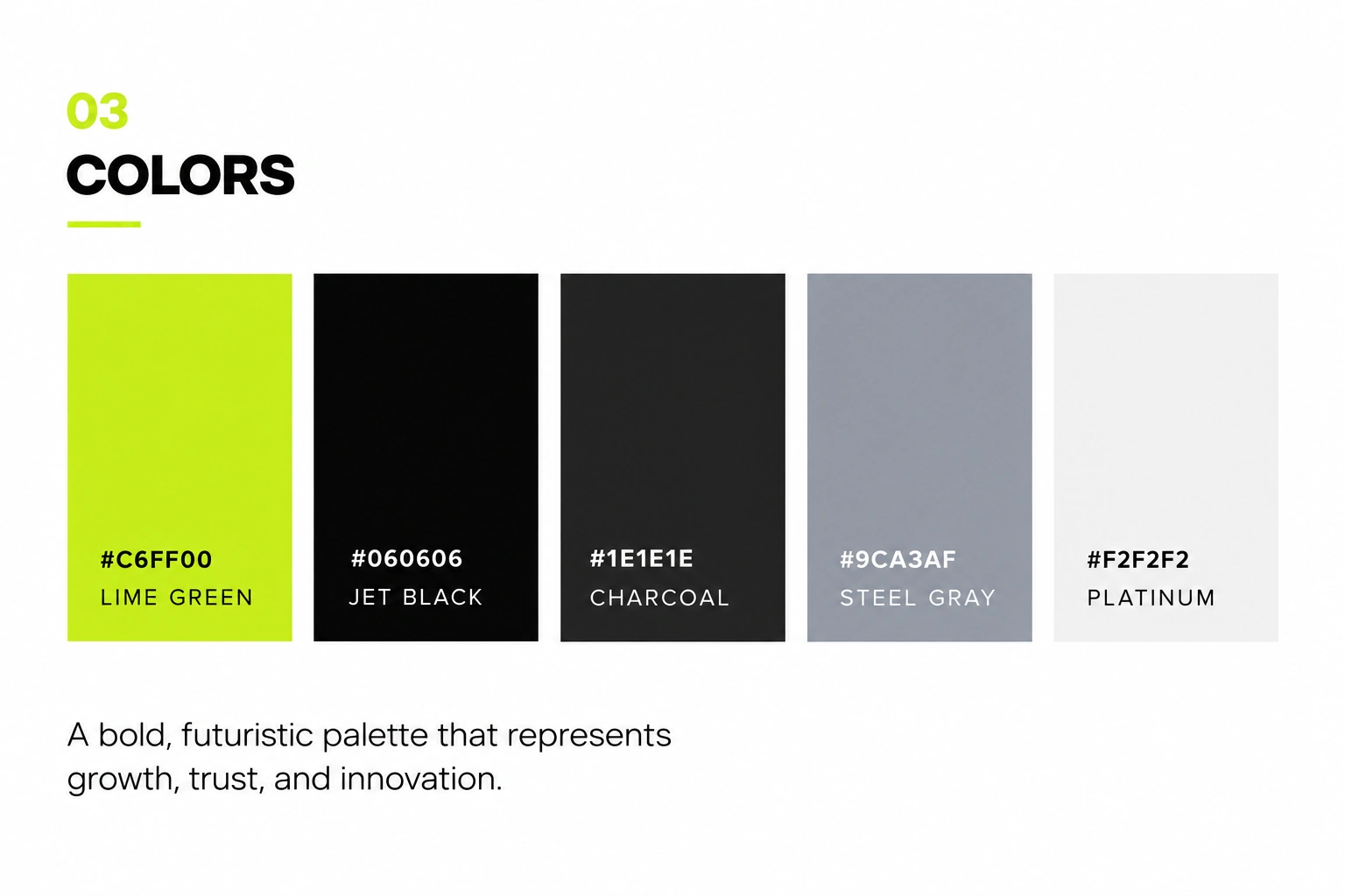
The visual system uses a deliberately restrained palette:
Lime Green — #C6FF00
Growth, energy, action, and innovation.
Jet Black — #060606
Confidence, authority, and digital sophistication.
Charcoal — #1E1E1E
Depth and supporting contrast.
Steel Gray — #9CA3AF
Technical neutrality and information hierarchy.
Platinum — #F2F2F2
Clarity, balance, and accessibility.
The result is a visual language that allows FinForge to move between dark digital environments and clean corporate applications without losing its identity.
Typography
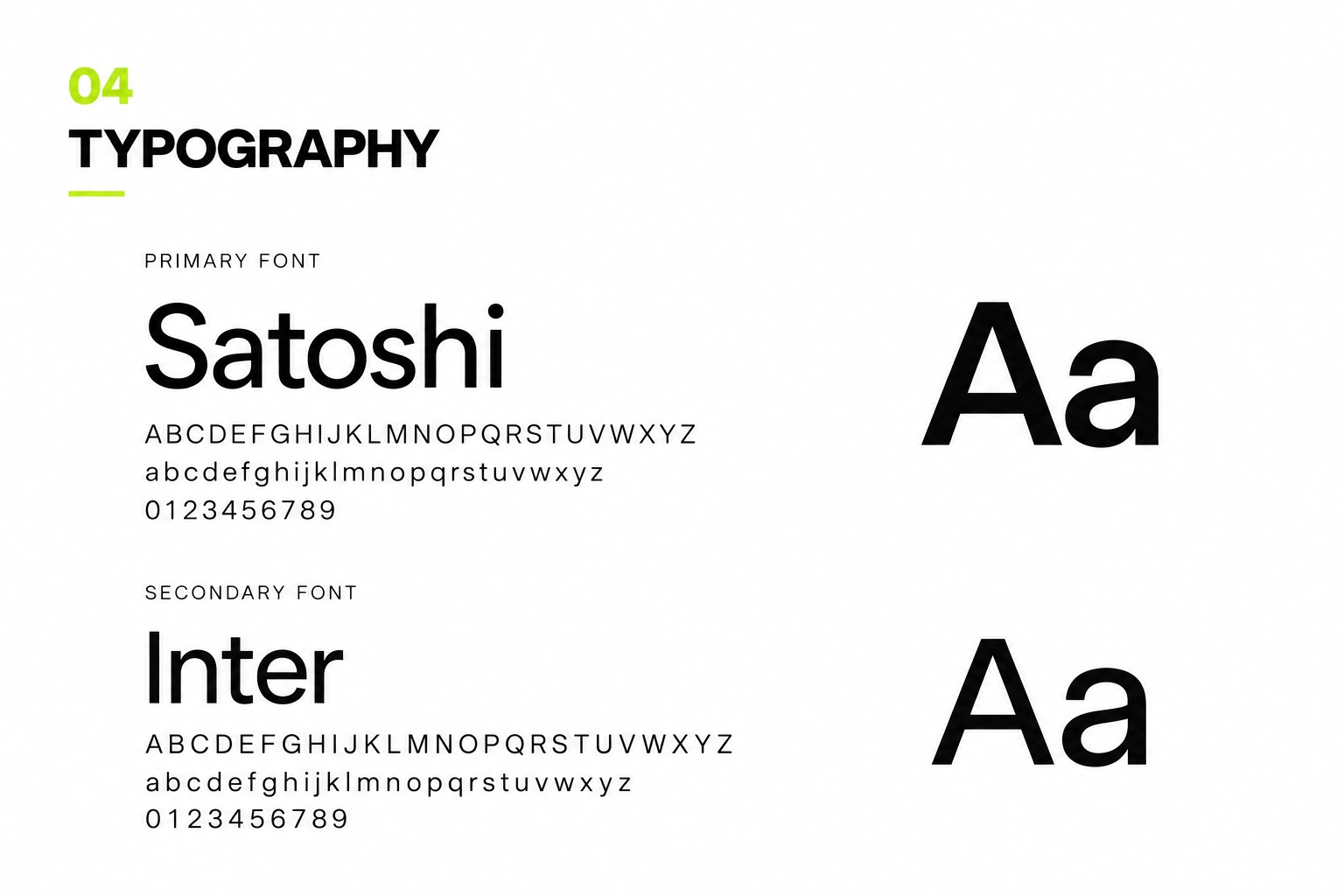
The typography system pairs:
Satoshi
Used as the primary typeface for headlines, statements, and prominent brand communication.
Its geometric structure gives FinForge a contemporary and technology-driven character.
Inter
Used as the supporting typeface for body copy, interface content, and information-heavy applications.
The combination creates a balance between brand personality and digital usability.
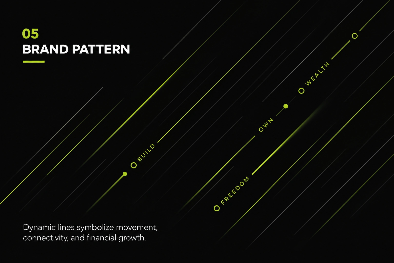
The Brand Pattern
The visual pattern system translates the idea of financial movement into a simple graphic language.
Directional lines move across the canvas to represent:
Movement. Connectivity. Progress. Growth.
Small markers and phrases such as Build, Wealth, and Freedom are integrated into the system to create visual rhythm and reinforce the brand narrative.
This gives FinForge a recognizable graphic device that can be extended across:
Campaigns
Social media
Presentations
Website sections
Digital advertising
Packaging
Brand communications
Rather than relying on the logo alone, the pattern gives the brand an additional layer of recognition.
Digital Brand Applications
The identity was designed to work beyond static brand guidelines.
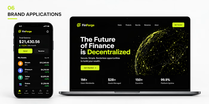
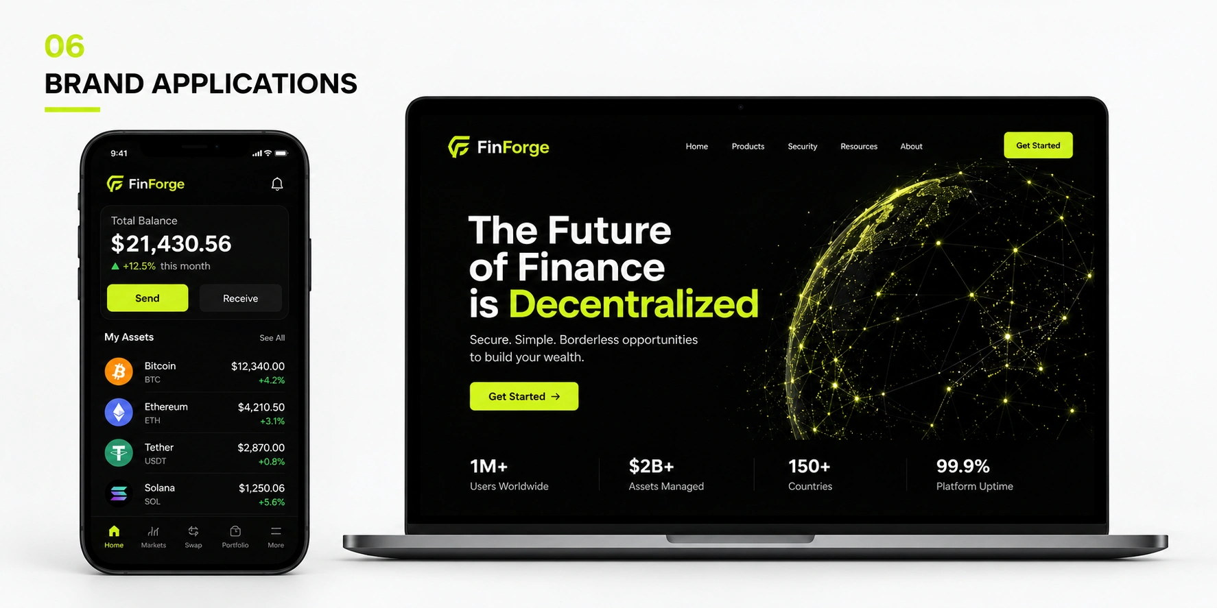
I translated the system into digital environments including a responsive website concept and mobile financial interface.
The website uses a dark interface, strong typographic hierarchy, lime-green CTAs, and data-driven visual elements to create a digital experience that feels modern while keeping the communication straightforward.
The mobile interface carries the same visual system into the product experience, ensuring that the identity remains consistent from brand discovery to financial interaction.
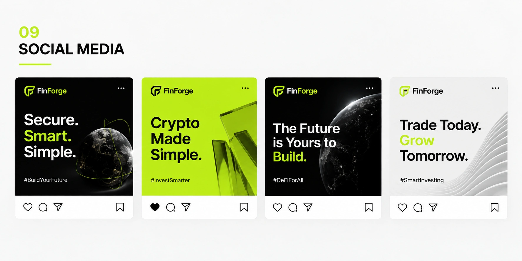
Social Media System
FinForge's social media direction was built around short, high-impact financial messages.
Rather than filling each post with information, the system uses:
Large statements
Strong typographic hierarchy
High-contrast compositions
Lime-green emphasis
Consistent brand positioning
Technology and finance-inspired imagery
This creates a recognizable content system that allows FinForge to communicate quickly while maintaining a consistent visual identity.
Packaging
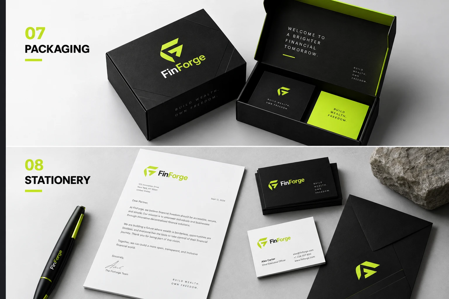
To demonstrate how the identity could exist beyond the screen, I extended FinForge into a premium packaging system.
The black packaging, lime-green accents, and minimal typography create a physical expression of the brand that feels structured and intentional.
This was important because the identity needed to feel like a complete company, not simply another digital crypto interface.
The packaging system demonstrates how the visual language can translate into tangible brand experiences while retaining its core characteristics.
Stationery
The identity was also applied across corporate stationery including:
Business cards
Letterhead
Envelopes
Branded writing materials
The stationery introduces a more professional and institutional side of FinForge while maintaining the same bold visual language.
This helps bridge the gap between technology brand and established financial organization.
The Outcome
The final identity gives FinForge a complete visual foundation capable of supporting the brand across multiple environments.
Instead of creating a logo in isolation, I developed a scalable brand system that connects:
Strategy → Identity → Digital Product → Marketing → Physical Brand Experience
Every touchpoint uses the same core principles, allowing the brand to remain recognizable whether someone encounters FinForge through a website, mobile interface, social post, package, or corporate document.
The result is a visual identity that feels bold enough to compete in digital finance, structured enough to communicate trust, and flexible enough to grow with the brand.
What I Designed
Brand Strategy & Visual Direction
Logo & Identity System
Primary logo
Alternative logo
Brand mark
App icon
Visual System
Color palette
Typography system
Brand pattern
Graphic language
Digital Applications
Website direction
Mobile UI concept
Digital brand applications
Marketing Applications
Social media system
Campaign graphics
Physical Applications
Packaging
Stationery
Business cards
Letterhead
Branded materials
Brand Guidelines
Visual identity documentation
Logo usage
Color system
Typography
Brand pattern
Application examples
My Role
Brand Identity Designer & Visual Strategist
I developed the visual direction, identity system, logo suite, typography and color system, graphic language, and brand applications presented in this case study.
Project Details
Industry
Fintech / Digital Finance / Web3
Services
Brand Strategy · Brand Identity · Logo Design · Visual Systems · Art Direction · Digital Brand Design · Packaging Design
Tools
Adobe Illustrator · Adobe Photoshop · Figma
Project Type
Brand Identity Concept
Final CTA
Building a brand that needs to look as credible as the business behind it?
I help ambitious startups turn complex ideas into clear, distinctive brand identities and digital experiences built to scale.
Let's build something people remember — and trust.
CONTRA DETAILS
For the actual Contra fields, I'd use:
Project Title:
FinForge — Digital Finance Brand Identity
Preview Description:
A bold visual identity for FinForge, a next-generation digital finance platform built around trust, simplicity, and financial freedom.
Role:
Brand Identity Designer & Visual Strategist
Industry:
Fintech
Services:
Brand Identity, Logo Design, Brand Strategy, Visual Identity, Art Direction, Digital Design, Packaging Design
Tools:
Adobe Illustrator, Adobe Photoshop, Figma
Project Type:
Self-Initiated / Concept Project
Client:
Leave blank if there was no client.
Project Duration:
Only add the actual duration if you want to disclose it.
Live Link:
Only add one if there is a genuine public FinForge website/product.
The visual order I'd use on Contra
Contra specifically emphasizes a strong cover and multiple high-quality visuals.
I would not simply upload the 11 images in the order you created them. I'd make the story flow like this:
01 — Cover
Exterior FinForge building signage
→ Immediately establishes the brand as a real, substantial company.
02 — Brand Statement
“BUILD WEALTH. OWN FREEDOM.”
→ Introduces the positioning.
03 — Brand Overview
→ Explains what FinForge is.
04 — Logo Suite
→ Shows the core identity system.
05 — Colors
→ Establishes the visual language.
06 — Typography
→ Shows the type system.
07 — Brand Pattern
→ Explains the graphic language.
08 — Digital Applications
→ Website + mobile interface.
09 — Packaging + Stationery
→ Shows the identity outside digital.
10 — Social Media
→ Shows the marketing system.
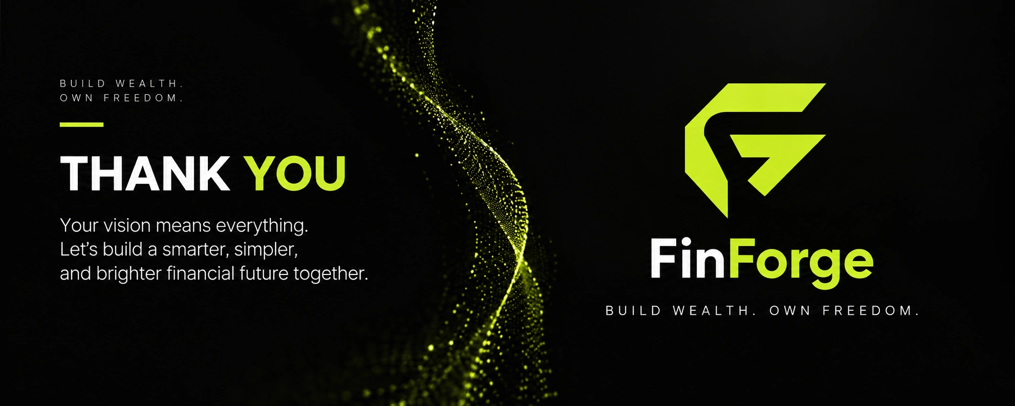
11 — Closing / Thank You
→ Strong visual ending.
That sequence tells an actual brand story, rather than making the viewer scroll through disconnected mockups.
Like this project
Posted Sep 25, 2026
Created a bold visual identity for FinForge, a crypto finance platform focused on trust and freedom.