Minimalist Beer Branding and Packaging Design by Raphaël RenoncourtMinimalist Beer Branding and Packaging Design by Raphaël Renoncourt

Minimalist Beer Branding and Packaging Design

Raphaël Renoncourt

Raphaël Renoncourt

Branding of "330ML" Beer - Industrial and Modern Design
The "330ML" beer brand embodies simplicity and modernity with an industrial touch. The name "330ML" reflects the standard can size, emphasizing practicality and accessibility, which is central to the brand's identity. The consistent typography, inspired by receipt tickets, adds a distinctive industrial edge to the branding. This digital-style typography is used uniformly across the packaging, enhancing the minimalist beer packaging design. The background features abstract waves representing hops and barley, which are color-coded according to the type of beer, allowing for easy identification of each variety. The design is further enhanced with condensation droplets, adding a sense of freshness and desirability.
"330ML" combines simplicity, modernity, and an industrial touch to create a strong and appealing visual identity. The use of digital-style typography and minimalist design with abstract motifs makes the branding stand out in the competitive beer market. The practical beer packaging not only ensures the quality of the product but also appeals to consumers looking for modern beer branding. This innovative approach in branding, packaging, and beer design highlights the uniqueness of the "330ML" beer brand, making it a perfect example of how industrial and modern design can be successfully integrated into product branding.
Like this project

Posted Jun 10, 2026

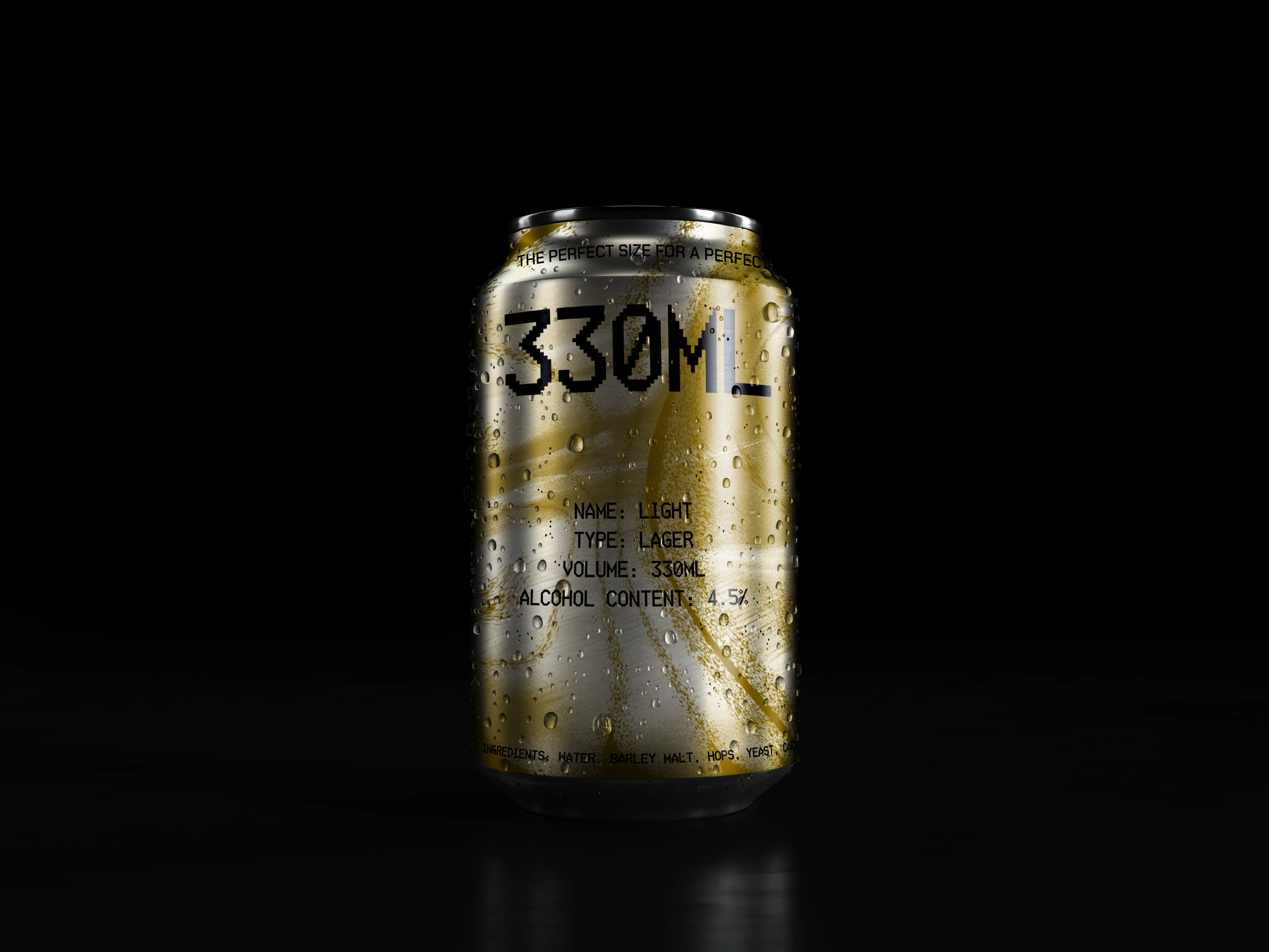
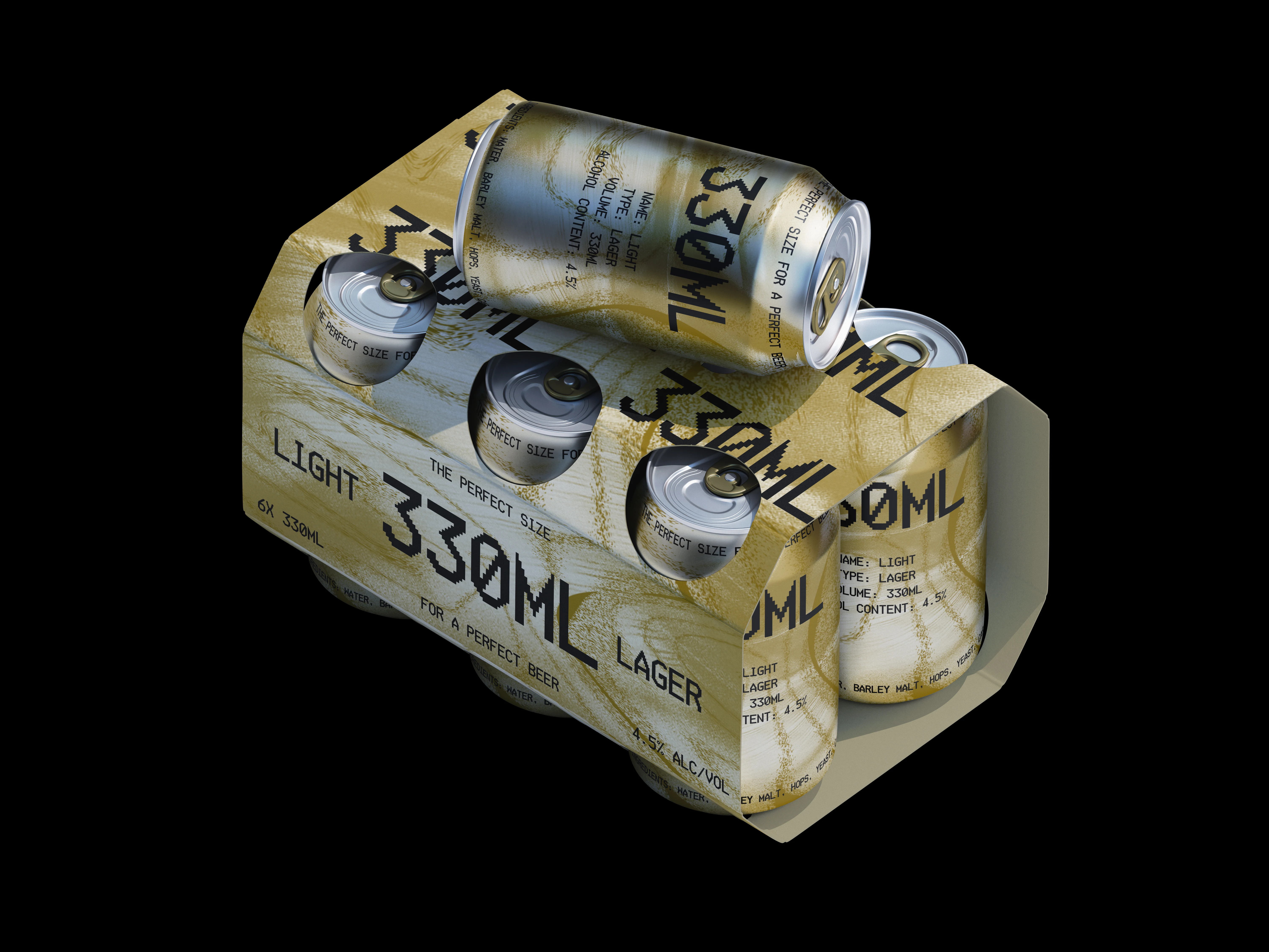
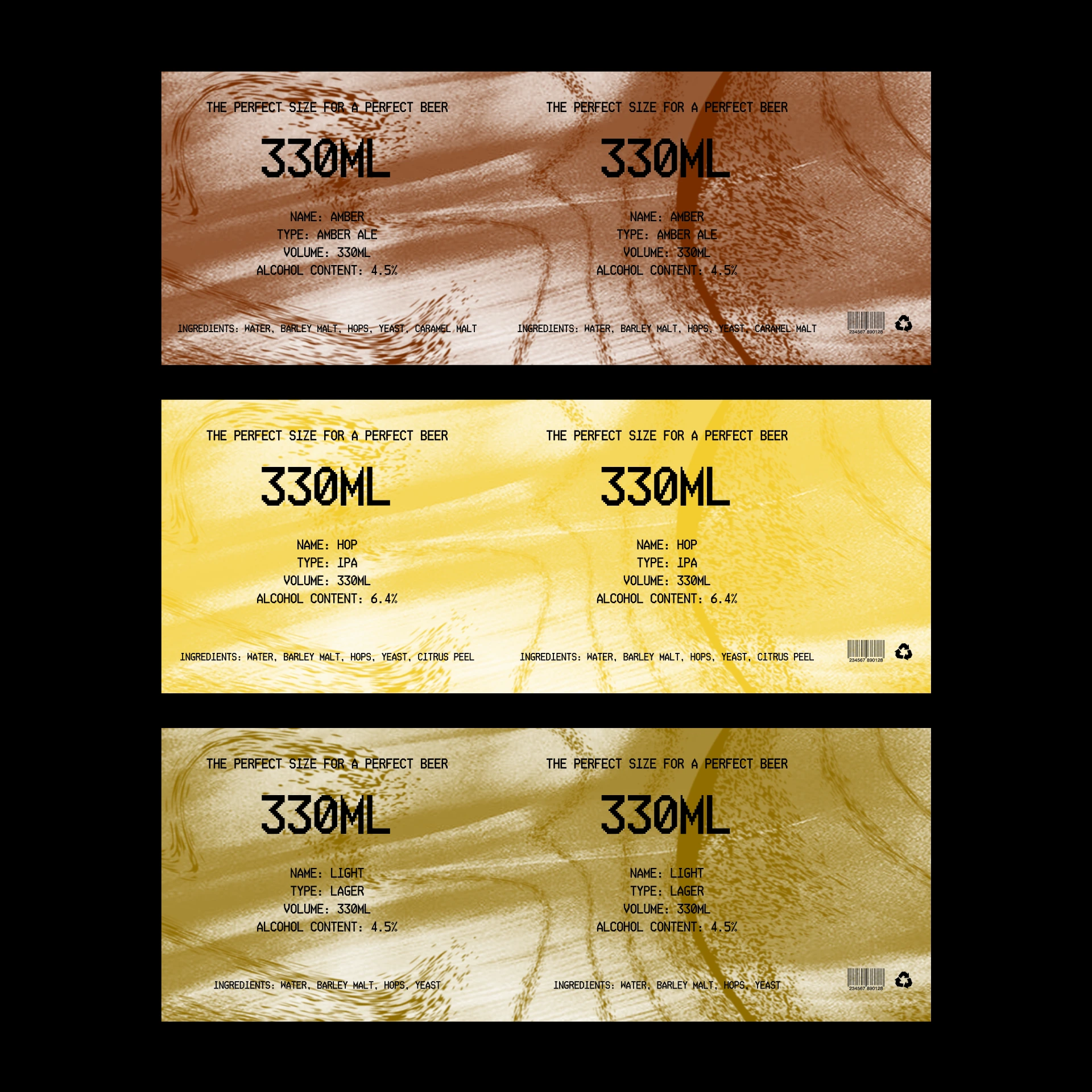
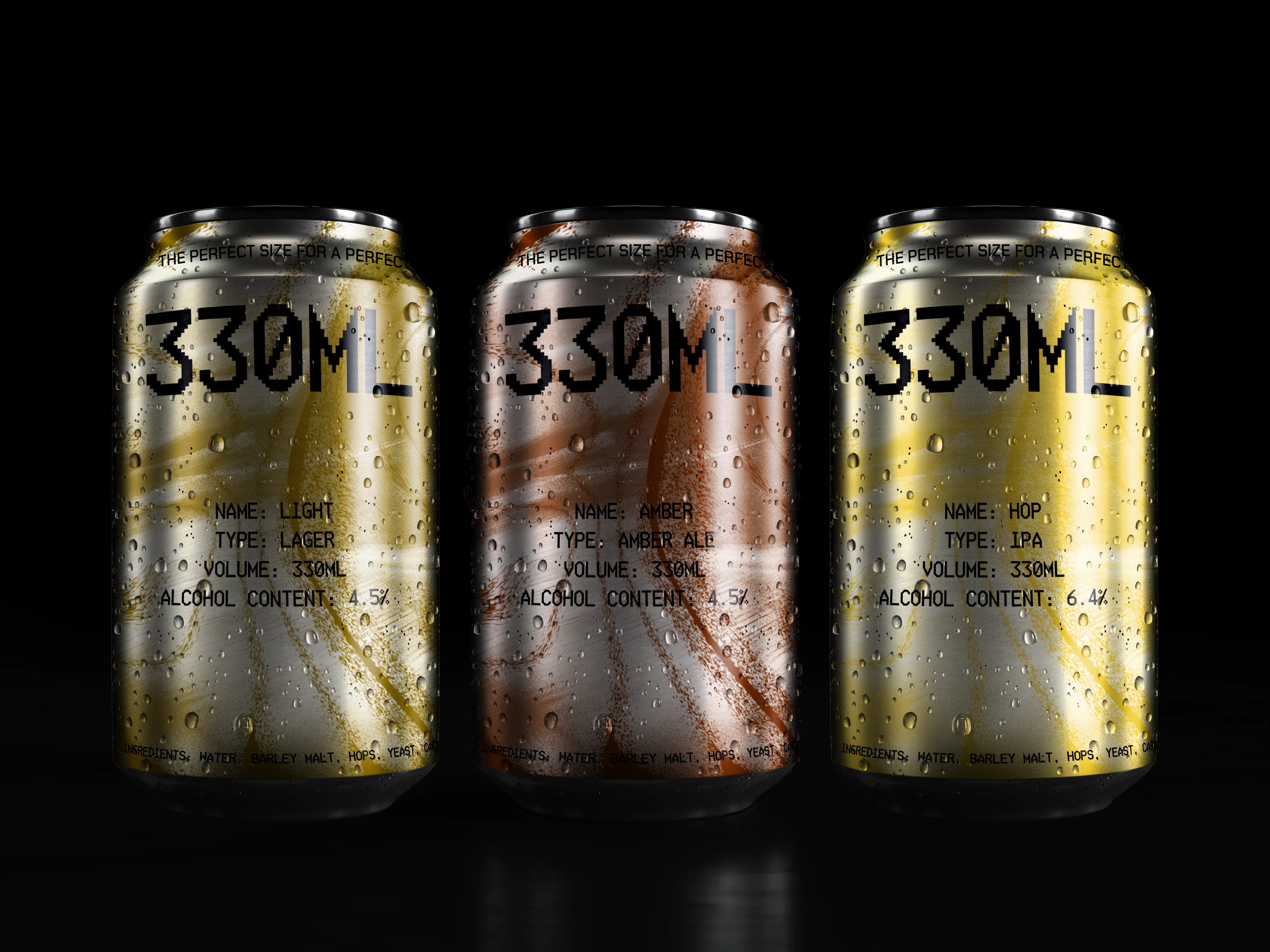
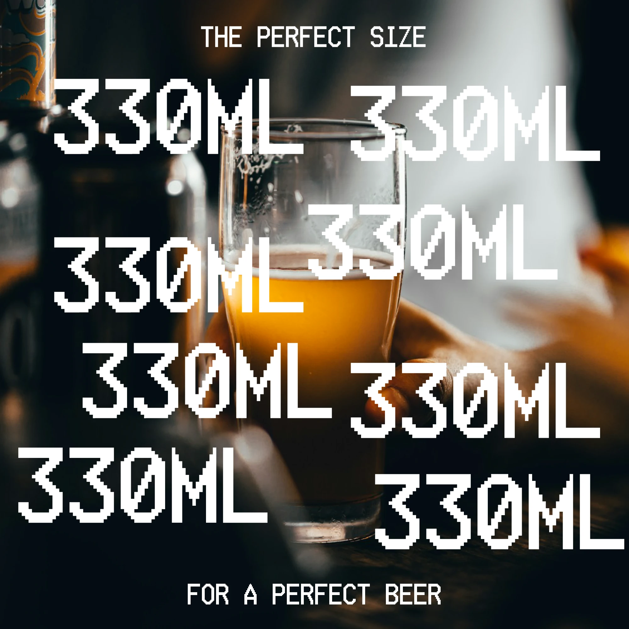
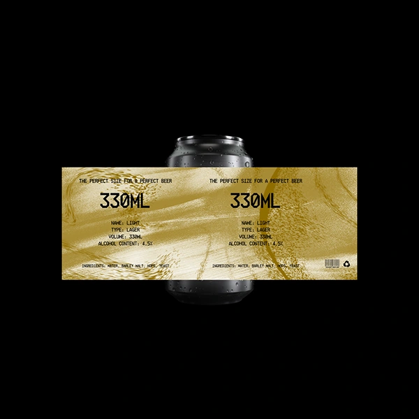
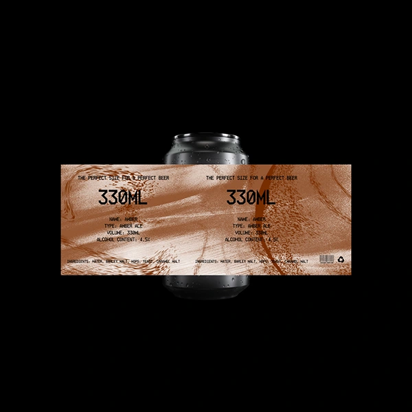
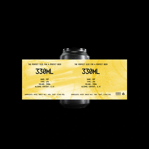
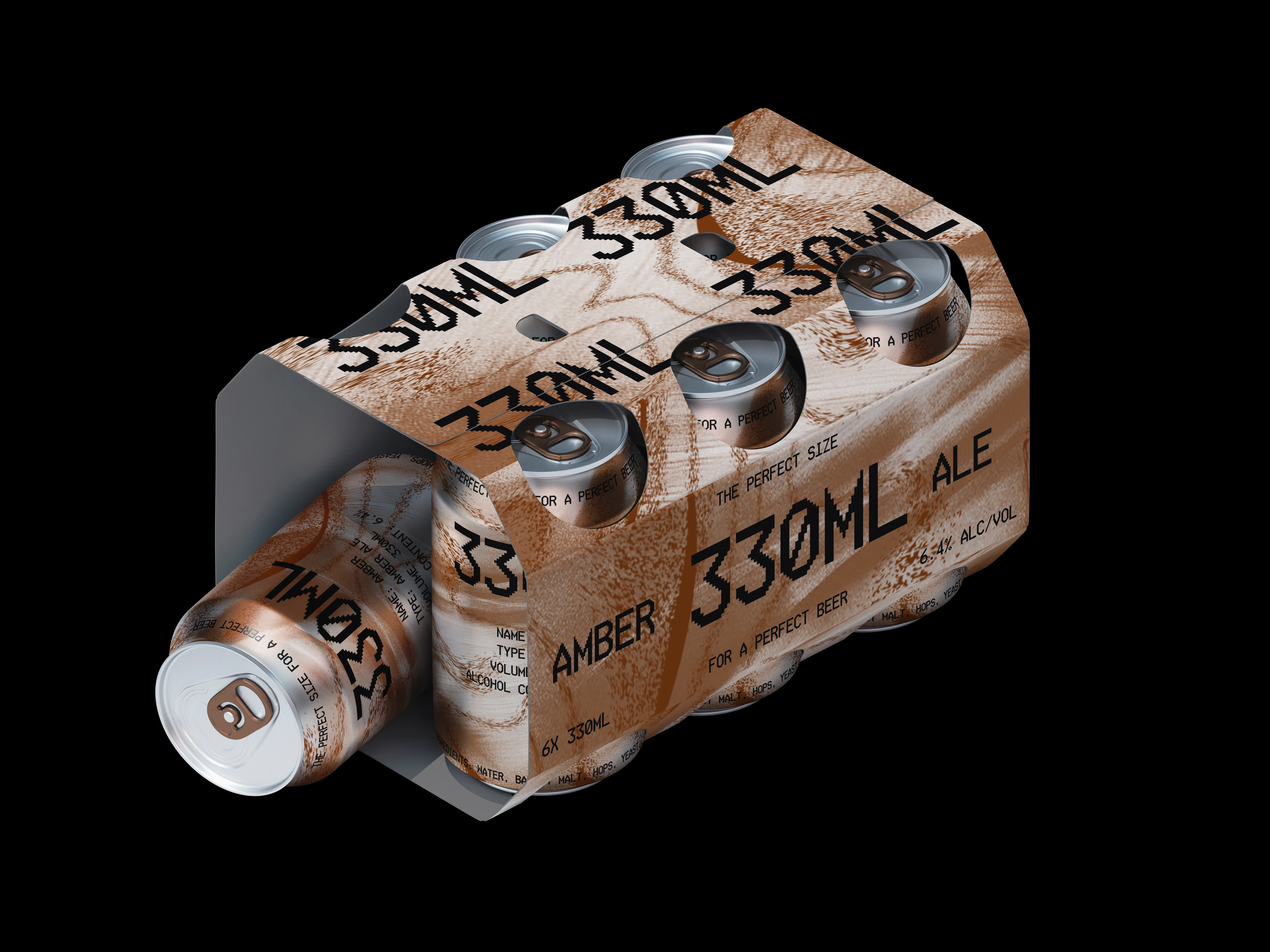
This project showcases the visual identity of a beer brand rooted in simplicity, functionality, and industrial design. Named after the standard can size, the concept emphasizes practical packaging and accessibility, making the product instantly recognizable. The use of digital-style typography inspired by receipt tickets gives the brand a raw, industrial aesthetic, aligning with a modern minimalist packaging system. The label design features abstract wave motifs, referencing hops and barley, color-coded to differentiate the types of beer. Combined with condensation textures and a clean layout, the identity conveys freshness, clarity, and modernity. This project blends graphic design, beer packaging design, and brand strategy to create a unique presence in the competitive beverage market — a bold example of how industrial aesthetics and contemporary branding can elevate a simple product into a memorable experience.