Minimal Honey Brand Identity & Label Design
Raphaël Renoncourt
Brand Identity of "beey®" Raw Honey - Packaging & Visual System
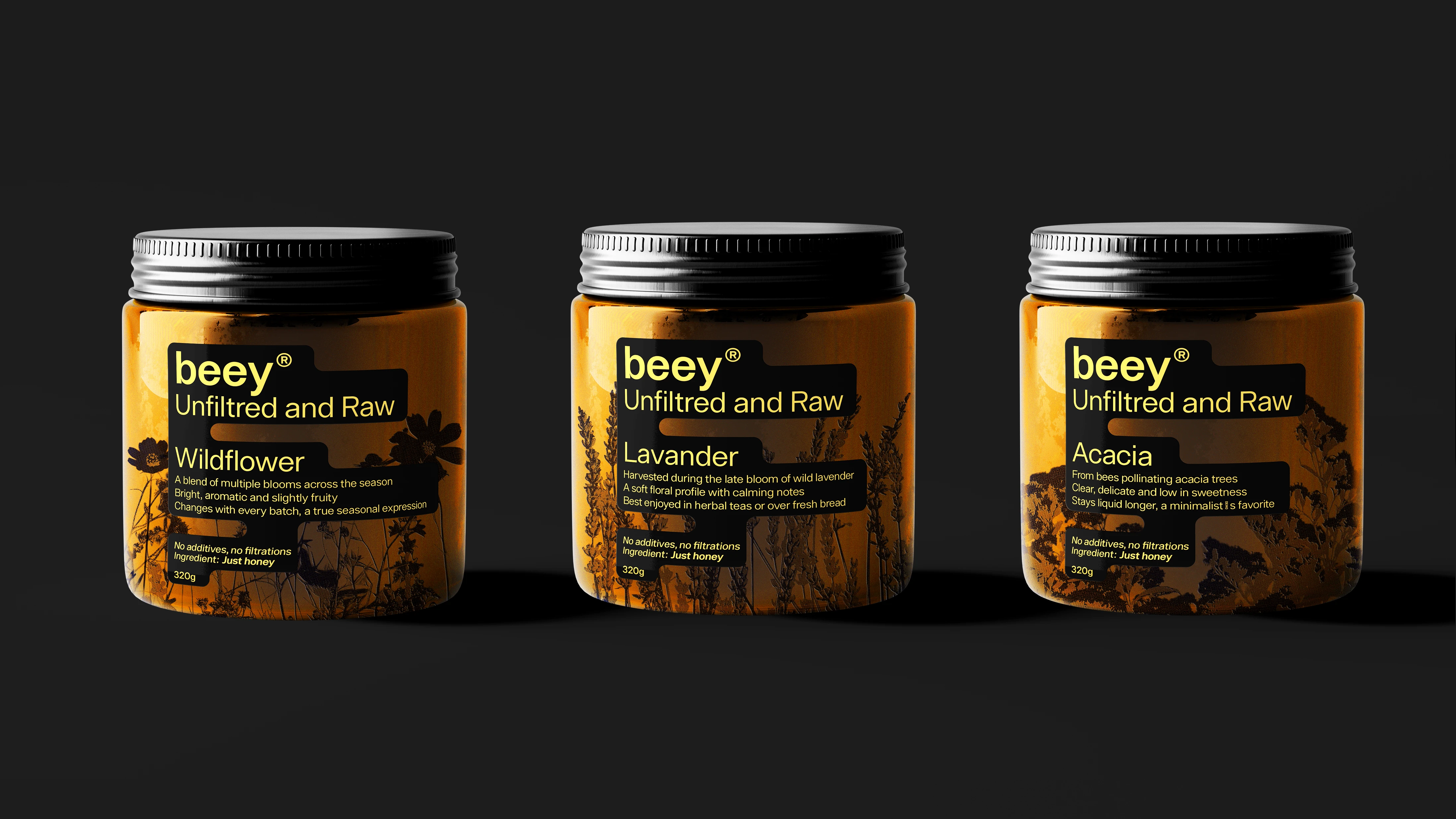
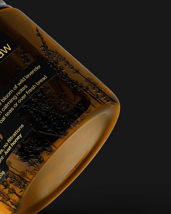
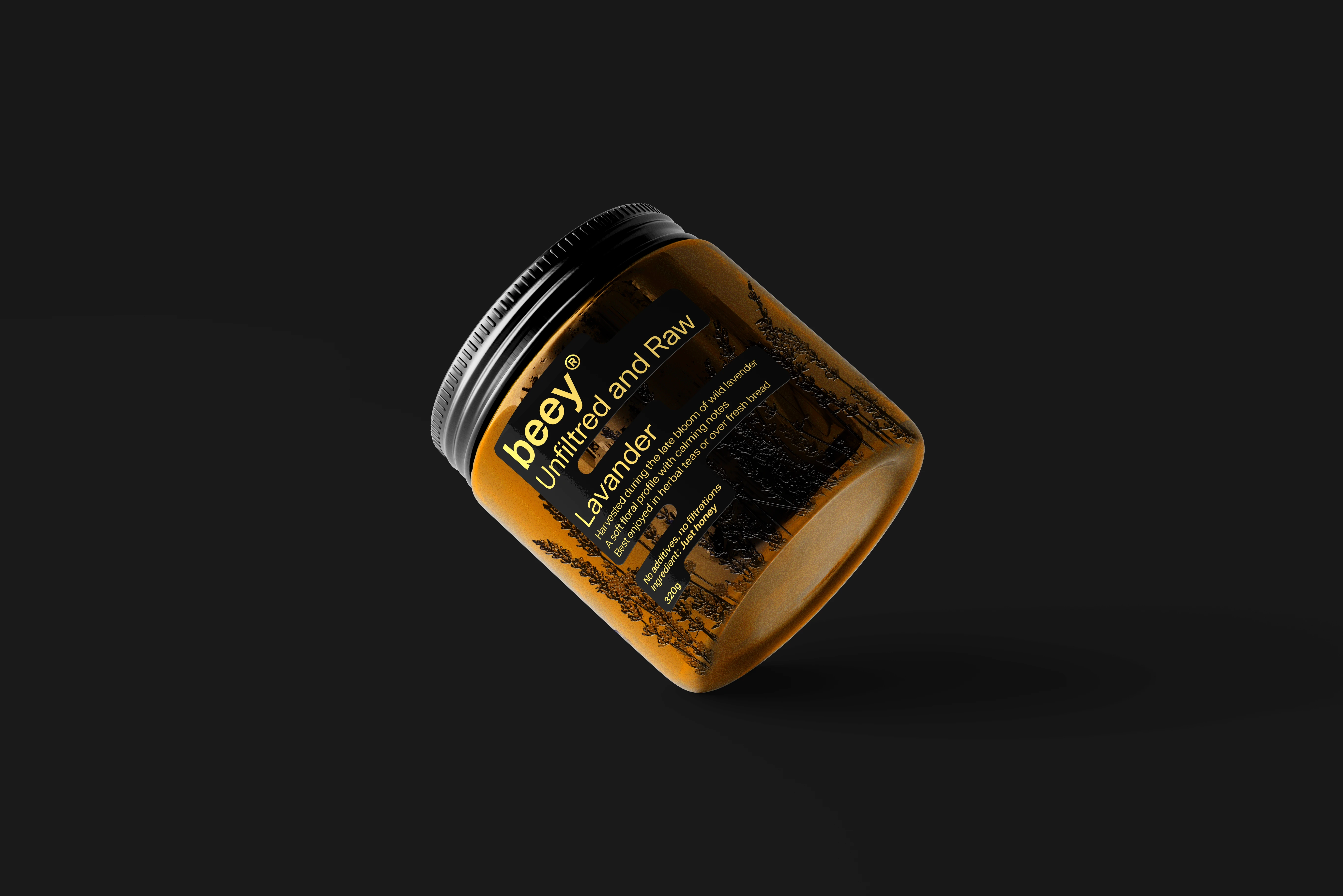
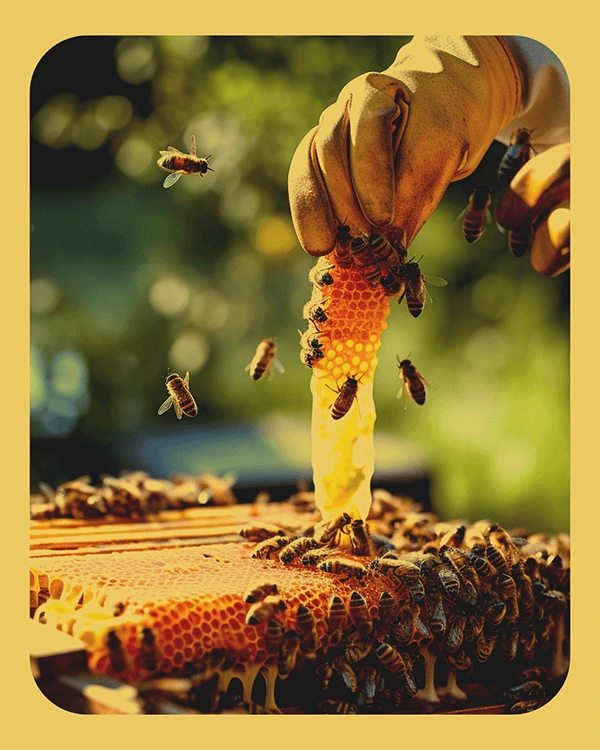
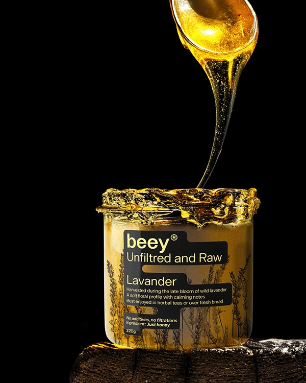
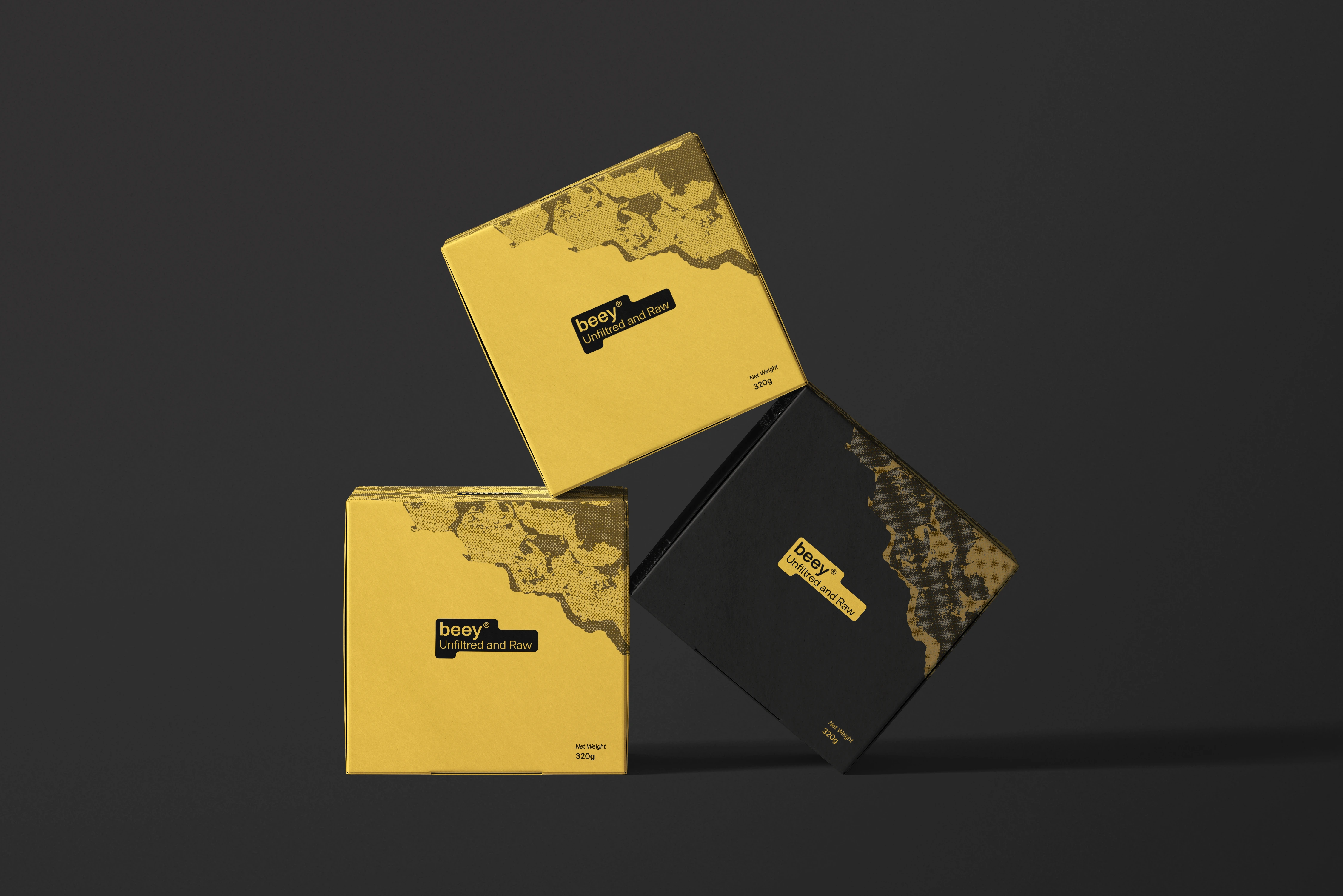
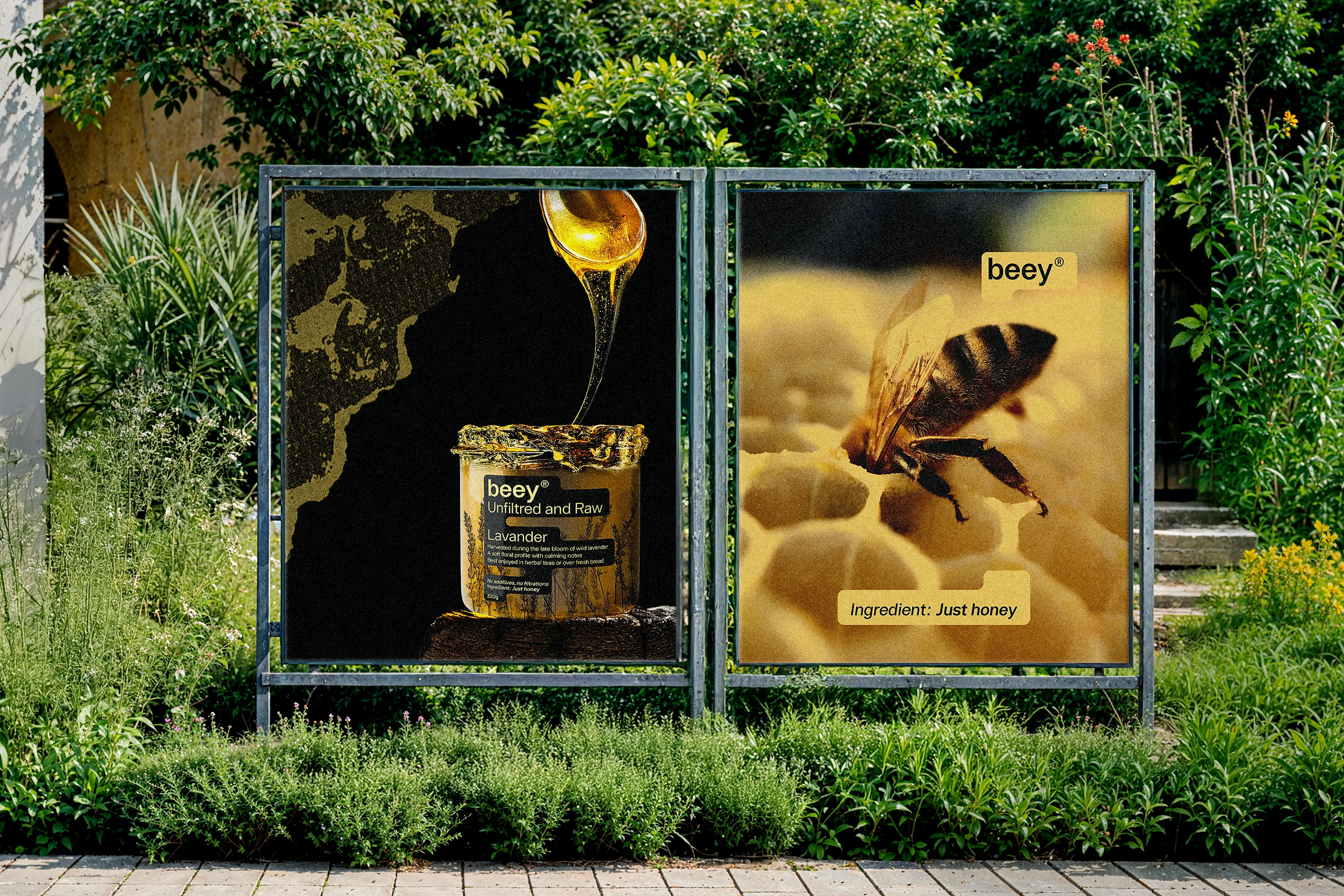
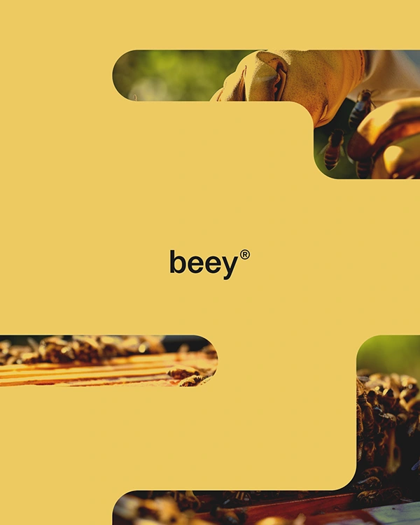
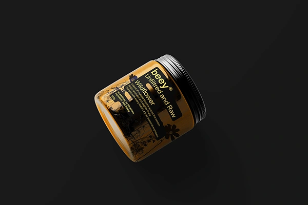
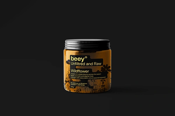
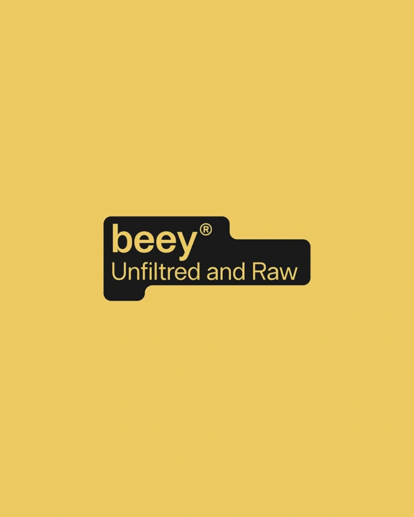
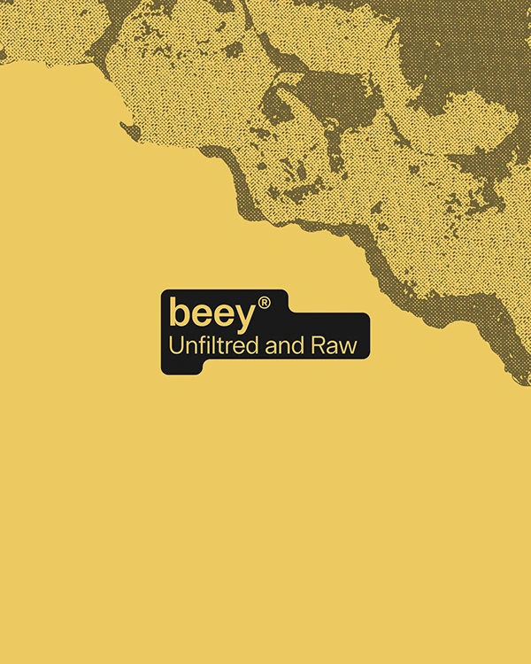
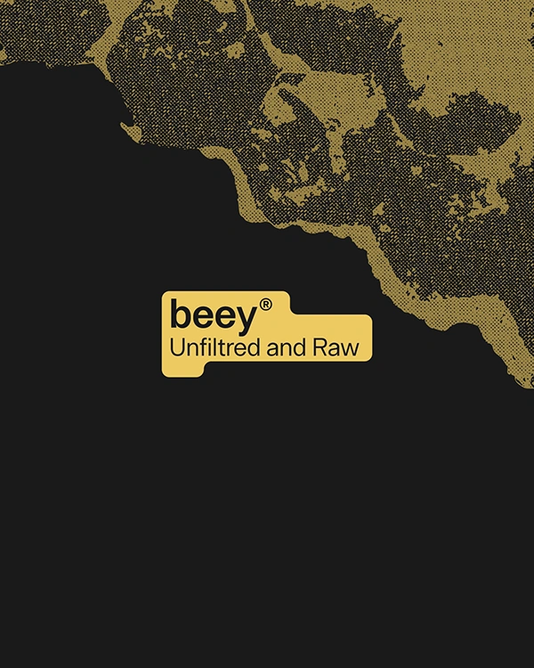
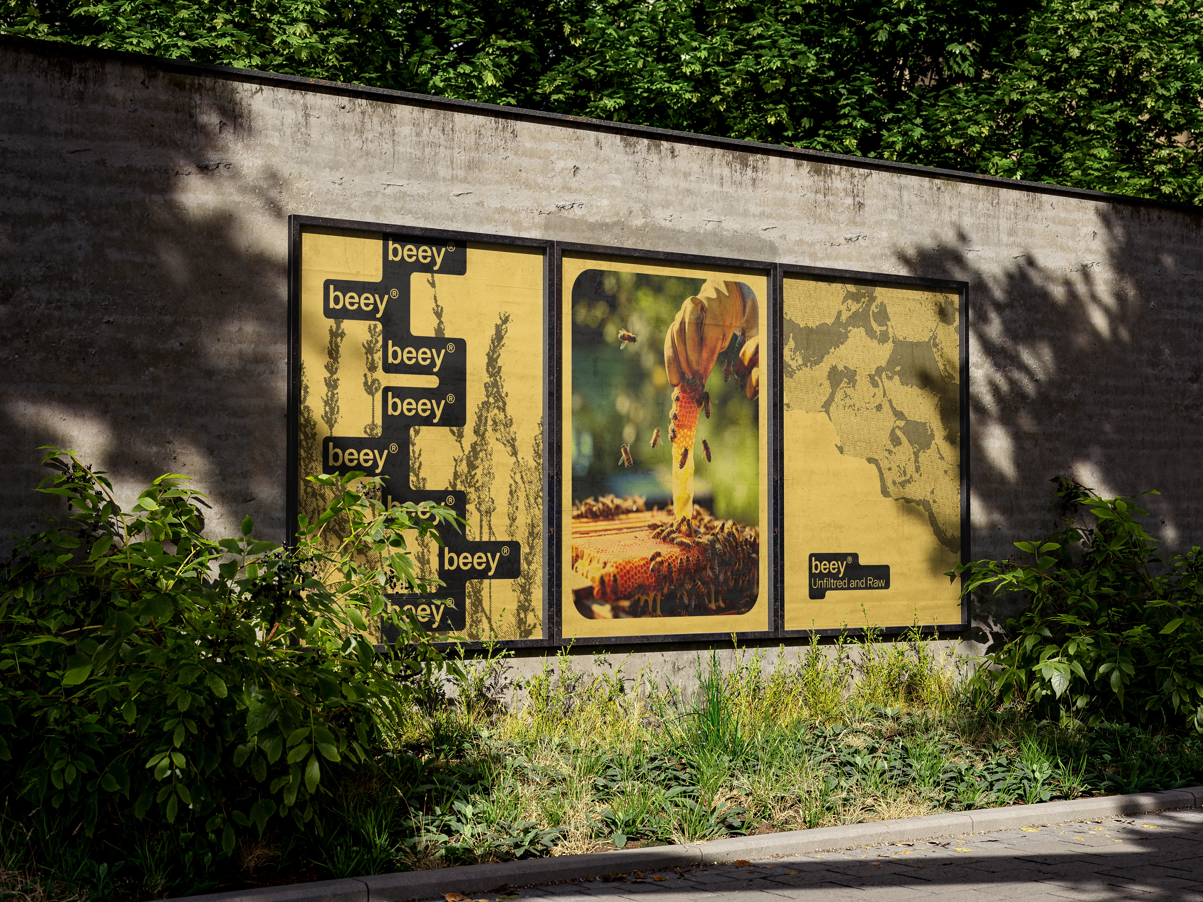
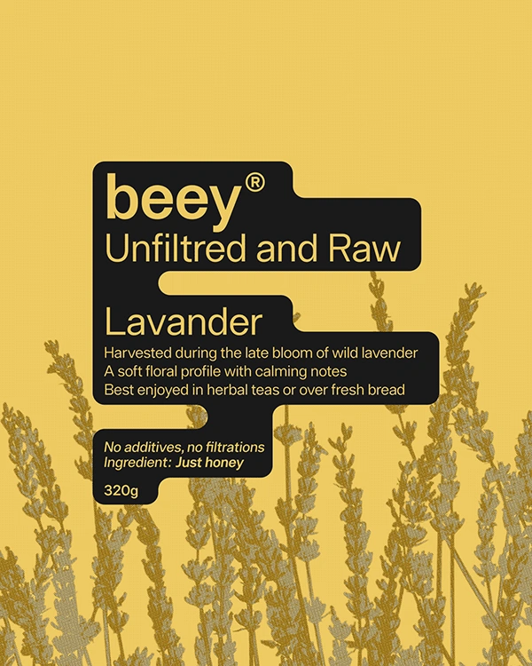
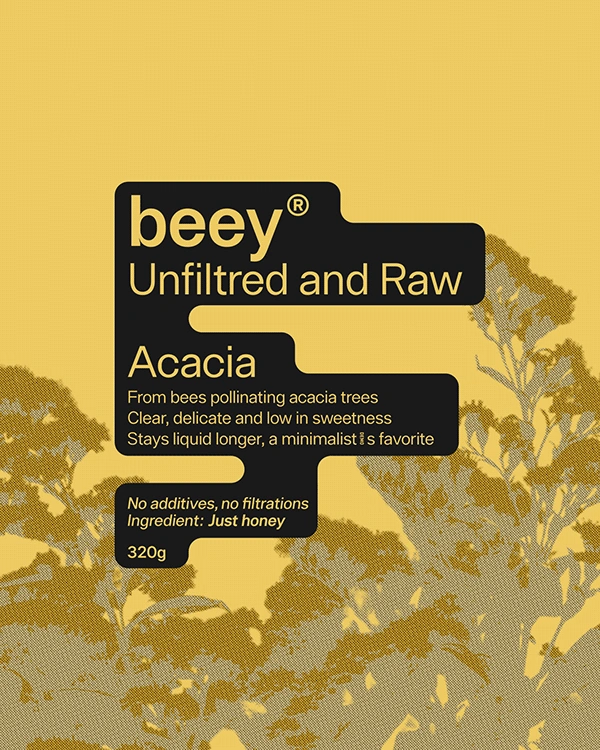
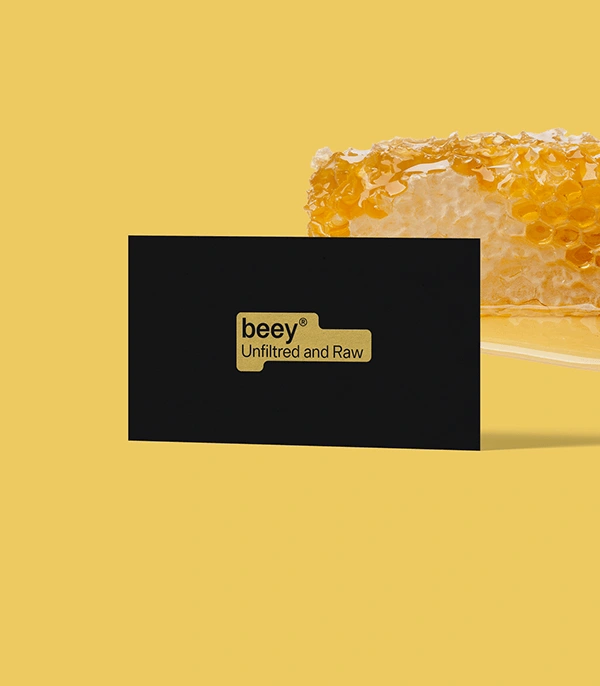
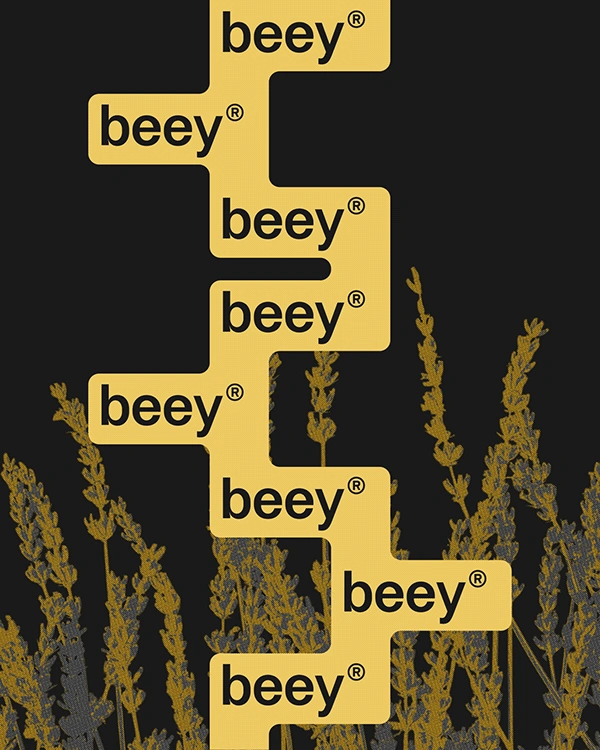
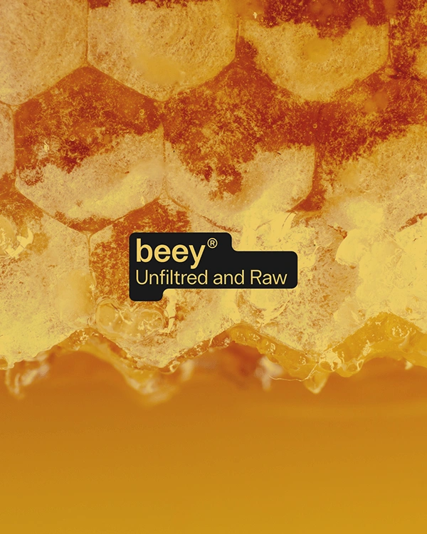
Beey’s identity is built around a single visual shape, a rounded label that brings structure and softness. It frames the logo, holds the content, and becomes the brand’s most recognizable mark. Its form subtly echoes the geometry of a hive, simplified and abstracted to avoid imitation. A soft droplet at the bottom introduces a quiet tension, suggesting the slow and natural flow of raw honey. The visual language is deliberately restrained. A warm creamy yellow and a deep black serve as the only colors. This limited palette creates clarity, calm and timeless contrast, guiding every other element with the same sense of intention.
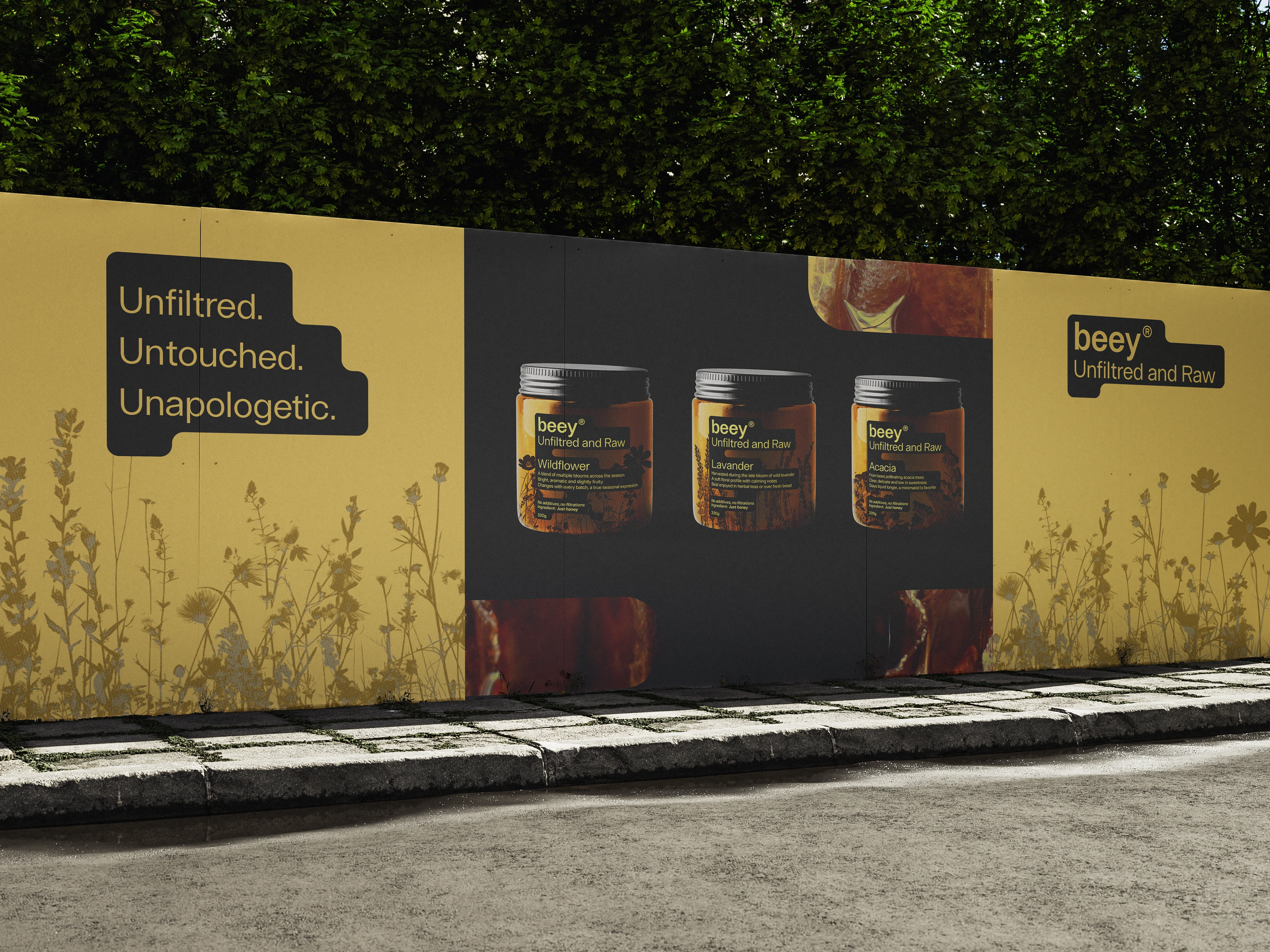
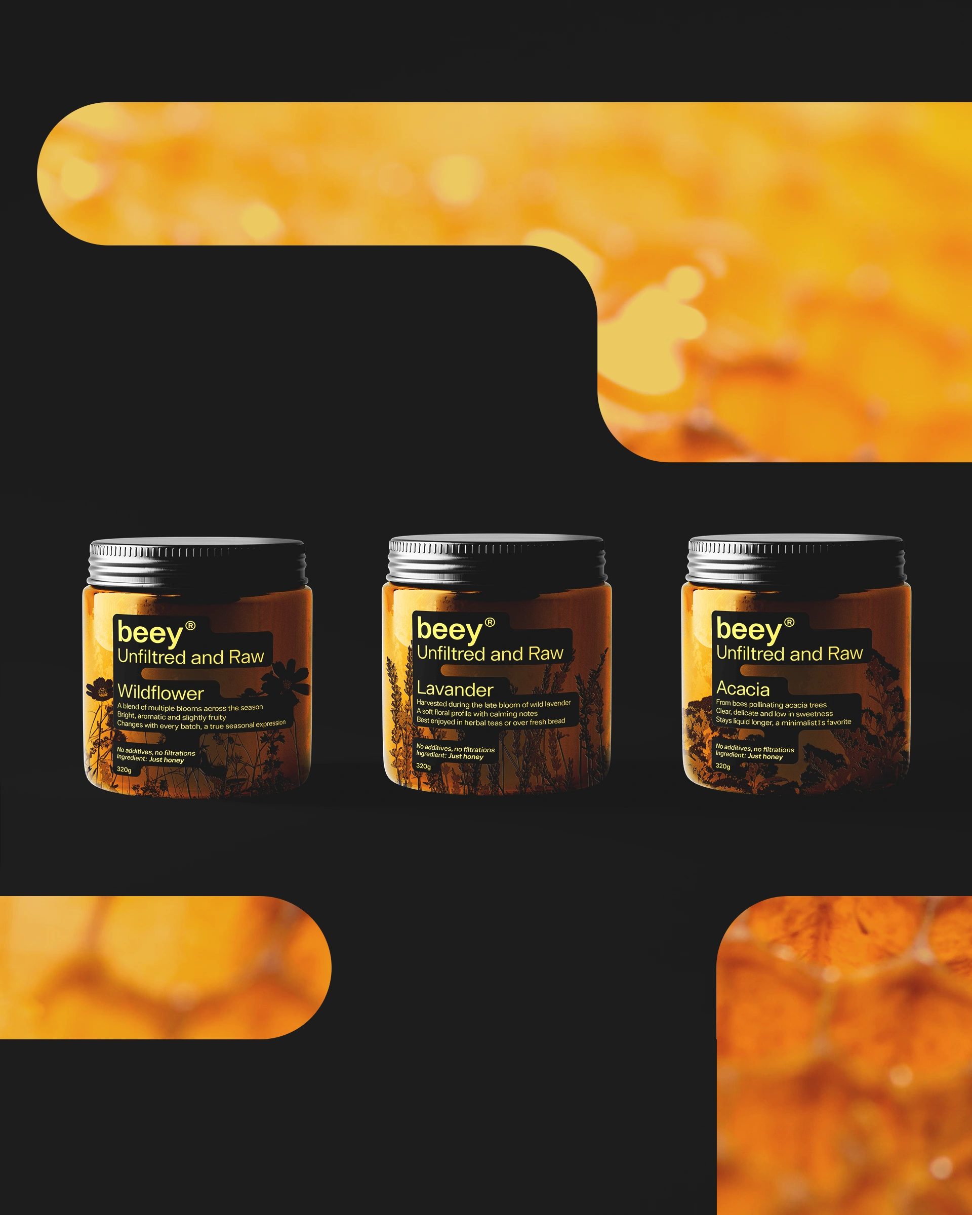
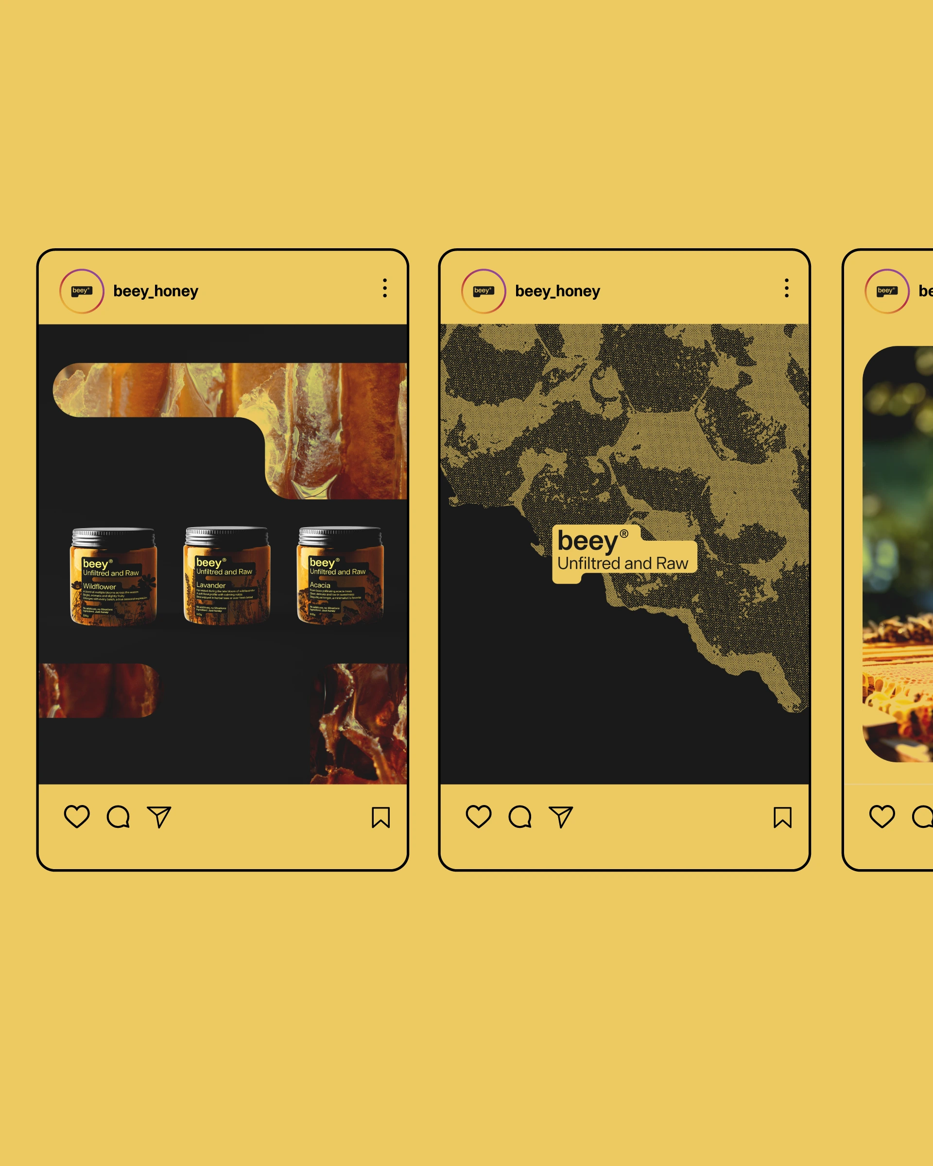
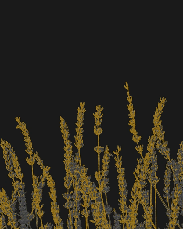
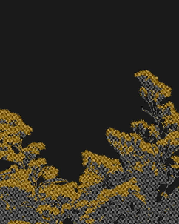
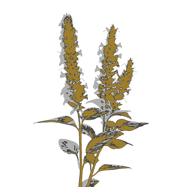
Typography is clean, centered and unobtrusive. The logo sits confidently within the label, accompanied by quiet graphic elements. Micro-details like margins, notations and rhythms structure the system without clutter. Each jar features a stylized floral image, printed directly onto the glass behind the label. These visuals are not decorative but atmospheric, evoking the botanical origins of each variety — Wildflower, Lavender, Acacia. Desaturated, softened and carefully framed, they add emotion while maintaining visual unity.
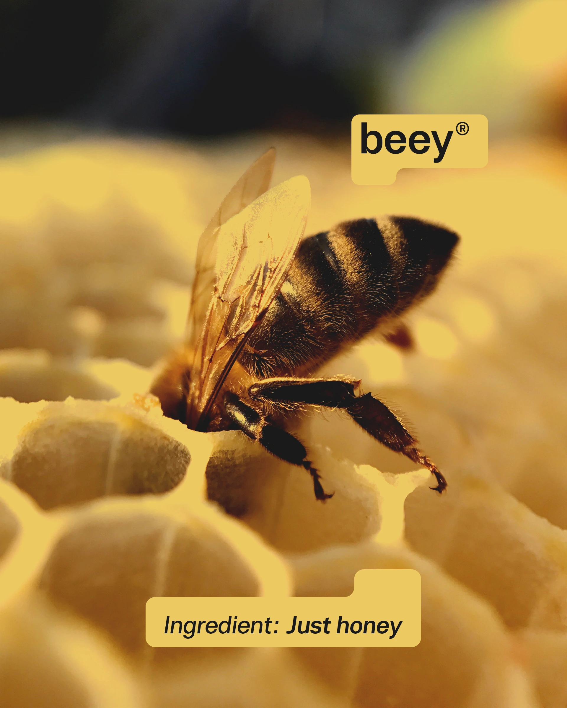
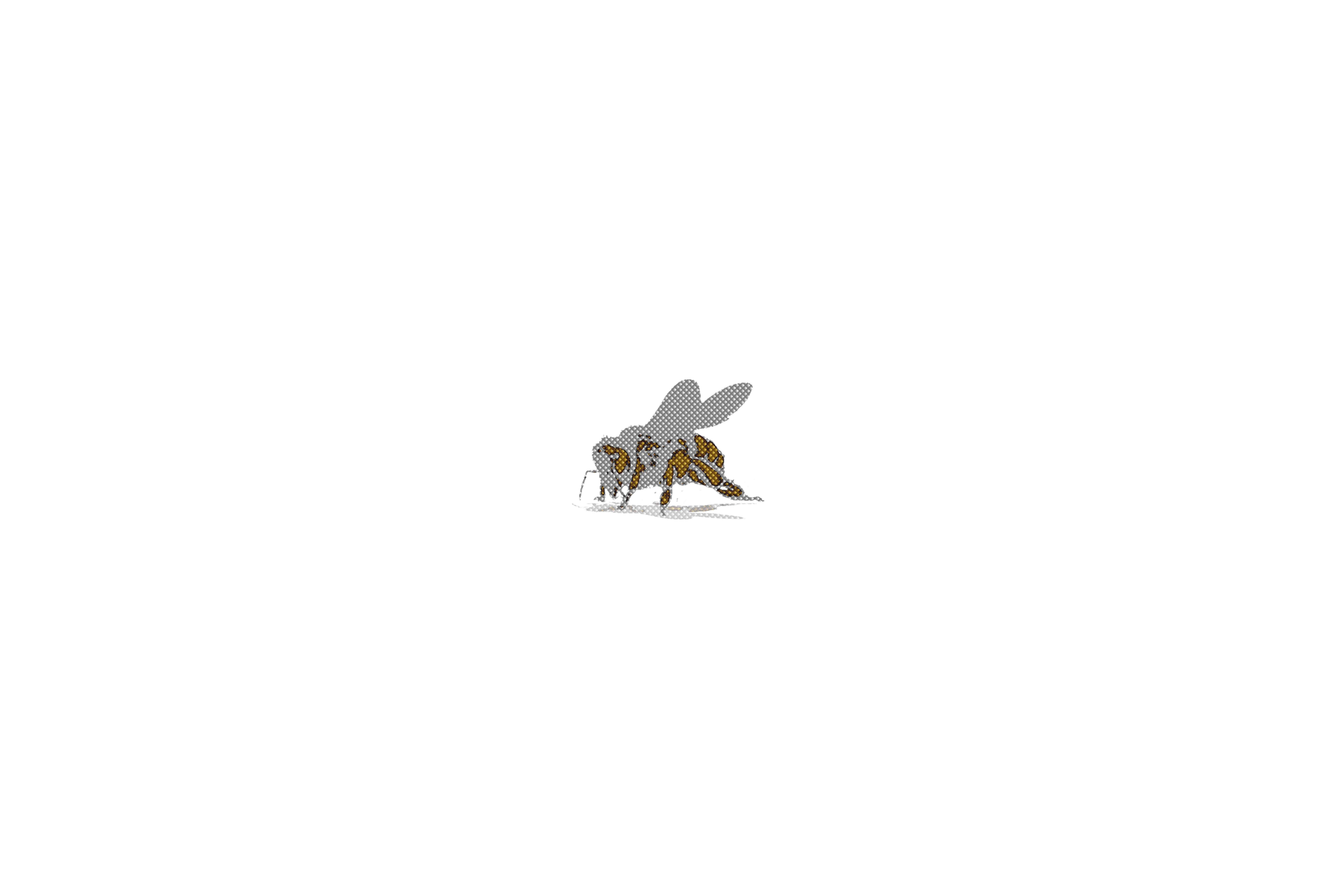
The label itself becomes a visual signature, reused across applications. It frames content in layouts, masks images, and acts as a constant without needing to repeat the logo. In the campaign, a stylized bee simply carries the label. No tagline, no effects. Beey speaks by being present. This project explores how branding can be quiet yet confident, precise yet emotional. Nothing added. Just honey.


Like this project
Posted Jun 10, 2026
Visual identity and packaging design for Beey®, a raw honey brand focused on clarity, softness and structure. The system is built around a signature rounded label, used across jars, layouts and campaign visuals. Minimal color palette, soft illustrations, and clean typography support a brand that speaks without noise. Designed by Raphaël Renoncourt, multidisciplinary graphic designer based in Montréal. Keywords: brand identity, raw honey, packaging design, label design, minimalist branding, visual system, graphic design, natural product branding, Montréal designer, BLEUCOEUR Studio
Likes
0
Views
1