Expressive Coffee Brand Visual Identity & Packaging by Raphaël RenoncourtExpressive Coffee Brand Visual Identity & Packaging by Raphaël Renoncourt

Expressive Coffee Brand Visual Identity & Packaging

Raphaël Renoncourt

Raphaël Renoncourt

Branding of a Coffee Brand — Expressive and Graphic Brand Identity
This project showcases the visual identity of an artisanal coffee brand built around raw expression, cultural codes, and an energetic graphic system. At the heart of the branding is a striking wireframe mascot — a dynamic figure that shapes the brand’s rhythm, layout, and tone. Its linear tension captures the intensity of coffee, becoming both symbol and structure in the overall identity.
The visual language draws from thermal printing, receipt-style typography, and radical compositions to break away from traditional coffee branding aesthetics. With saturated color codes and graphic contrasts, the design challenges expectations while embracing the brand’s Hispanic roots. The use of inverted exclamation marks — ¡ ! — acts as a bold visual device, reinforcing cultural identity and functioning as iconic branding elements.
DORADO reimagines artisanal coffee branding through a system that is alive, saturated, and unapologetically expressive. This identity merges graphic design, cultural symbolism, and layout experimentation to build a brand that is both memorable and full of character.
keywords: coffee branding, expressive brand identity, cultural branding, artisanal coffee, visual identity, graphic design, bold typography, thermal printing design, packaging design, Hispanic branding, radical layout, branding for coffee brands, creative direction, modern coffee brand, mascot branding, receipt-inspired design, saturated color palette, identity system, contemporary coffee packaging
Like this project

Posted Jun 10, 2026

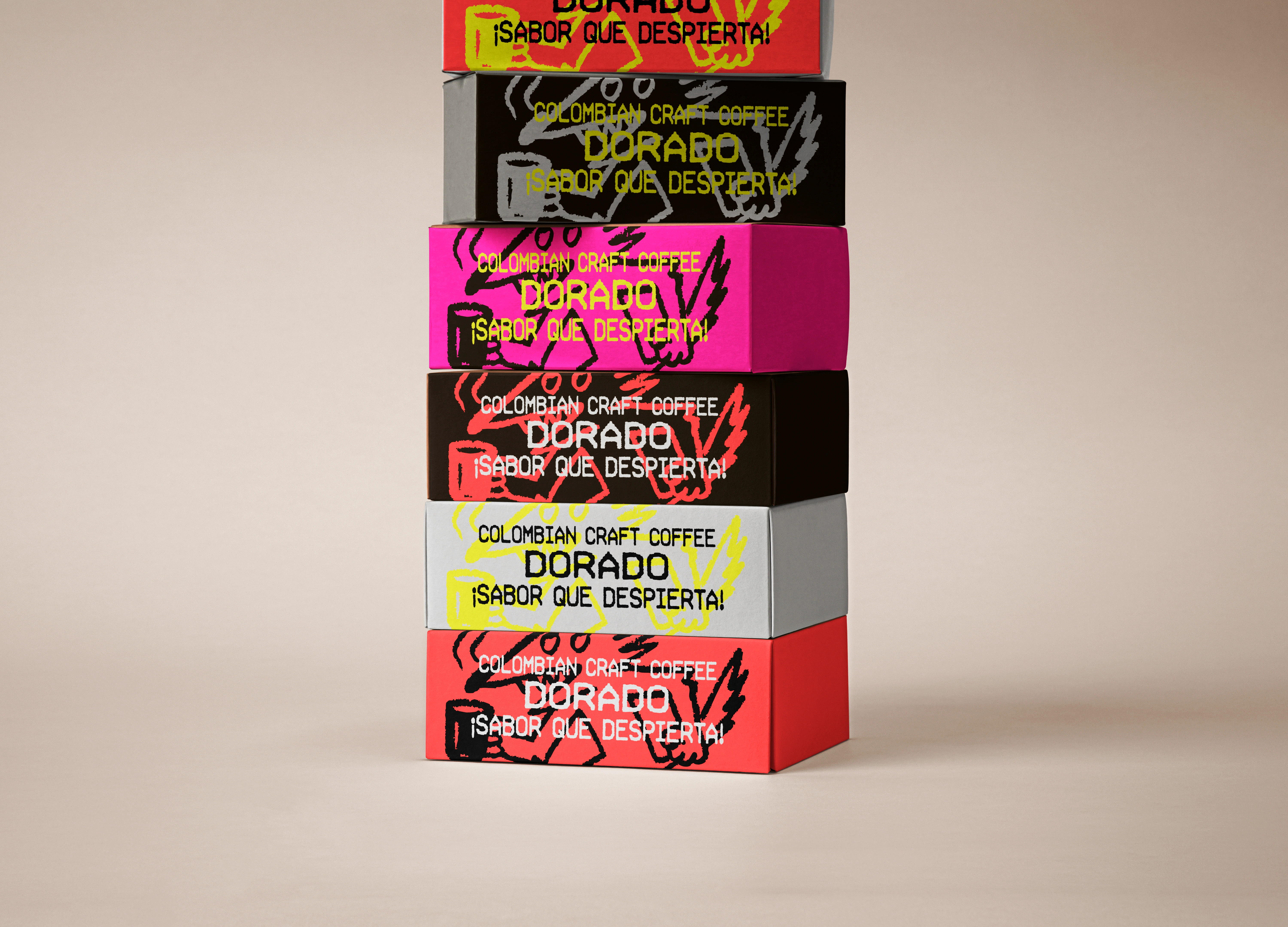
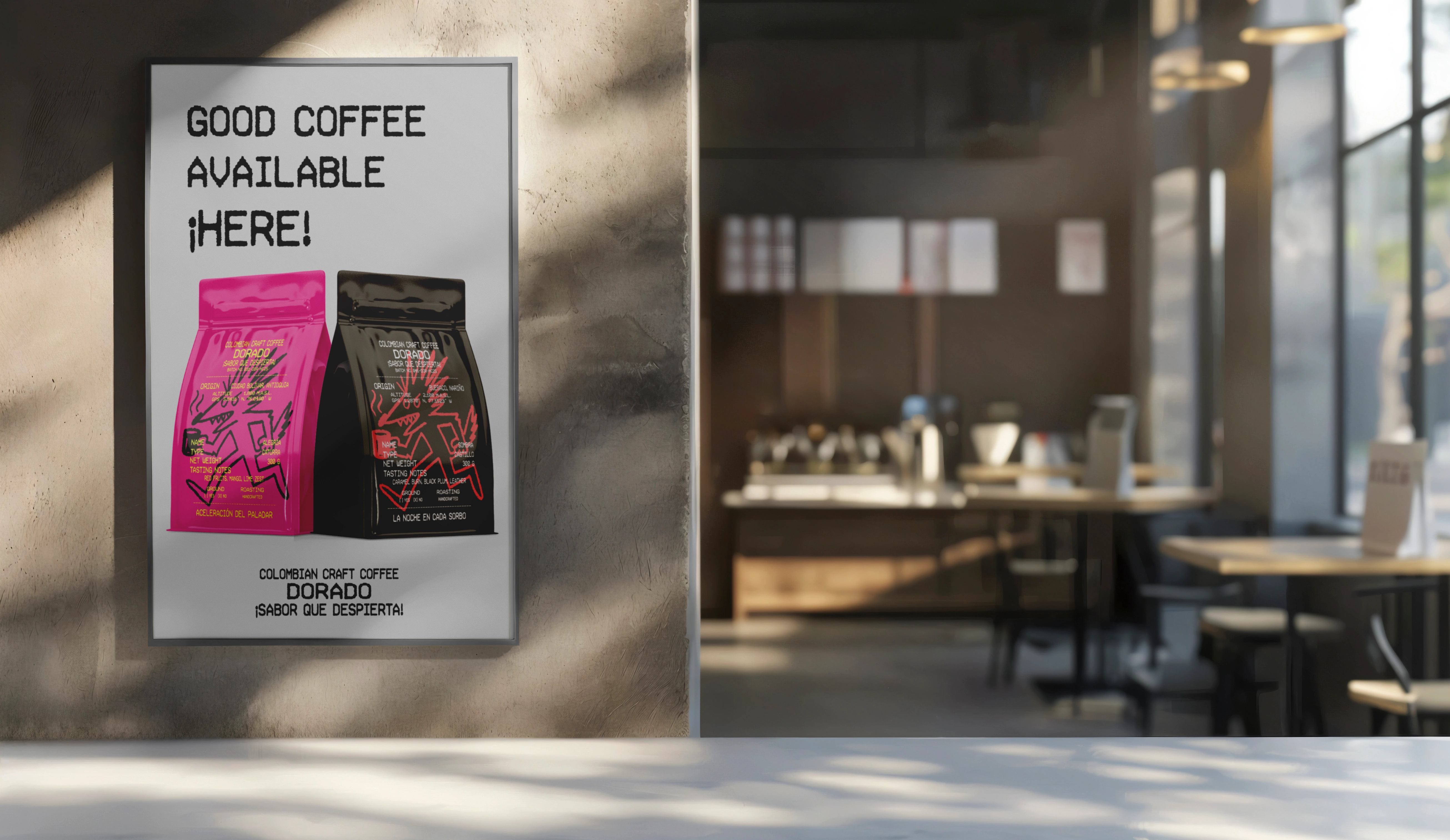
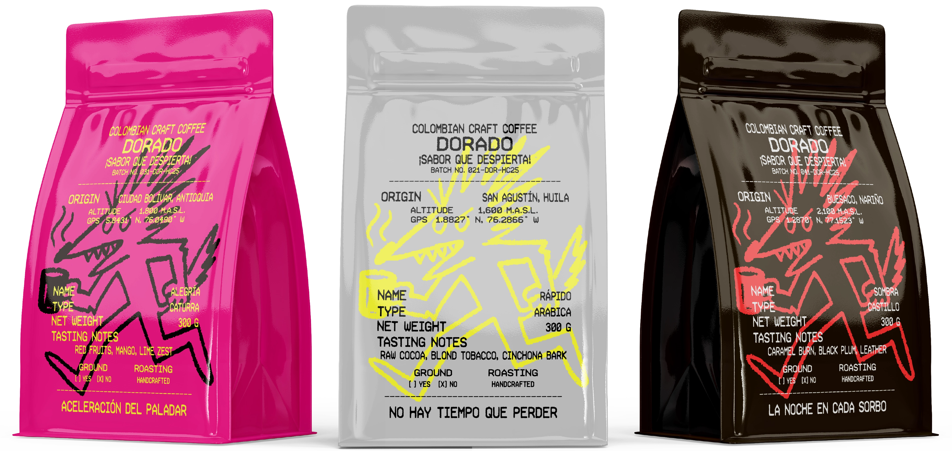
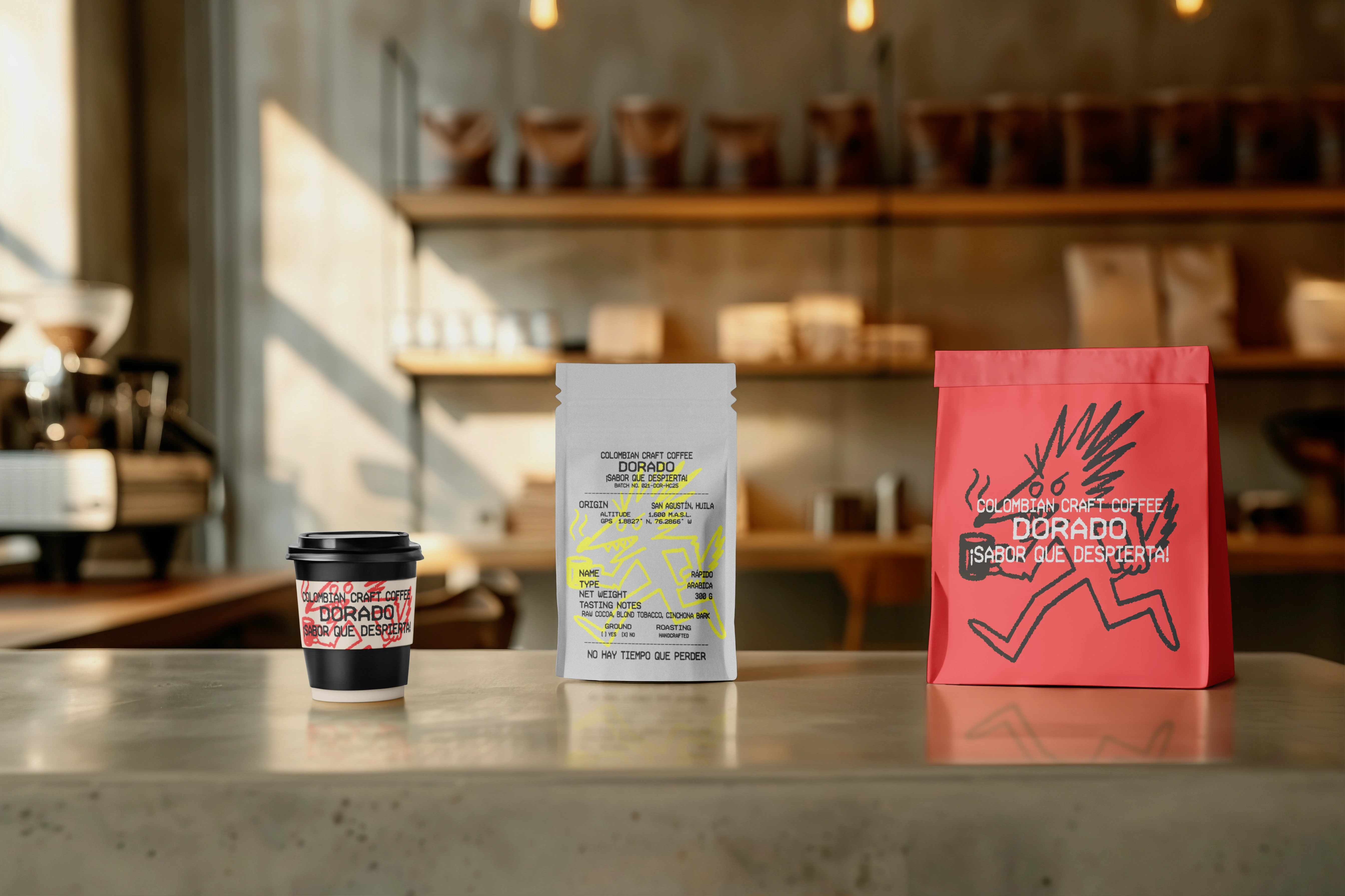
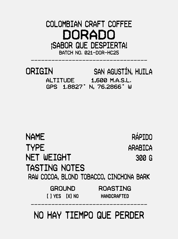
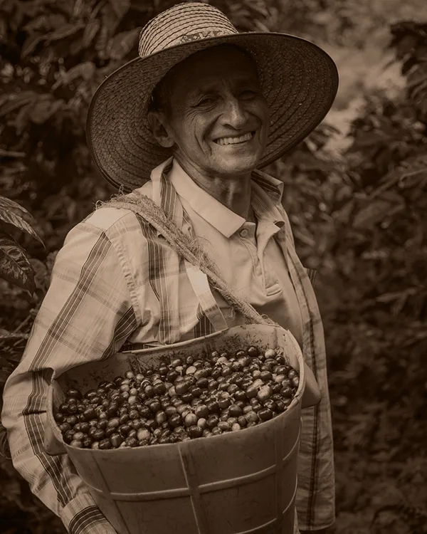
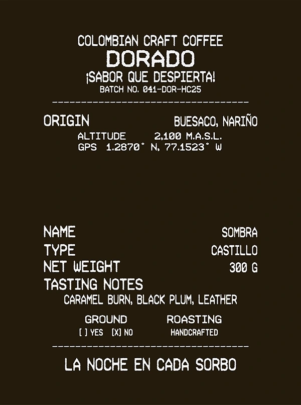
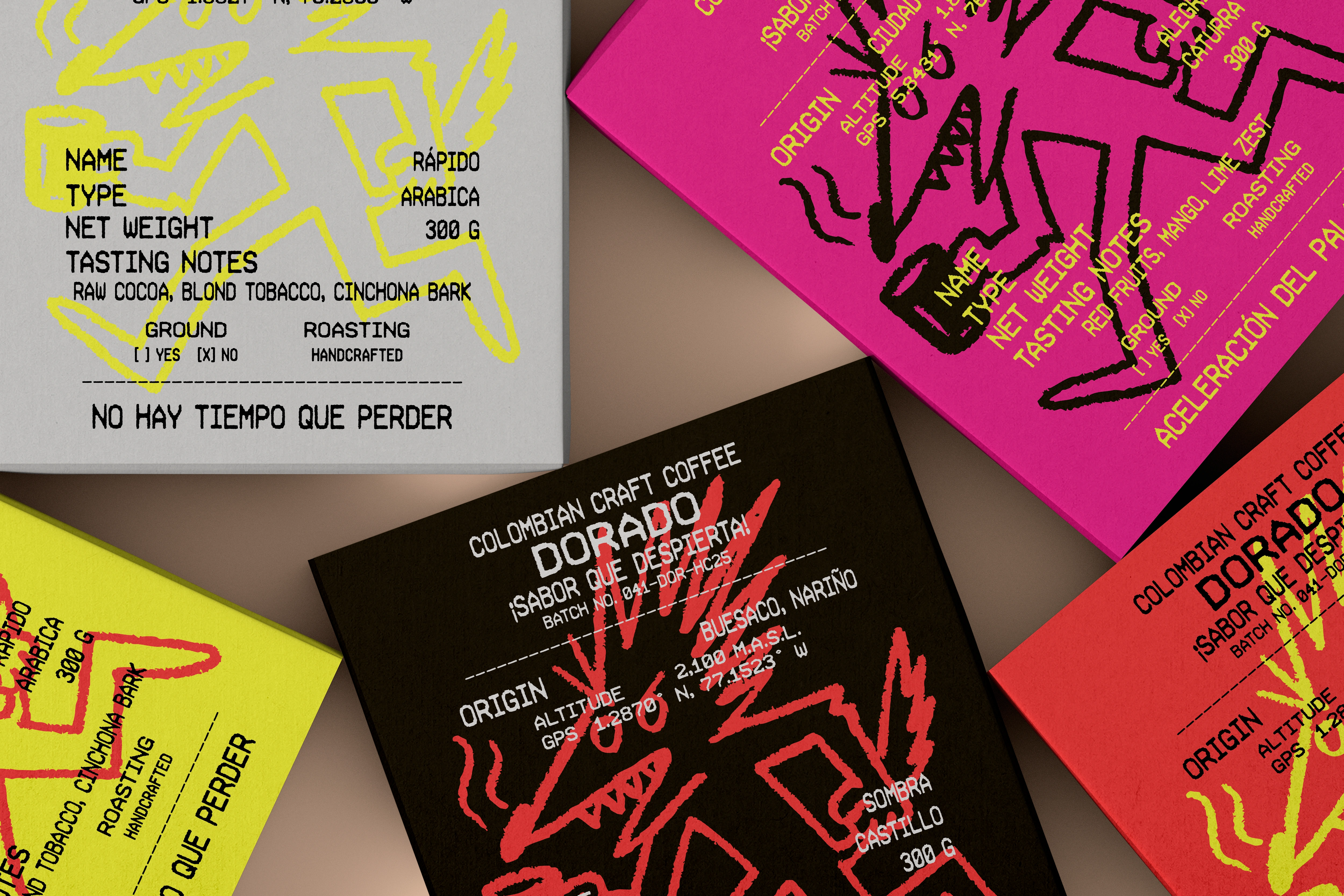
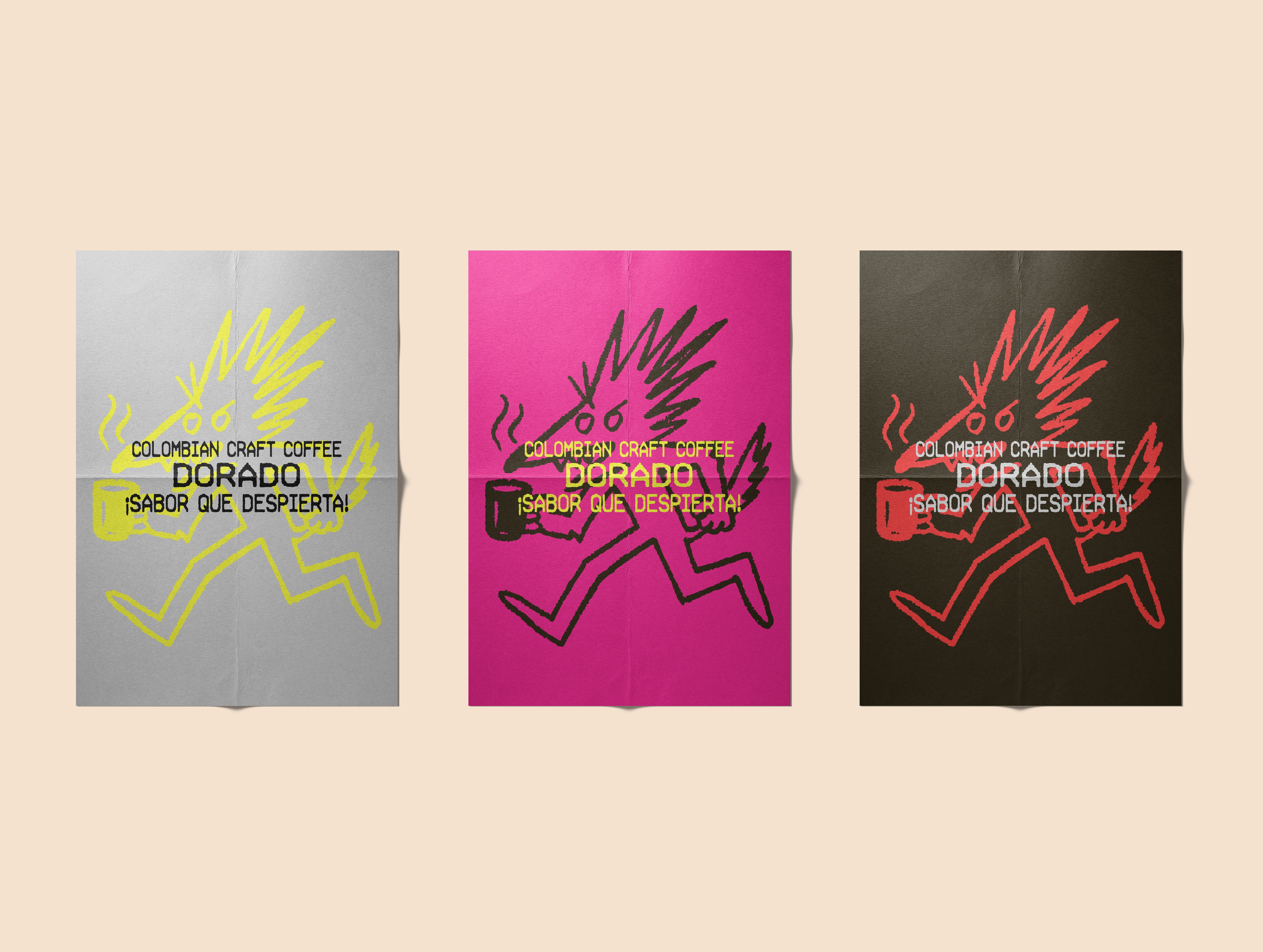
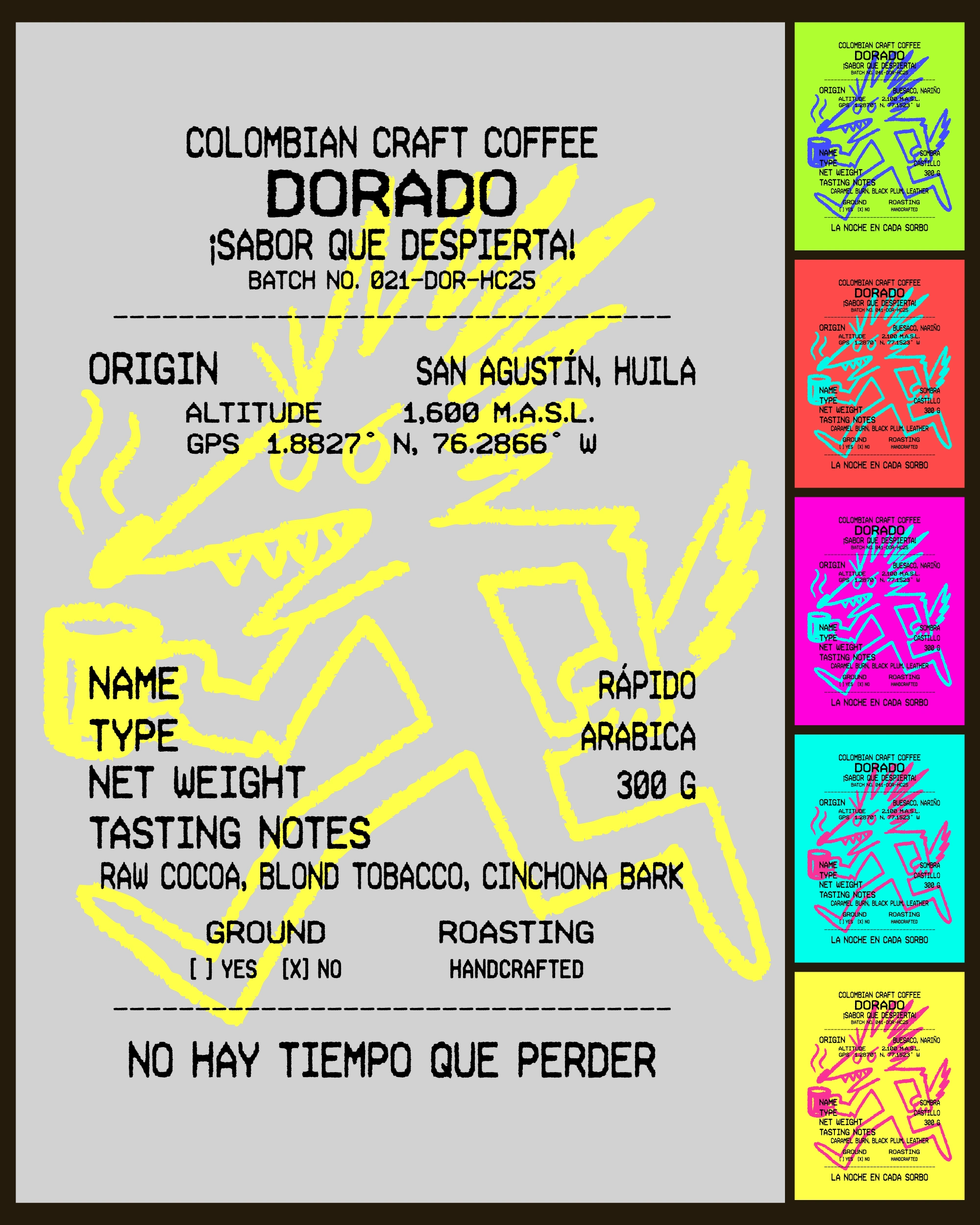
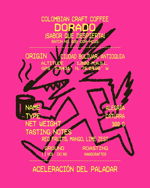
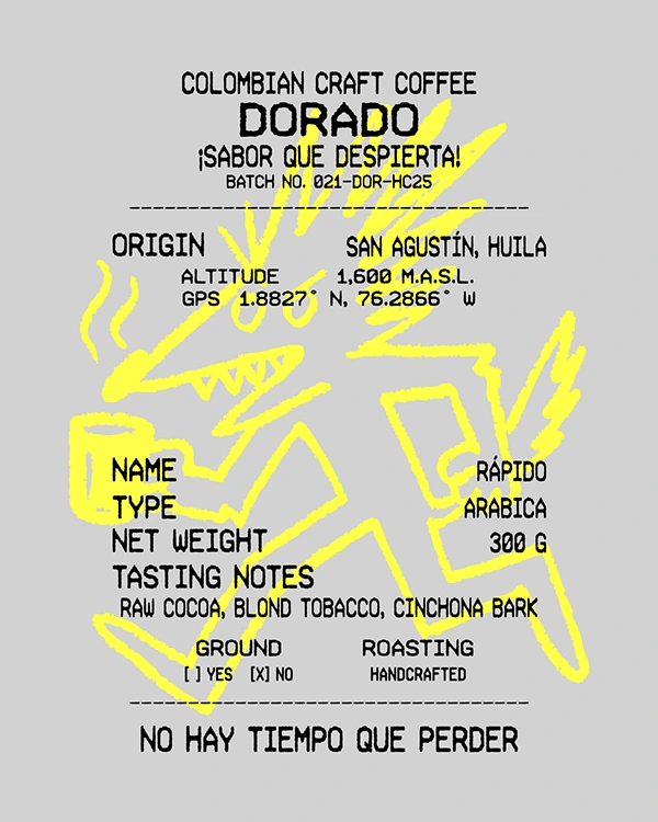
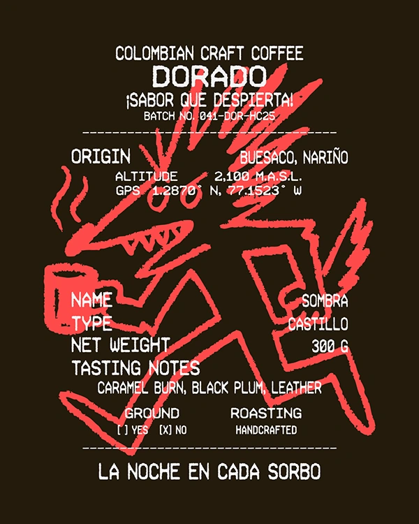
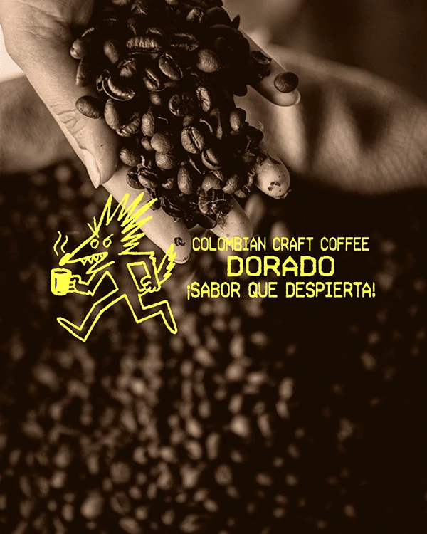
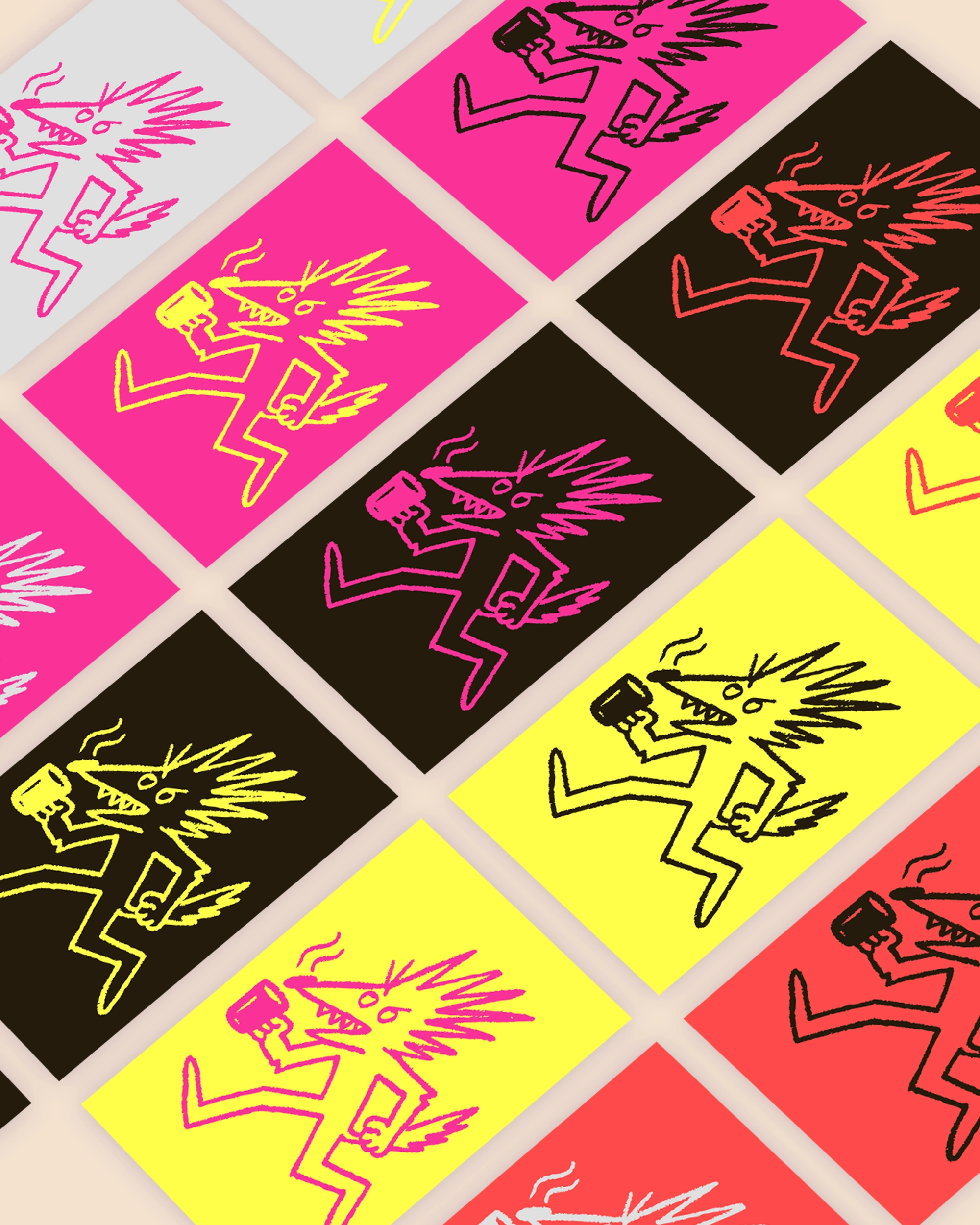
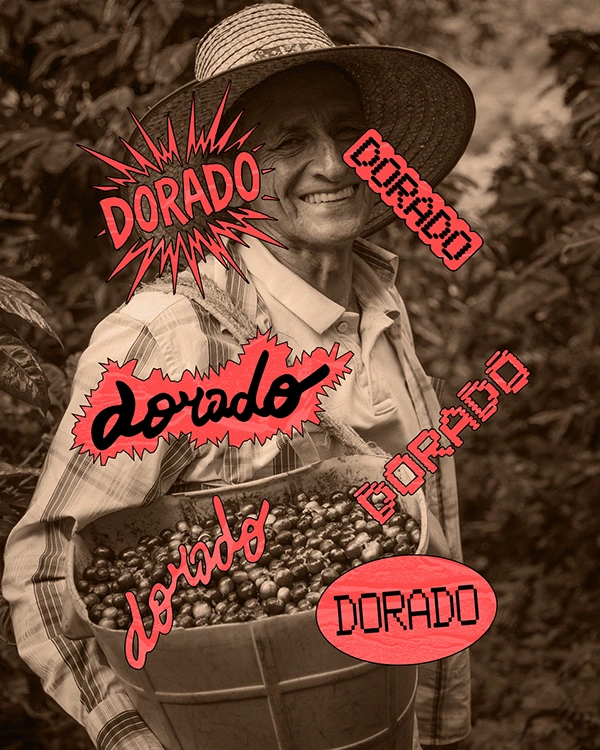
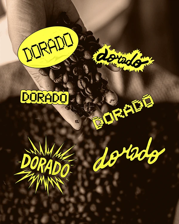
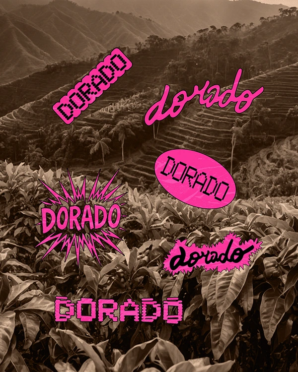
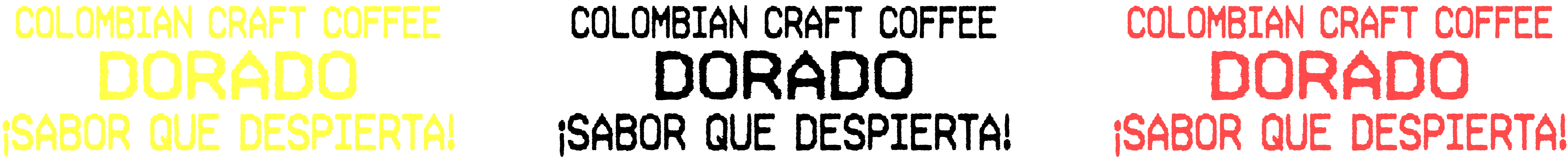
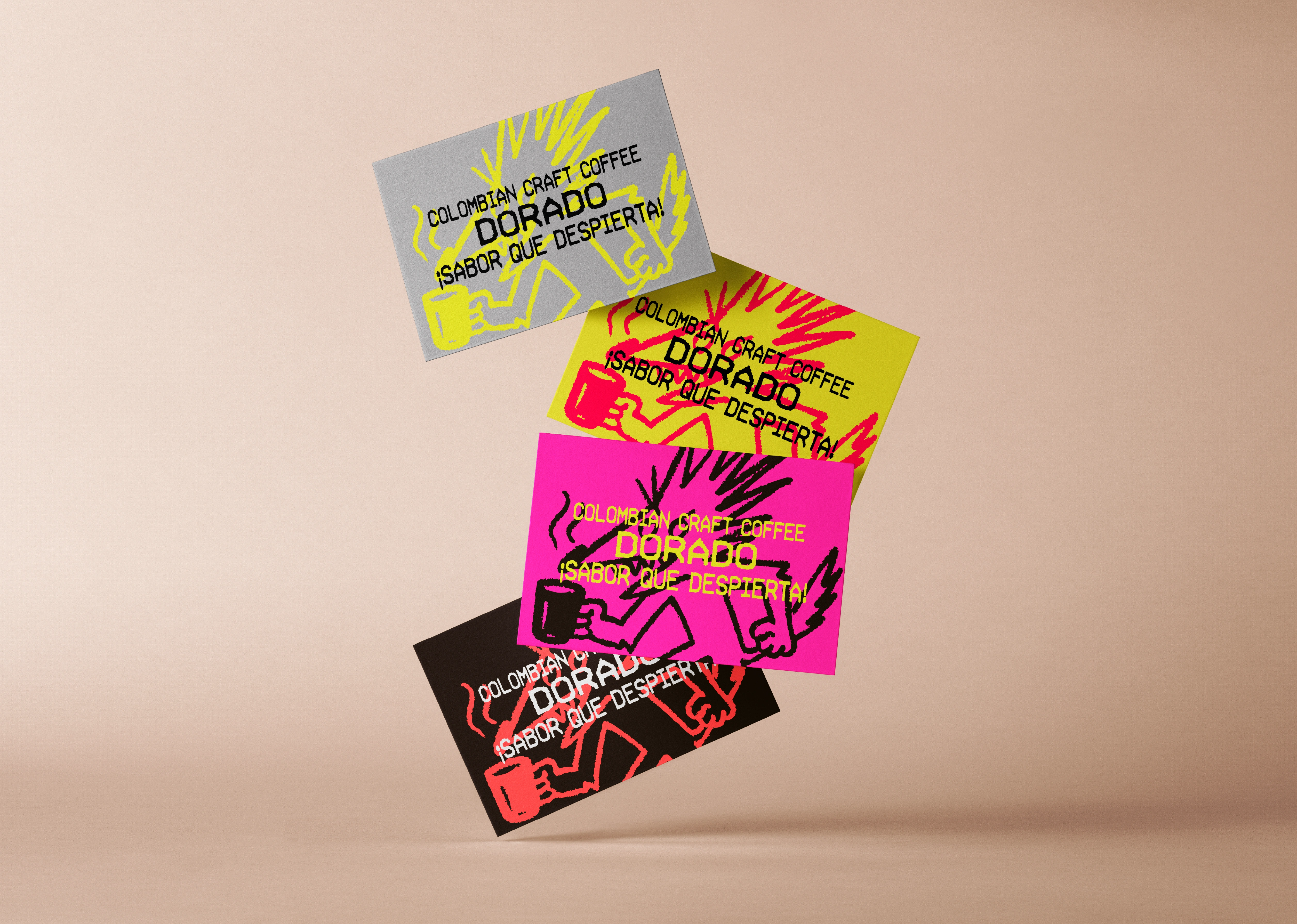
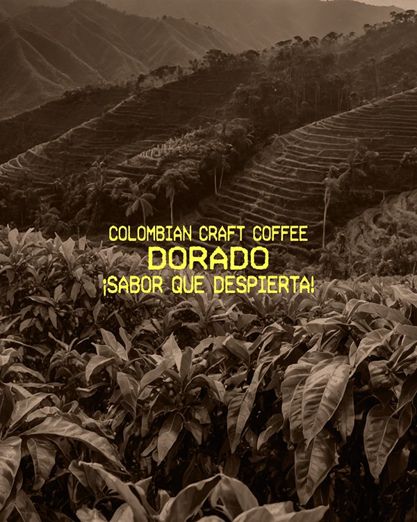
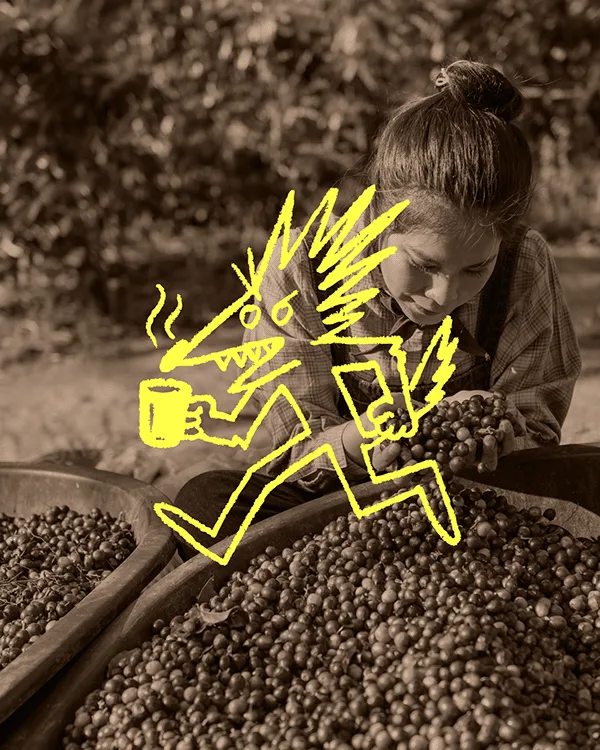
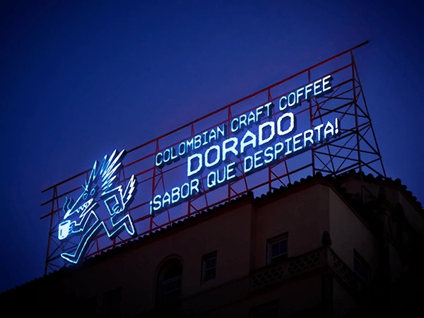
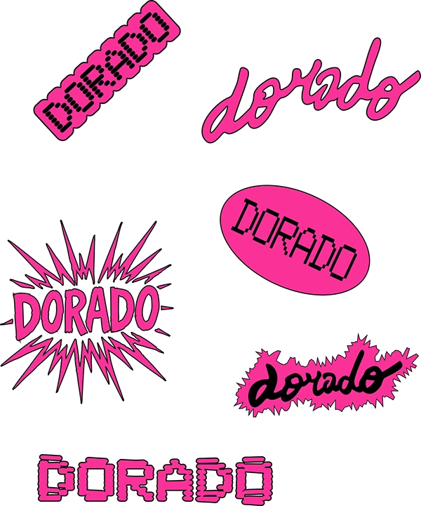
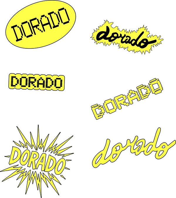
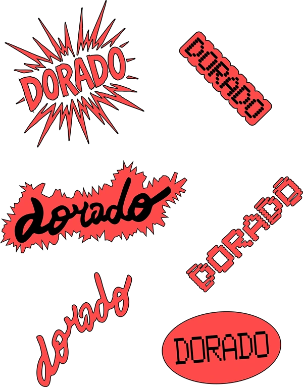
DORADO is a bold and expressive coffee brand with a strong visual system rooted in graphic rhythm, cultural codes, and raw energy. At the heart of the identity is a wireframe mascot, a tense and dynamic figure that gives the brand its tempo — structuring layouts, guiding flow, and echoing the intensity of the coffee itself. The graphic language draws inspiration from thermal printing, receipt compositions, and bold typographic choices, offering a radical take on contemporary coffee branding. Saturated colors and inverted exclamation marks (¡ !) affirm the brand’s Hispanic heritage, transforming these signs into powerful graphic symbols that function beyond the logo. DORADO reimagines artisanal coffee branding by rejecting clichés in favor of something alive, urgent, and unapologetically graphic. Through this identity, form becomes energy, and every visual element tells a story of intensity, culture, and character.