OSÉ | Brand Identity
Cynthia Jego

(En)
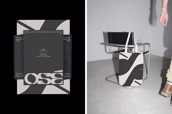
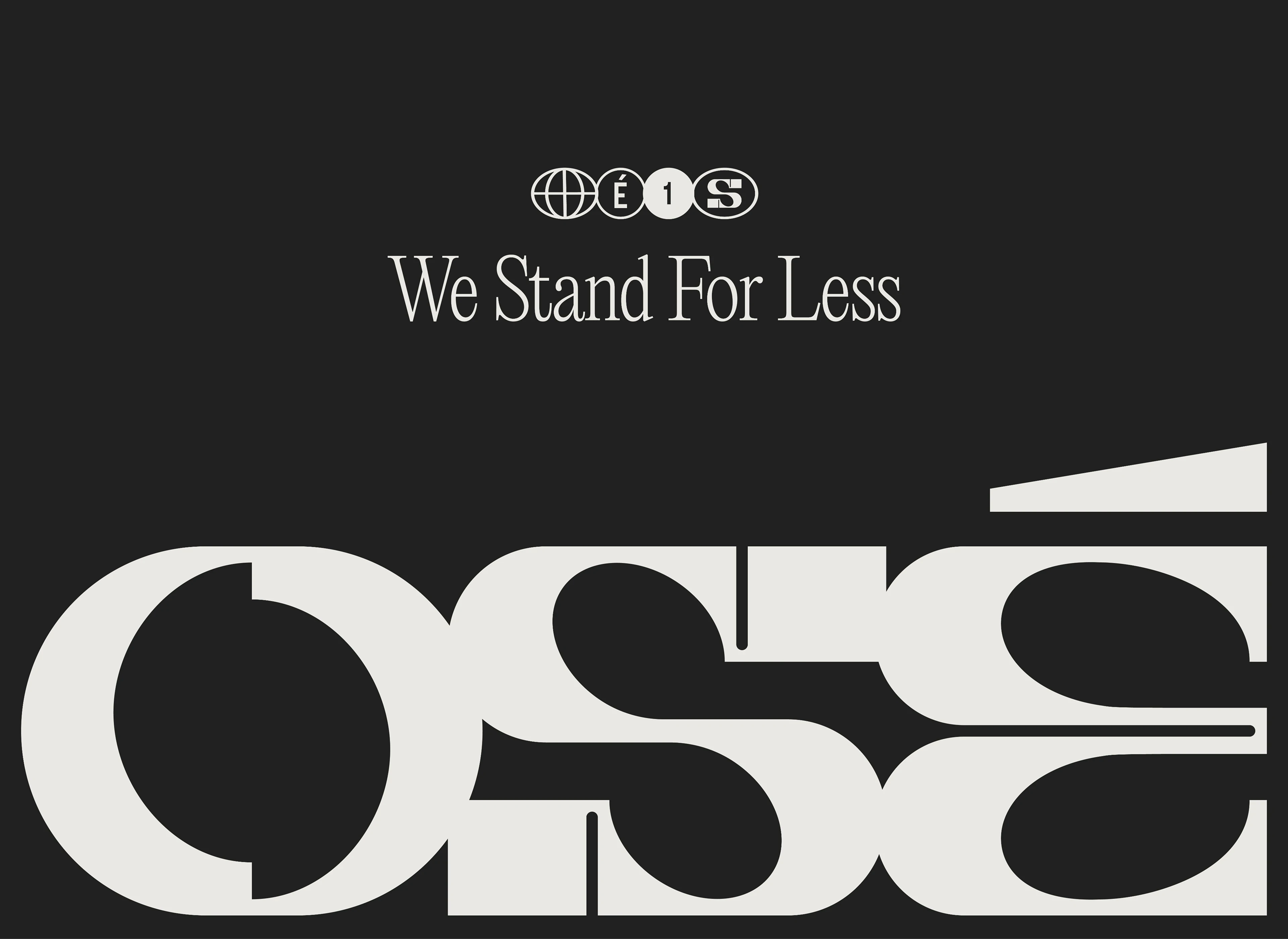
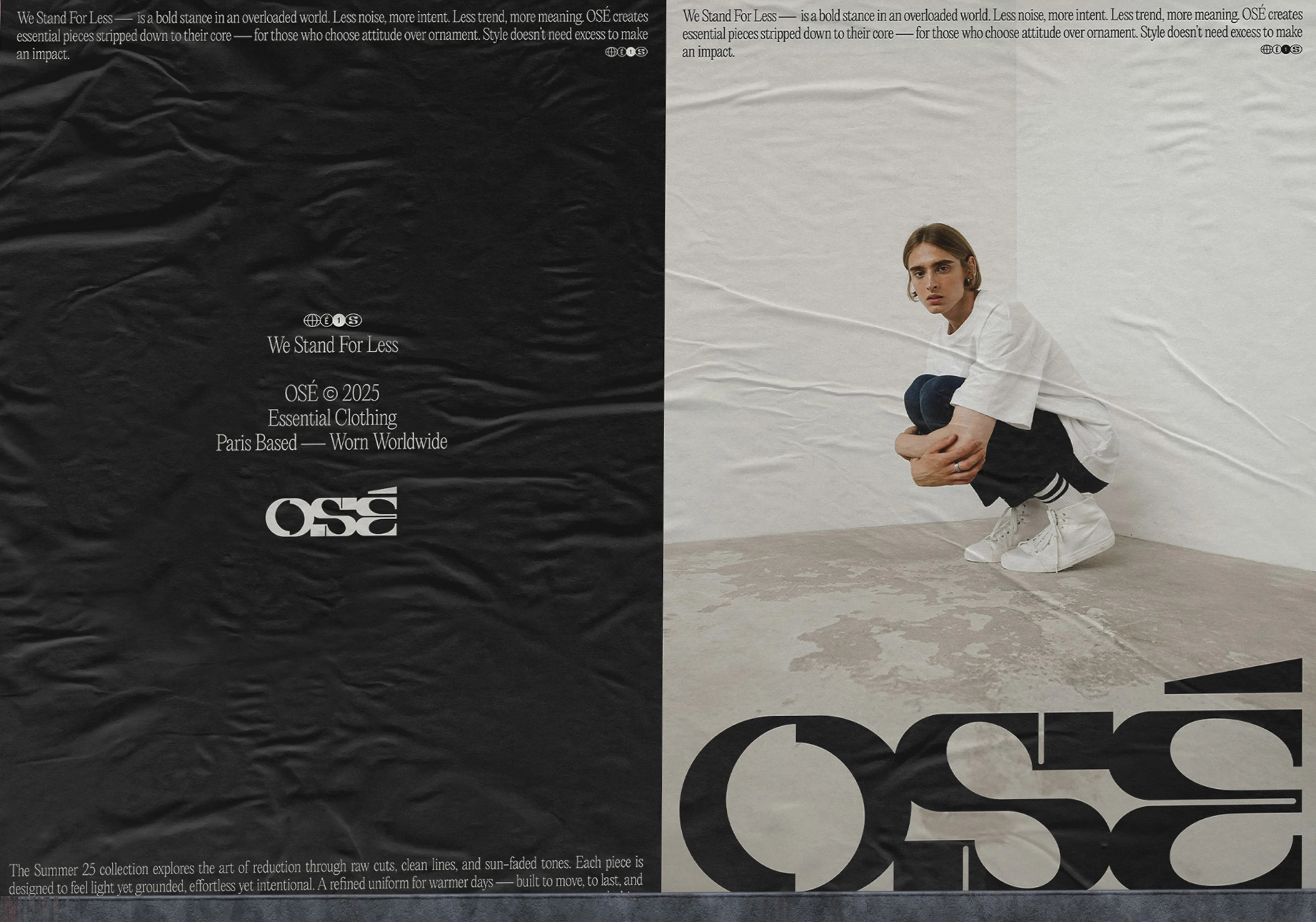
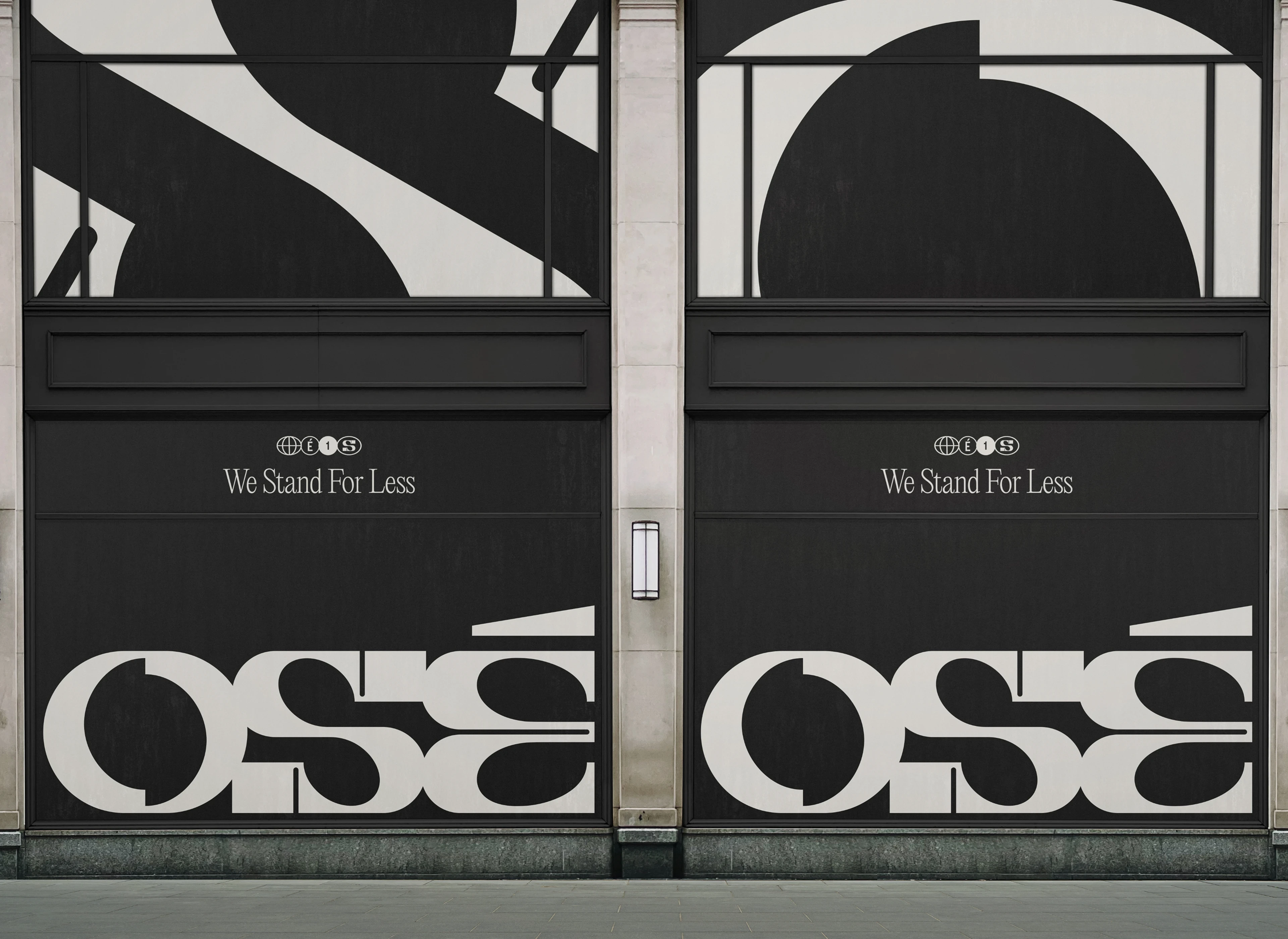
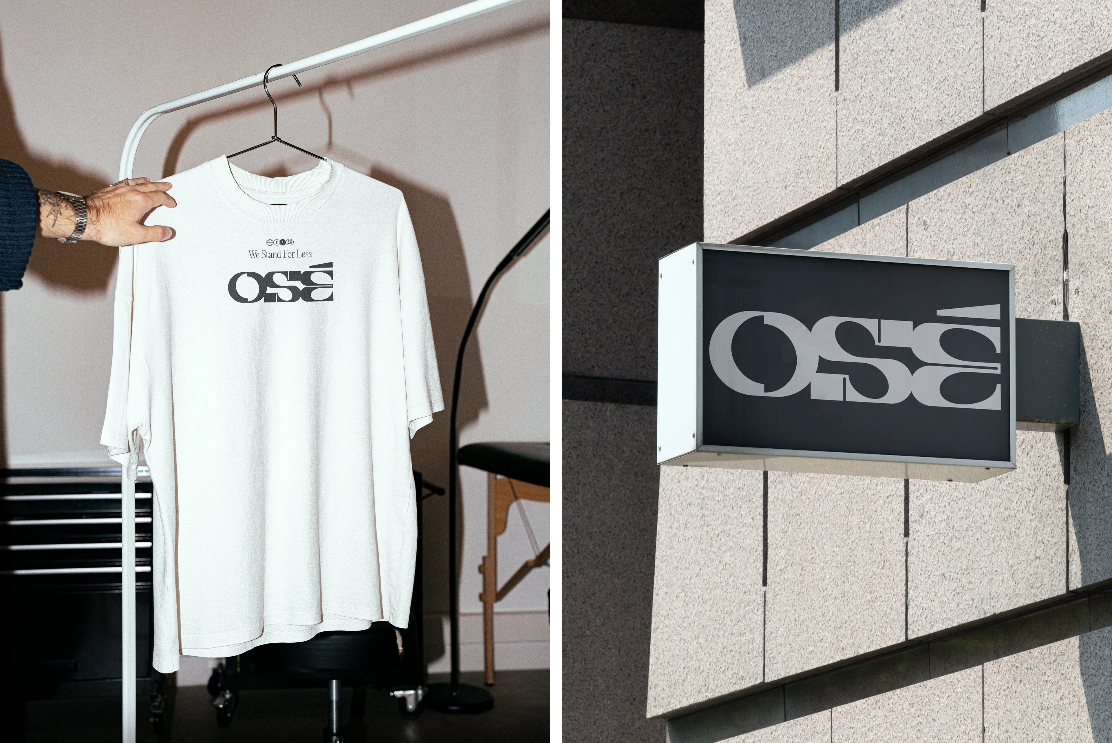
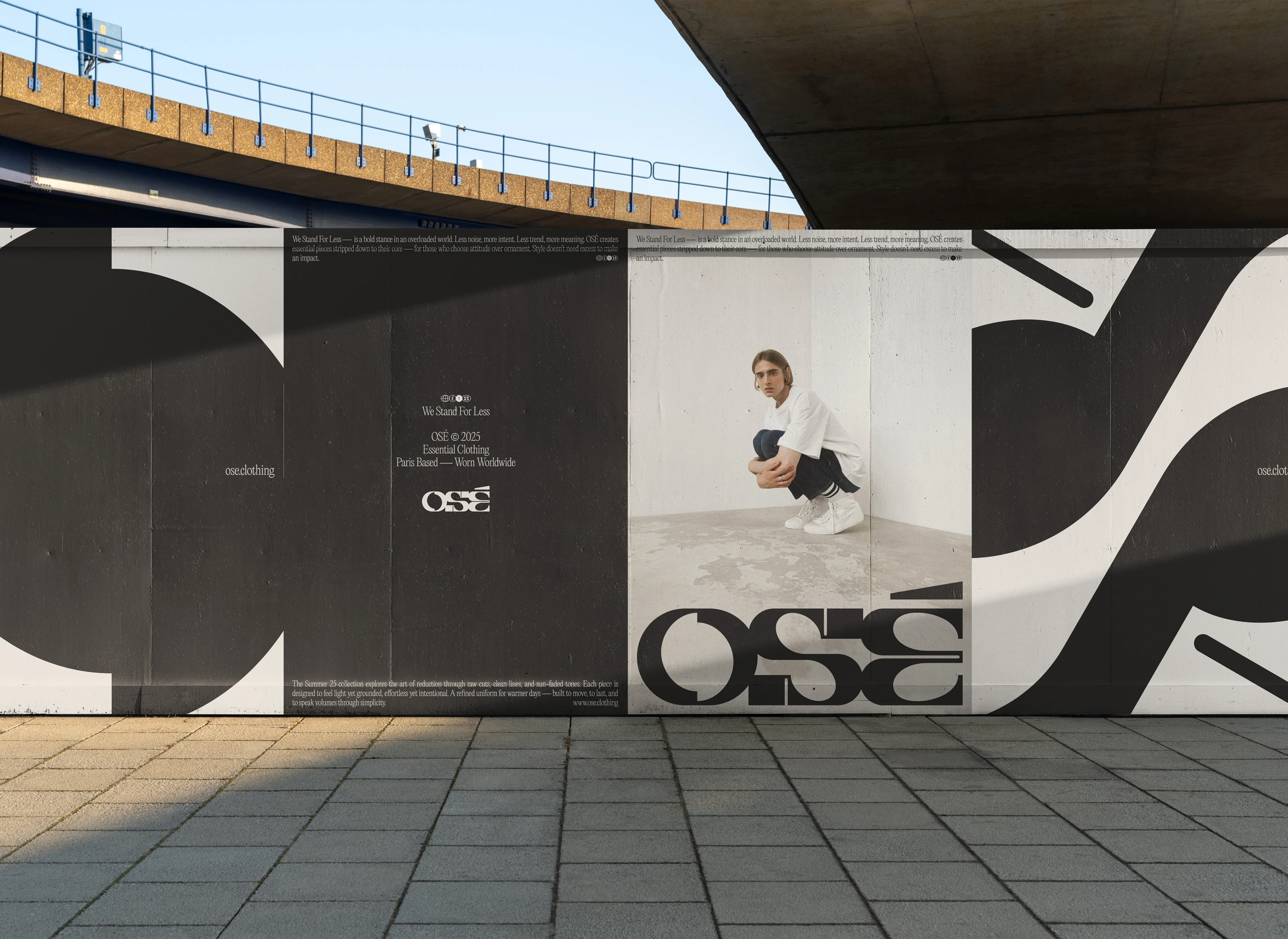
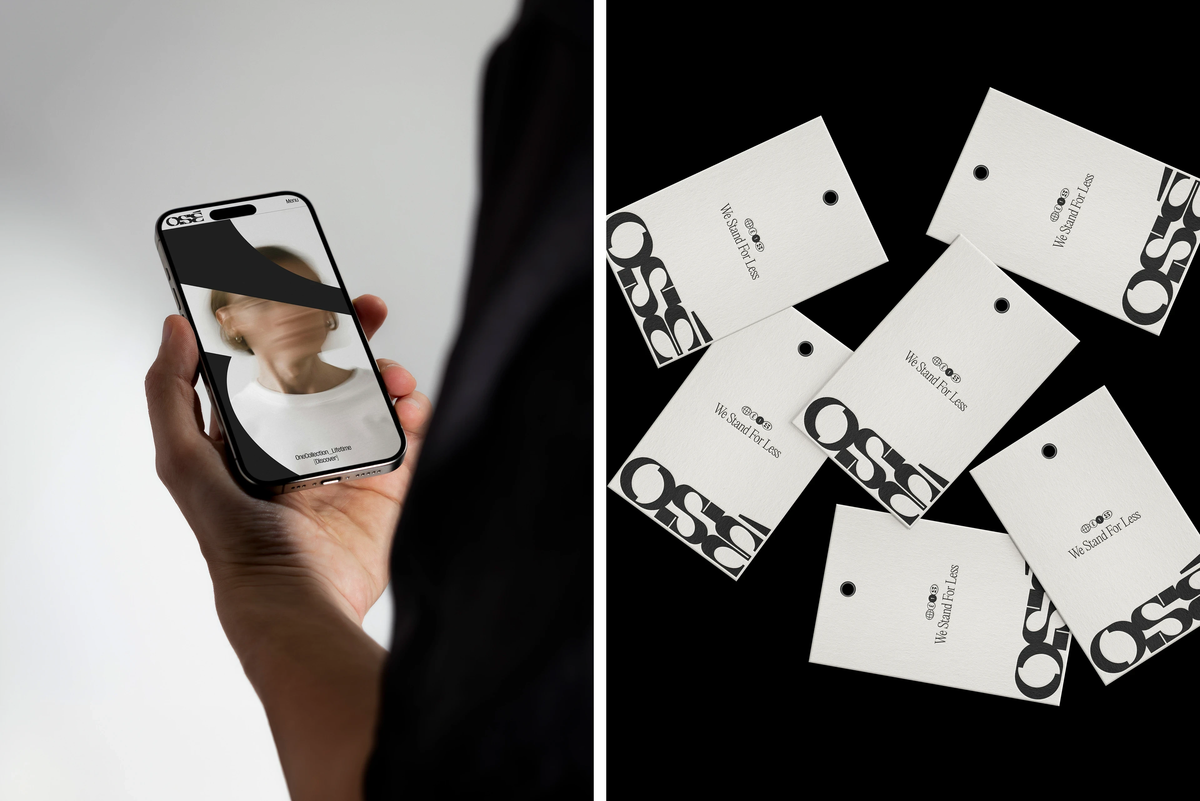
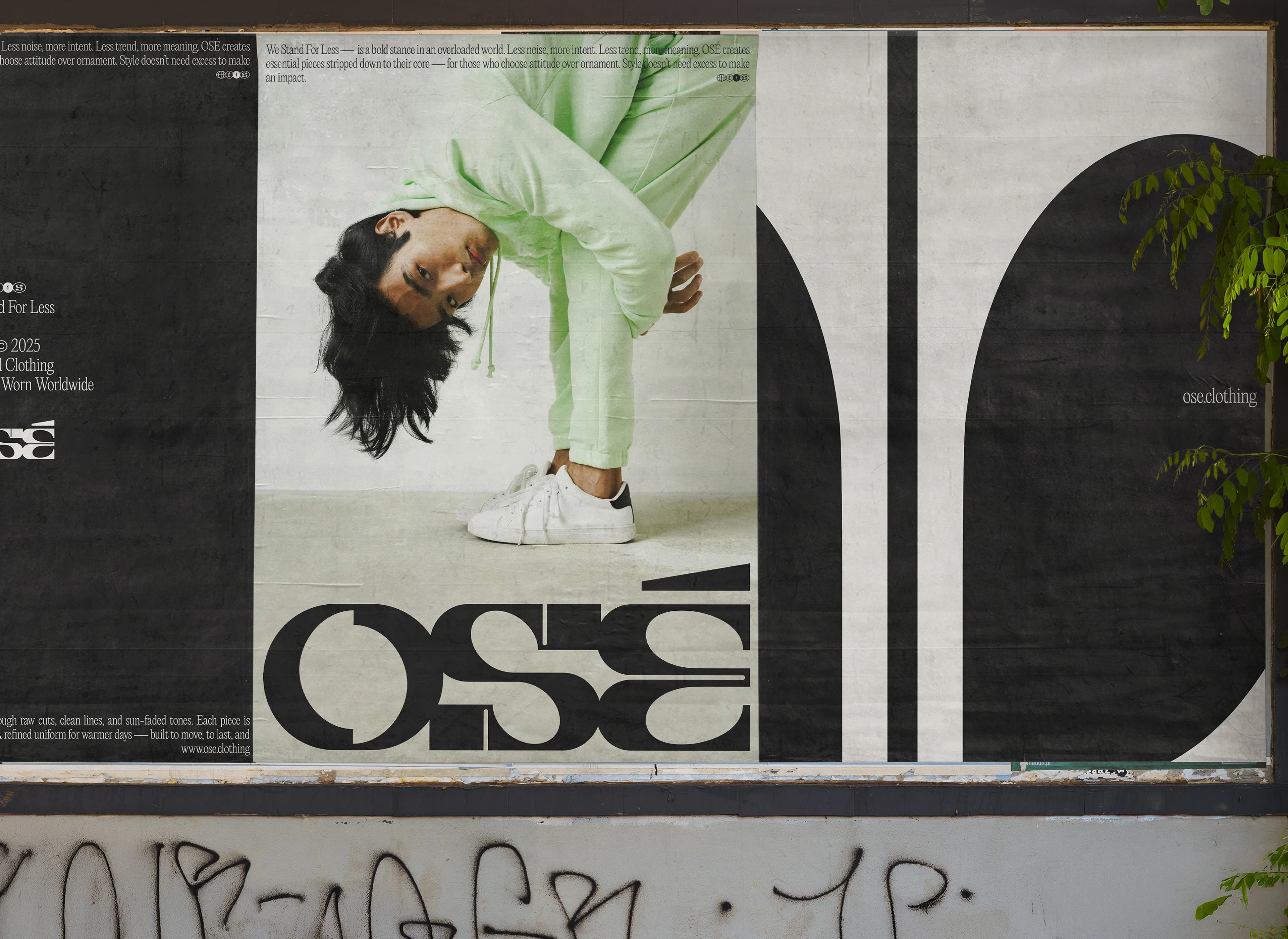
OSÉ is a clothing brand that embraces a bold, minimalist aesthetic. Designed as an essential wardrobe, the brand takes a radical approach to style. The manifesto We Stand For Less encapsulates its vision of a fashion that is built to last — more intentional, more honest.
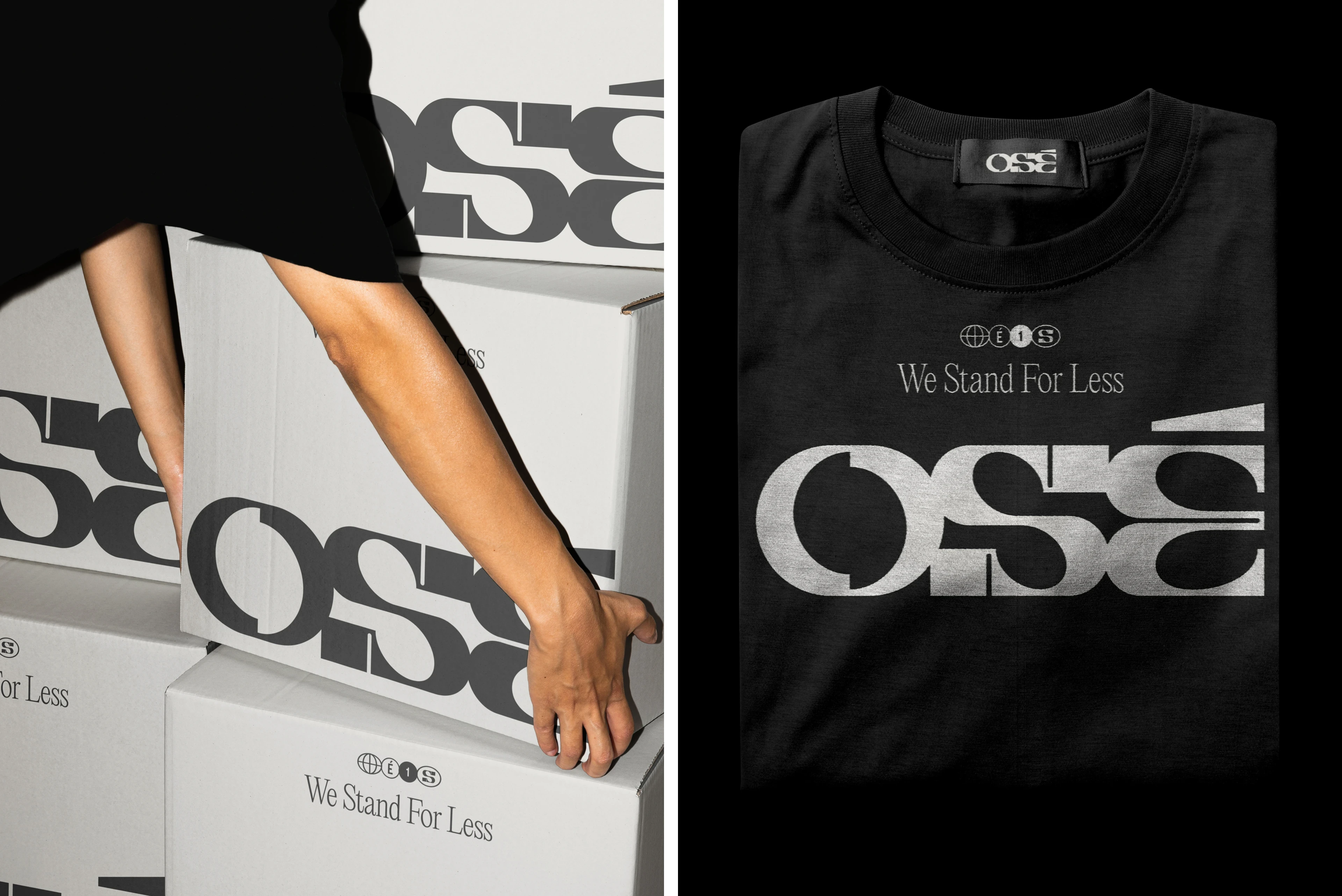
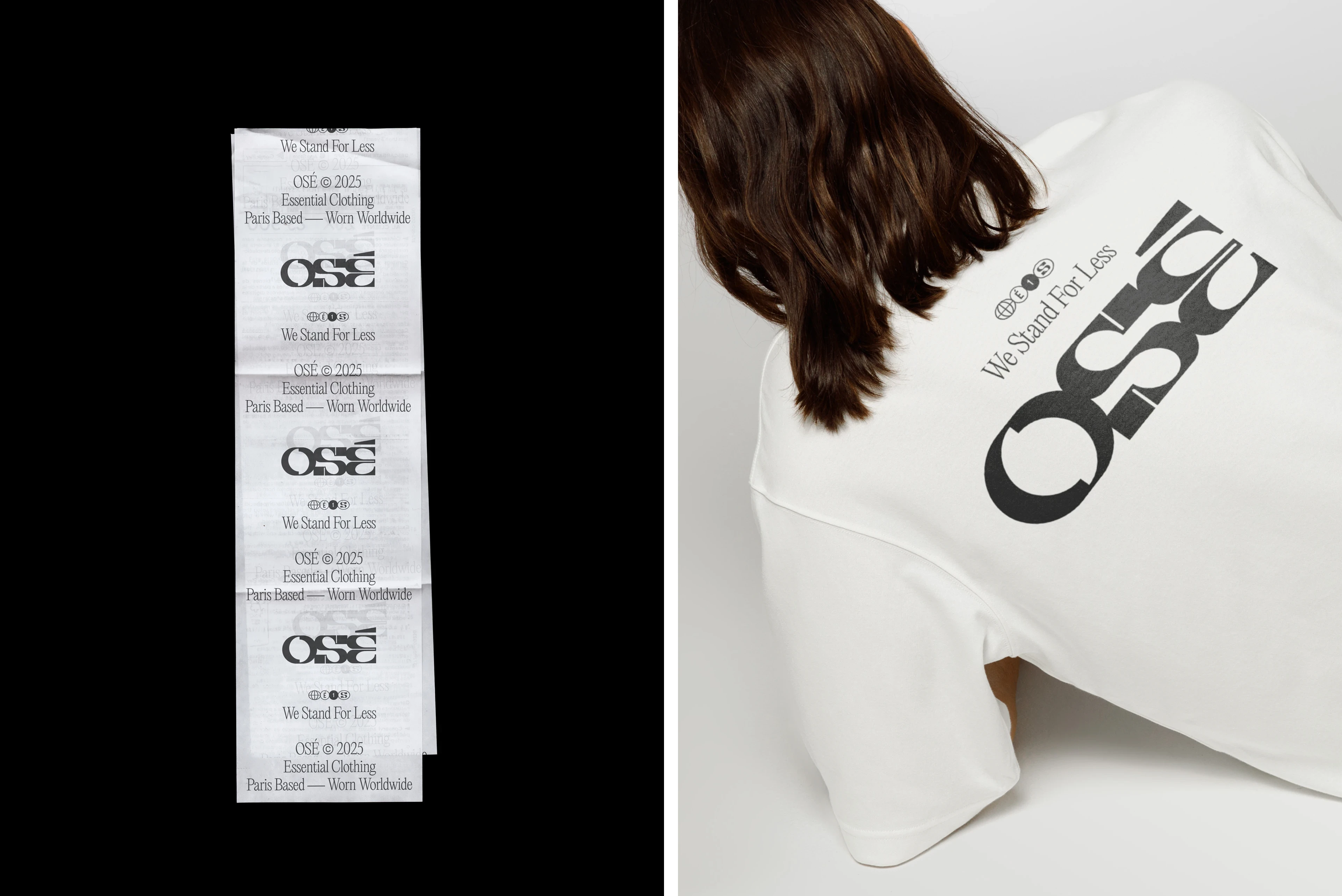
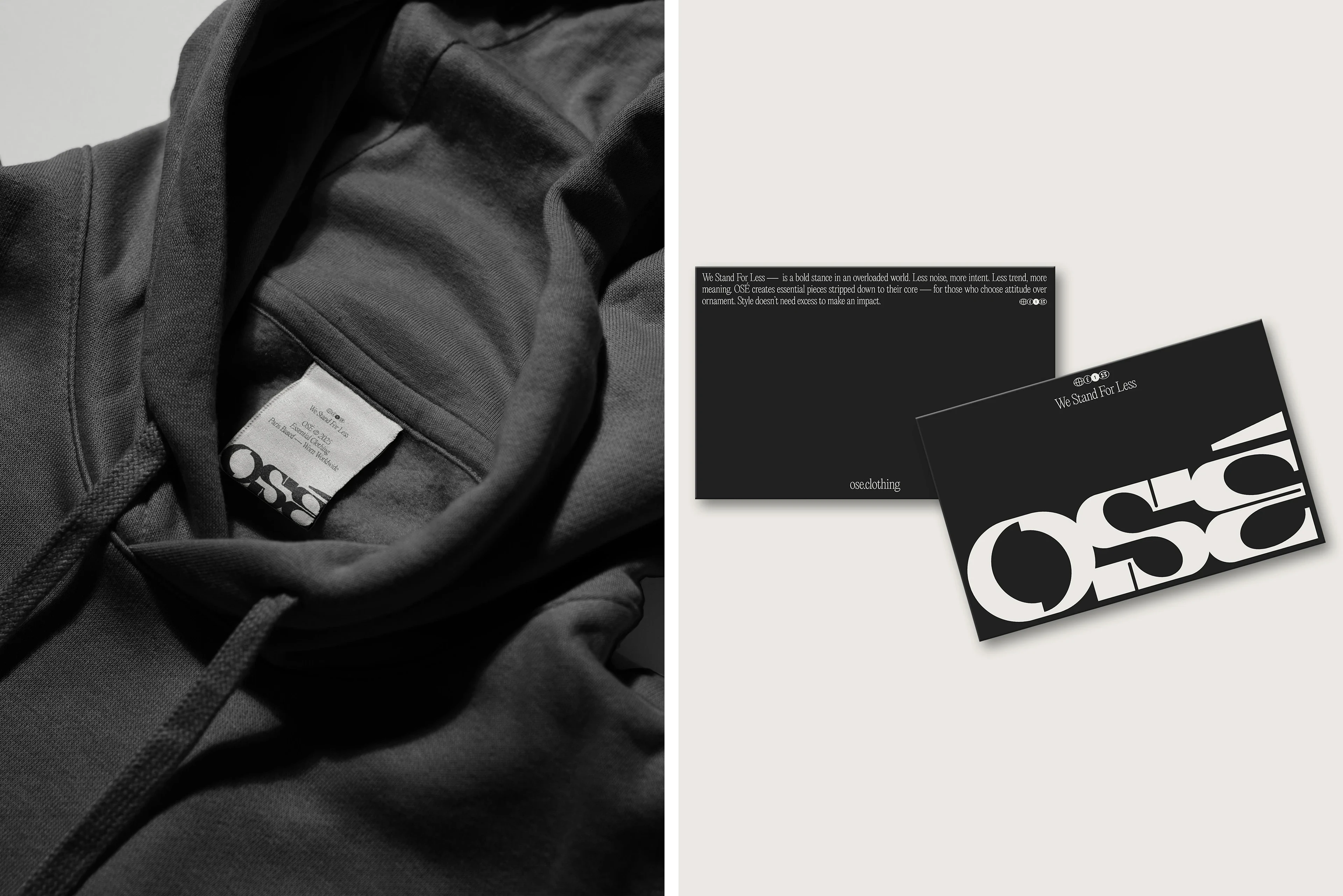
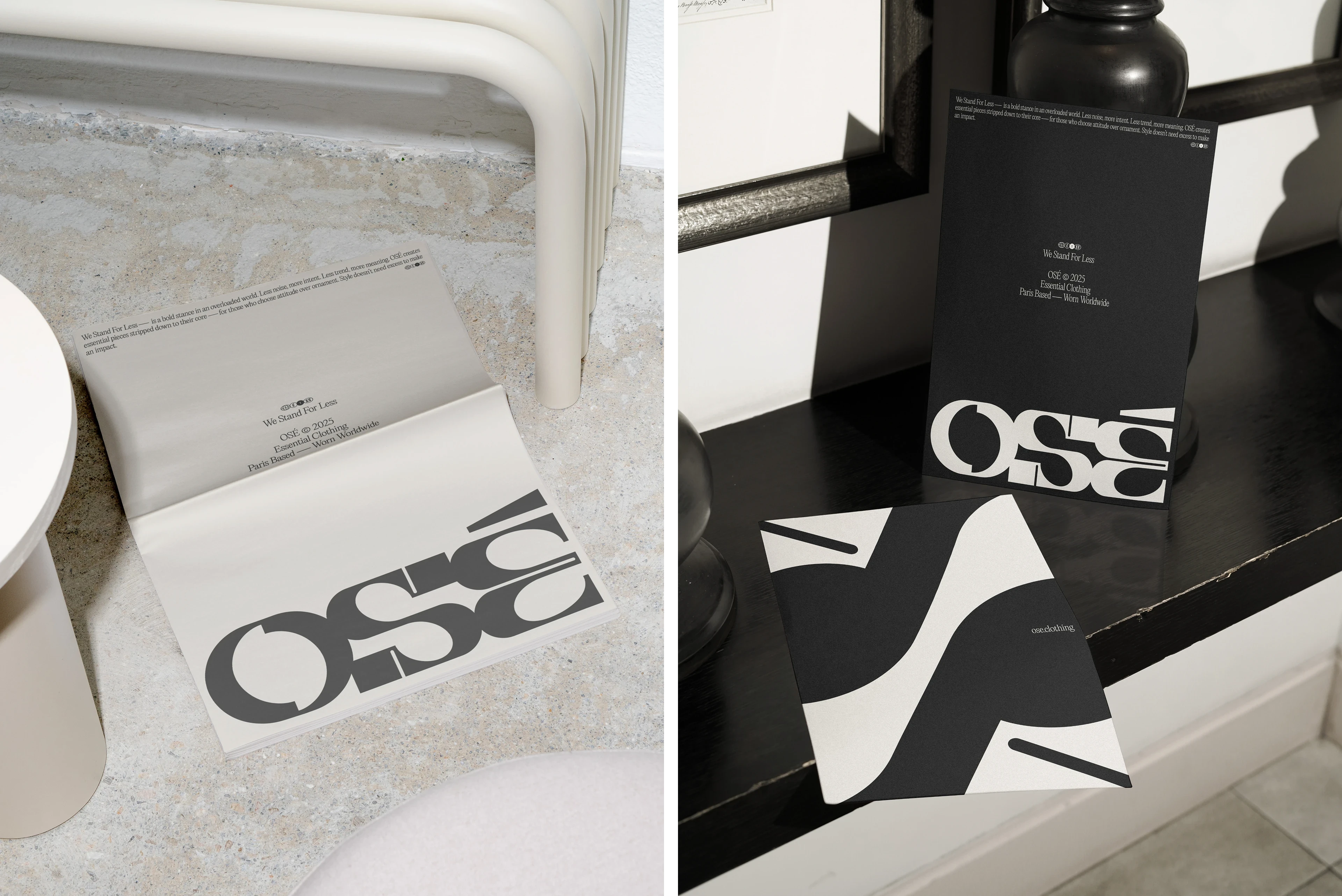
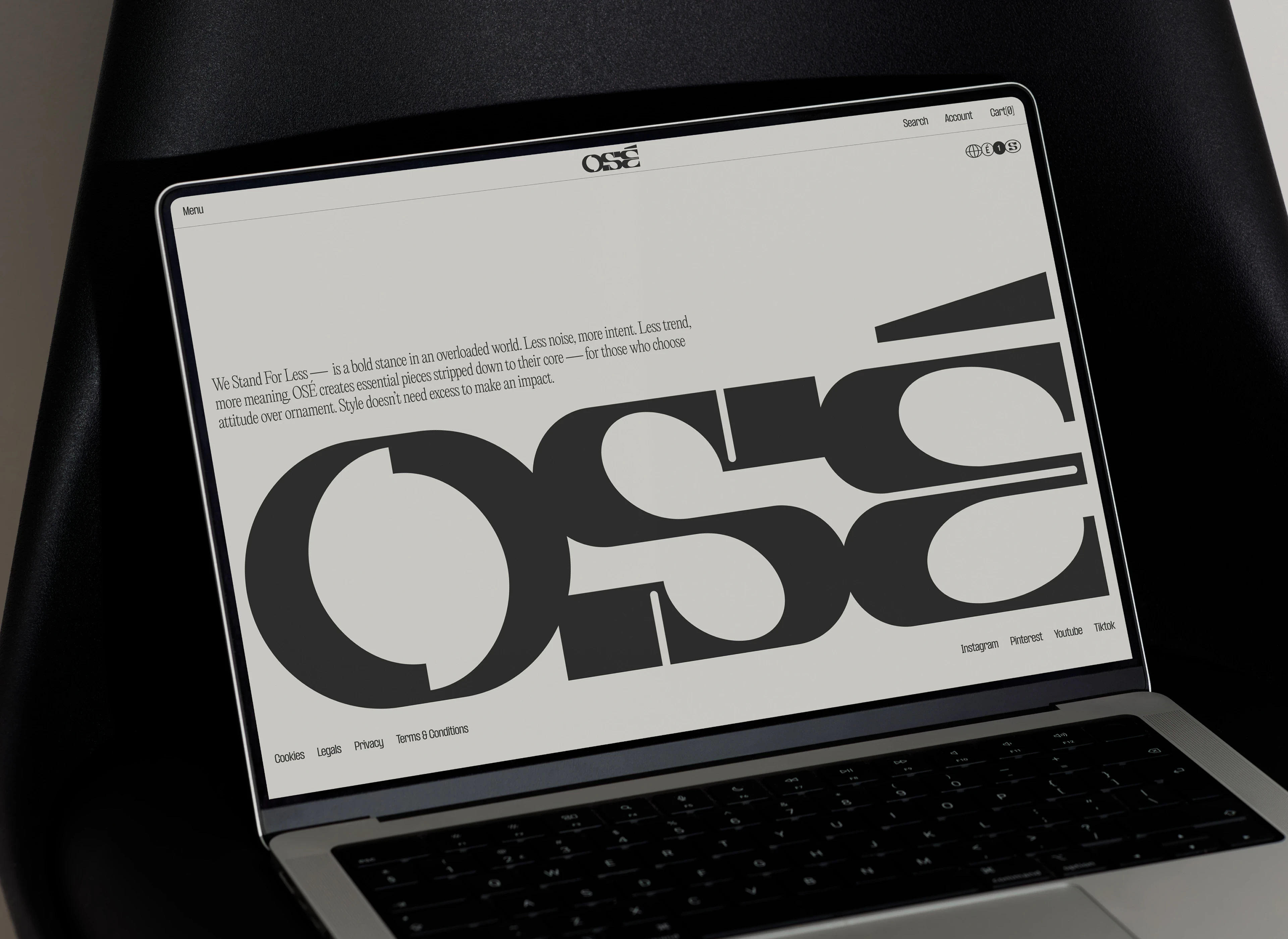
The visual identity reflects this strategy through a custom typeface that combines sharp breaks with pronounced curves. This duality embodies OSÉ’s stance against the norms of fast fashion. Each letter asserts its own character within a symmetrical, circular structure, forming a typographic language that balances distinction with cohesion.
The graphic system extends this approach through a pared-down color universe — black, beige, and white space — where typography becomes the core design element. Used as a pattern, it turns into a compositional material, playing with repetition and fragmentation.
(Credits)
Mockups by : Bendito Mockup, Akoya Mockups, Alex Paliotta, AT Studio, Mocku, PPF Mockups, Fabricated Studio, DVLOOP, Cruzada Supply
Typeface foundry : Pangram Pangram


(Thanks for watching)
Cynthia Jego
Website : cynthiajego.com
Instagram : cynthia_jego
Like this project
Posted Sep 24, 2025
Bold visual identity for OSÉ with custom typographic logo and minimalist design system.