Minimalism doesn’t have to be
Cynthia Jego
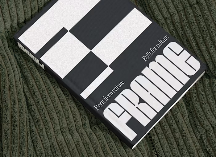
Minimalism doesn’t have to be quiet.
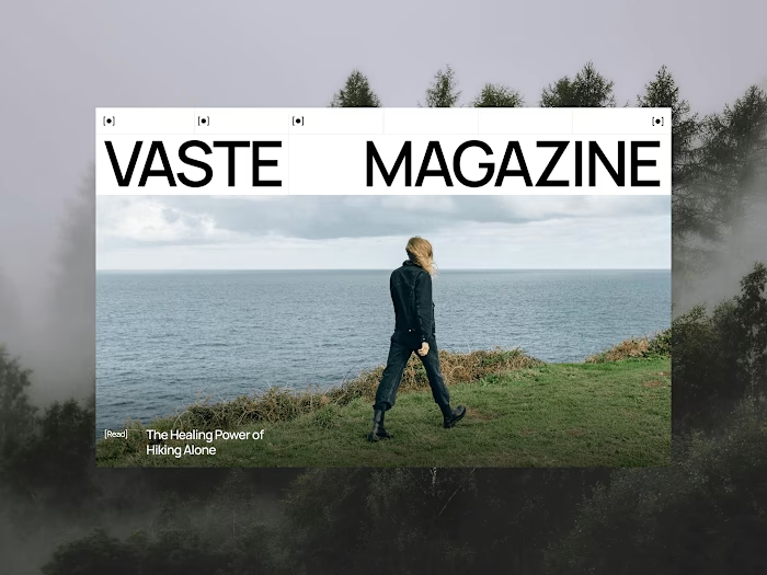
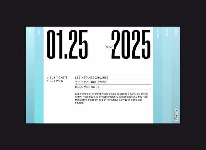
When I designed the visual identity for OSÉ, I wanted to show that less can also be bold.
OSÉ stands for a slow, lasting vision of fashion. Its manifesto, We Stand For Less, challenges fast fashion and calls for intention.
To translate that into visuals, I worked with strong typographic contrasts: letters with sharp breaks and subtle curves, a structure that feels balanced.
The visual system continues this dialogue: a reduced palette of black, beige and wide white spaces, where the typography itself becomes pattern and texture.
This project reflects my own practice:
Creating identities where minimal design carries a strong voice, and where simplicity is never bland but a stance.
—
Cynthia Jego
Independent Designer
Crafting Visual Identities for Brands & Websites
Like this project
Posted Oct 21, 2025
Minimalism doesn’t have to be quiet. When I designed the visual identity for OSÉ, I wanted to show that less can also be bold. OSÉ stands for a slow, lasti...