Automobile Ad — Case Study
Temiloluwa Adeosun
Automobile Ad — Case Study
Project Type: Concept Advertising Design
Focus: Automotive Visual Communication, Brand Perception, Motion & Luxury
Tools: Figma, Adobe Photoshop
1. Project Overview
This project is a conceptual automobile advertisement created to explore how strong visual storytelling can elevate a brand’s perception in a single frame. The goal was to design an ad that communicates motion, confidence, and premium value instantly, without overloading the viewer with unnecessary elements.
The challenge was to create something that feels fast, bold, and aspirational—while still maintaining clean visual balance and readability.
2. The Problem
Most automobile ads fail not because of poor visuals, but because they try to say too much at once.
Common issues I aimed to avoid:
Visual clutter
Weak focal points
Overuse of effects
Poor hierarchy between car, message, and brand
The real problem to solve was:
How do you communicate power, speed, and elegance in under 3 seconds of attention?
3. The Goal
The key objectives of this design were:
Create a strong emotional first impression
Establish clear visual hierarchy
Highlight the vehicle as the undisputed hero
Maintain a luxury, premium brand feel
Ensure the design works across social media and digital ad formats
4. Design Strategy
I approached this project with simplicity and intention as the core principle.
Key design decisions:
Hero-first composition: The car dominates the frame for instant recognition.
Directional lighting: Used to emphasize form, curves, and motion.
Minimal typography: To avoid competing with the vehicle.
Controlled color palette: To reinforce brand sophistication and focus.
Whitespace balance: To allow breathing room and elevate the premium feel.
The design had to feel fast without feeling noisy.
5. Visual Direction
Mood: Confident, powerful, refined
Emotion: Aspiration, control, adrenaline
Style: Clean, cinematic, modern luxury
Audience: Car lovers, aspirational buyers, performance enthusiasts
The aim was to make the viewer feel the car before reading anything.
6. Execution Process
Concept ideation: Defined the emotion and narrative the ad would communicate.
Composition planning: Built the layout around the car as the focal point.
Lighting & contrast control: Enhanced depth and visual punch.
Typography testing: Kept messaging minimal and bold.
Final refinements: Adjusted balance, spacing, and visual weight for impact.
7. Final Outcome
The final ad delivers:
A strong premium look
Immediate visual impact
Clear brand and product dominance
High adaptability for Instagram, banners, and digital billboards
The design successfully communicates speed, status, and sophistication in a single glance.
8. Key Lessons Learned
Simplicity outperforms complexity
Emotional impact comes before information
Good design isn’t loud—it’s intentional
What you remove from a design is just as important as what you add
9. Designer’s Reflection
This project strengthened my understanding of how composition, restraint, and storytelling work together in advertising. It reinforced my belief that powerful design doesn’t beg for attention—it commands it effortlessly.
Like this project
Posted Nov 30, 2025
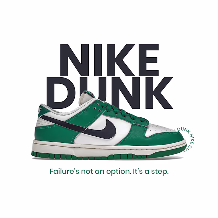
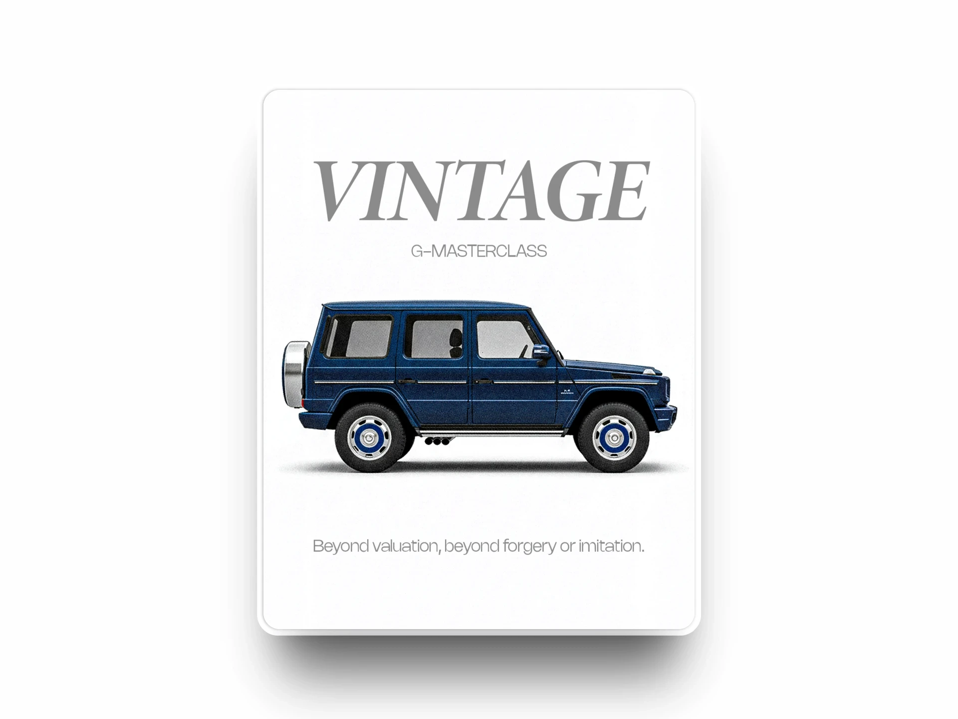
Automobile Ad: Sleek, modern automotive advertisement design — bold visuals, clean composition and brand‑centered layouts for social media and print.
Likes
0
Views
8