Dental Marketing Design
Temiloluwa Adeosun
Dental Marketing Design — Case Study
Project Type: Marketing & Brand-Focused Design
Scope: Visual Identity, Marketing Collateral, Digital & Print Ads
Role: Lead Designer — Concept, Visuals, Layout, Brand Elements
Tools: Figma, Adobe Photoshop, Illustrator, InDesign
1. Project Overview
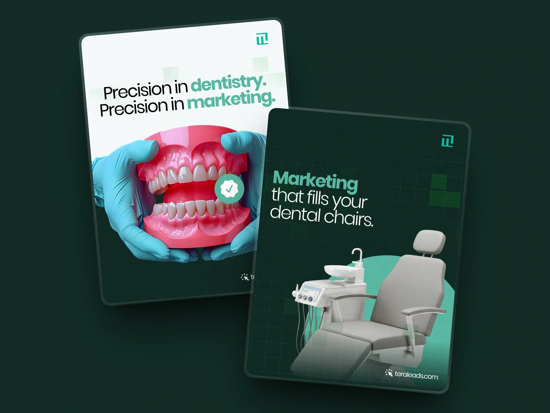
In a healthcare space crowded with generic visuals and sterile design tropes, this project set out to reimagine dental marketing with a more human, warm, and trust-driven approach.
The goal was to craft visuals that feel inviting and comforting, while still communicating professionalism, expertise, and reliability—helping the brand stand out from the usual cold, clinical dental advertising.
Core Objective:
To build a cohesive visual identity and marketing system that conveys comfort, clarity, and professionalism, while inviting patients to trust the brand with their care.
2. The Challenge
Traditional dental marketing often relies on antiseptic visuals that can feel impersonal or intimidating. The key challenges were to:
Avoid the cliché “cold clinic” look
Replace harsh white-and-blue aesthetics with a warmer, more welcoming tone
Establish a unique and emotionally resonant brand identity
Maintain visual consistency across social media, flyers, banners, and print assets
Communicate trust, care, and professionalism in a friendly, human way that appeals to families, adults, and first-time patients
3. Strategy & Design Approach
The design strategy was anchored on four guiding principles:
Human-Centric Visual Tone:
Soft color palettes, warm lighting, subtle textures, and friendly yet clean typography.
Clarity & Visual Hierarchy:
Minimal layouts, strong spacing, and instant readability for calls-to-action and key information.
Brand Consistency:
A unified visual identity system covering colors, typography, spacing, and layout style across all formats.
Emotional Resonance:
Every design decision aimed to make viewers feel comfortable, valued, and confident, rather than overwhelmed.
4. Design Process & Workflow
Research & Inspiration
Studied existing dental and healthcare marketing to identify clichés and gaps.
Built a moodboard of warm, lifestyle-driven healthcare branding that balances professionalism with friendliness.
Concept Development & Exploration
Tested multiple color directions using soft neutrals and warm accent tones.
Explored modern, humanist sans-serif typography.
Created layout variations for social media posts, flyers, and digital banners.
Design Execution
Produced core assets including social-media creatives, flyers, and promotional graphics.
Applied the visual identity system consistently across all deliverables.
Carefully managed whitespace to preserve calmness and clarity.
Mockups & Realistic Previews
Designed real-world mockups for social feeds and print materials.
Showcased how the designs would function in actual usage environments.
5. Final Outcome & What It Communicates
A cohesive marketing design system that feels warm, professional, and approachable
A visual identity that clearly differentiates the brand from typical cold dental ads
Clean, readable layouts that prioritize message clarity over visual noise
A patient-first design approach that builds trust and comfort even before first contact
6. Reflection & Key Lessons
Empathy is a design tool: People connect to how a brand makes them feel before what it says.
Consistency builds credibility: A unified identity strengthens brand trust instantly.
Less truly is more: Minimal, intentional design communicates confidence better than clutter.
Context matters: Designs must adapt across media while remaining visually cohesive.
Like this project
Posted Nov 30, 2025
Redefining dental marketing with warm, human-centered design that builds trust, comfort, and clarity across all touchpoints.
Likes
0
Views
15