Trailink Brand Identity Development
Like this project
Posted Dec 6, 2025
Developed Trailink’s brand identity featuring bold gradients, geometric structure and a modern flow driven system.
Trailink Brand Identity Case Study
Overview
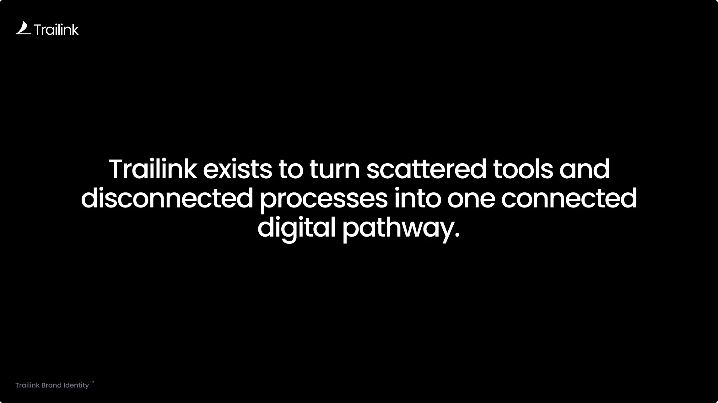
Trailink is a digital solutions brand focused on helping modern teams navigate complexity with clarity and speed. The project goal was to create a visual identity that reflects movement, connection and intelligent workflow design. The final system is expressive yet minimal, built to support a product that aims to unify tools, people and data into a single seamless experience.
This case study highlights the complete development process, from strategy to execution.
The Challenge
The client wanted a brand identity that could visually communicate the idea of a connected digital pathway. They needed a system that feels modern, fast and reliable while still maintaining a sense of warmth and approachability. The brand had to stand out in a competitive tech environment where clarity, visual consistency and ease of use matter more than ever.
Brand Strategy
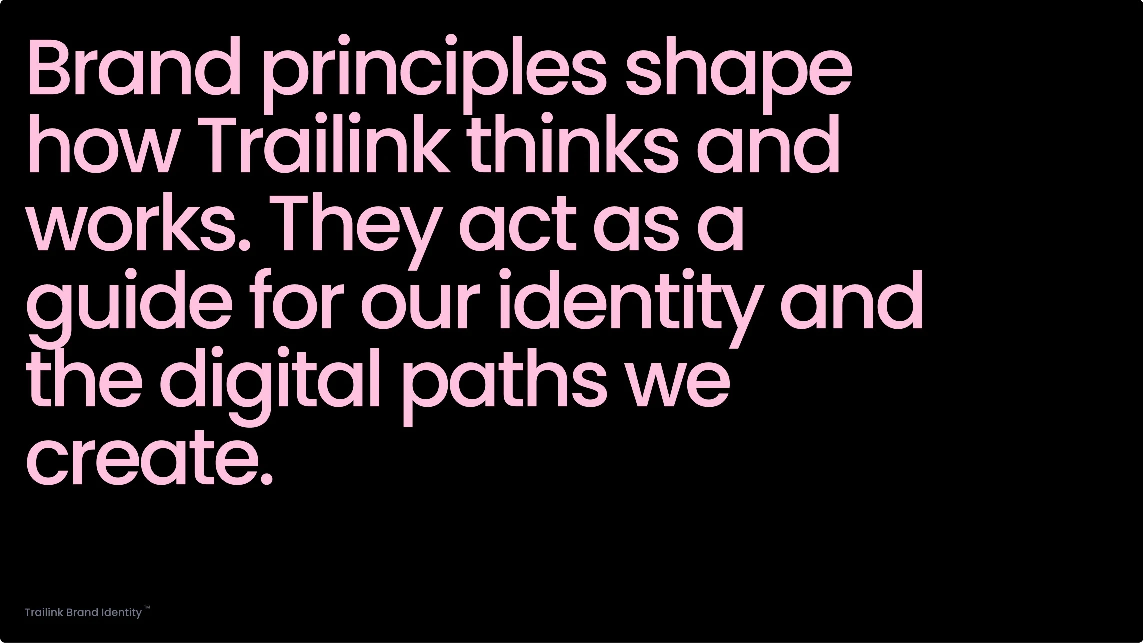
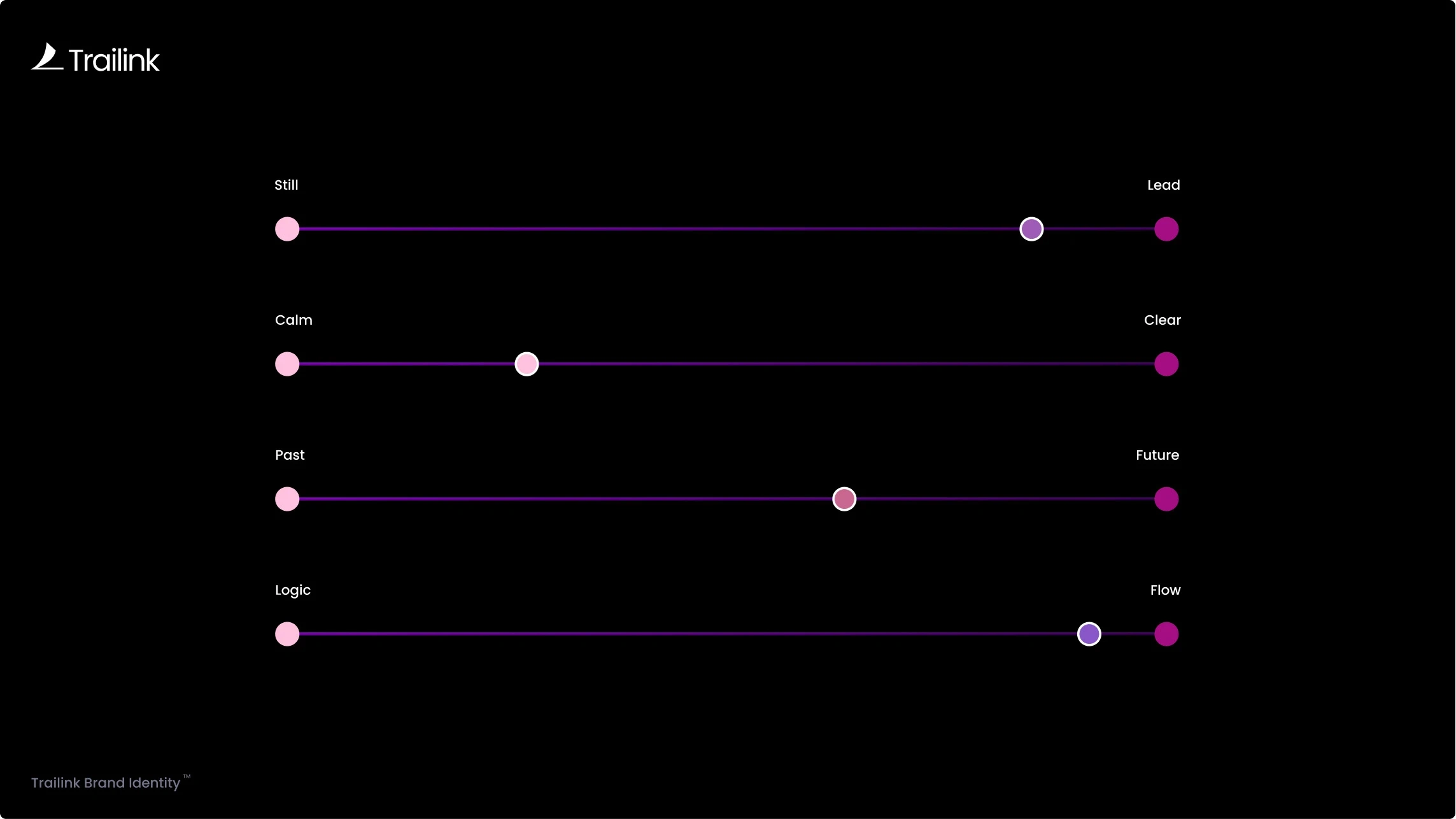
Trailink’s strategy is shaped by three core ideas.
Clarity. Removing noise and simplifying the experience is essential. The brand needed to feel calm, clean and intentionally structured.
Connection. Trailink helps teams bring fragmented systems together. The identity reflects this through flowing shapes, unified colors and minimal visual tension.
Momentum. A focus on forward movement defines the entire system. Every curve, gradient and typographic choice reinforces a sense of progress and direction.
These principles informed the tone of voice, visual style, color choices and typographic structure.
Identity Development
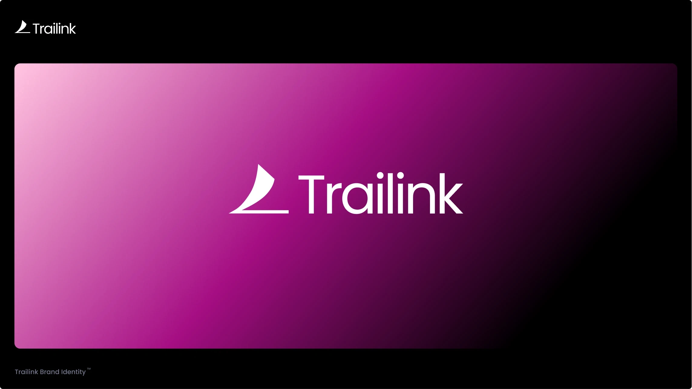
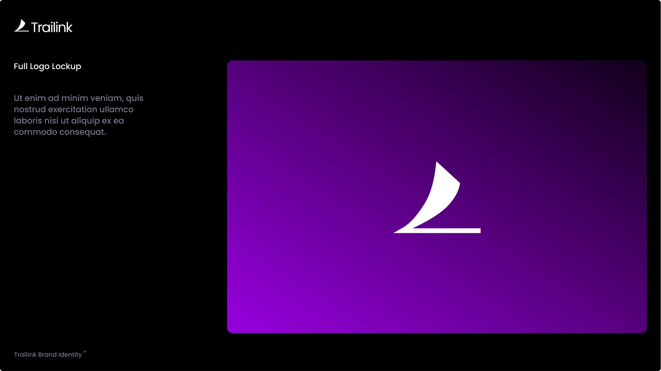
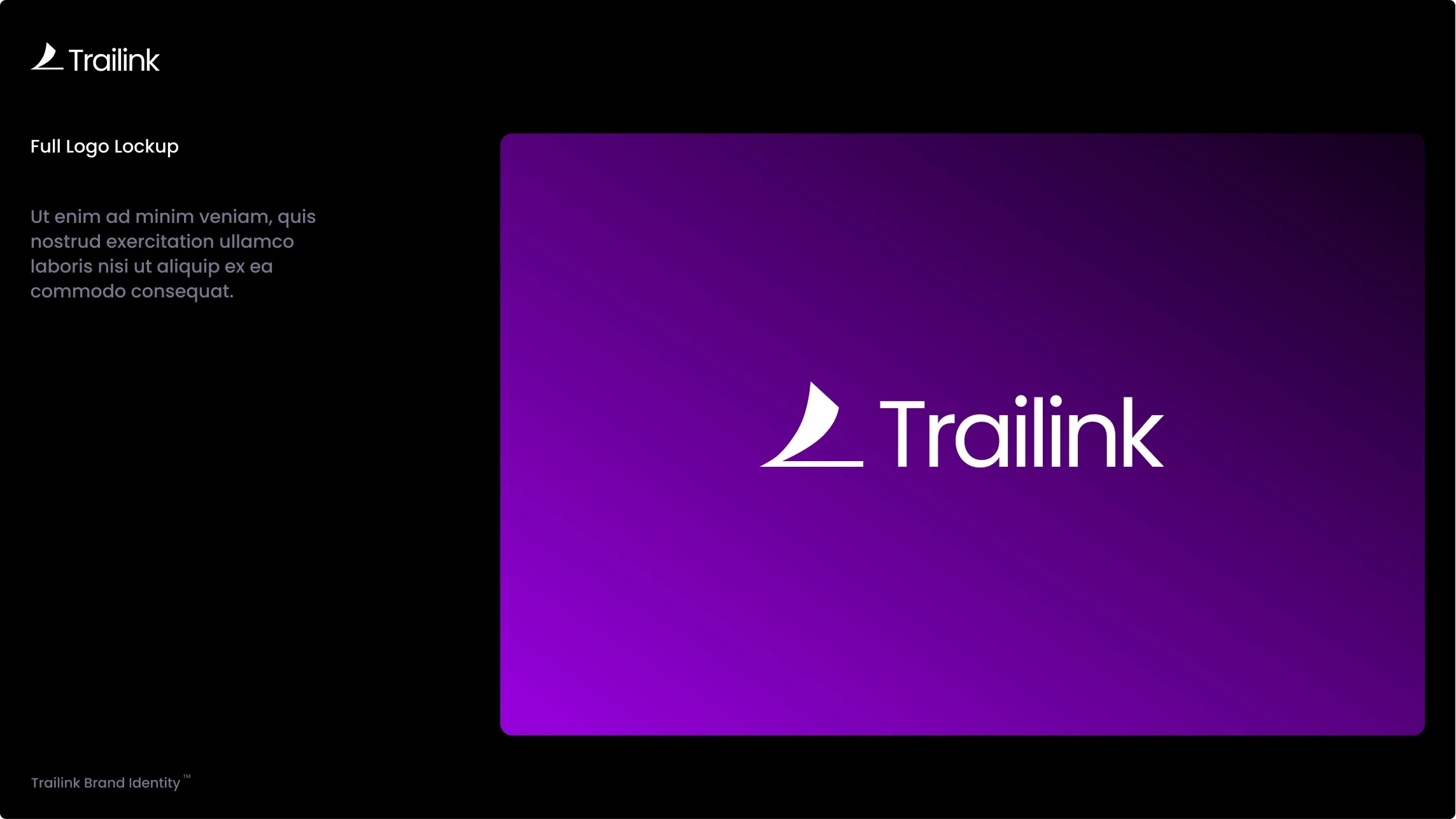
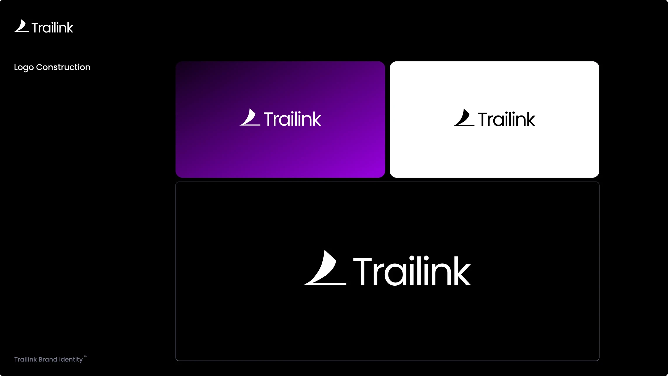
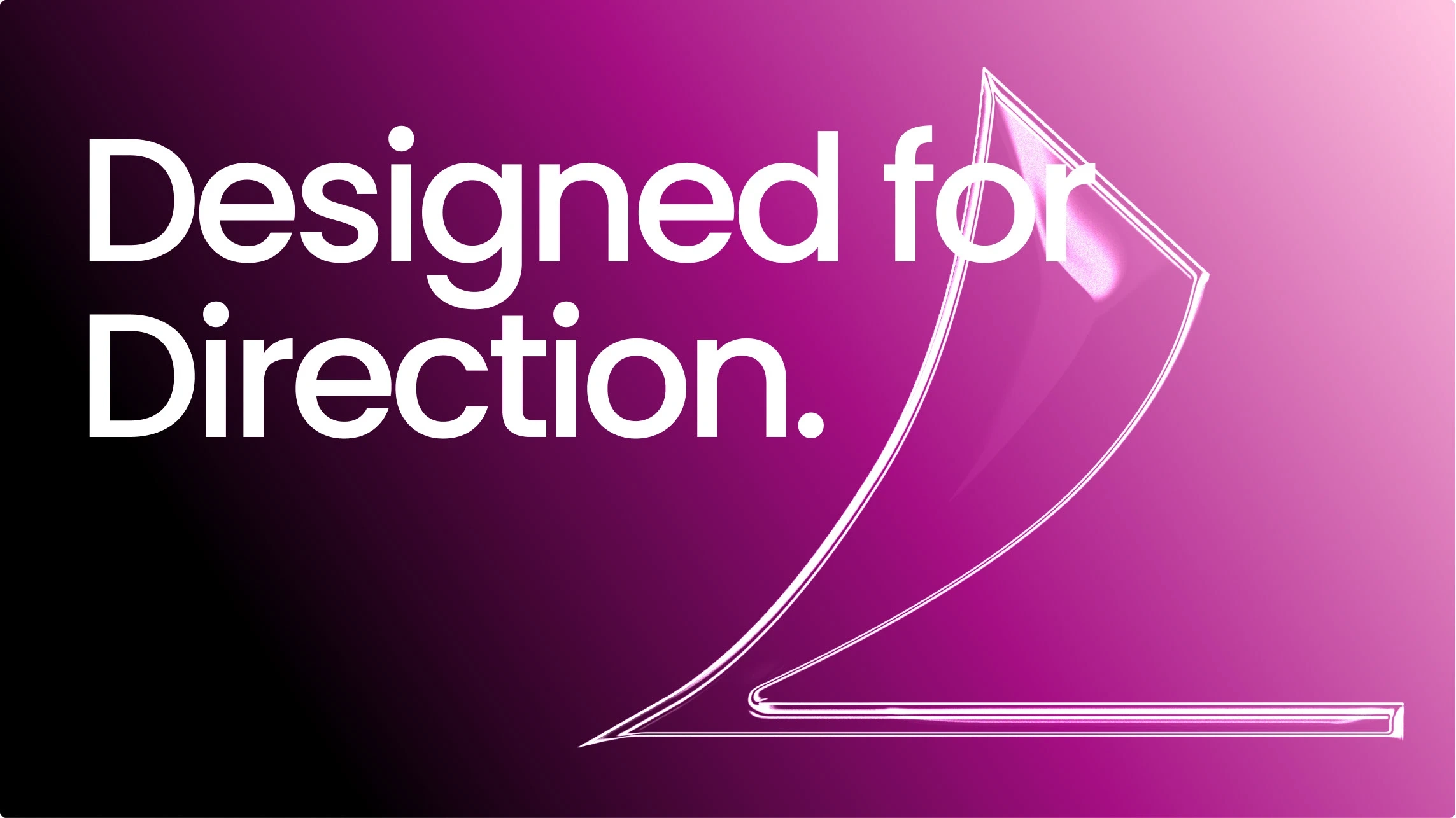
The Trailink symbol is constructed from geometric forms that represent a guided digital pathway. The curve suggests direction while the negative space reflects connectivity and intentional flow. The wordmark uses Poppins to maintain a geometric consistency and reinforce clarity across digital environments.
The system was crafted to be extremely flexible. It functions well in product UI, landing pages, marketing visuals and dark mode environments. The identity is expressive enough to feel memorable but simple enough to scale with the brand.
Color System
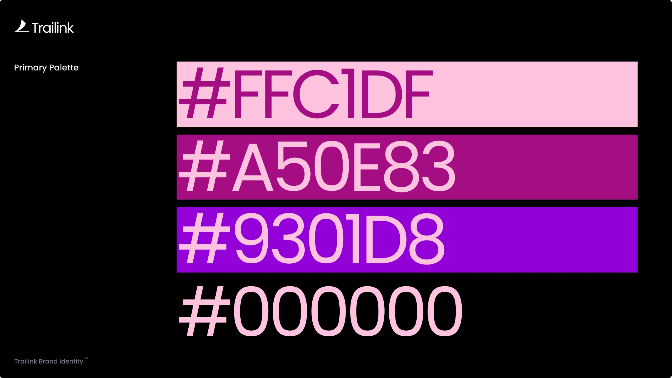
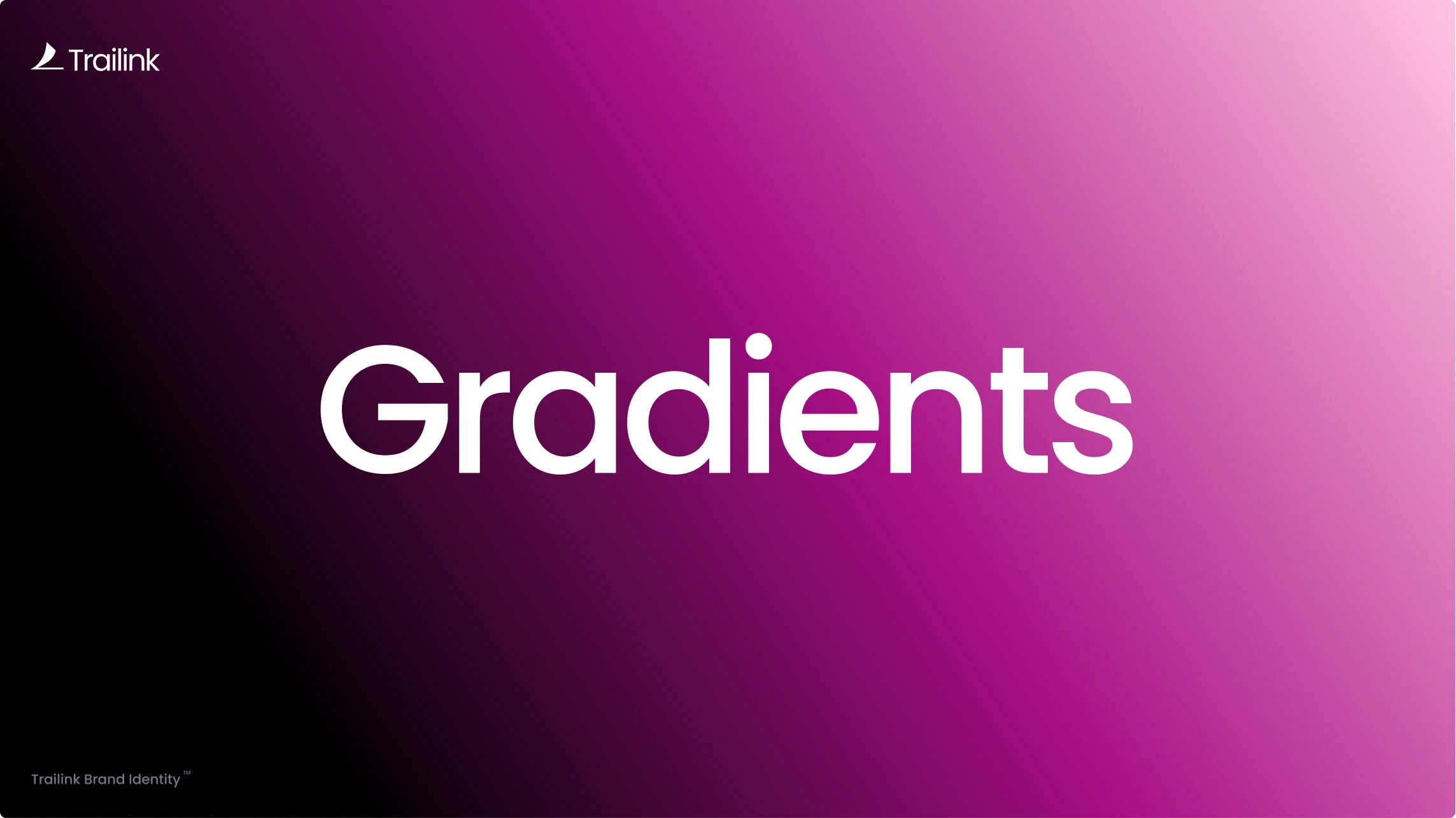
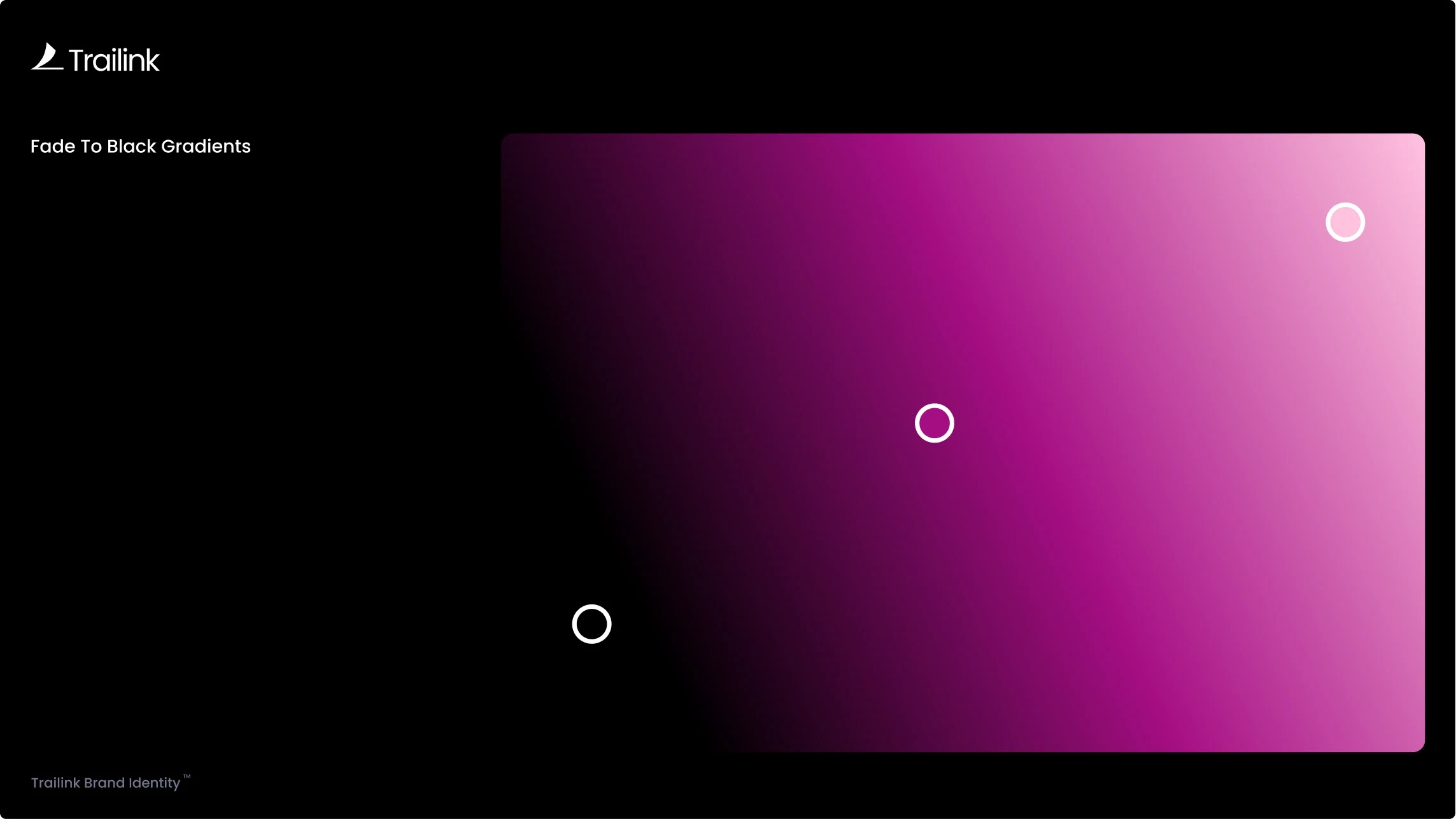
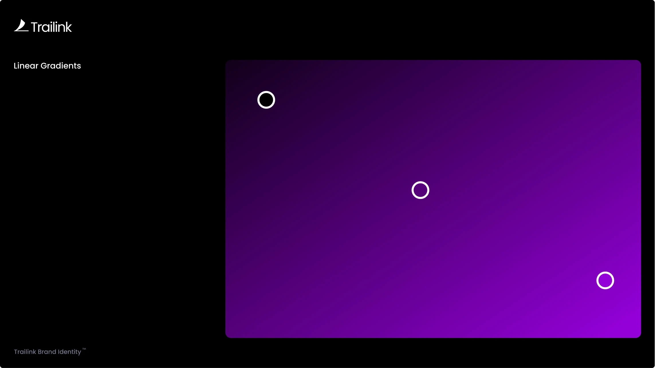
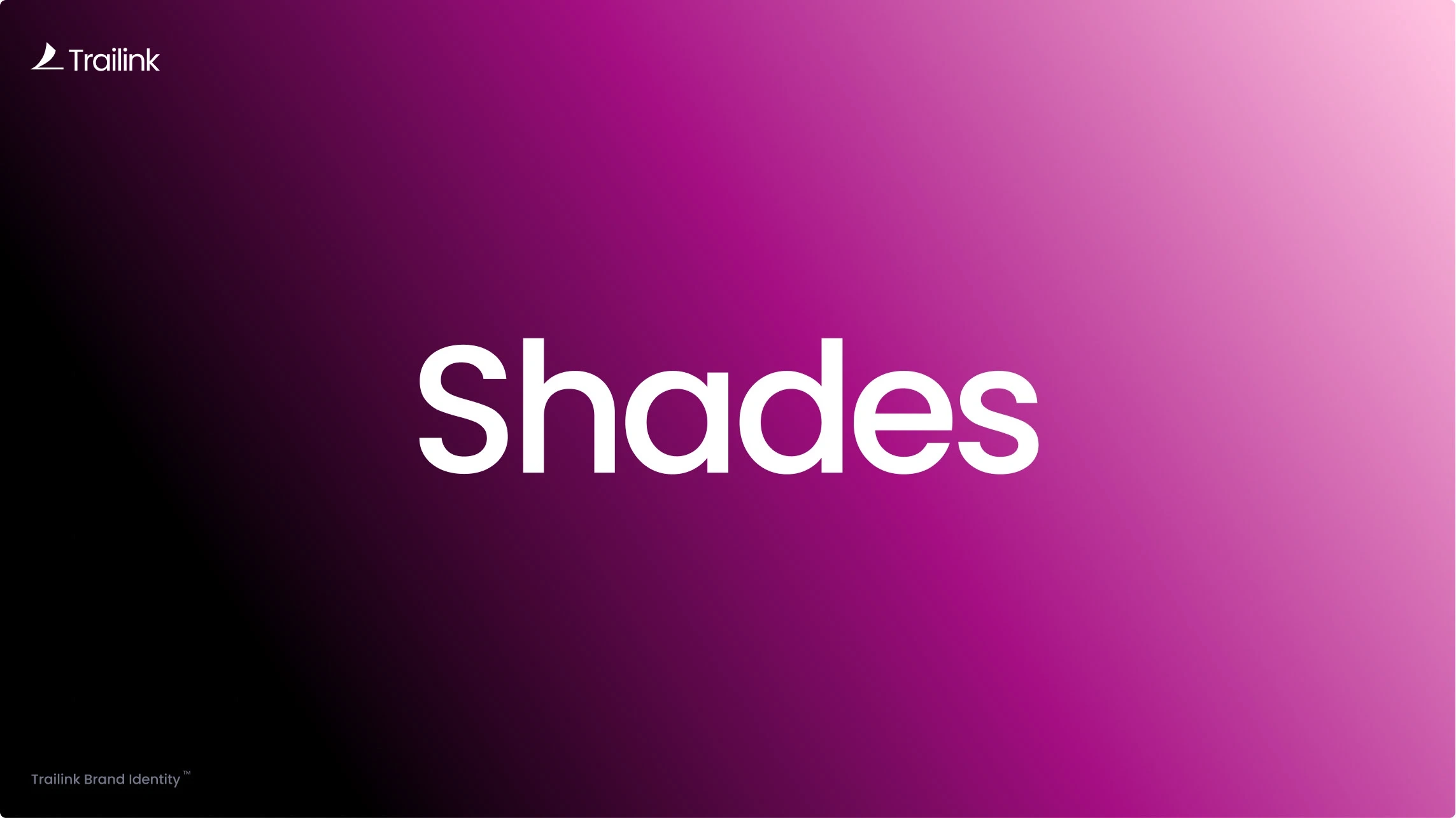
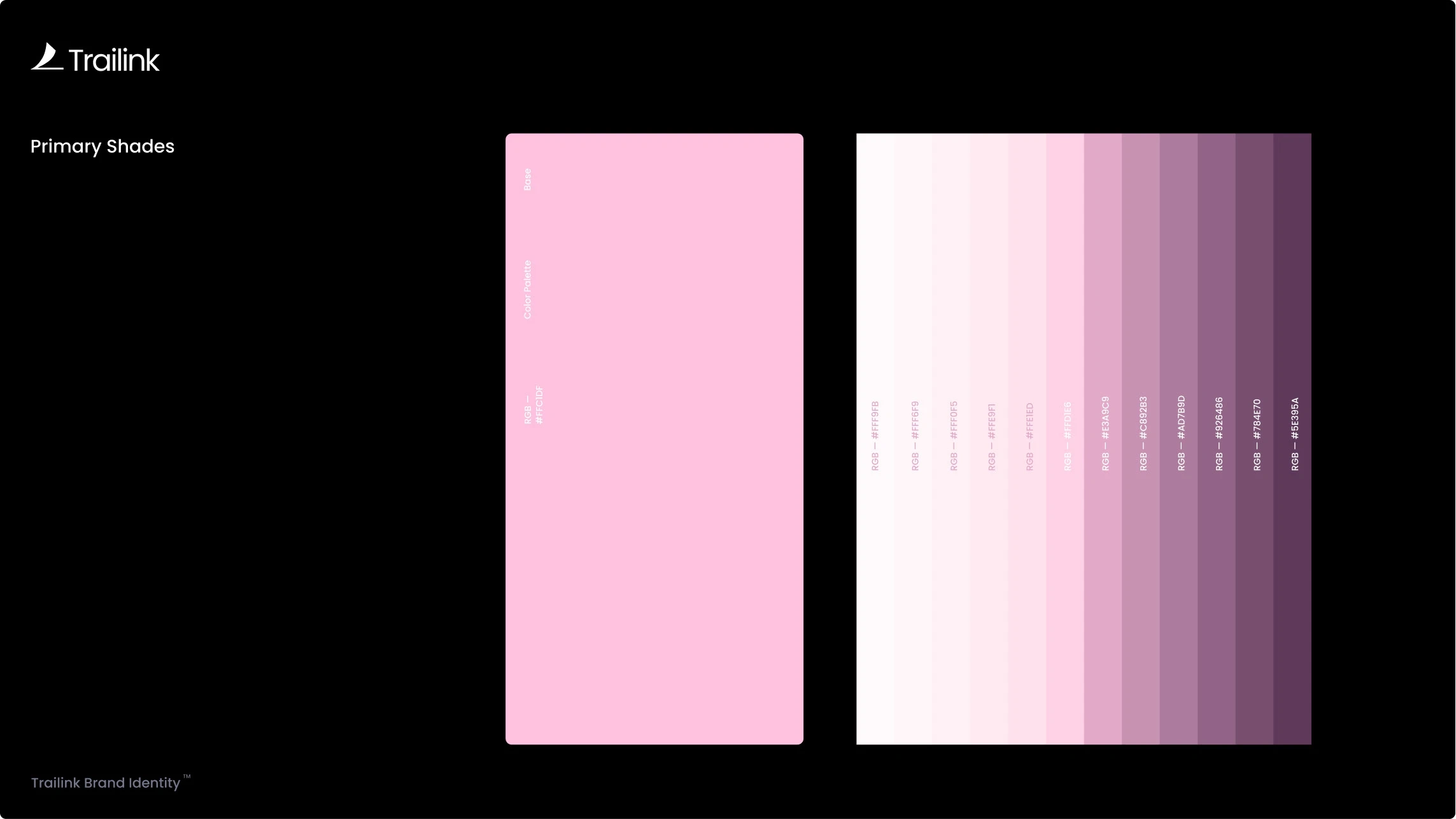
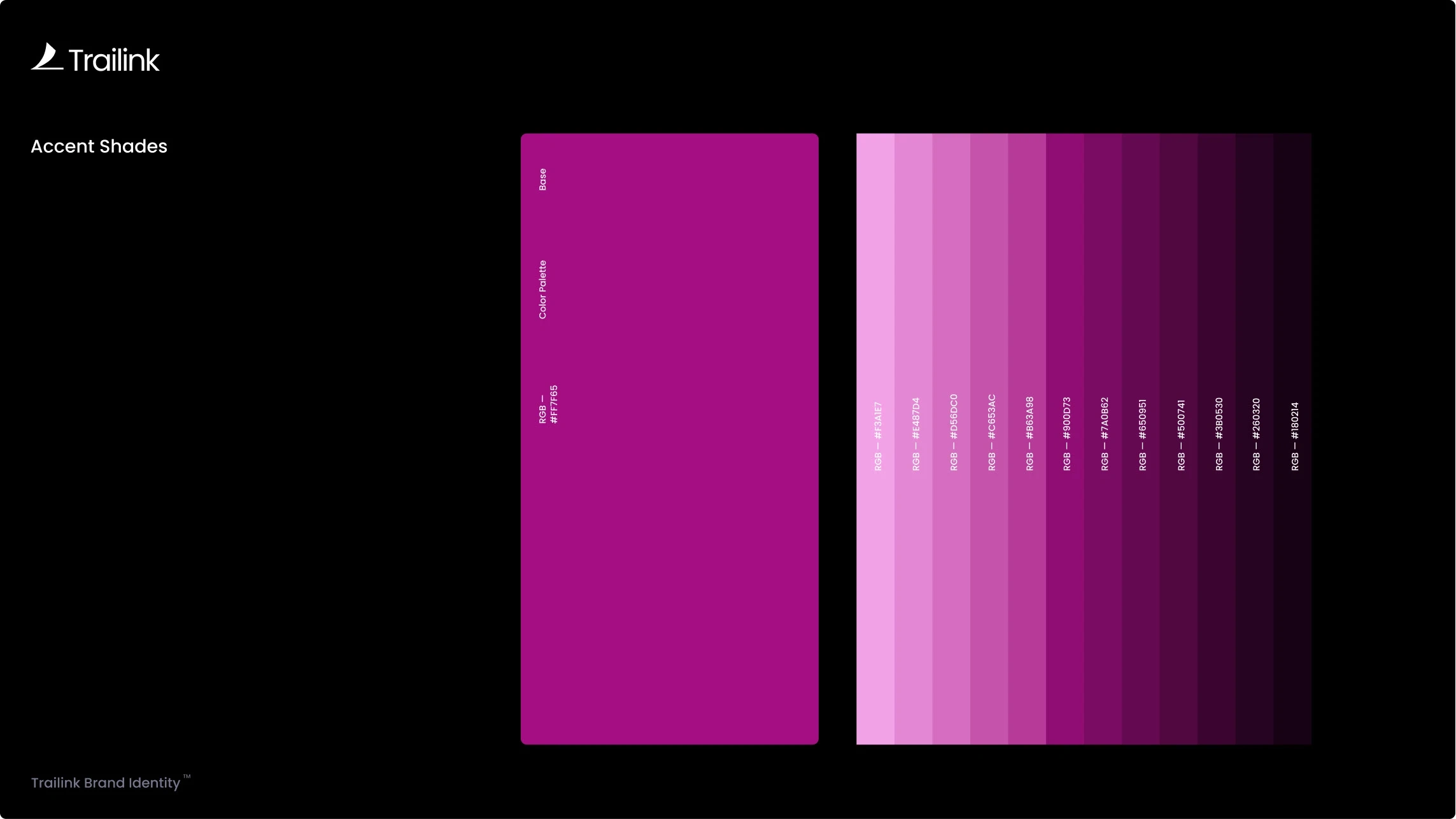
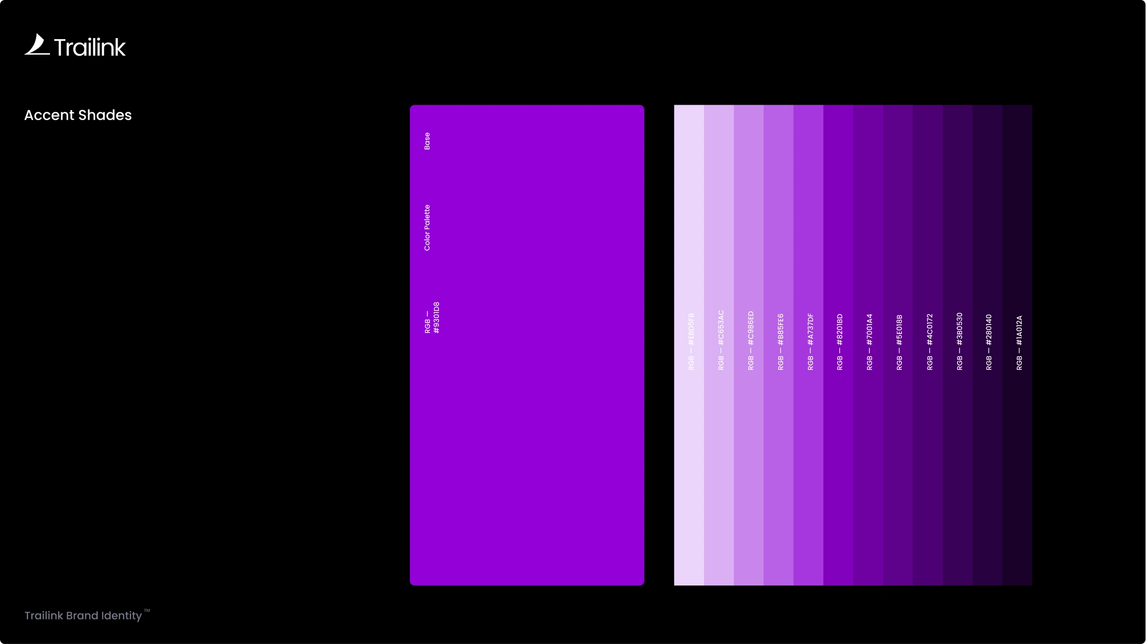
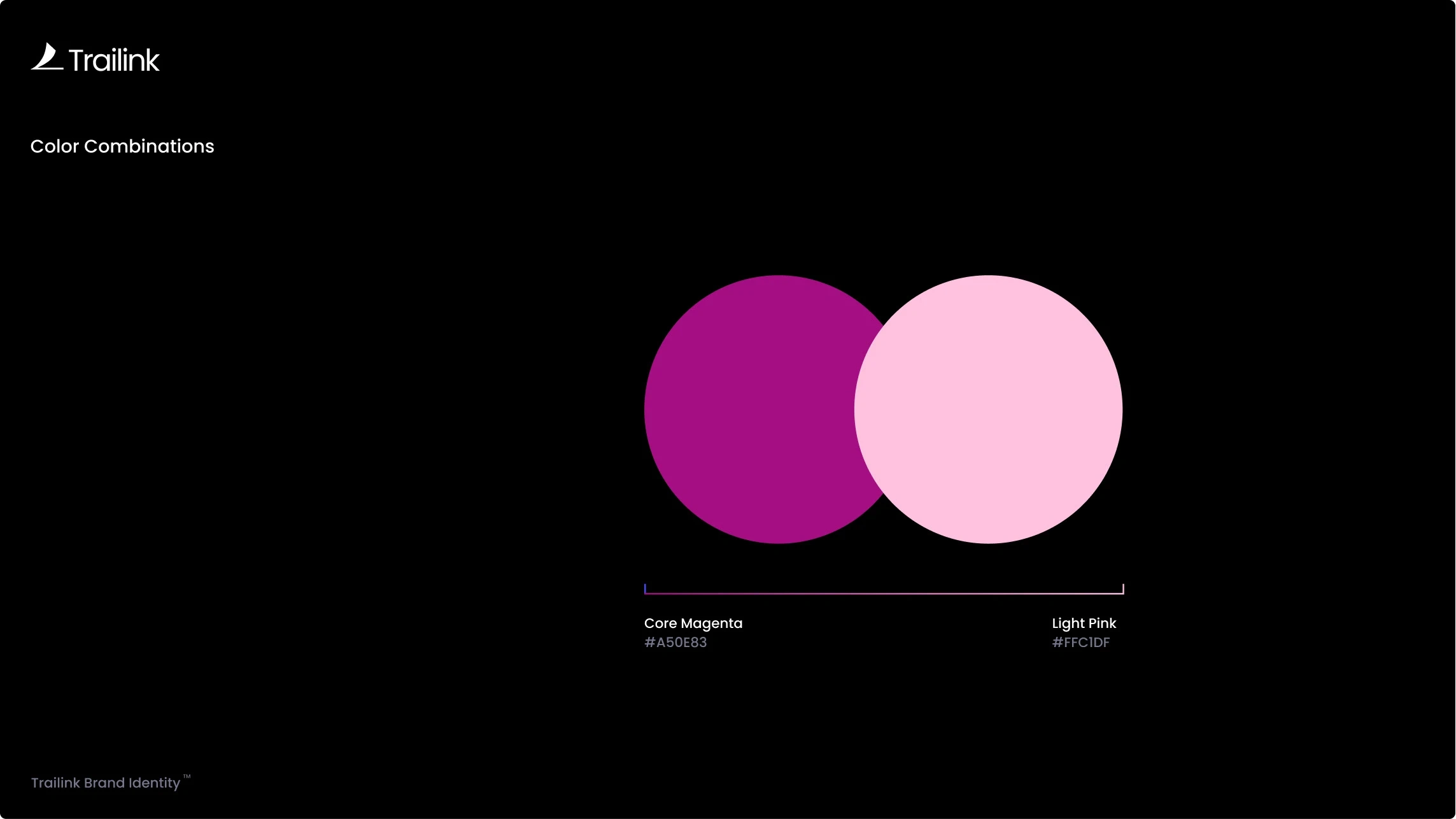
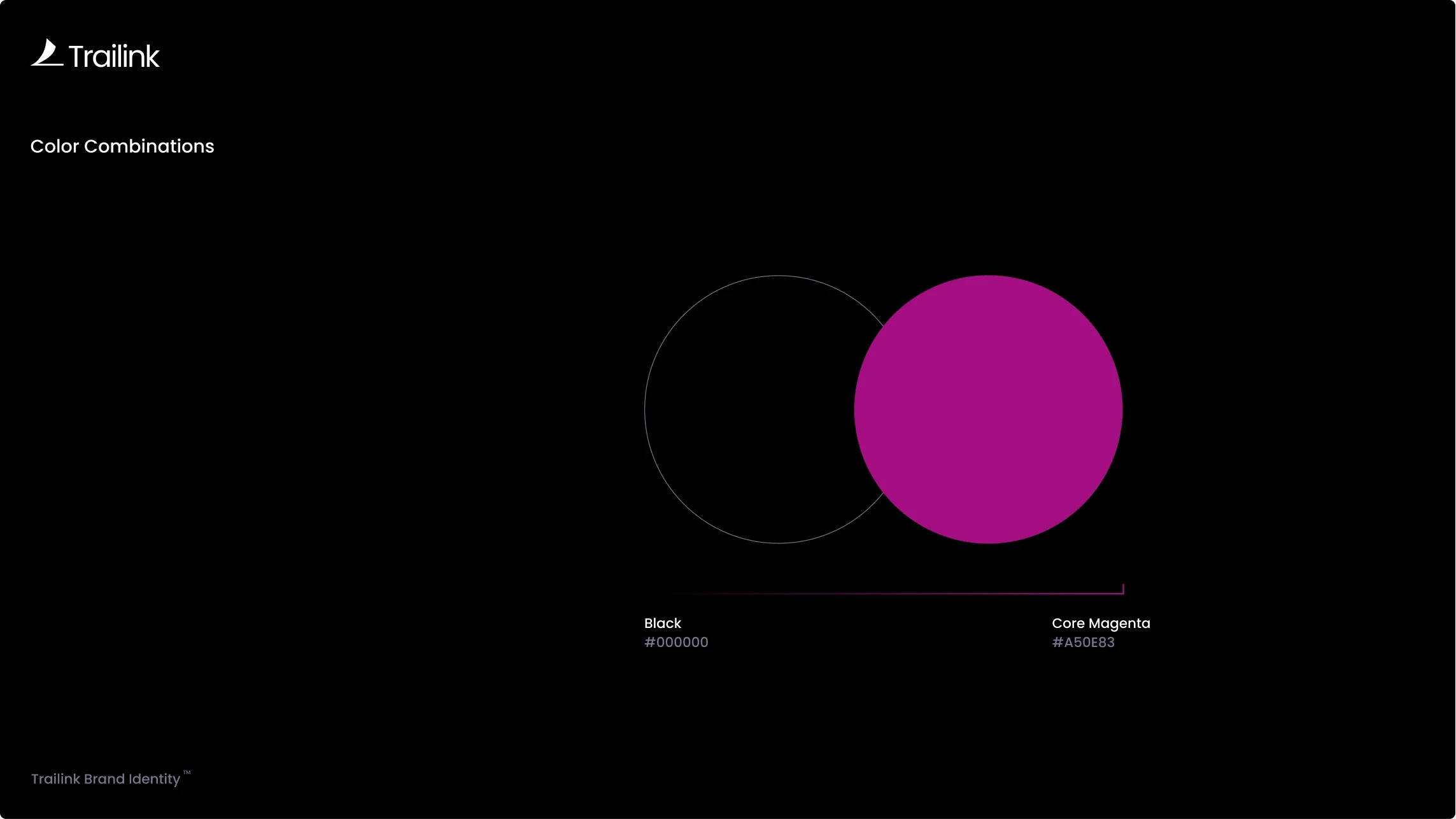
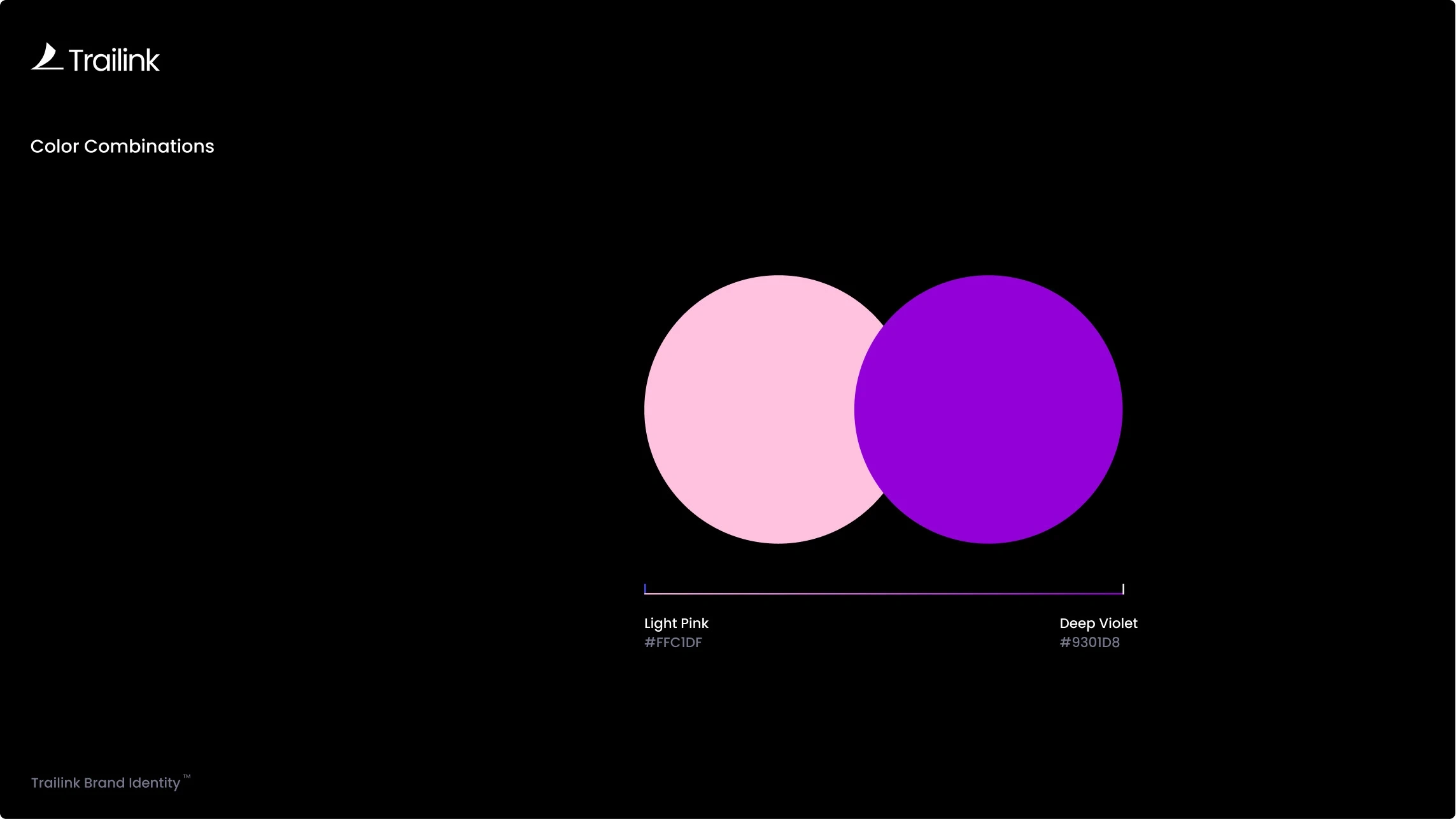
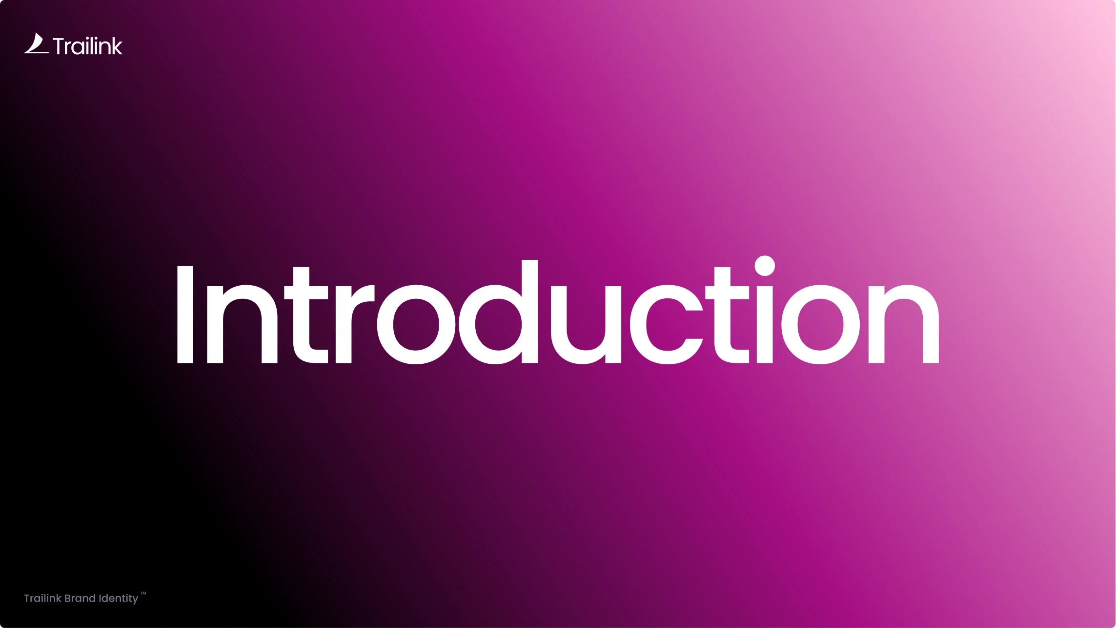
The color palette uses bright magenta, deep violet and soft pink tones supported by clean neutrals. These colors create a visual narrative of motion and energy while still feeling refined. Gradients were designed to move smoothly between tones, giving the brand a living, atmospheric quality that works beautifully in both static and interactive layouts.
Typography
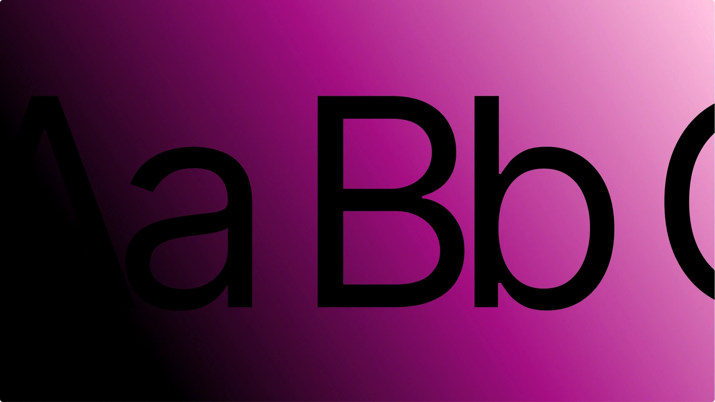
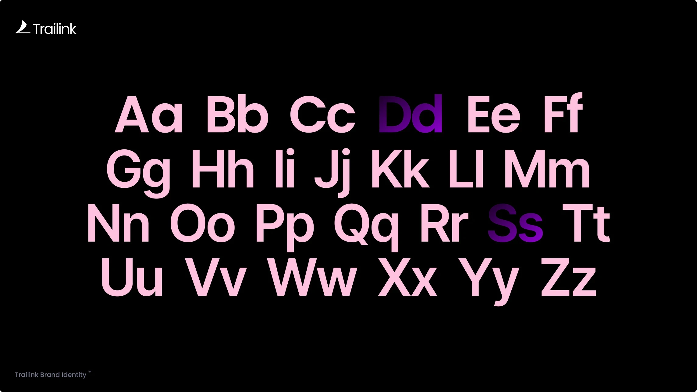
Poppins was selected for its geometric structure and versatility. It supports strong visual hierarchy and stays consistent with the shapes found in the logo system. The type scale was built on a modular structure to maintain rhythm and balance across every page. This ensures readability and clarity in both small UI text and bold headline moments.
Application and Layout
Trailink uses a grid system that prioritizes breathing room and alignment. Spacing is generous, layouts feel calm and content remains easy to navigate. The design choices create a digital environment where users feel guided rather than overwhelmed.
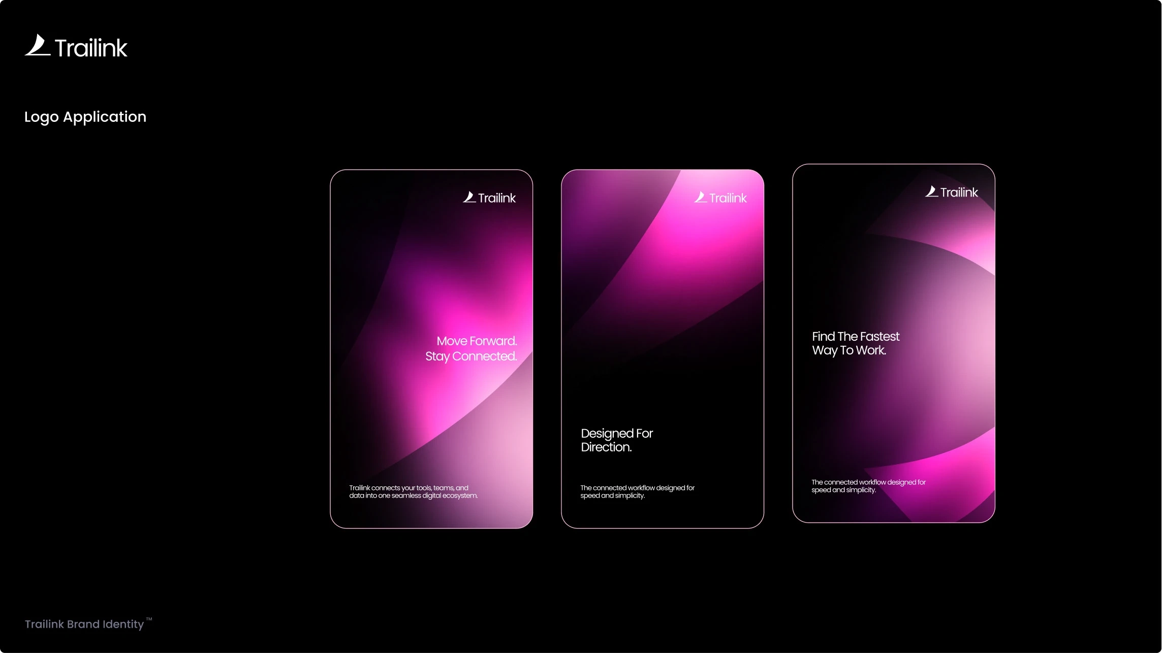
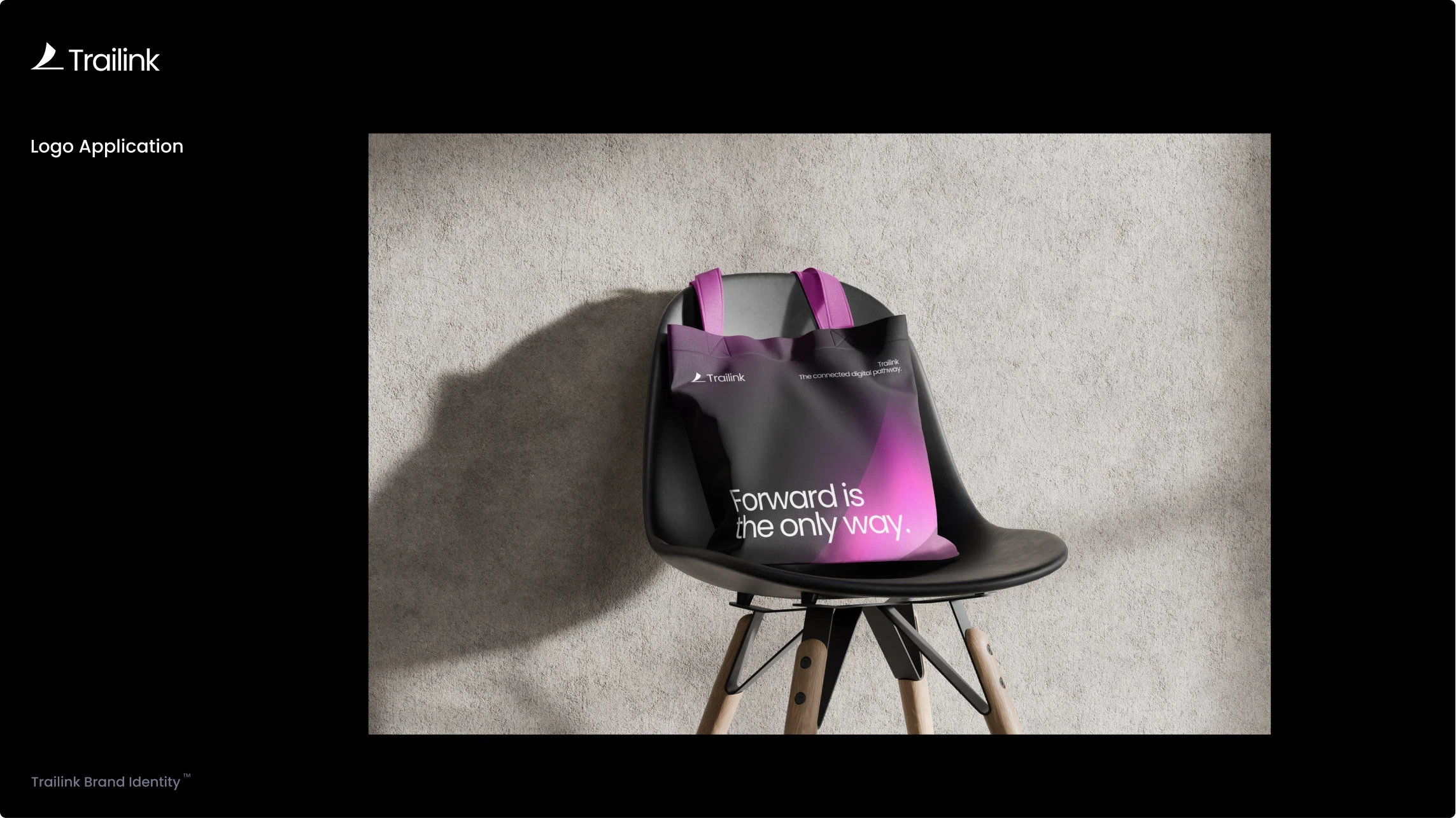
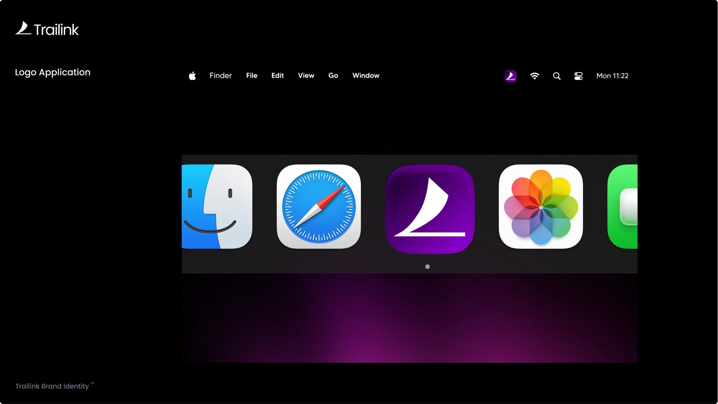
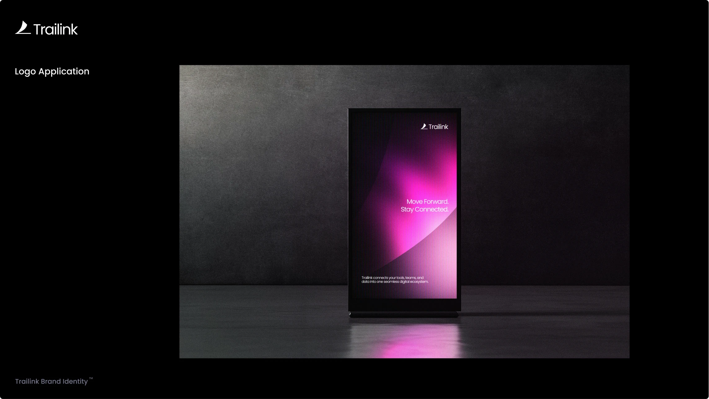
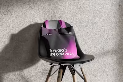
Mockups and real world applications include product interfaces, marketing pages, motion graphics, gradient compositions and identity staples such as logo usage, spacing and contrast guidelines.
The Outcome
The final identity gives Trailink a defined voice and a strong visual foundation. It communicates direction, speed and intentionality at every level. The brand now has a scalable system that supports future growth across digital platforms and product expansions.
Founders and teams in fast moving industries can instantly understand what Trailink stands for. A clear path. A connected experience. A brand built for speed and modern workflow systems.
Conclusion
Trailink represents a new standard for calm but confident digital branding. It demonstrates how a strong identity can turn complexity into clarity and bring purpose to the way teams interact with their tools.
If you are building a tech product and want a brand identity that matches your vision, I am open to new collaborations.
