Chai | Branding,Typeface Design, Packaging
Archit Pujar
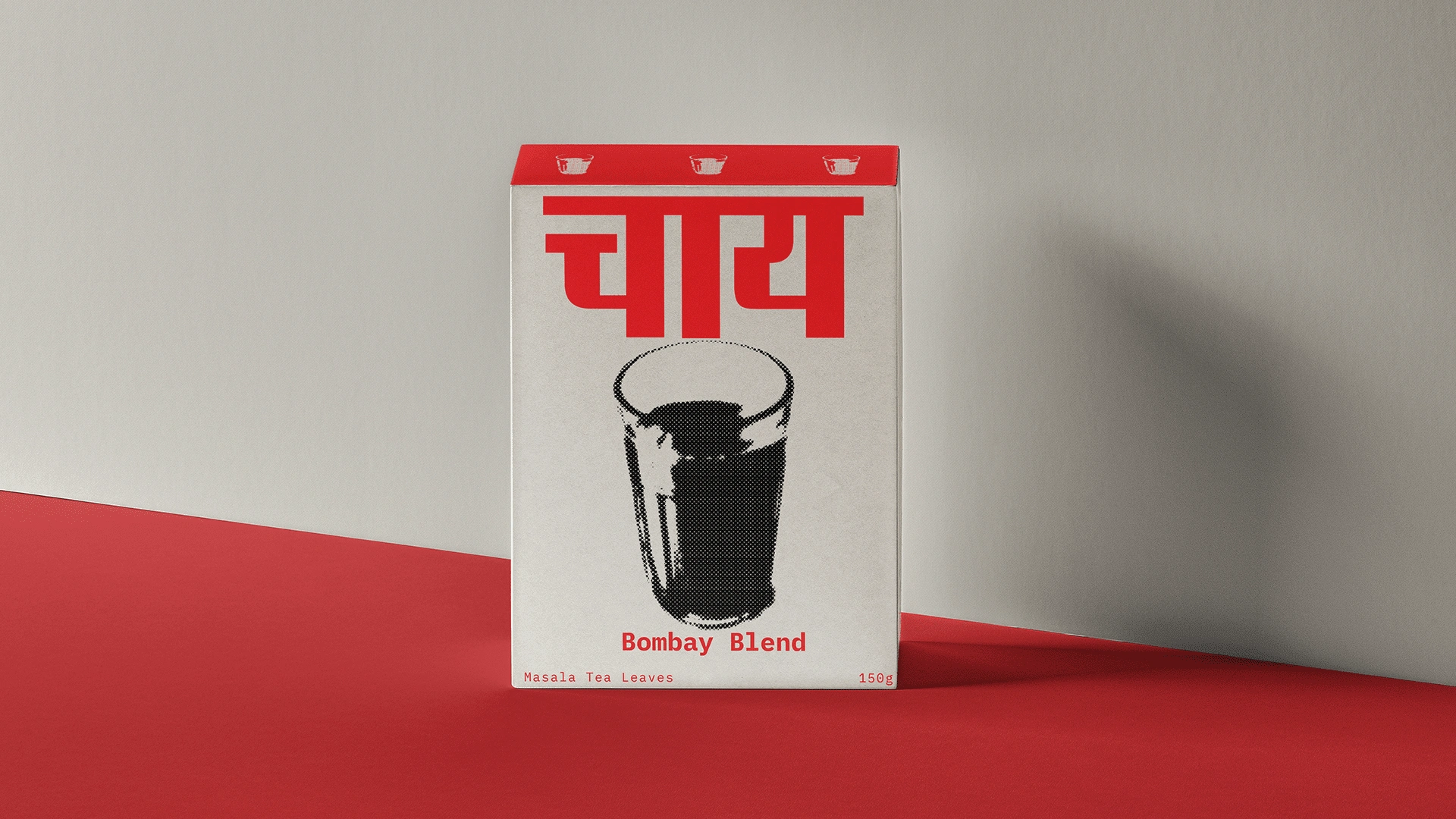
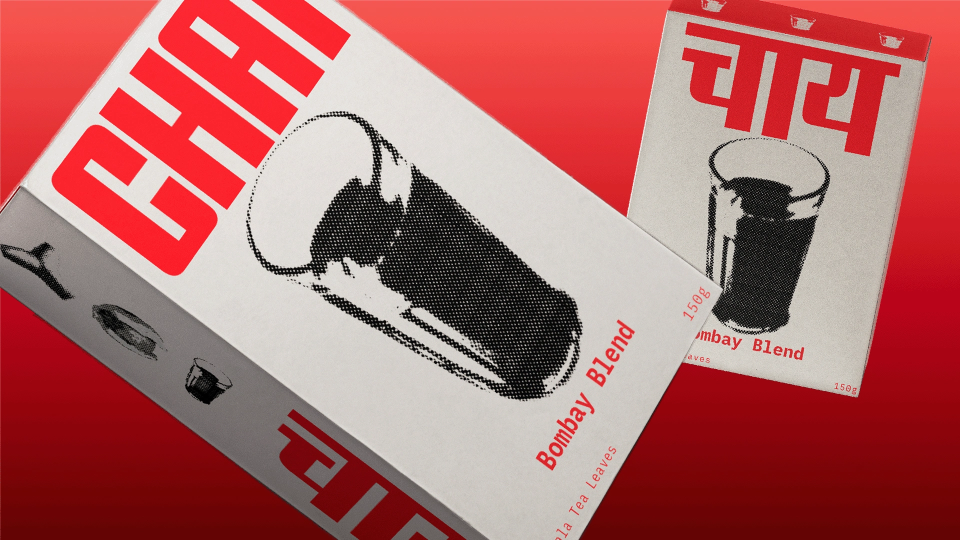
About Chai
This project aimed to position Chai as a simple, everyday pleasure in an urban environment.
Concept behind Chai
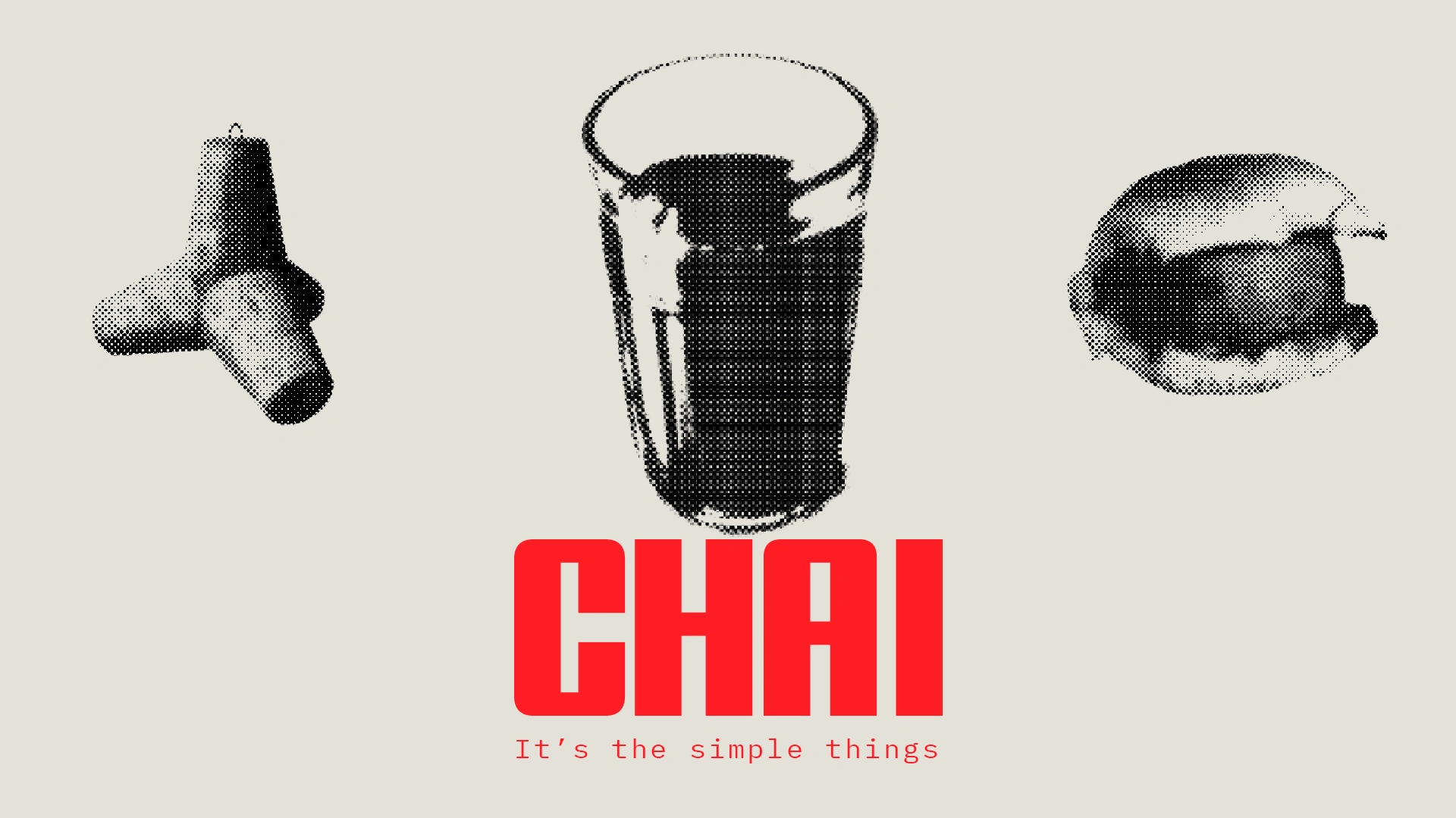
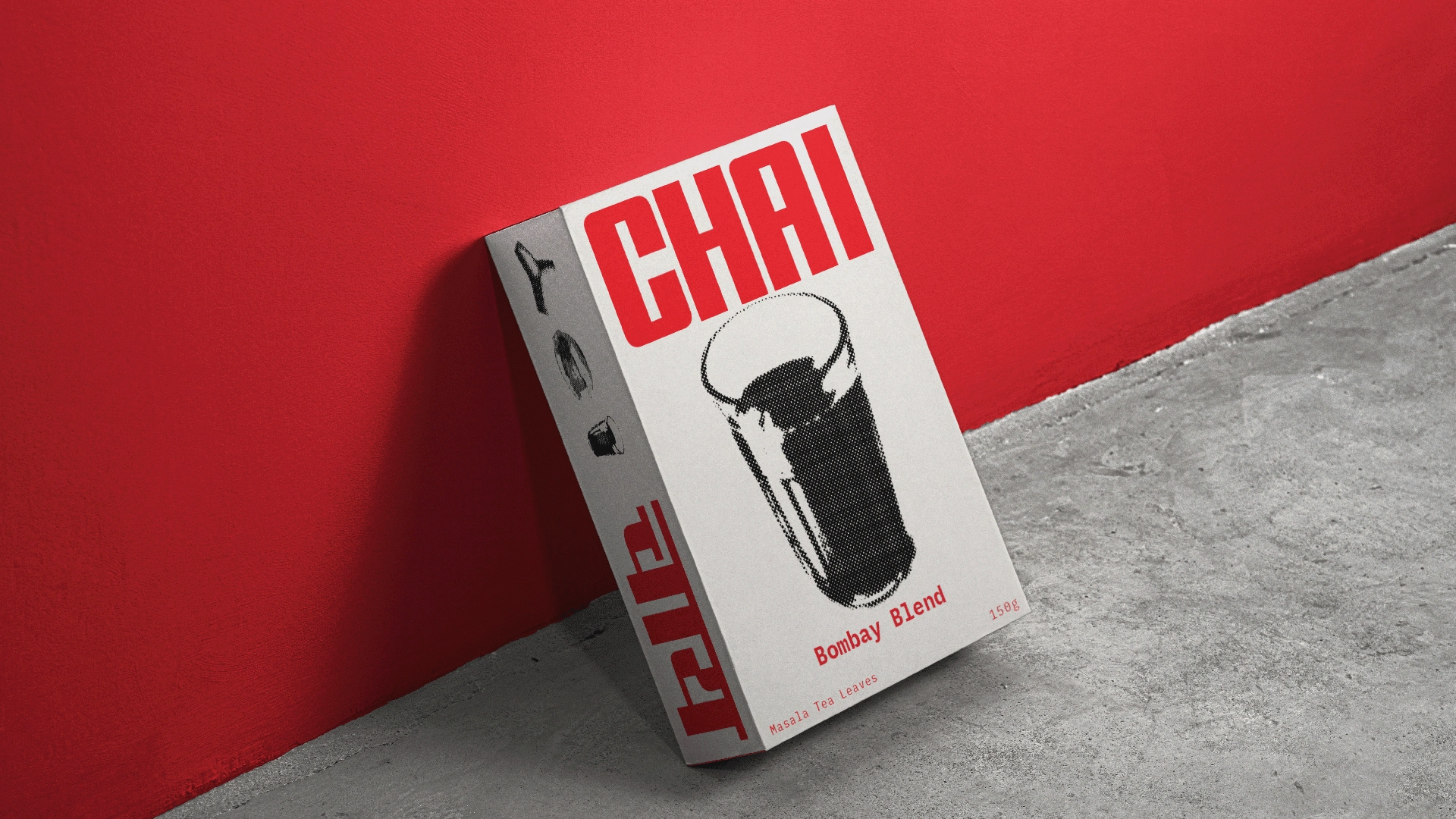
The goal was to represent Chai as its authentic self – a simple, everyday pleasure that feels approachable and familiar. Drawing inspiration from the small joys of urban India, I incorporated local motifs like the wave breakers of Marine Drive, the iconic faceted glass of chai, and the quick grab of a vadapav from a street vendor
The logotype is inspired by the Hindi typework seen in the diamond wood type industry in Meerut, India, commonly found in urban areas. The bold, geometric style feels familiar and authentic, with both English and Hindi versions designed to be approachable and true to the vision.
Like this project
Posted Dec 8, 2024
Branding and packaging designed to position Indian tea leaves as an everyday pleasure rather than a luxury.