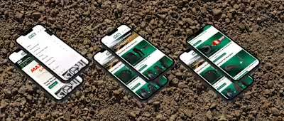
Bunnings Intranet Upgrade Project
Bunnings Warehouse
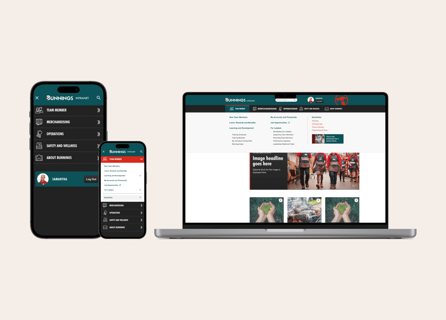
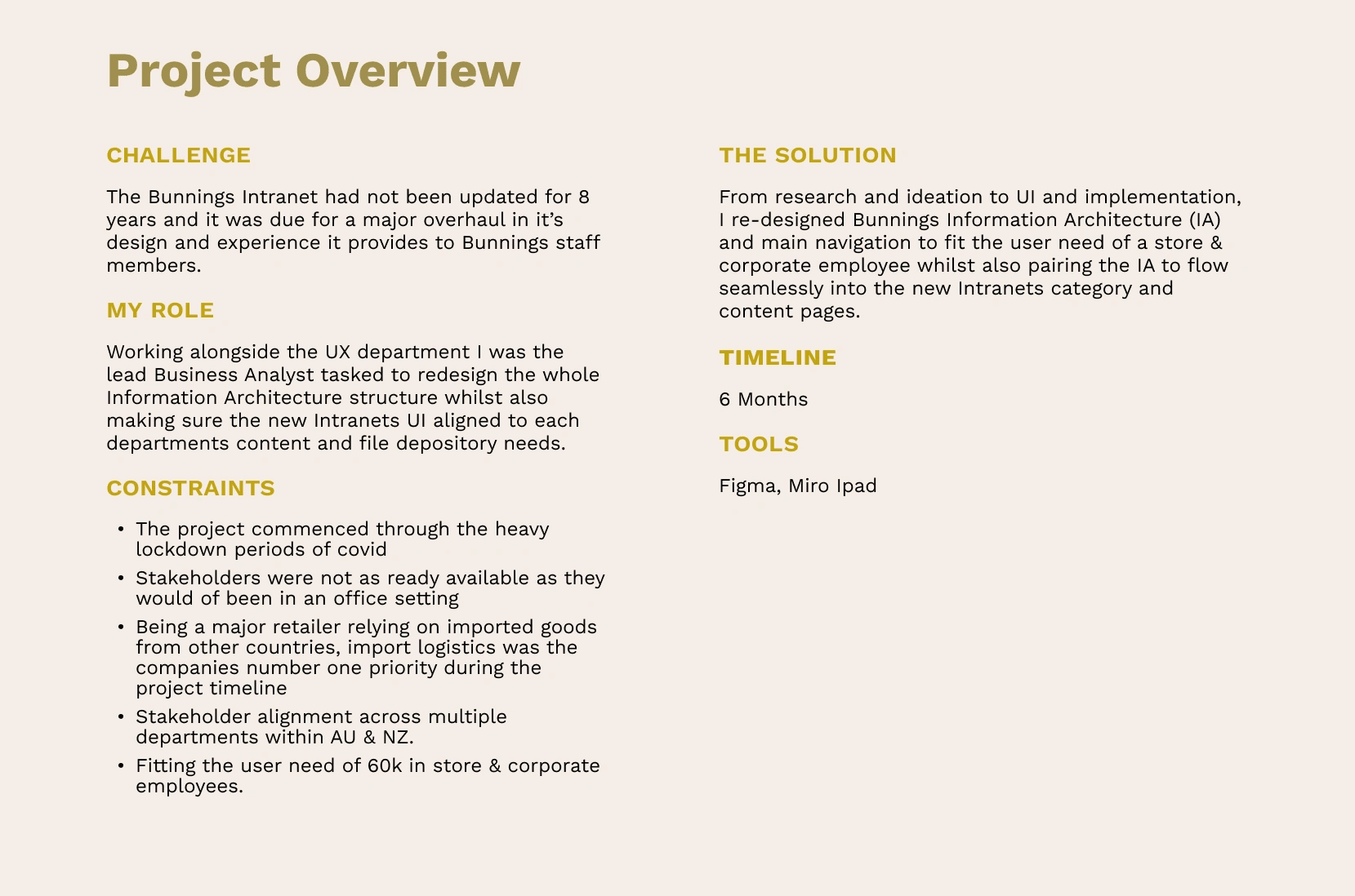
Consistent with the Bunnings vision “building the best”, Bunnings aim is to improve team member experience by rolling out a new intranet that will be mobile friendly and will combine the current two Australian and New Zealand sites into one. With superior search functionality and a fresh design, content will be easy to find and look slick. The aim is for it to be accessible outside of Bunnings, it’ll allow you access anywhere, anytime, on any device.
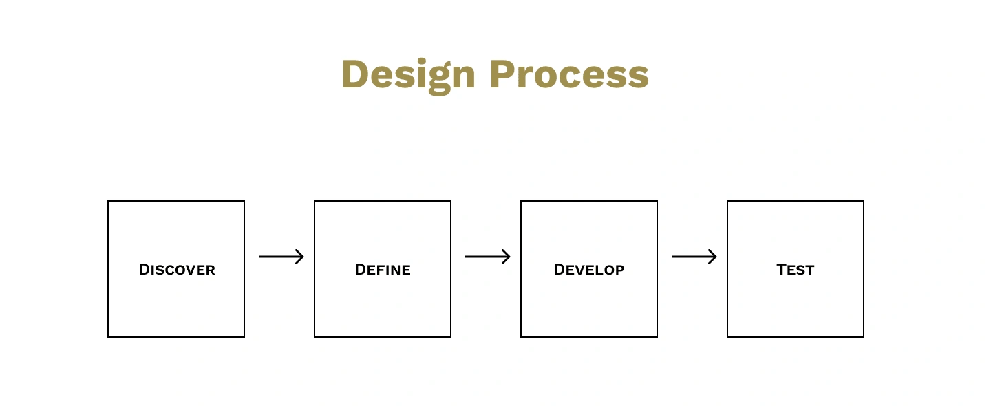
DISCOVER
Stakeholder Alignment
We started the project by conducting a planning session that brought together essential stakeholders and members of the project team. This session facilitated a comprehensive understanding of the present situation, identification of available resources, establishment of crucial dates, and discussion of potential constraints.
Part of my role here was to develop key requirements from the stakeholders to help form a preliminary hypothesis of what the envisioned end state may be.
User Interviews
Over the first month, I interviewed end users across various roles within stores and corporate. Next, this led to follow-up one-on-one conversations with key stakeholders and senior leaders. The results gave us both a ‘bottom-up’ and a ‘top-down’ view of the organisation.
This process was extended to the New Zealand business to surface critical similarities and differences between the NZ division and Australia.
In addition to research activities, I conducted a content and tools analysis.
Activities included:
• Familiarised ourselves with the current intranet and gained familiarity with key pain points and needs
• Worked with stakeholders to obtain a list of relevant information and topics
• Analysed content pages from the current intranet
• Evaluated material against best practice designs from other organisation
• Surfaced vital similarities and differences between Australia and New Zealand
Google Analytics Data
I took a look at some of the quantitive data we had available through google analytics looking at the website traffic in regards to sessions and clicks. Although the data wasn't strong I did find some key metrics as per the following:
YOY the Intranet has seen a steady decline in clicks and sessions down around 5% each year for the past 5 years.
I also noticed that some pages had also not seen any sessions for some years which initially indicated to me that these pages are inactive for a reason. I followed up on the pages with the key department managers and confirmed the hunch that even some forgot the pages still existed and the documents and content needed to be removed.
Affinity Mapping
Through affinity mapping, I found meaningful relationships between the raw qualitative data gathered from user interviews. It helped uncover critical themes and patterns around the user's feelings, behaviours, and thoughts related to the current Intranets pain points and what team members called out they felt would be needed new Intranet.
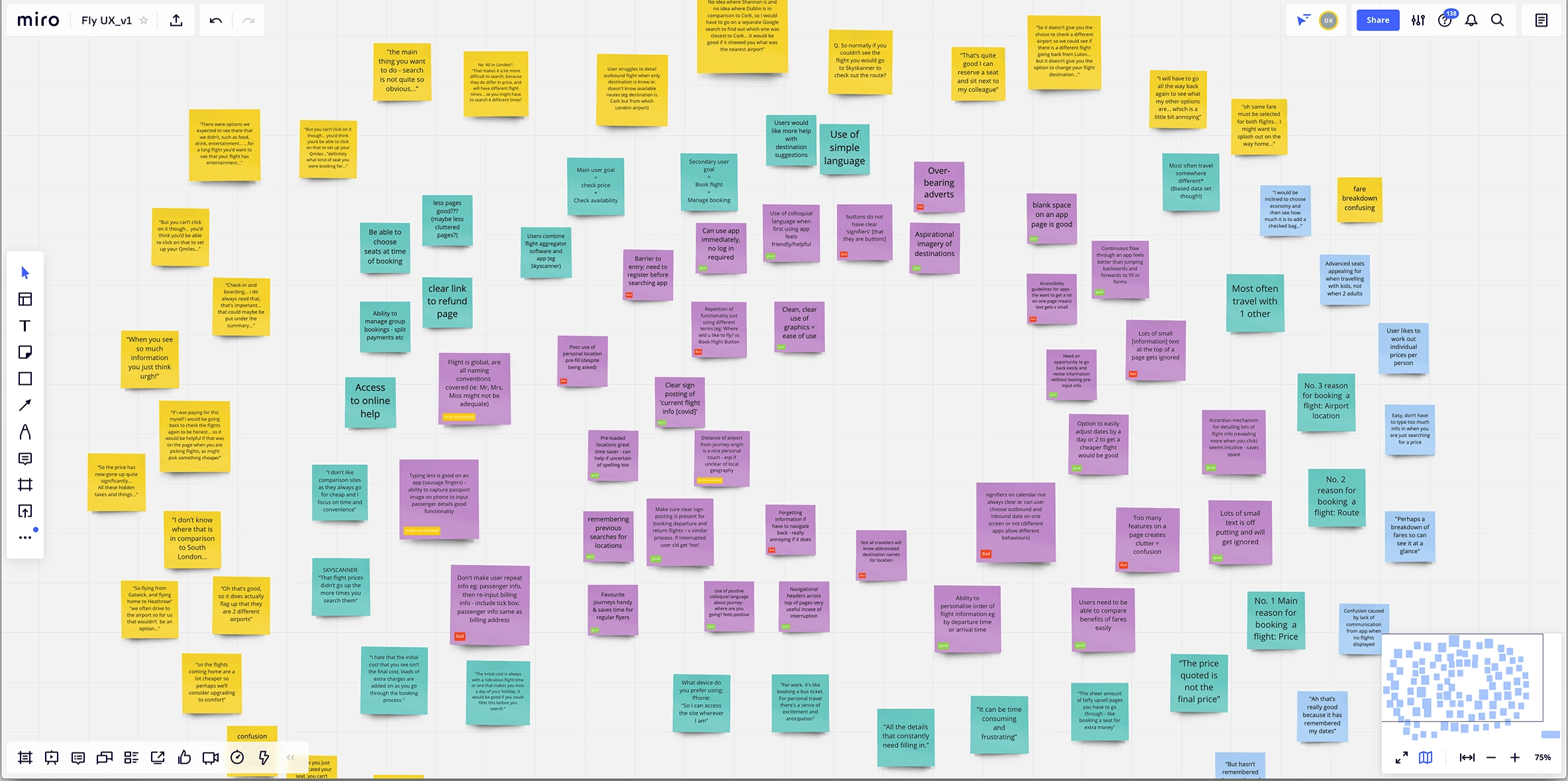
Miro affinity mapping (not from the project)
Key Findings
Inefficient Information Architecture: Team members expressed frustration due to the misalignment of departments and content categories, leading to confusion when navigating the Intranet.
Subpar Search Functionality: A notable challenge emerged with the search feature, causing team members to abandon searches and contact supervisors for information, negatively impacting work efficiency.
Content Updating Hurdles: Team members faced difficulties updating content and documents on their respective pages, as the current system needed more flexibility for real-time edits, impeding content maintenance.
Lack of Mobile Accessibility: The absence of mobile compatibility hindered team members' ability to access and contribute to the Intranet's resources, causing delays in customer information.
Store Member vs. Corporate: I established that user needs differed between the store and corporate members. Store members noted they just wanted a quick experience to get back to serving the customer, while a corporate member's main goal was to house and update relevant content to their departments.
NZ vs. AU: Surprisingly, the same pain points NZ had were the same AU team members also had.
Inactive and unknown pages: Multiple sections of the site had not been used for some time and the content and documents needed to be updated or removed through an audit.
User Personas
Using what I learned from both my primary and secondary research, I created two user persona that accurately represented who I was designing for. This persona helped guide my decisions along the design process to ensure the solution I am developing is centered on our two users, In-store employee Rachel & John, our corporate employee.
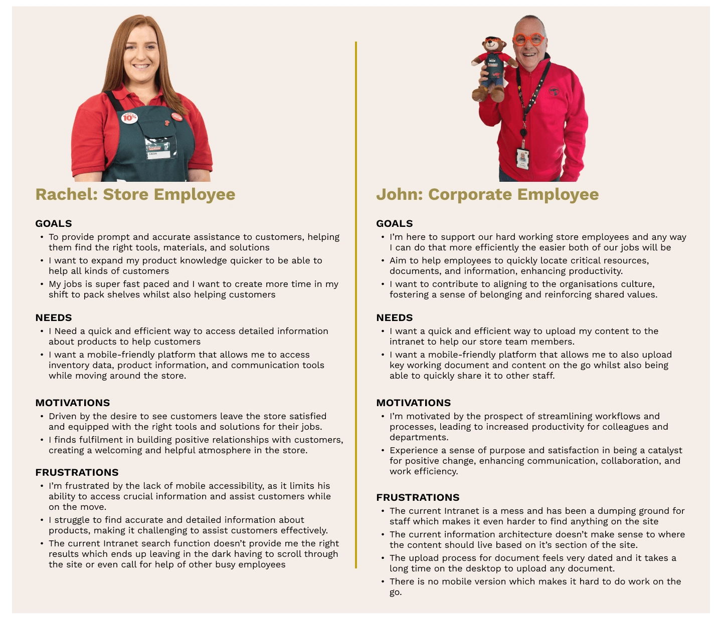
Personas
DEFINE
User Stories
Now that I knew whom I was defining, I could use the insights and needs gained from research to identify the main problems I am trying to solve. I used those insights and needs to create user stories to meet each persona's needs and align them to the goal of the Intranet Upgrade Project and the new proposed Information Architecture.
Store Member's User Stories
As a store member, I want the ability to find documents quickly, so that I can provide the most efficient customer service throughout my shift.
As store members, I want to be able to trust that the right information will in the right sections, so that I can put trust in the customers hand that I can provide the best service.
As a store member, I want to be able to use my mobile device on the Intranet, so that I don't have to head back to the office to grab the product information.
Corporate Employee User Stories
As a corporate employee, I want to be able to upload documents efficiently to the right sections so that I can provide the in-store members the most efficient experience throughout their shift.
As a corporate employee, I want to be able to use my mobile device on the Intranet to upload documents and content, so that when I am out of the office, I can still fulfill my job requirements
As a corporate employee, I want to be able to trust that the Intranet is updated and valid, so that my fellow employees can have limited blockers throughout their shift.
Card Sorting
Now that we know our users and their needs, I ran card sorting sessions across all key departments and a separate session for store members online across three days with a total of 3,000 employees within AU and NZ. During the workshops I used a open card sorting technique with participants to organise cards into their own categories.
This allowed me to analyse and determine how staff thought about and naturally arranged content and other intranet information.
What I found was participants ended up arranging cards aligned to groups of their core business units.
Information Architecture Draft
After analysing the feedback gathered, a significant milestone was reached in creating the initial Information Architecture draft. This draft emerged due to three days of comprehensive testing and observation.
The team's pain points were carefully listened to and addressed during this process. An integral aspect of this achievement was the meticulous categorisation of all content into their respective significant departments. Additionally, to ensure a coherent user experience, we strategically established subsections where content naturally extended across multiple pages while maintaining a cohesive link to the overarching section of the site.
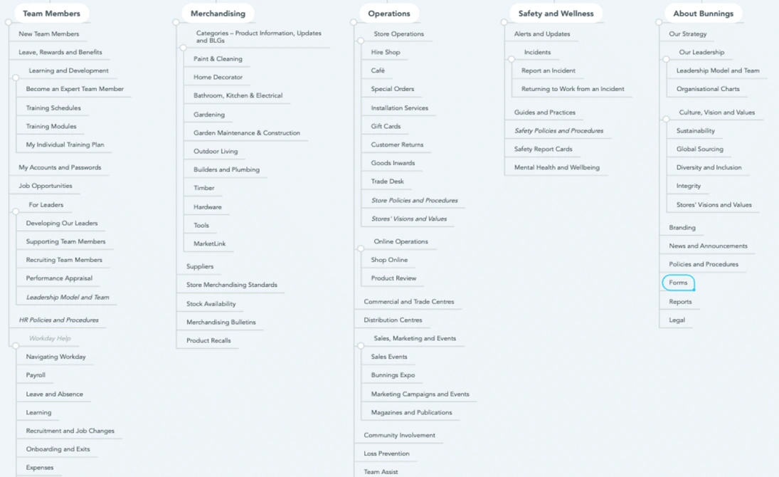
IA Draft
Iteration Process
Content Audit
Collaborating closely with the department heads and store members, the content audit gathered valuable insights. Initial testing feedback highlighted team members' frustration with misplaced content within departments. We successfully streamlined the content structure through a comprehensive reconstruction process, substantially reducing it from 1,000 pages to a more focused and efficient 250 pages. This achievement addressed content organisation concerns and paved the way for a more user-friendly and coherent intranet experience.
Information Architecture Site Map Iteration
After weeks of iterative testing on the proposed IA, we engaged in workshops with key departments and store members. We utilised the content audit to consolidate numerous pages into what we aptly named "home hubs." This approach involved strategically grouping related content, aligning with the collective need for easy and centralised access on mobile, tablet, and desktop devices. This was a notable shift from the scattered content layout observed earlier.
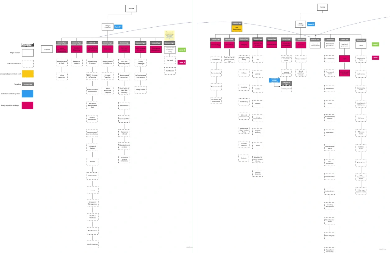
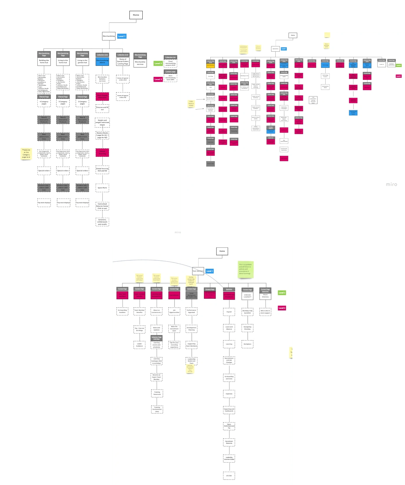
Miro Iterations
Low Fidelity Wireframes
We agreed upon a design guideline after a half-day workshop with our Intranet upgrade project team, using everything we learned throughout the research and iteration.
Four main templates would be created
Created annotated wireframe designs for core
pages that include navigation and visual hierarchy (desktop and mobile)
The initial structure of the IA and how it would be presented visually.
As my role as apart of the project was assigned to the IA, I then worked on creating lofi wireframe sketches based on the agreed design guidelines the project team decided on.
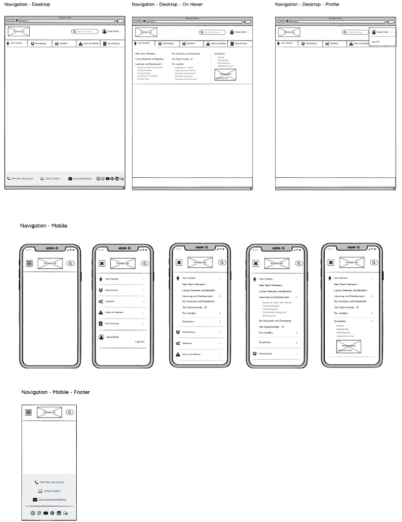
Desktop & Mobile
DEVELOP
High Fidelity Wireframes
Using Figma, I first started by creating high-fidelity wireframes based on the low-fi wireframes and the design guidelines agreed upon.
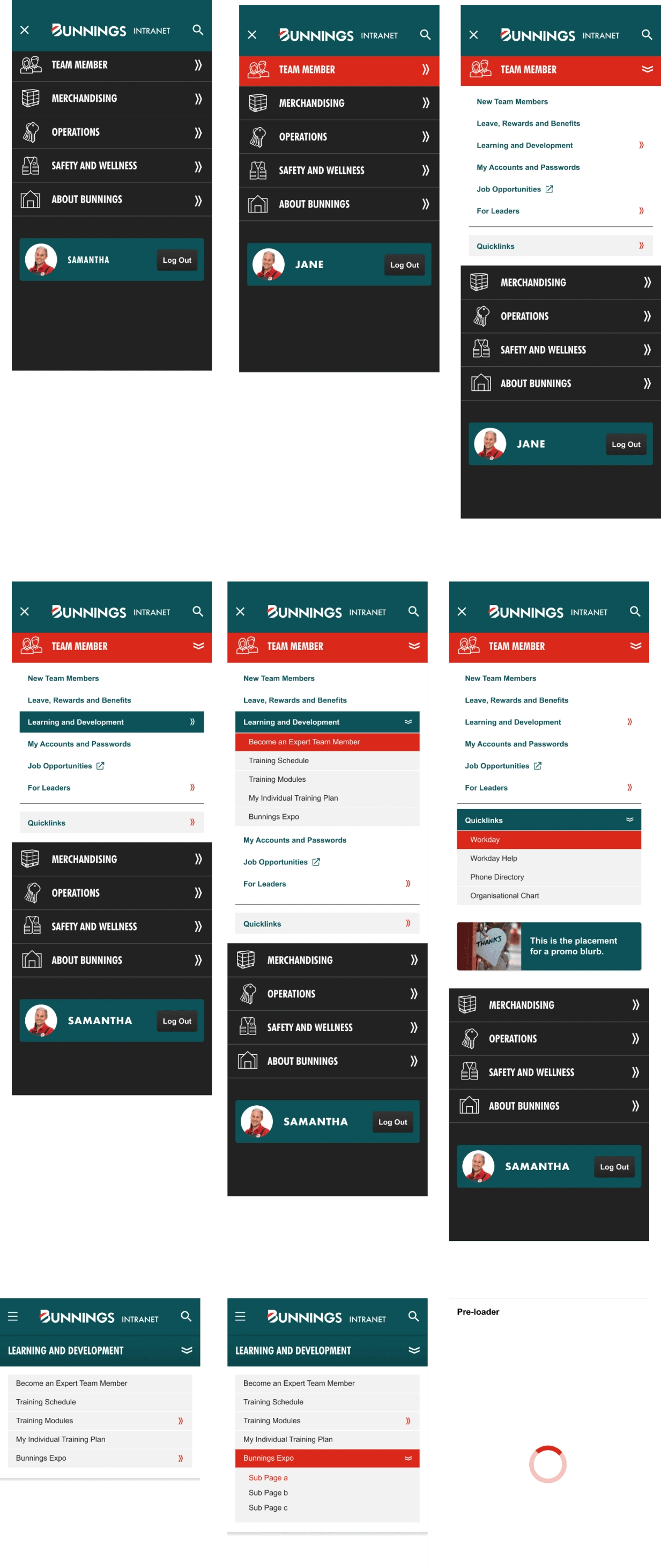
Mobile

Desktop
Prototype
Following my wireframes, I then used Figma to create an interactive high, fidelity, limited functionality prototype that I would use for usability testing.
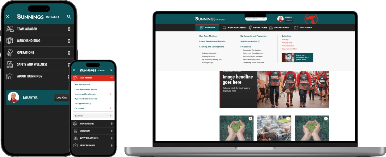
TEST
User Testing
The objective of the usability testing was to identify any usability issues and enhance the user experience of the Intranet IA. The testing involved 5 participants who performed tasks such as searching for content aligned to their company department, navigating their way through the flow of the IA, and testing on both mobile and desktop devices. The testing was conducted remotely in a moderated setting.
Testing Results
Navigation Efficiency: Users could navigate through the IA, indicating no potential issues with the organisation of content, menu labels, or placement of navigation elements.
Content Discovery: Users needed help understanding how the IA might link to their specific information or resources to get an overall complete experience.
Hierarchy: Users were happy with the “home hub” content hierarchy but again expressed how they would visualise IA linking to their home hubs.
Device: Users were excited to see the seamless transition of using a mobile device versus a desktop device.
Outcomes
Given a general approval of the navigational experience of the IA across all devices, I was pleased with the outcomes. However, the gap I identified was that we needed to re-test the user experience in correlation with the overall intranet project design.
I reached out to the UX team to re-test with the same user group and a new set of 5 candidates who shared the same pain points to see if we would encounter any further issues. We found the following results:
Users were happy with the transition from AI to their content pages.
Users agreed that there is now less clutter on the content pages, and the IA makes sense to where the categories are placed.
Users were also happy with the present search option to allow them to grab and go.
Users expressed their joy with the Mobile device's usability and how it will make their day-to-day easier.
Launch & Conclusion
The launch was kicked off in 3 separate phases:
Launch to a testing group that was gathered during the project:
The feedback from the group was very positive, with team members able to navigate through the site freely.
There were also positive comments on the look and feel.
2. Once the phase 1 group was approved, we launched to store members only as they are the organisation's backbone.
Team members were impressed with the site's usability; however, communication could have been better with team members in finding their specific content. The communication & project team did launch training and usability sessions with the team, but given the Covid-19 climate, it was extremely difficult to train 60k employees over video learning.
3. Launch to the broader business
We found a positive reception from our wider business and store support team members. They were delighted that they didn't have to wait for the channel team to update their content and documents so they could get their messages out there faster and more effectively in an ever-changing Covid environment.
Learnings
Given that we thought Covid wouldn’t still be impacting our project, we could have allowed us more of a buffer in timings to accommodate more training to the team.
Using our platform provider Oracle, we faced multiple issues over the project length with the impact on Indian-based developers coming and going from the project due to personal reasons impacted by the pandemic.
Next Steps
Now that covid has ended, it would be advised to re-test with users in the stores face-to-face rather than on a video call to understand better how they use the Intranet.
Launch any new revisions made from the re-testing with clear communication to all staff members.
Overall, it was a fantastic project that allowed me to grow my skillset across multiple job roles. I am forever grateful for the connections I made with the team and look forward to the Bunnings Intranet's progression.
Like this project
Posted Aug 13, 2023
Working alongside the UX department I was the lead Business Analyst tasked to redesign the whole Information Architecture structure.
Likes
0
Views
103


