MTB Direct: Bundle Deals Landing Page
Project Overview
Timeline: July-August 2023
My Role: UI/UX Designer, Digital Marketer
As the Marketing Lead at MTB Direct, I undertook the role of a UX Designer to elevate the user experience and streamline the process of exploring and selecting bundle deals on our website. This case study explores the user-centered approach taken to introduce the Bundle Deals Homepage and provide customers with an engaging and intuitive platform to discover the latest offers.
Problem Statement & Constraints
Recognising the absence of a dedicated landing page for bundle deals on MTB Direct's website, a pressing need arose. Customers were confronted with an unstructured and less intuitive approach to exploring the array of bundle options. This led to a suboptimal browsing experience that hindered their ability to seamlessly navigate through the variety of offerings. The challenge at hand was to establish a well-structured, visually captivating, and user-centric Bundle Deals Homepage that would effectively address this issue, elevating the overall browsing experience for our customers.
Current state
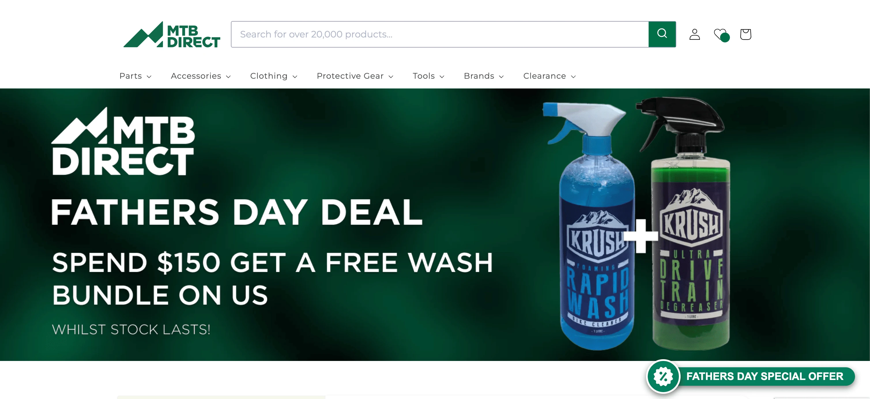
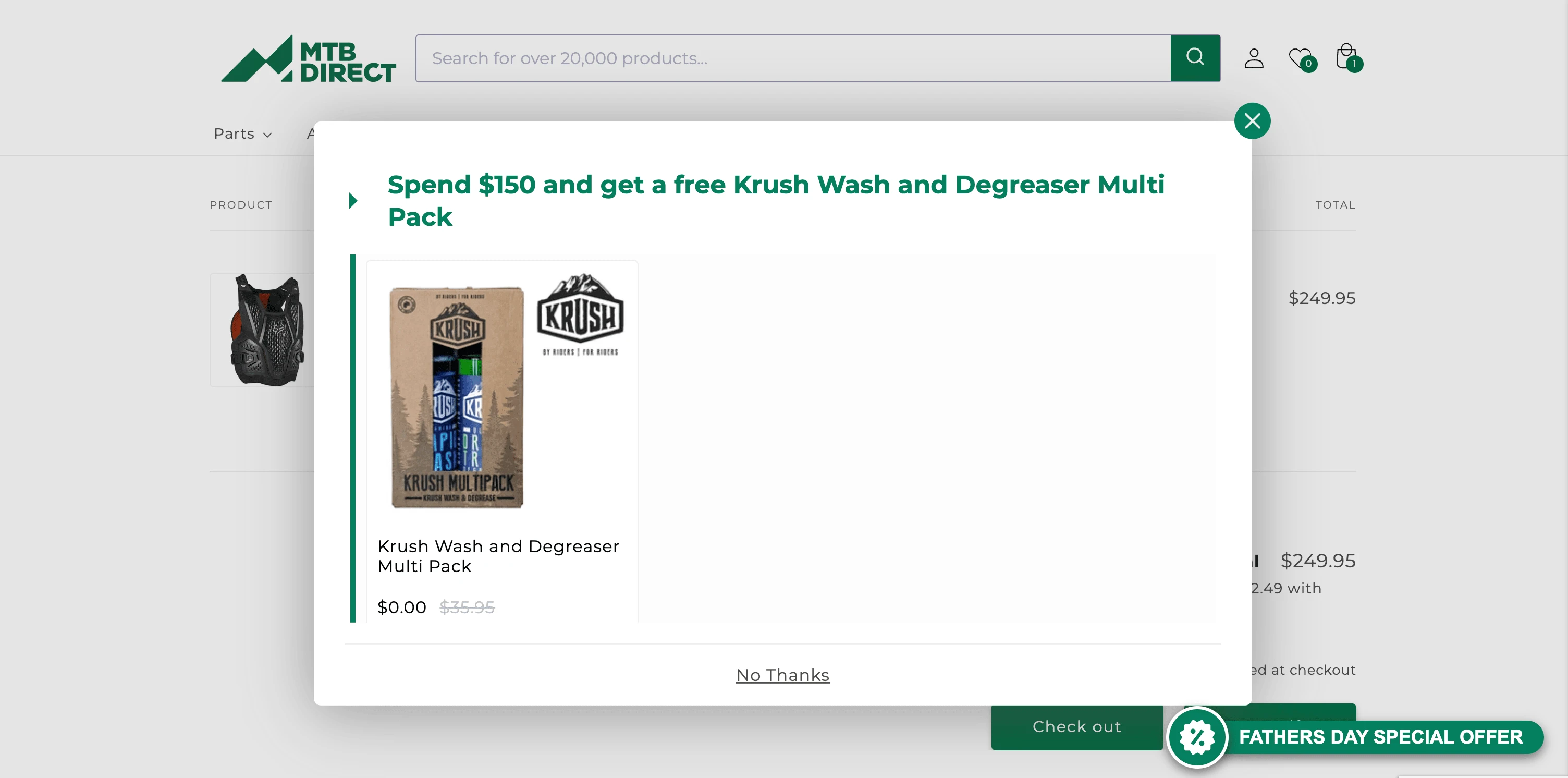
Currently, users rely solely on our weekly promotional campaigns on the website's homepage banners and a pop-up informing them about their progress toward unlocking bundle deals. This limited method of communication poses challenges for our users, especially during instances of multiple active bundle deals. The pain point emerges when customers must navigate to their checkout cart or await a device pop-up to discover ongoing bundle deals. This lack of accessible information hampers the user experience, underscoring the necessity for a more streamlined and user-friendly solution.
User Research
We employed a multifaceted approach to comprehend users' pain points when engaging with bundle deals. Drawing insights from user interviews, analysed website analytics through Google Analytics, and deep-dived into our customer feedback captured via our customer service app, Okendo. This holistic breakdown improved our understanding of users' challenges, nurturing the evolution of a more intuitive and user-oriented solution.
Google Analytics (GA4)
Google Analytics provided valuable quantitative insights that guided our redesign strategy. We noticed an interesting trend – users engaging with bundle deals spent more time on the website. However, conversion rates for those customers remained low, demonstrating a higher bounce rate. The results helped form the assumption that underlying usability issues required further investigation.
GA displayed 70% bounce rates and more than 10 minutes per a users session
Okendo Customer Feedback
We researched the qualitative domain with Okendo to augment the quantitative insights. Users willingly shared their experiences, articulating the obstacles they encountered. The recurring themes within this feedback echoed the difficulties highlighted in the Google Analytics data. Customers often expressed frustration over the struggle to effectively compare options, locate relevant products within the bundles, and grasp the value of each offer. These insights formed a strong understanding of the user journey's pain points.
Klaviyo: Engaged Customer Survey
To triage our findings, we leveraged the perspectives of our most engaged customers through a carefully crafted email survey through Klaviyo. The responses confirmed the patterns we determined from Google Analytics and Okendo. Users reiterated the challenges they faced in navigating through bundles, with a notable emphasis on the difficulty in comprehending the value proposition of each deal.
Summary
Common Pain Points:
Frustration and confusion were consistently highlighted across these channels, offering a unified perspective on user experience limitations.
Foundation for Redesign:
This multifaceted exploration formed the basis for our innovative redesign strategy.
User Expectations and Aspirations:
The ultimate goal was to realign the experience with user expectations and aspirations, enhancing the overall journey.
The Primary Goal
Now we gathered our user research and identified the user pain-points we formed the primary goal and intention of the project
Create a dedicated bundles landing page that acts as a centralised hub for all our bundling deals, catering to customers accessing these offers both via our website and marketing channels.
Design Process
Ideation and Sketching: Merging UX Innovation with E-commerce best practice
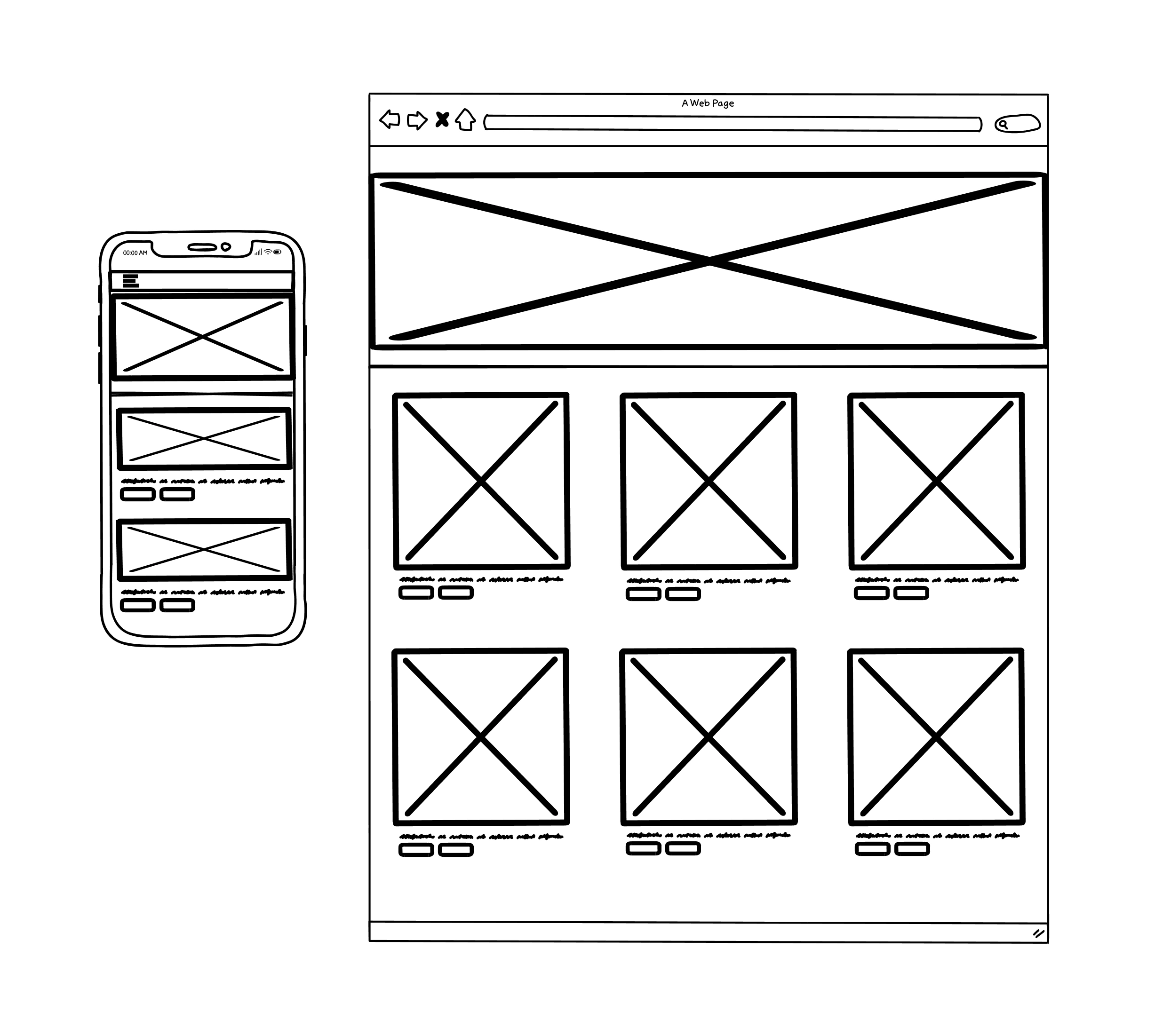
Best practices and the UX innovation of cycling giants MAAP and Attaquer influenced the two device sketches. However, we kept in mind our users' pain points, we set out for a clean and simple design approach that would ensure clarity and certainty with MTB Directs bundle offerings.
Sketches to Prototype
Now that I had sketched out my ideas, I wanted to test the decisions I made and make sure that the structure and flow of the app is intuitive for our users. Before working on the visual design, I wanted to first make sure that the design was functional. In order to do this, I decided to create a mid-fidelity prototype which would help me quickly test the design on real users and make any priority revisions before integrating the branding and visual design.
Low Fidelity Wireframes
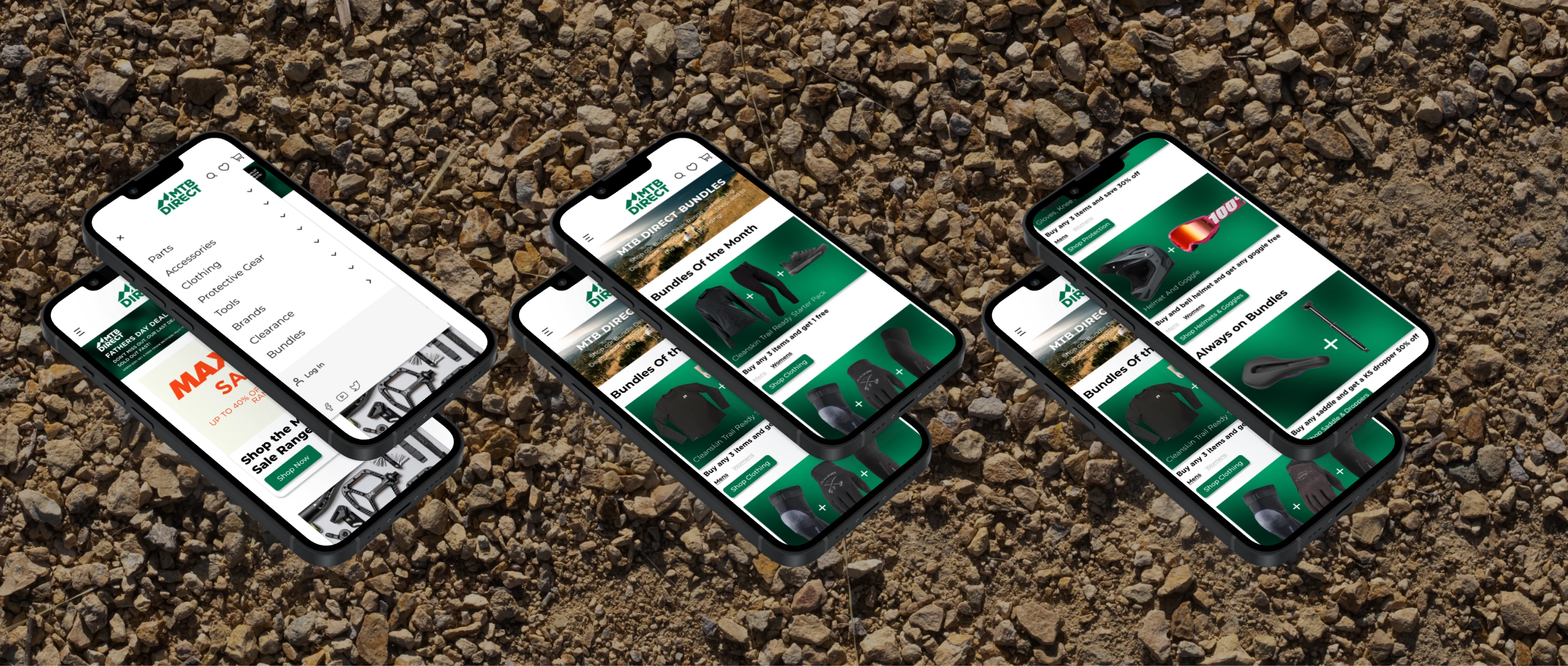
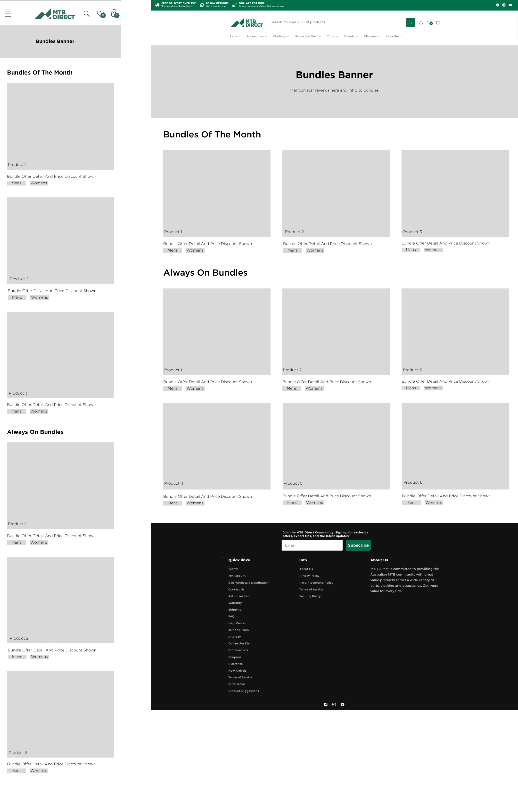
To create my prototype, I first started by creating mid-fidelity wireframes on Figma of the key screens the users would be interacting with. During this phase it was noted from the business that they wanted two types of bundles. "Always on" and "Bundles of the month" which fell inline with promotional marketing campaigns
Mid Fidelity Prototype
Taking the wireframes, I then worked on creating a mid-fidelity, limited functionality prototype, using Figma, to use for usability testing.
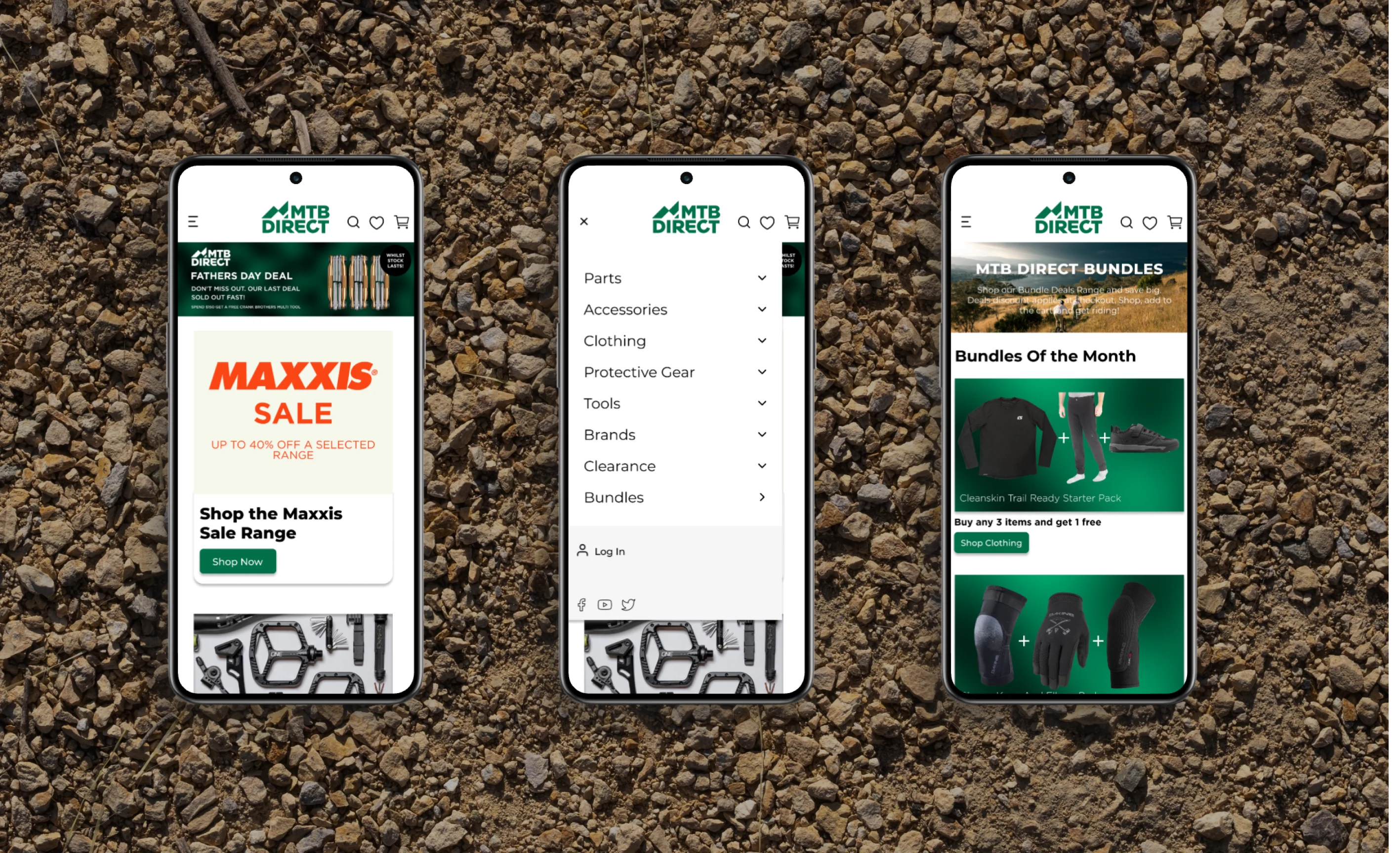
Mid Fidelity Mock Up
Usability Testing
Being a fully remote e-commerce business testing our users can often be challenging. The most effective platform for testing is our email communication platform Klaviyo. We tested with the same highly engaged audience list through a structured survey guiding the user through the wireframes and prototype.
Prototype Survey Questions:
From the homepage, how quickly were you able to locate the "Bundle Deals" section? Did the placement of this section align with your expectations?
Were there any elements on the homepage that guided you to the "Bundle Deals" section? If yes, were these elements clear and effective in directing you?
Imagine you're a new user visiting our website for the first time. How intuitive is the process of finding the "Bundle Deals" section? Were there any obstacles you encountered?
As an experienced customer familiar with our website, did the navigation to the "Bundle Deals" section feel consistent with other sections you often explore? Were there any discrepancies?
While navigating to the "Bundle Deals" section, did any terminology or labels confuse you? If yes, please provide details on which terms raised confusion.
Upon reaching the "Bundle Deals" section, how easy was it for you to understand the available options? Did the layout and categorisation help you quickly grasp what was offered?
Reflecting on your navigation experience to the "Bundle Deals" section, how confident do you feel about returning to this section in the future? Are there any aspects you believe could be improved to enhance this confidence?
User Feedback
Based on survey results, a recurring issue was the need to make bundle options more inclusive for all users, addressing gender-specific choices for Males and Females. Initially included in low-fidelity wireframes, technical constraints led to its exclusion in later designs. However, due to substantial feedback, we're exploring ways to reintegrate this into the overall design.
Feedback was predominantly positive. Users easily located the bundles page via the mega menu, comprehending available options clearly due to effective labelling and signifiers in the prototype. The UI's brand-representative colours were well-received, along with the presentation of potential bundle products.
Notably, the design omitted the checkout process, which wasn't in the brief due to its uniformity across the site. Users navigated an end-to-end experience, moving from bundles to item collections they could bundle, with discounts visible at checkout. Participants appreciated this process, emphasising the newfound value of a dedicated bundles page.
Priority Revisions
Taking what I learned from my survey results, I began to make revisions to my design based on the recommendations identified.
Gender inclusion
The survey findings highlighted a clear requirement for gender inclusion in our design iteration. Specifically, users expressed the need for male and female options within our offerings. To make this a clear option for our users I implemented a clickable option to filter between Male and Female options.
If a user chooses the "Women's" option and subsequently clicks the designated shopping button for that particular bundle, they will be seamlessly directed to the gender-specific collection associated with the bundle offer. This implementation ensures that users are efficiently guided to the relevant product assortment, enhancing their overall shopping experience.
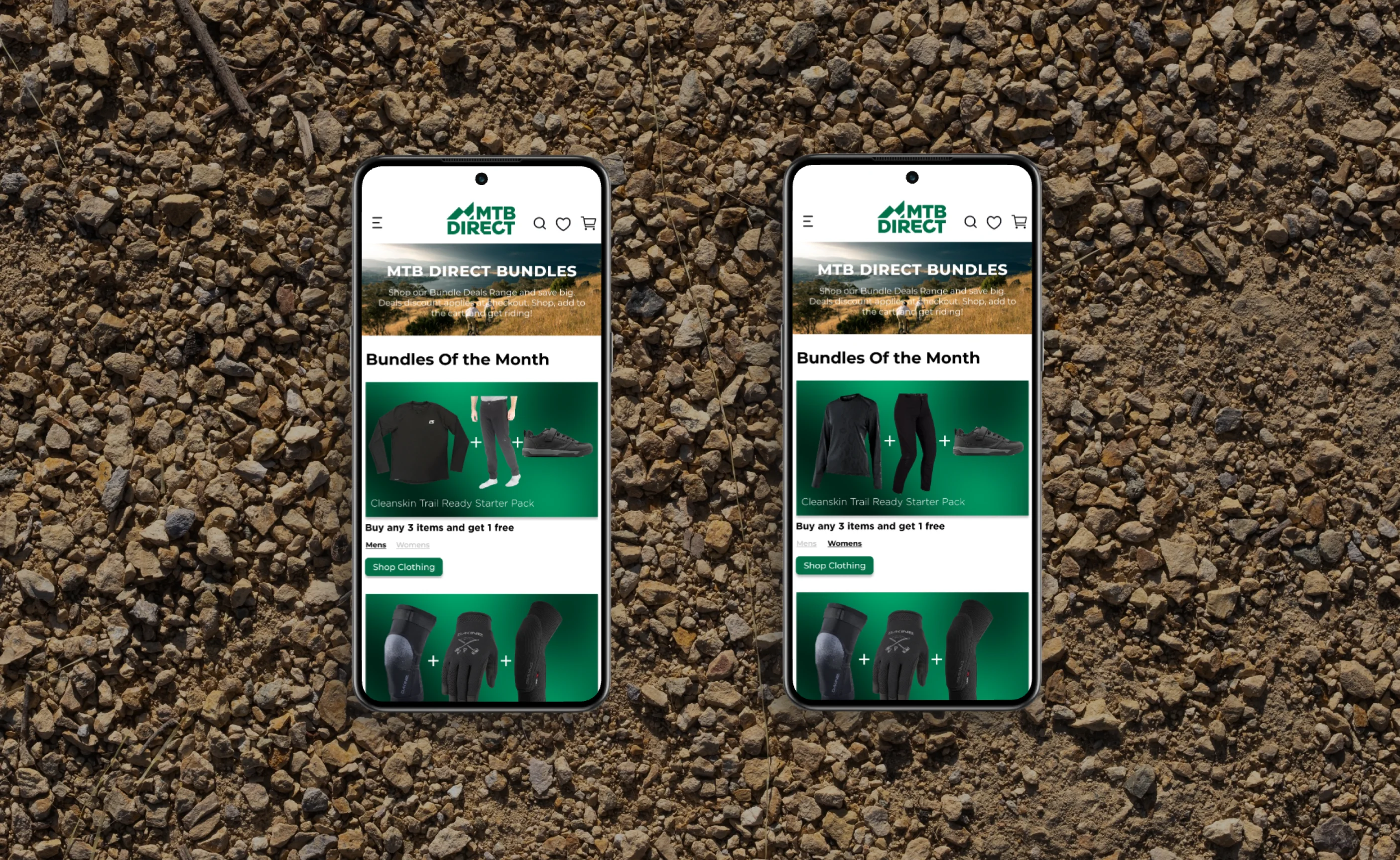
Mens (left) Women's (right) filtered view
Final Prototype
Taking my revised wireframes I leveraged Figma to transform the high-fidelity UI designs into an interactive prototype for MTB Direct's bundle. This comprehensive prototype provided an end-to-end user experience, showcasing how to seamlessly navigate to the bundle page and effectively filter products based on gender and the special bundle deals on offer.
Reflection
Working on the MTB Direct project provided me with valuable insights into the challenges of designing for a business without an established design system. As a newcomer, I navigated uncharted design territory, shaping the websites visual identity from scratch while ensuring consistency.
Being a fully online business limited our ability to conduct comprehensive user testing. I learned to use digital tools effectively to simulate real-world interactions and gather meaningful feedback, highlighting the importance of virtual engagement.
In hindsight, given more time I'd prioritise developing a design system from the project's outset to enhance visual coherence and efficiency. Collaborating closely with stakeholders and exploring partnerships with mountain bike communities could mitigate the challenges of limited in-person testing.
In summary, my experience with MTB Direct taught me to adapt to unique constraints, creatively problem-solve, and leverage available resources for a user-centric design.
Next Steps
1. Re-Test
With the new revisions, I would want to test my design again to ensure the design’s accessibility standards are being met with a new user group
2. Hand Off
After validating the design, I would hand-off the design to developers or other stakeholders to work on developing the landing page
3. Product Launch
After the page has been built, we will introduce the new product to the market
4. Add any additional features
After the first version of the app has launched, I would observe how people are using it and work on updating priorities and adding new features to the app
Like this project
Posted Aug 17, 2023
Craft a captivating landing page for bundled offerings, prioritising UX. Engage users with intuitive design, persuasive content to maximise conversions.
Likes
0
Views
29
