Case Study: Redesigning TeleportHQ's User Onboarding Experience
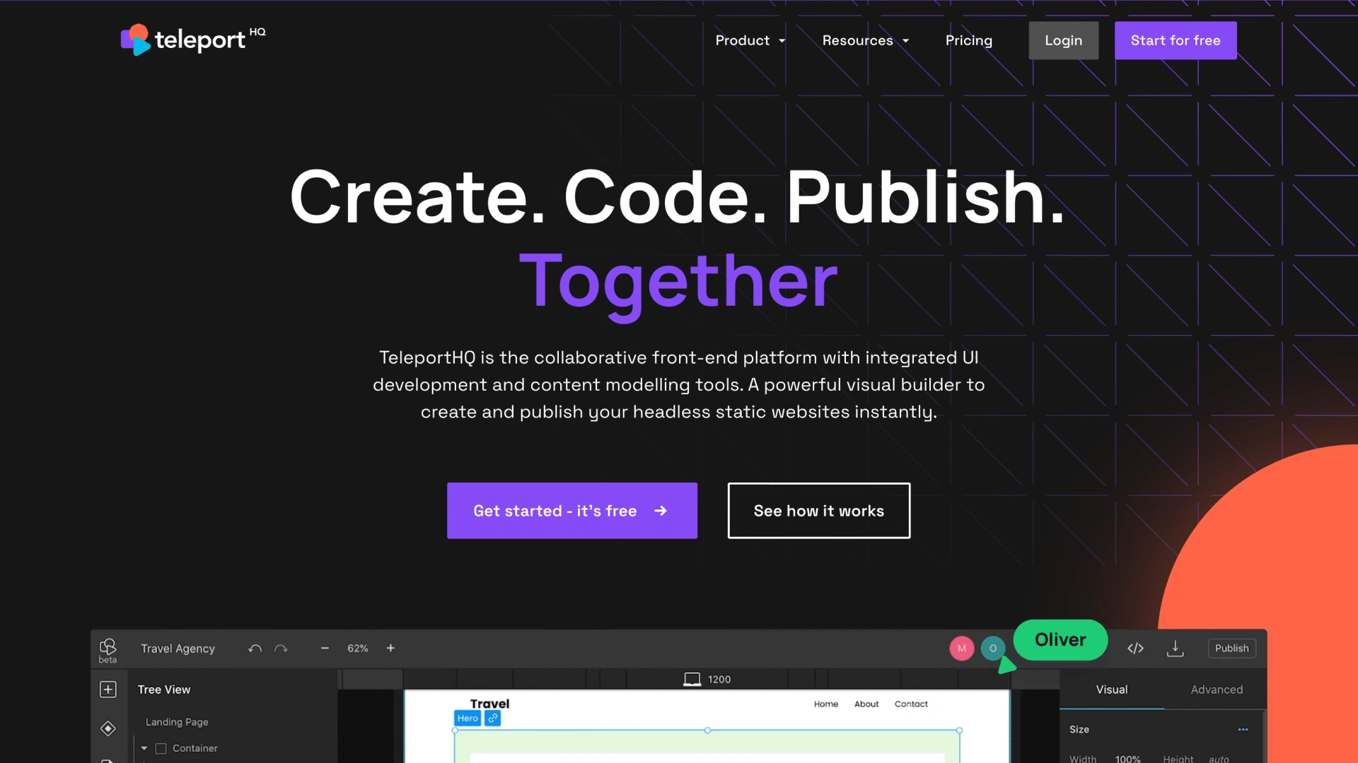
teleportHQ Landing Page Hero
Introduction
Over the course of my year at TeleportHQ, I had the opportunity to lead a highly transformative project focused on enhancing the user onboarding process and redesigning the user interface (UI) of the dashboard for the no-code website builder tool.
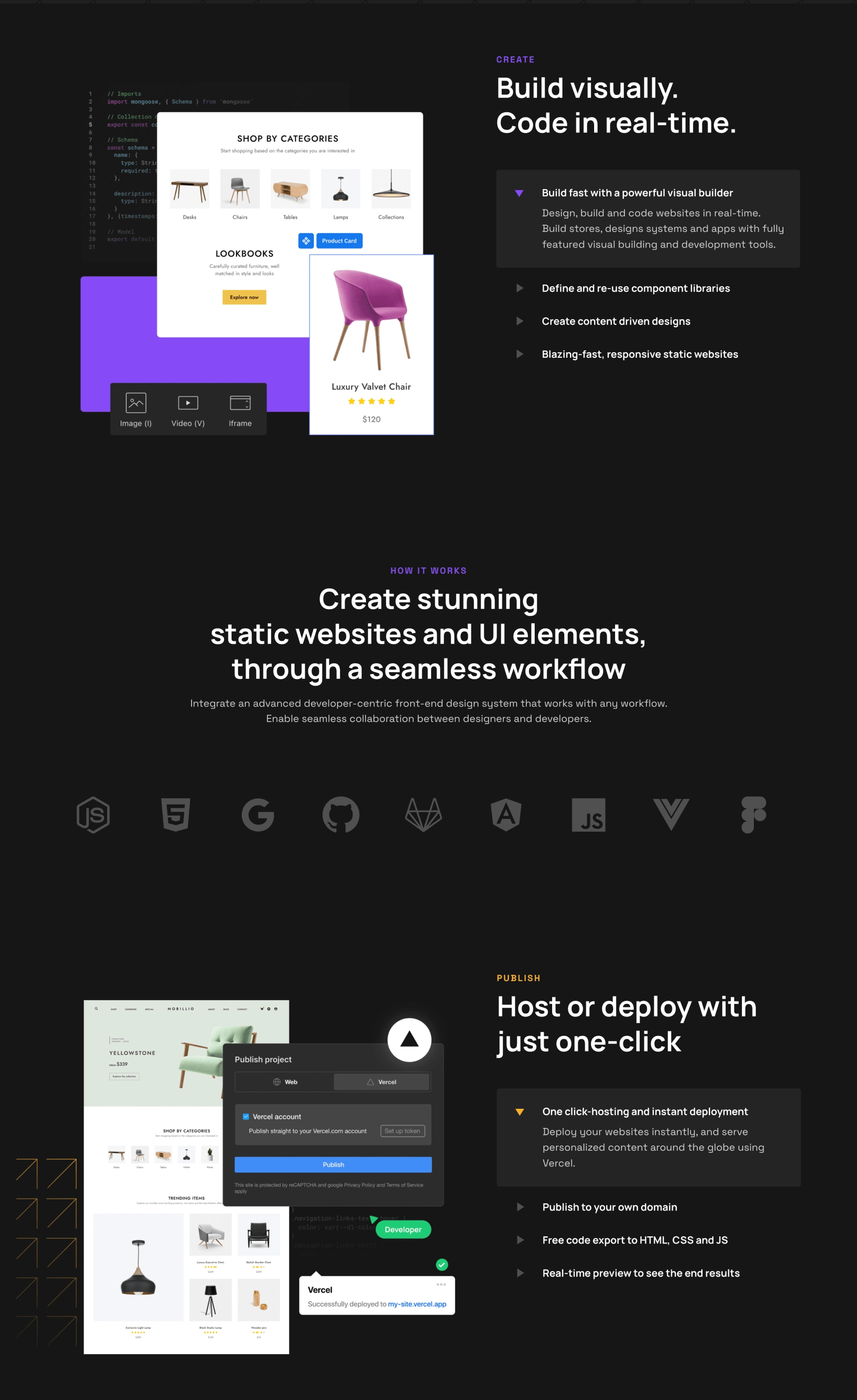
teleportHQ Landing Page
Challenge
User Onboarding: The initial challenge was to re-imagine the user onboarding process. Recognizing the importance of first impressions, I aimed to make the onboarding journey not just seamless but an integral part of a product-led growth strategy.
Dashboard Redesign: The existing dashboard UX/UI needed a facelift to align with modern SaaS tools. My goal was to create a dashboard that not only looked aesthetically pleasing but also provided an intuitive and frictionless experience.
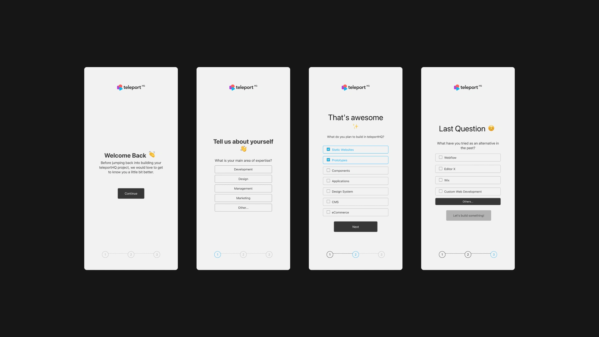
Activation Phase: Segmentation Questions
User Onboarding Transformation
Product-Led Growth Strategies: In tackling the user onboarding process, I implemented product-led growth strategies. My aim was to guide users organically through the platform, allowing them to discover the tool's value at their own pace. This approach not only increased user retention but also empowered users to become advocates of TeleportHQ.
Segmentation Questions in Activation: Understanding user needs is pivotal. I strategically integrated segmentation questions into the activation process, ensuring that users were immediately directed to features and functionalities most relevant to their objectives. This personalized approach significantly improved user satisfaction and engagement.
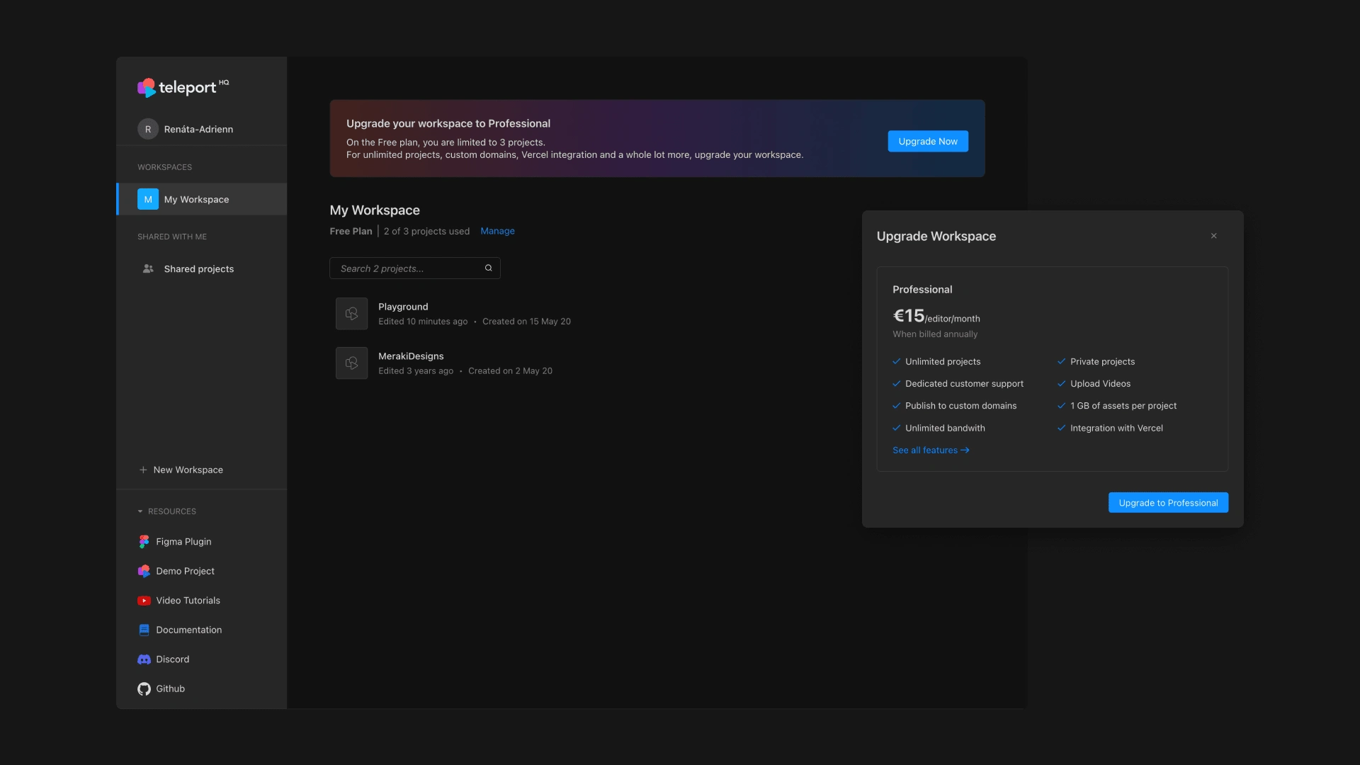
teleportHQ Dashboard / Dark Mode
Dashboard Redesign
In-Depth Research: To craft a UI that stood out in the crowded space of SaaS tools, I conducted extensive research on modern design trends and functionalities in the industry. This not only ensured the updated dashboard met current standards but also anticipated user expectations.
Seamless User Experience: The redesigned dashboard focuses on providing a seamless user experience. Intuitive navigation, decluttered interfaces, and strategically placed elements contribute to a dashboard that not only looks good but enhances user efficiency and satisfaction.
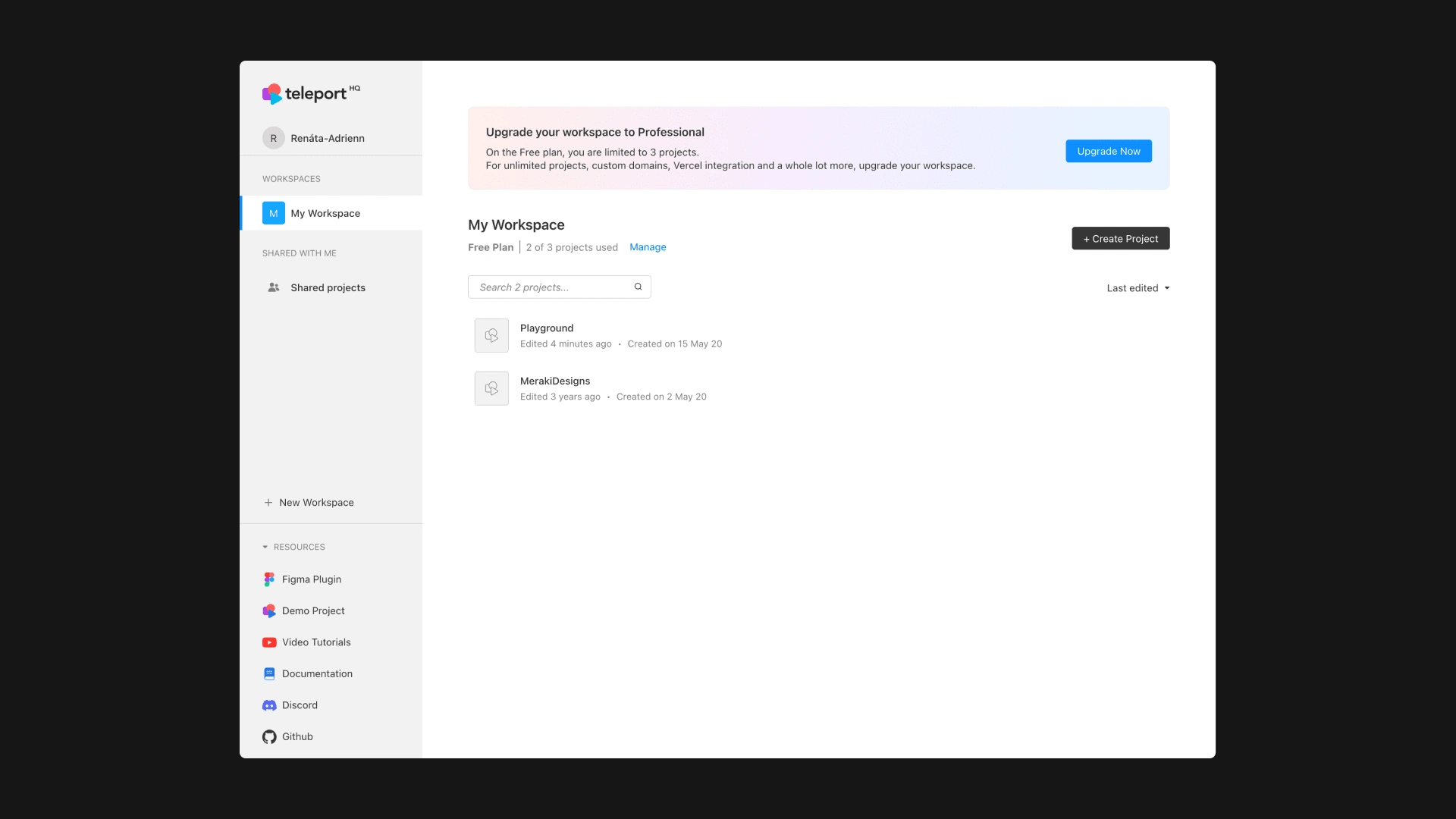
teleportHQ Dashboard / Light Mode
Results
The impact of these changes was immediate:
User Onboarding Success: The implementation of product-led growth strategies led to a 17% increase in user activation within the first month.
Onboarding Completion Rates: Improved onboarding completion rates by 20%, indicating that users were successfully navigating through the activation process.
Enhanced User Engagement: The segmentation questions in the activation process together with a personalized welcome experience resulted in a 25% increase in user engagement, as users found themselves directed to the features most pertinent to their needs.
Feature Adoption Rates: Observed a 30% increase in the adoption rates of key features suggested through the segmentation questions.
Positive User Feedback: The revamped dashboard received positive feedback, with a 35% increase in user satisfaction scores.
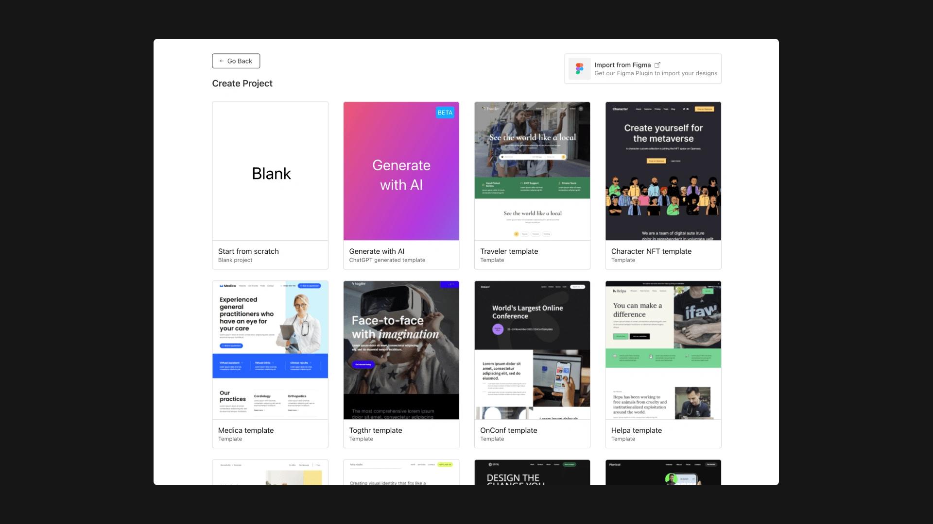
teleportHQ Dashboard / Create Project
Conclusion
Working on the user onboarding and dashboard redesign for TeleportHQ has been a journey of innovation and impact. The project not only elevated the user experience but also contributed significantly to the company's growth.
I am proud to have played a key role in reshaping the way users interact with TeleportHQ, making it more intuitive, personalized, and enjoyable.
Like this project
Posted Jan 15, 2024
Lead the design of a seamless user onboarding experience, implemented product-led growth strategies, and crafted a modern and user-friendly dashboard redesign.

