Logo 💎 Design, Brand Book
Logo Designing

Helvet Finance
Objective:
The project aimed to create a modern and professional logo, along with a cohesive brandbook, for a Swiss financial company. The branding needed to reflect the company's values of precision, trust, and innovation while honoring Swiss heritage.
Context:
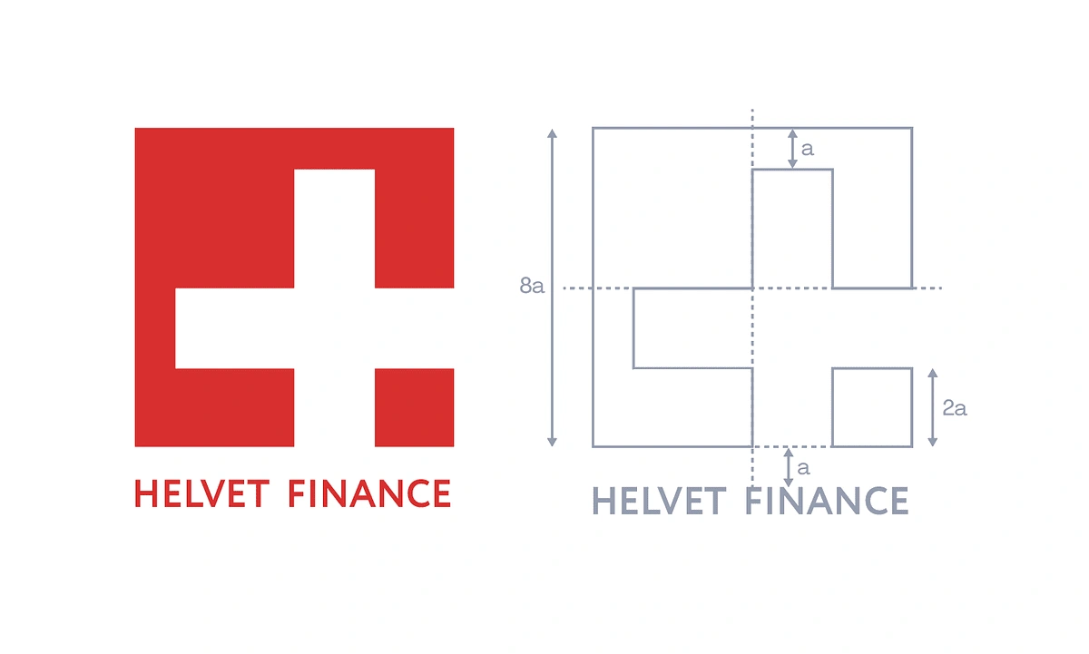
Drawing inspiration from the iconic Swiss colors—red and white—and the cross symbol, I developed a design system grounded in a modular grid. This approach ensured balance, symmetry, and versatility across various branding applications.
Challenges:
The challenge was to craft a logo that conveyed mathematical precision and a timeless aesthetic. It needed to align with the company’s financial expertise while being flexible enough for modern branding needs.

Brand Book
Solution:
Using the golden ratio as the foundation, I meticulously crafted a logo that adheres to mathematical principles, ensuring visual harmony and proportion. The design incorporated the Swiss cross subtly within the grid system, symbolizing the company’s roots. I expanded the visual identity into a comprehensive brandbook, detailing typography, color palette, spacing rules, and application guidelines to maintain consistency across all materials.
Lessons Learned:
This project reinforced the importance of merging artistic creativity with mathematical precision to achieve visually striking and functionally effective designs.
What I’d Do Differently:
In future branding projects, I’d explore incorporating dynamic identity elements to adapt to digital-first environments while maintaining core brand integrity.
Images and Social Media Content
Include the final logo, examples of the modular grid, and applications such as business cards, stationery, and digital platforms.
Roles
Logo Design
Brandbook Development
Conceptualization and Research
Tools
Adobe Illustrator
Company
Swiss Financial Solutions
A leader in financial services, rooted in Swiss precision and reliability, providing innovative solutions for global markets.
Like this project
Posted Dec 19, 2024
Logo and brandbook for a Swiss financial firm: precision design using the golden ratio, modular grid, and Swiss colors to reflect trust, innovation, and heritag
Likes
0
Views
6


