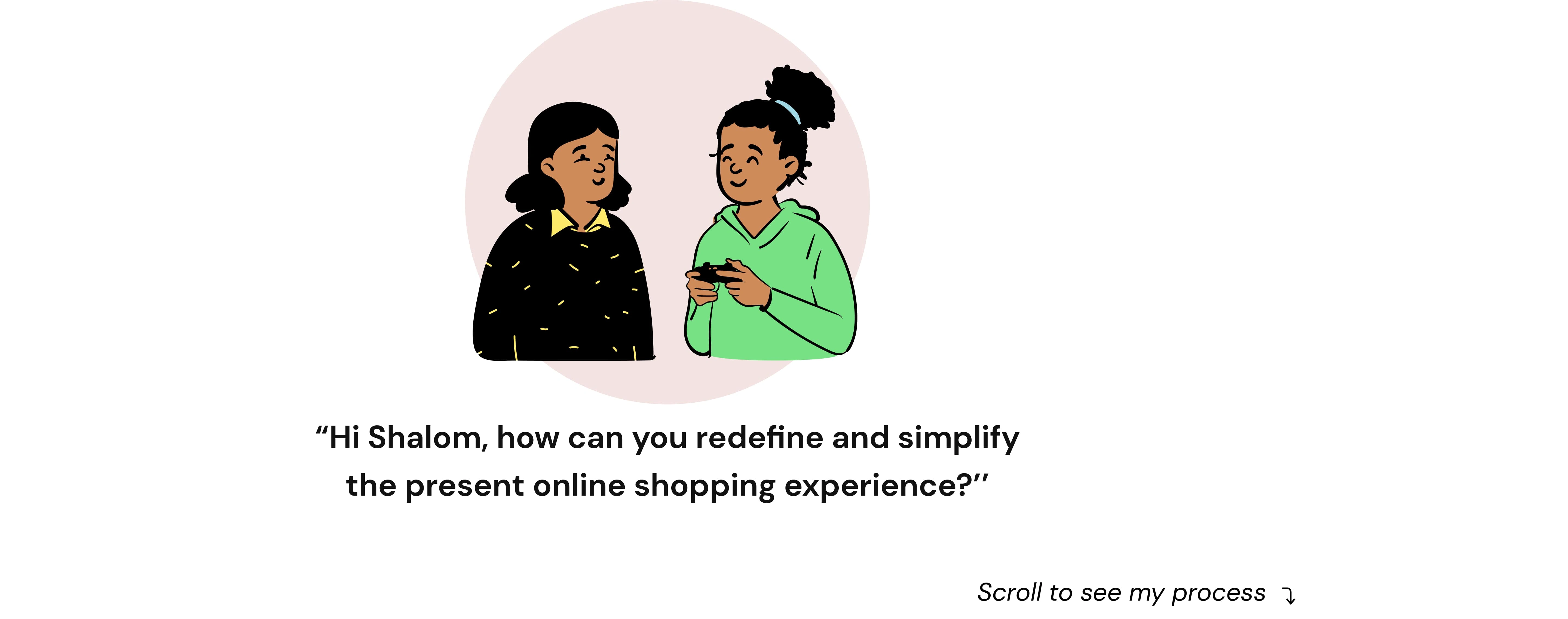
UX Case study :Tienda-E-Commerce
Shalom Ohuegbe
Background:
Voy a la tienda. These days, a lot of people buy things from online vendors, but this can sometimes be a chore. Tienda seeks to simplify the e-commerce experience, especially for those looking to get fashion items.
Role:
My role is the Product Designer and I set out to conduct extensive research and design a more desirable experience for users to shop online
Tools:
Zoom: User Interviews
Notion: Documentation
Miro: Empathy Mapping
Figma: User Flow, Wireframes, and Hi-FI Designs
Contra: Presentation
Here's a video preview of the end product and to view the full case study click here
Constraints:
One of the main limitations of e-commerce is security. In most cases, people are hesitant to provide their persona; and financial details in spite of advanced data encryption security systems in place. Moreover, there are some websites that do have the capability and features installed to authenticate transactions, there are also sites that illegally collect consumer statistics without permission. This is why people get skeptical while using e-commerce sites. Another challenge is fear, some users prefer to shop physically because they can access the product thoroughly. They feel surer and safer.
Problem:
With the world turning into a global village, the Commerce world is not left out. In 2010, less than 5% of retail sales happened online. During this decade of eCommerce growth, that number more than tripled to 18%. Much of that growth happened in 2020 when eCommerce sales increased by 44%. E-commerce growth may be slow, but the share of retail sales that moved online will continue to go up, not down. The problems of e-commerce are notoriously difficult but I will focus on the UX issues of e-commerce which include: Poor shopping experience, Lack of favorable reviews, frustrating checkout process, inadequate product descriptions
How Might We? ( A Problem Statement Approach)
How Might We design a product that refines the experience of shopping online? How can we achieve the simplification of the user journey from onboarding to checkout?
Stepping Into Users' Shoes
Online shopping is convenient, but users face frustrations—unclear product details, static images, confusing navigation, and clunky checkouts that lead to abandoned carts.
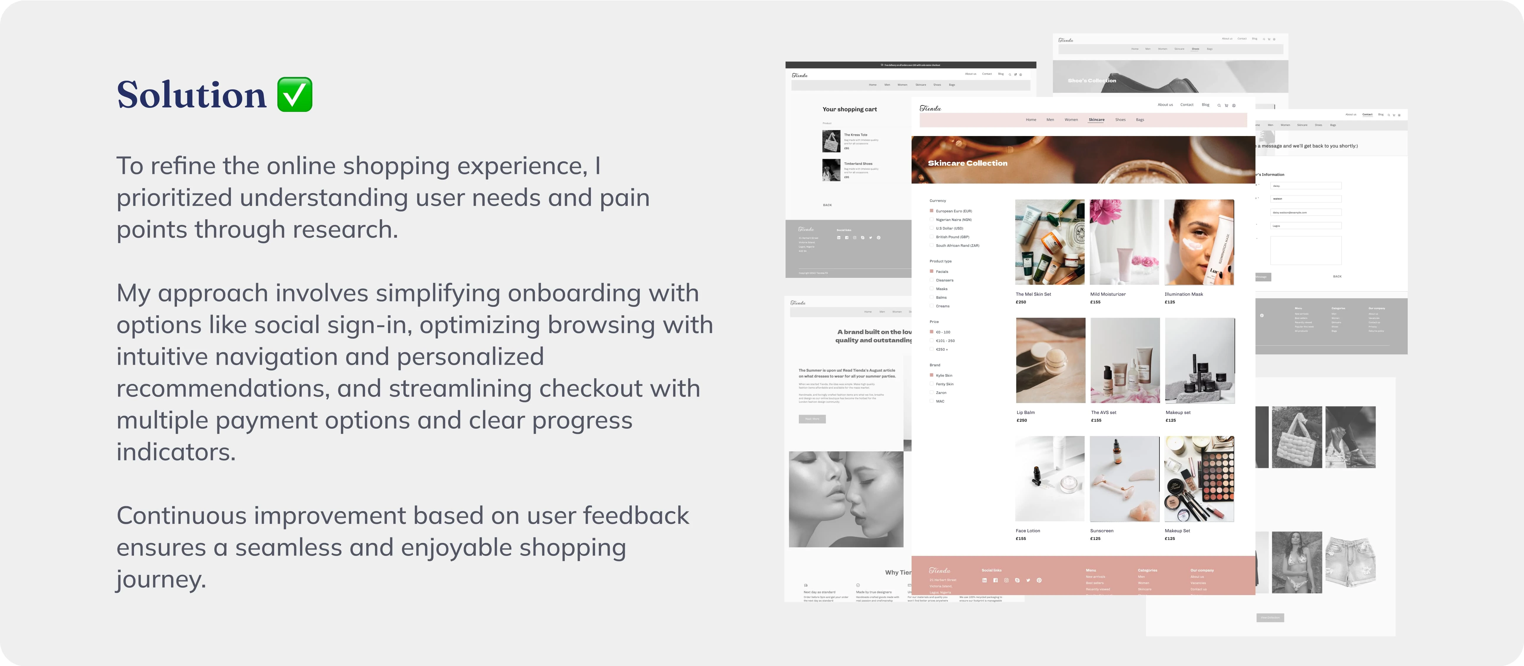
The Fix:
A clean, intuitive design, detailed product descriptions with model images, smart filtering, flexible payment options, live chat for trust, and seamless checkout.
By solving these pain points, shopping becomes effortless and enjoyable.
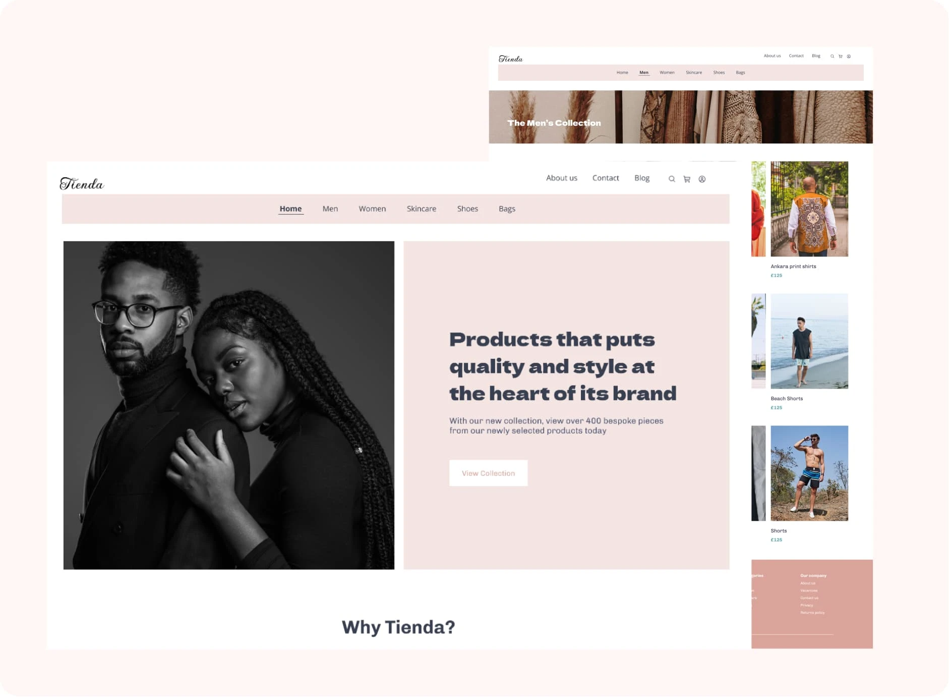
Hi-Fi breakdown:
After interviewing potential users, I aligned user needs with opportunities that I could use during iteration. The opportunities I found for Tienda were specific, I prioritized a few key features that would be most impactful to achieving our goals.
Getting started with ease: A simple and aesthetically pleasing application with an easy-to-navigate landing page. A website that offers a seamless user experience is a catch from the very beginning.
Dive in smoothly: An appealing arrangement for the listing of the products available on the site. A detailed product description, reviews, and use of models for the product display image. This is to build trust within the users.
Stay in control: Both filtering and sorting allow users to take control of the products they see at the top of a long list of products and, even if sort does not bring exactly the products they need to find to the top, it still allows them to systematically work through the products in an order they understand
Different funding methods. We will employ the all-or-nothing method here so that the users have a plethora of choices when it comes to the checkout section. A majority of the users complained about the lack of simplicity at the checkout section during the user interviews.
Stay informed: A fashion blog
User Testing:
While I had some heuristics to help guide my decision-making, I knew I needed to do testing with actual users to prove our hypotheses.
To see whether Tienda improved the usual shopping experience, I had a monitored usability testing session with users and asked them to speak aloud their thoughts
I asked the users to interact with the prototype and to try to shop there.
These were some of the reviews:
I prefer to choose the currency that I want to shop in
The picture in the hero section implies that this is a feminine site
I want to see a track my order screen, it makes me feel safe.
100% of the users said that the checkout process was seamless
75% of the users felt safe and said that they would shop on the Tienda site because the site wasn’t clustered and the flow was easy.
65% of the users loved the selection of images because I used models and they could visualize the product on a human’s body. This made them feel safe
Like this project
Posted Mar 20, 2025
Redesigned the e-commerce experience by improving navigation, product visuals, and checkout flow—reducing cart abandonment and enhancing user satisfaction.
Likes
1
Views
4
Timeline
Oct 3, 2022 - Dec 20, 2022
Clients
Tienda