Brasa — Brand Identity for a Wood-Fire Grill

Vitalii Rigalovskyi


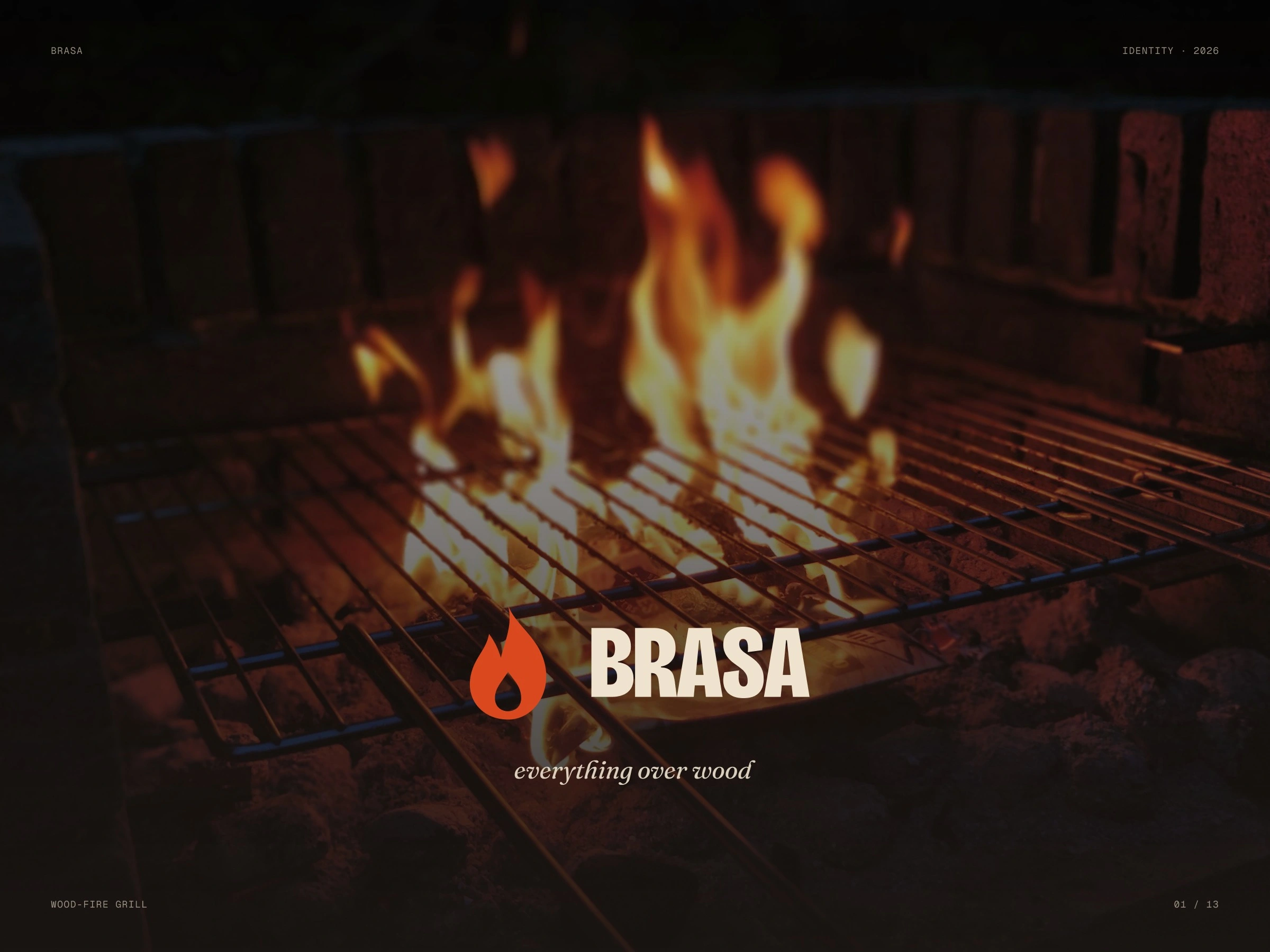
A brand you could burn into a wooden board — identity for a restaurant that cooks only over oak and olive wood.
Scope: Logo · Colour · Type · Print · Signage
The brief
Grill restaurants tend to look either rustic or like a steakhouse chain. Brasa needed something warmer and sharper, made from the one thing the kitchen is built around — the fire.
What we did
The symbol is a flame with an ember cut out of it. The name is set heavy and narrow so it reads on an awning and a matchbox alike. Char, oxblood, ember and bone come straight from the grill, with two patterns — flames and grill marks — for napkins, tape and boxes.
Full case: webraw.studio/work/brasa
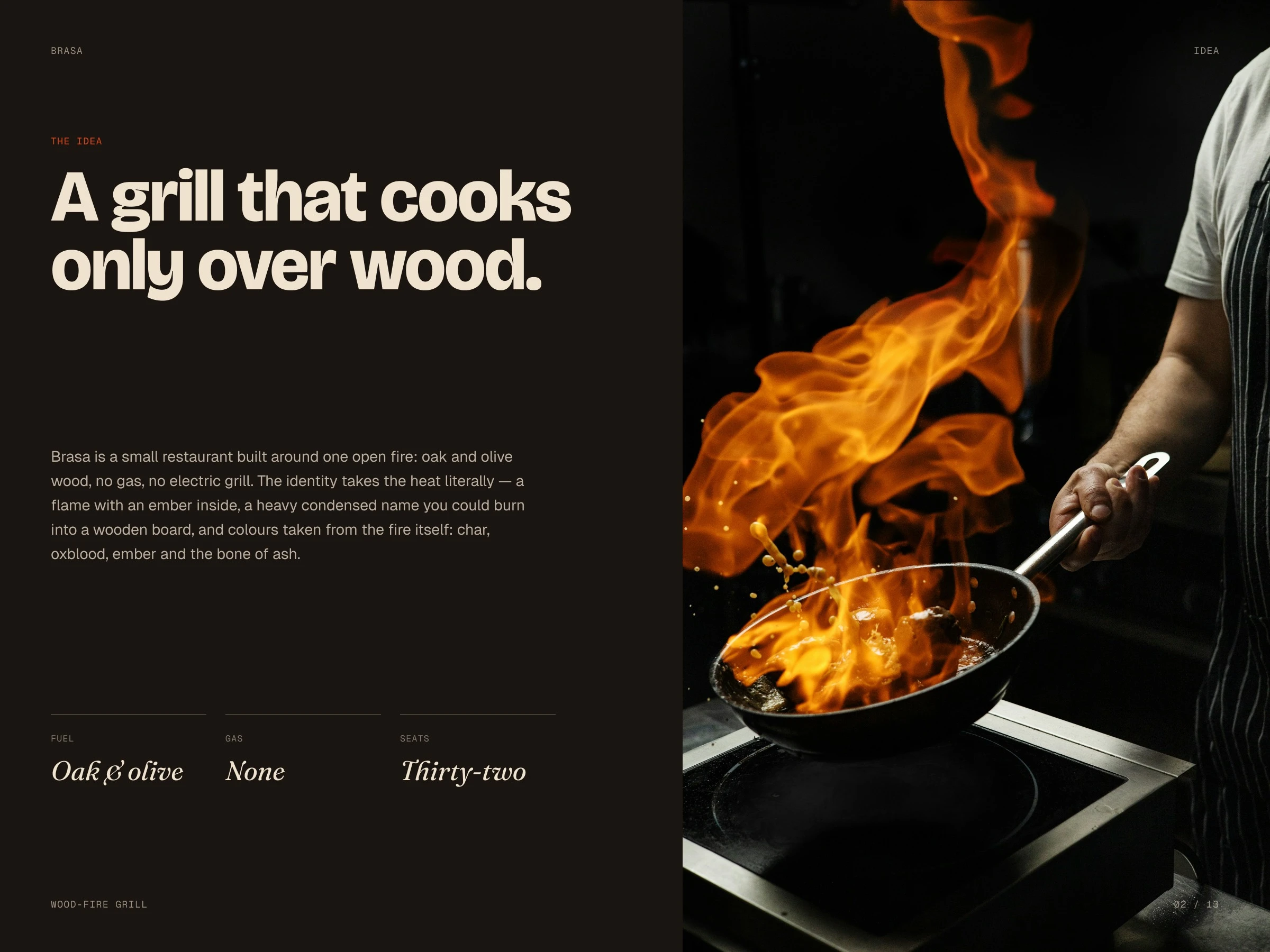
A grill that cooks only over wood
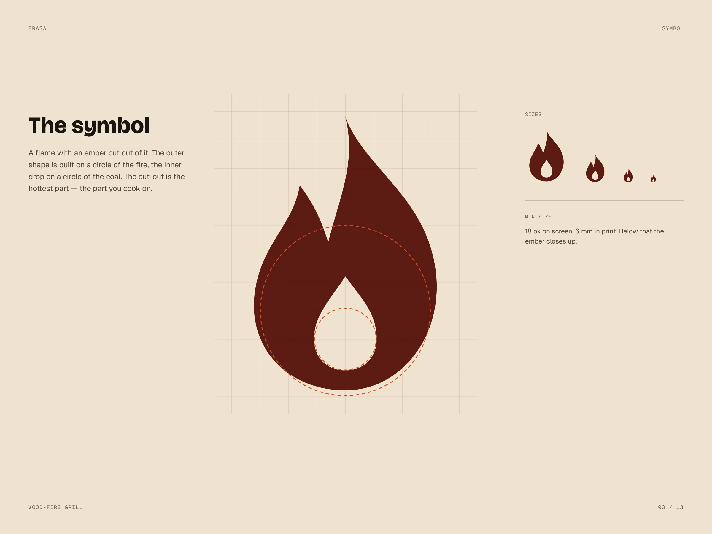
Symbol: a flame with an ember
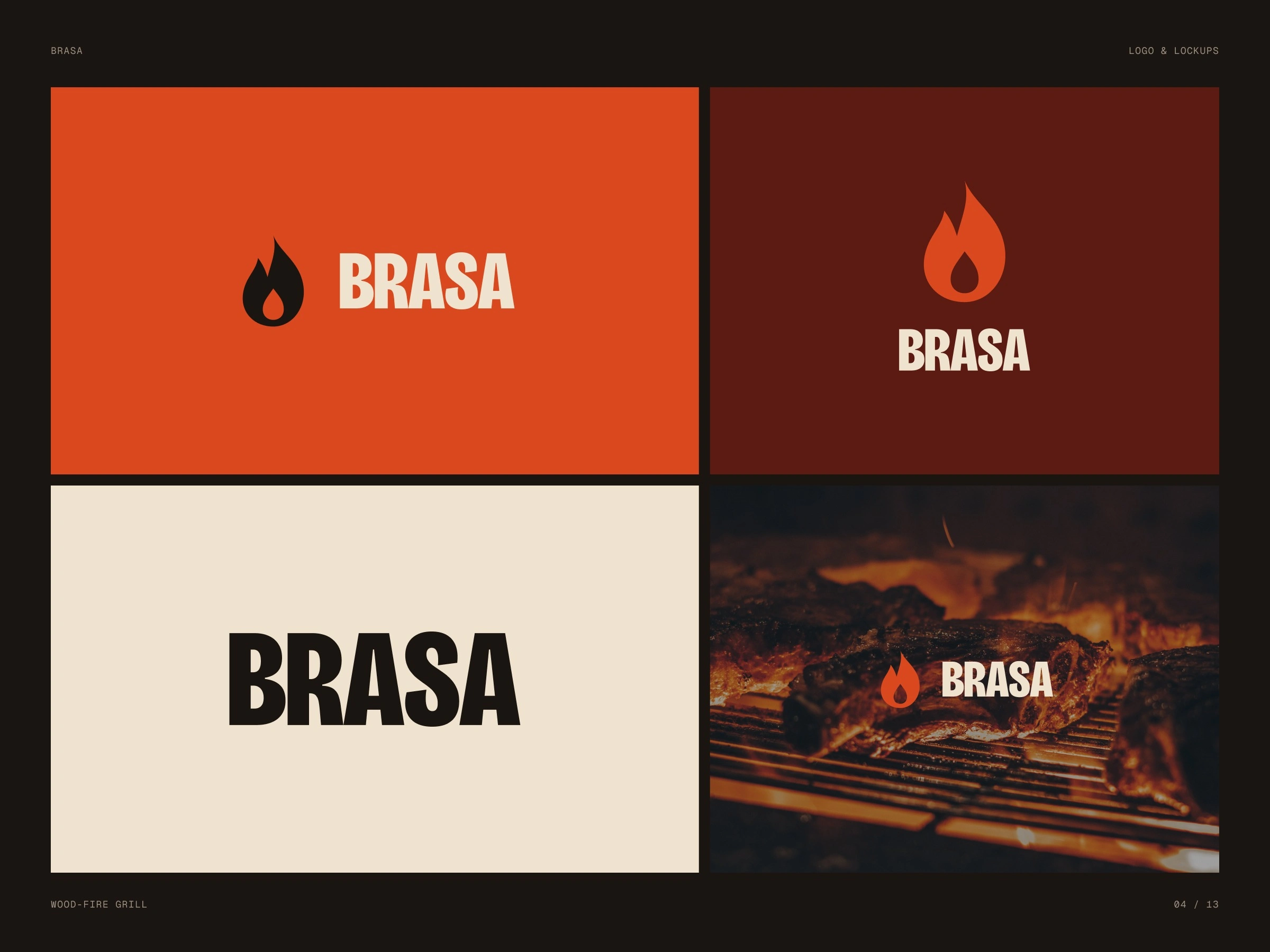
Lockups
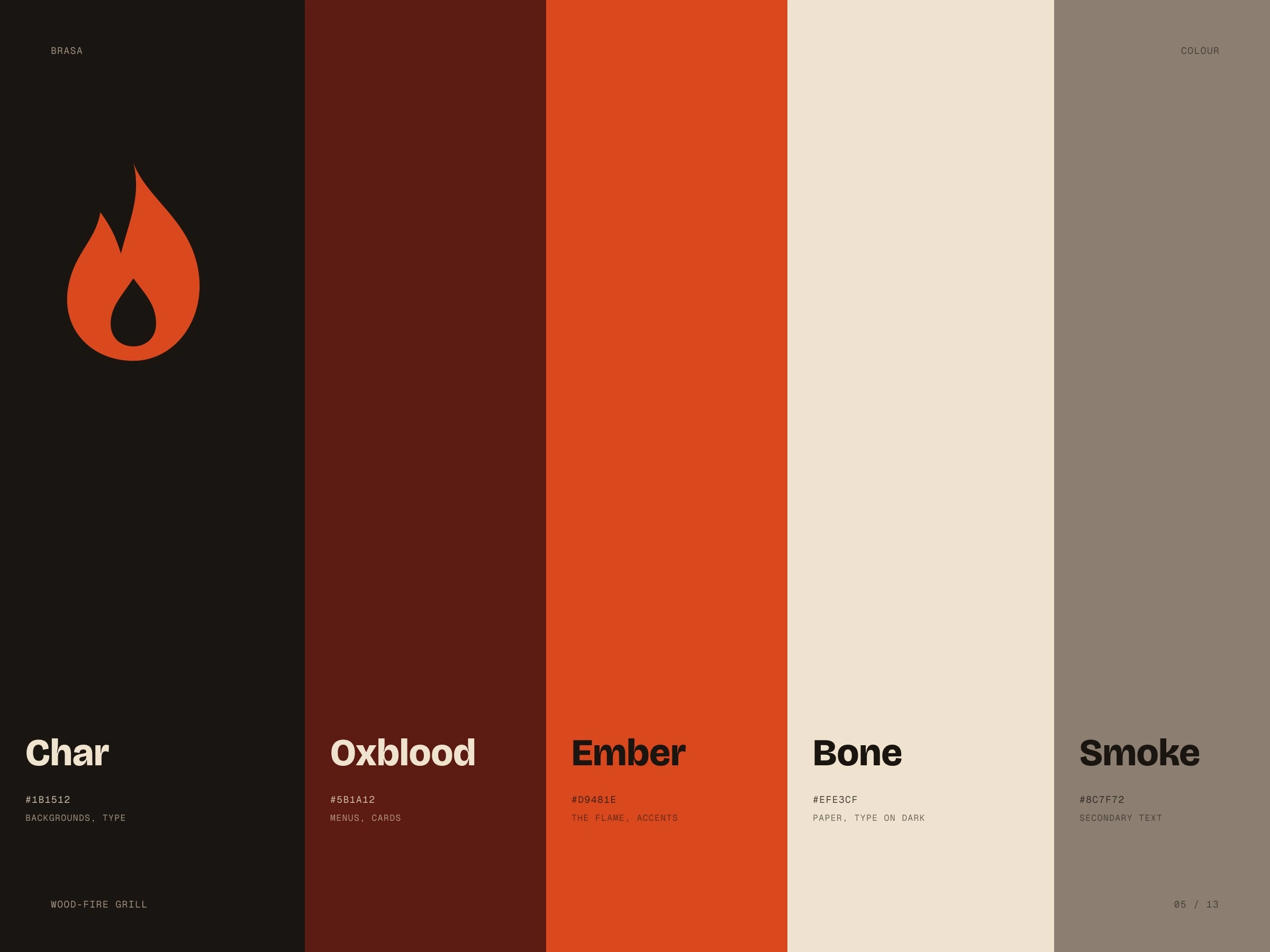
Colours of the fire
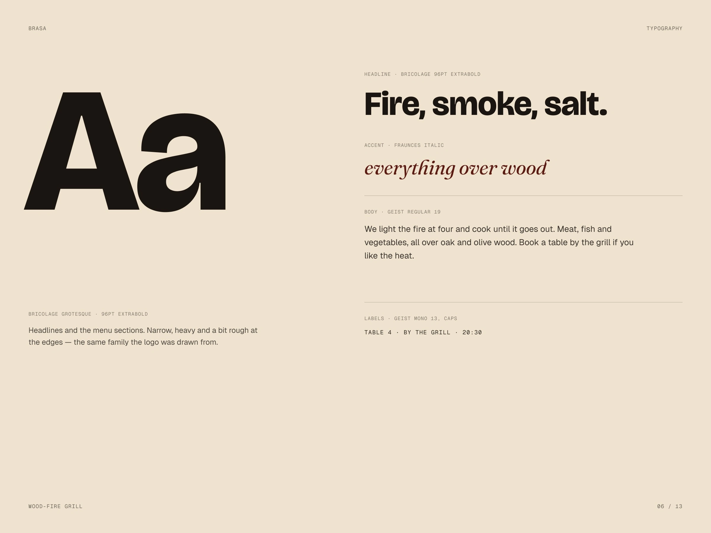
Typography
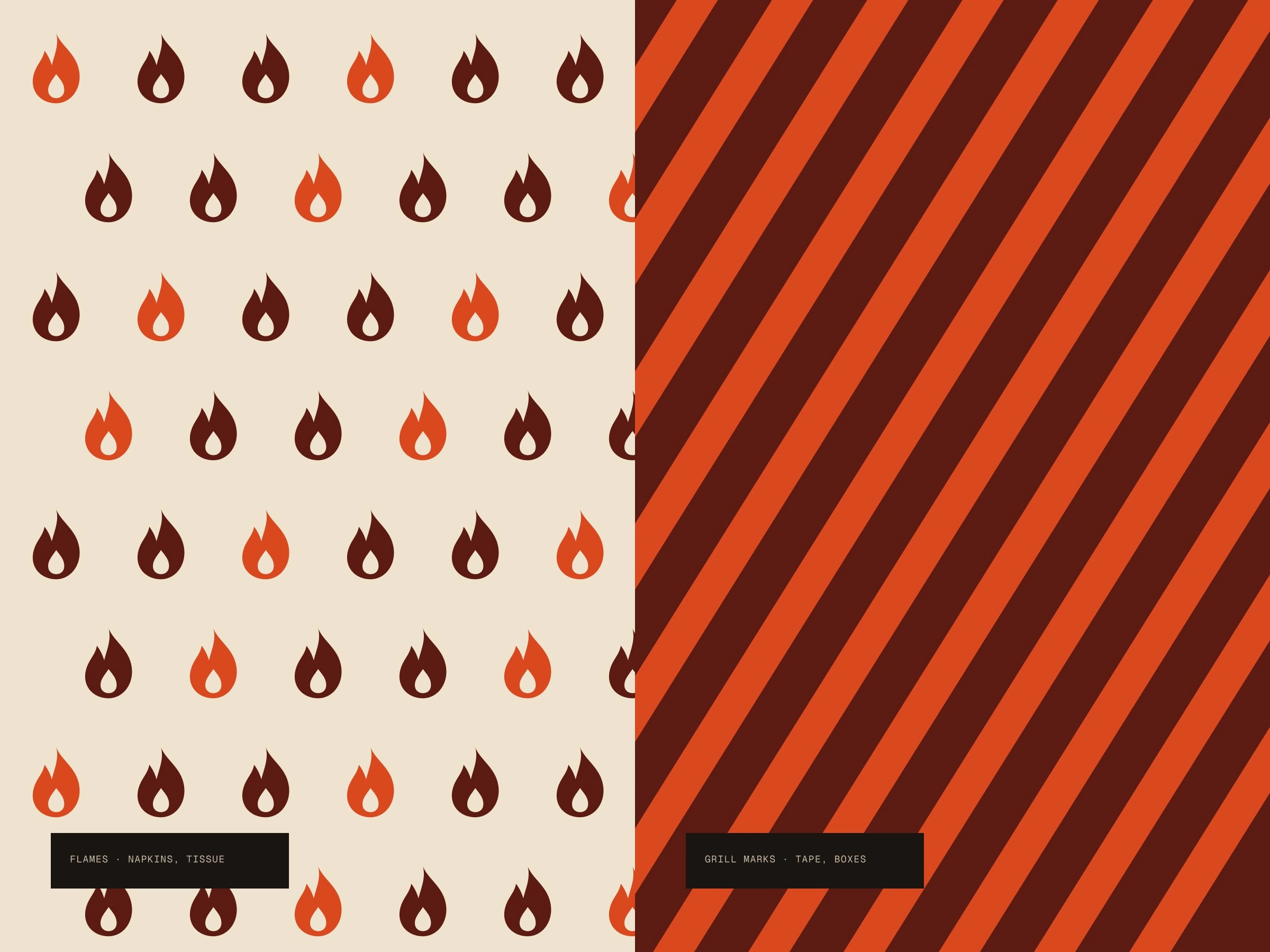
Patterns
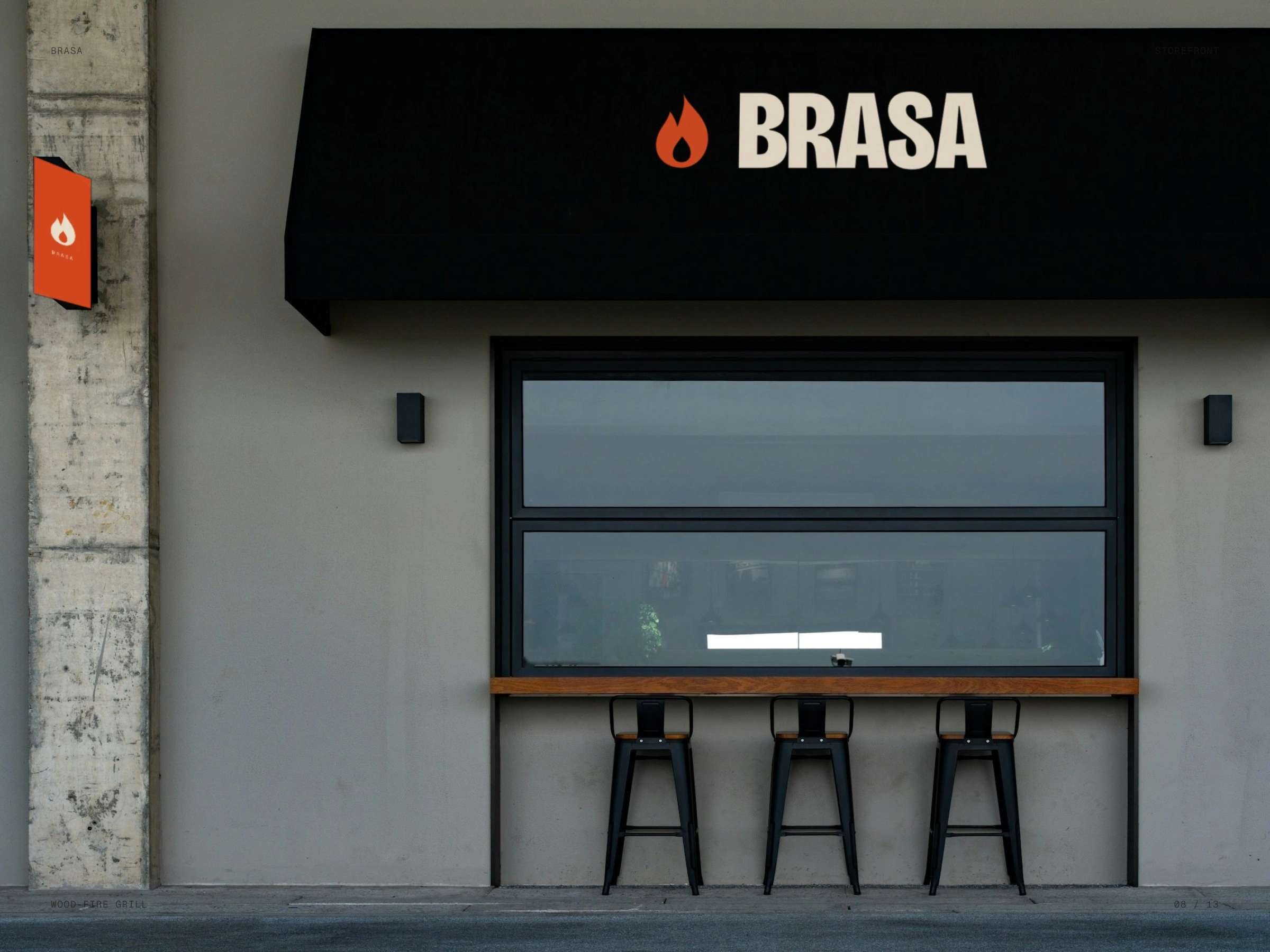
Storefront
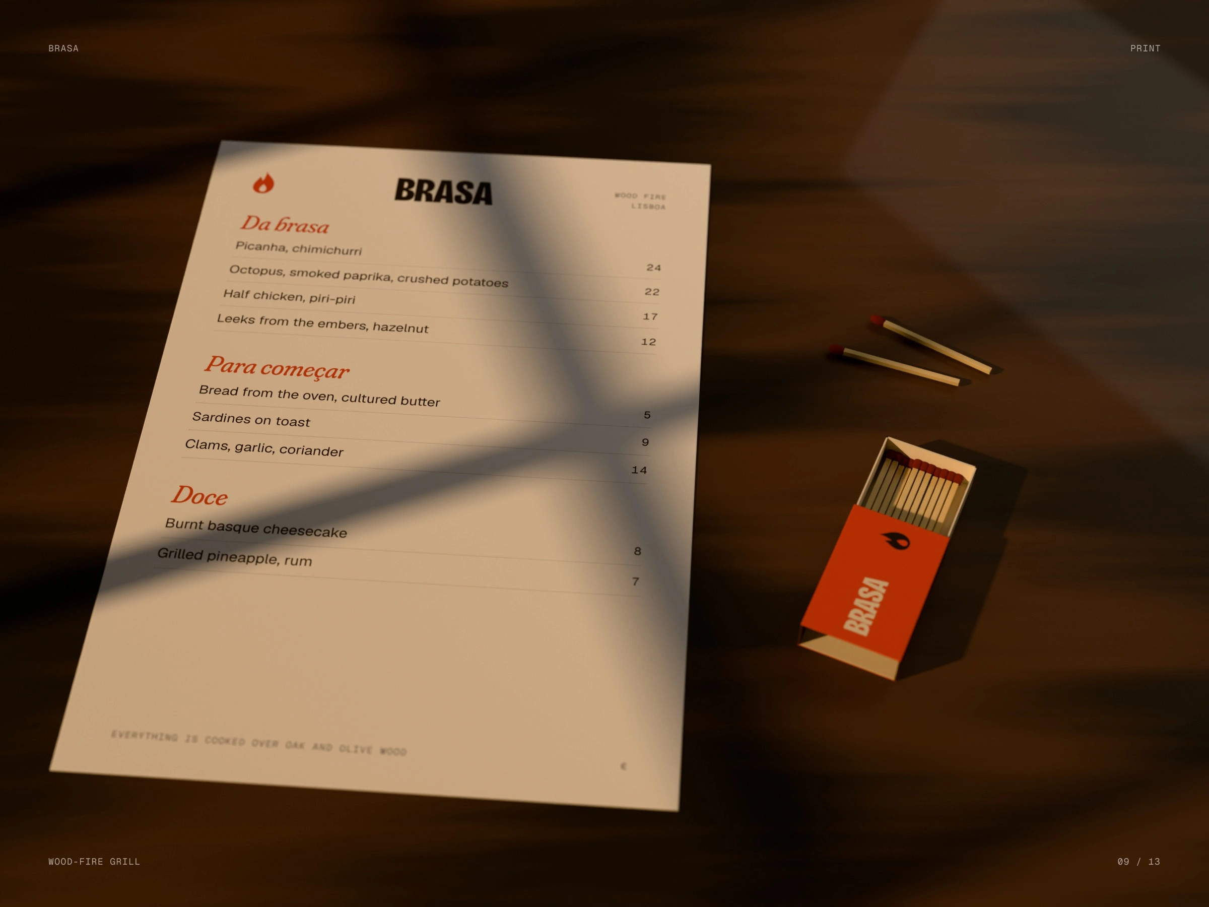
Menu and matches
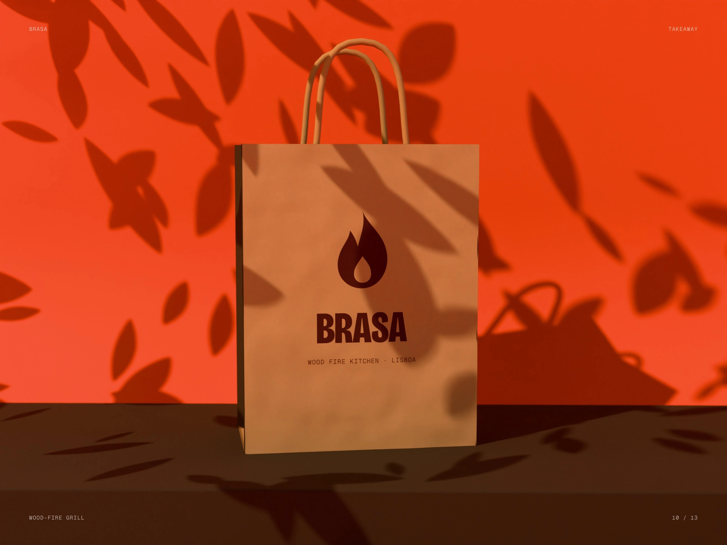
Takeaway bag
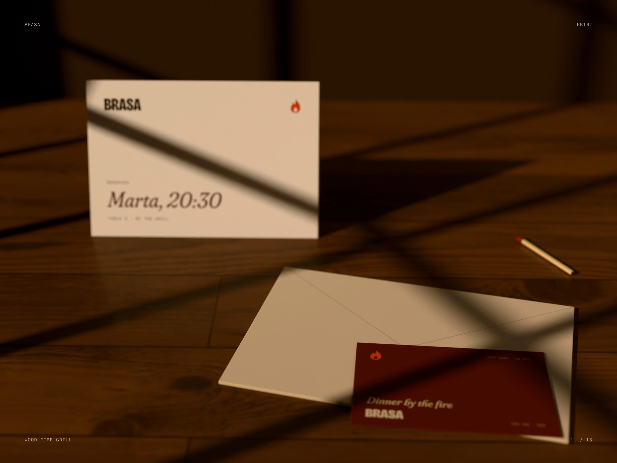
Table card and gift card
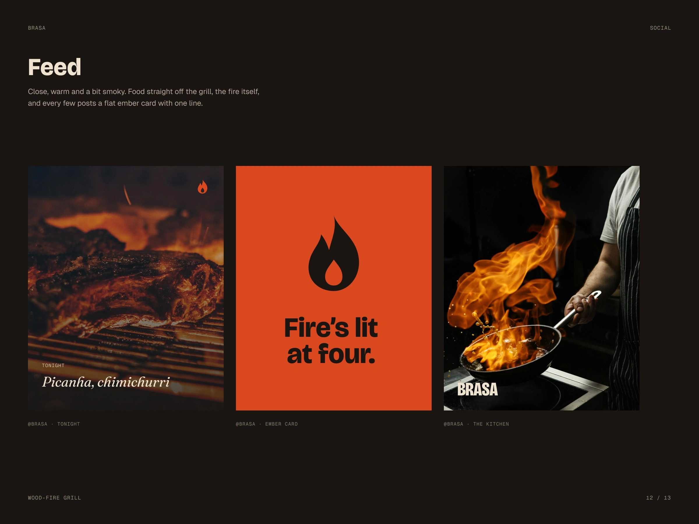
Social
See you by the fire
Like this project
Posted Oct 14, 2026
A flame with an ember inside, a heavy condensed name and colours taken from the fire — on the awning, menu, matches, bag and gift card.
Likes
1
Views
2