Ilma — Brand Identity & Packaging for Barrier Skincare

Vitalii Rigalovskyi


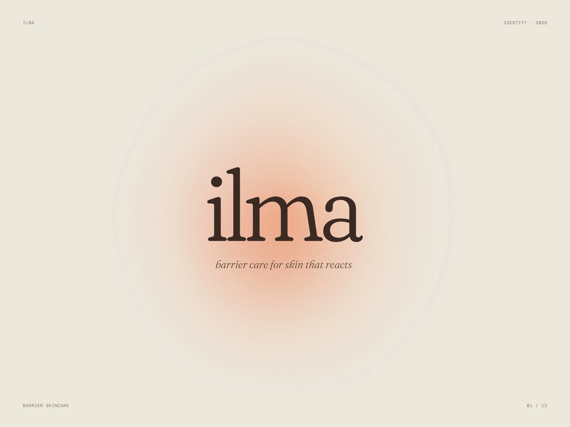
A quiet brand for skin that has had enough of loud products — identity and packaging for barrier skincare.
Scope: Logo · Colour · Type · Packaging
The brief
Products for sensitive skin often look clinical: white, blue, lots of claims. Ilma needed something softer that feels like skin after it calms down.
What we did
The name is set in a soft serif, always lowercase, and the system is built around one gradient — warm in the centre, fading to the edges. One label grid carries the whole range: name, a big step number, ingredients and size — on the serum bottle, tubes, jar and boxes.
Full case: webraw.studio/work/ilma
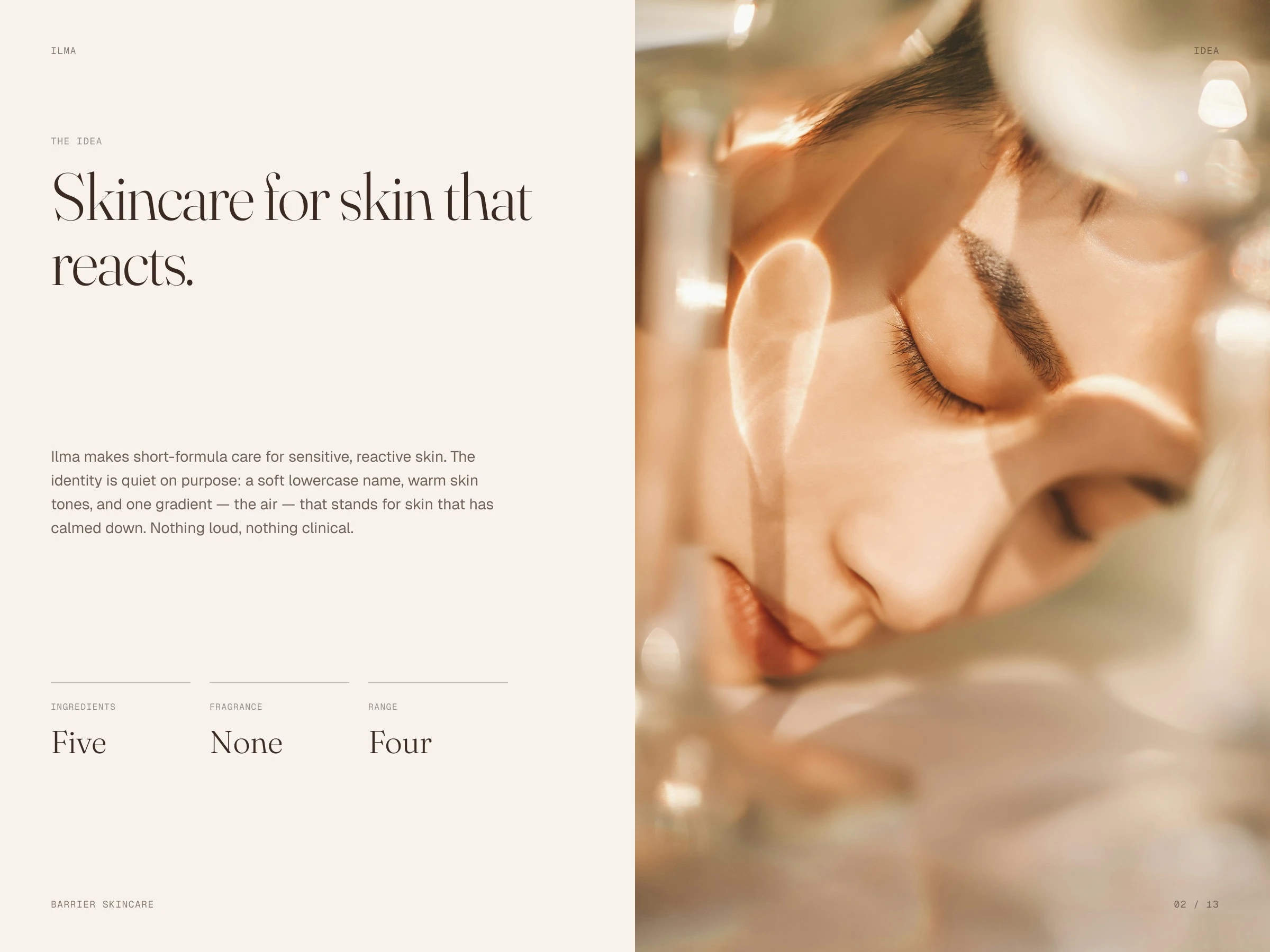
Skincare for skin that reacts
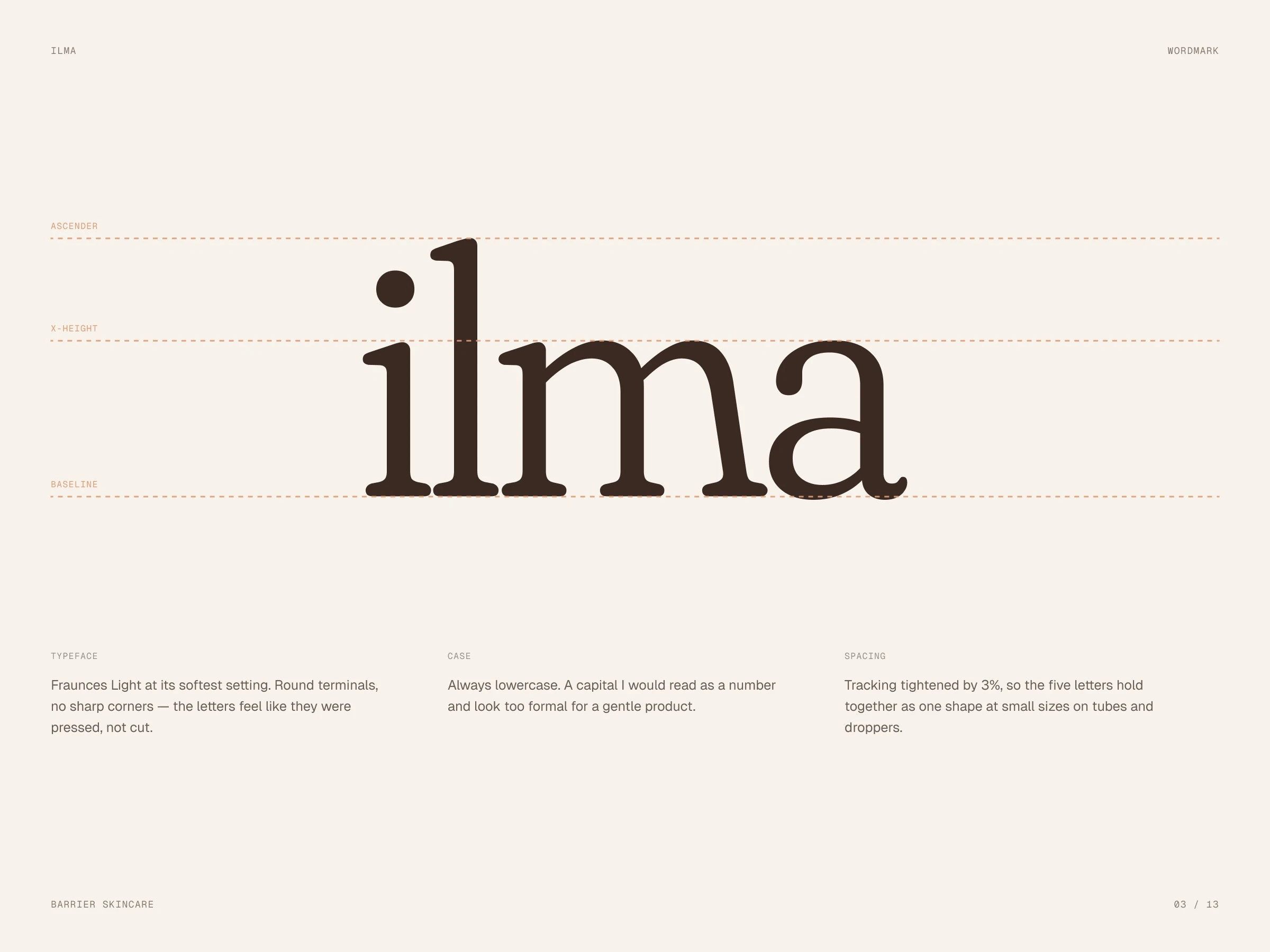
Wordmark
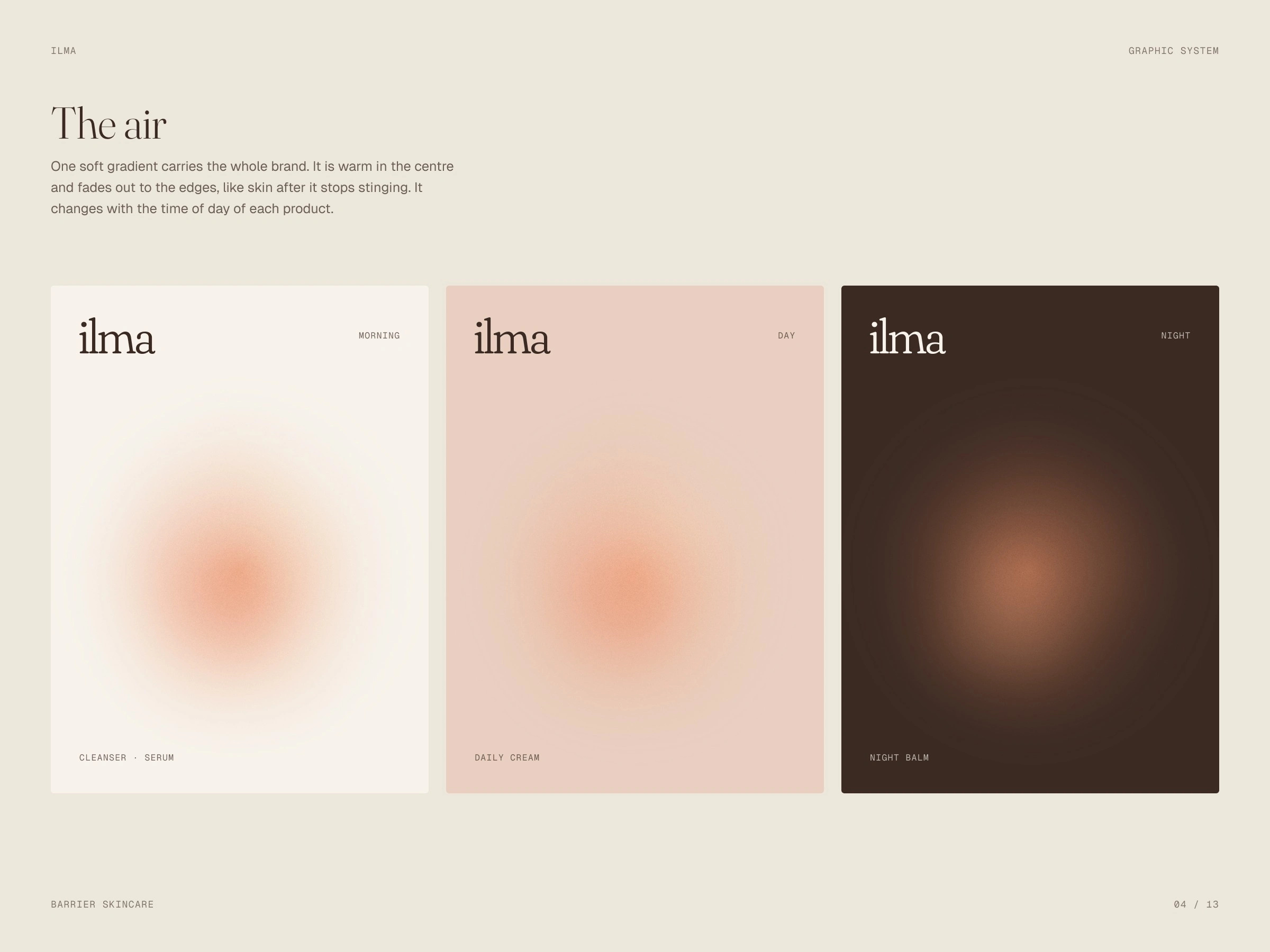
The air
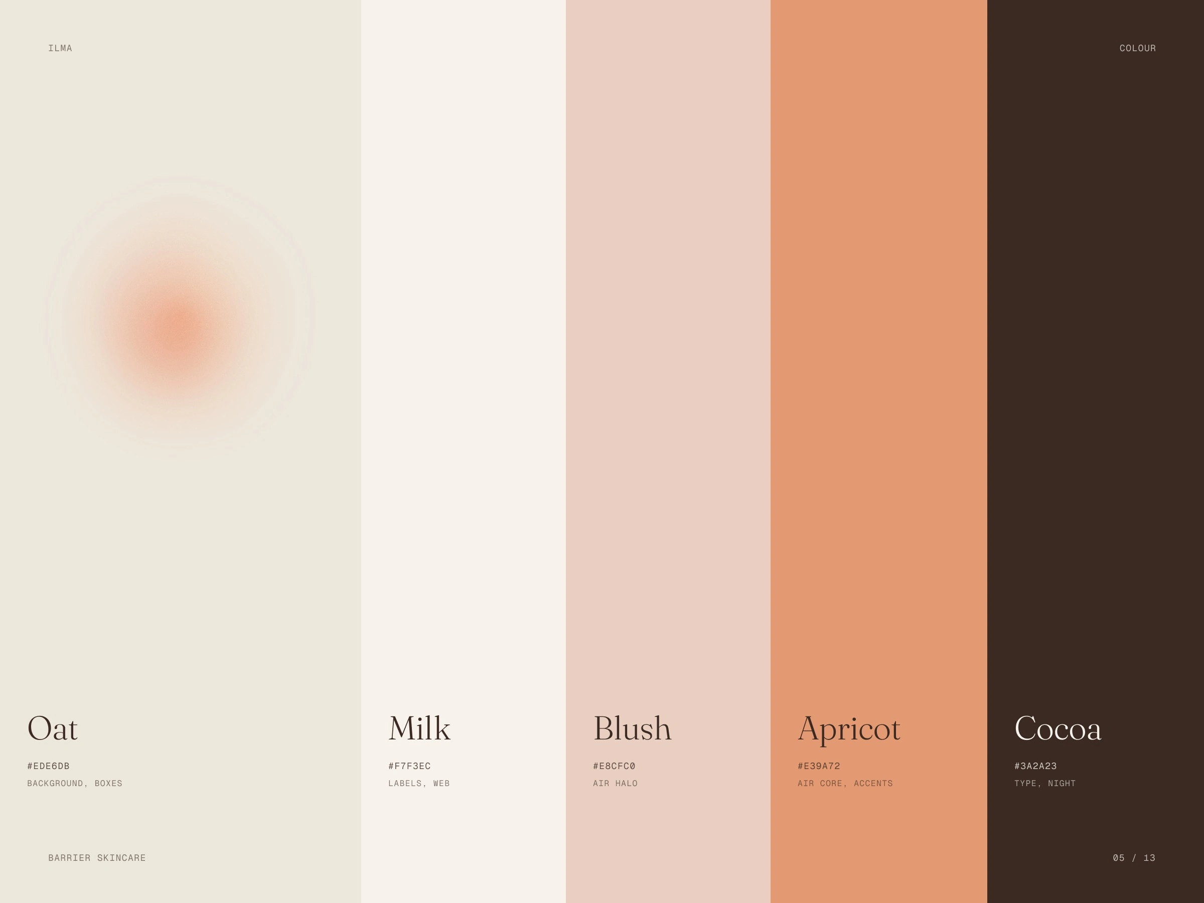
Warm skin tones
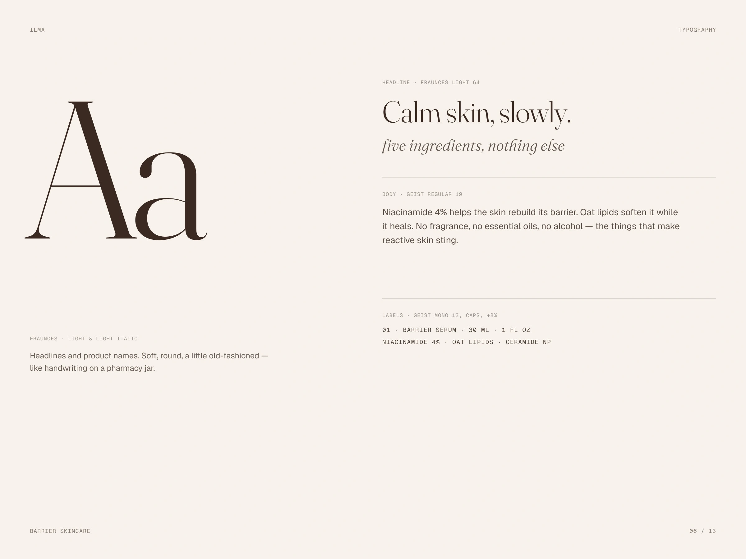
Typography
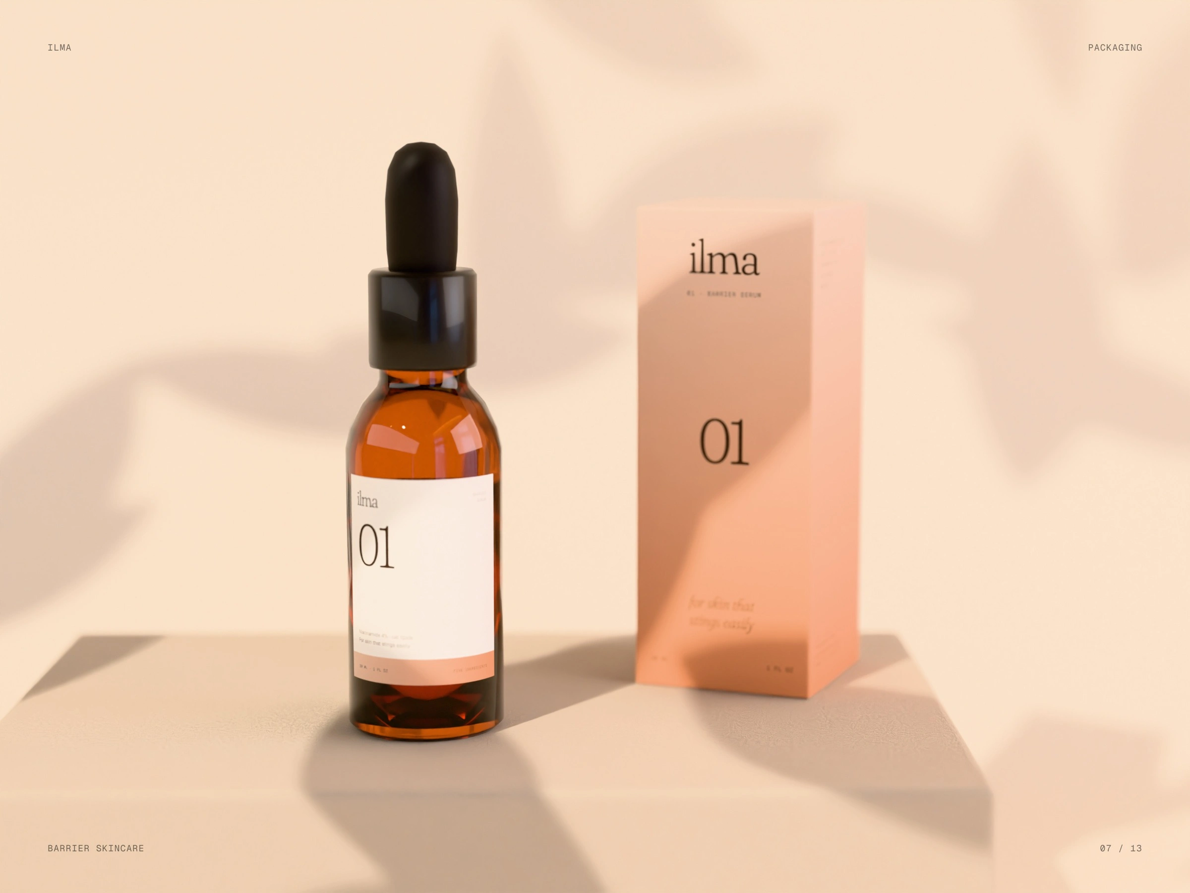
Barrier serum
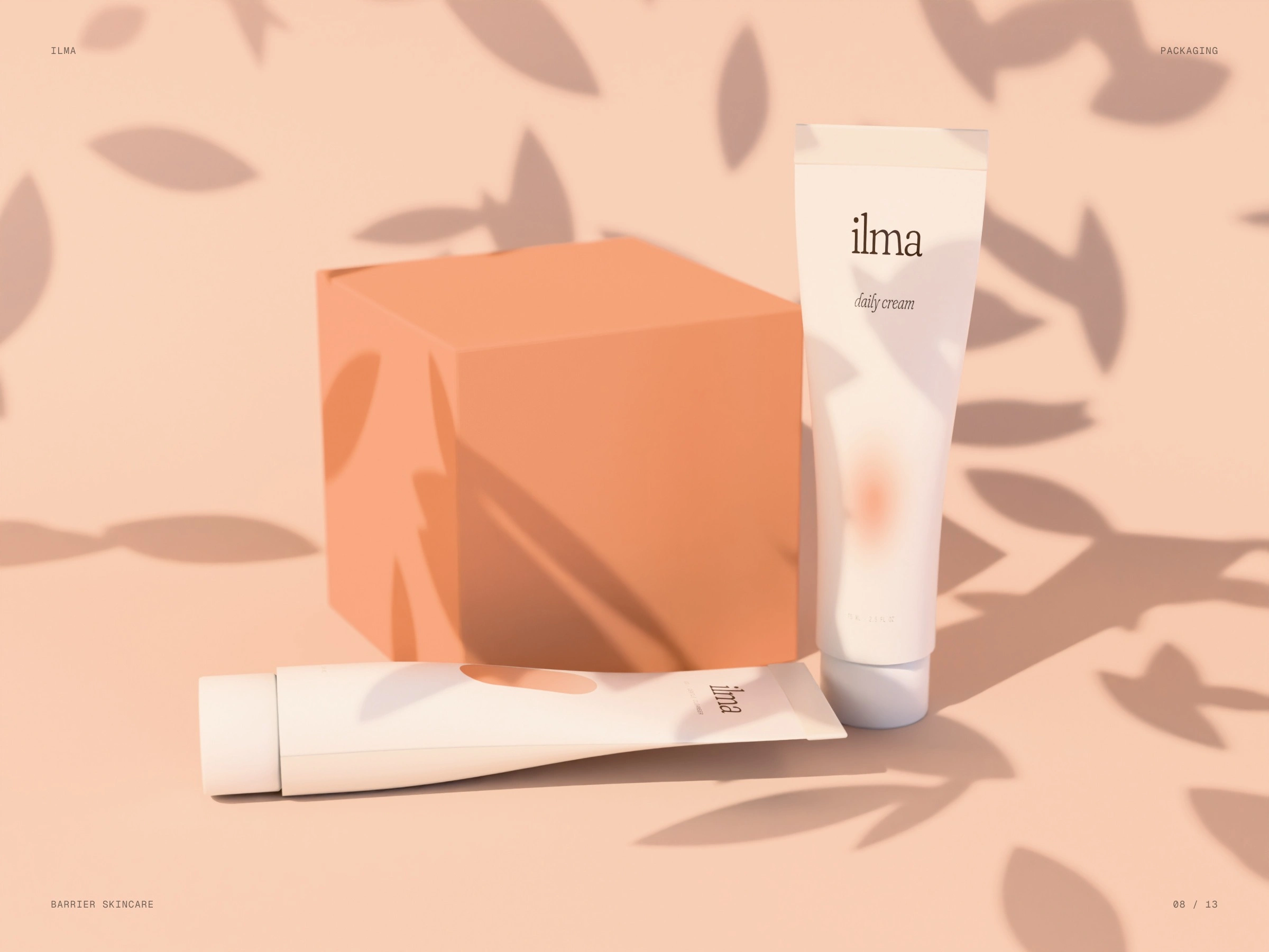
Cream and cleanser
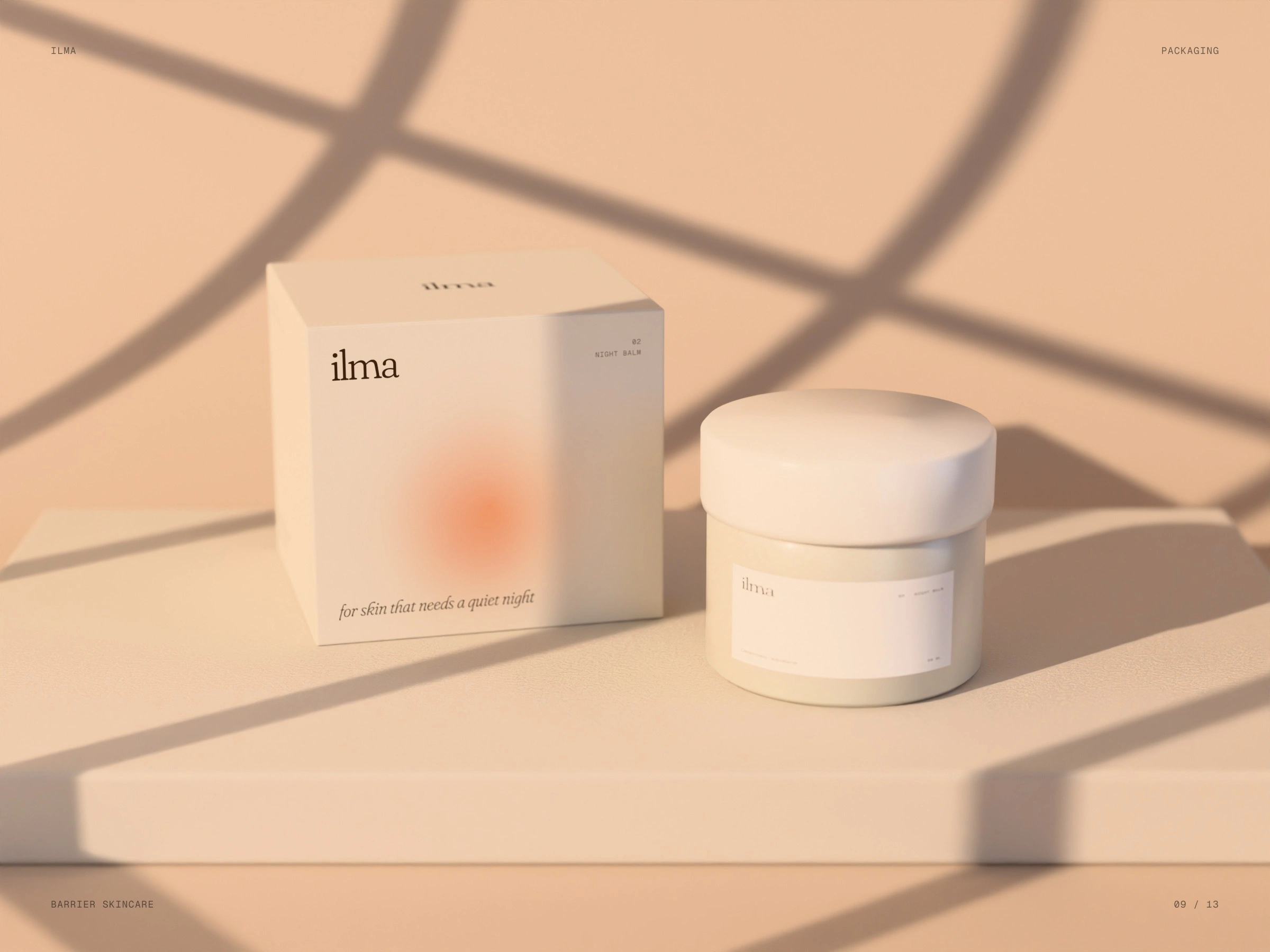
Night balm
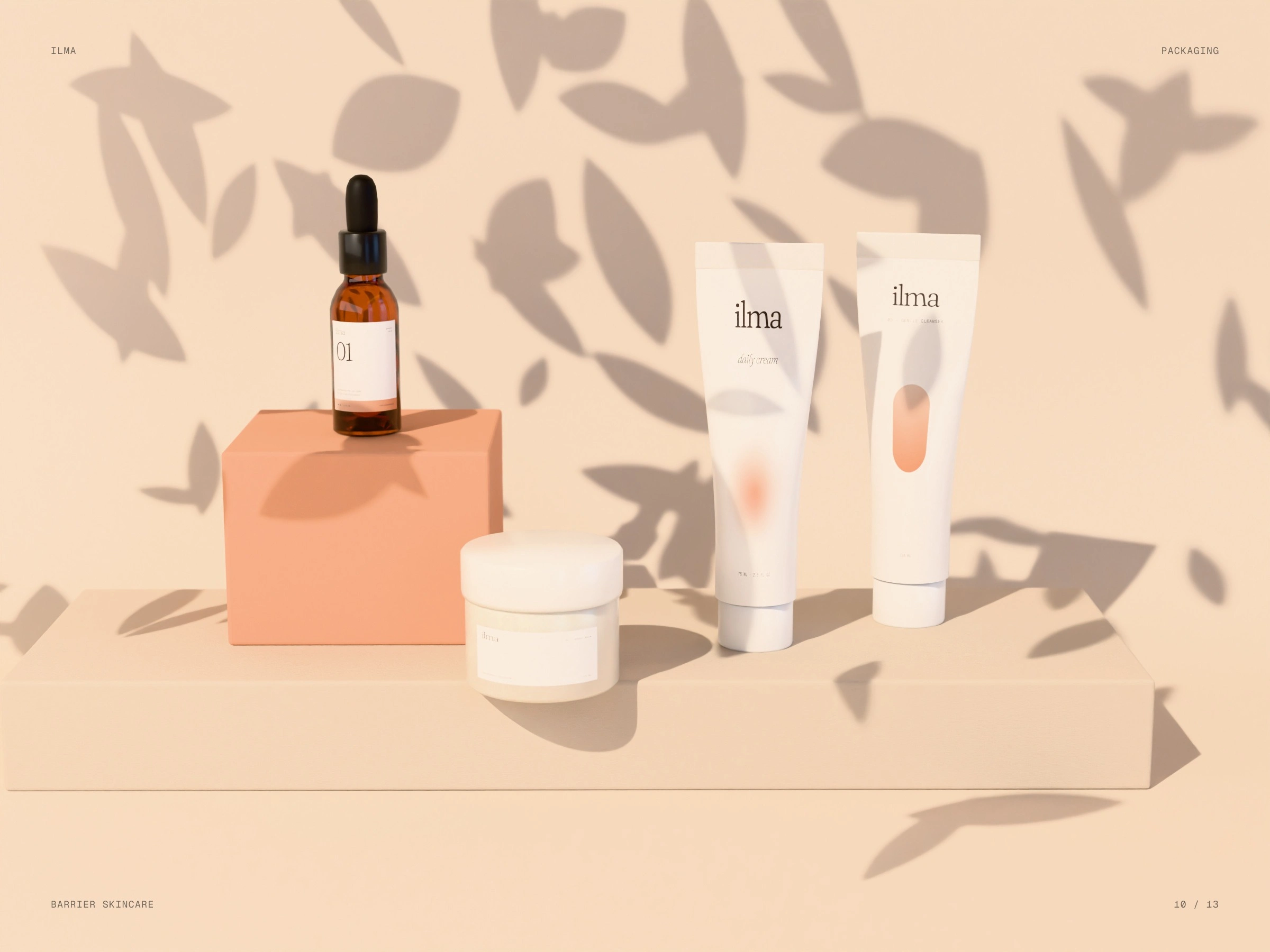
The range
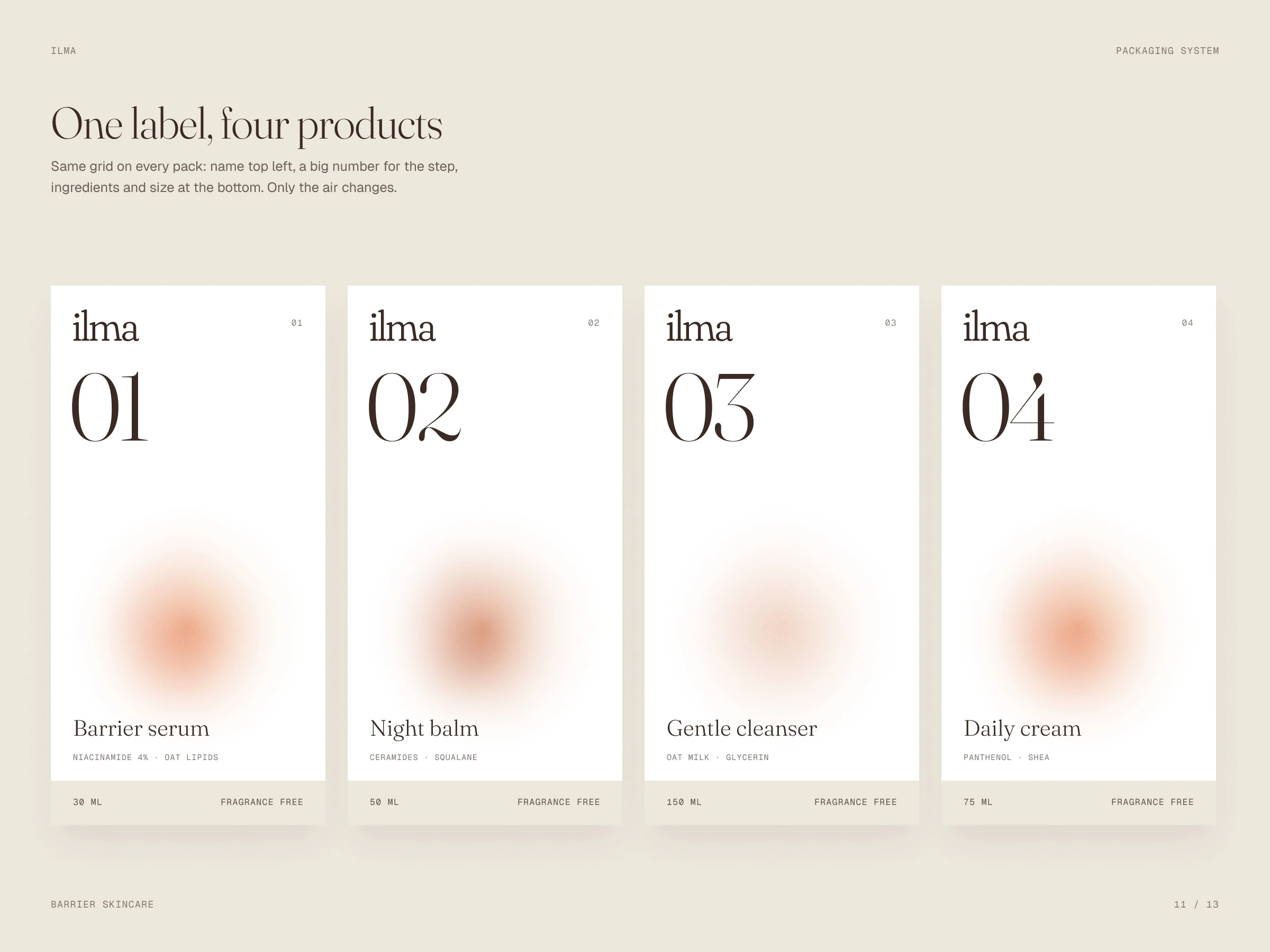
One label, four products
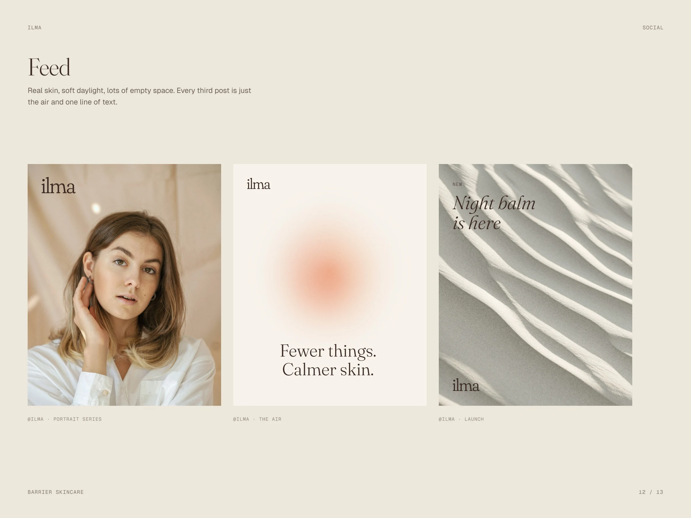
Social
Calm skin, slowly
Like this project
Posted Oct 14, 2026
Soft lowercase serif, warm skin tones and one gradient — the air. A single label grid carries the serum, tubes, jar and boxes.