Holistic Branding for artisanal Gelato

Roshni Kochhar


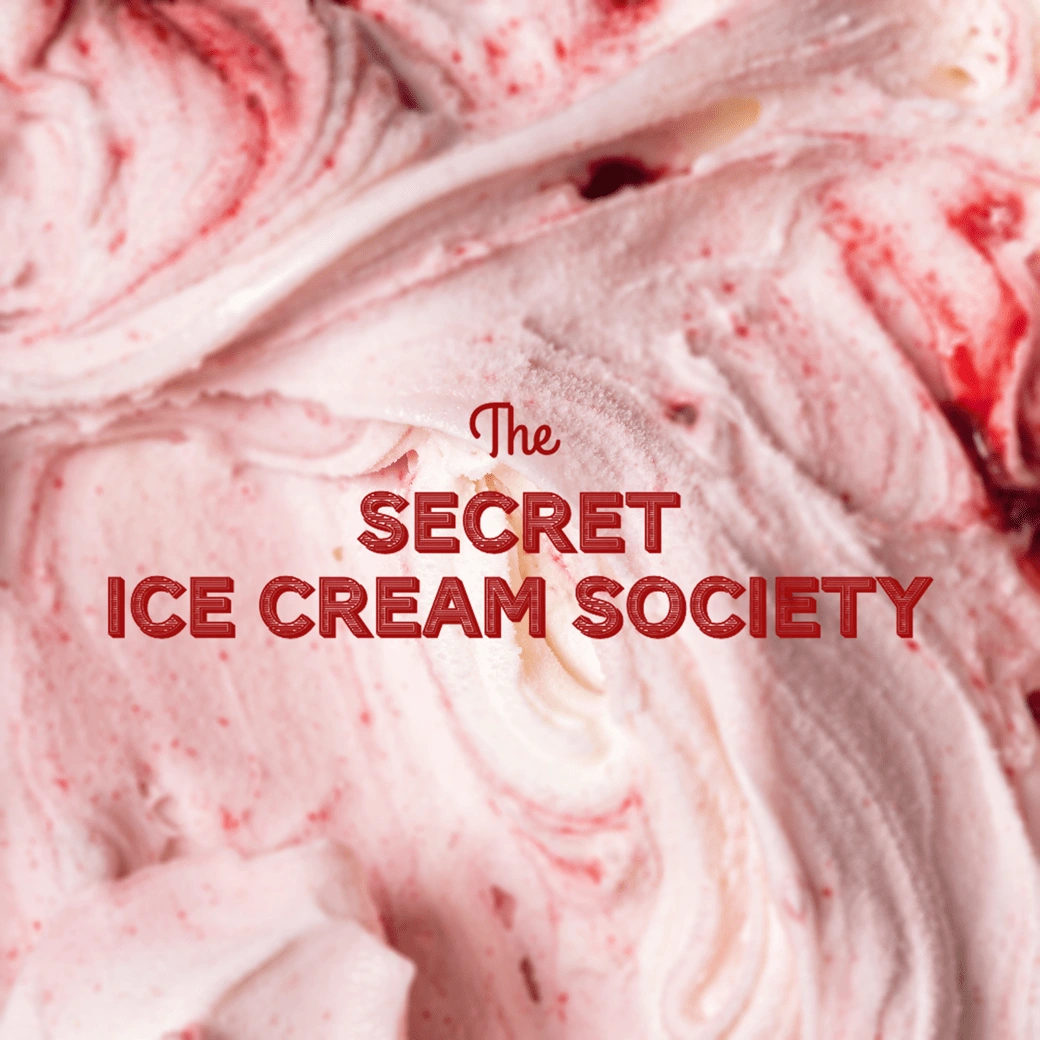
Branding
The brand identity is built around the concept of dynamic duos. The logomark features a playful juxtaposition of typefaces – This concept of pairing is further explored throughout the brand identity, with unexpected color combinations, playful type treatments, and intriguing flavor pairings.
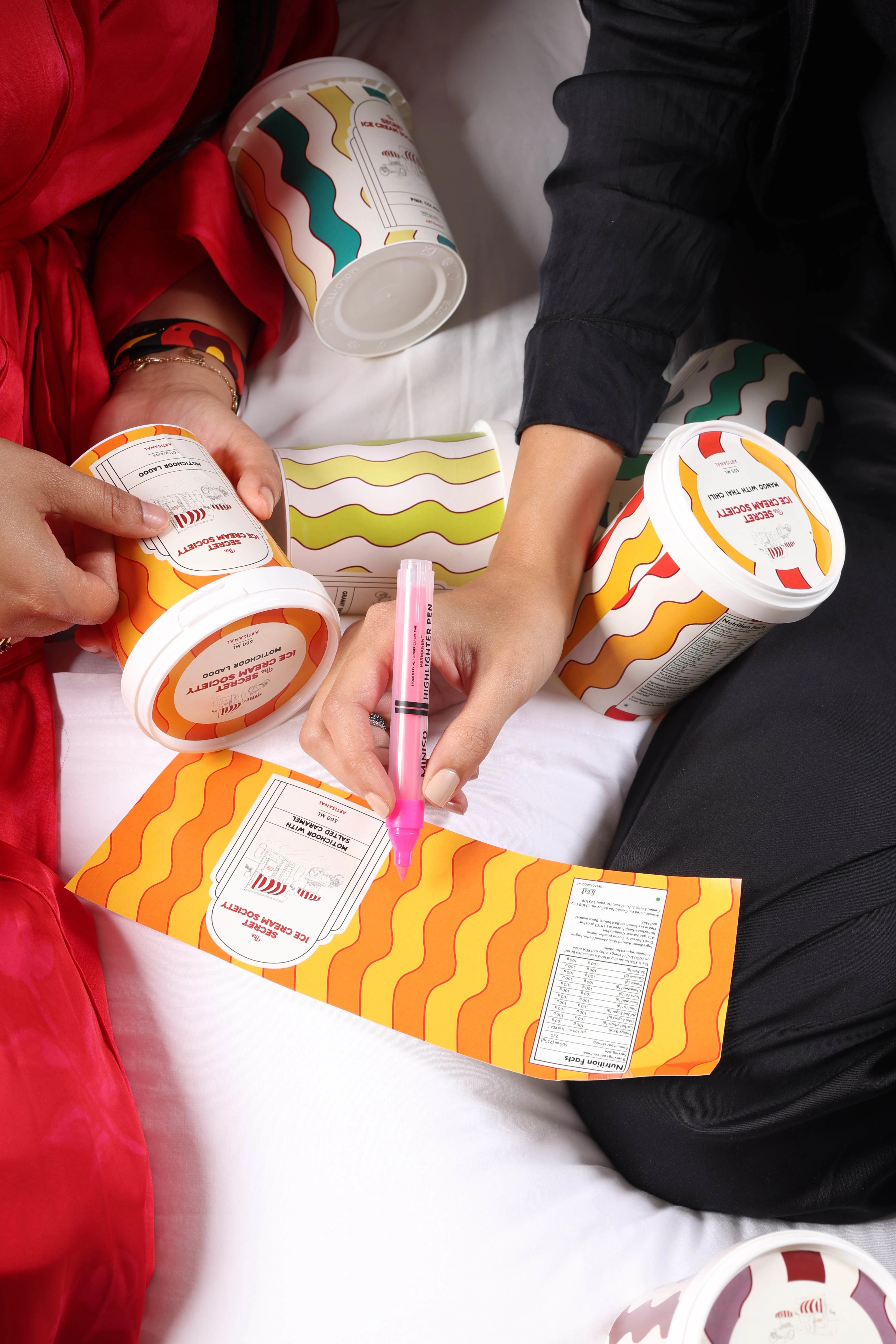
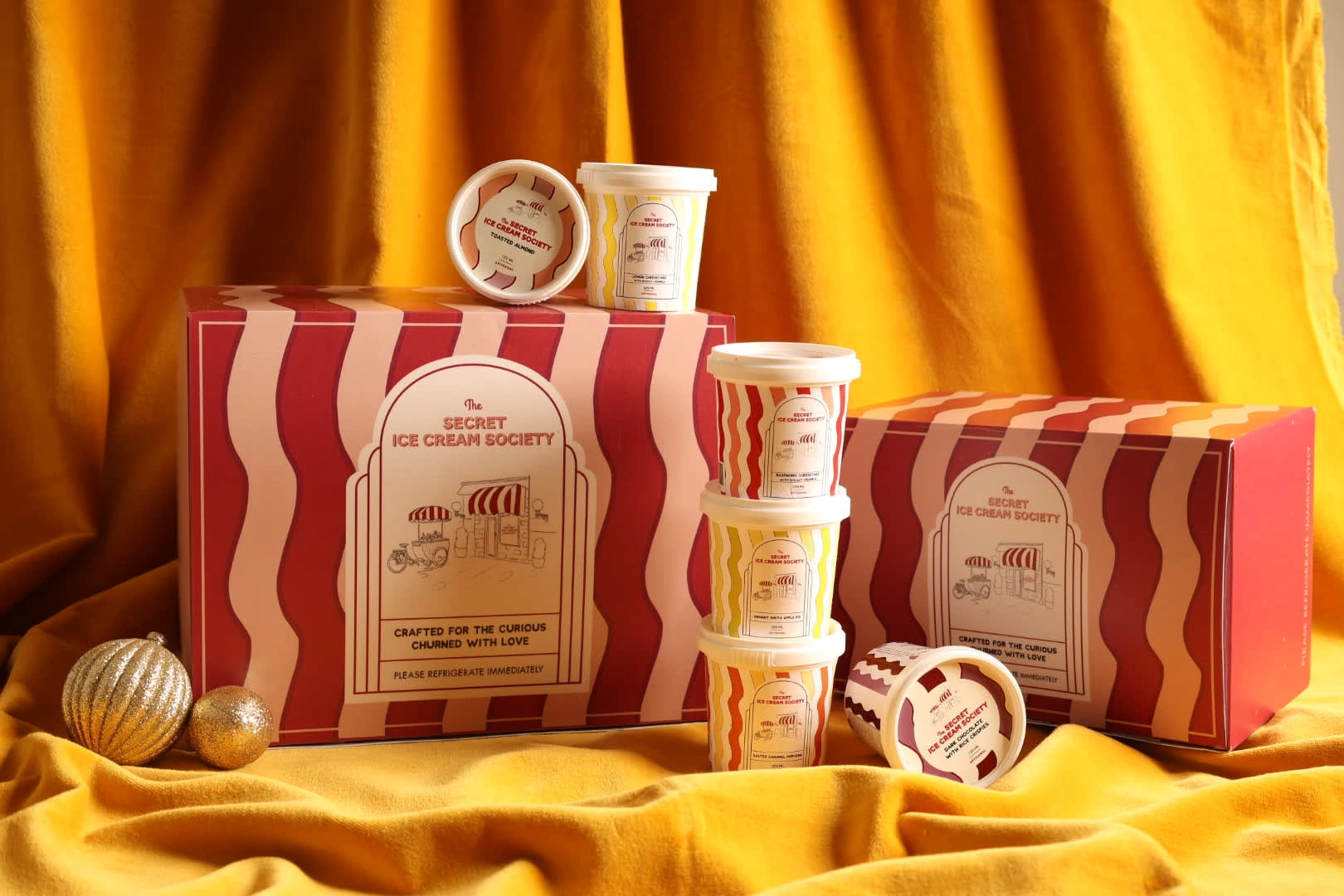
Packaging
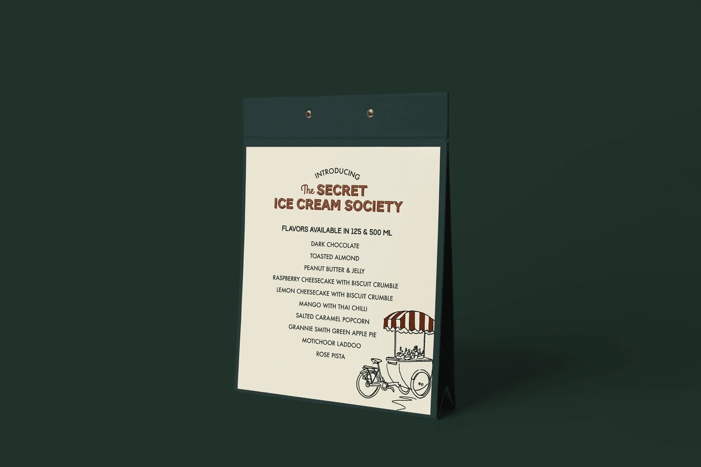
The packaging design mirrors the brand's playful and intriguing personality. We wanted to use bold colors and playful patterns to create a sense of excitement and anticipation. The typography is clean and modern, with a touch of whimsy.

Website
We wanted to pair rich visuals with minimalistic typography to create a seamless user experience. The overall color scheme is fresh and playful, reflecting our brand’s essence. The balance of aesthetics and functionality was important to us, so we focused on responsive design and imagery that feels like an exploration for our users - to dive into our world of innovation and indulgence.

Like this project
Posted Apr 25, 2025
Brand Identity + Website Design + Packaging Design Holistic brand strategy and design for an artisanal gelato brand launch
Likes
0
Views
0
Timeline
Aug 1, 2024 - Dec 1, 2024