homepage redesign
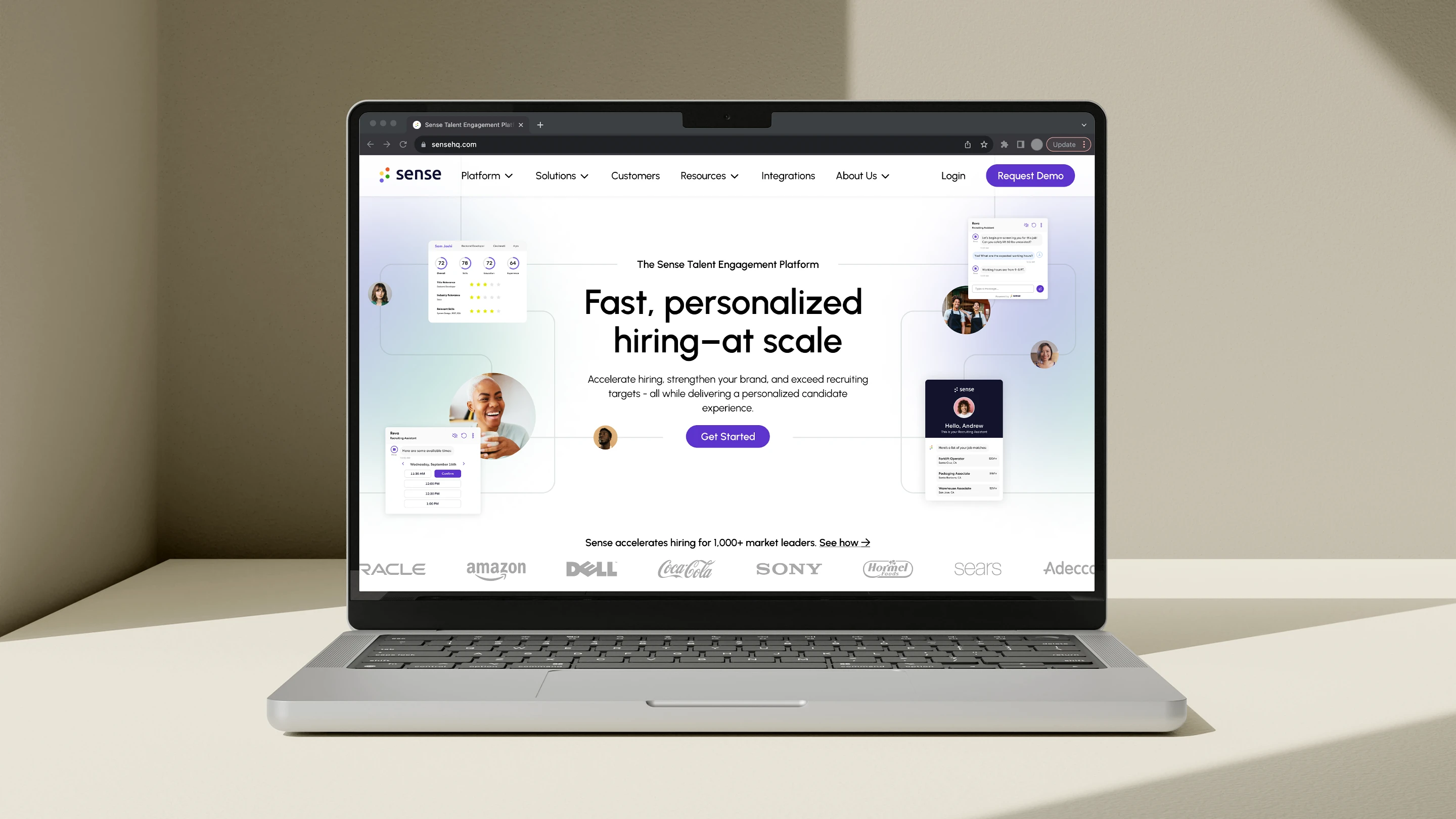
The Sense website was feeling unoriginal and out of date. We weren't standing out from our competition, and it was lacking in realistic product imagery, leaving potential clients wondering what exactly they were signing up for. I was asked to create 2 options of the homepage redesign - one more "light mode" and one using more "dark mode" elements - while incorporating our updated brand look and feel so we could have a fresh homepage before one of our biggest industry conferences. Continue to link below for full story

Like this project
Posted Dec 7, 2023
redesigning a recruiting AI startup's homepage to bring them into the future.


