Aechen Architects | Brand Identity & Logo Design






Crafting a Distinctive Brand Identity for a Toronto-Based Architecture and Interiors Firm
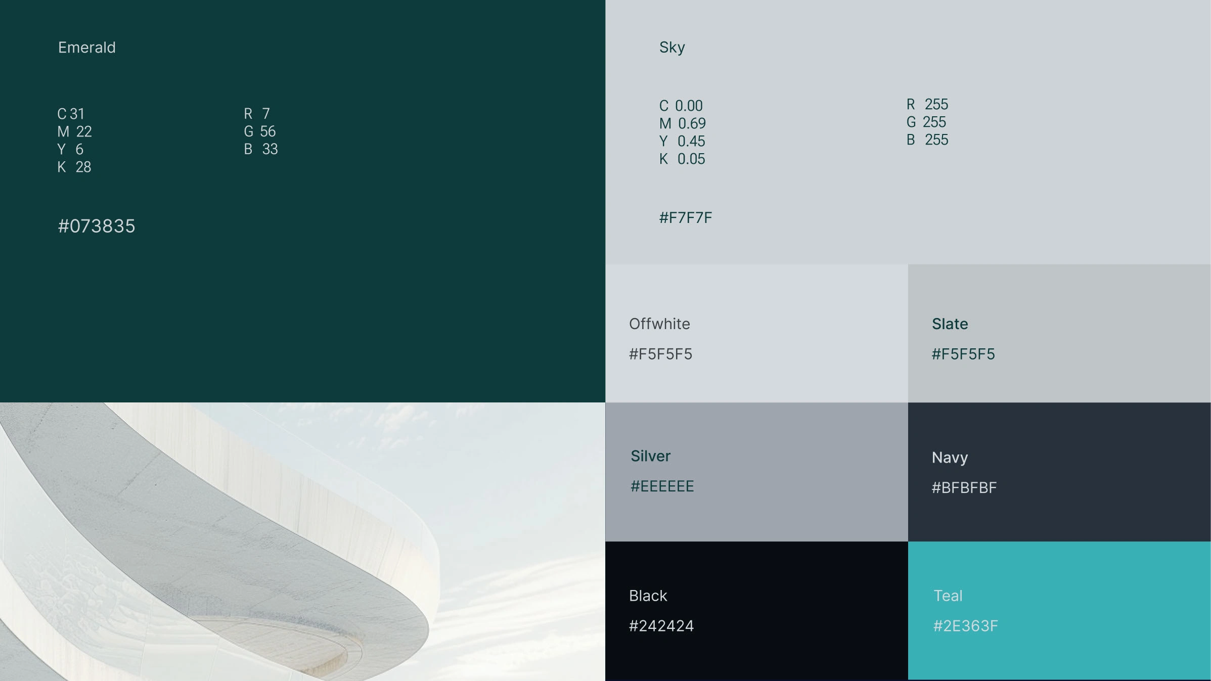
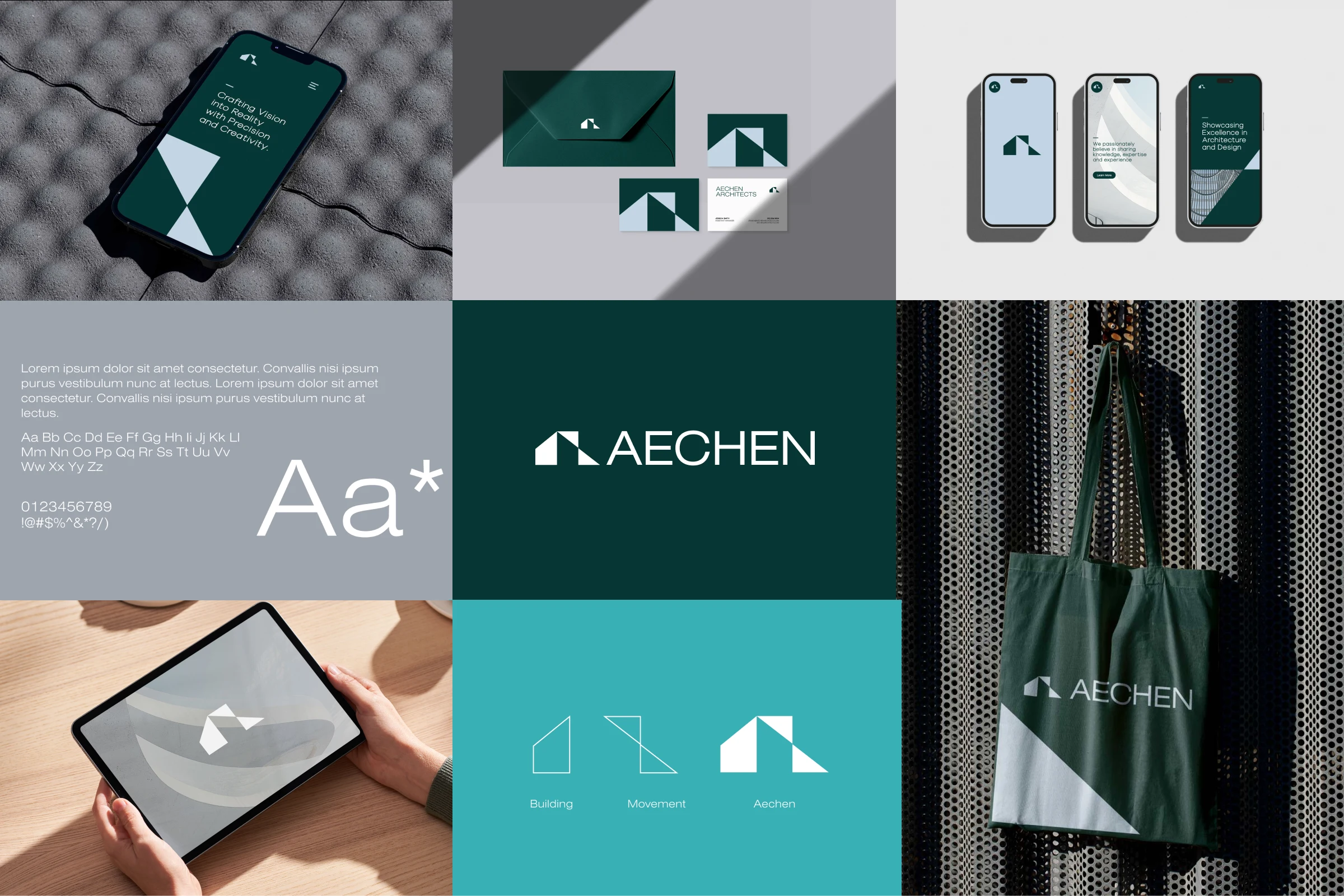
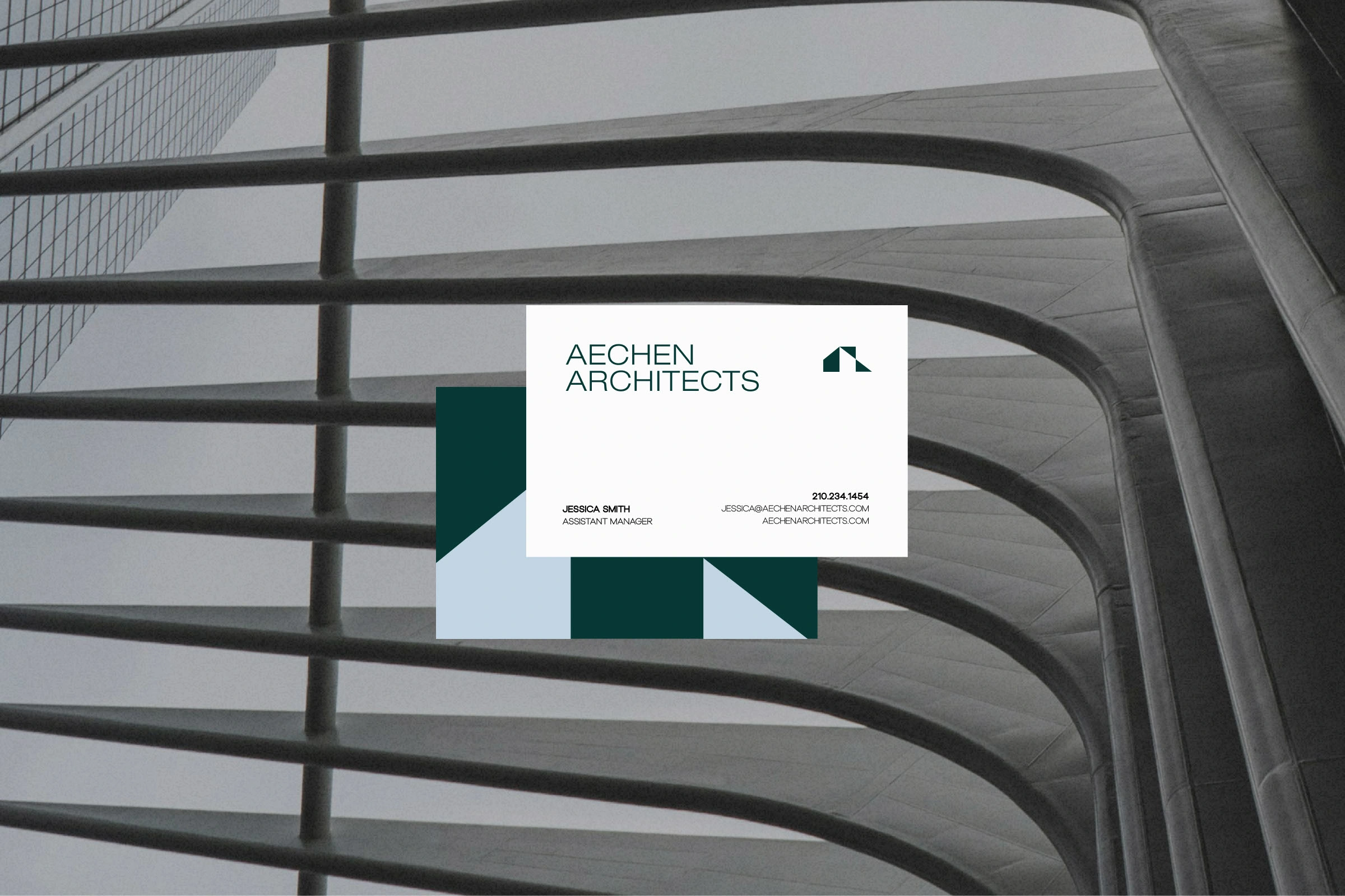
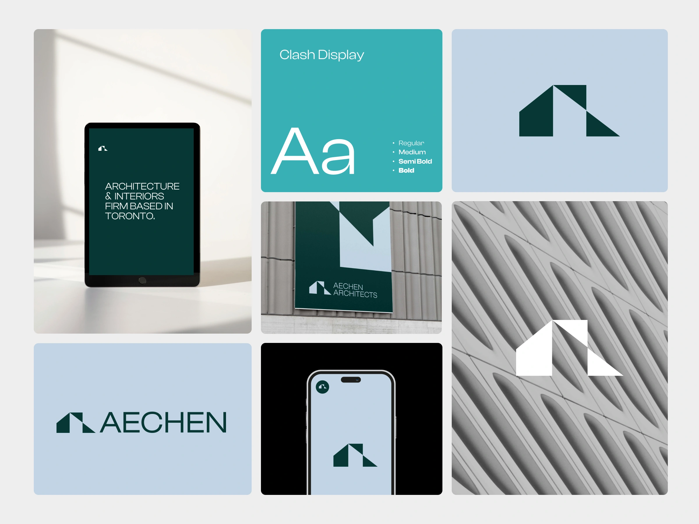
Based in Toronto, Canada, Aechen Architects specializes in creating innovative and forward-thinking designs that blended functionality with aesthetic appeal. Using a palette of deep emerald greens, sky blues, and neutral tones, I aimed to craft a brand identity that exuded tranquility and modernity, capturing the essence of contemporary architectural trends. Their team was dedicated to transforming spaces into dynamic and inviting environments, ensuring each project resonated with their clients' visions.
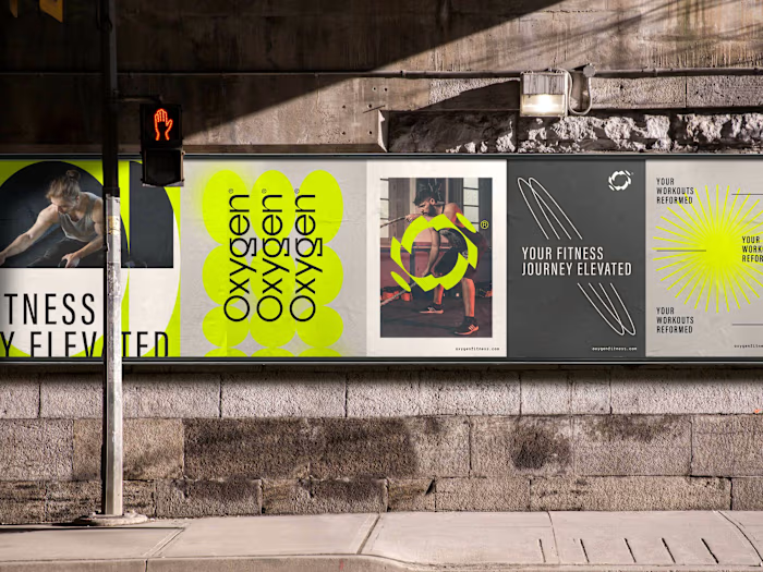
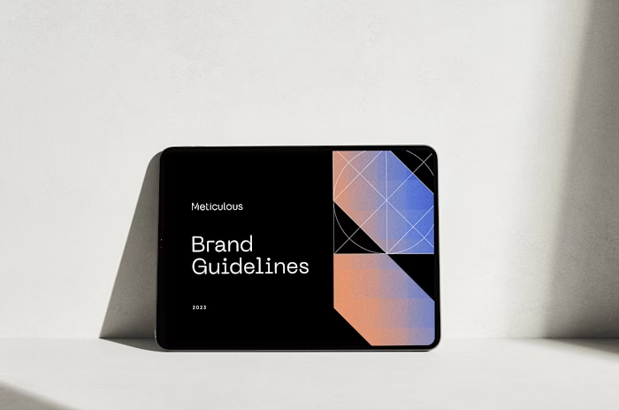
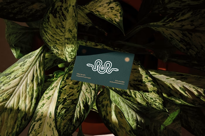
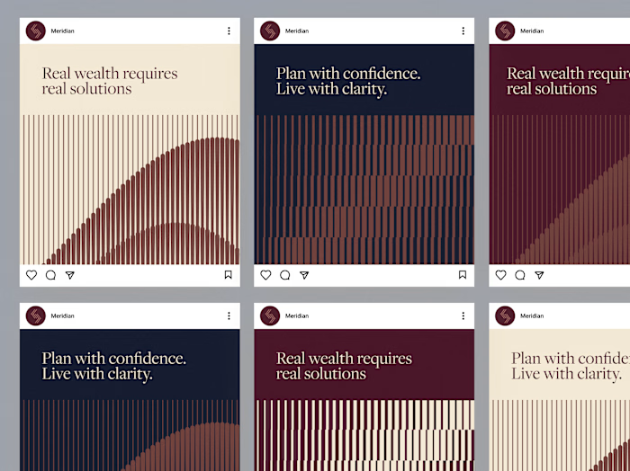
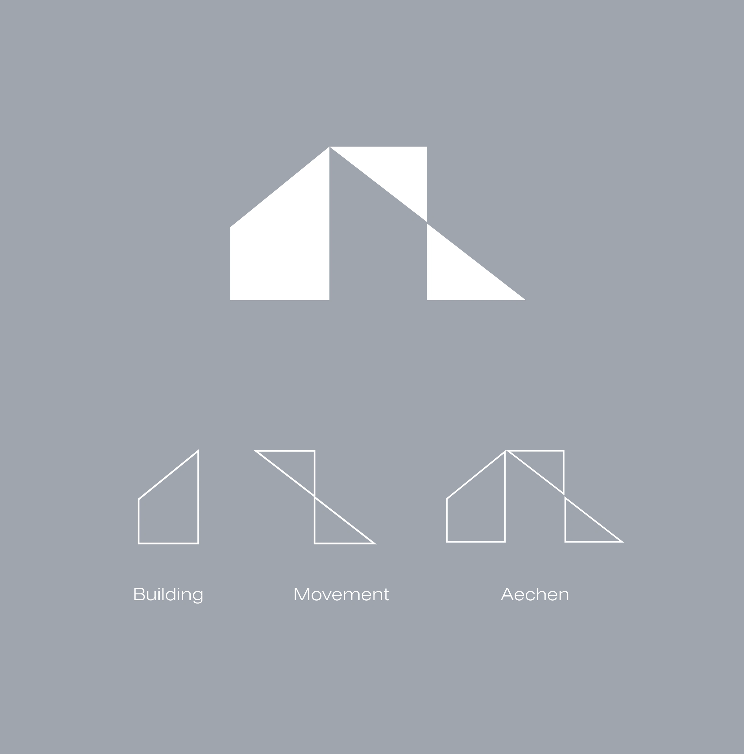
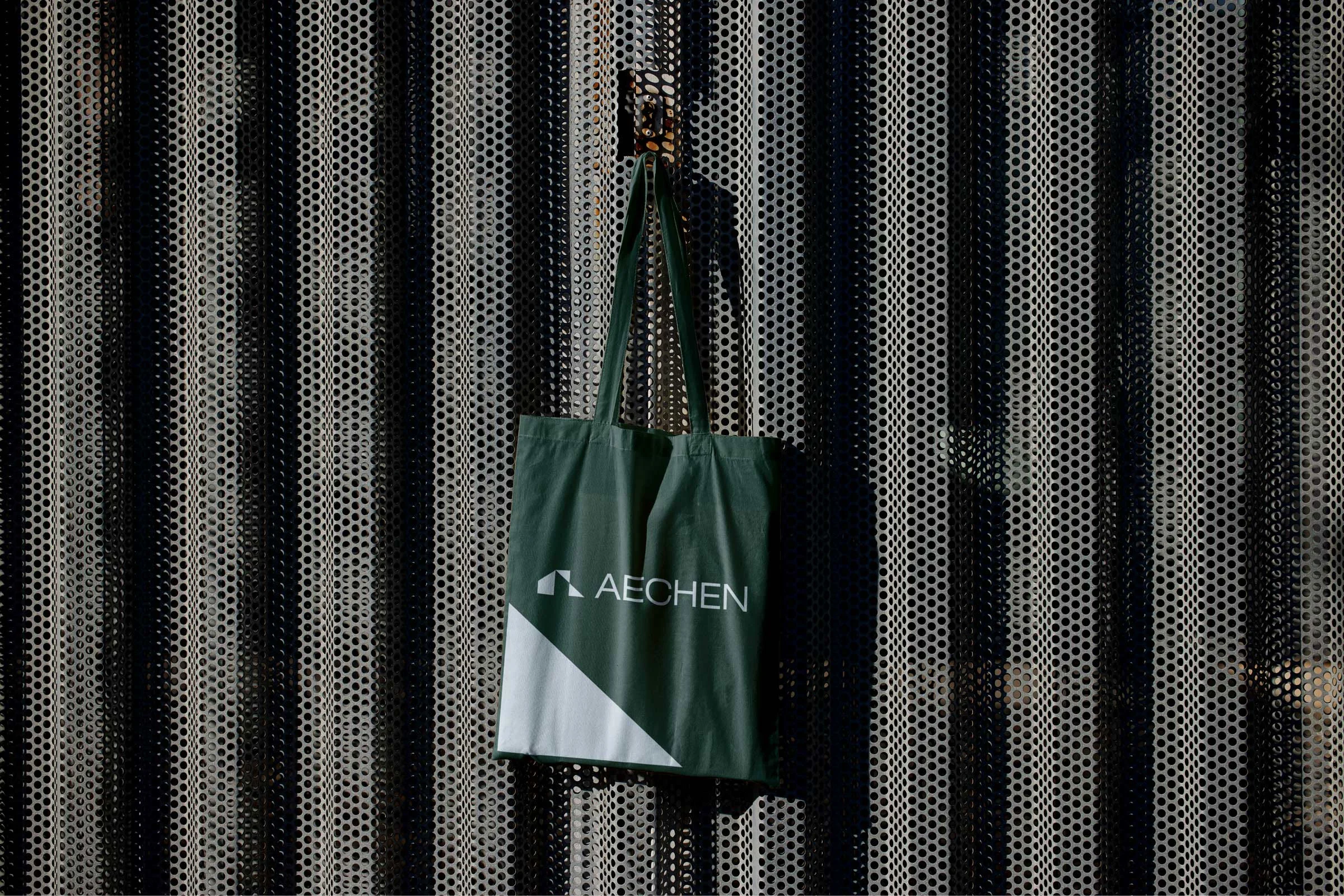
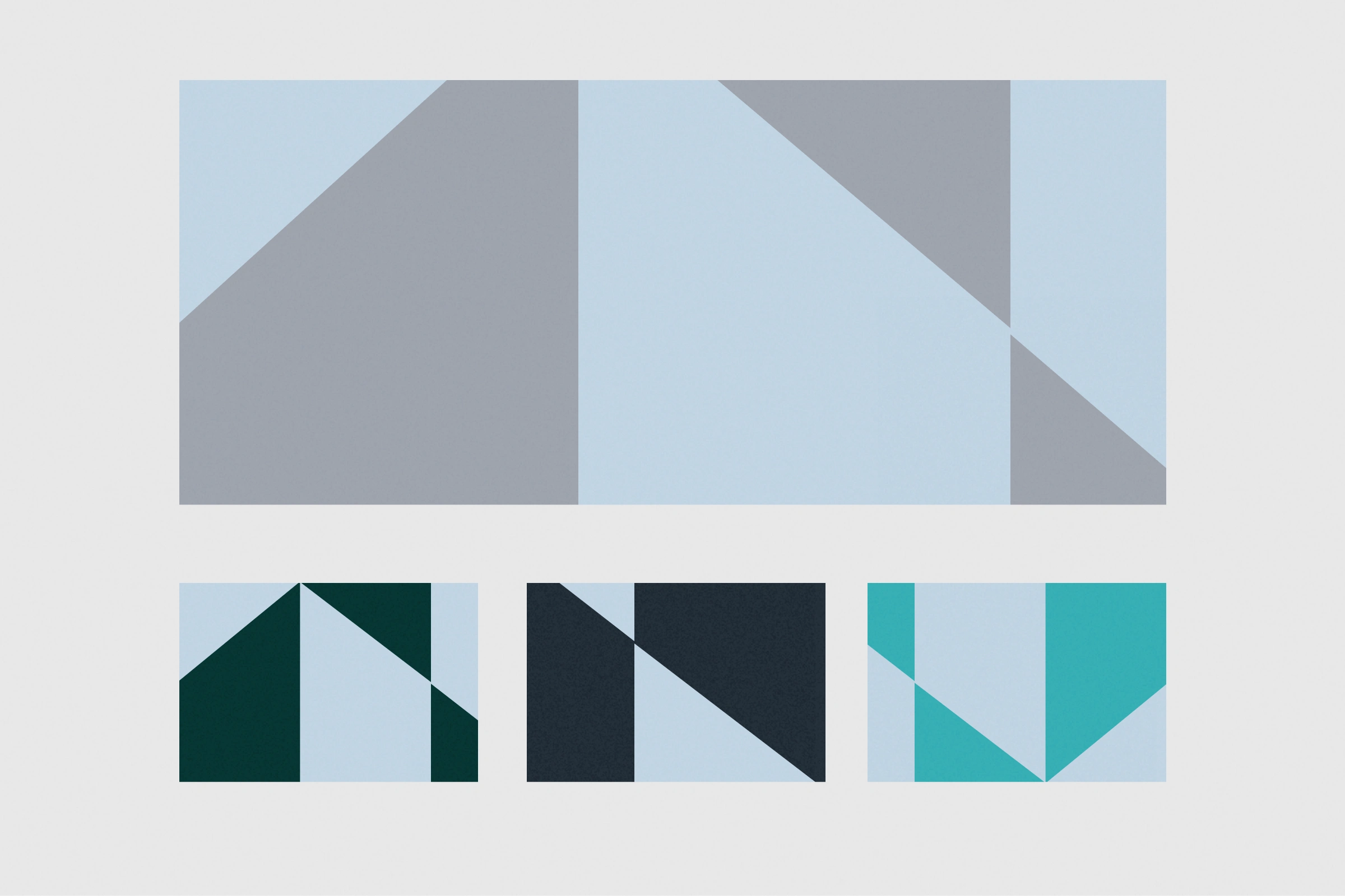
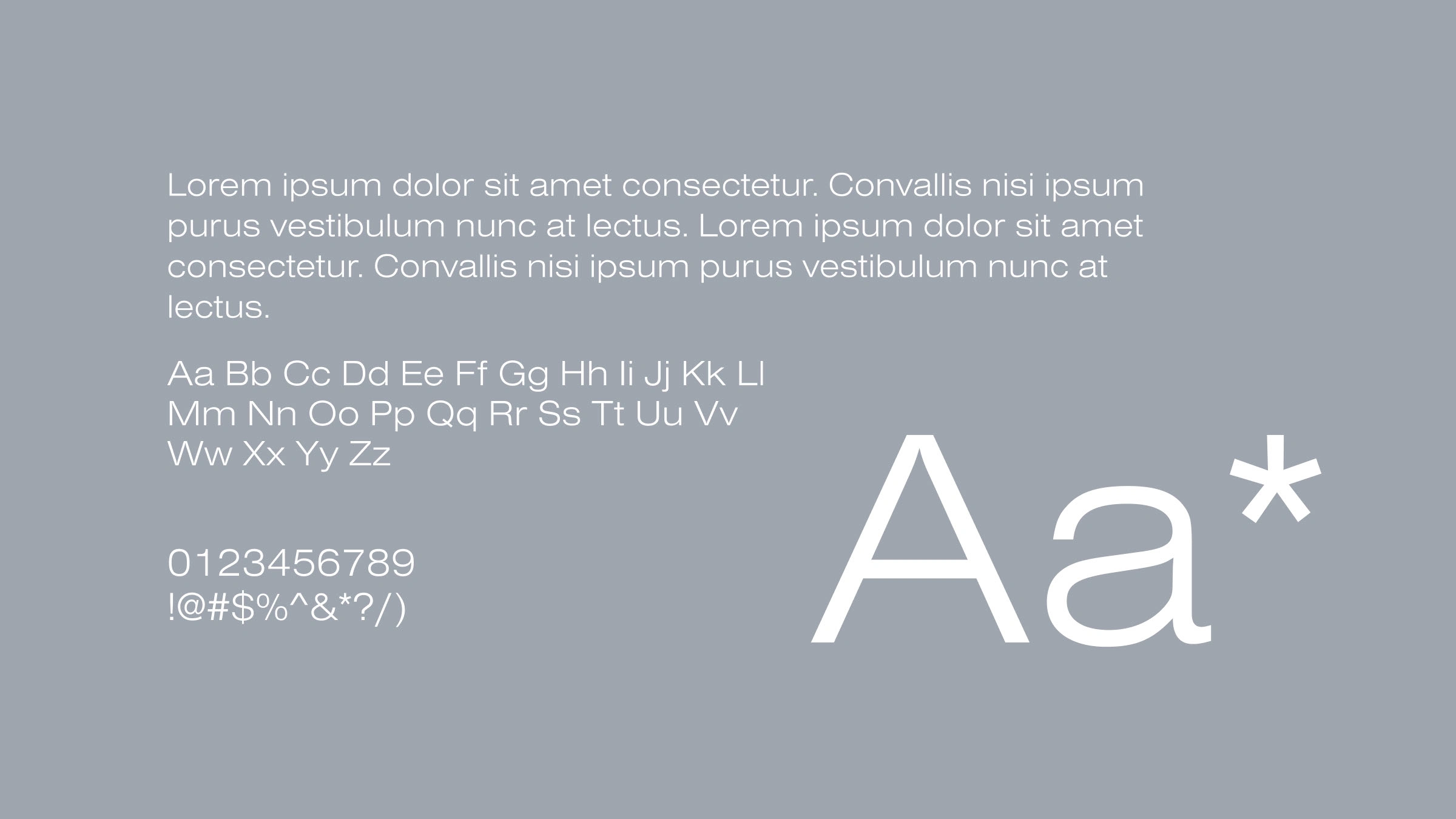
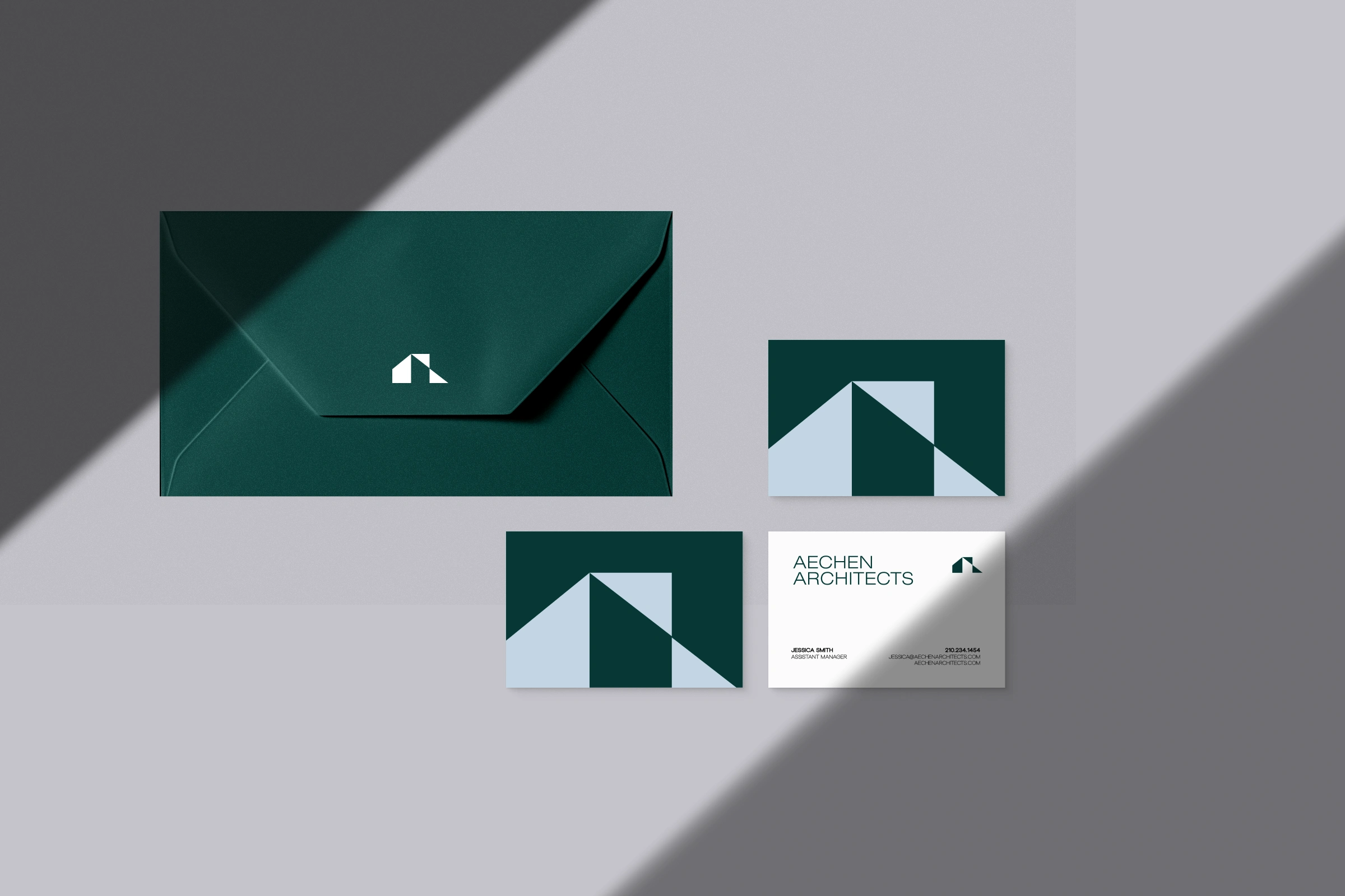
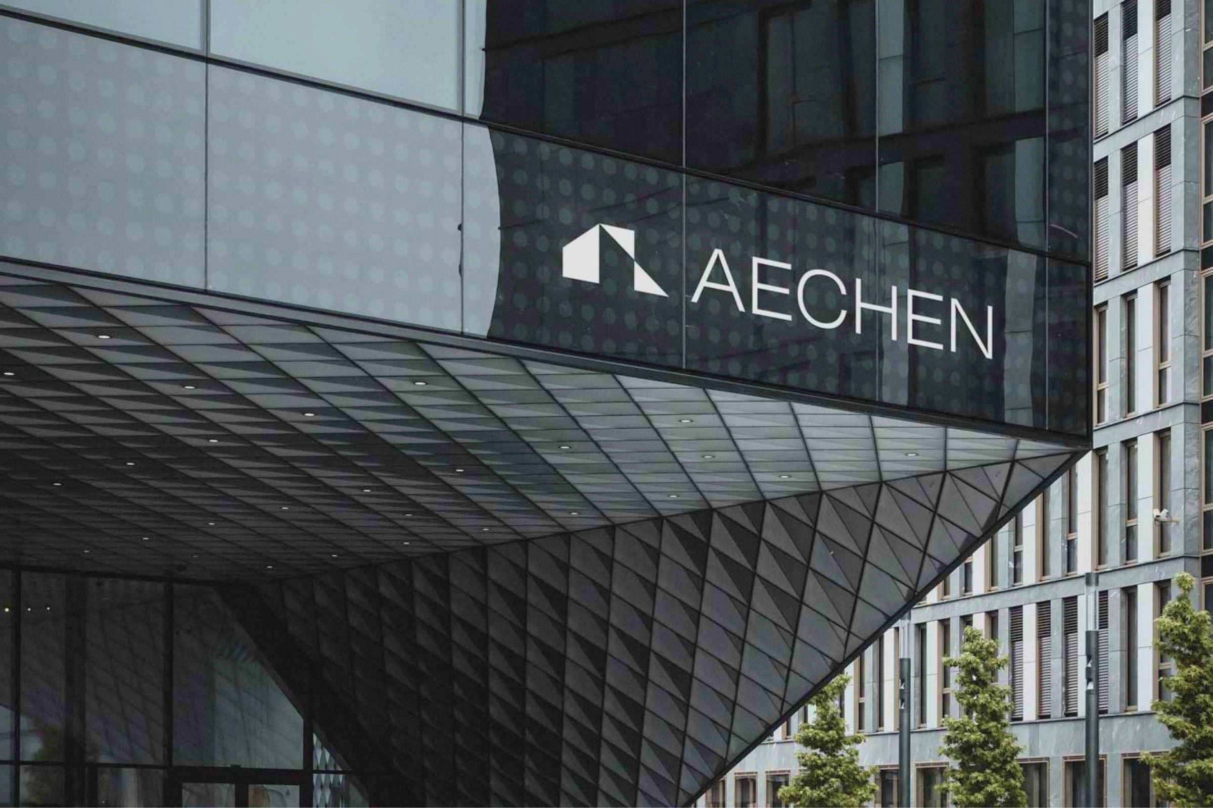
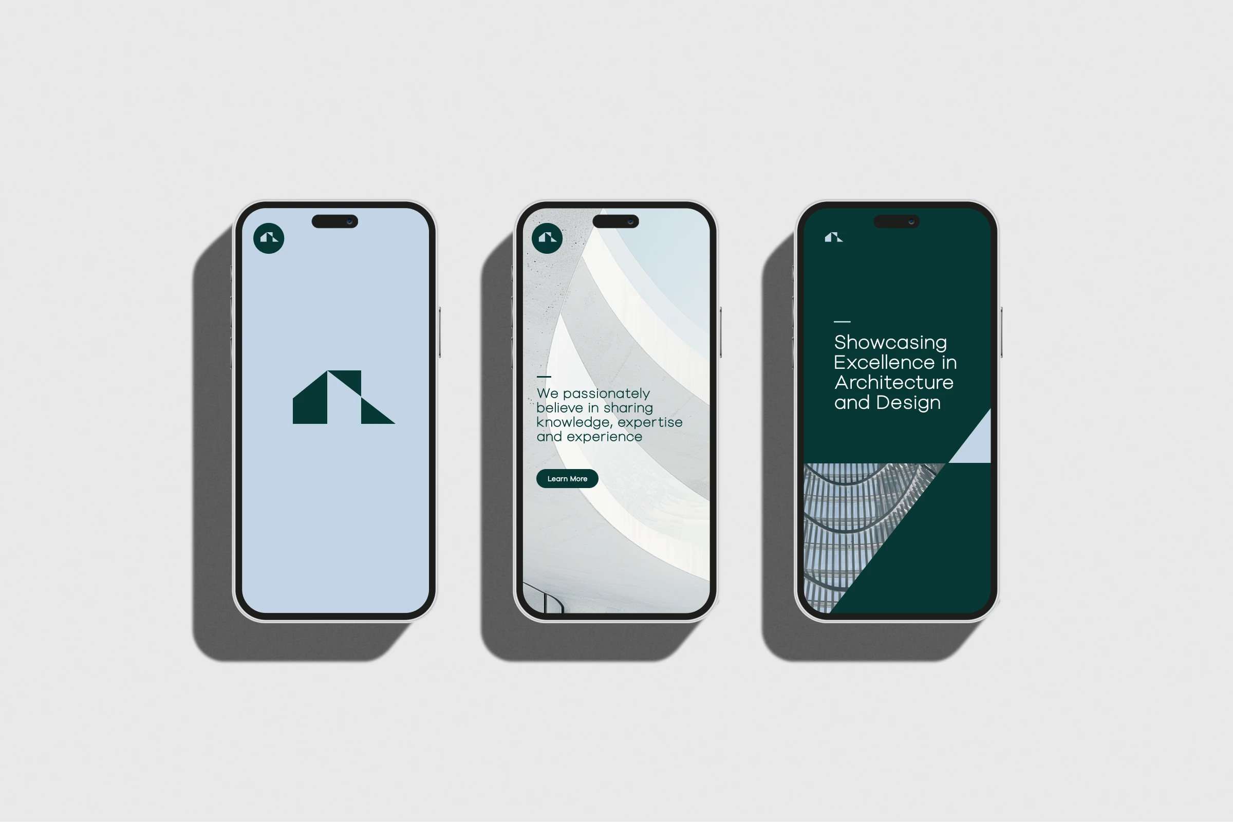
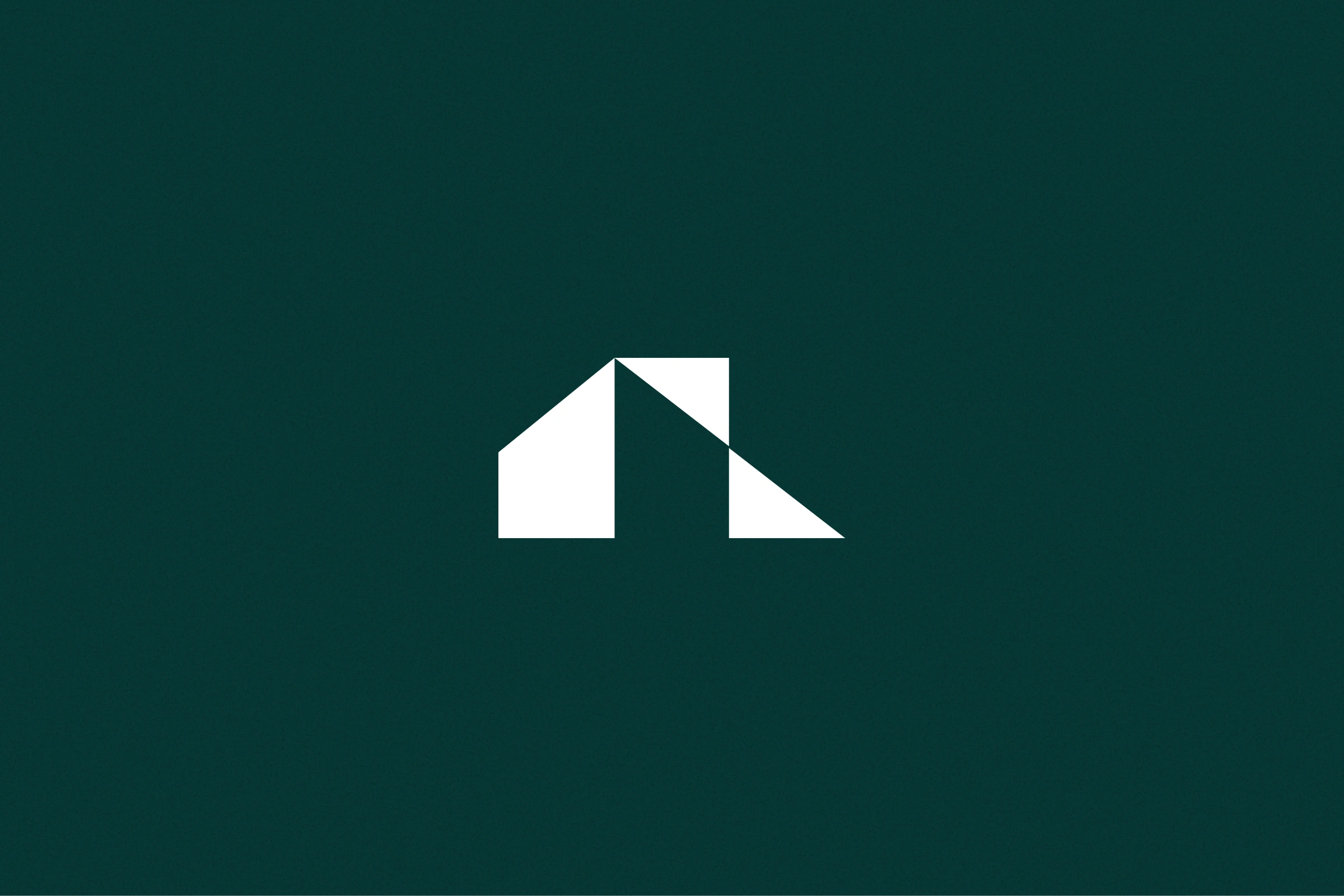
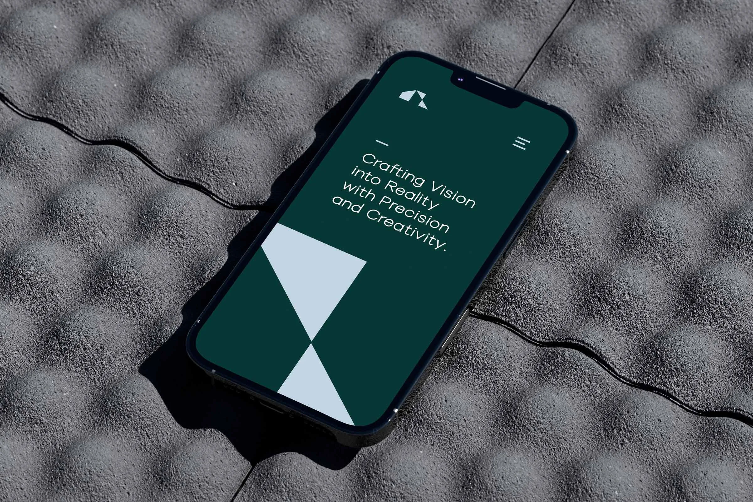
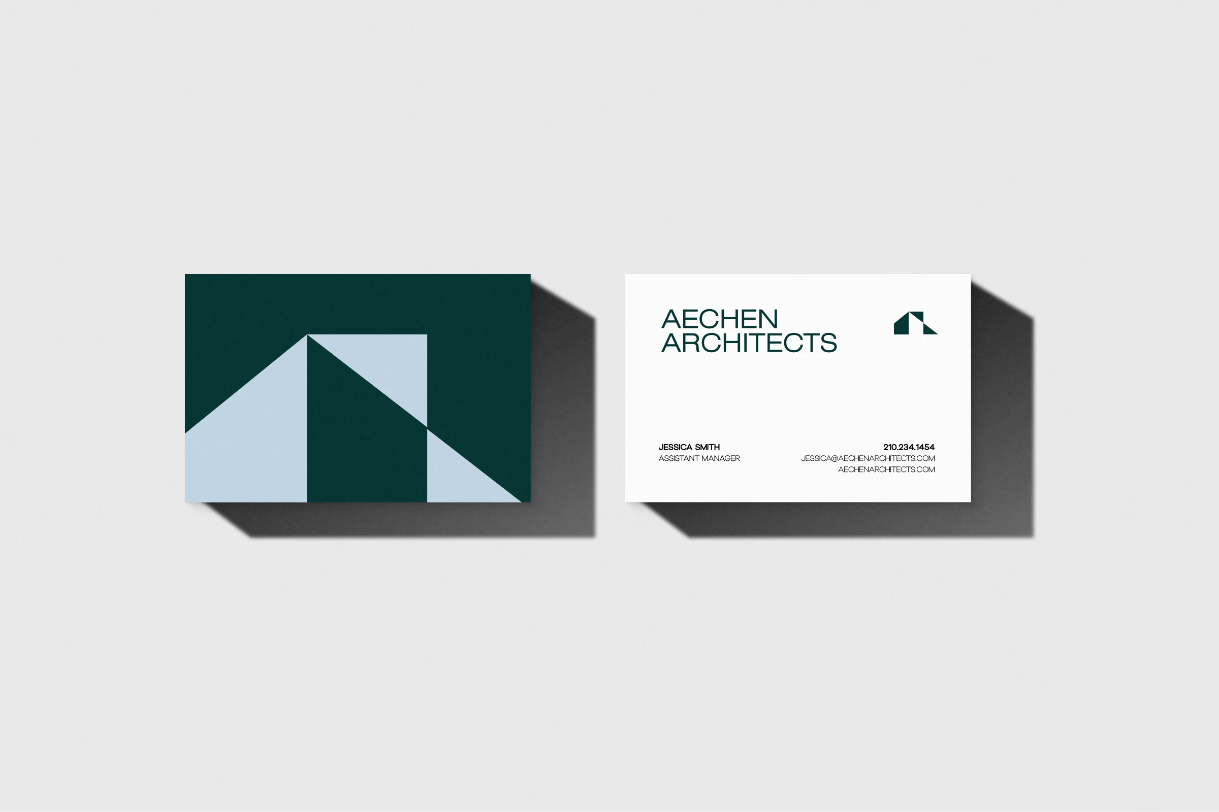
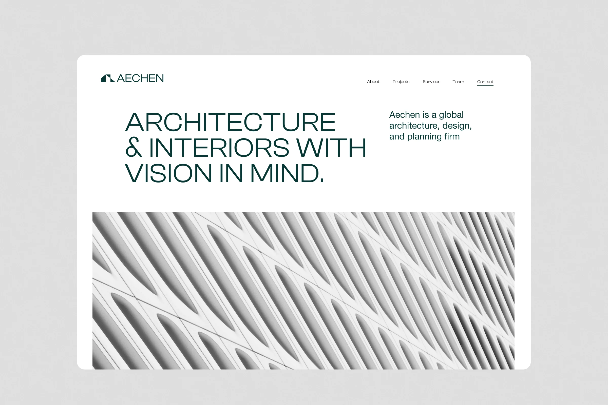
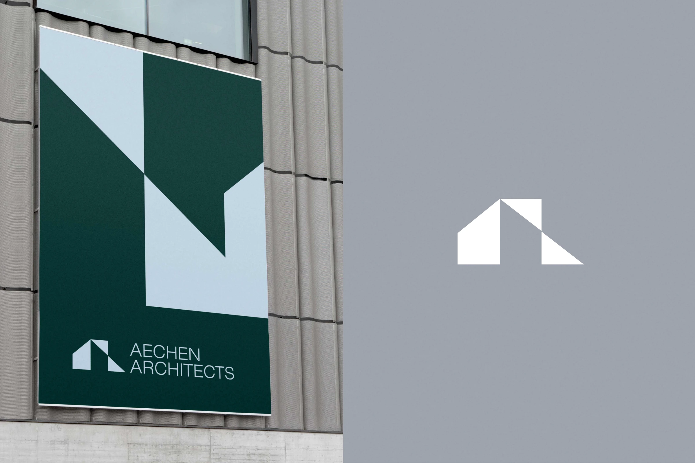
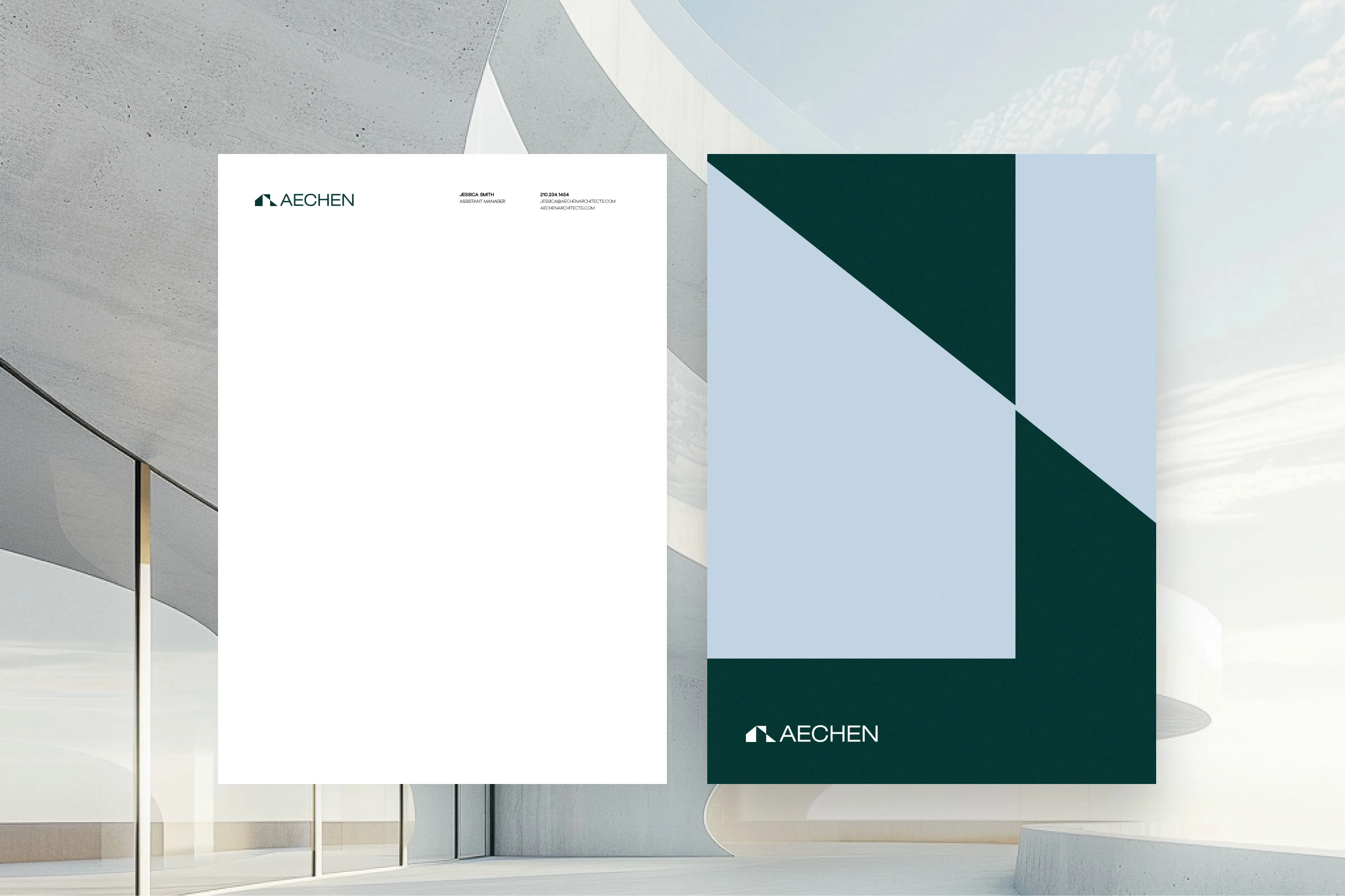
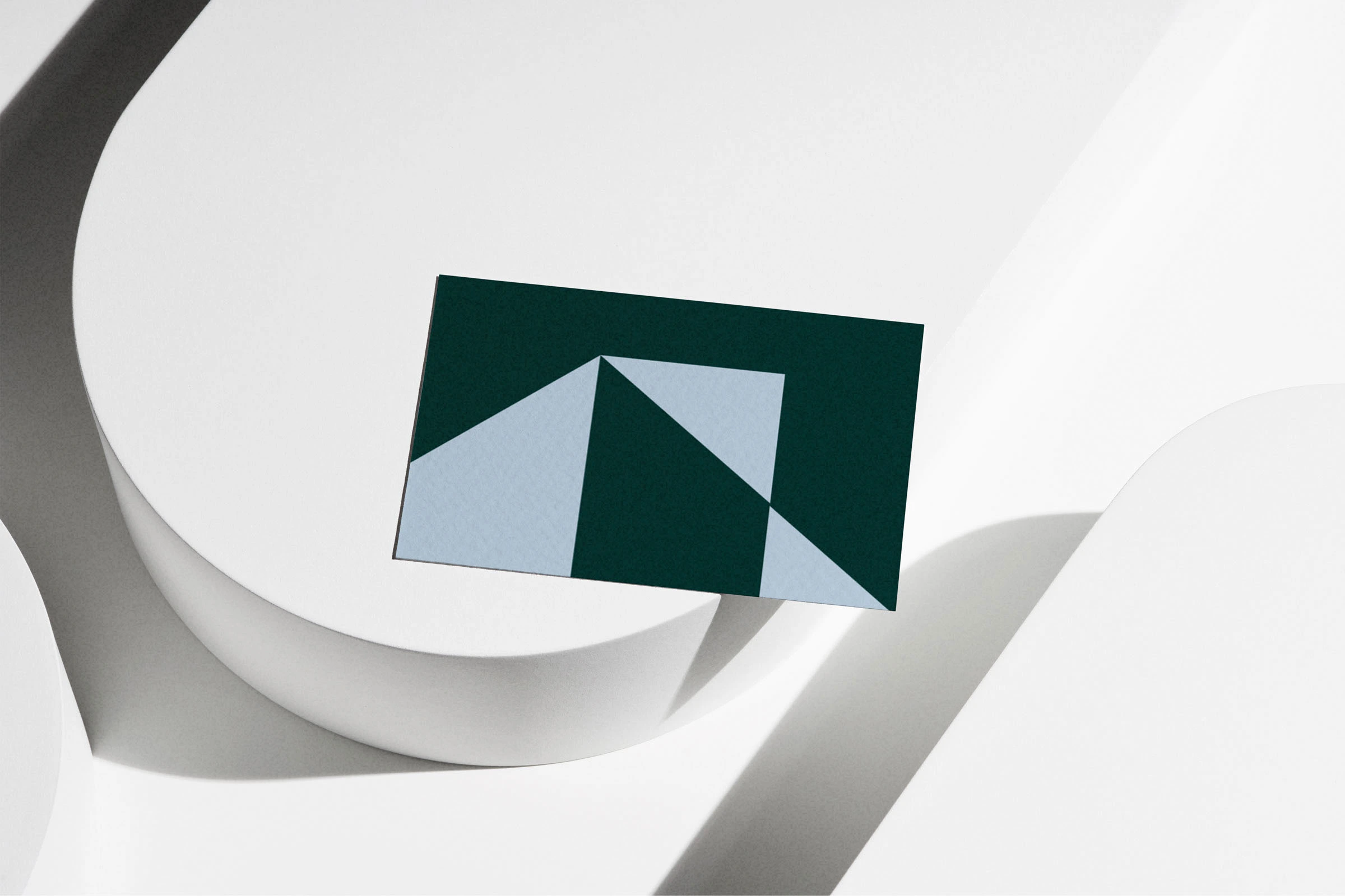
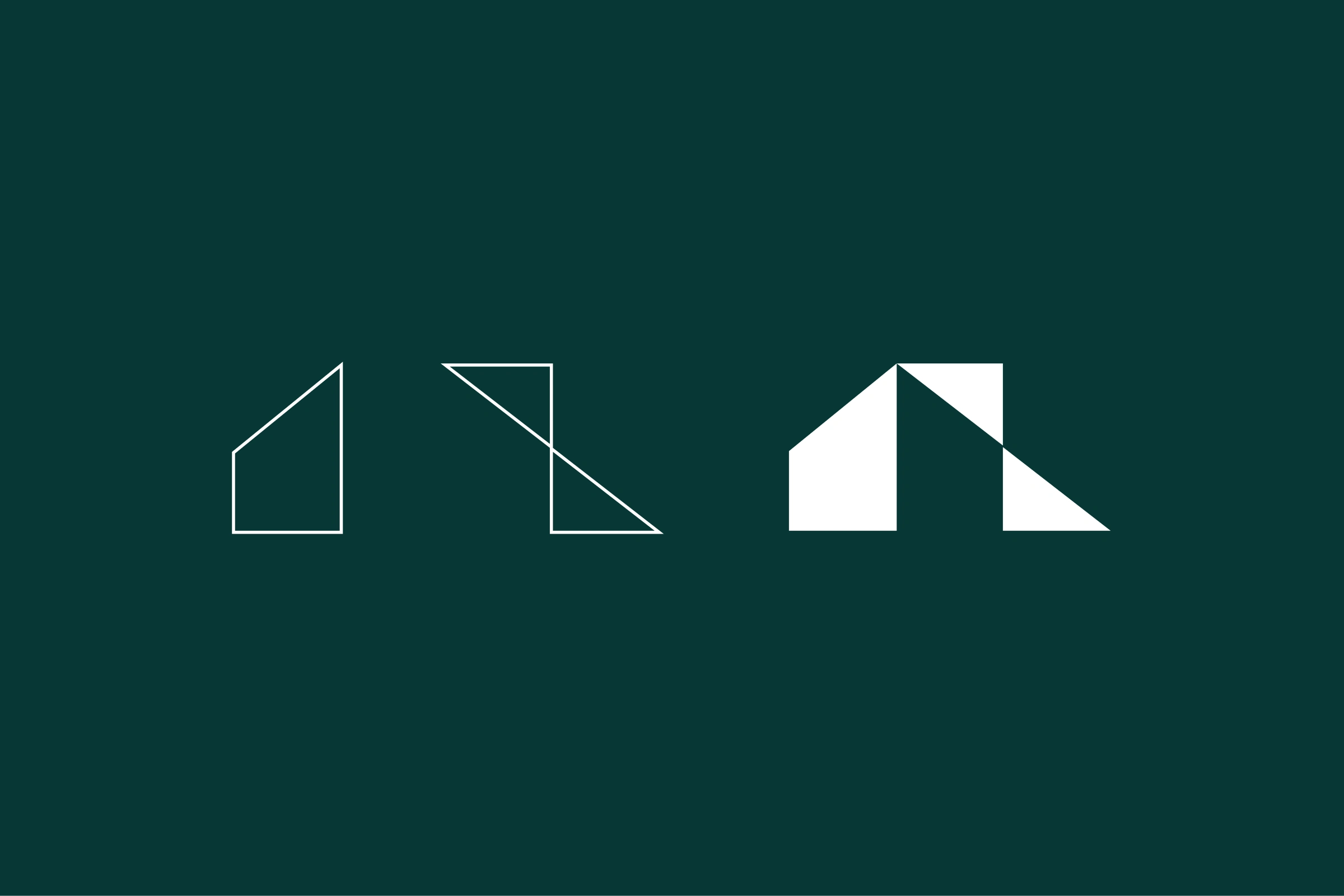
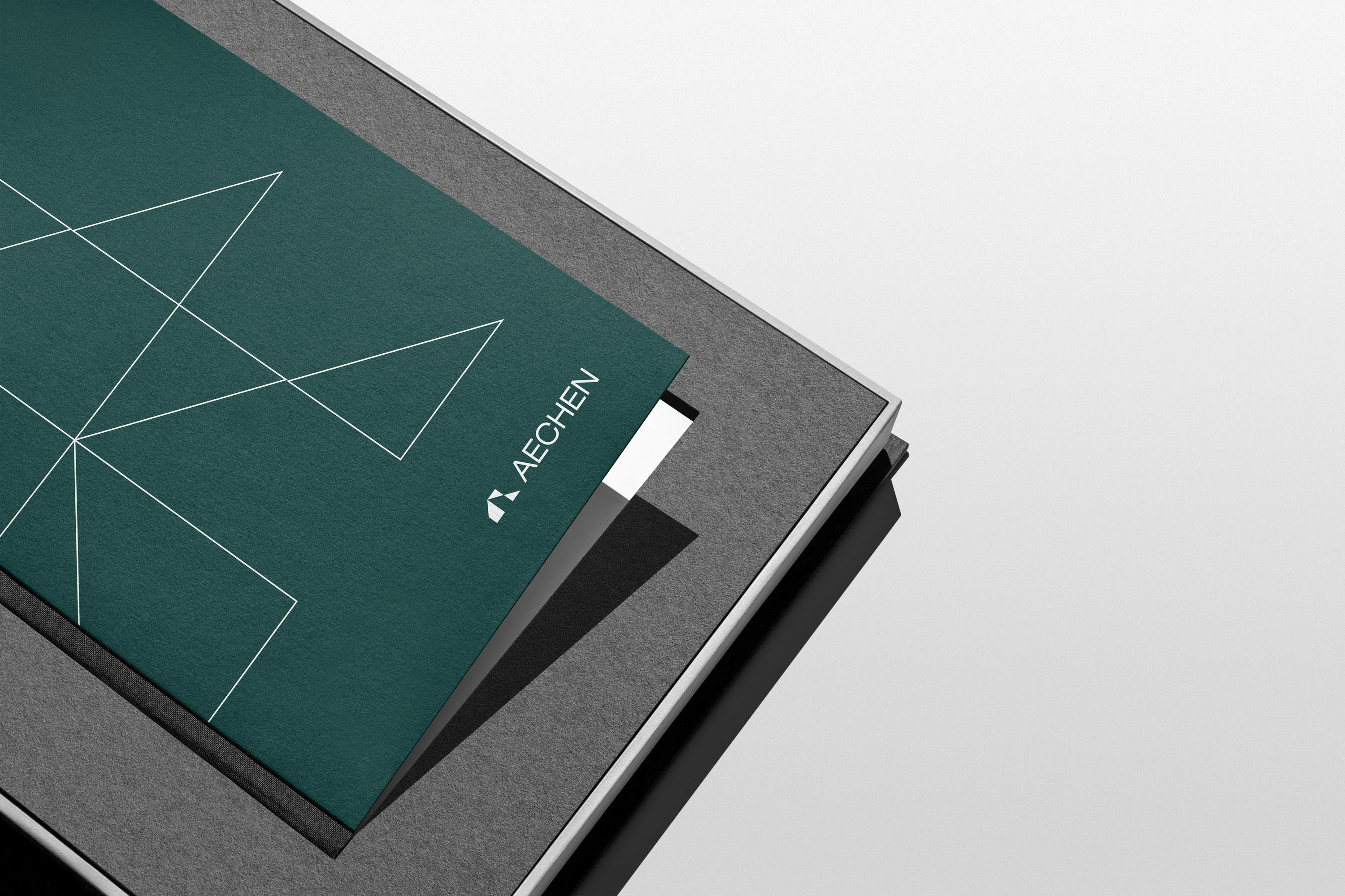
The logo I designed for them was an angular abstract of a building combined with dynamic shapes, specifically tailored to reflect the firm’s commitment to forward movement and innovative design. For the typography, I chose Clash Display, a unique sans serif font with varying thicks and thins, to enhance the brand's distinctive yet approachable nature. I applied this cohesive identity across social media, their website, business cards, and collateral, using abstract modular shape patterns to accentuate the logo and create a visually engaging brand presence.
Like this project
Posted Sep 28, 2024
Branding,Logo Design,Graphic Design

