Oxygen Fitness






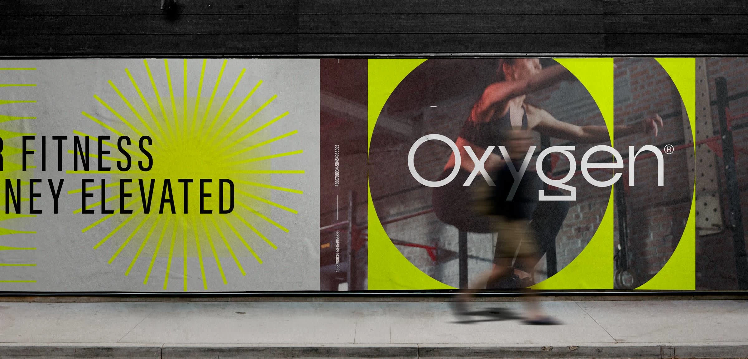
Oxygen Fitness is a fitness brand that strives to provide a high-quality gym experience backed by science and knowledge. The brand's mission is to help customers achieve their fitness goals while learning about the science behind their workouts. The target client for Oxygen Fitness is typically young professionals and established executives who appreciate the science behind fitness and seek more than just a regular gym experience. One of the challenges that Oxygen Fitness faced was to establish a brand identity that would resonate with its target audience and reflect the brand's values. The brand aimed to create an aspirational and futuristic brand identity that would make customers proud to be a member. To achieve this, Oxygen Fitness used the keywords "strong, achiever, futuristic, and intelligent" to guide the brand identity.
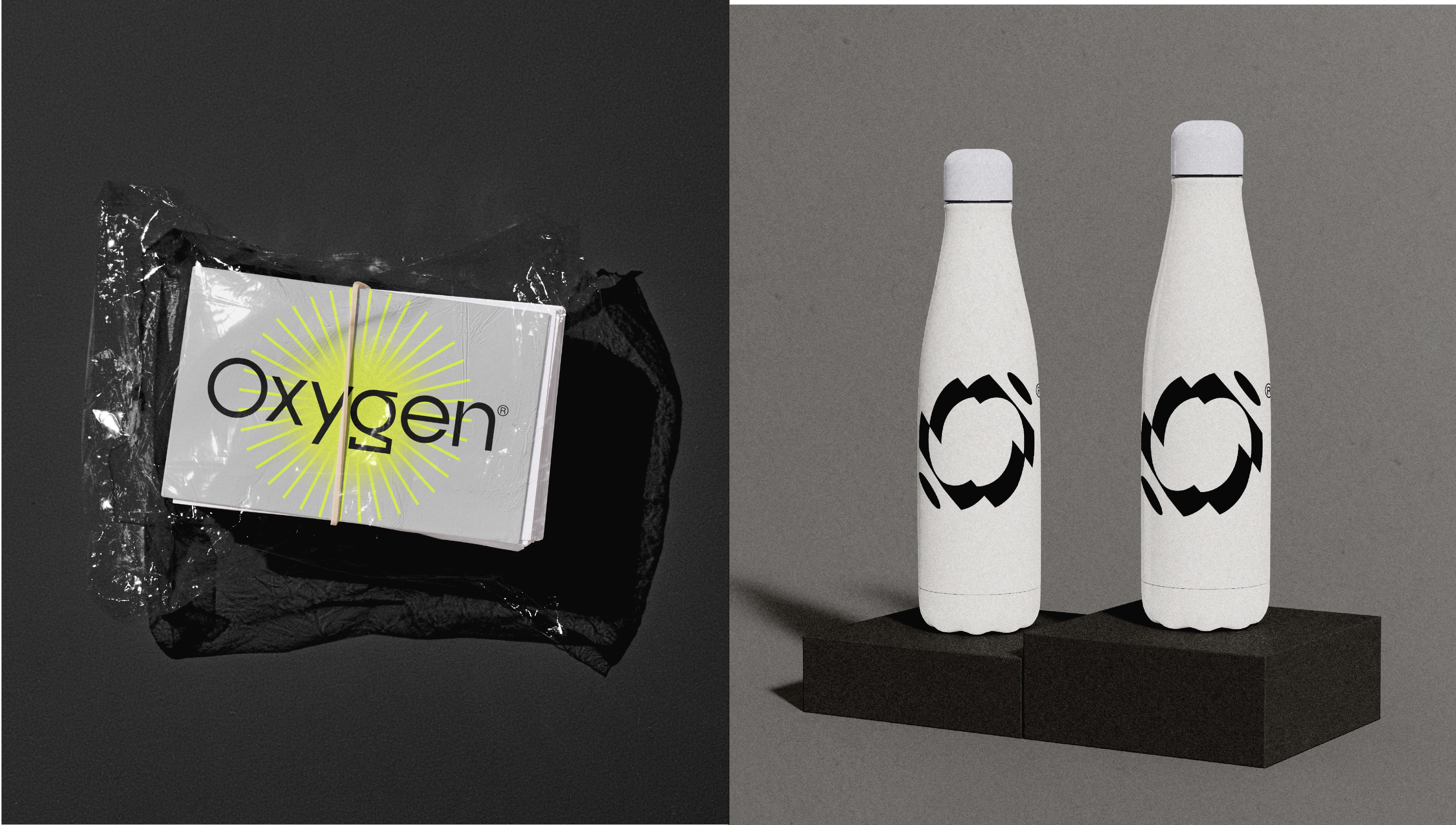
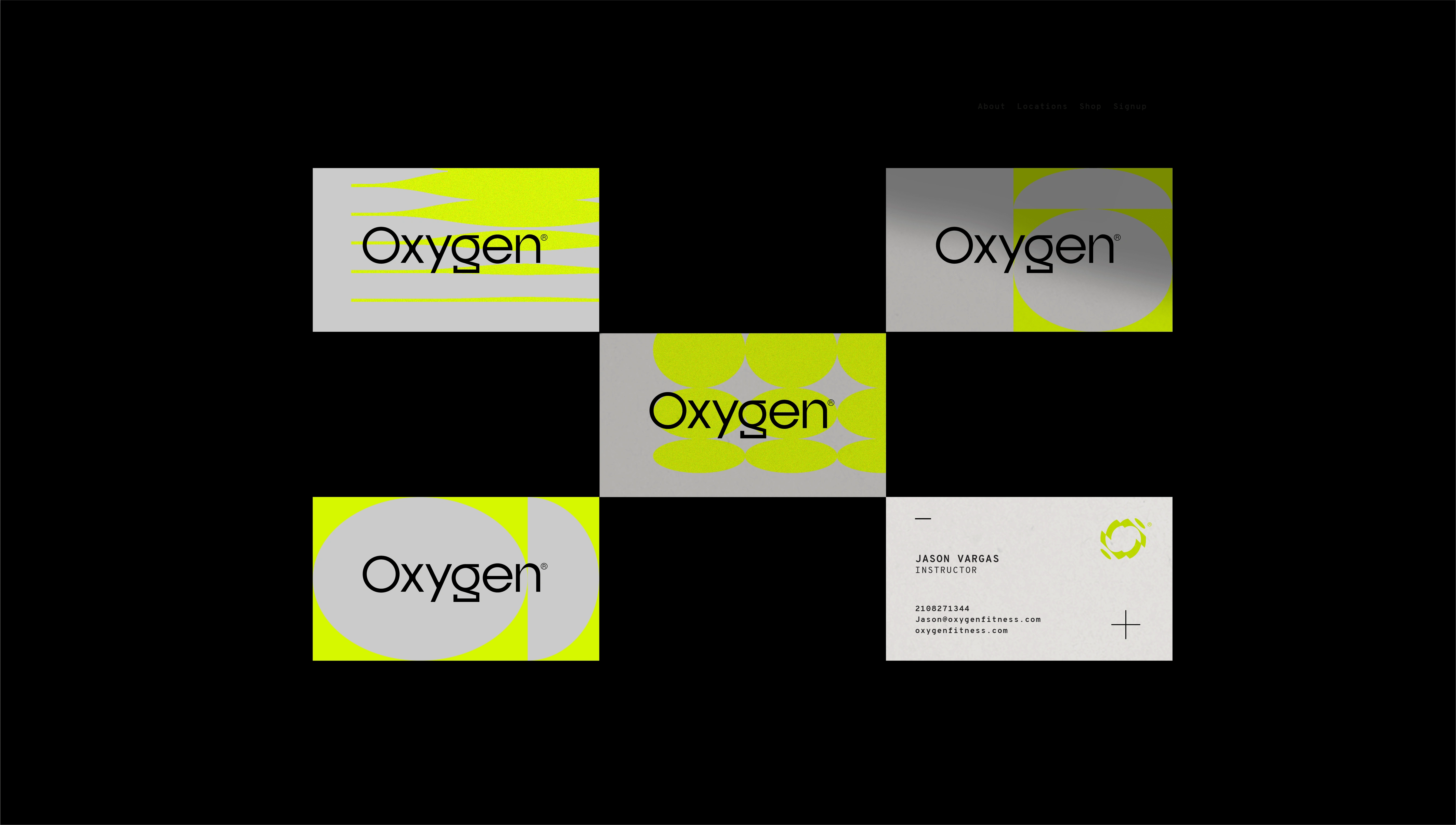
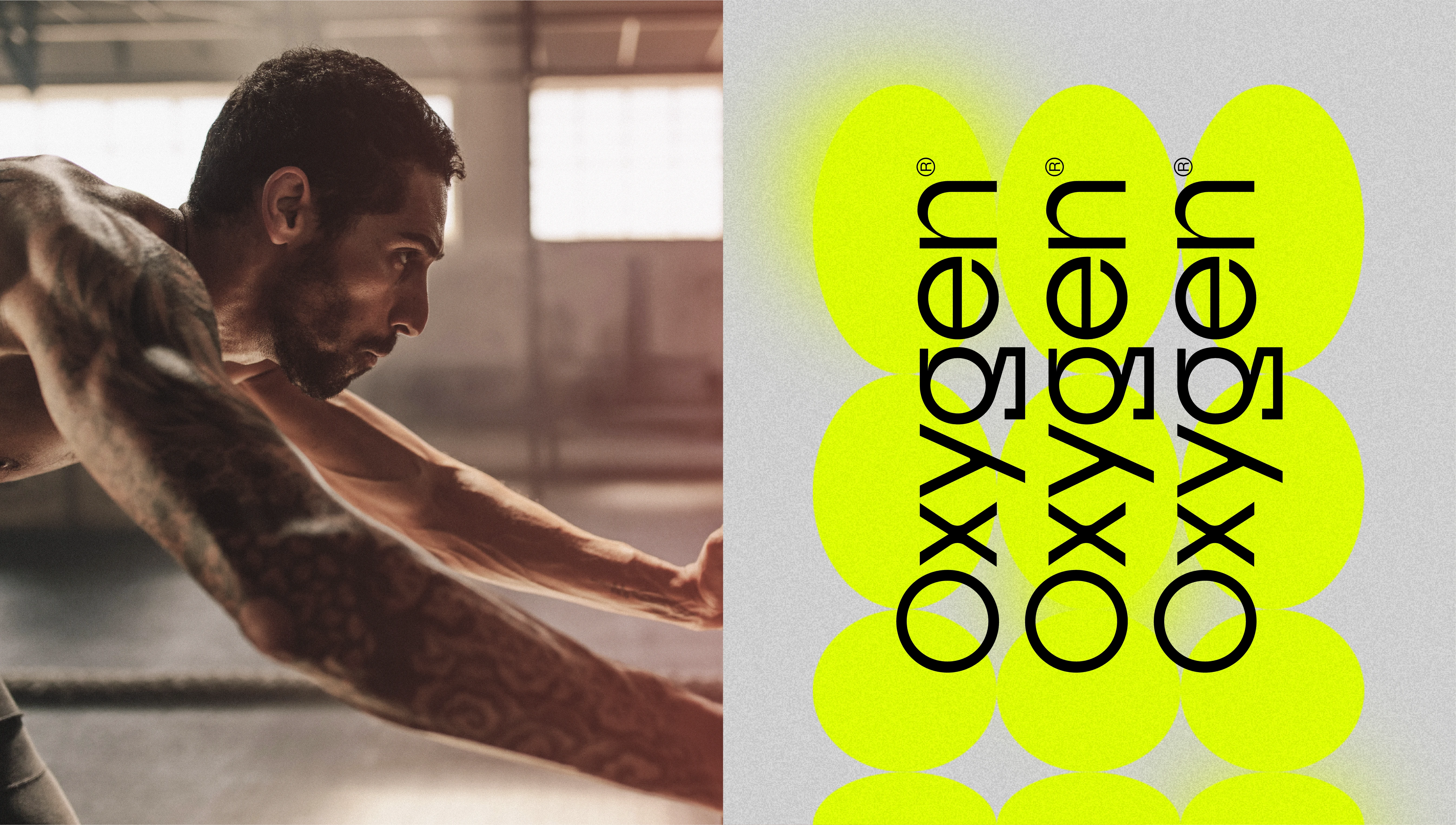
The brand identity for Oxygen Fitness includes a color scheme of neon yellow, cool grey, black, and white, which gives the brand a futuristic and high-end look. The logo mark is an O transforming into different segments, as though it is being analyzed, and has motion to the design. The logotype is a stylized sans serif that complements the logo mark. The font choices are bold, condensed fonts with a mix of monotype. The photography used warm hues of red to contrast the neon yellows and cool grays, and was in motion to capture the energy and dynamism of the workouts.
In conclusion, Oxygen Fitness successfully established a brand identity that reflected its values and resonated with its target audience. The brand's futuristic and high-end look, along with its emphasis on science and knowledge, makes it stand out in the competitive fitness industry. The use of warm photography with red hues added a touch of energy and dynamism to the brand's visual identity. Overall, Oxygen Fitness created an aspirational and futuristic brand identity that aligns with its mission of helping customers achieve their fitness goals while learning about the science behind their workouts.
Like this project
Posted May 24, 2023
Oxygen Fitness is a fitness brand that strives to provide a high-quality gym experience backed by science and knowledge. The brand's mission is to help customer

