Heni: Açaí Brand Identity (Art Direction)

Mateus Franzé


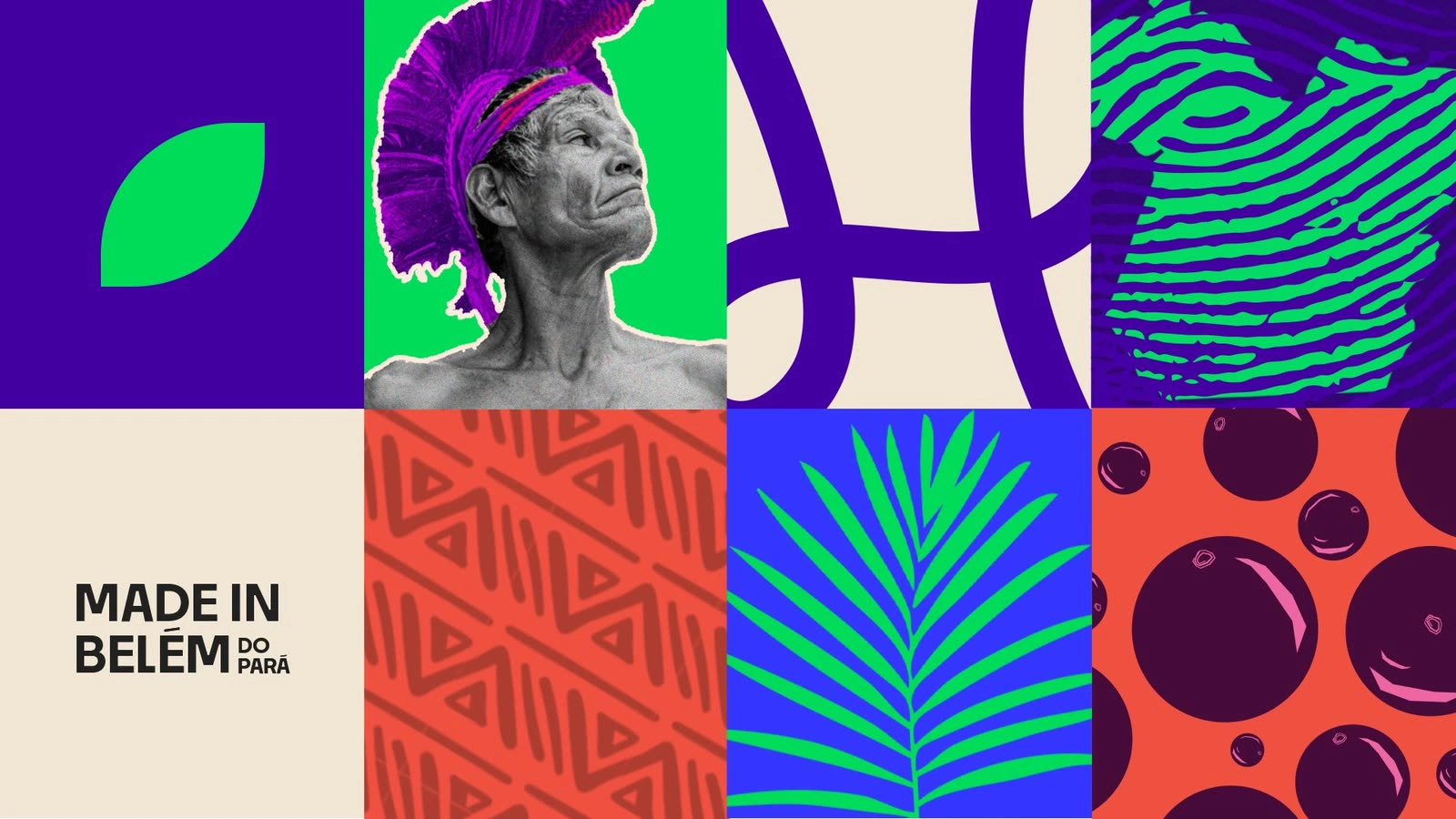
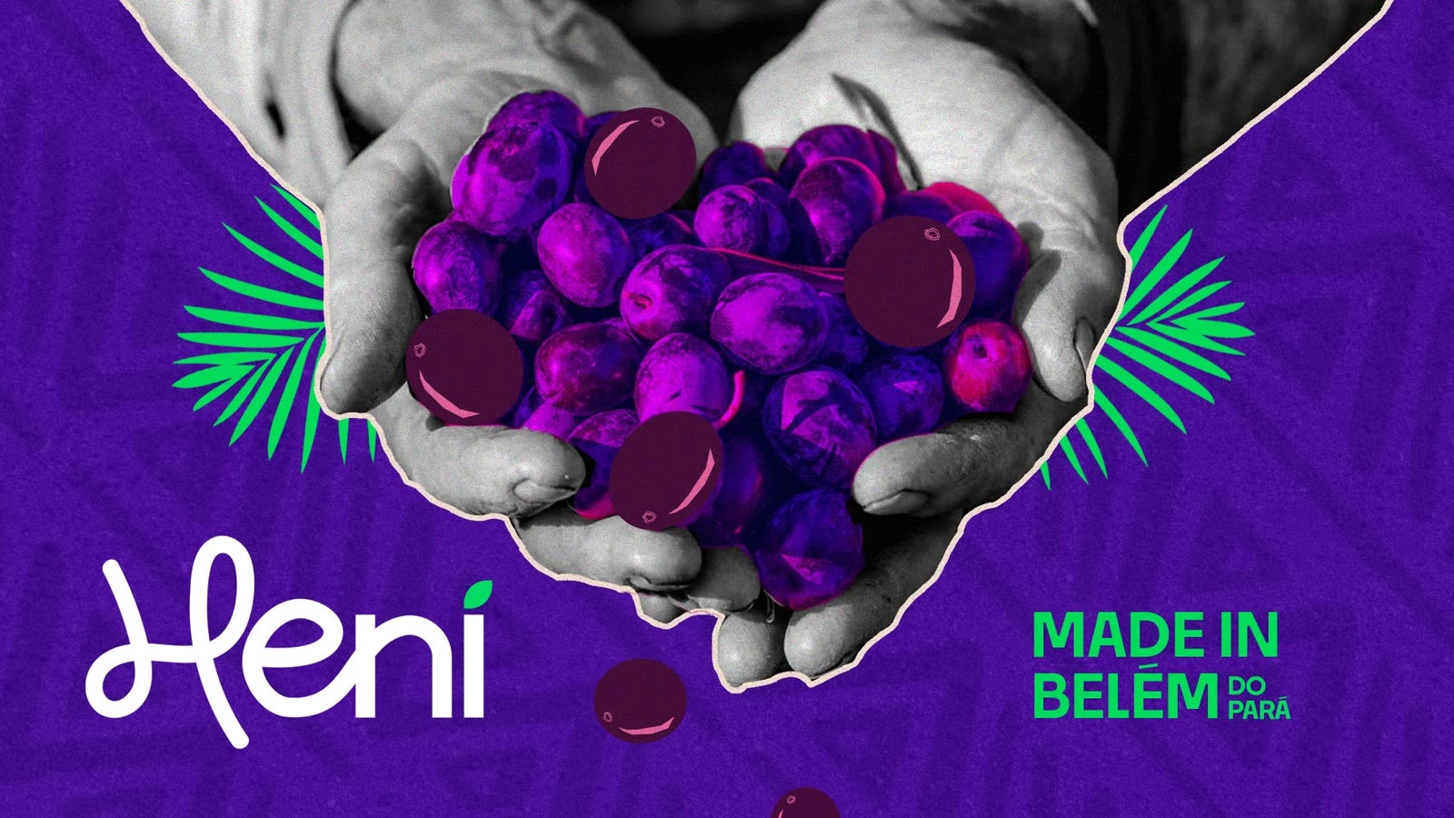
Heni is a regional açaí producer that takes the original fruit of the Brazilian North to the rest of the country. Art direction by Mateus Franzé; brand identity designed by Mateus Belchior.
The brief
Use the codes people already link to açaí, so the category reads at a glance, and still stand apart on a shelf full of look-alike labels.
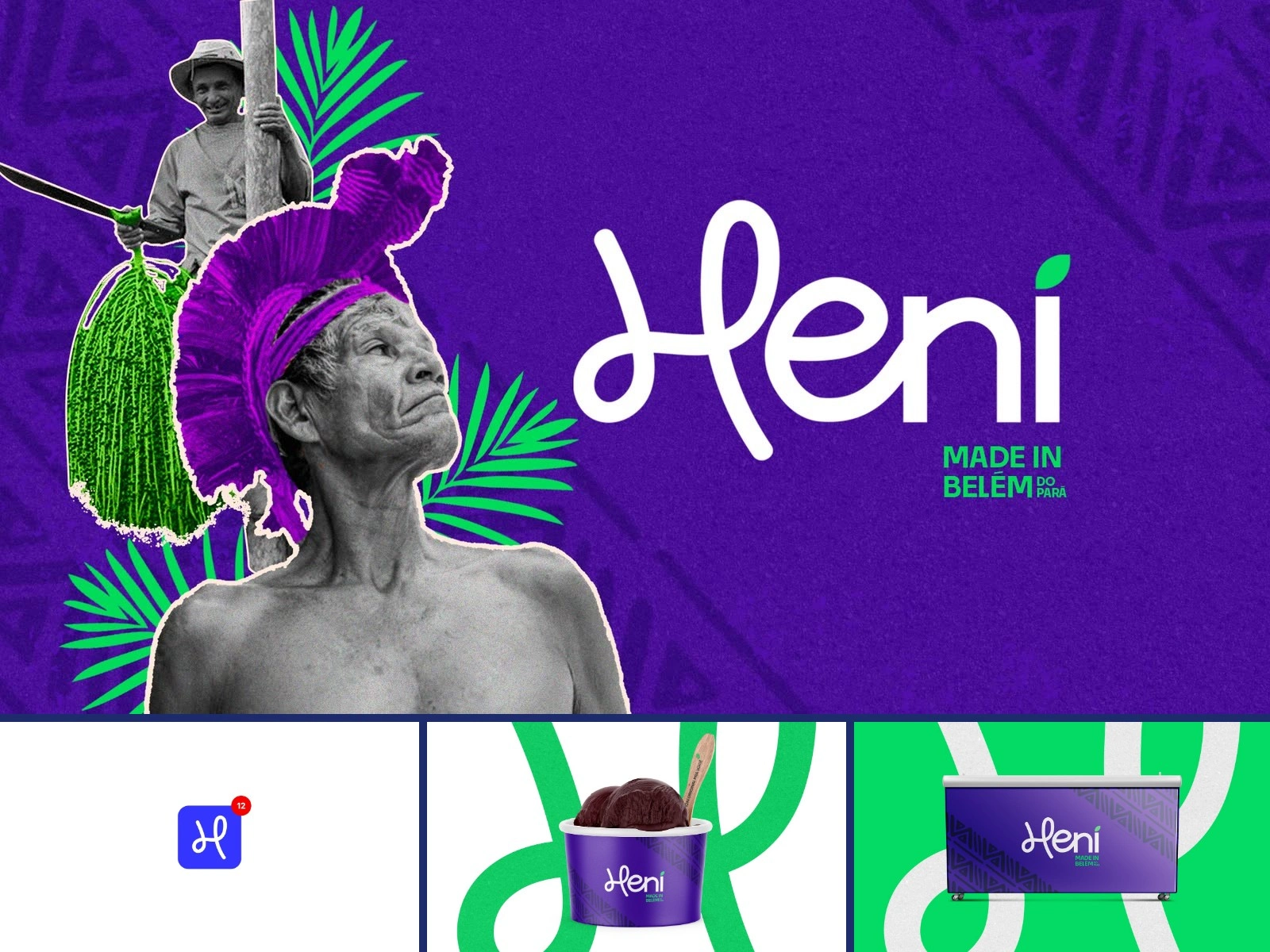

Blue, where everyone else is purple
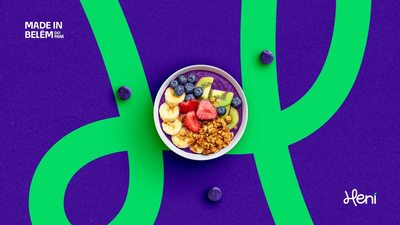
Royal blue leads the palette, taken from the flag of Belém. Purple stays as a complement, so the product still speaks the language of açaí.
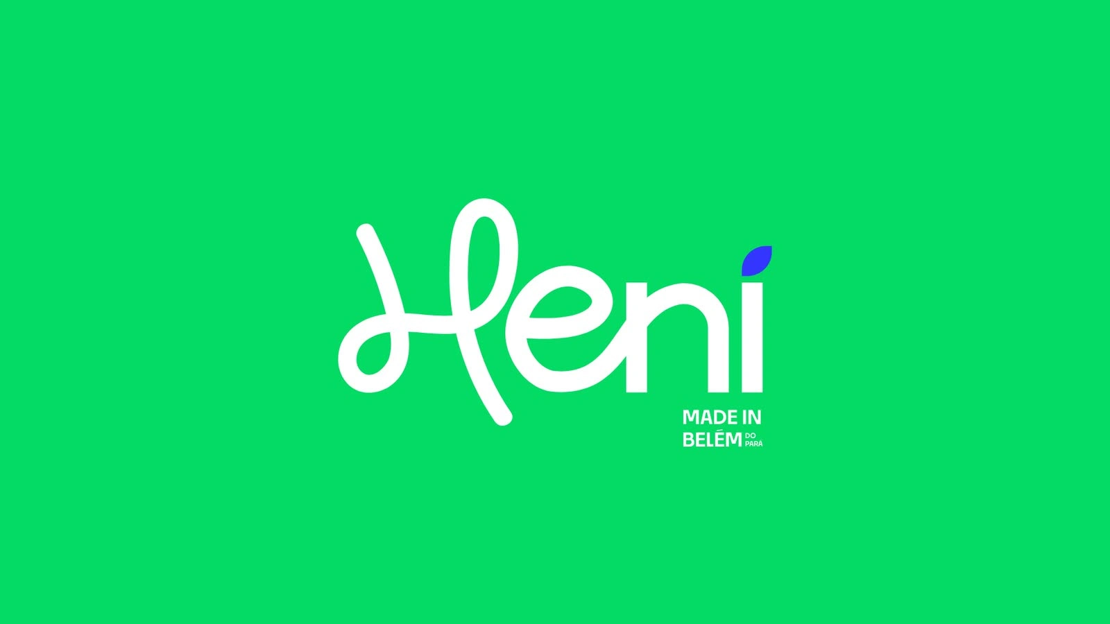
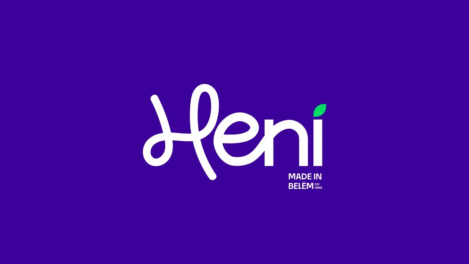
One letter, drawn by hand
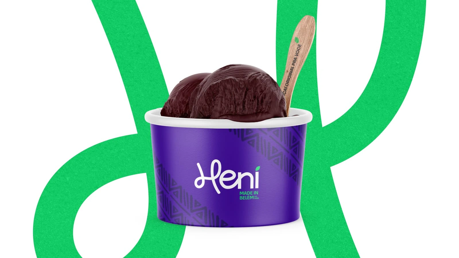
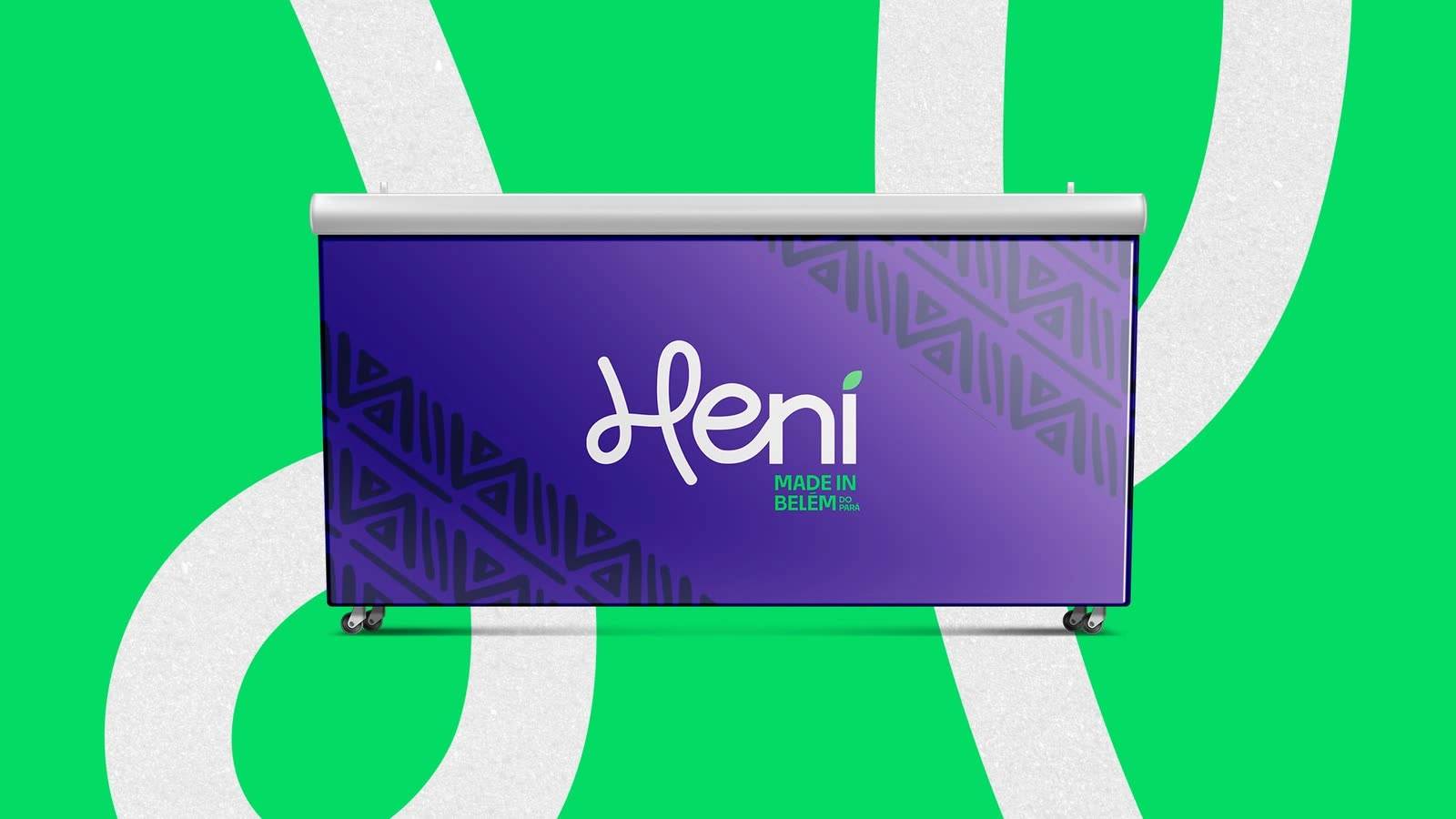
The symbol is an H drawn only for Heni, and the whole logotype is lettered by hand. It stands alone where the name does not fit, like an app icon or a seal.

Like this project
Posted Oct 15, 2026
Art direction of a brand for a regional açaí producer from Belém. Blue where everyone else is purple. Identity designed by Mateus Belchior.