
JPB is a construction and real estate company. The challenge was to turn solidity, trust and a vision of the future into an identity just as strong on the job site as at a launch.
An engineered brand
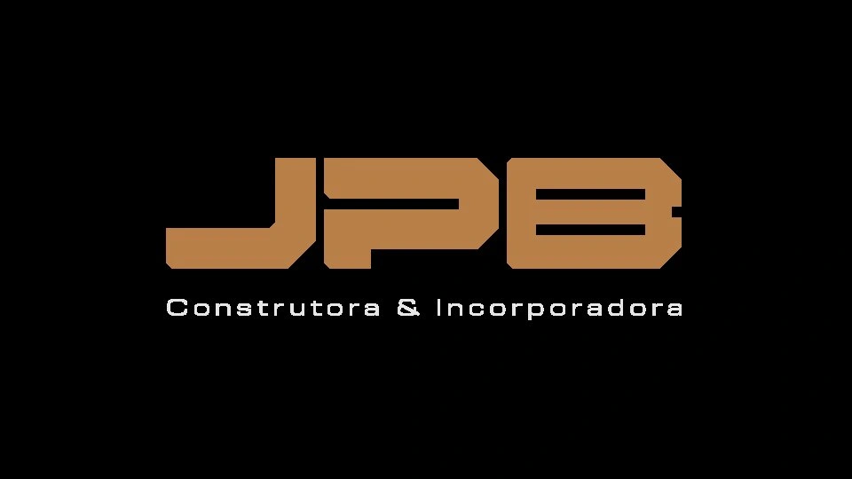
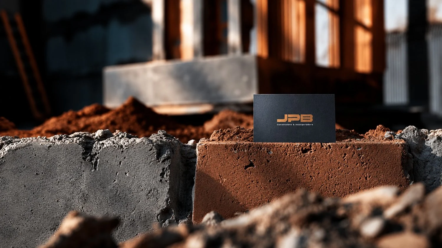
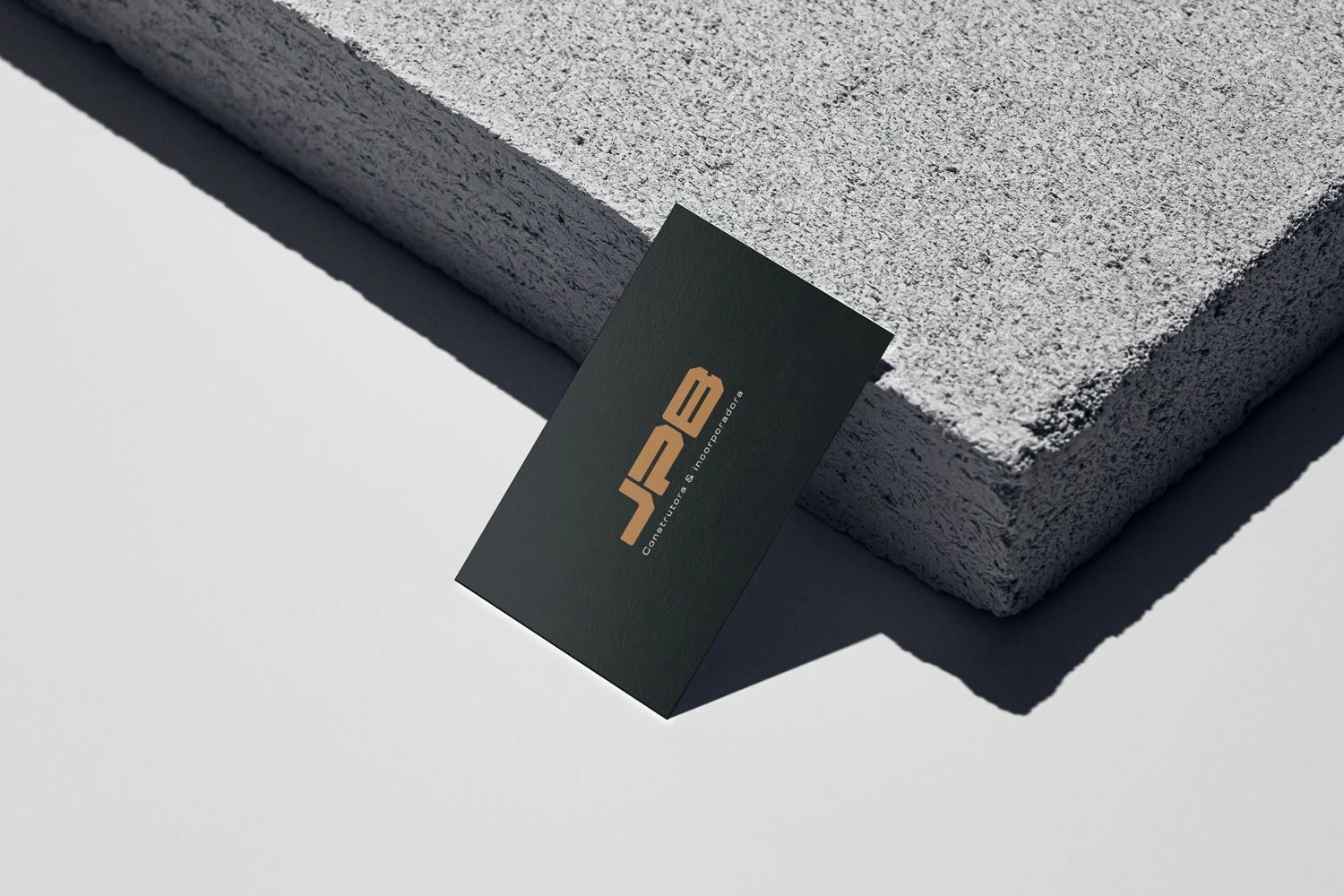
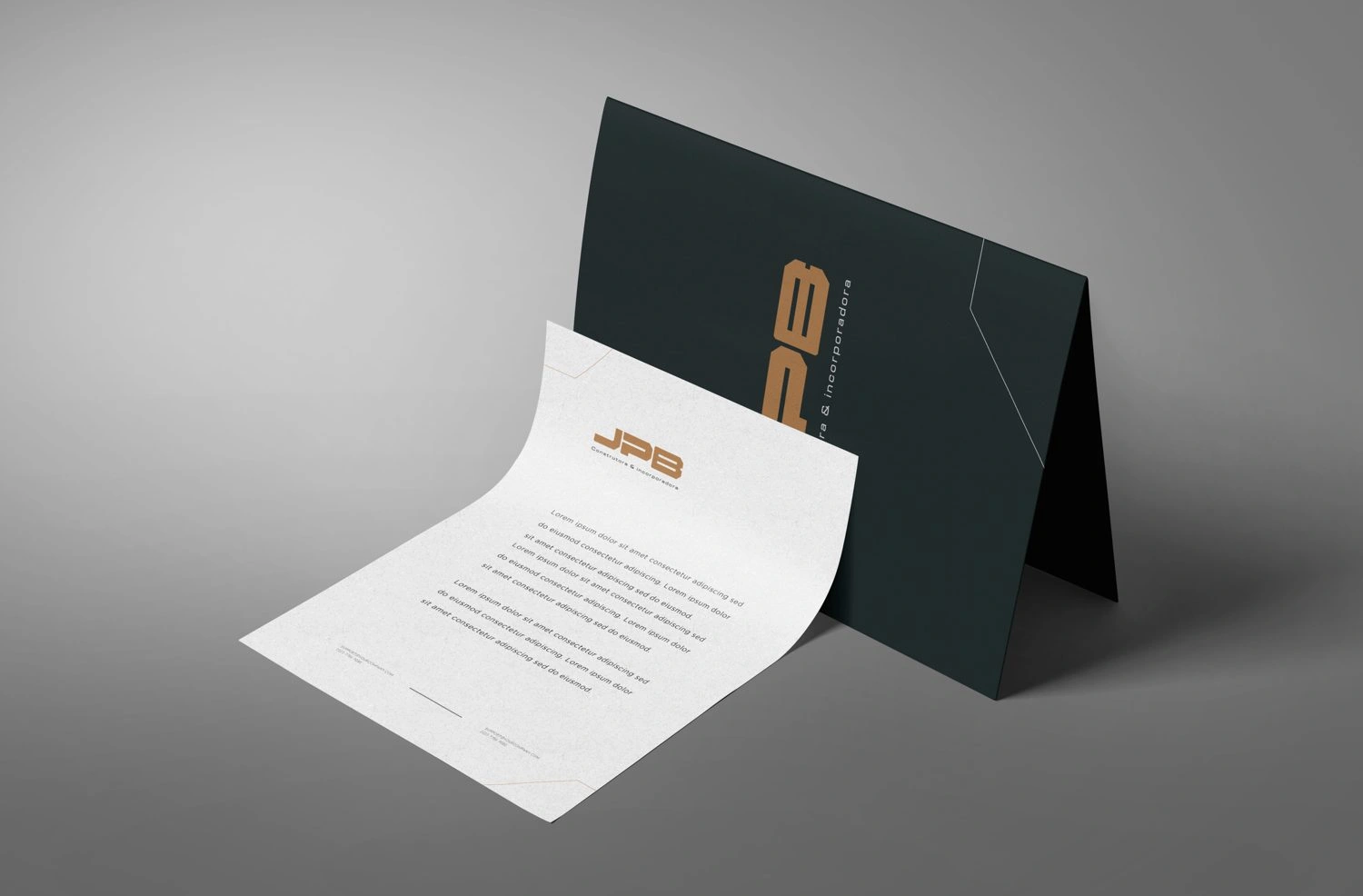
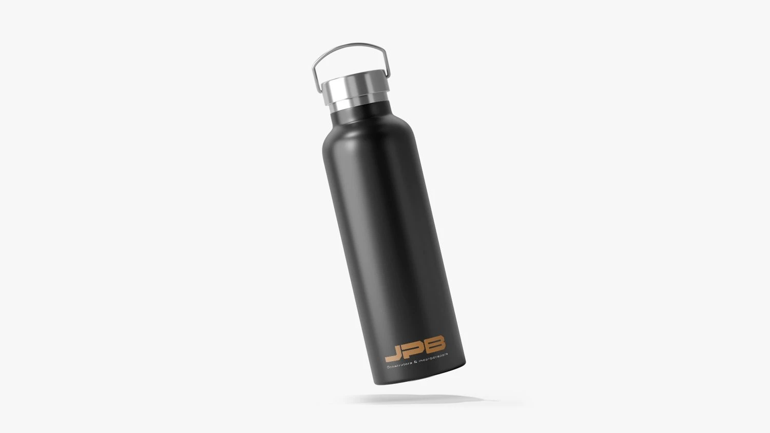
The logo comes from typographic engineering: solid blocks, precise angles and calculated gaps. Copper brings warmth and the tone of metal; petrol graphite brings authority. Far from the construction orange cliché.
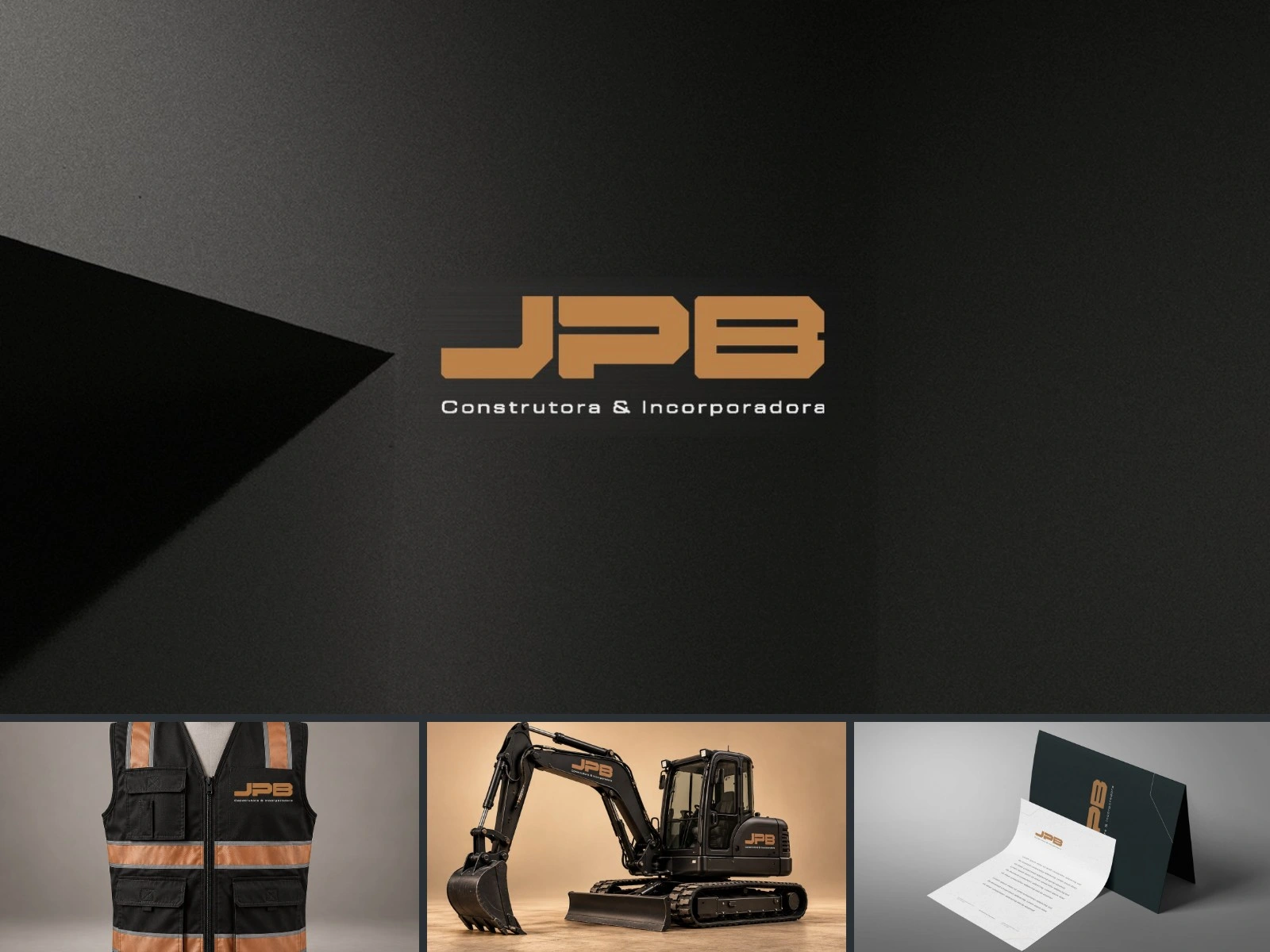
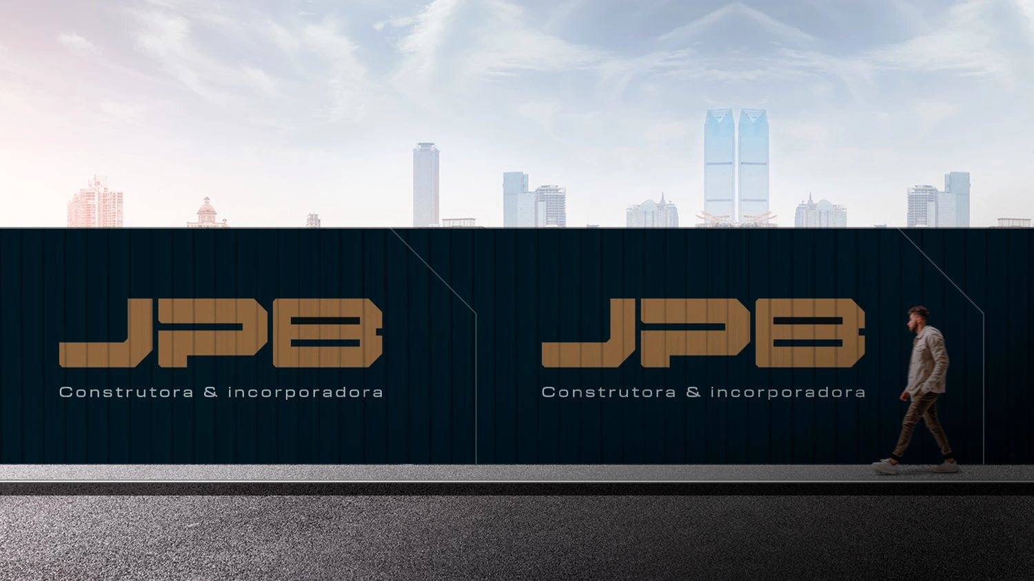
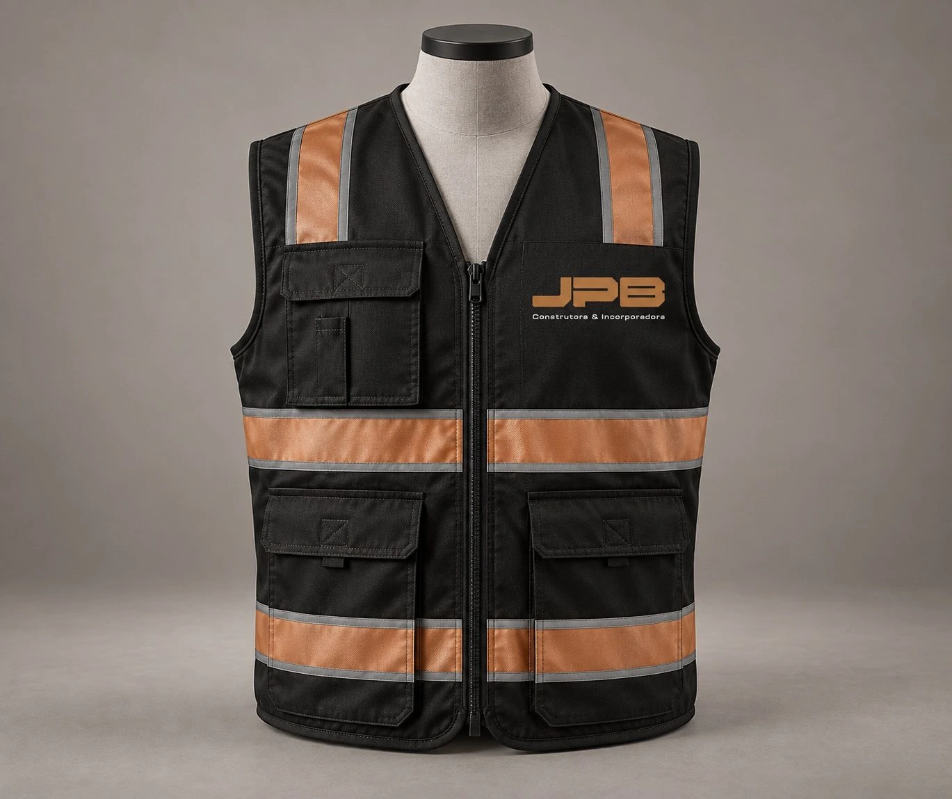
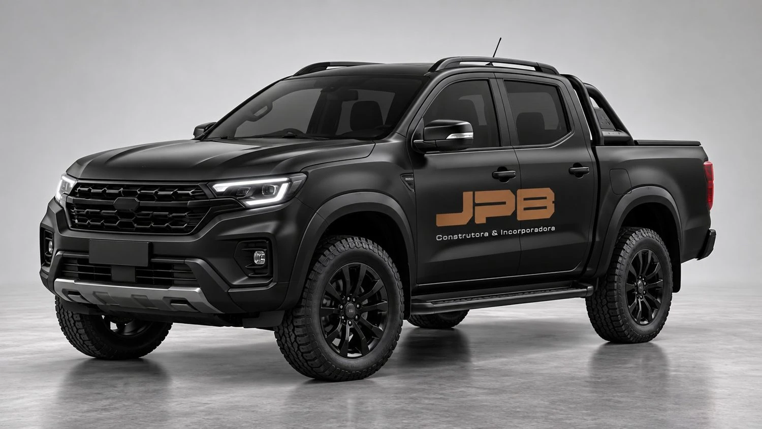
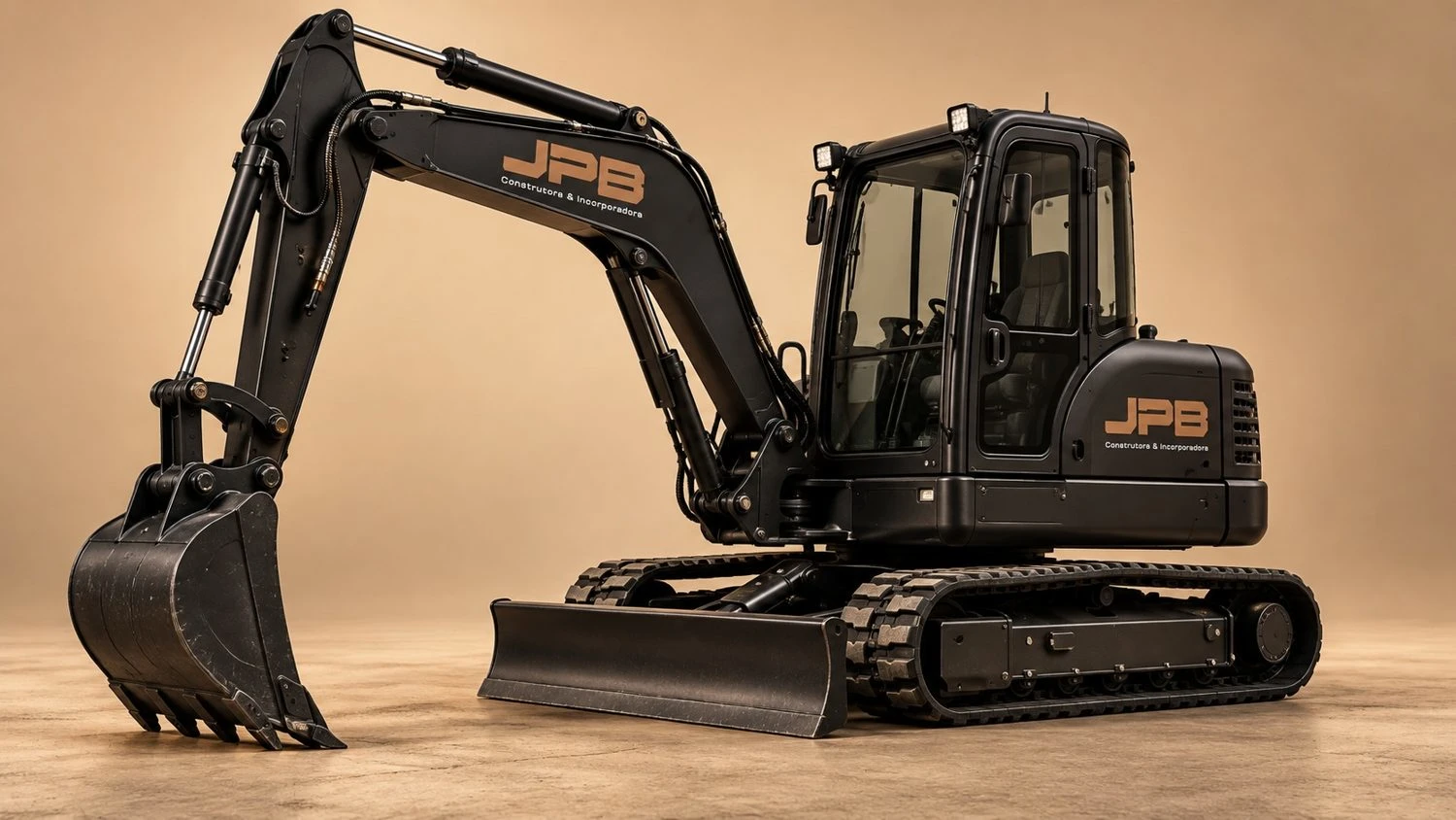
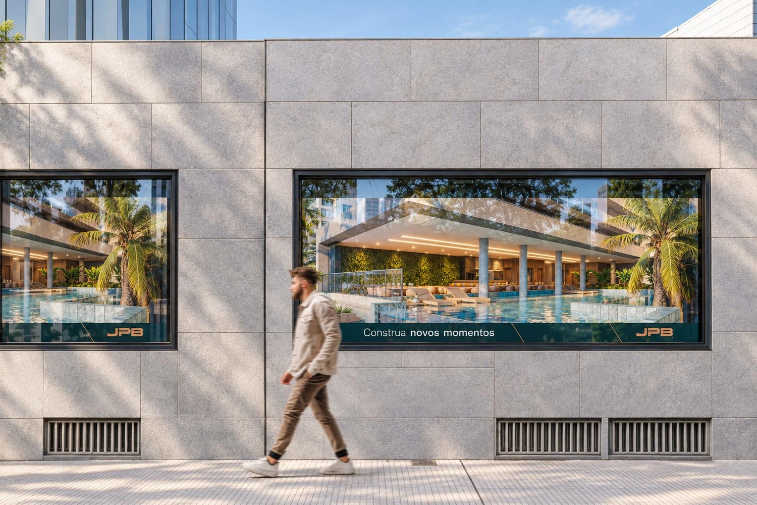
From the job site to the launch
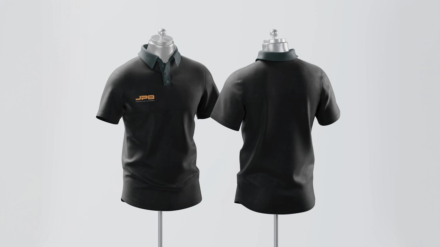
Signage, fleet, uniforms and stationery.
1 like · 8 views · Oct 5, 2026
Brand identity for a construction and development company, built for the job site and the launch alike.


