The Zenith Home
Natalya Ren
Zenith Visual Identity
The Zenith Home is a home décor & lifestyle brand founded in London in 2024 by the Douglas family. With the intention to evoke calm into your everyday.
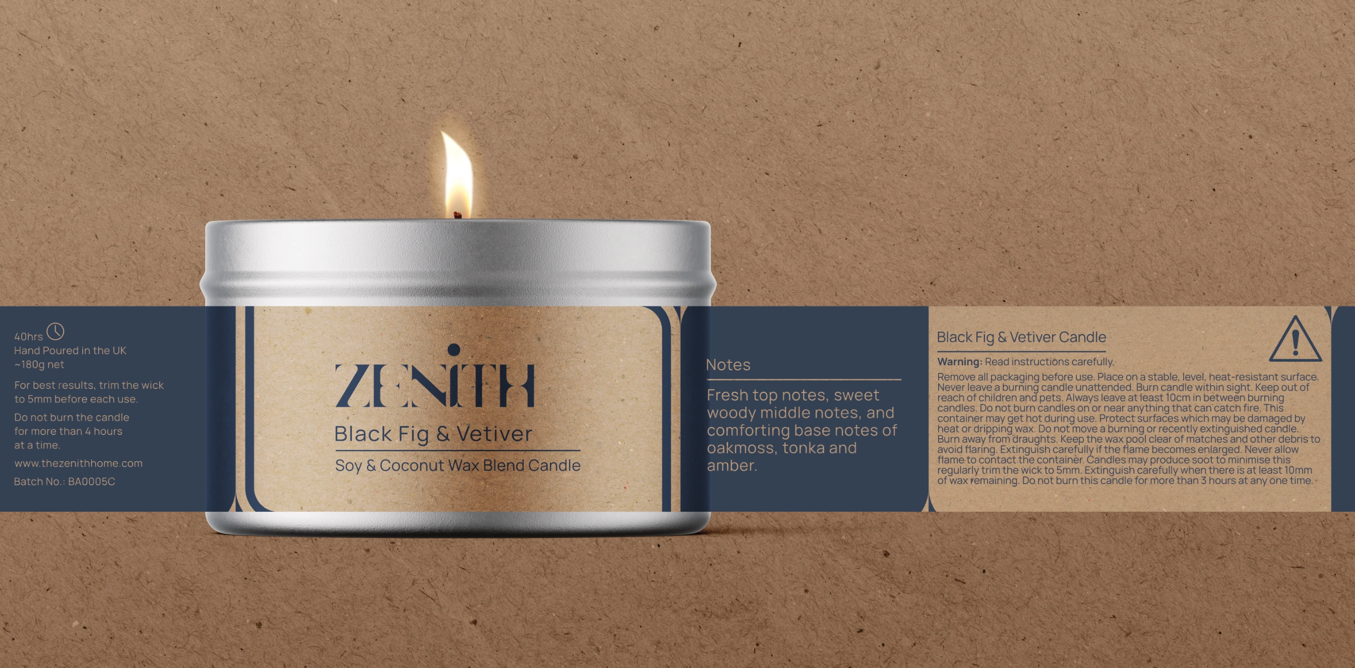
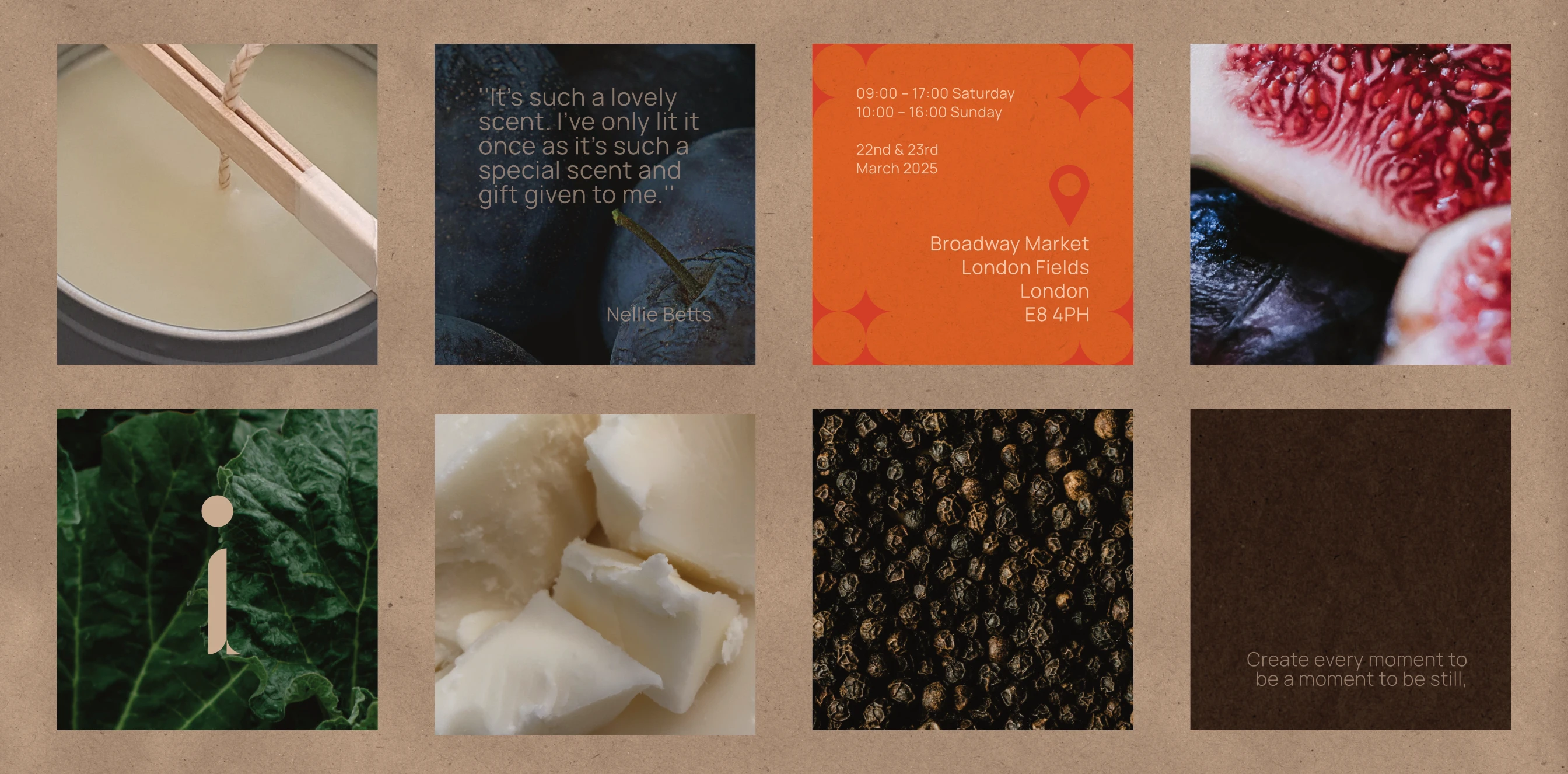
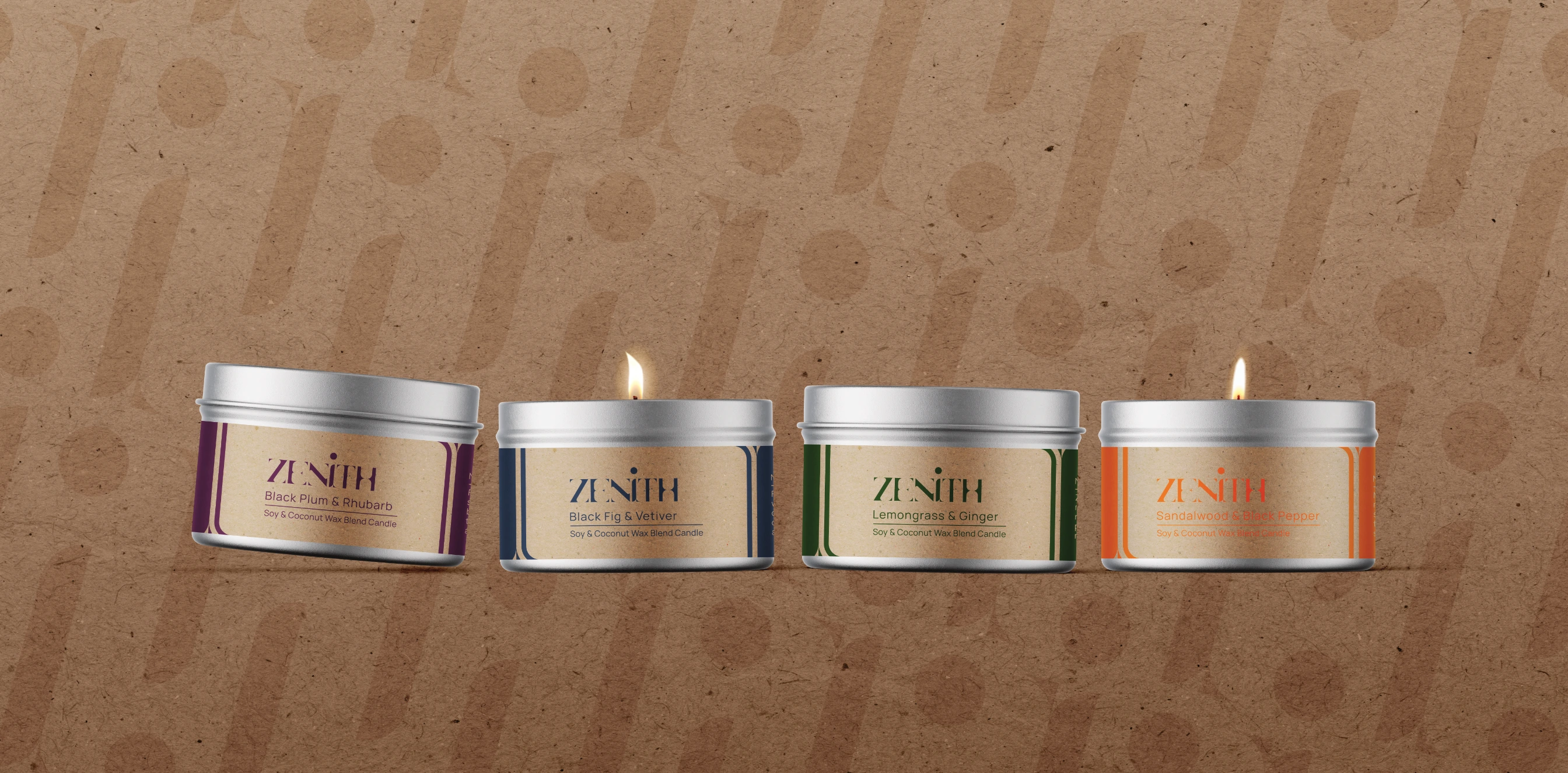
Zenith hand-creates and develops a range of fragranced candles, body care and home accessories. Harmoniously using considered materials, colours, form and fragrance to elicit moments of stillness in your day.
They believe that through the little things in your everyday, we can develop meaningful experiences.

Challenge:
To define Zeniths’ brand in the homeware market, whilst allowing a variety of visual variations through packaging, labels, and marketing to use where most appropriate.
Approach:
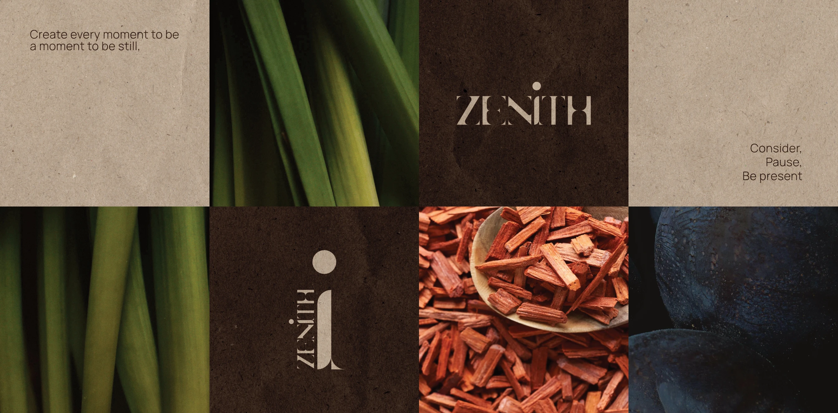
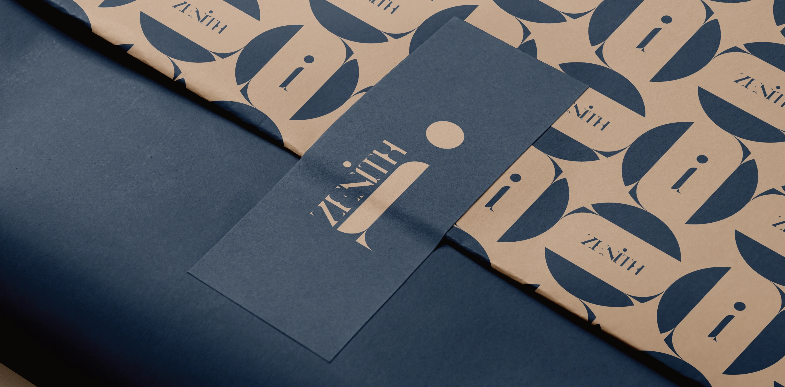
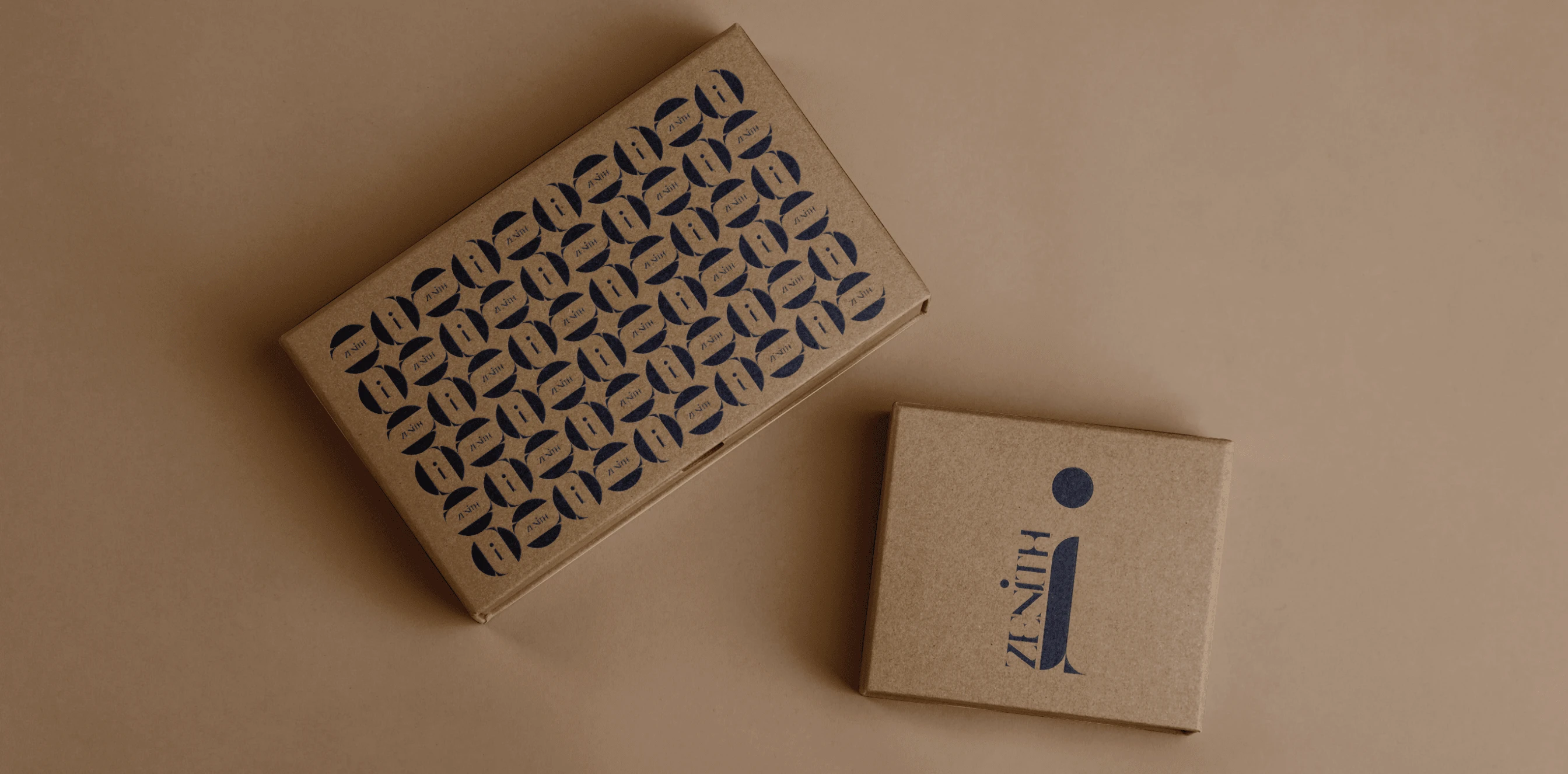
Having a motif throughout the branding creates this consistent, cohesive, yet distinctive design that can be adapted to different shapes, colours and materials whilst maintaining the brand recognition.

Solution:
The custom typeface is a modern sans serif font with smooth curves and high contrast, keeping the tone fresh and new, yet refined.
The ‘i’ icon refers to the original idea of the start of the brand - exclusively with candles - which expanded into home accessories at a later point. It is a clear bold icon to use as an identifying mark for the brand, and the curves of the ‘i’ create the recurring motif solidifying the brand identity with consumers.


Like this project
Posted Oct 28, 2024
Creating Zeniths’ brand identity in the homeware market, whilst allowing a variety of visual variations through packaging, labels, and marketing.
Likes
0
Views
12