Redefining Compact UX: A Fresh Look at Smartwatch Design
Breaking Boundaries in Smartwatch Design: UX for the Modern Wrist
In this design exploration, I tackled the unique challenges of smartwatch interfaces, reimagining user interactions to create an intuitive experience on compact screens. By embracing yellow—an unconventional choice for primary branding—I proved that, with thoughtful design, any color can enhance usability and aesthetic appeal. This project redefines smartwatch UX with a bold approach to color and a focus on minimal, user-friendly interactions.
See more of this project and others here :)
Color Experimentation:
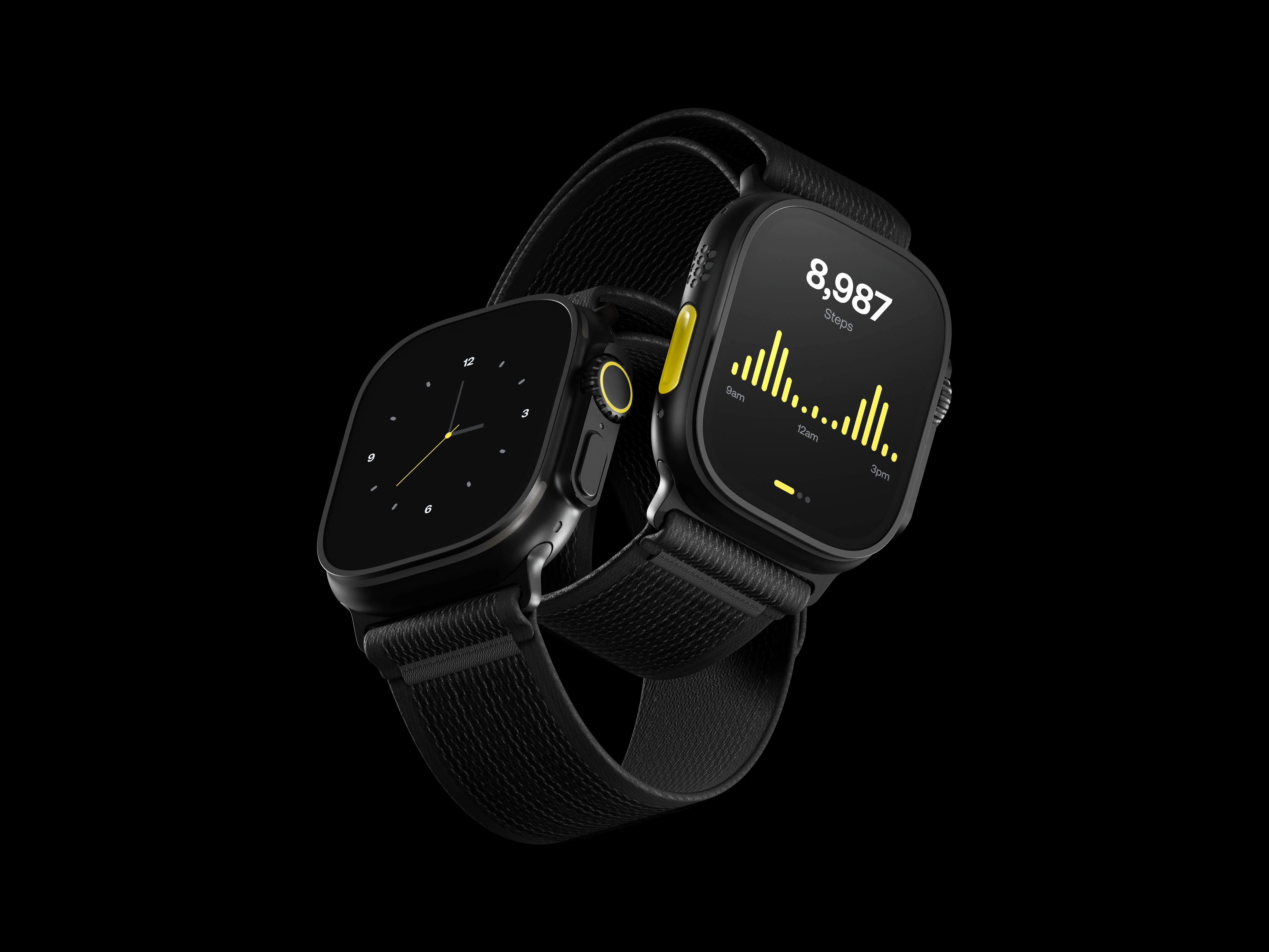
I chose yellow for the UI, a color widely considered one of the worst for digital design due to its poor readability in many shades. However, I believe that the real issue lies in the selection of inappropriate tones and the attempt to use it in the same way as other colors. By carefully curating the shades of yellow and using them purposefully, I believe it can work well, even enhancing the overall aesthetic when applied thoughtfully.
UX Optimization for Small Screens:
Smart watches are inherently limited by their small interfaces, and expecting users to engage in complex interactions, such as scrolling or navigating menus, is impractical. My goal was to create a UI that is minimal and functional, delivering only the essential information at the right moment with zero distractions. The design avoids over-complicating the user experience, acknowledging that the smart watch should serve as a quick, glanceable tool rather than a phone-like device.
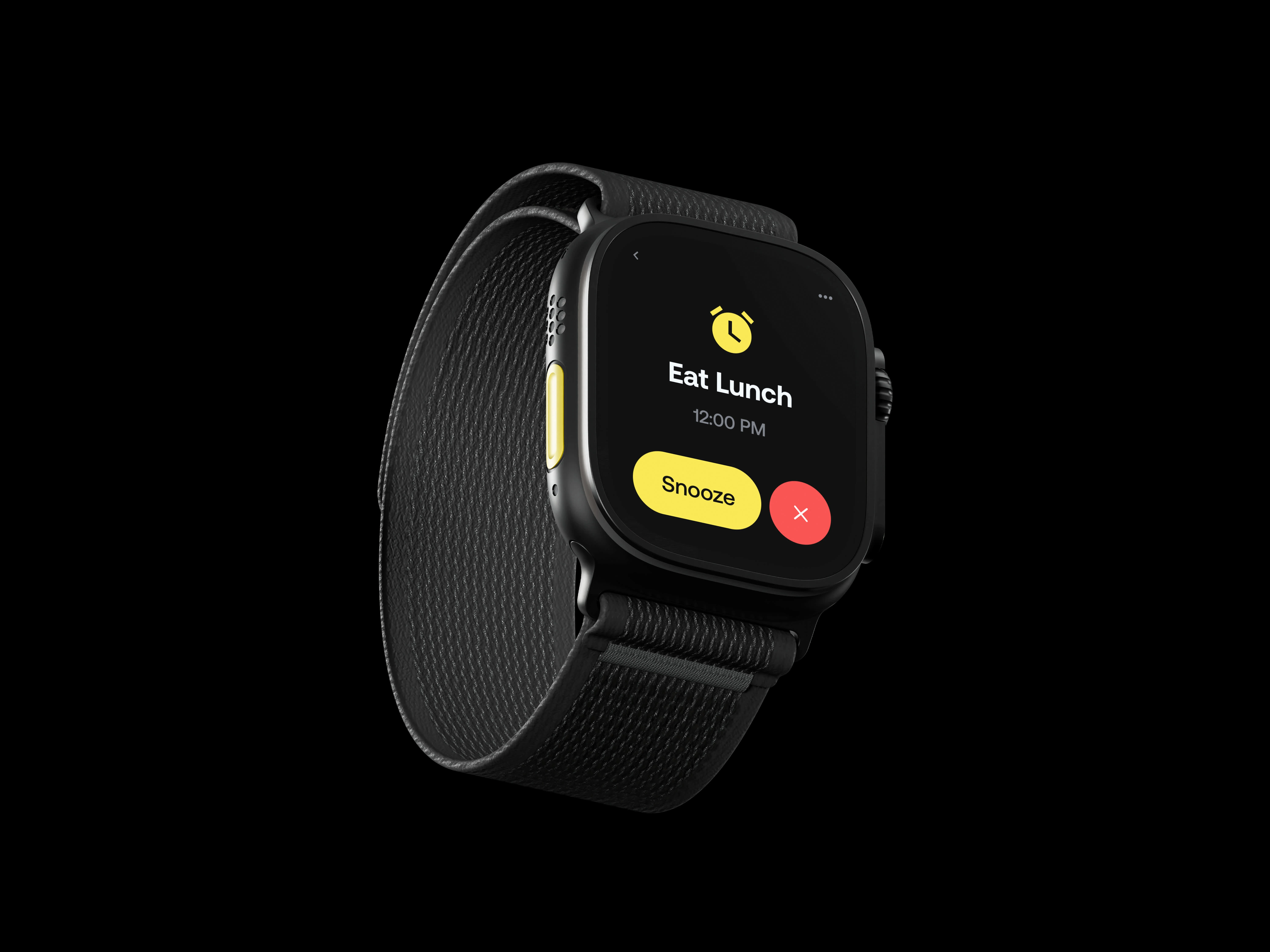
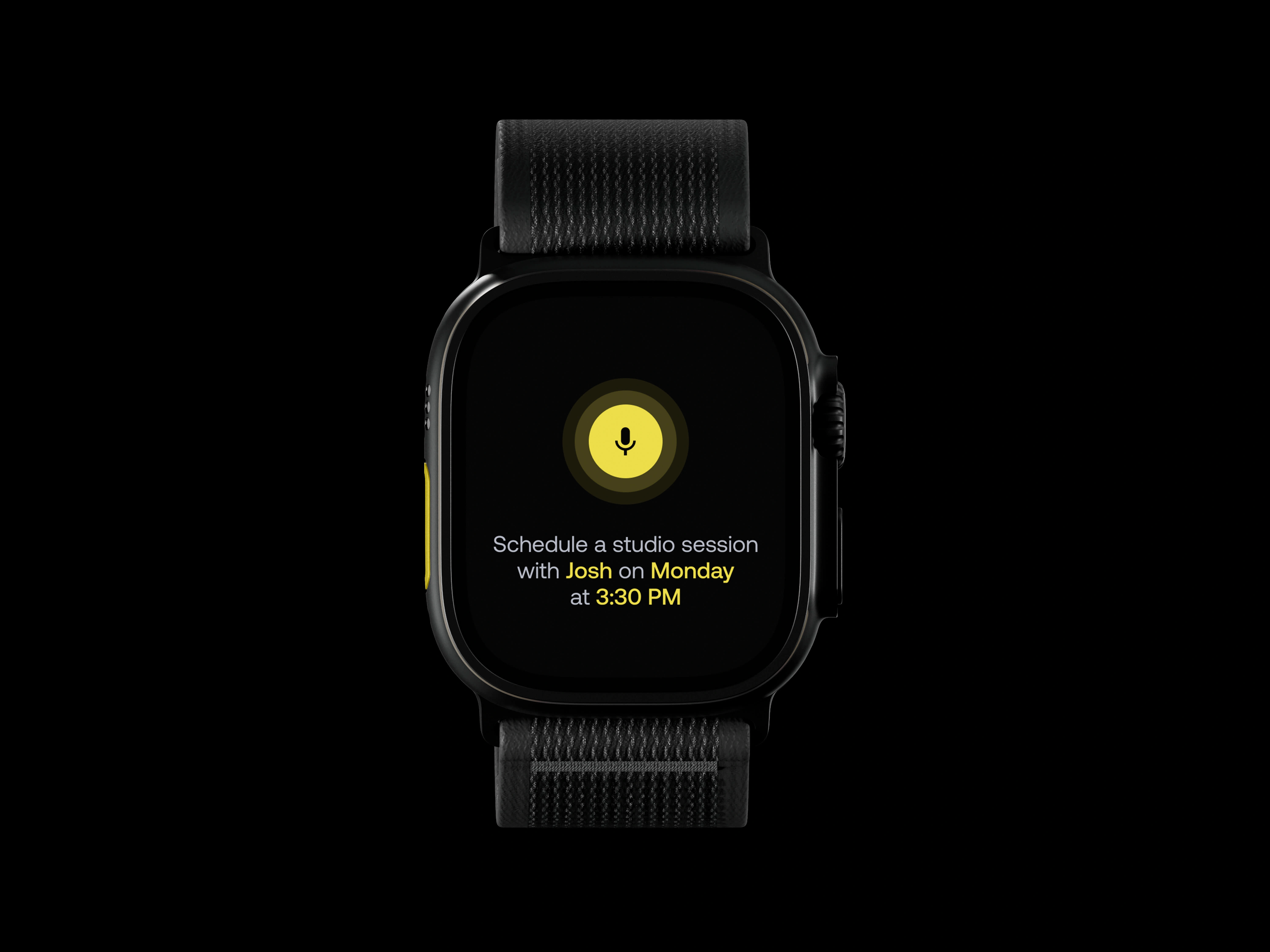
This exploration offered insights into the power of color and the necessity for restraint and focus in designing for smaller screens, reinforcing the idea that a smart watch should be a highly specialized, minimal tool for quick interactions.
Like this project
Posted Mar 4, 2024
Explored smartwatch UX, using bold yellow branding to enhance usability and reimagining interactions for a clear, user-friendly experience on compact screens.
Likes
4
Views
107

