Built with Framer
RedSense - Framer Website & Branding
Alex Karpodinis
RedSense — Framer Website & Branding
I created a fully custom brand and website experience for RedSense during my time at goodcode, helping them reposition as a modern, edgy, and action-driven leader in the threat intelligence space.
Key features included scroll-based animations, bold typography, and an interactive 3D red panda logo inspired by 90s mech anime. These choices were intentionally designed to strike a bold first impression, keep users engaged, and clearly differentiate RedSense from competitors.
A standout element was the red-on-black palette and tech-glitch visual language — reinforcing themes of intensity, clarity, and cyber edge.
Result: A rebrand the client is thrilled with — hitting every mark they hoped for. We’re excited to see how users respond to the new direction.
🔗 See it live at redsense.com
Timeline:
April 2025 - April 2025 (3 Weeks Total)
Scope of Work
Branding & Art Direction
Framer Design
Framer Development
Custom Interactive 3D Asset Design
AI Image Generation
Custom Illustrations & Icons
No-Code Web Development
Custom Code Components
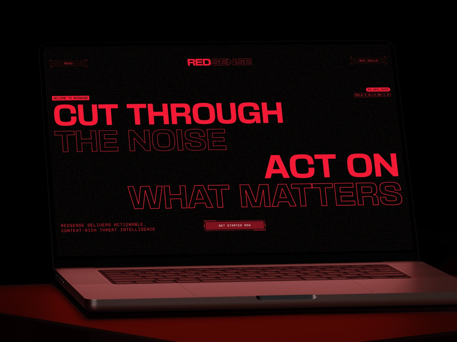
Image of the HERO section of the website
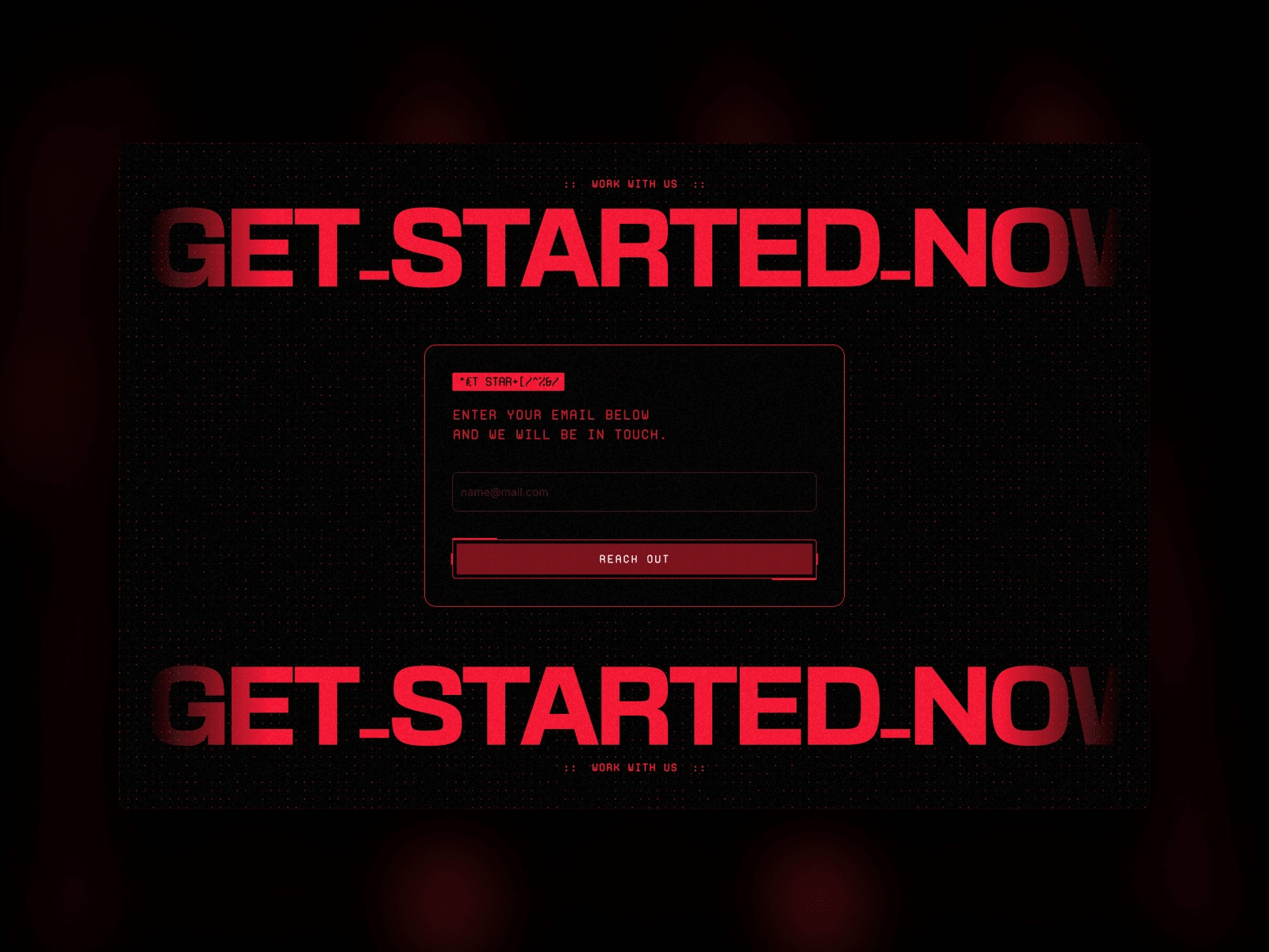
CTA sign up section
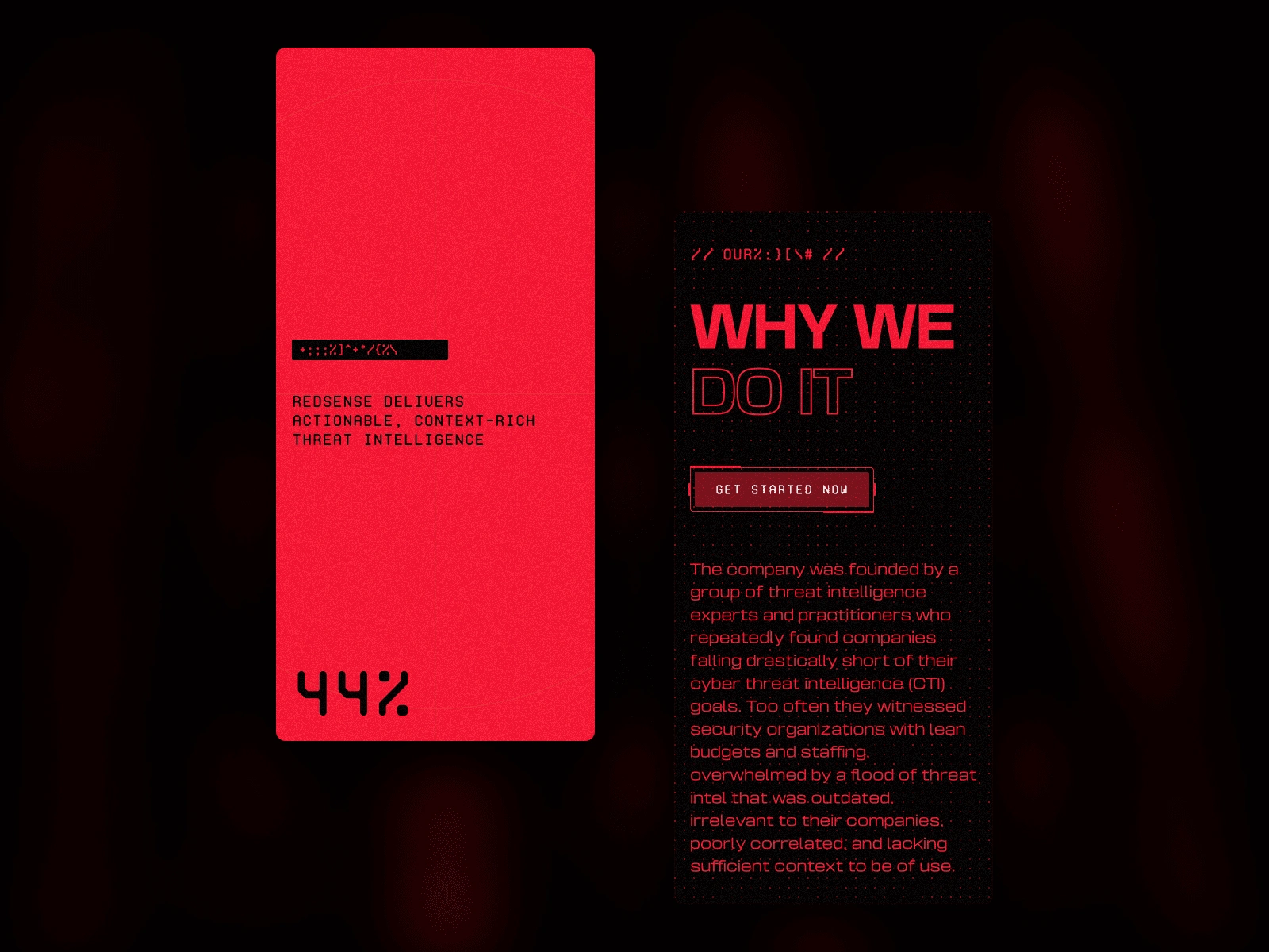
Mobile loading screen and "about us" section header
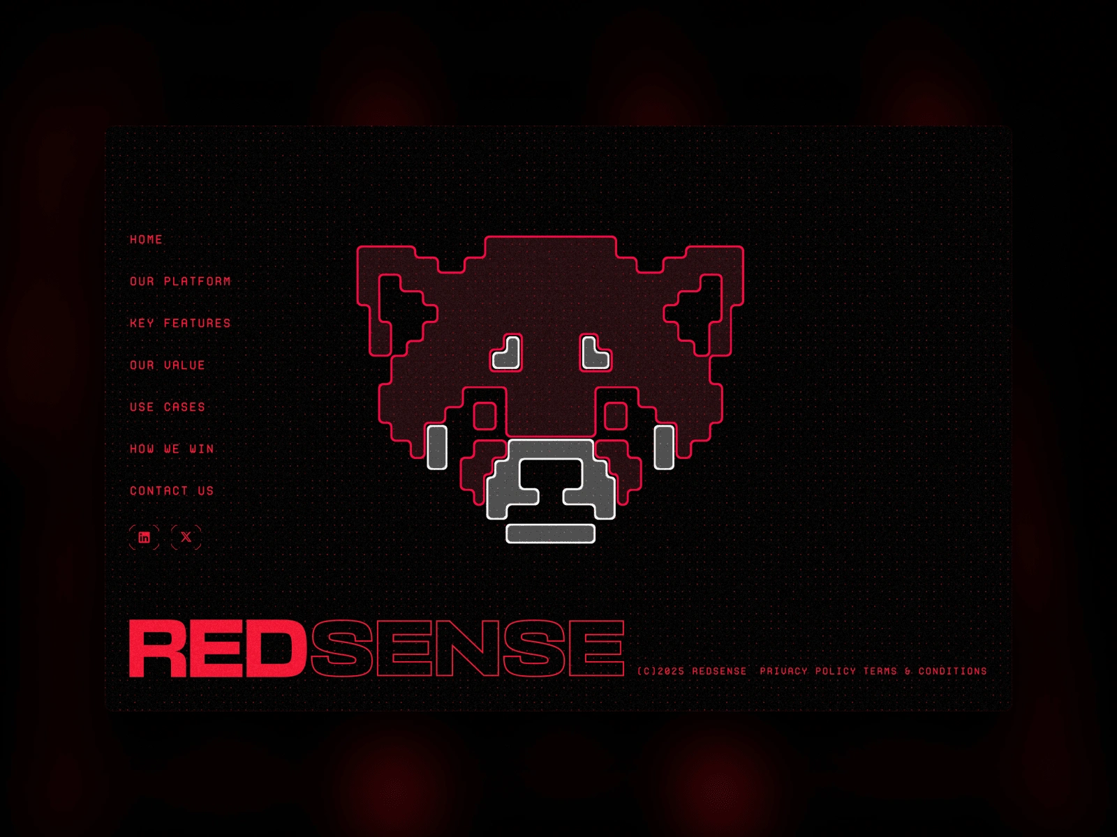
footer on desktop showing interactive custom 3D red panda
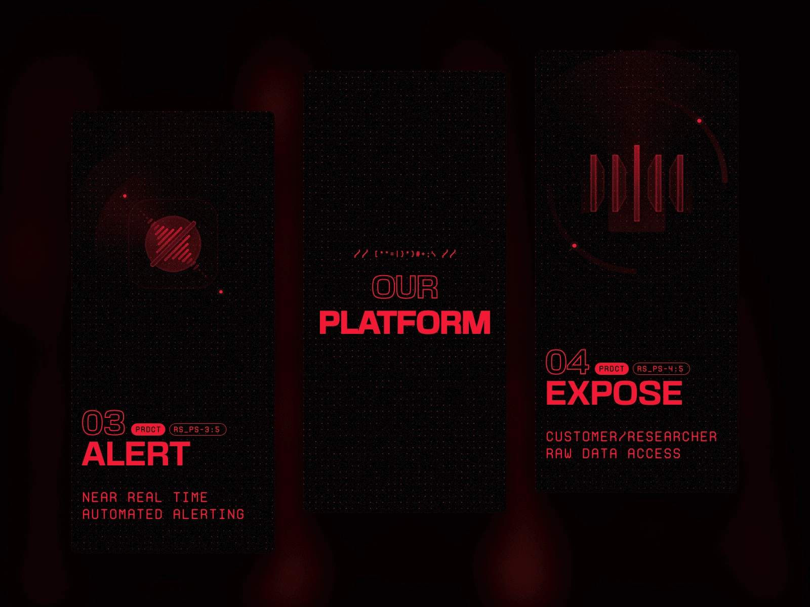
process section on mobile
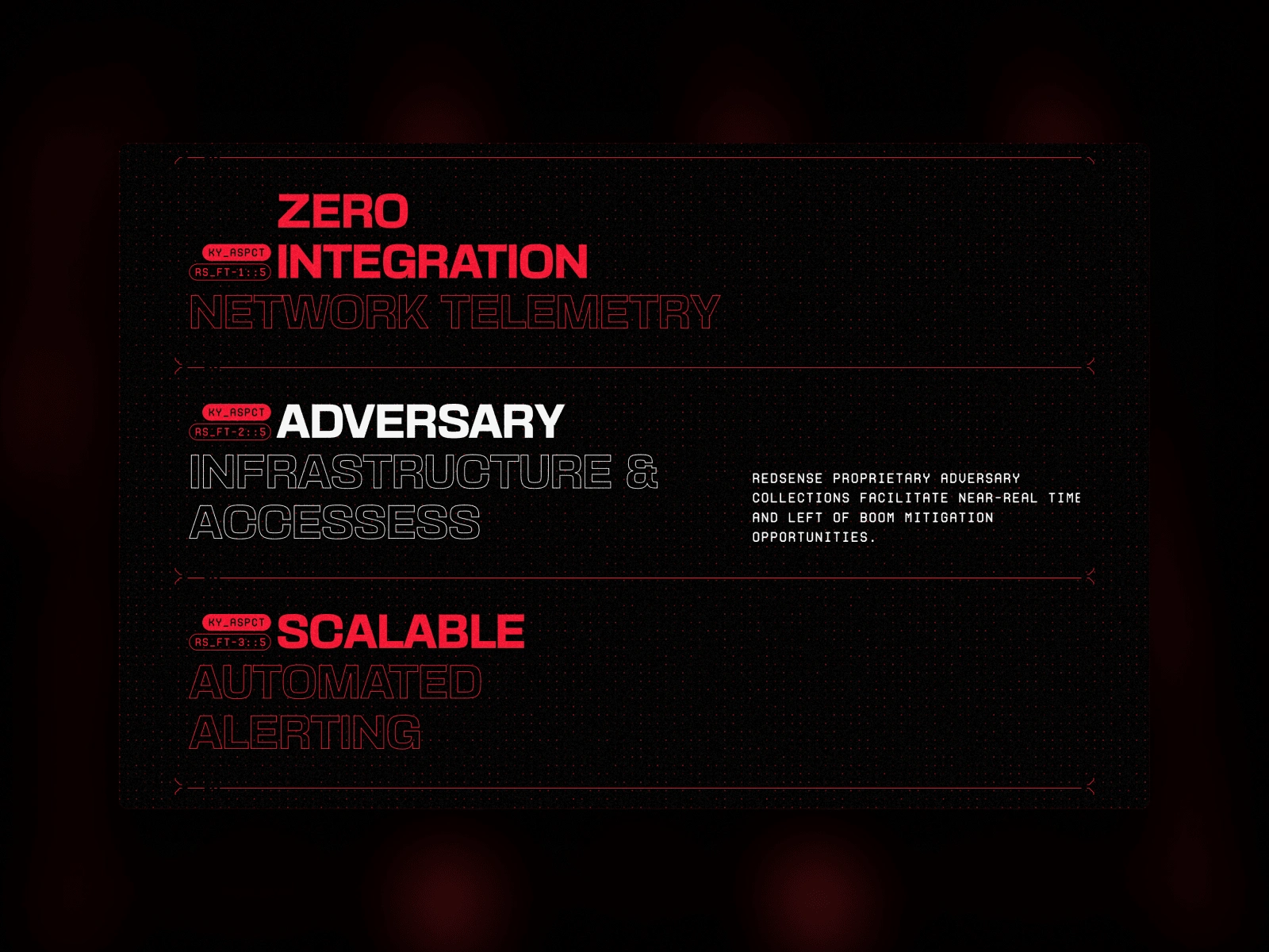
key features section showing hover state
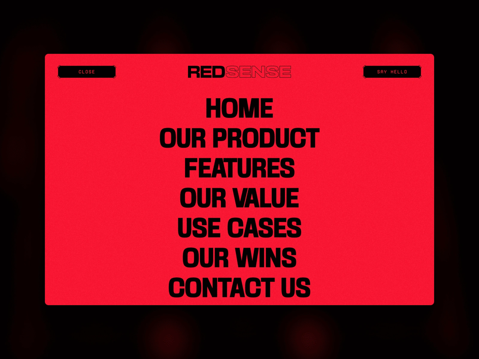
main navigation menu
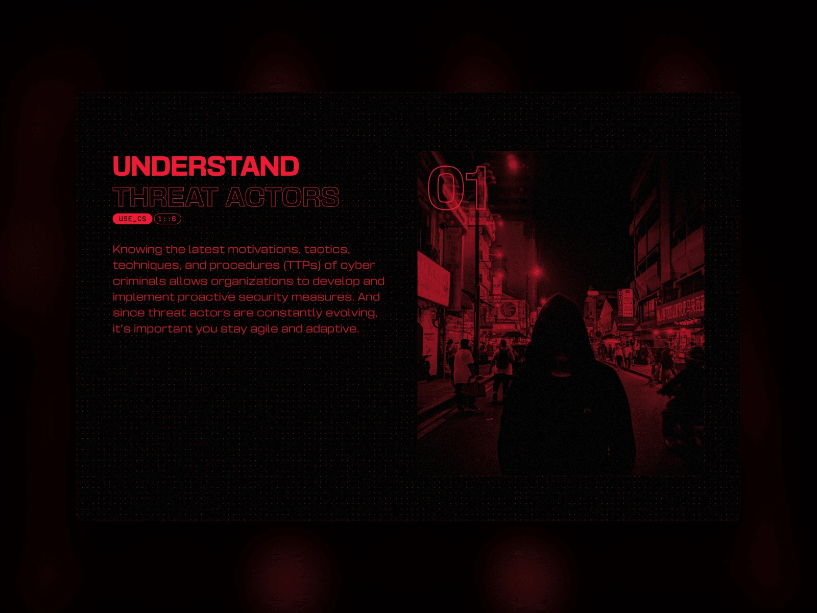
Use case section
Like this project
Posted Apr 29, 2025
Led a bold rebrand and built a custom Framer site for RedSense, featuring anime-inspired 3D assets, unique layouts, and rich interactive design.
Likes
12
Views
238
Timeline
Apr 3, 2025 - Apr 20, 2025
Clients
RedSense