Humans ❉ - Visual Identity Exploration

Supreet


Humans is a brand concept developed inside Unicorn Studio. The idea was simple. Explore how a tech forward identity can still feel warm, expressive and human. This first visual study focuses on clarity, presence and a soft sense of depth.
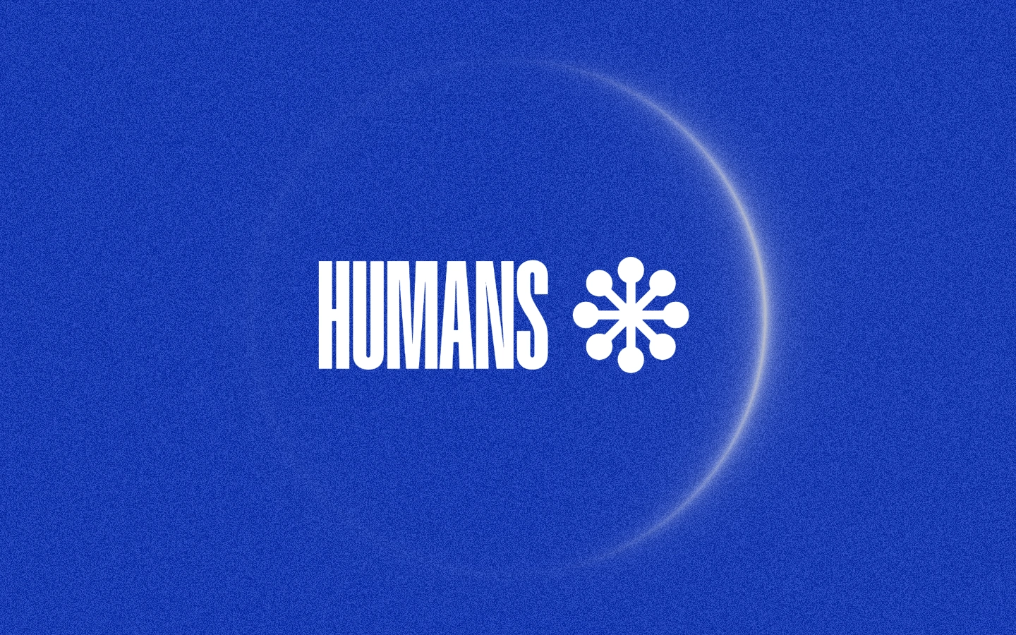
The Core Mark
The graphic combines two elements.
The HUMANS wordmark uses a tall condensed type that communicates intention and confidence.
A radial symbol built from rounded nodes that represents connection and alignment. Together they create a visual system that feels modern, social and quietly powerful.
Color and Atmosphere
The core palette uses an electric blue tone that projects calm intensity and a future focused attitude. A soft crescent glow behind the symbol adds dimension and introduces a subtle sense of motion. The grain texture keeps the identity grounded and tactile.
Design Intent
This exploration studies how minimal components can express human connection. It also tests how light, type and symbolic geometry can establish a brand personality using only one frame. The result is a direction that feels expandable for motion, interface design, product surfaces and storytelling.
Built in Unicorn Studio
This visual was created inside Unicorn Studio using rapid layout iteration, precise layering for glow and grain effects and high quality export flows for brand assets. Even with a single graphic the identity feels intentional and ready for further development.
Humans - Built in Unicorn Studio
Like this project
Posted Dec 6, 2025
A visual identity exploration for Humans created in Unicorn Studio. Focus on minimal forms, bold type, and a calm, futuristic atmosphere.
Likes
1
Views
3