
Nomi Logo+Branding+Mascot+Packaging
Nomi is a playful foxnut brand bringing unexpected flavours to everyday snacking.
Design Decision
The visual identity was designed to make healthy snacking feel fun, approachable, and memorable. Bright colours, playful illustrations, and rounded typography were used to create a cheerful personality that stands apart from the often serious health-food category. The packaging balances product information with character-driven storytelling, making it both informative and engaging.
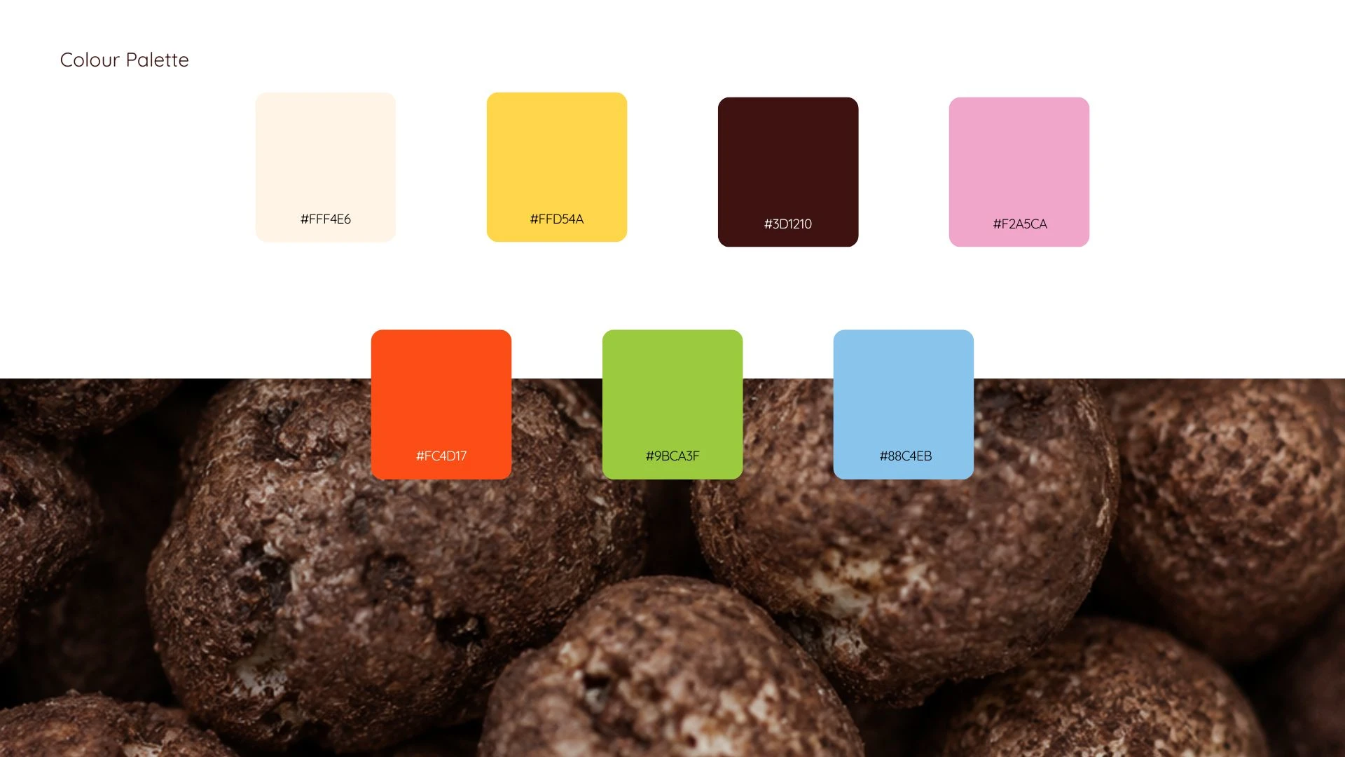
Palette Selection
Font Selection
Logo
The logo was developed using soft, rounded letterforms inspired by the shape and texture of popped water lily seeds. The playful curves create a friendly and approachable feel, while the seed-shaped dot on the "i" subtly reinforces the product itself. The final logo reflects the brand's lighthearted and snackable personality.
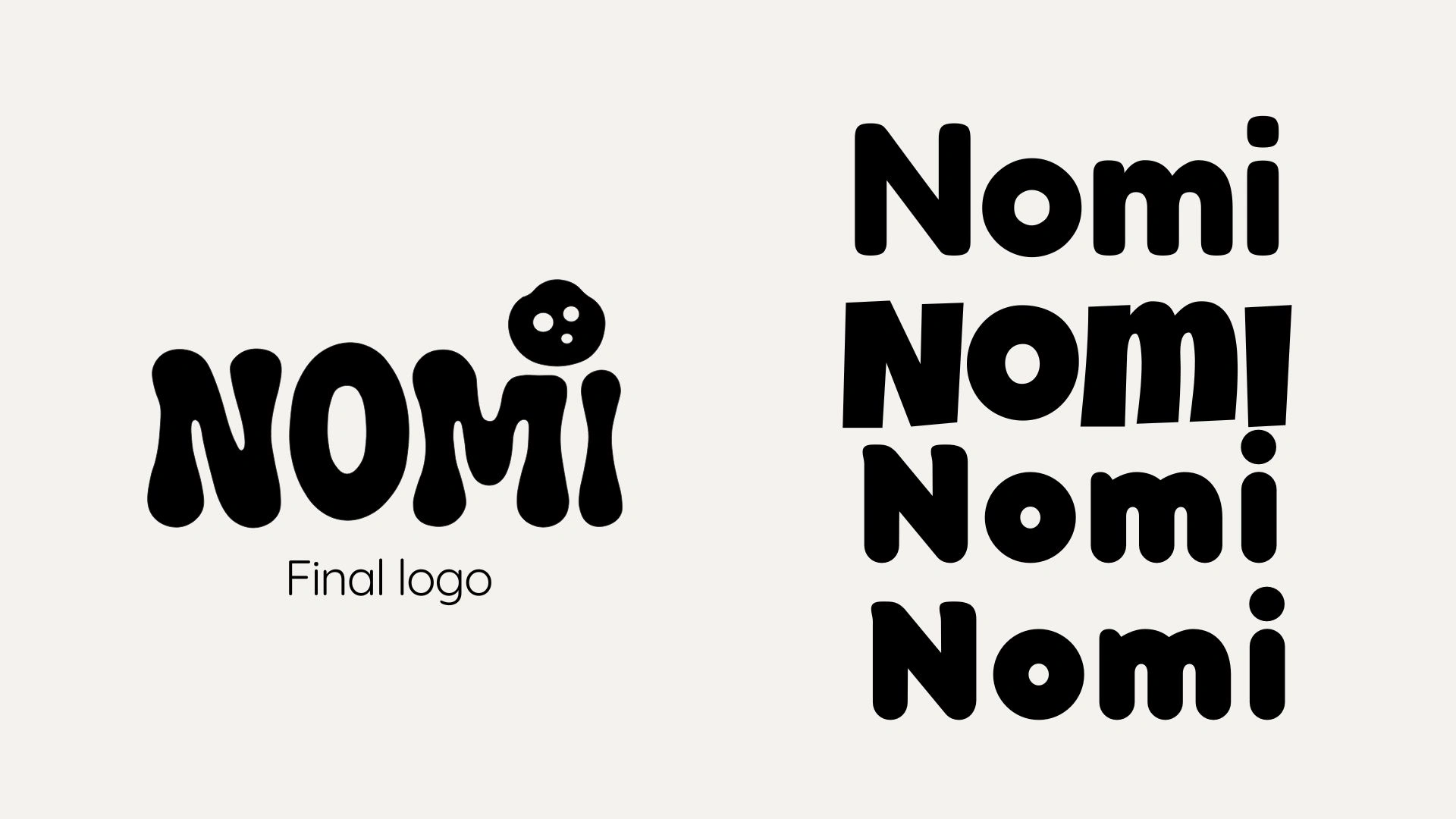
Logo Exploration
Mascot
The mascot system was created to bring warmth and character to the brand across different flavours and packaging variants. While the core mascot remains consistent to build brand recognition, its expressions and interactions change depending on the flavour and context. This creates a flexible visual language that keeps the packaging playful, relatable, and engaging across the product range.
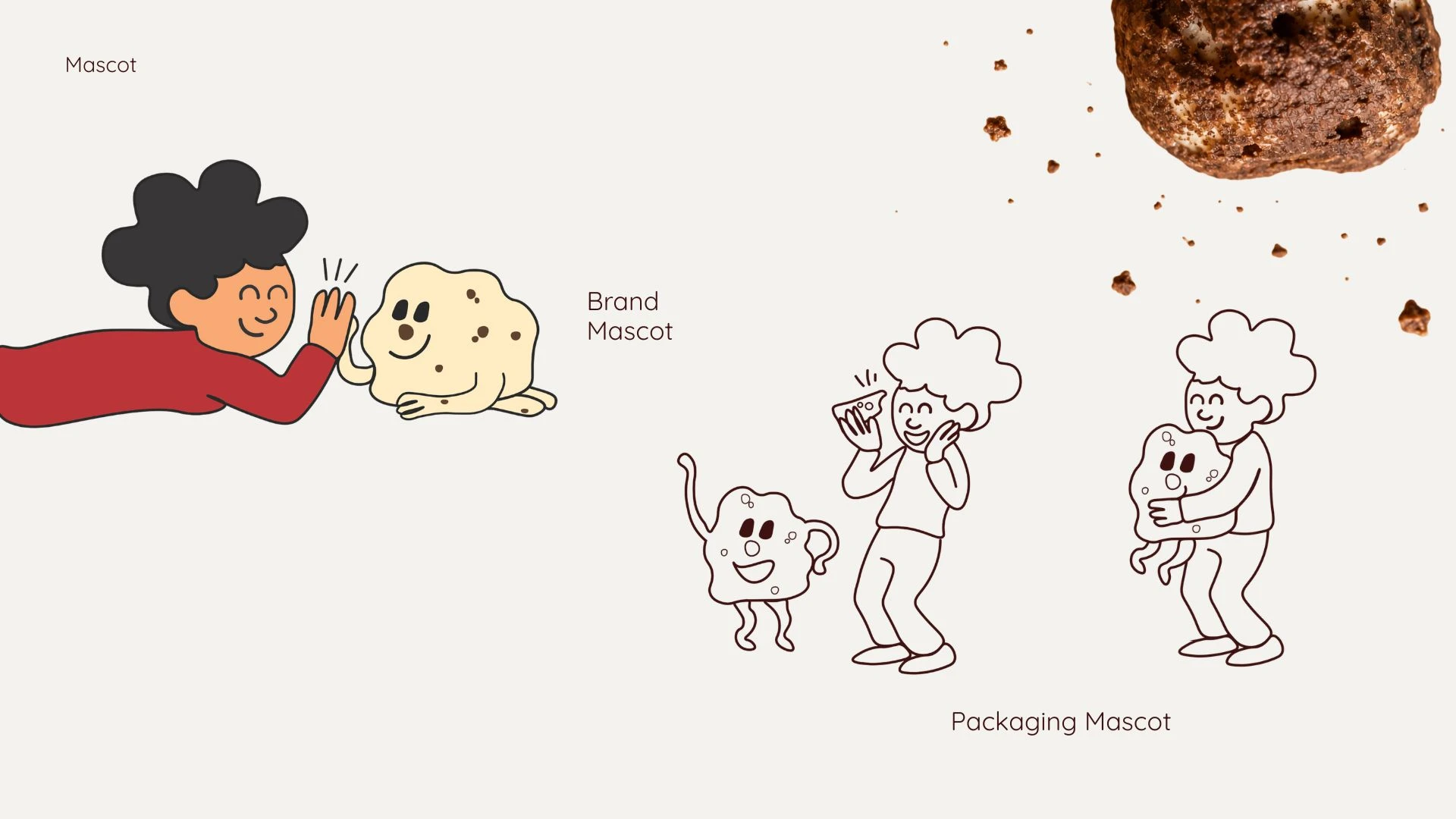
Mascot Design
Packaging Design
Bring all the visual elements together. The packaging transforms foxnuts from a conventional health snack into a playful flavour experience. Bold colour blocking, expressive mascots, and flavour-driven storytelling create a distinctive shelf presence, while the visual system allows each variant to have its own personality without losing brand consistency
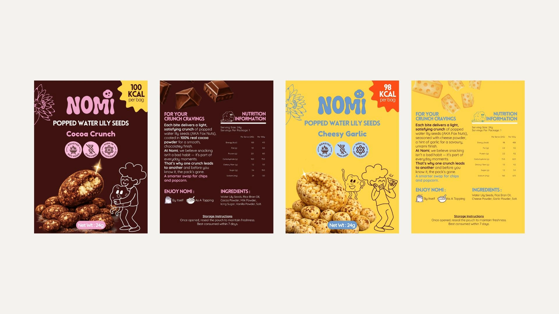
Packaging Design
Final Launched Product
While the suggested mode of packaging was Tin cans, the client chose a flexible alternative for cost reduction.
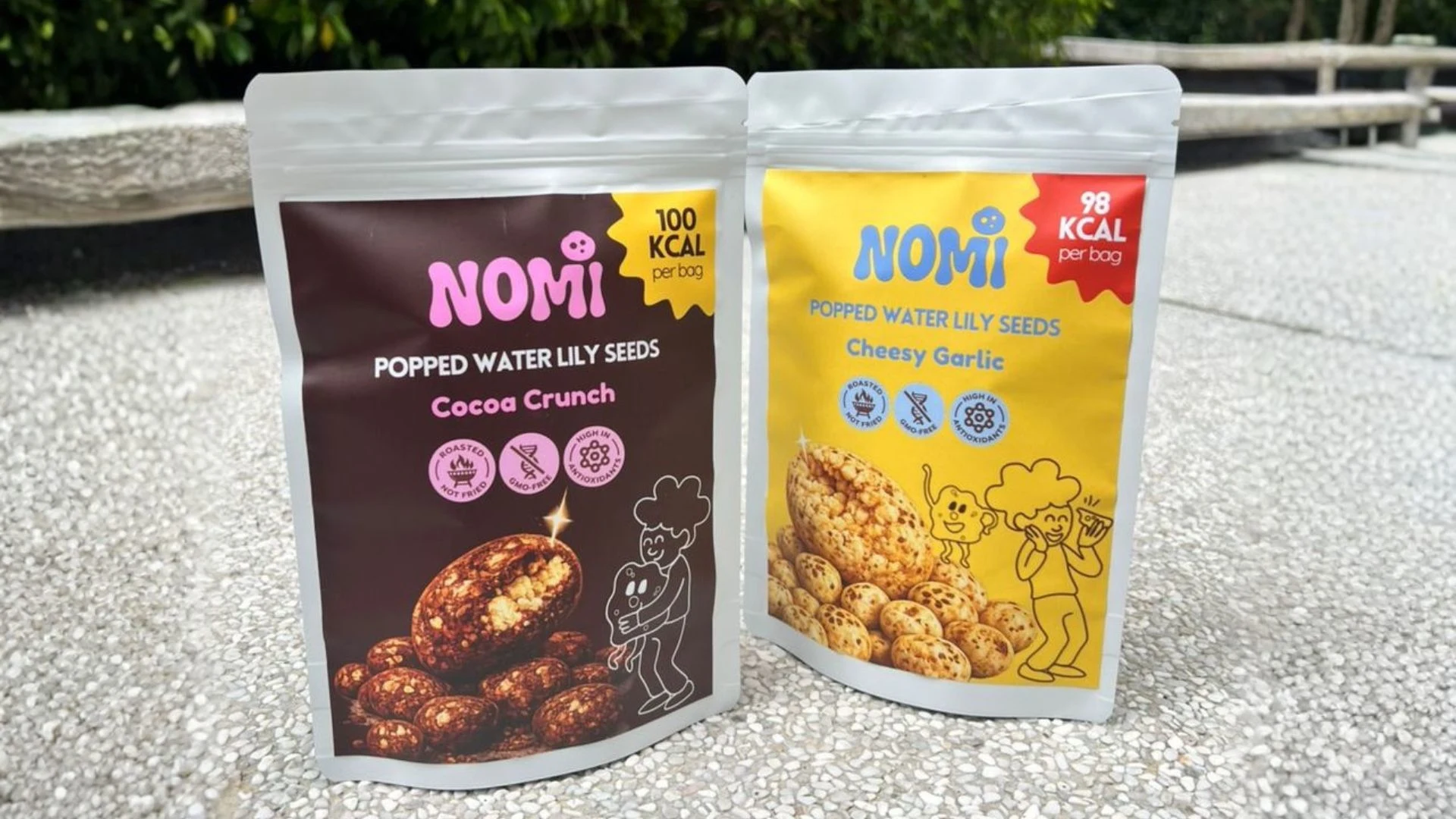
Released Product
1 like · 35 views · Jun 23, 2026
Nomi is a healthy snack brand, we designed a playful brand identity for them, including logo design, mascot design, and packaging design.


