
Pilatesroom Campaign Imagined
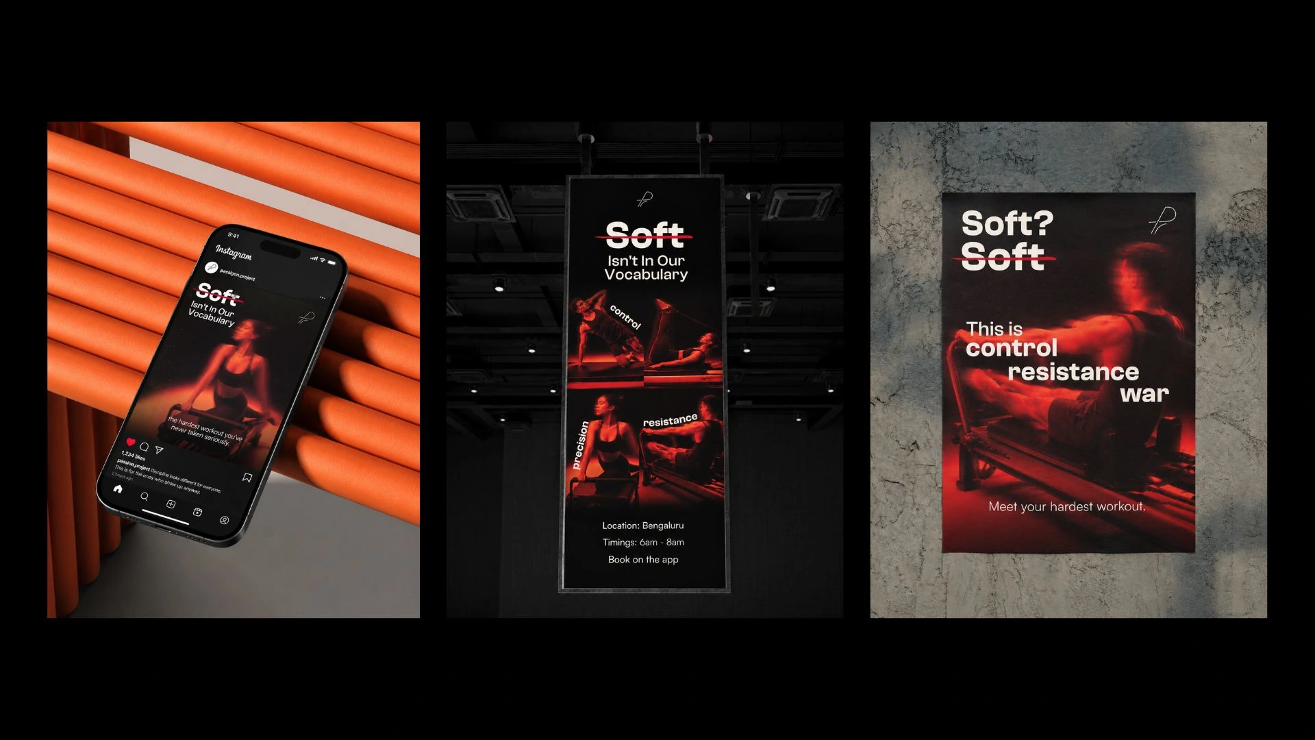
Concept: Pilates has a reputation problem; it's seen as the soft option, the thing you do when you can't handle a real workout. That's the tension to detonate. Pilatesroom enters the market by declaring war on its own category's image. We strike through the word SOFT and build everything around the provocation: this is the hardest workout you've never taken seriously. The Pilatesroom isn't a prop; it's resistance, precision, and control made physical. It's not gentle. The tone is confrontational, proud, and a little bit arrogant because Delhi responds to confidence.
Campaign Name: Soft Isn't In Our Vocabulary
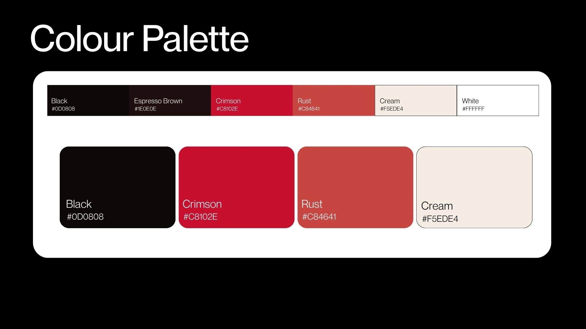
Chosen Colors

Chosen Fonts
Campaign Strategy
Detailed expansion of the brand campaign strategy, the first phase is a soft launch, is all about the tease, to create a buzz and get the audience talking, and the second phase is focused on the big reveal.
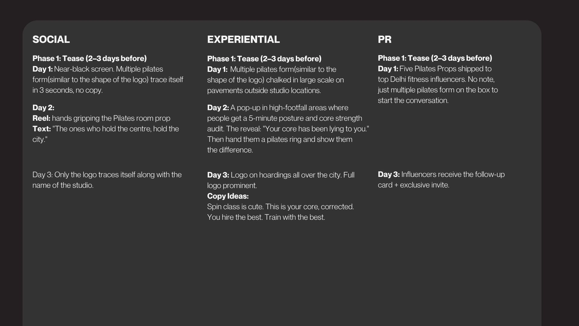
Phase 1
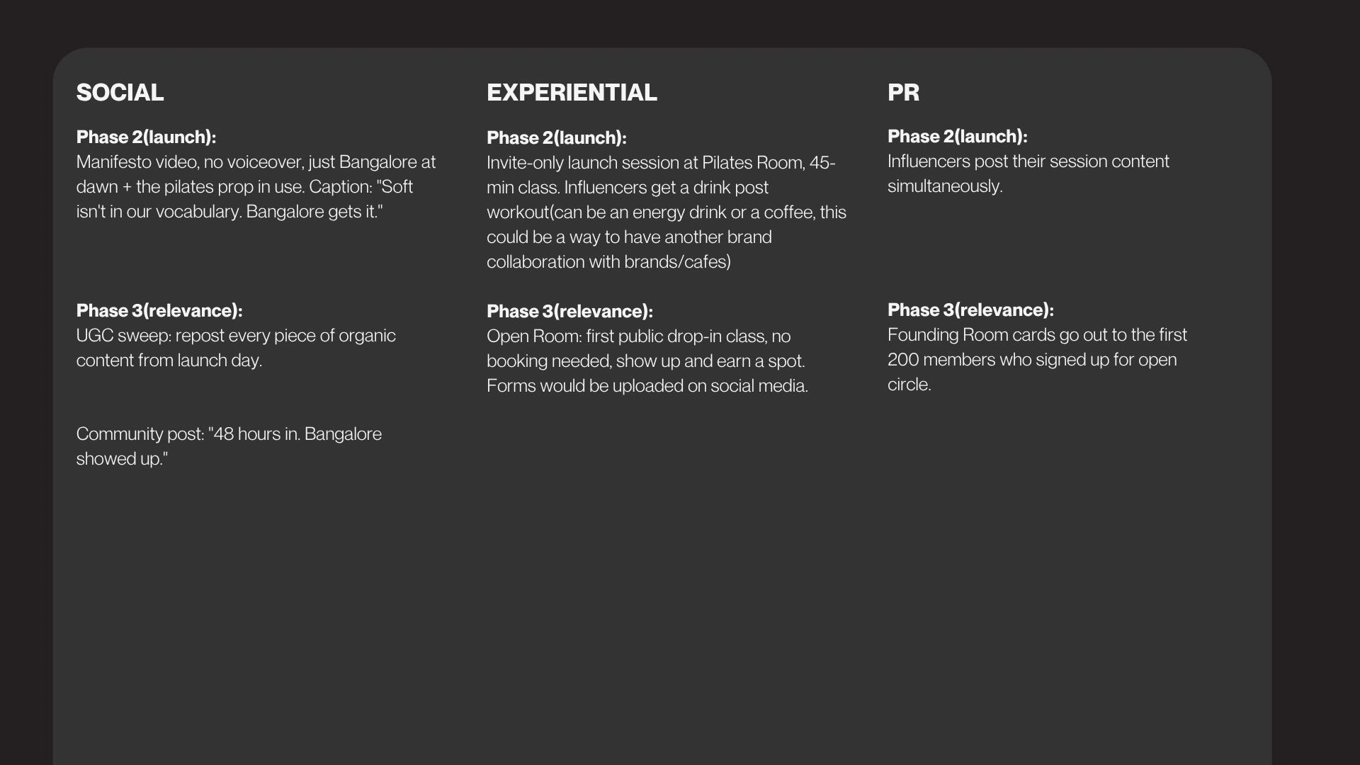
Phase 2
Final Marketing Assets
The imagery was intentionally treated in a dark, cinematic, and almost aggressive manner to challenge the common perception of Pilates as a “soft” workout. Motion blur and intense red lighting were used to communicate strength, resistance, control, and endurance, while the close-cropped compositions create a sense of intensity and focus. By showing people in powerful moments rather than graceful poses, the visuals reinforce the campaign message that Pilates is not about softness; it's about discipline, precision, and strength.
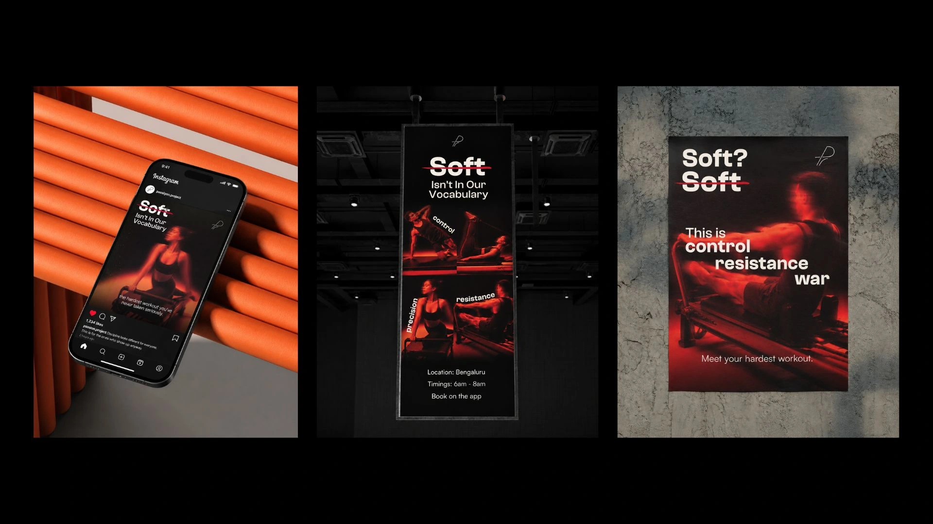
Final Assets
1 like · 23 views · Jun 22, 2026
We designed the brand campaign Pilatesroom in Bengaluru with a bold campaign challenging the soft image associated with Pilates.


