Luxury Skincare Packaging Design for LUCE di OLIVA
Marta Custic
How I designed luxury olive oil skincare that makes you believe it can solve everything.
Most skincare packaging falls into two tired categories: sterile white boxes that feel like medicine or busy botanical designs that scream wellness store. Premium beauty brands get stuck choosing between looking clinical or looking cheap. LUCE di OLIVA needed luxury skincare packaging that could command prestige positioning while making discerning consumers feel like they'd discovered something special.
The solution wasn't adding more skincare clichés. It was understanding that luxury buyers don't want products, they want to feel transformed.
Instead of competing in the crowded skincare category, I repositioned LUCE di OLIVA through intentional design choices:
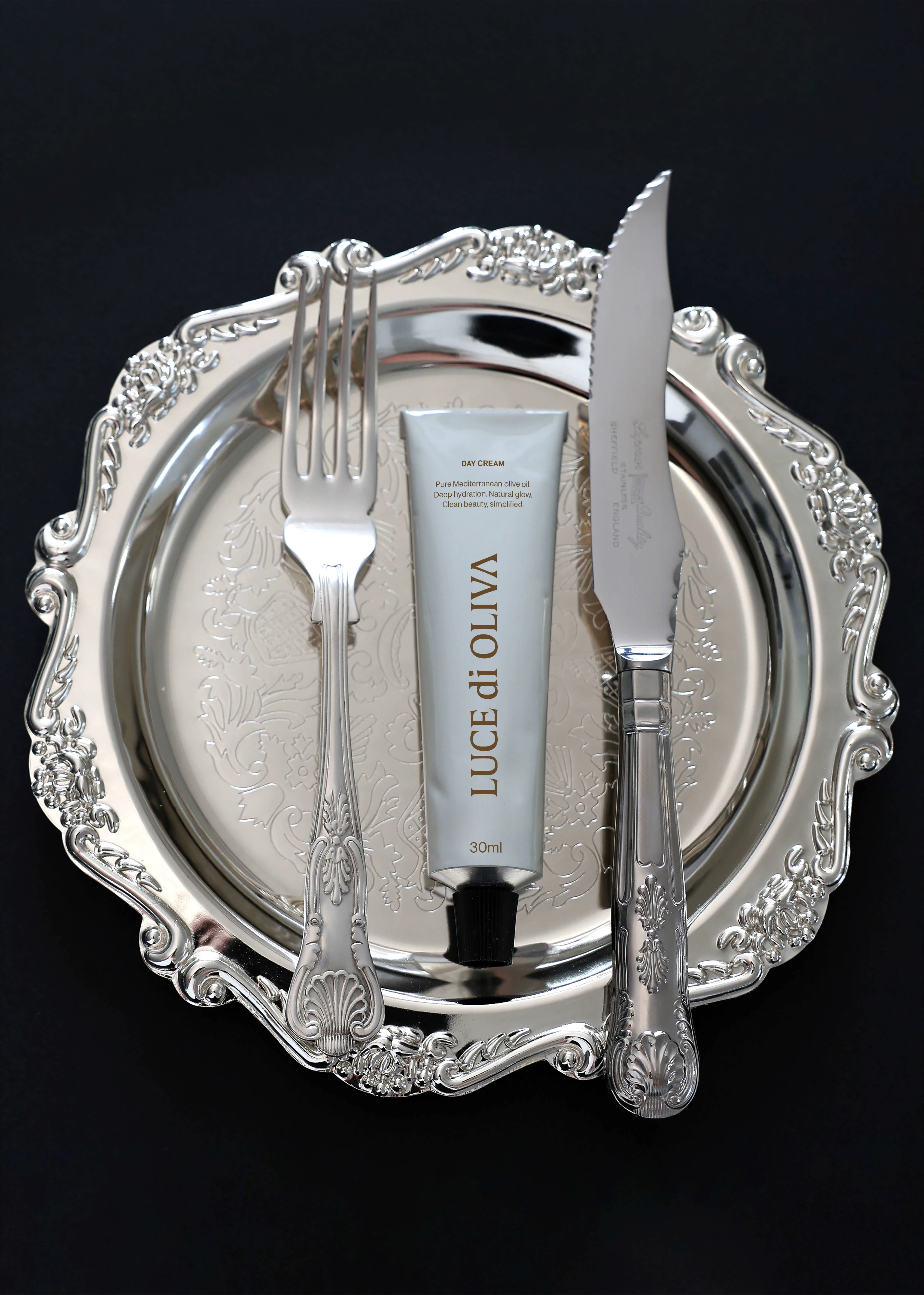
Research Phase: I studied luxury home goods and fashion packaging (think Hermès, not Sephora)
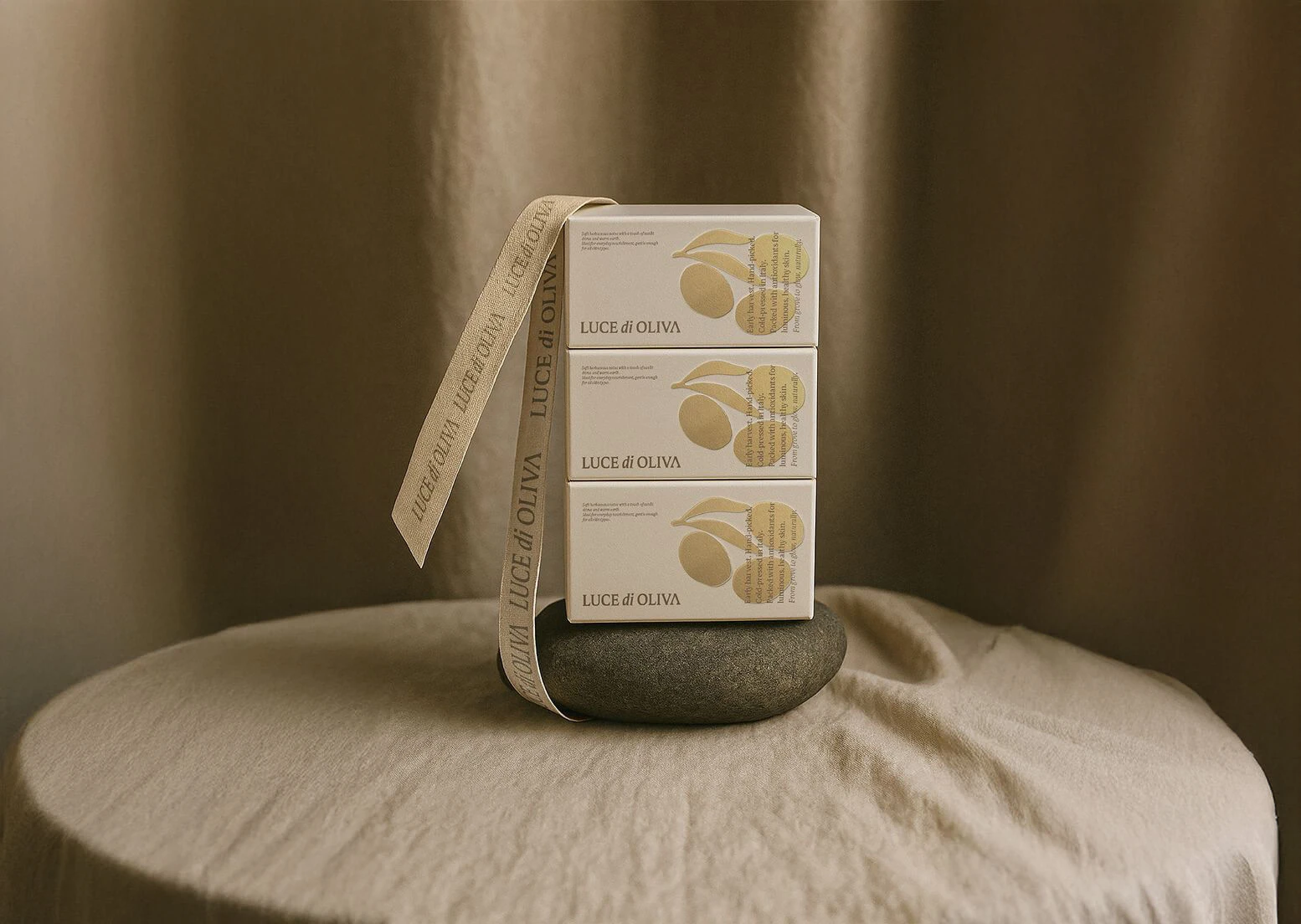
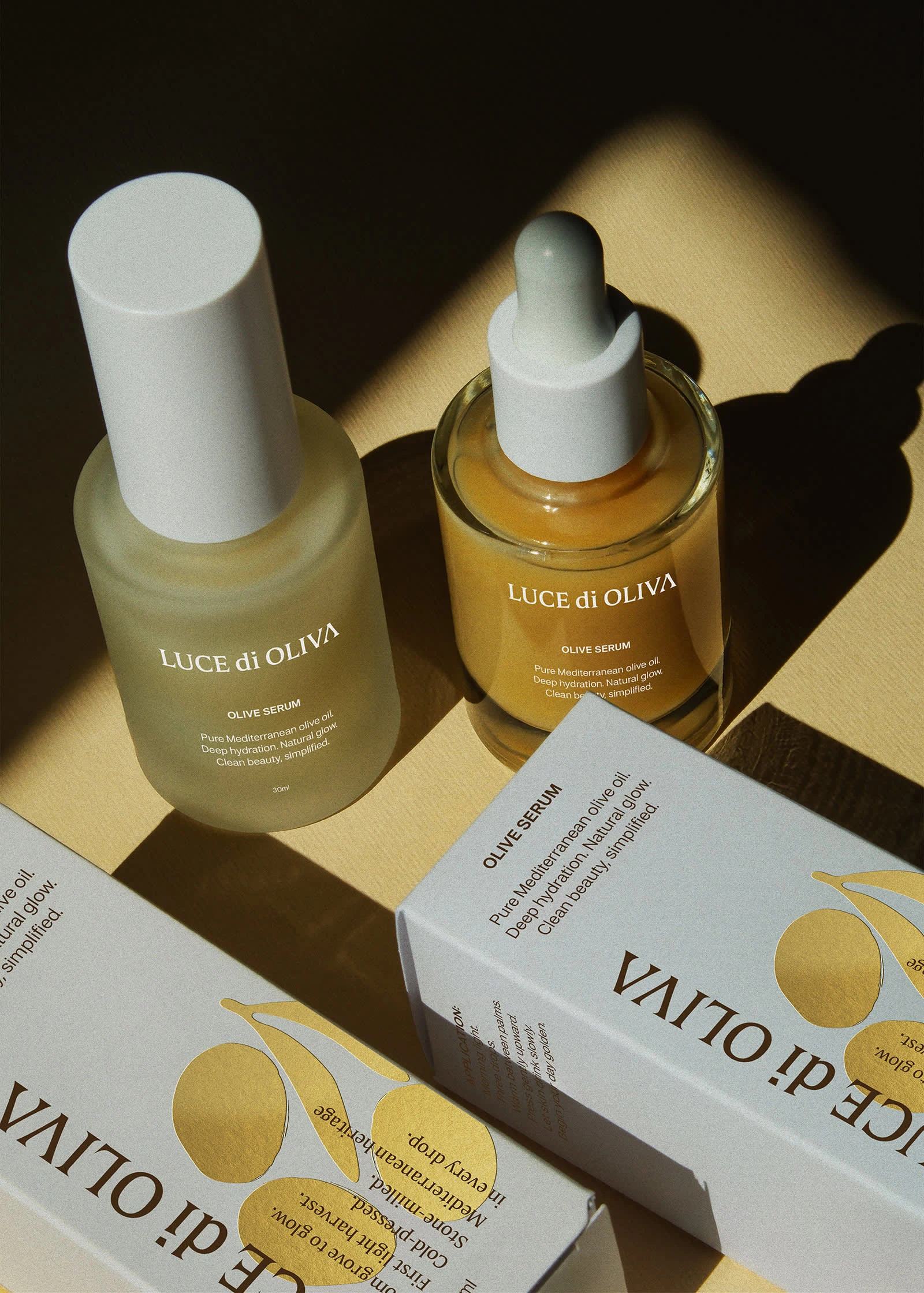
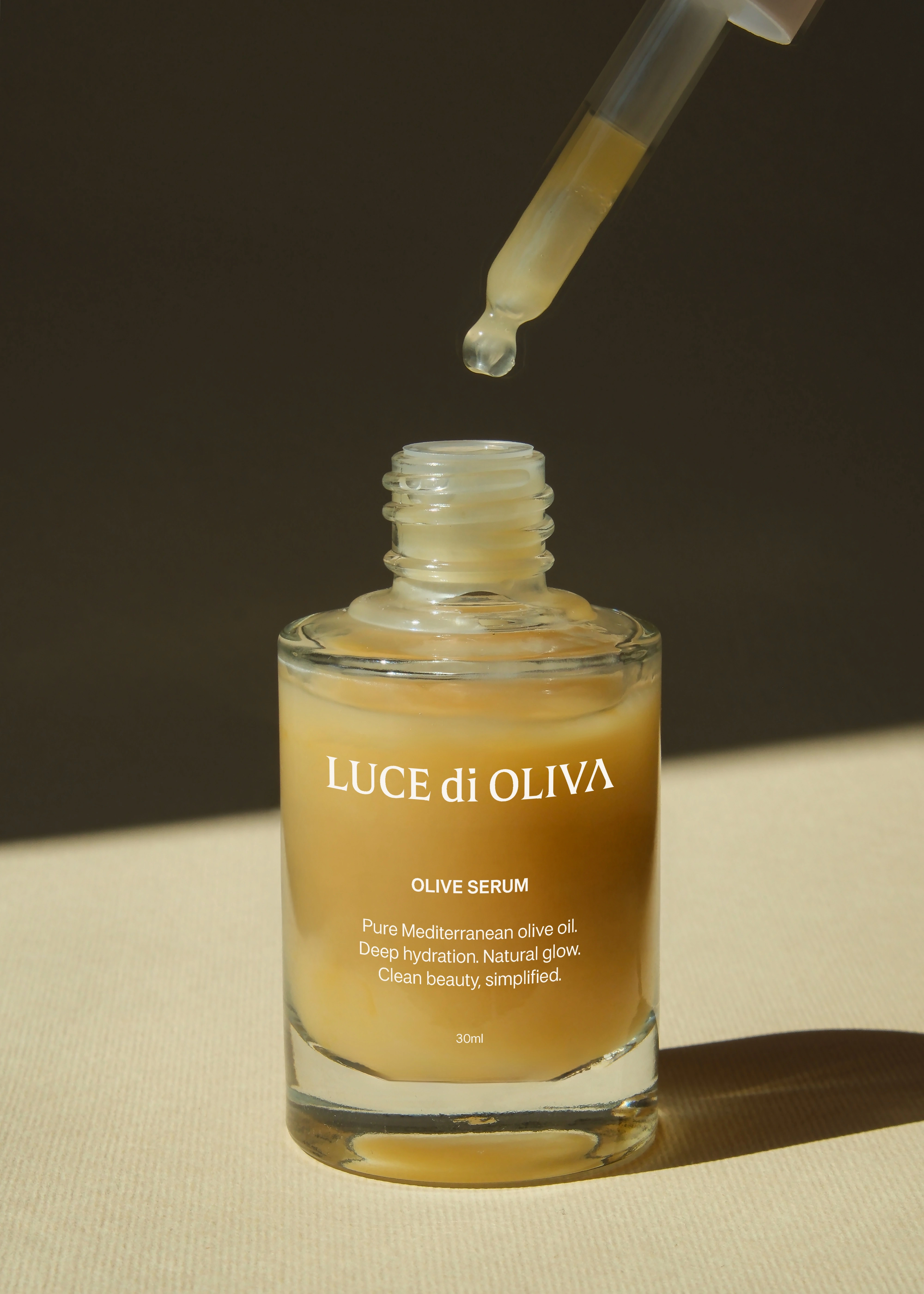
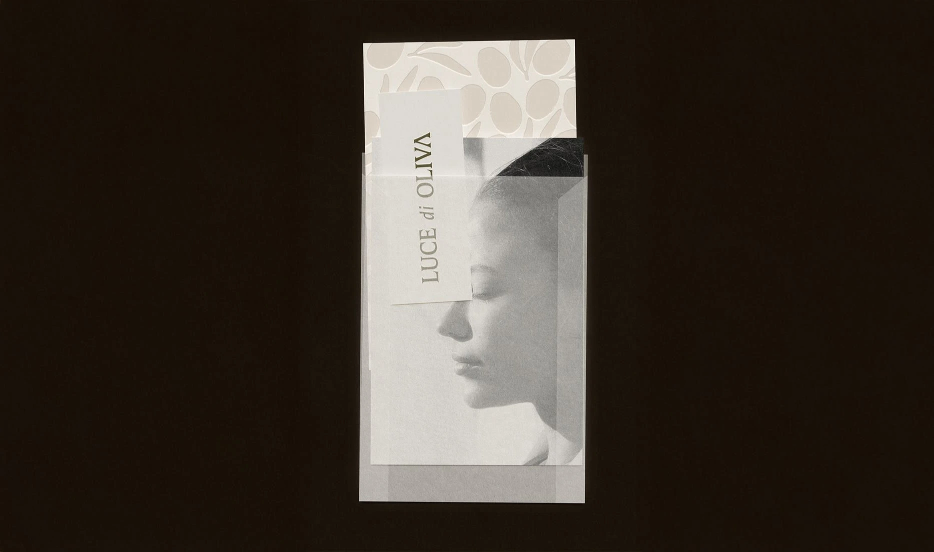
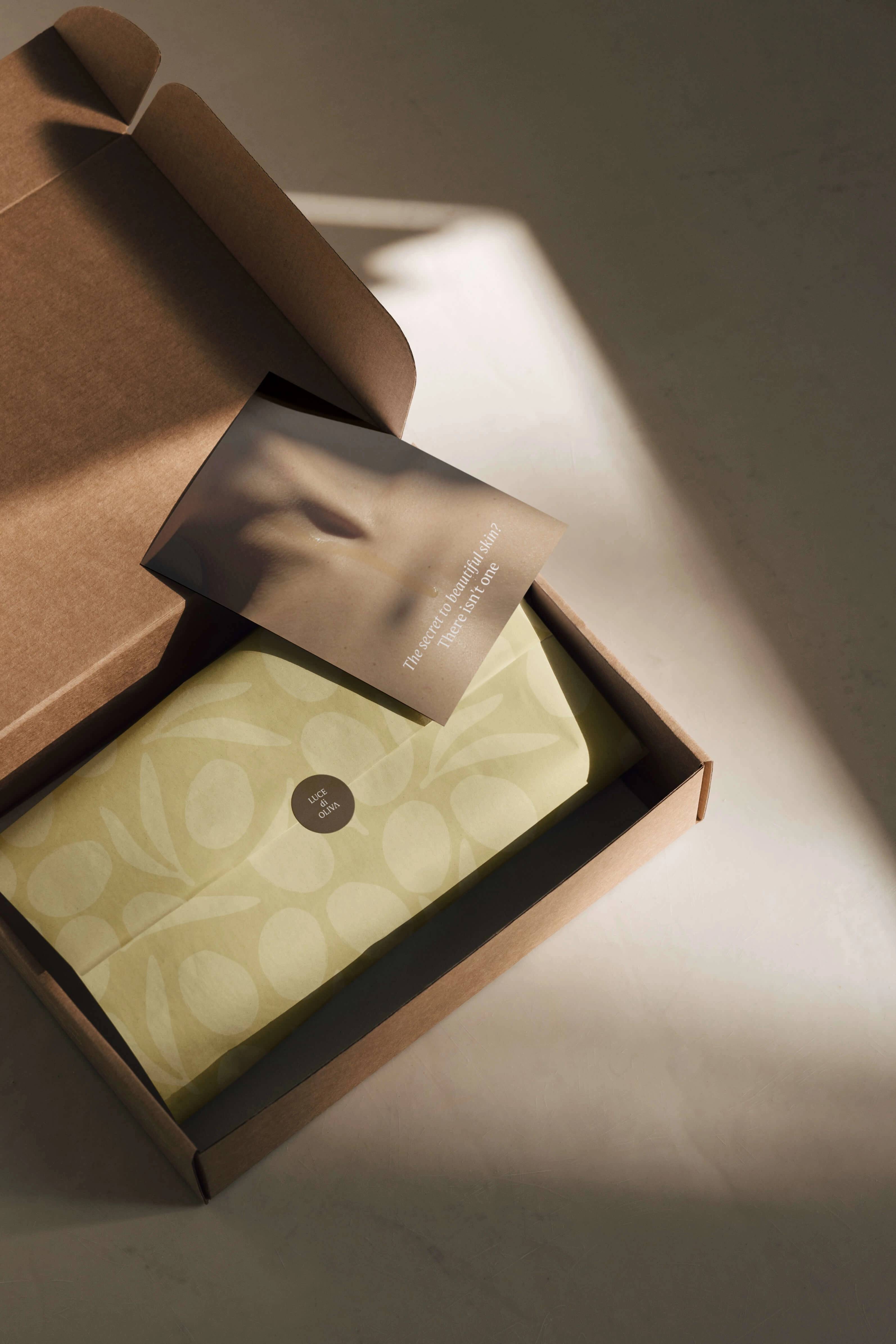
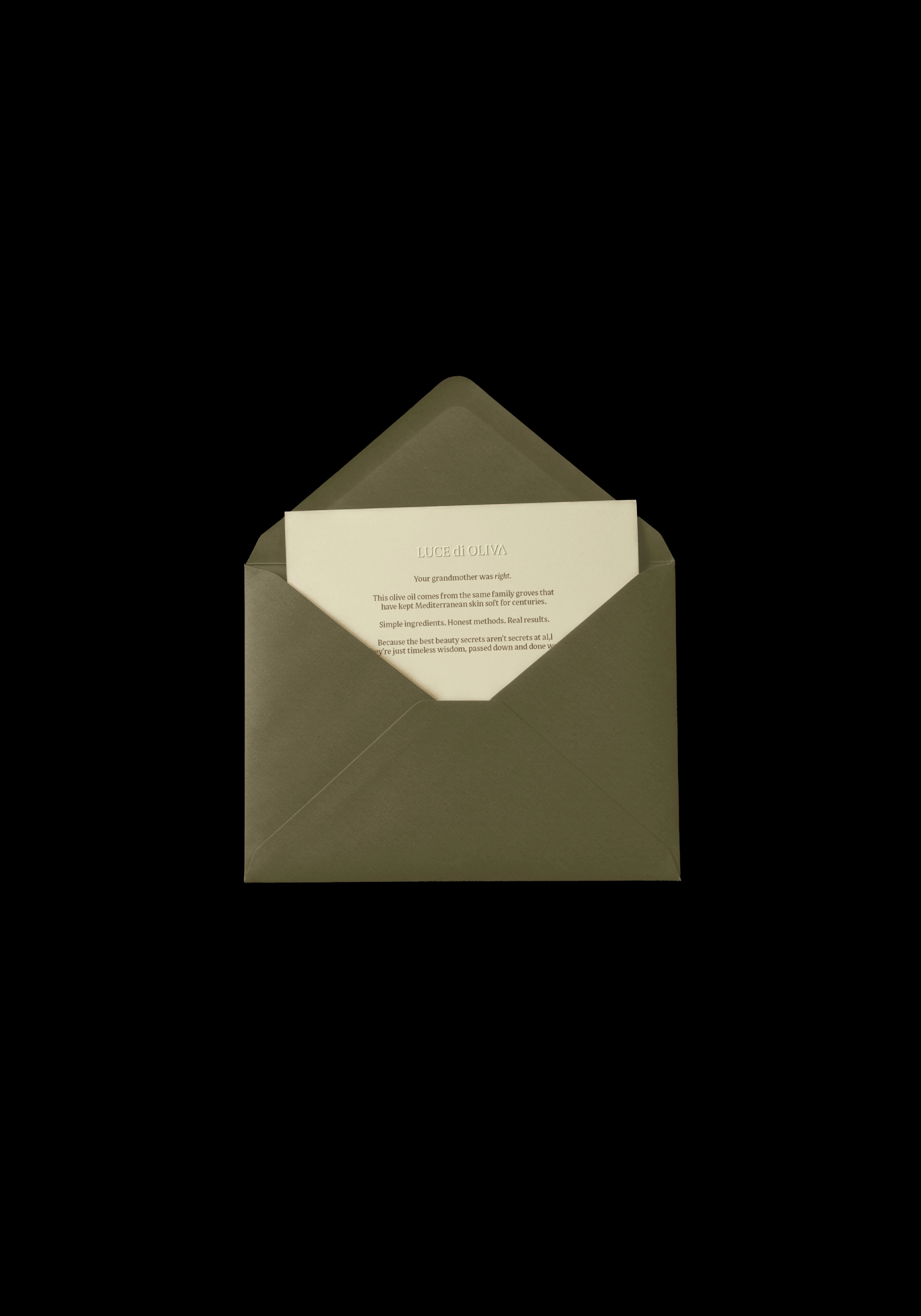
Design Strategy: Created packaging so beautiful you want to pick it up, hold it, keep touching it
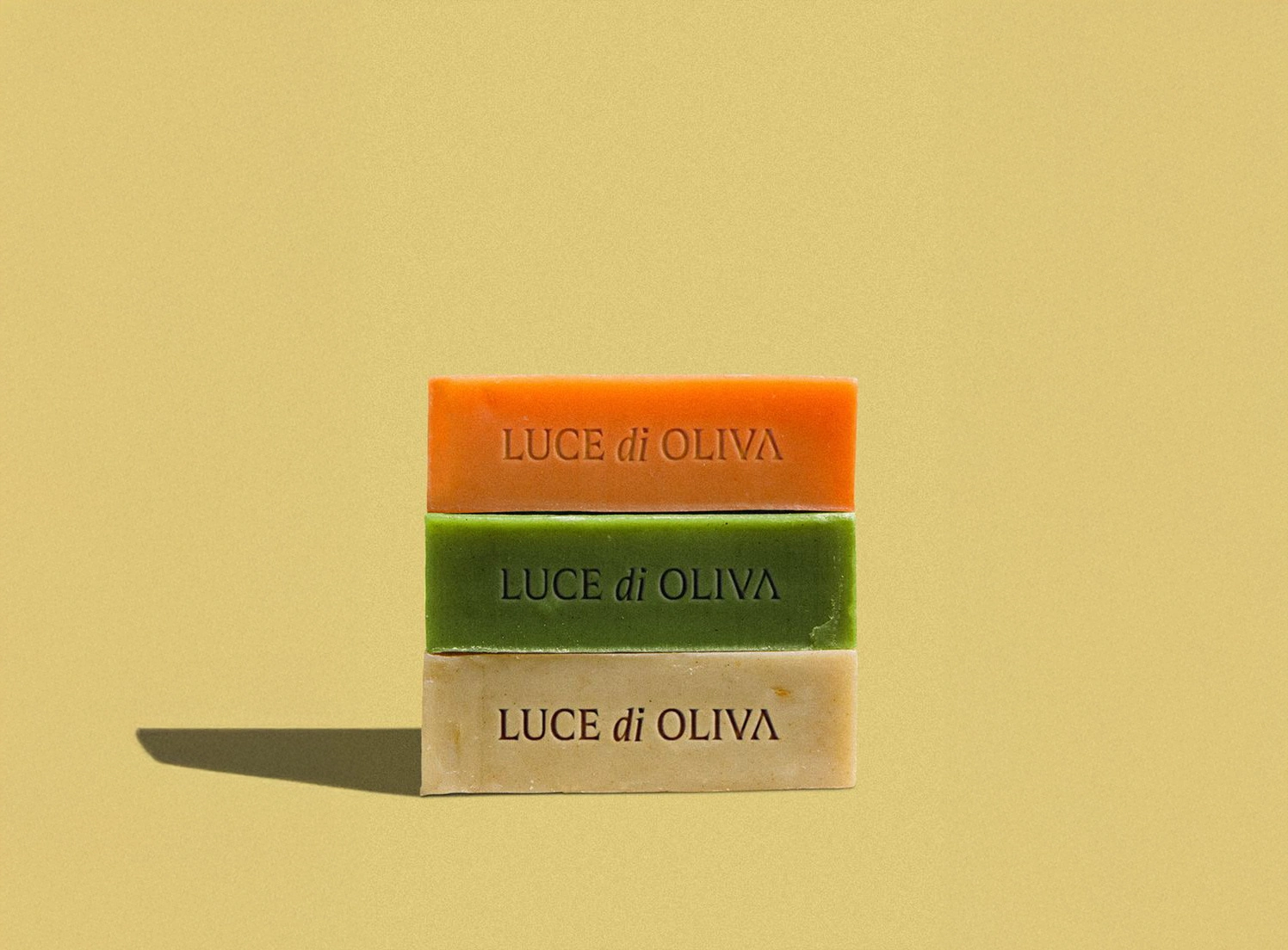
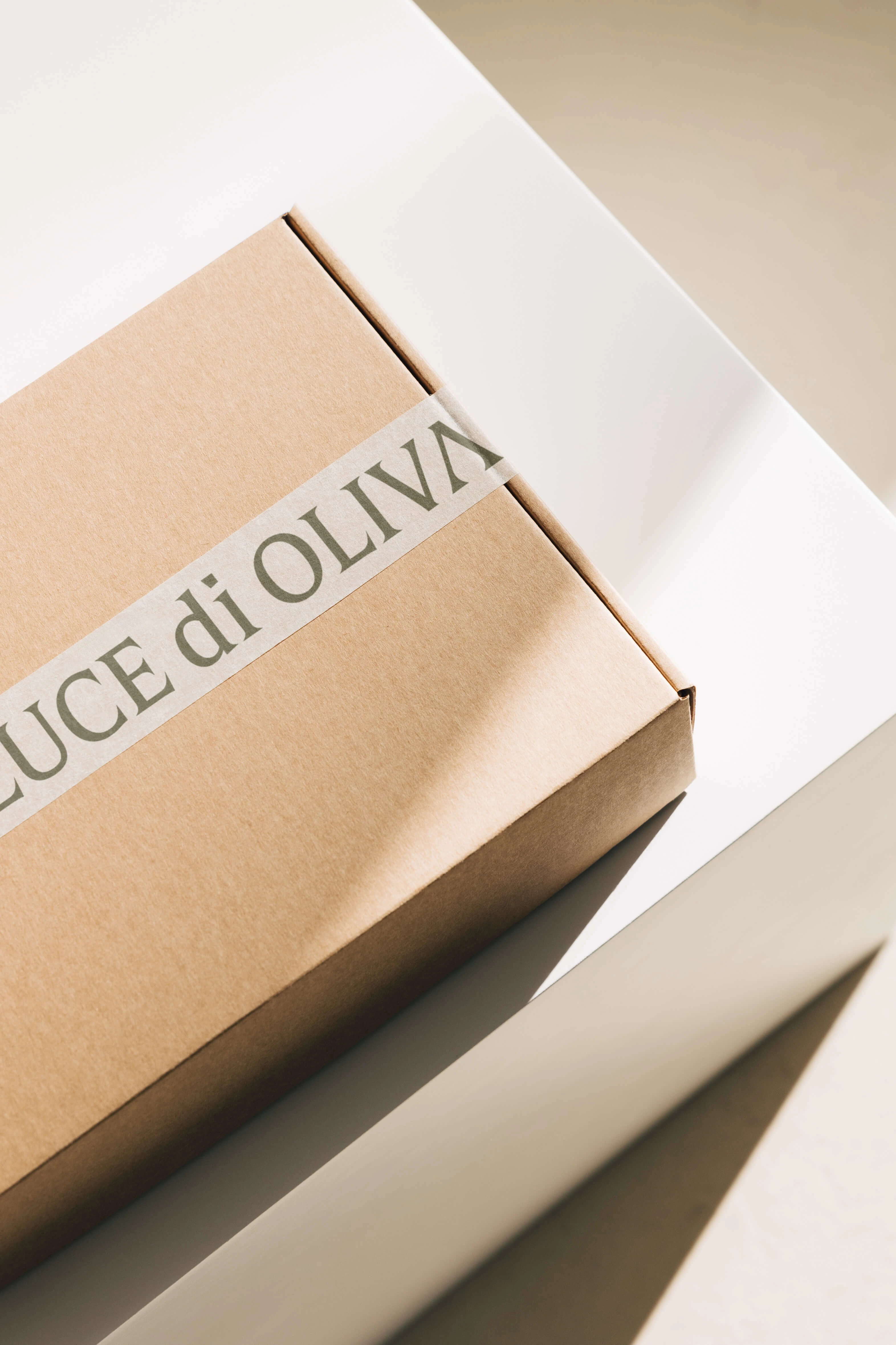
Material Selection: Hand-drawn olive illustrations, embossed gold foil, textured papers that beg to be touched
Instead of competing in the crowded skincare category, I repositioned LUCE di OLIVA through intentional design choices:
Research Phase: I studied luxury home goods and fashion packaging (think Hermès, not Sephora)
Design Strategy: Created packaging so beautiful you want to pick it up, hold it, keep touching it
Material Selection: Hand-drawn olive illustrations, embossed gold foil, textured papers that beg to be touched
Killed all skincare clichés. No dewy models, no "glow" promises, no before/after energy.
Borrowed from luxury fashion. Think quiet confidence, not beauty counter.
Created tactile experiences. Embossed details and textures that make you believe this can solve everything: your skin, your stress, your entire life.
Copy that speaks to wisdom: "True luxury lies not in what we add, but in what we perfect."
✓ Packaging that feels like a talisman, not just skincare
✓ Visual identity that promises total transformation
✓ Brand positioning that transcends beauty into lifestyle
✓ Design system that makes olive oil feel like liquid gold
Most importantly: I created packaging that makes you believe this simple olive oil can solve not just your skin problems, but somehow make everything in your life better. When you design for hope and desire, logic becomes irrelevant.
Like this project
Posted Sep 16, 2025
Designed luxury skincare packaging for LUCE di OLIVA, emphasizing transformation and prestige.
Likes
35
Views
673
Timeline
Aug 1, 2025 - Sep 15, 2025