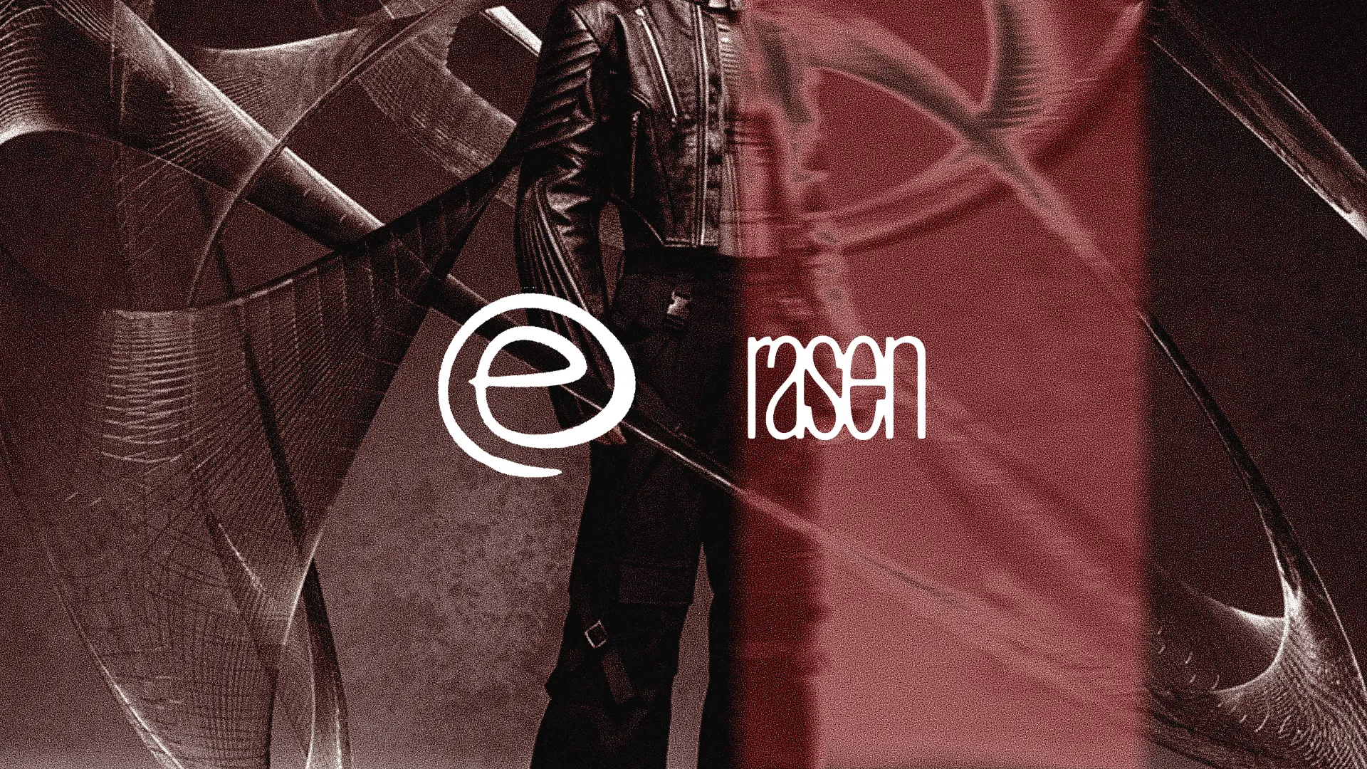
rasen — Streetwear Brand Identity (punk version) by Insanramah Khasanah.rasen — Streetwear Brand Identity (punk version) by Insanramah Khasanah.

rasen — Streetwear Brand Identity (punk version)

Insanramah Khasanah.

Insanramah Khasanah.

Brand Name : rasen
Origin of the word: from "rasen," the Japanese word for spiral.
Theme : punk streetwear - Tokyo.
Philosophy
the spiral is framed as energy breaking loose from a fixed point. Freedom here is defined as motion and energy, not a path or direction.
[EN]
Concept and Origin Story
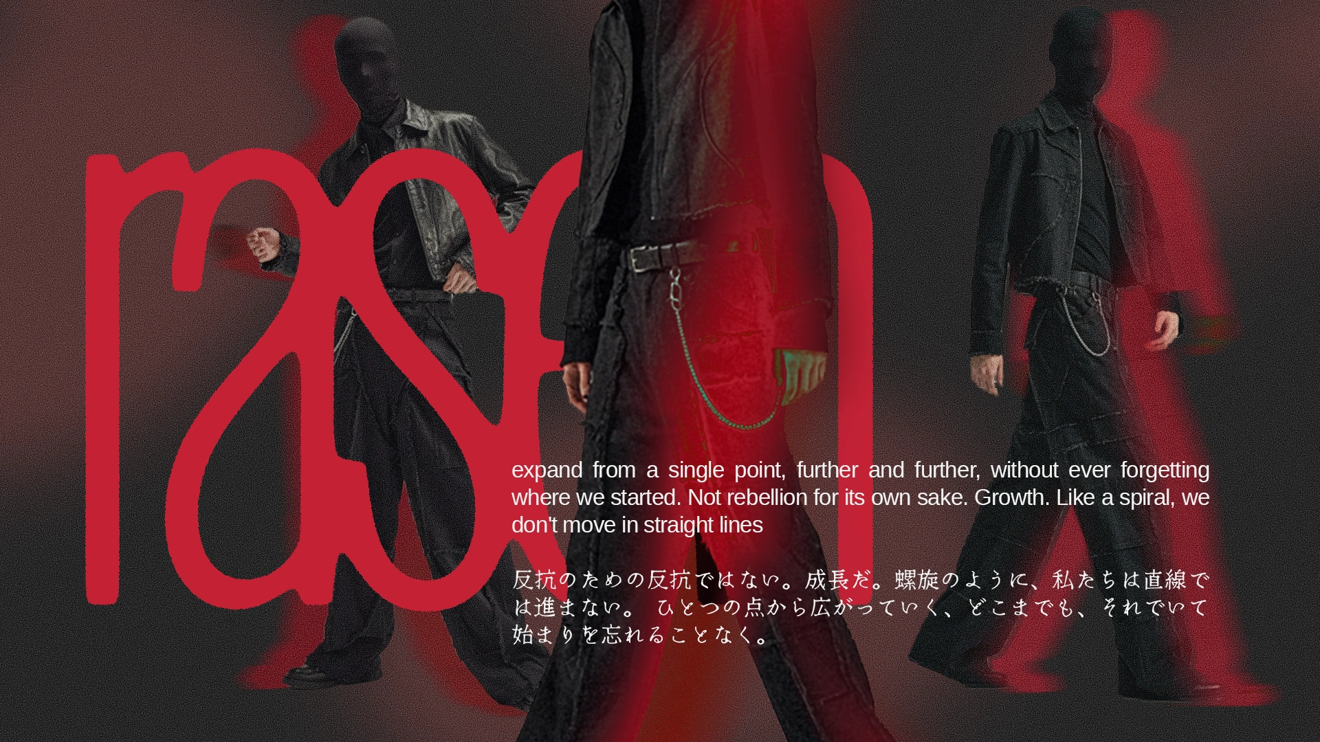
rasen is inspired by an observation about people that living monotonous routines. The same hours, the same commute, no room to change. rasen frames freedom not just as escaping routine, but as the starting point where a person begins growing into a bigger version of themselves. Like a spiral that grows outward from its center, expanding, but never losing its original shape.
[JPN]
コンセプトと起源のストーリー
rasen は、東京で単調な日々を生きる人々への観察から生まれた——同じ電車、同じ時間、変化の余地がない毎日。rasen が描く自由とは、単にルーティンから逃れることではなく、自分自身のより大きなバージョンへと成長し始める出発点である。螺旋がその中心から外へ向かって成長し、広がりながらも、決して元の形を失わないように。
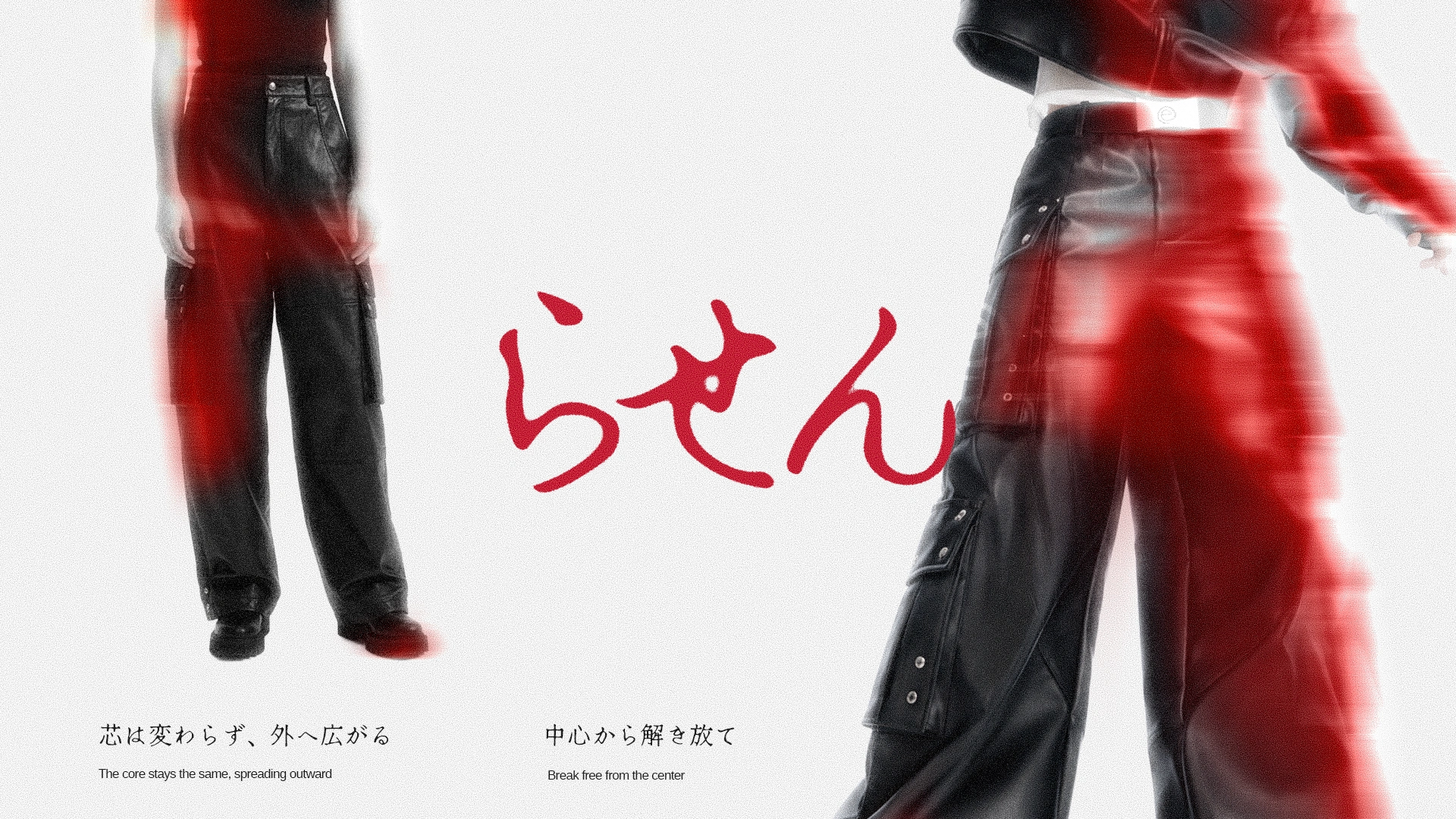
このストーリーがビジュアルに反映される理由: 使用される螺旋の要素は、単に「回る」だけの螺旋ではなく、成長し広がっていく螺旋——密で締まった状態から始まり、徐々に広がり緩んでいく線が、単調さ(締め付けられた状態)から自由(広がり緩んだ状態)への移行を表現している。
VISUAL STYLE (ビジュアルスタイル)
[EN]
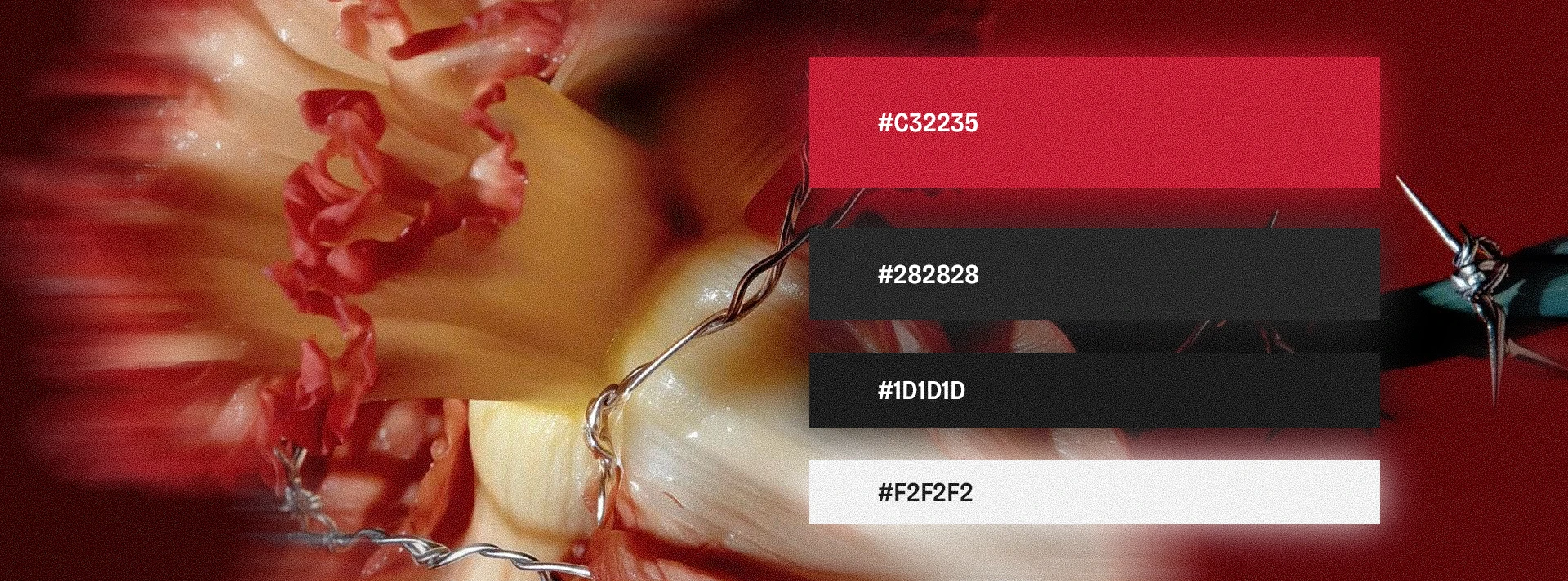
Color Palette:
Primary: Black & White, the monochrome base, representing routine and monotony
Secondary: Oxblood/dark red, the life, the potential, the brave to break free, and so it stays cohesive with the monochrome system.
Tertiary: Grey only used for transitional elements and texture.
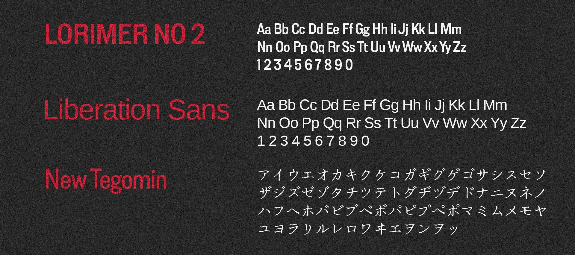
Typography:
Bold condensed sans-serif that assertive, dense, easy to read from a distance.
Mood Reference:
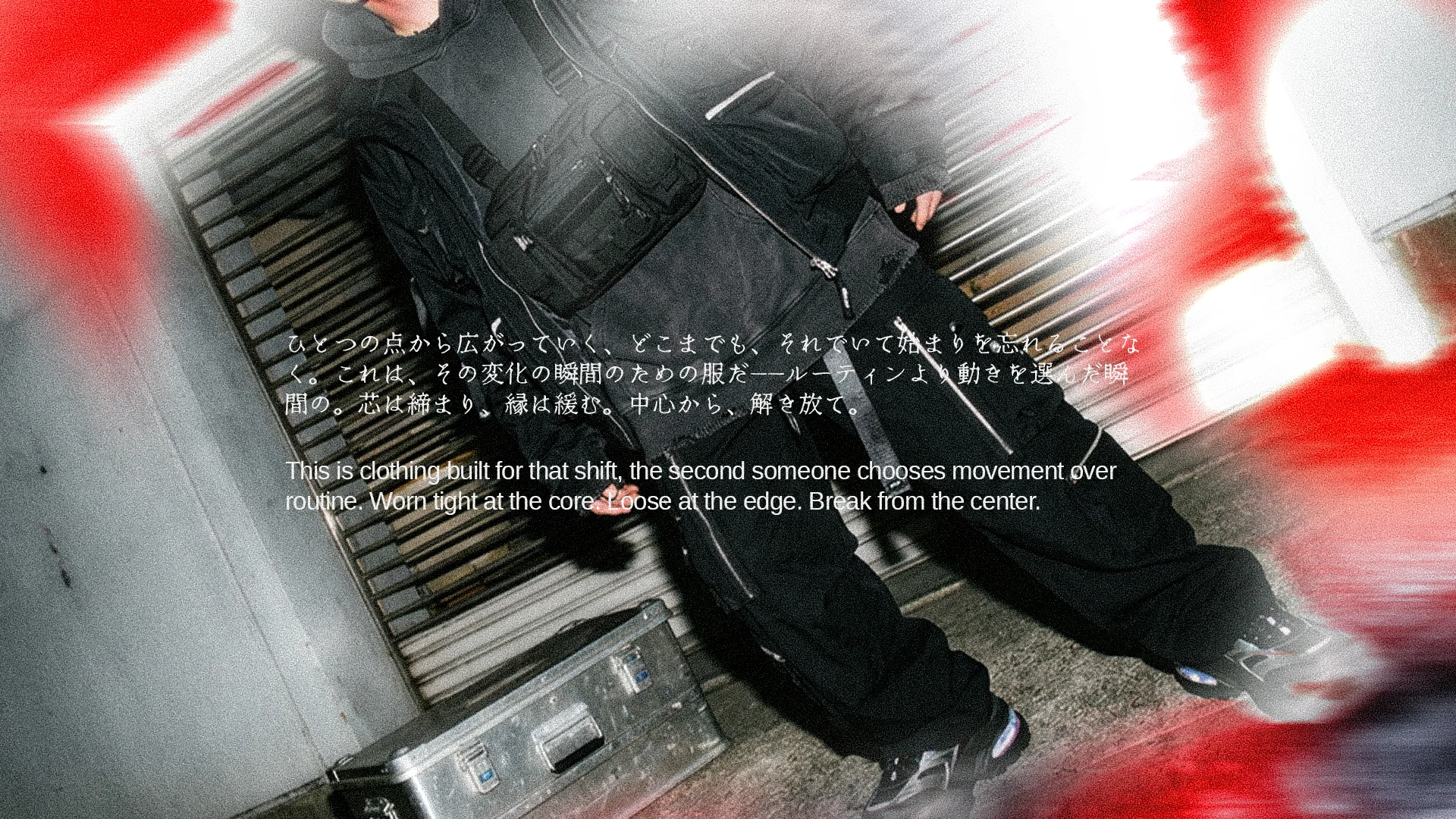
A combination of grunge/rough texture + bold, blurry, and flare. Bold elements represent the rigid, monotonous side of the story. Grunge texture represents the side that's breaking free from that structure. Blur and Flare represents of the different person than before and has seen a new diection.
[JPN]
カラーパレット:
プライマリー: 黒と白。モノクロームの基盤であり、ルーティンと単調さを表す。
セカンダリー: オックスブラッド/ダークレッド。生命力、可能性、そして解き放たれる勇気を表し、それでいてモノクロームの体系と調和し続ける。
ターシャリー: グレー。移行的な要素やテクスチャにのみ使用。
タイポグラフィ: 力強く、密度が高く、遠くからでも読みやすいボールド・コンデンスド・サンセリフ。
ムードリファレンス: グランジ/ラフなテクスチャ+ボールド、そしてブラー(ぼかし)とフレアの組み合わせ。ボールドな要素は硬直的で単調な側面を表し、グランジのテクスチャはその構造から解き放たれていく側面を表す。ブラーとフレアは、以前とは違う人物になったこと、新しい方向性を見出したことを表す。​​​​​​​
Statement
[EN]
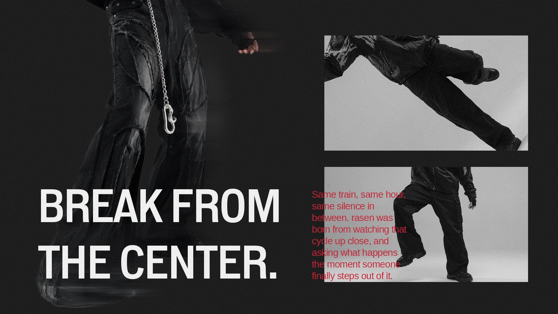
Break from the center.
[JPN]
中心から解き放て。
Logo & Core Assets
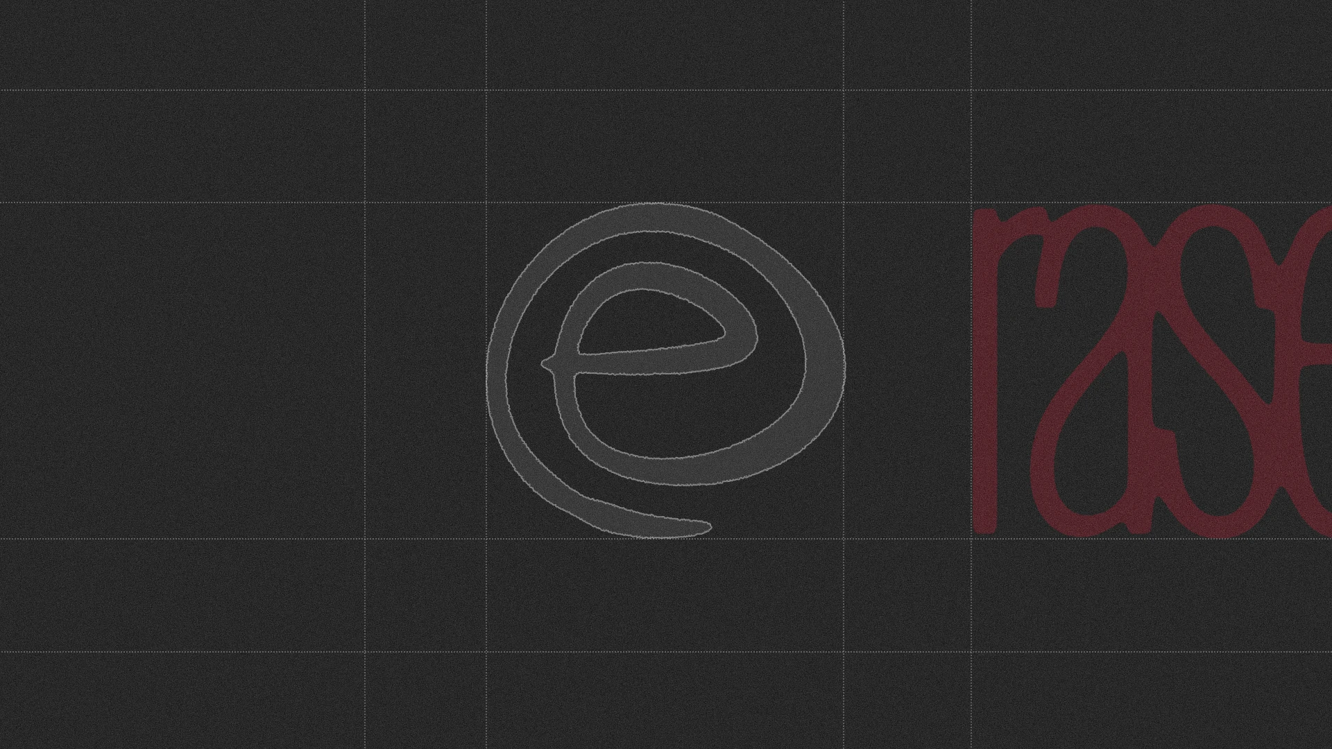
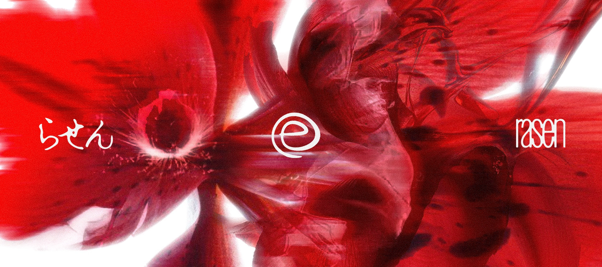
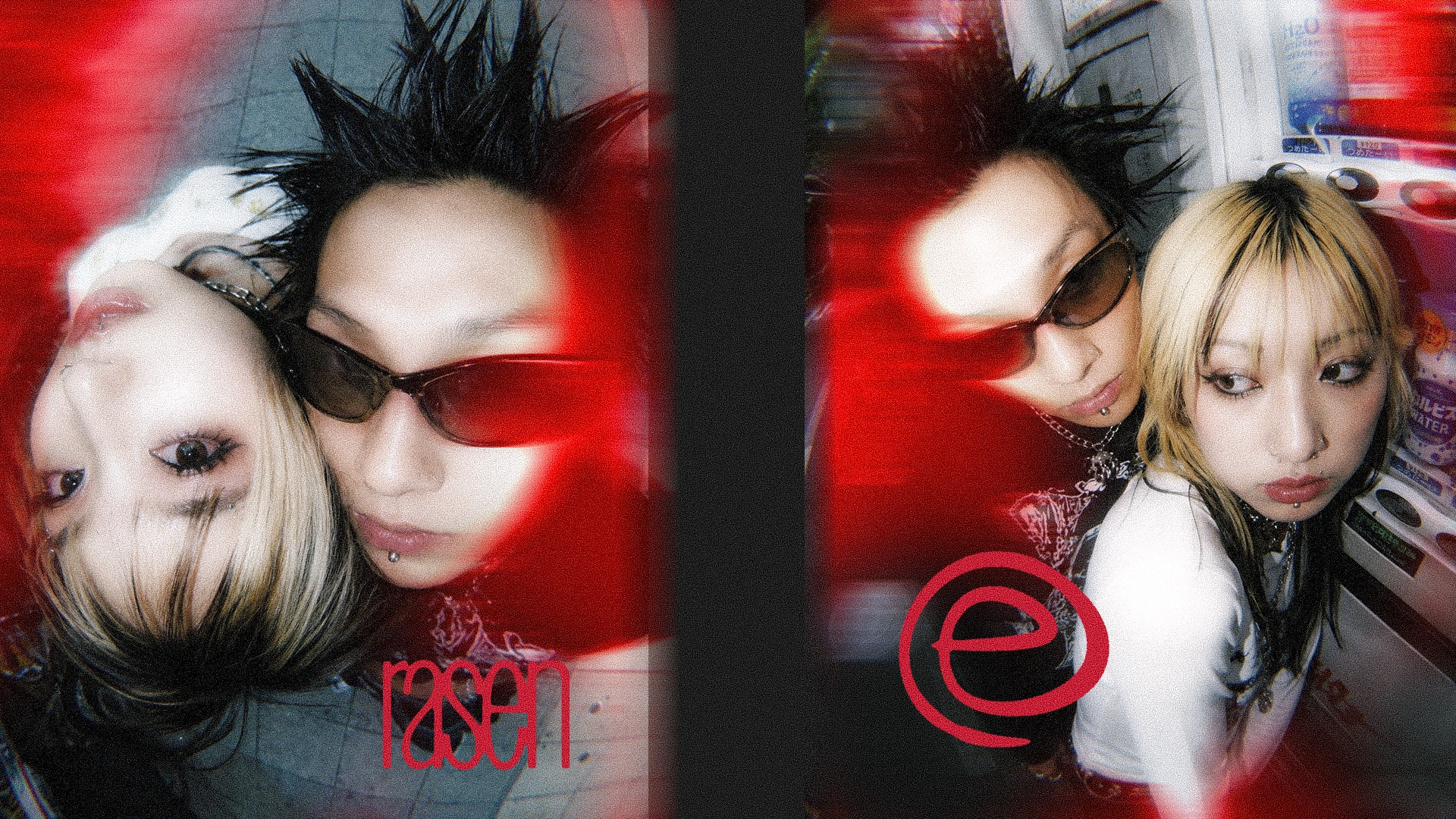
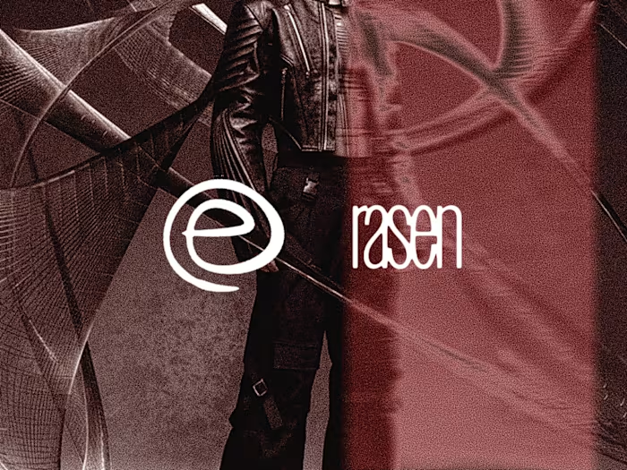
Structure: Wordmark & Symbol, usable separately.
Symbol: Abstract spiral (implied curved lines, not a literal spiral shape)
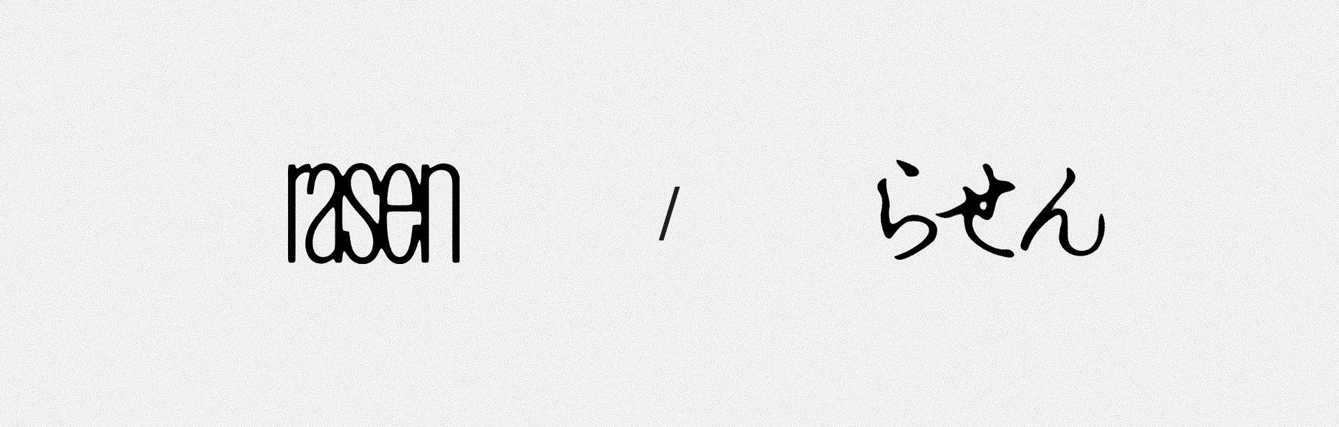
Supporting : rasen logo in Hiragana (Japan Language)
pectiiive & rasen © 2026 Direction by Pectiiive
You like the concept? Let's work together!
email : pectiiive@gmail.com
instagram : pectiiive
contact number : +62 851-4763-3353​​​​​​​
Like this project

Posted Oct 17, 2026

"rasen" is a punk streetwear brand identity concept exploring what it means to break out of a monotonous life. Inspired by people who wake up to the same hour, the same routine, the same silence in between, day after day, the brand reframes freedom not as a path to follow, but as energy breaking loose from a fixed point. "Break from the center" The identity is built around an abstract spiral, growing from tight, dense lines at its core into wider, looser forms, mirroring the shift from routine to growth. A monochrome palette of black and white carries the weight of repetition, while a muted oxblood accent represents the quiet energy simmering beneath it. The logo is designed as two independent elements, a wordmark and a symbol, built to be flexible rather than fixed, echoing the brand's core idea of growing into a new version of yourself without losing your original shape. This is a self-initiated concept project by Pectiiive.