Macrame Cords Pari: E-Commerce Redesign, 80% More Orders

Bhumanyu Kamboj


Driving Growth Through Design: How a Strategic Website Redesign Boosted Traffic and Orders by 80% for Macrame Cords Pari
Overview
Macrame Cords Pari is an e-commerce brand serving women artists and macrame enthusiasts with vibrant, affordable crafting cords. I led a full rebranding effort to realign the brand's visual identity with its core values, alongside a targeted redesign of key website sections to deliver a more intuitive, visually engaging, and conversion-focused user experience.
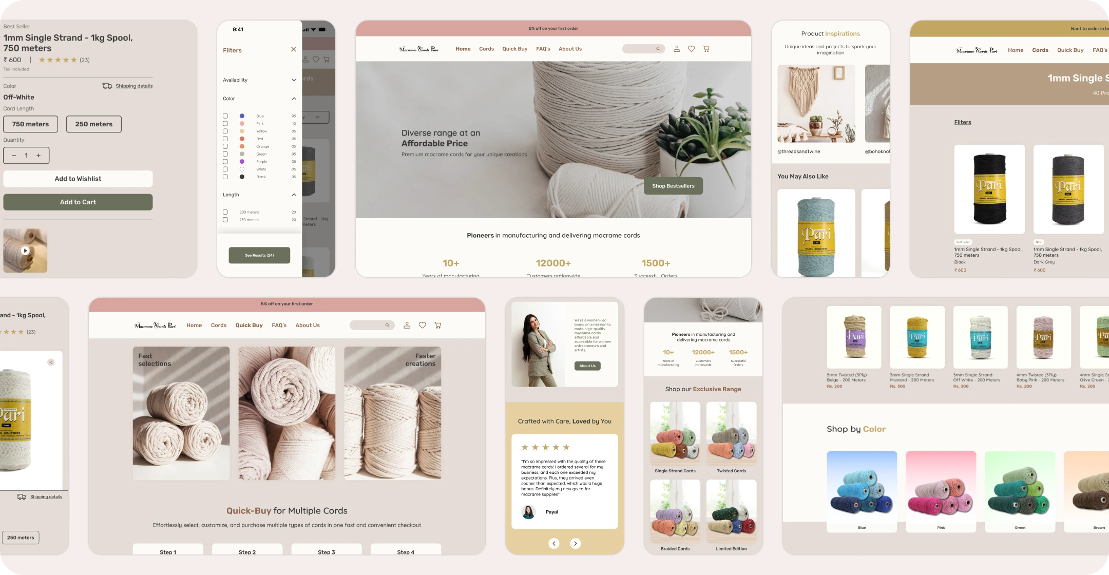
Product discovery, Quick Buy, and trust signals, all in one redesign.
Problem
Early user feedback pointed to significant usability challenges on the existing website. With only 8% of orders being completed online, the data made one thing clear: the digital experience was failing to convert a growing audience of potential customers. The website needed a focused, research-backed redesign to reduce friction and build trust with new and returning users.
The Challenge
How might we refine Macrame Cord Pari's brand identity and redesign the website to create a more intuitive, trustworthy, and engaging e-commerce experience that onboards new users seamlessly and drives online order completion?
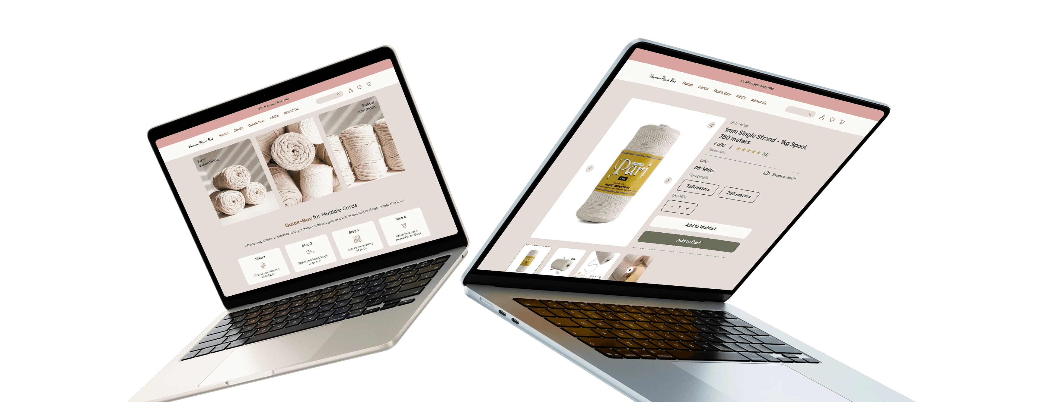
Quick Buy flow and detailed product pages, designed for confident purchases.
Design Approach
Research and Discovery
Competitor analysis and user interviews surfaced consistent pain points, including unclear brand messaging, cluttered navigation, insufficient product detail, and a lack of trust signals.
Targeted Redesign
Using research insights, key areas of the website were redesigned, including the homepage, product pages, and the Quick Buy feature, to create a clearer and more confident purchase journey.
Iterative Testing
Usability testing and feedback loops were run at every stage to refine layouts, validate design decisions, and sharpen overall usability.
Outcome
A cohesive brand experience and a streamlined e-commerce platform that helps users explore products and complete purchases with confidence.
The homepage redesign that helped drive 80% growth in orders.
Streamlined cords browsing with filters that actually help users decide.
Solution
Dedicated Quick Buy Experience
A streamlined Quick Buy flow was designed to reduce purchase friction and keep high-intent users moving toward checkout without unnecessary steps.
Enriched Product Pages
Product pages were upgraded with detailed descriptions and inspiration content to help users make informed buying decisions and stay engaged longer.
Visual Standardisation
Consistent visuals were applied across the platform to reinforce brand identity, improve professionalism, and create a cohesive browsing experience.
Trust-Building Elements
User reviews, influencer content, and a live order counter were integrated to strengthen brand credibility and encourage first-time and repeat conversions.
Redesigned product page. More detail, more trust, more conversions.
Quick Buy redesigned. Fewer steps, less friction, more completed orders.
Like this project
Posted Jun 8, 2026
E-commerce website redesign, brand identity refinement, and user journey optimisation that boosted online orders and traffic by 80%.
Likes
0
Views
9
Timeline
Oct 1, 2024 - Nov 1, 2024